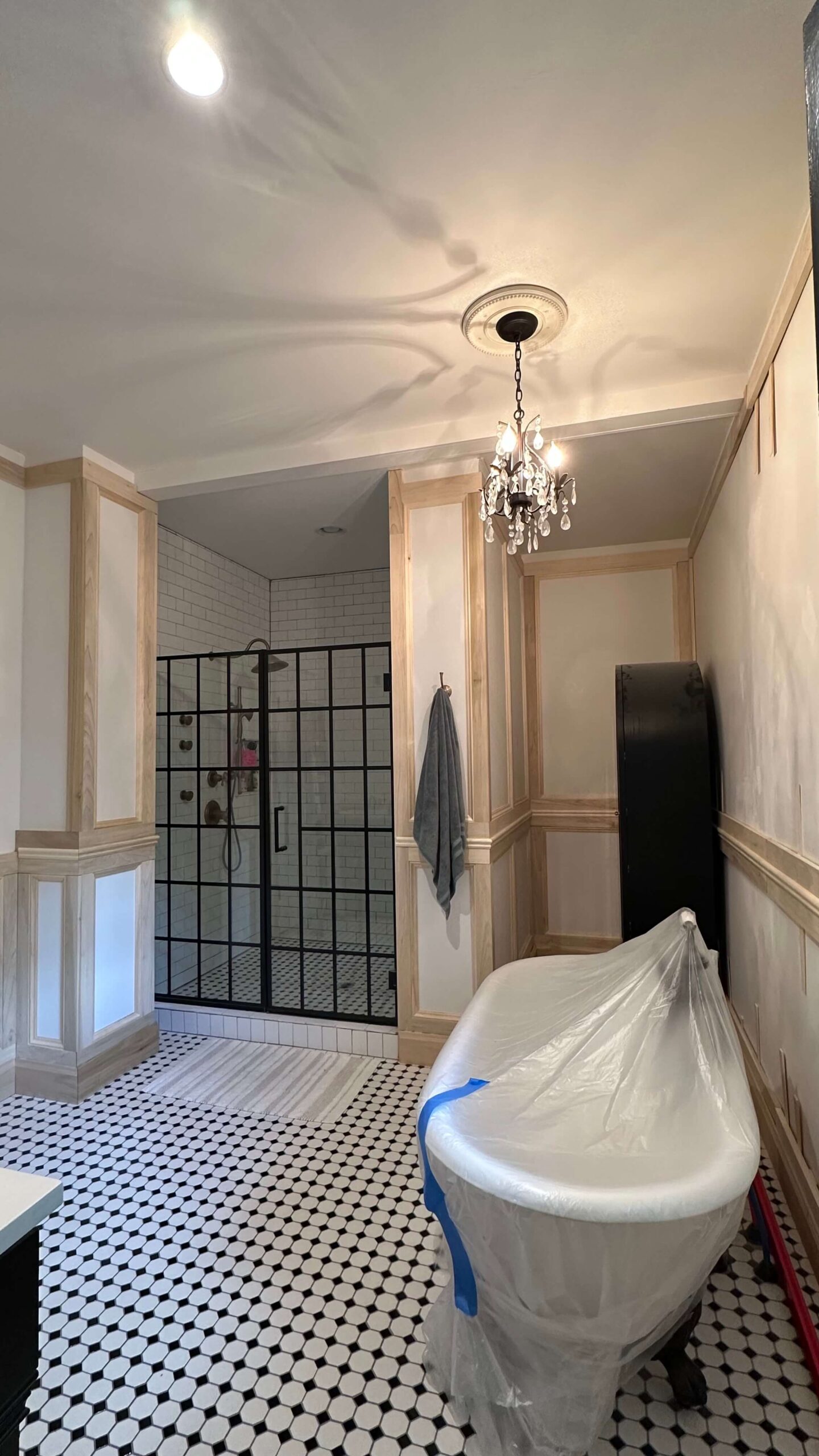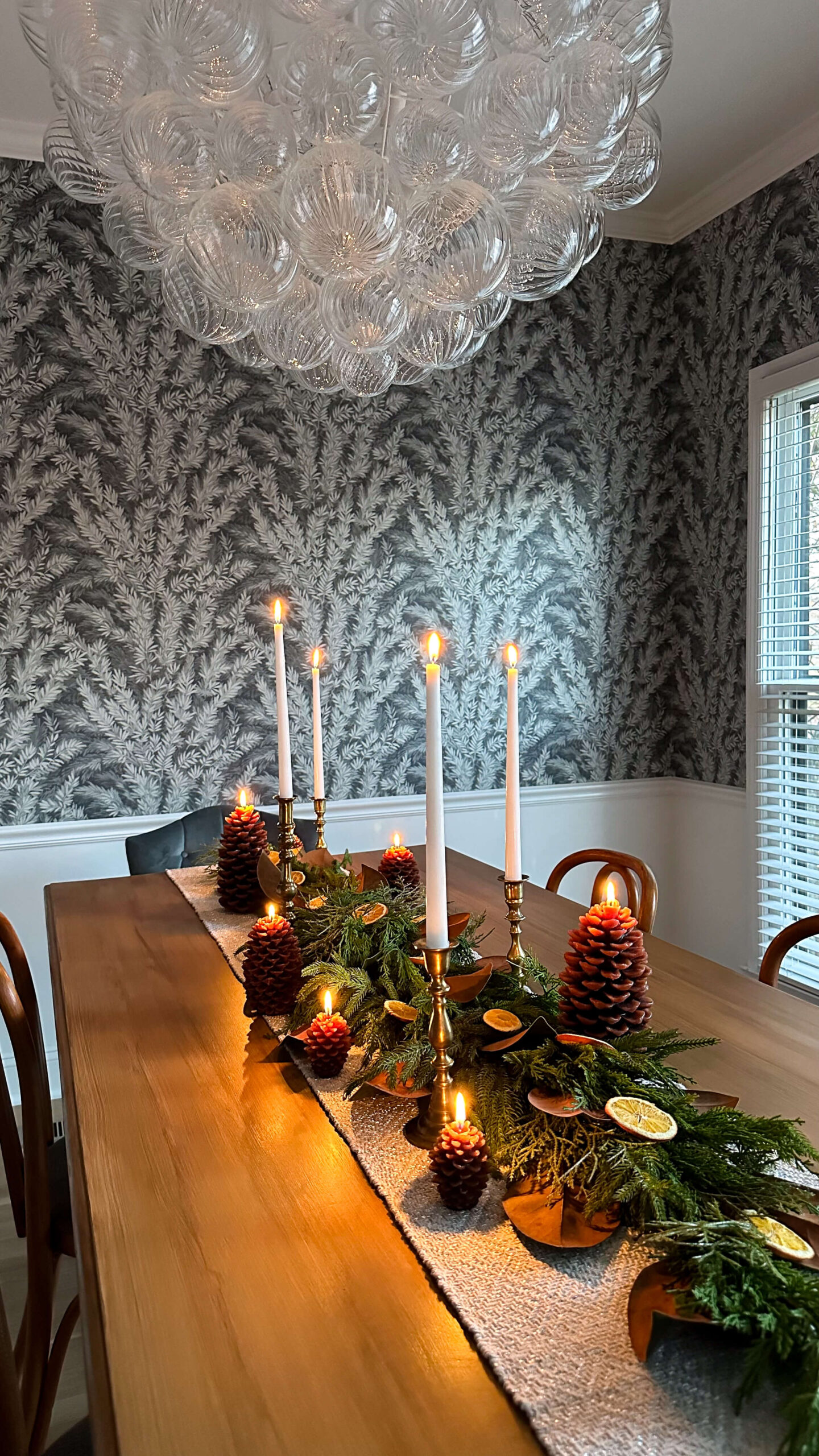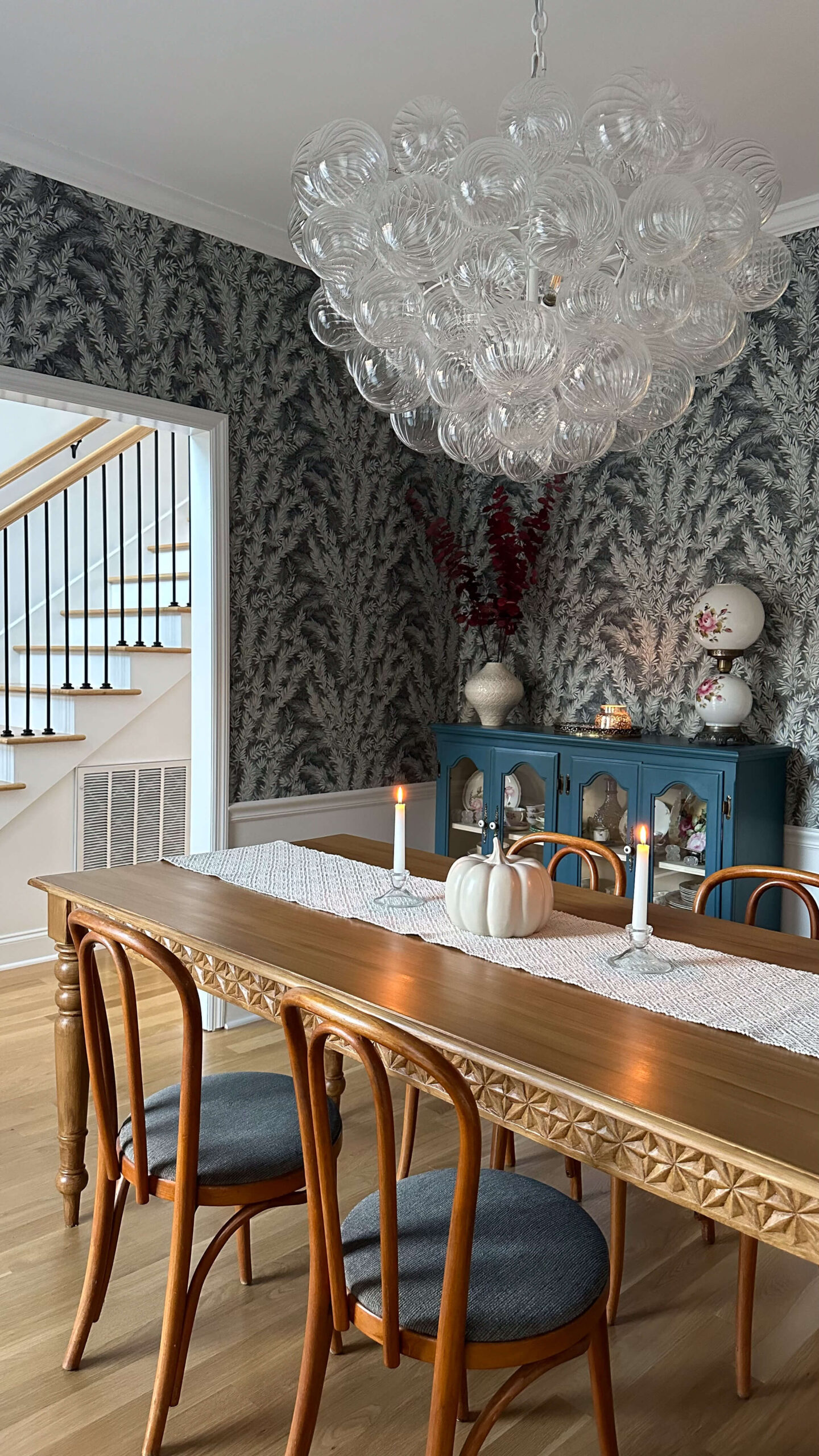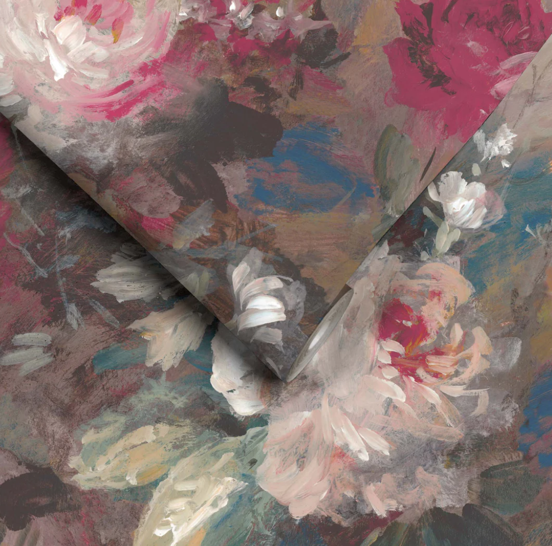


Color drenching has been making waves in the interior design world, and for good reason. This bold, immersive technique—where walls, ceilings, trim, and even furniture are painted in the same hue—creates a cohesive, dramatic, and deeply atmospheric look. But despite its growing popularity, many people hesitate to try it, often due to common misconceptions.
Let’s set the record straight by debunking some myths about color drenching and I’ll share some expert tips to help you pull it off beautifully in your own home.
Myth #1: Color Drenching Makes a Space Feel Smaller
Reality: While it’s true that darker colors can absorb light, making a room feel more intimate, this doesn’t mean it will feel cramped. In fact, color drenching blurs the visual boundaries of a room, making walls and ceilings blend seamlessly. This trick eliminates harsh contrasts and creates the illusion of depth, often making a space feel larger and more expansive.
Tip: If you’re worried about the room feeling too enclosed, opt for a mid-tone or earthy shade rather than an ultra-dark hue. Soft greens, warm taupes, or dusky blues can add depth while still feeling airy.
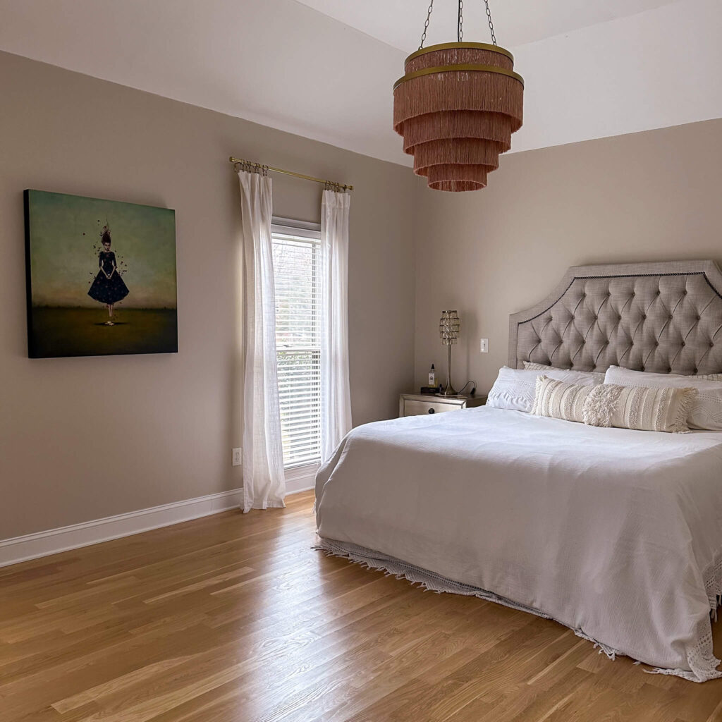
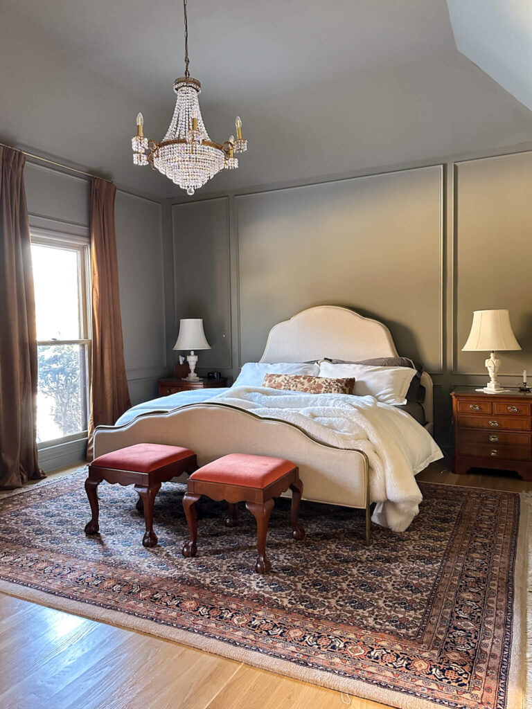
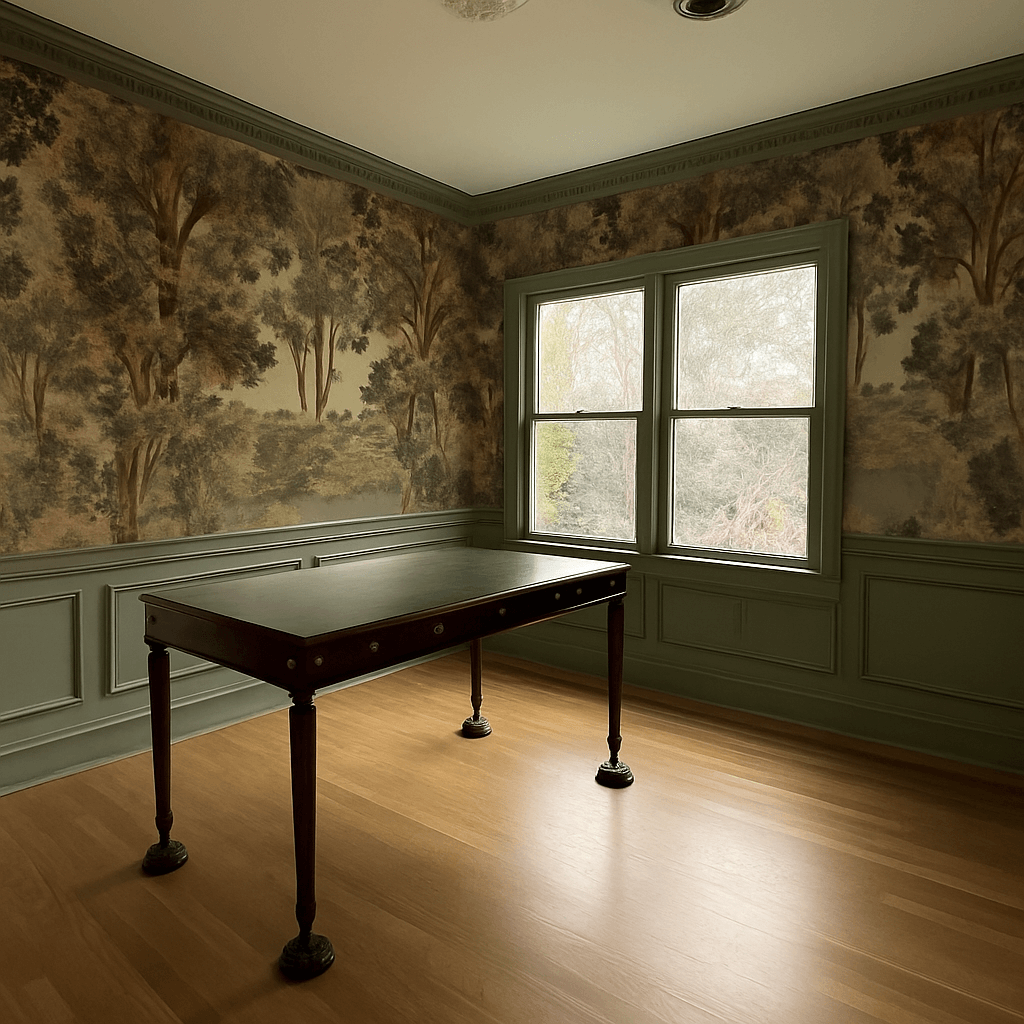
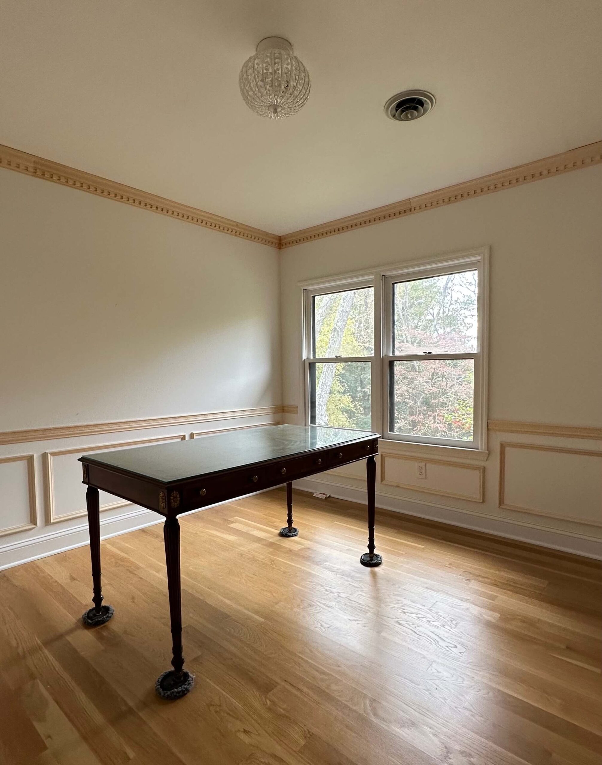
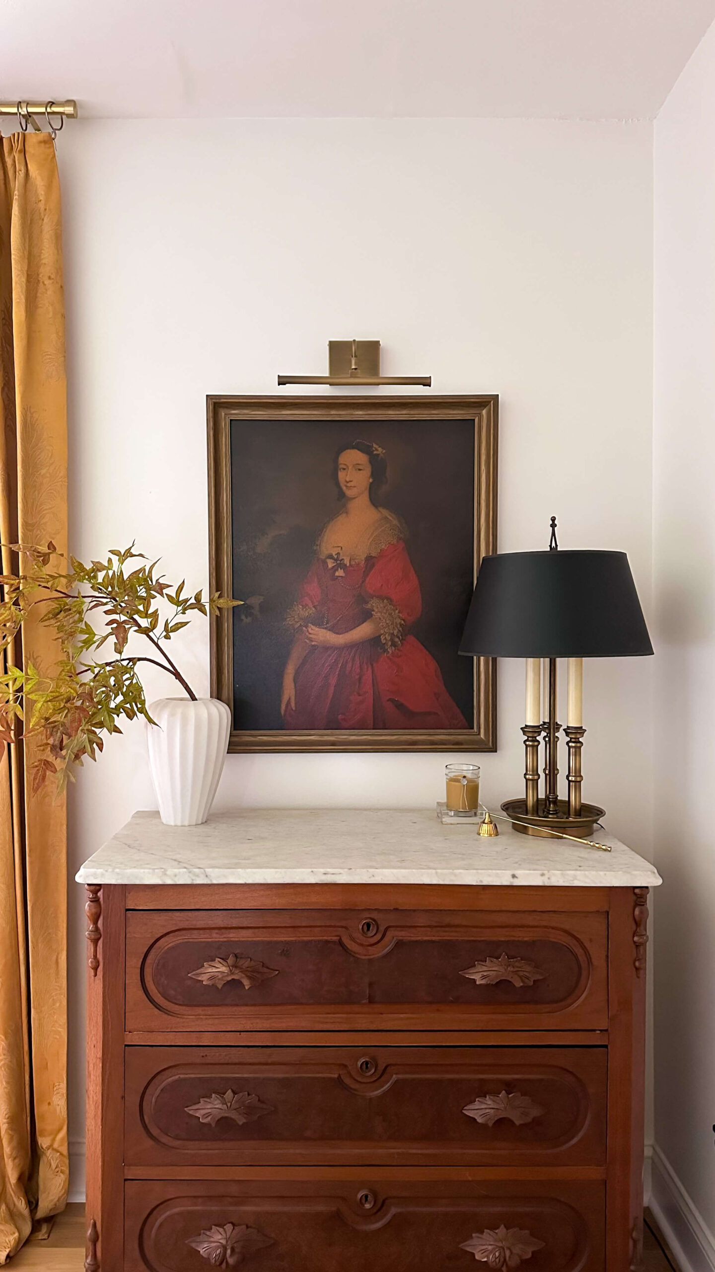
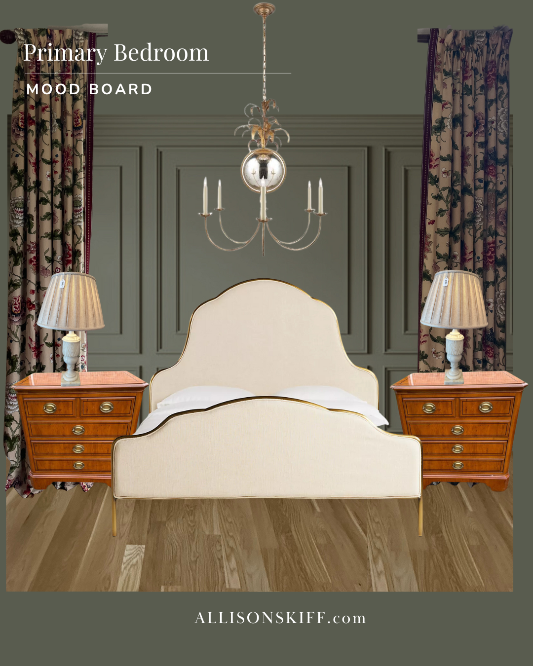
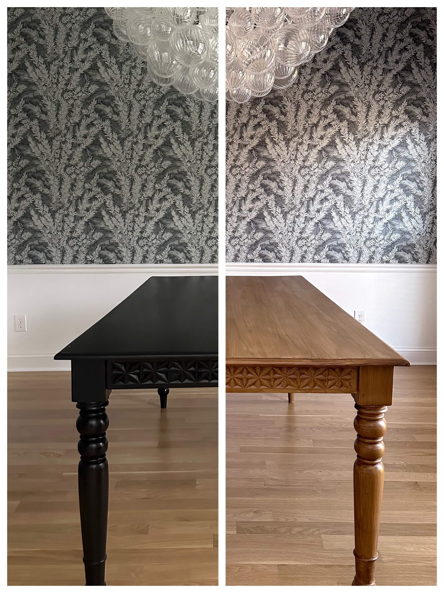
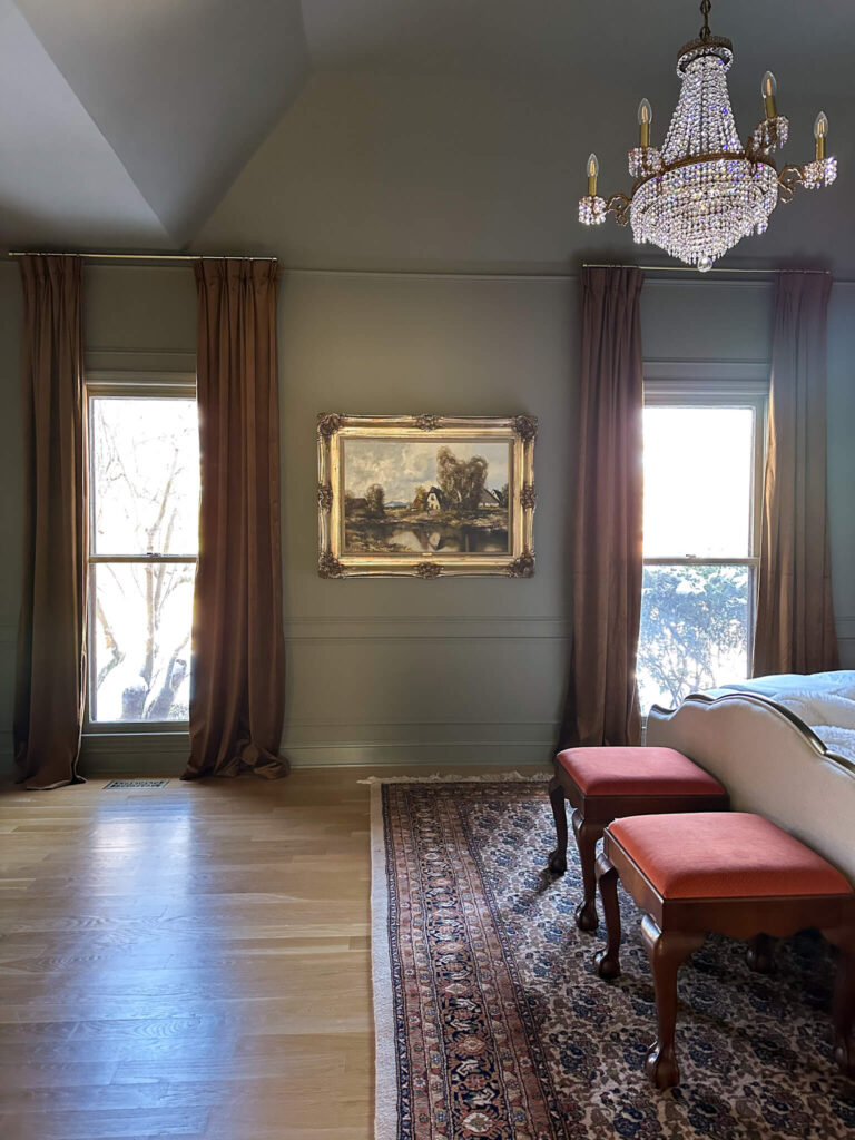
The Primary Bedroom Before & After Color Drenching
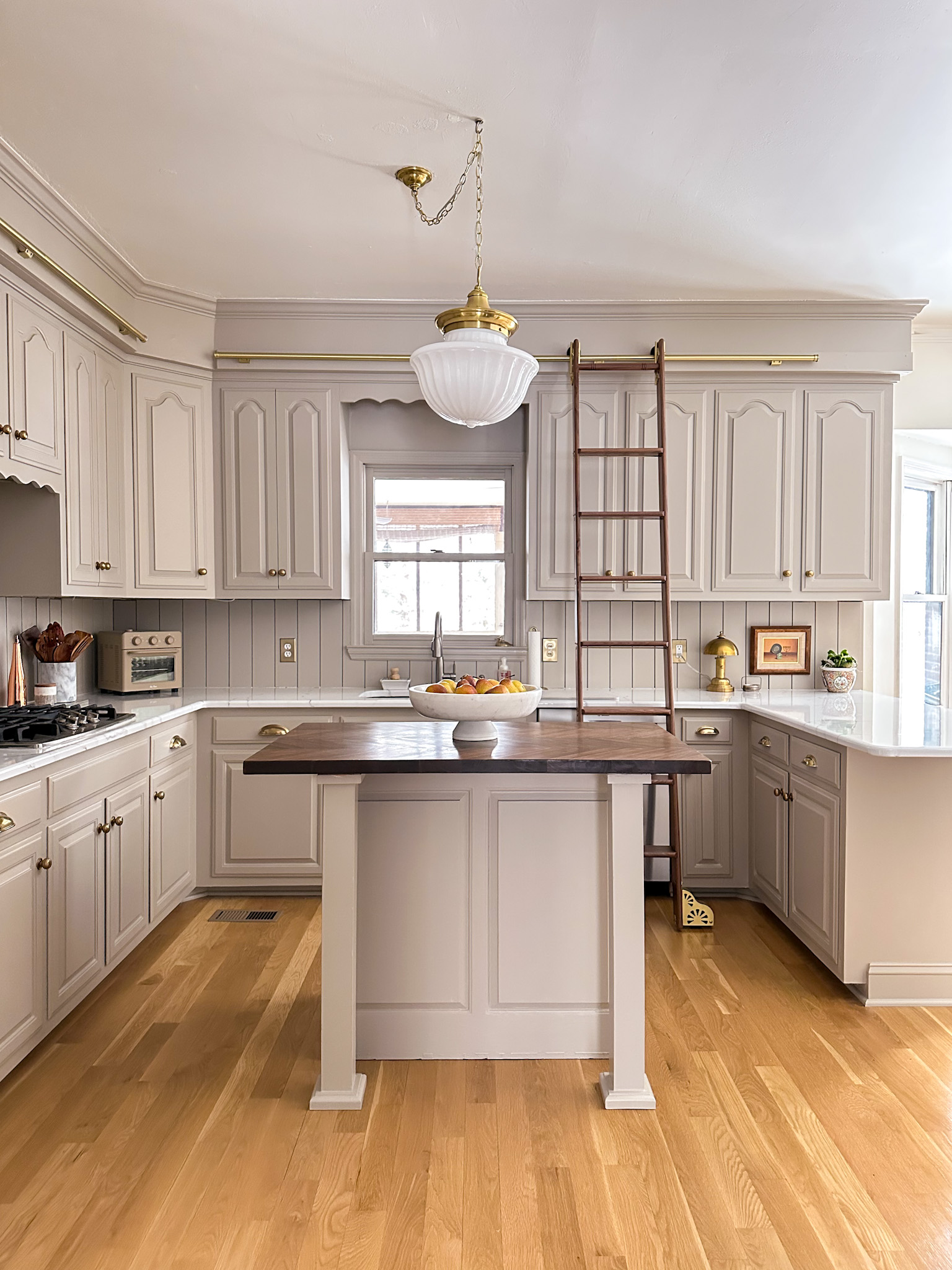
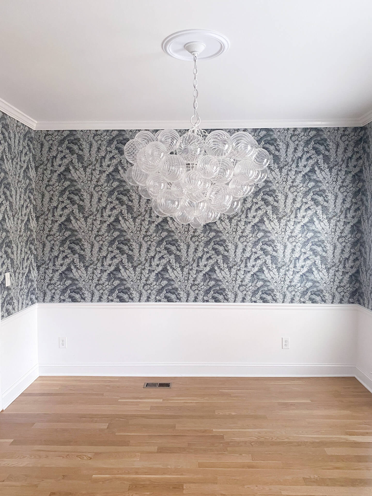
Myth #2: You Can Only Use Dark Colors
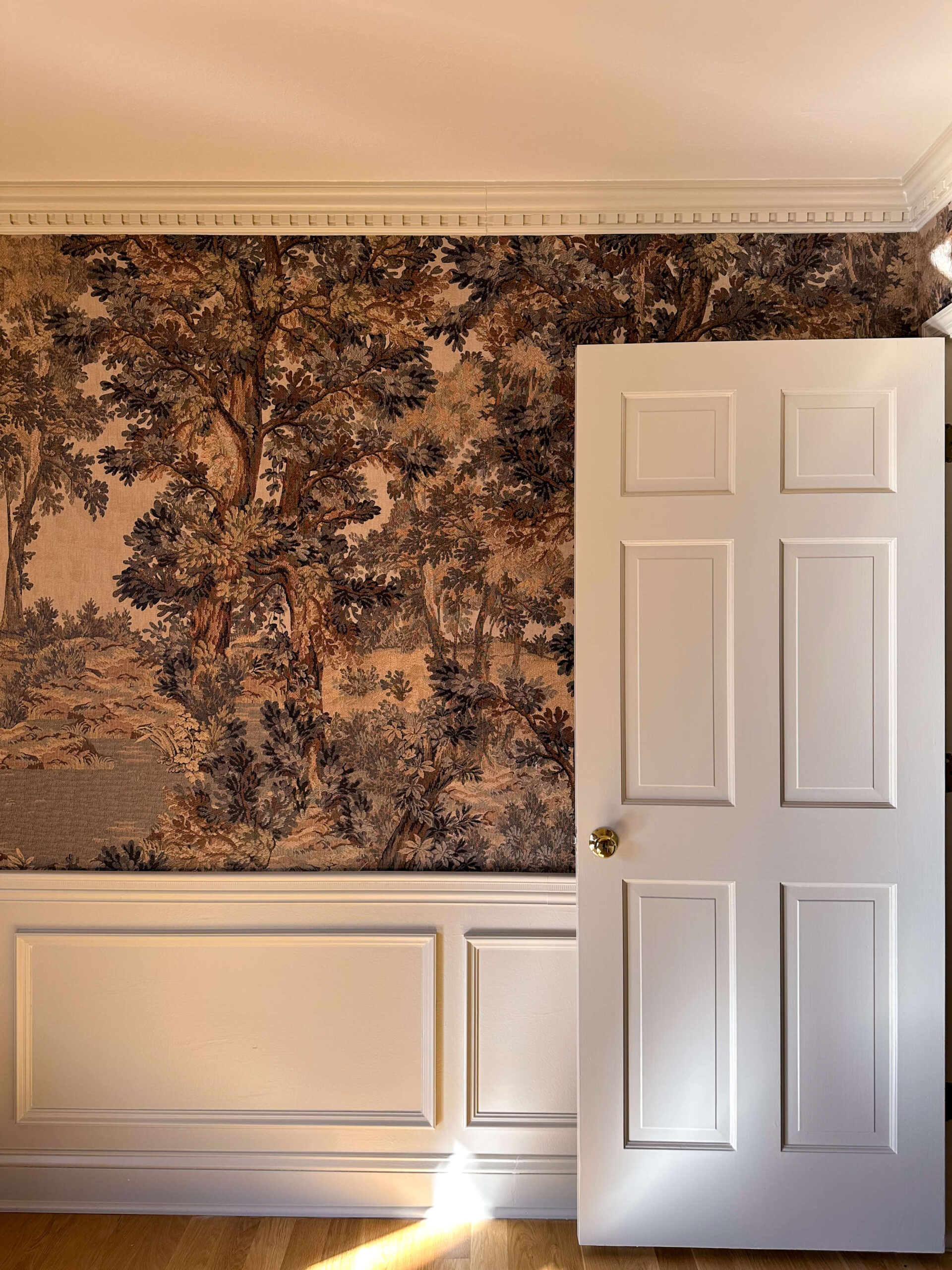
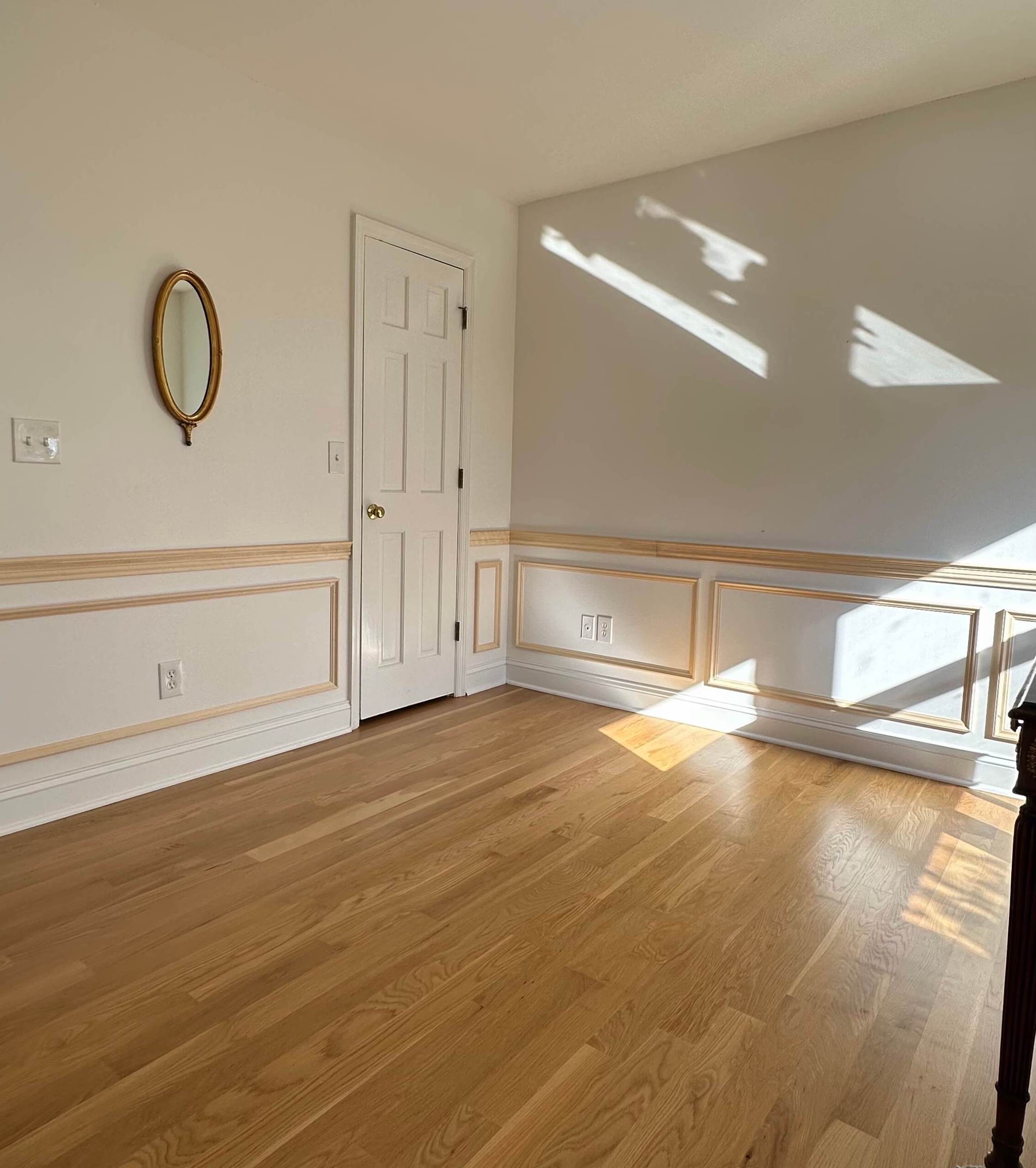
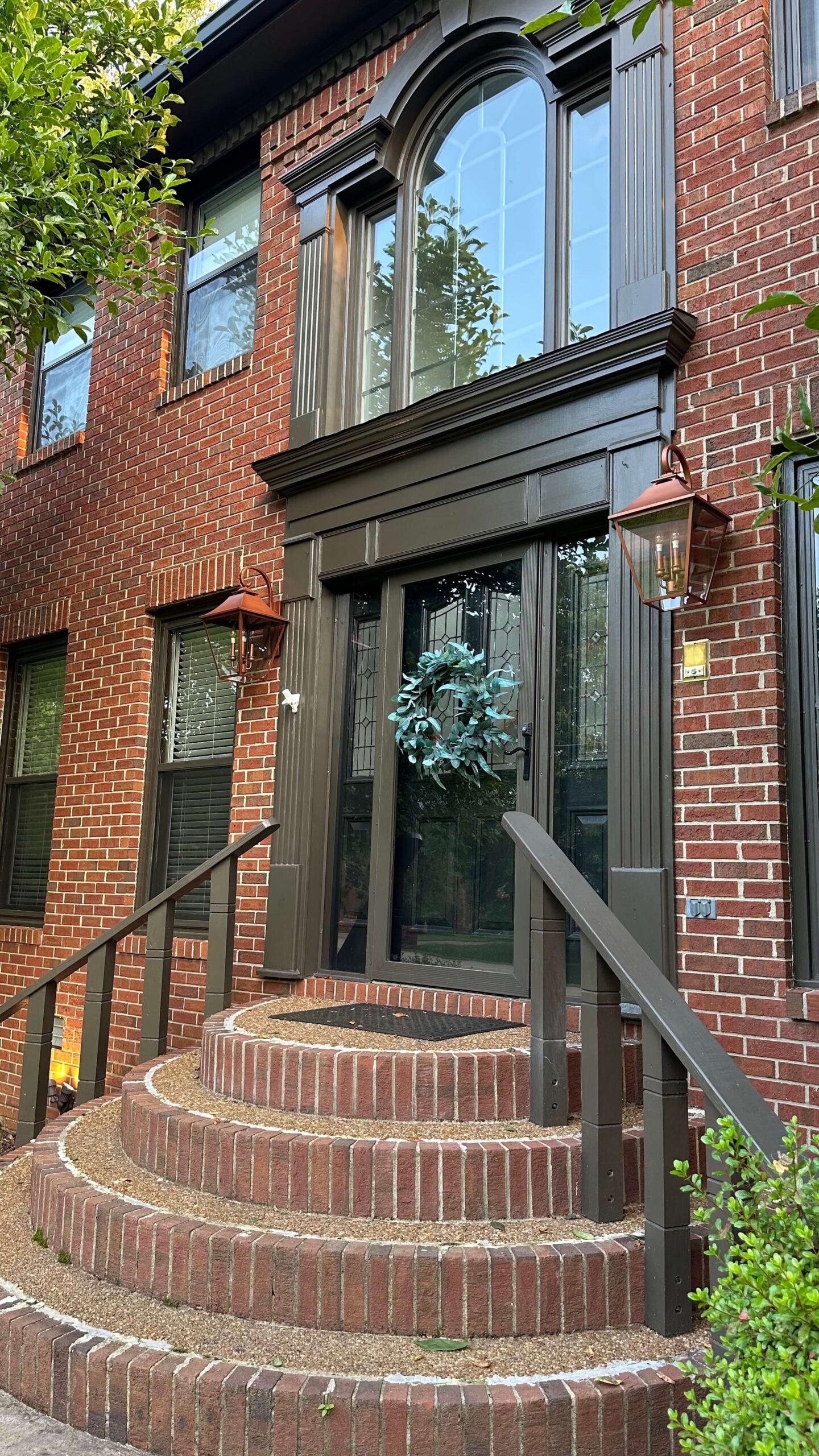
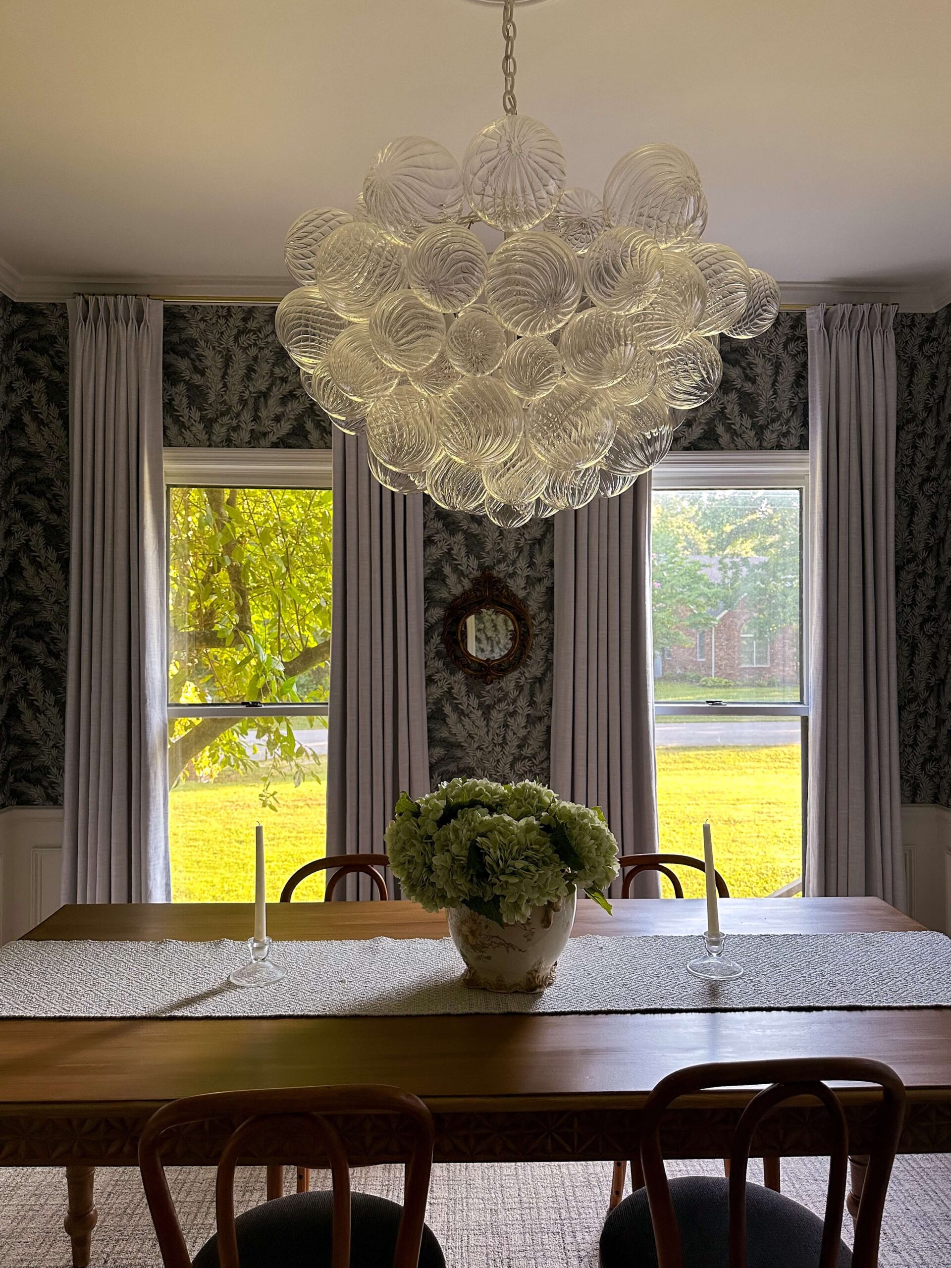
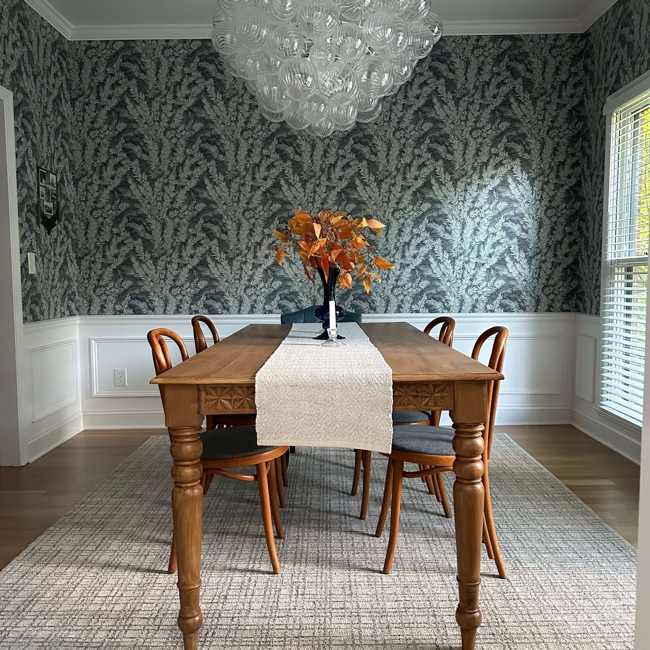
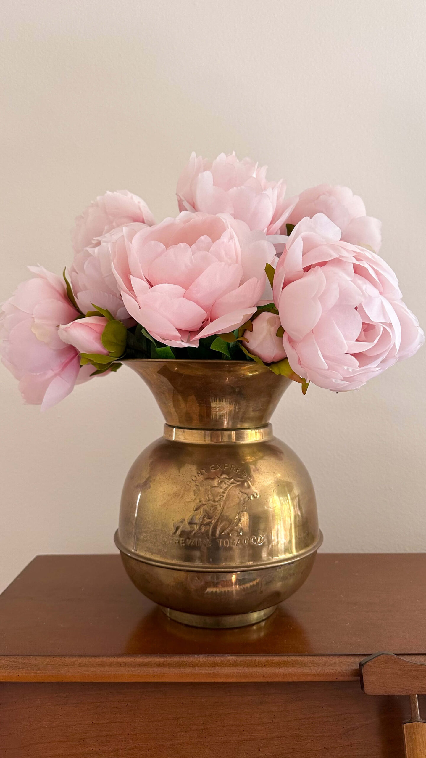
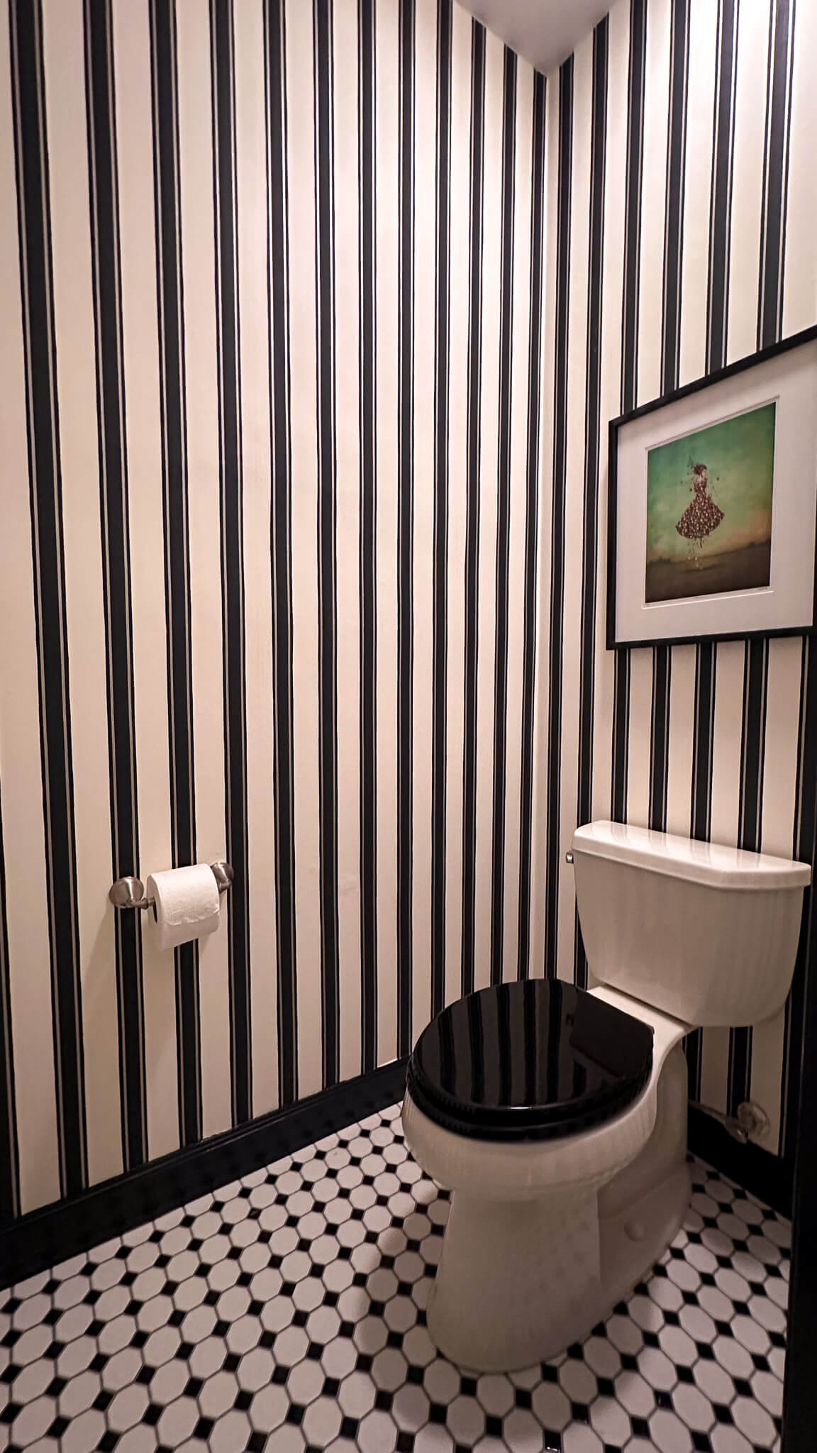
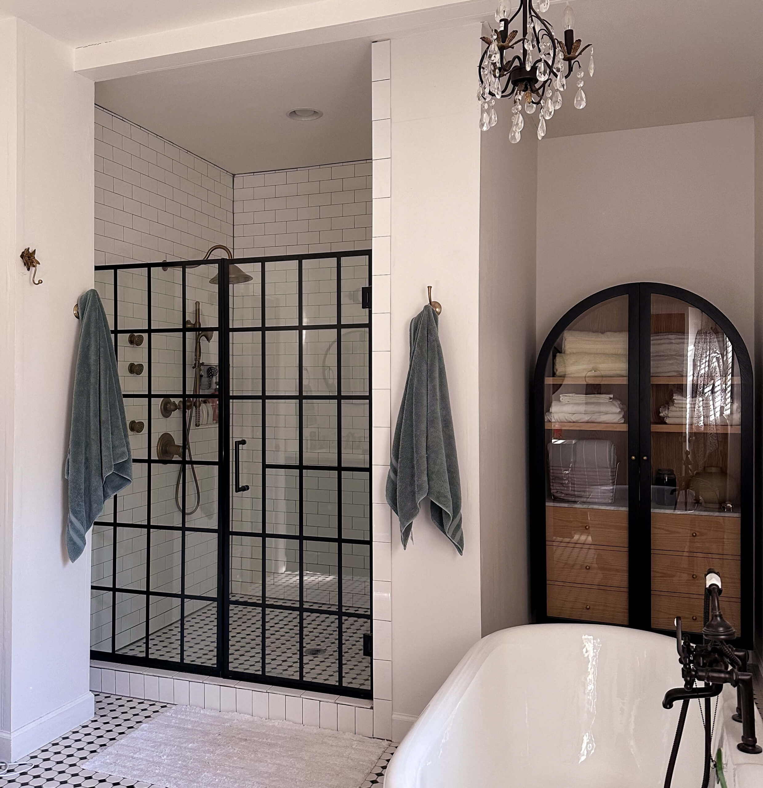
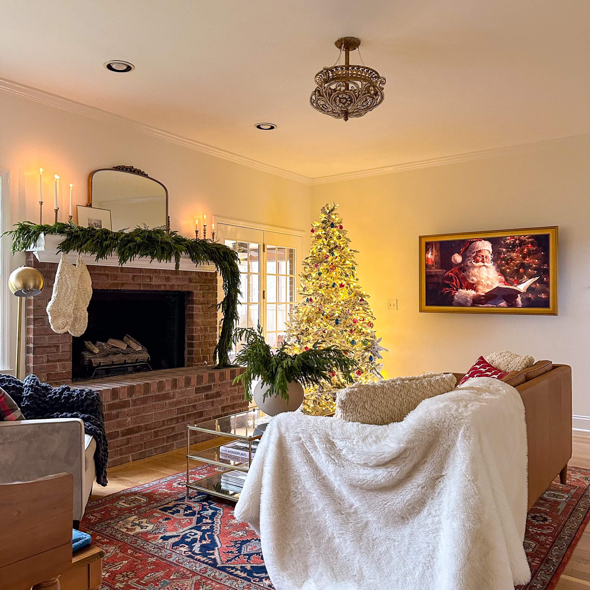
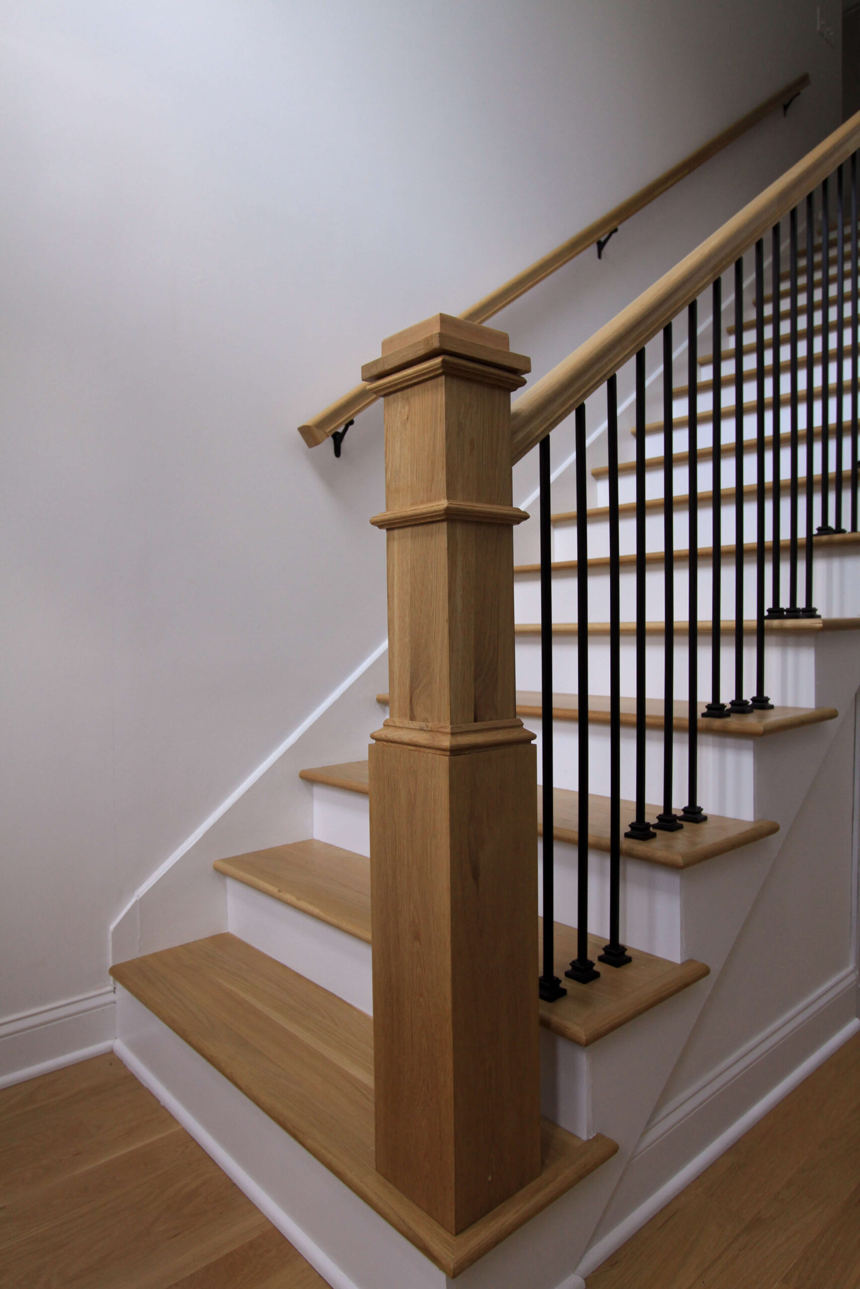
Reality: While deep, moody shades are often associated with color drenching, this technique works just as well with lighter colors. In fact, you’ve probably already done it…do you have an all white space? I’m sharing my entry way as an example below. If you’re ready to take the next step, muted pastels, soft creams, and warm neutrals can create a serene, enveloping effect without feeling heavy. The key is to choose a color with enough depth to create impact.
Tip: If you love neutrals but want a sophisticated, layered look, try a warm beige, greige, or muted blush. Painting walls, trim, and even built-ins in the same tone can create a rich and elegant space without overpowering it.
Related: designing the staircase
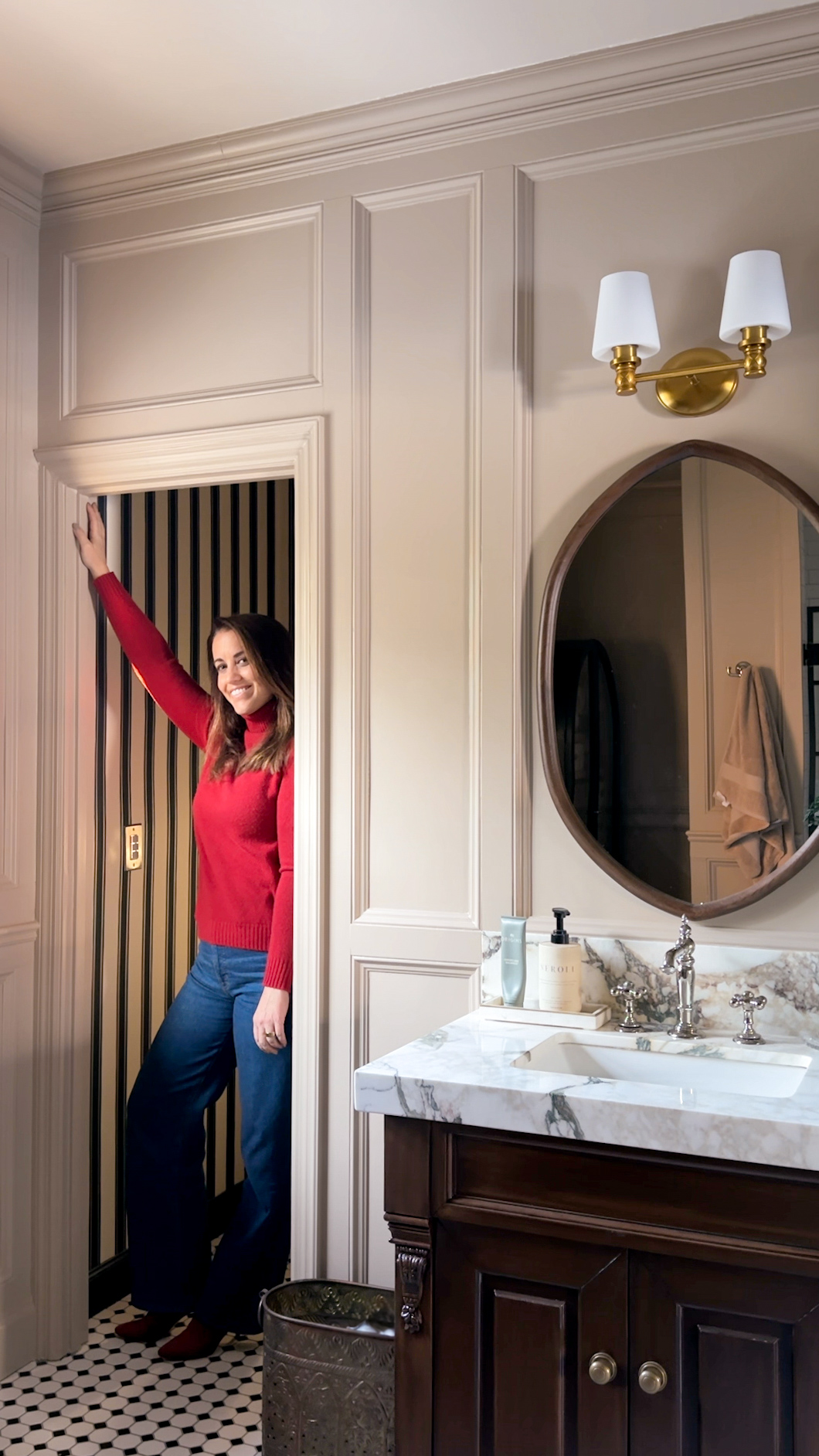
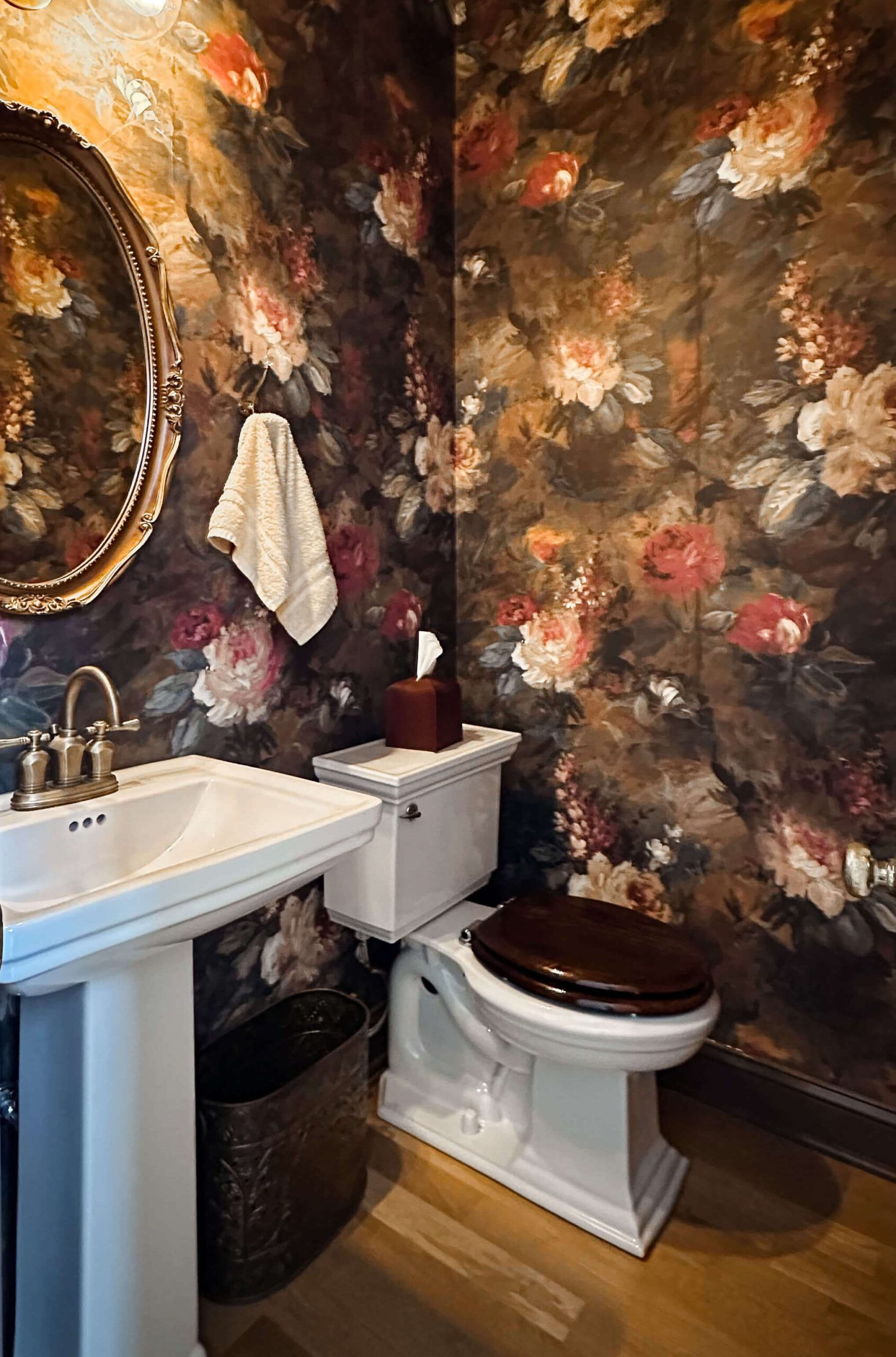
Myth #3: Color Drenching Only Works in Large Rooms
Reality: This technique is actually a secret weapon for smaller spaces! When a single color is used throughout, it eliminates visual breaks, making the room feel more cohesive and expansive. Color drenching can be especially effective in awkwardly shaped rooms or spaces with low ceilings because it minimizes visual contrast, reducing the emphasis on irregularities.
Tip: If you’re working with a small space, choose a color with a slight sheen for added light reflection. Satin or eggshell finishes can help bounce light around, keeping the space from feeling too heavy.
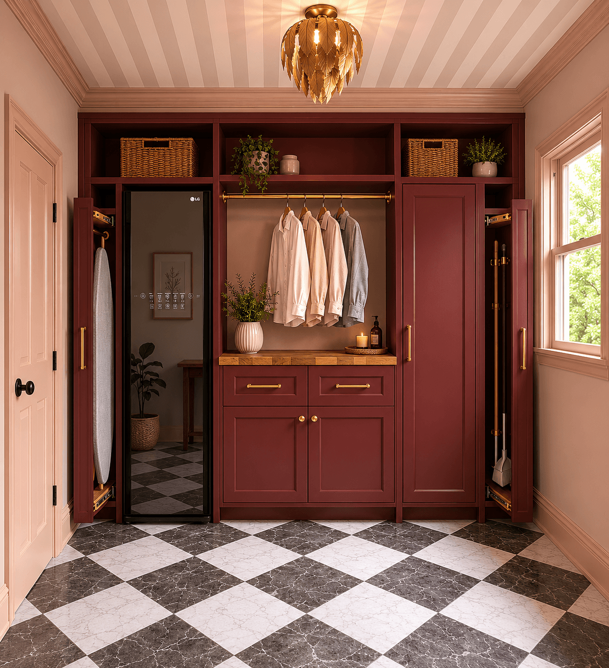
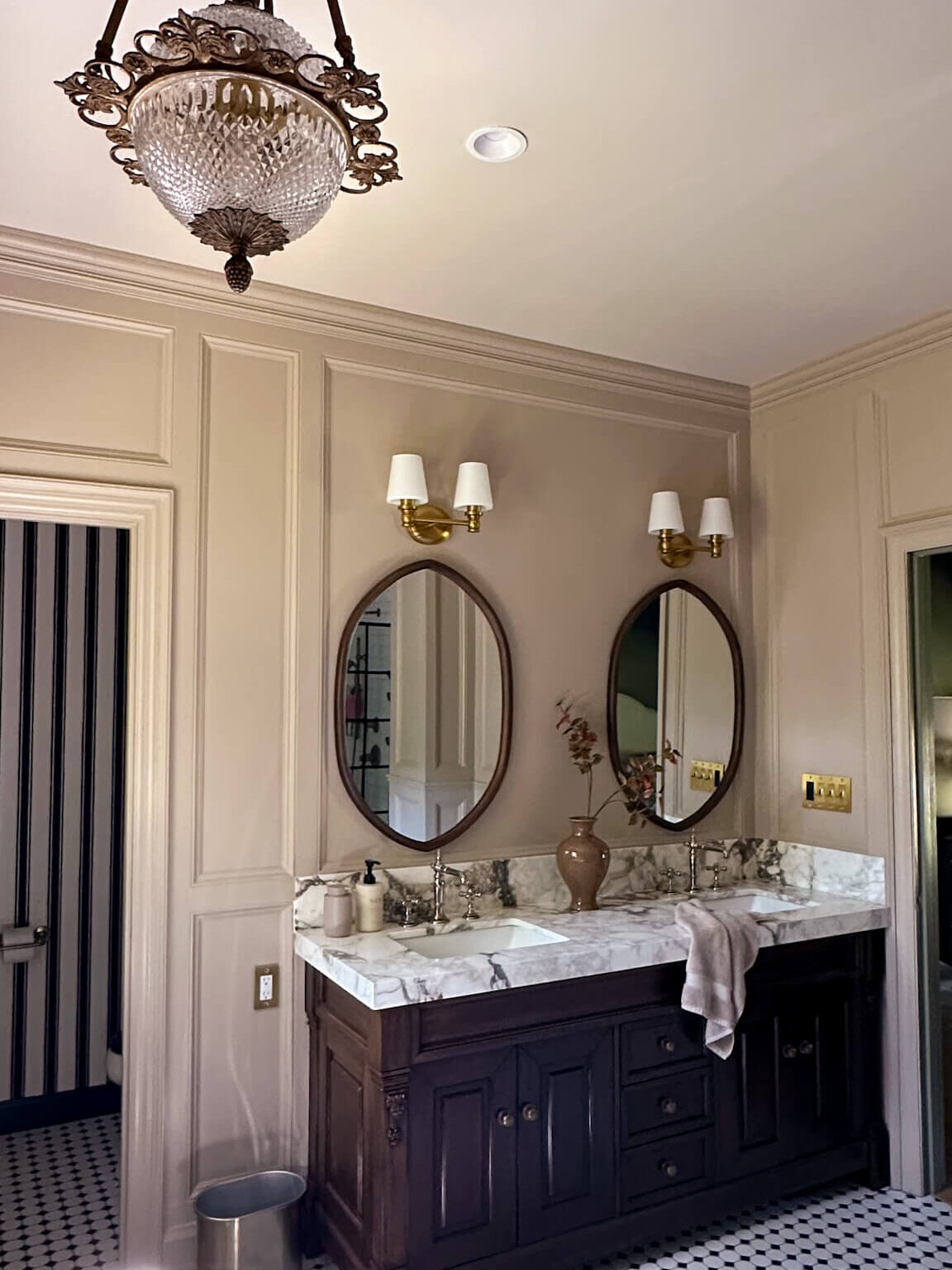
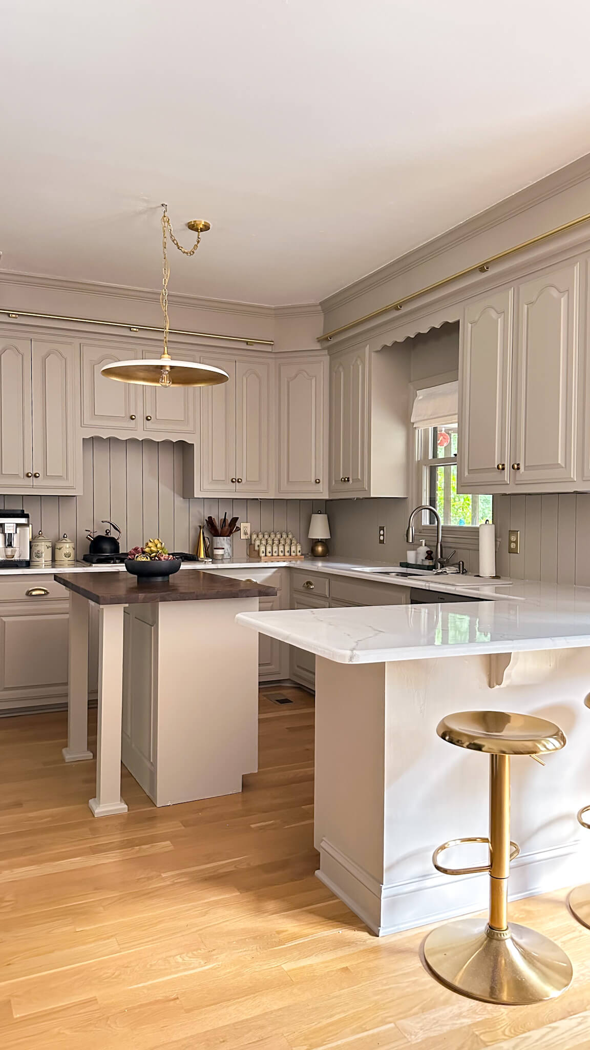
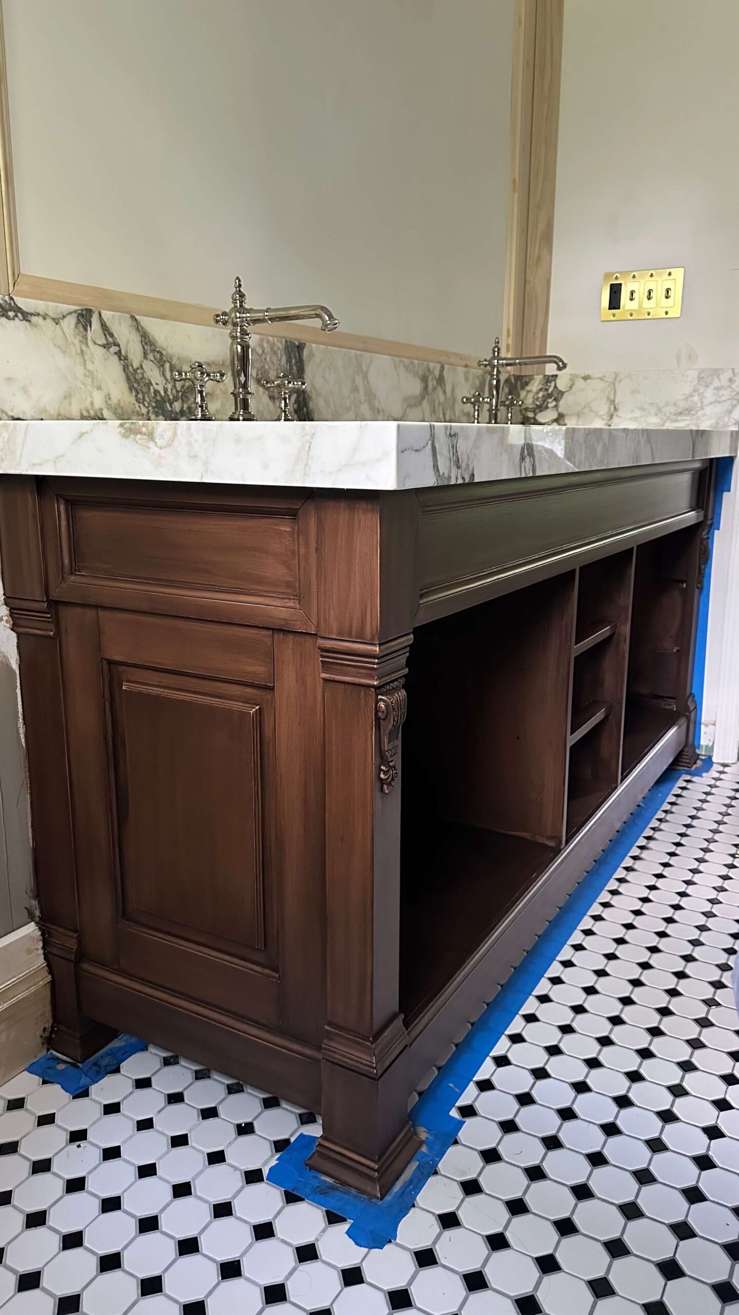
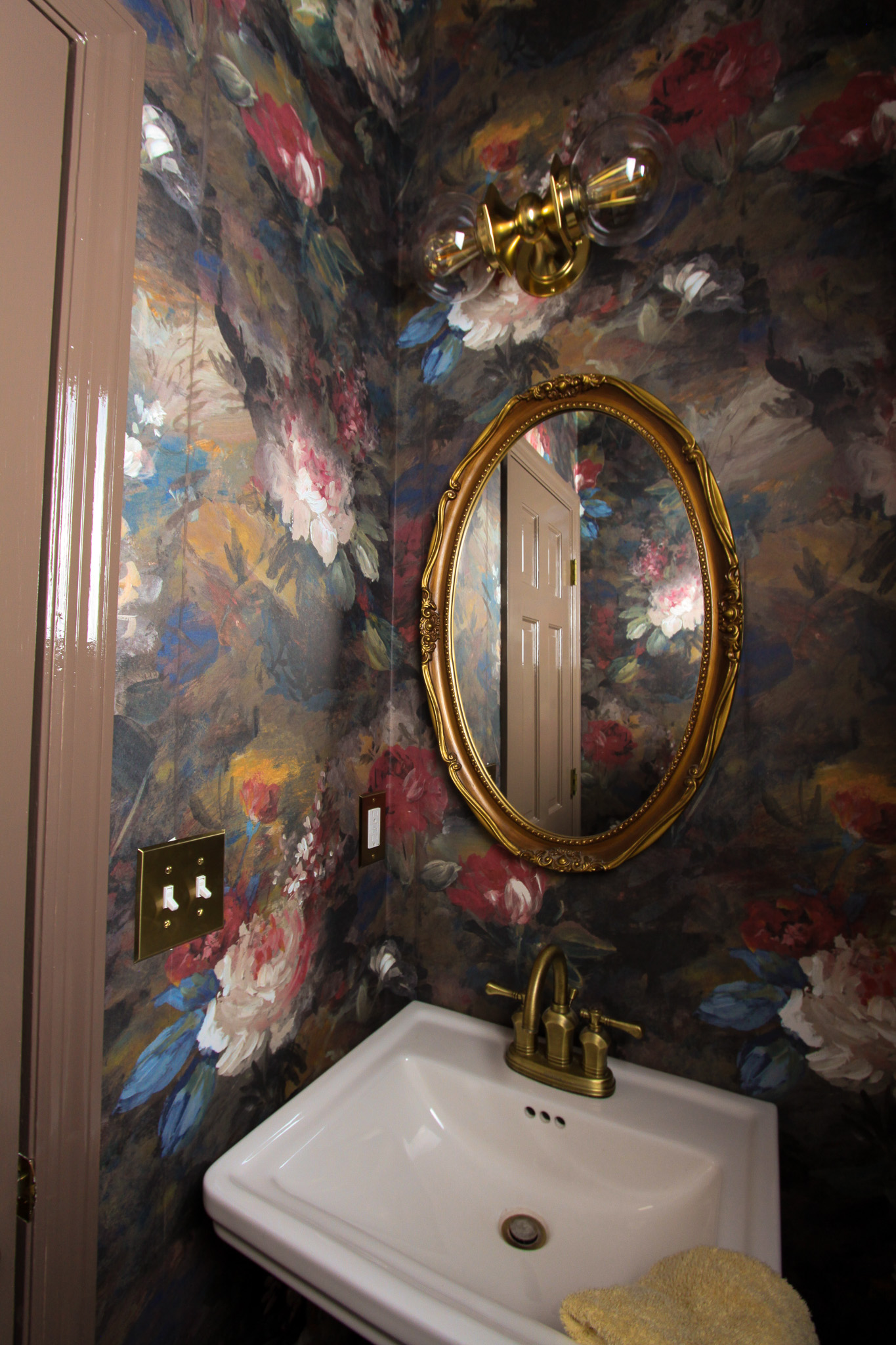
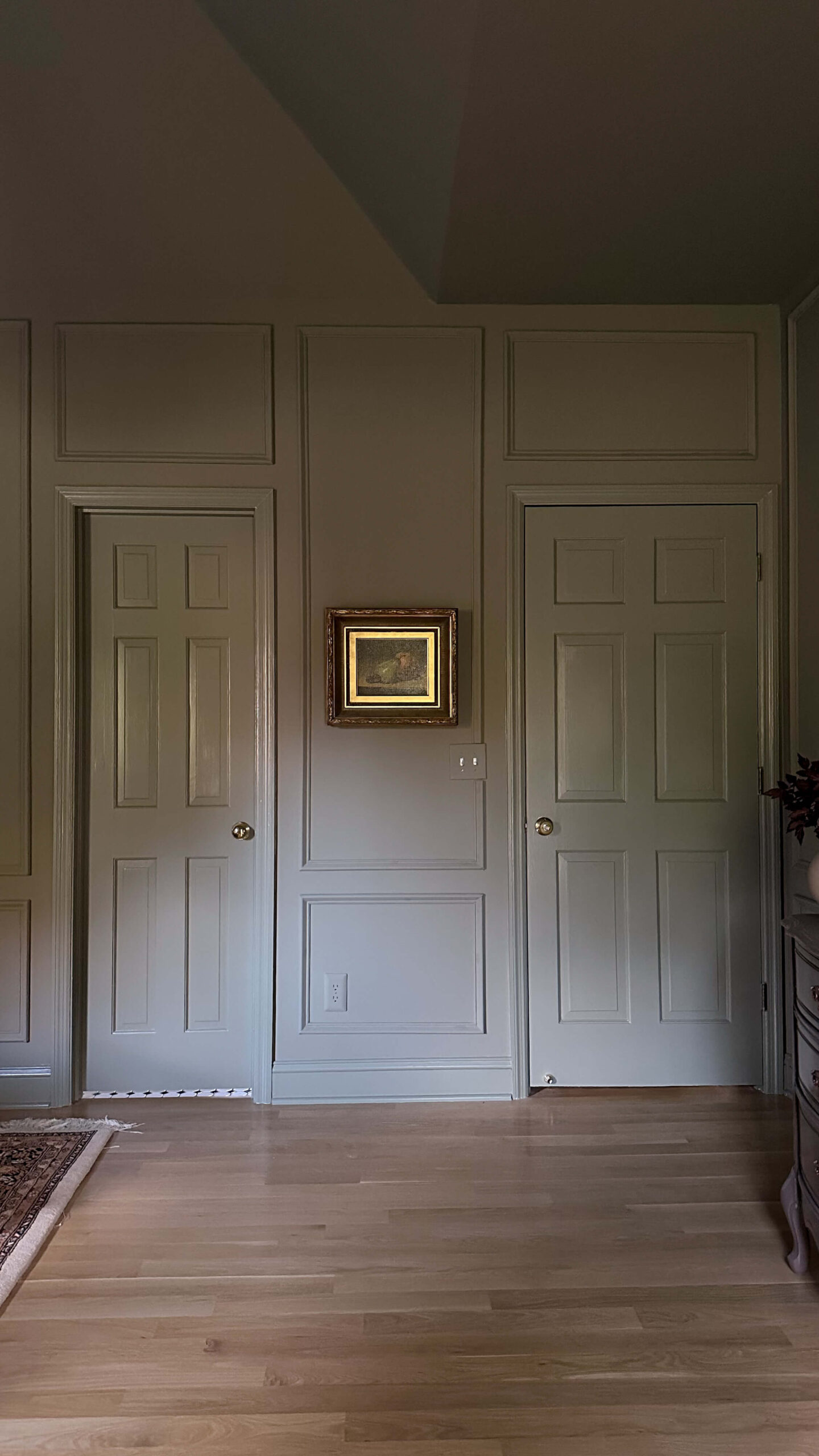
Myth #4: Everything Has to Be the Exact Same Shade
Reality: While the idea of color drenching is to create an immersive effect, that doesn’t mean every surface needs to be identical in tone. Playing with different finishes—like a matte wall and a satin trim—adds subtle contrast while maintaining a cohesive feel. You can also layer slightly varied shades of the same color for added depth and interest.
Tip: If you’re hesitant about committing to full color drenching, start with the walls and trim in the same color but in different sheens. Or try painting built-ins and doors to match the walls, leaving the ceiling neutral for balance. Not sure which sheen to use? Check out my guide on paint sheens here.

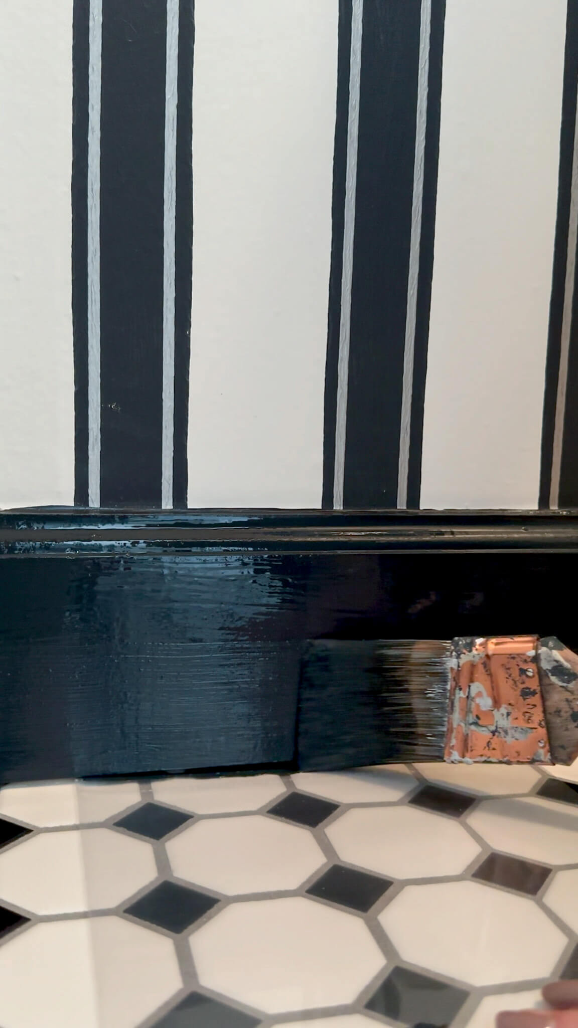
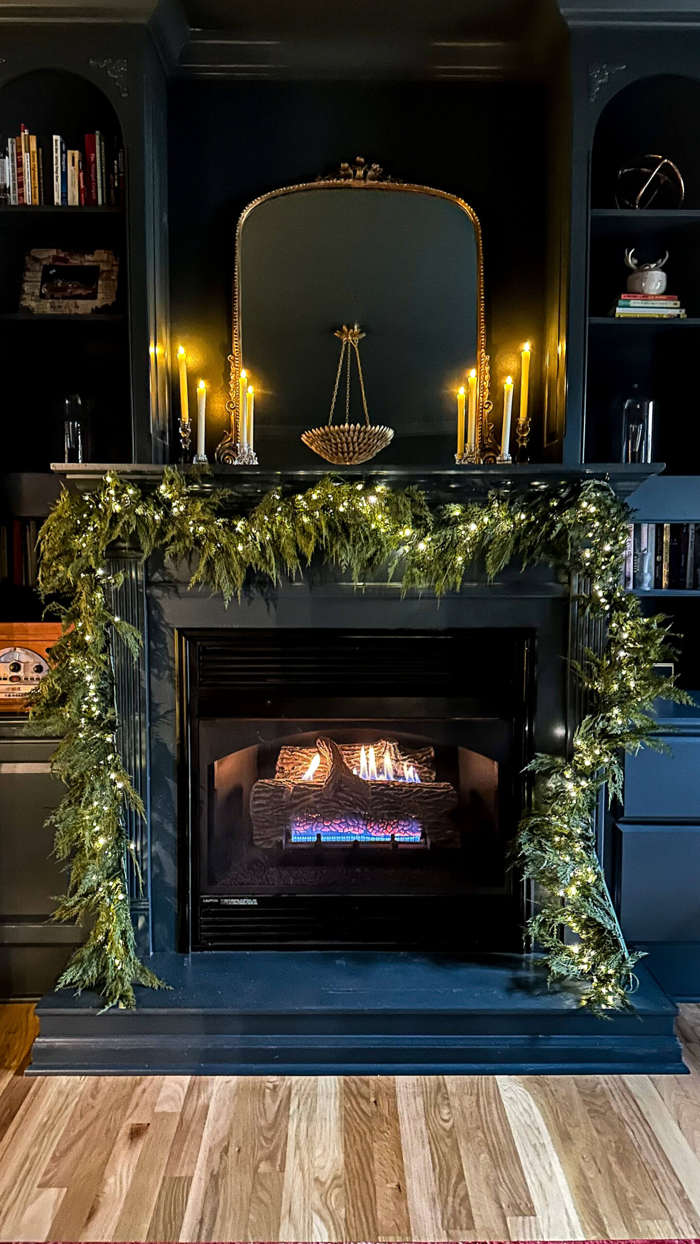
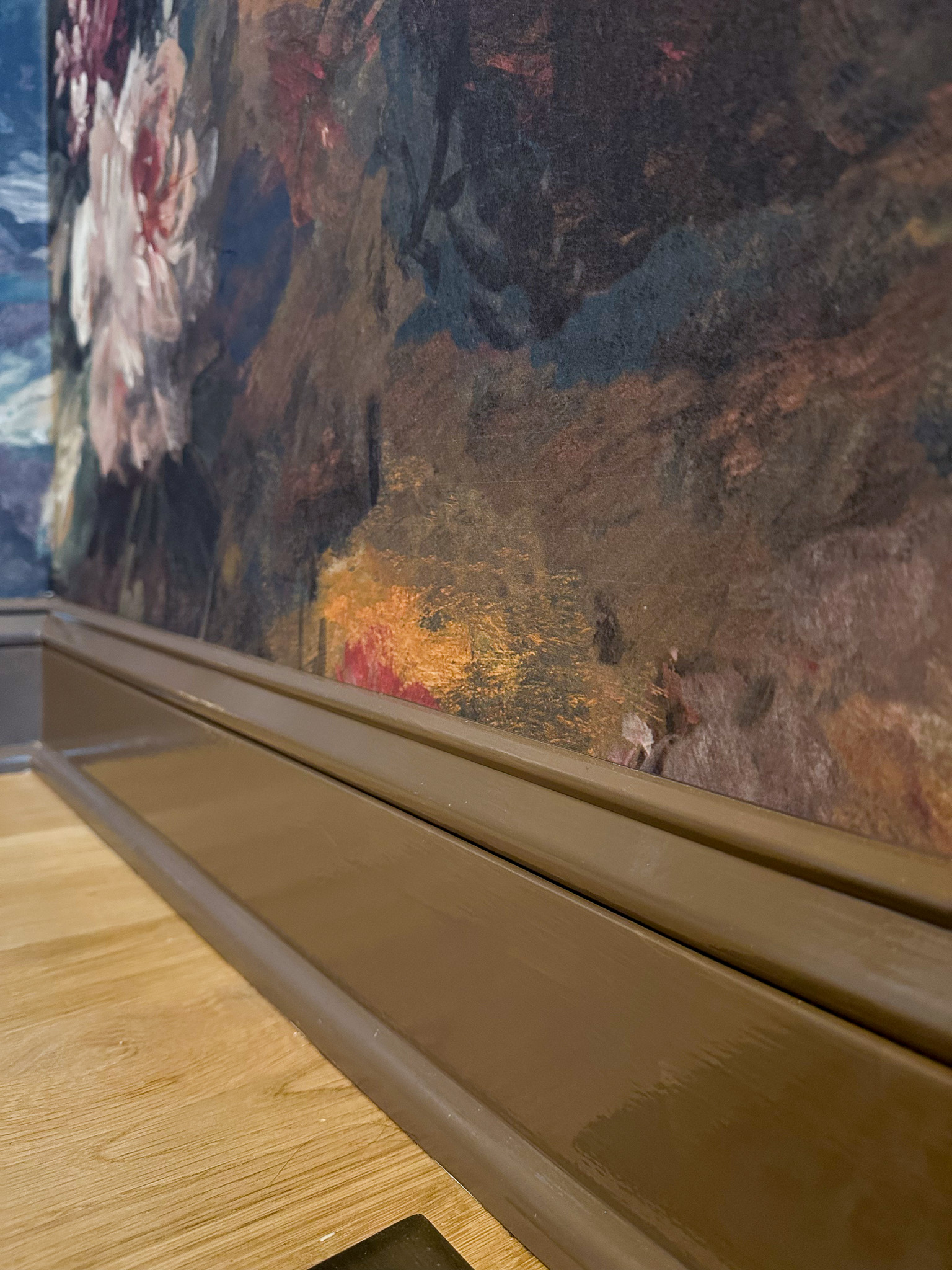
A satin finish for the trim and matte finish for the walls gives everything dimension
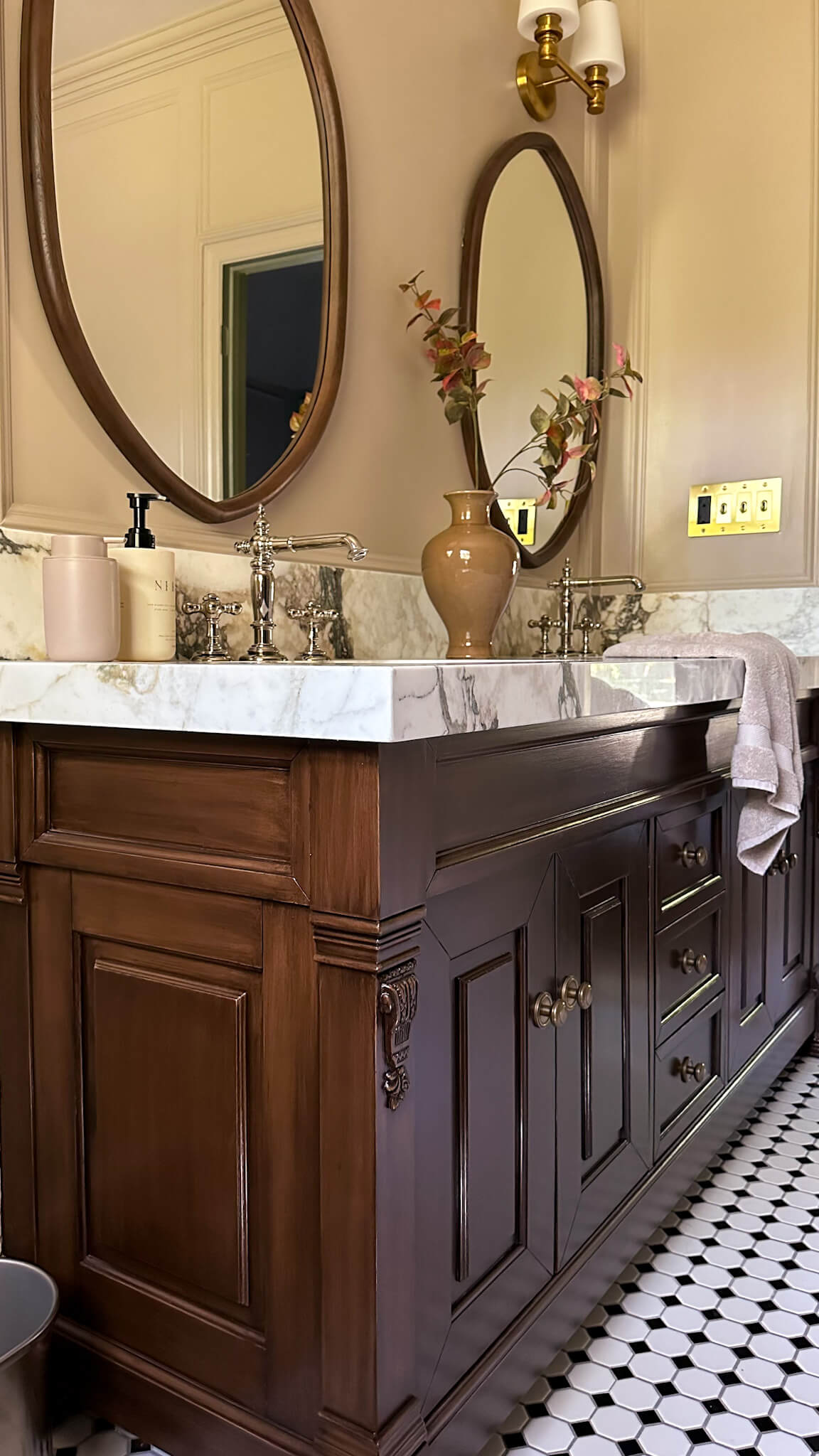
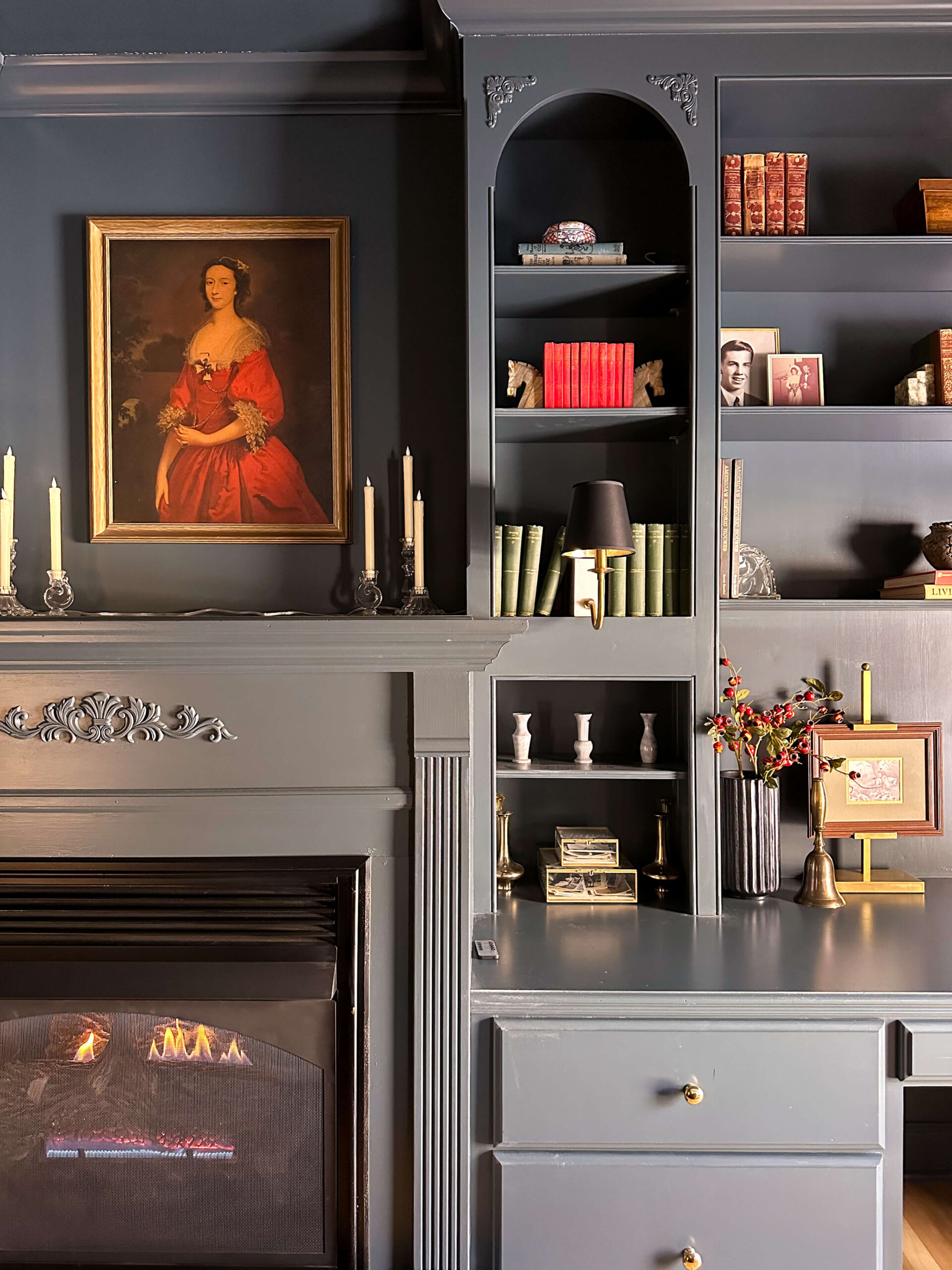
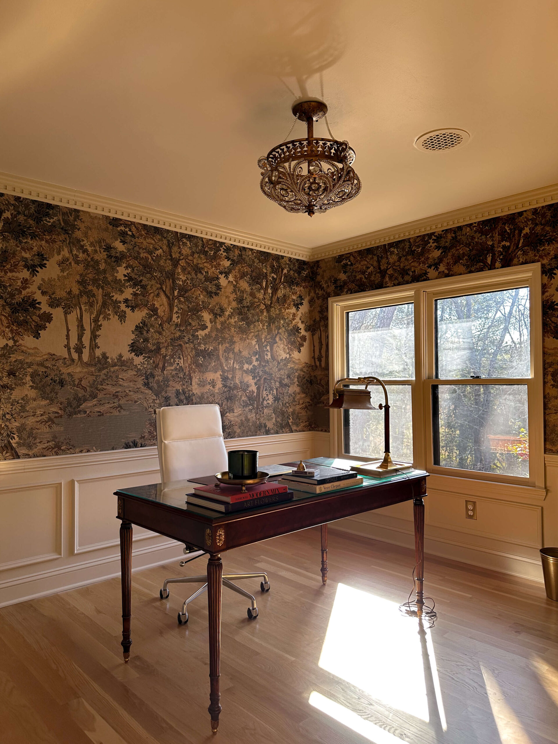
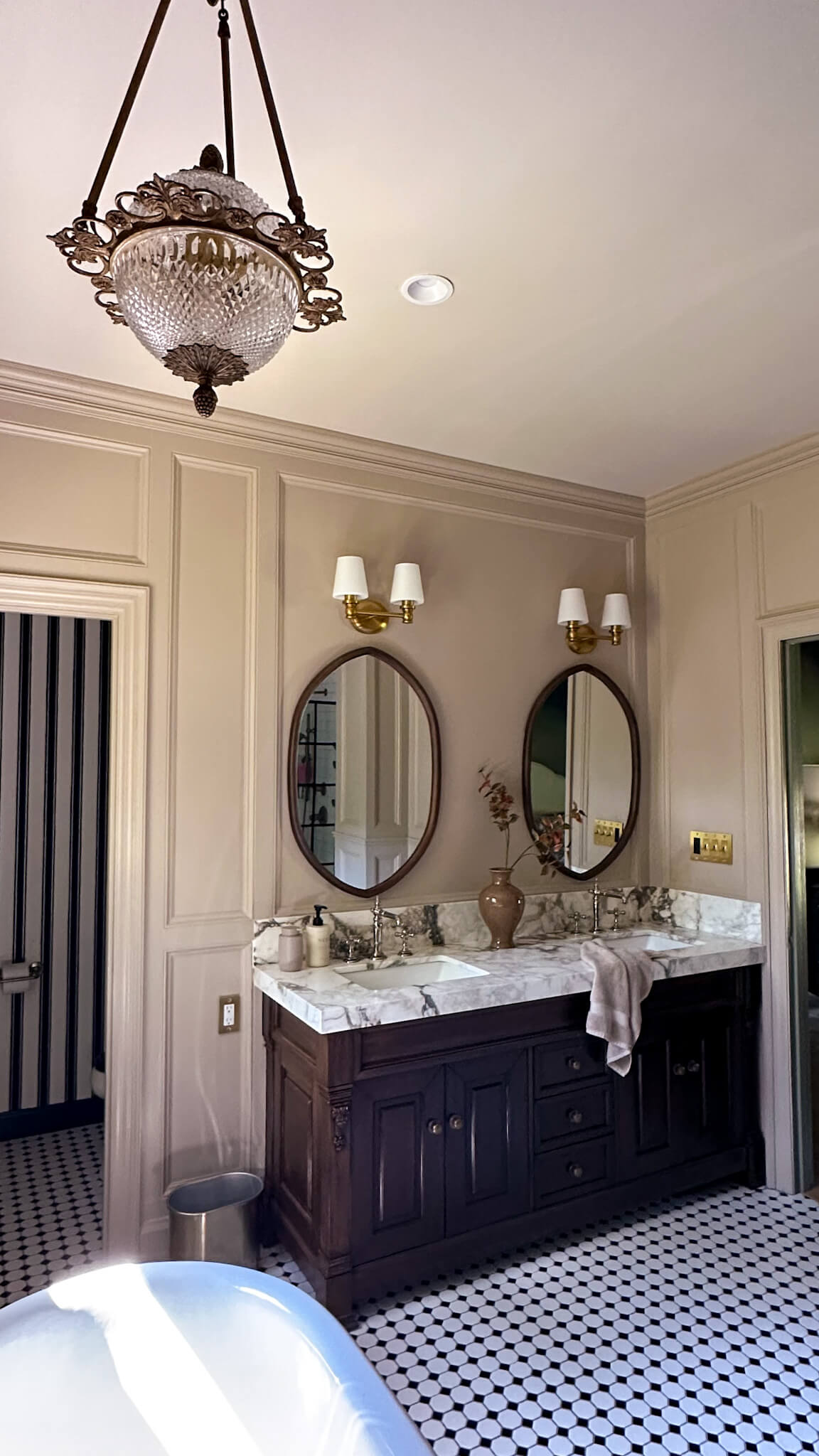
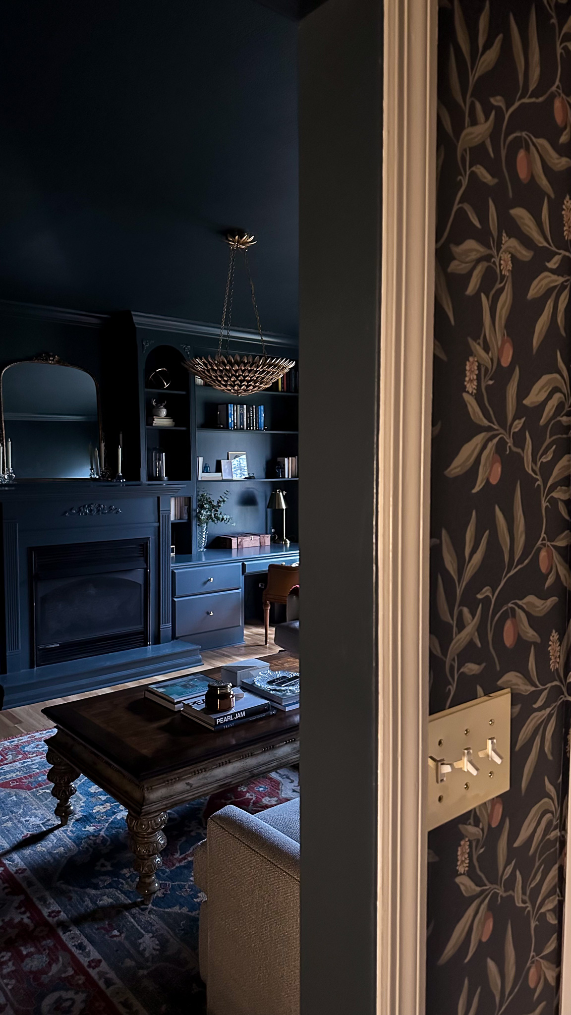
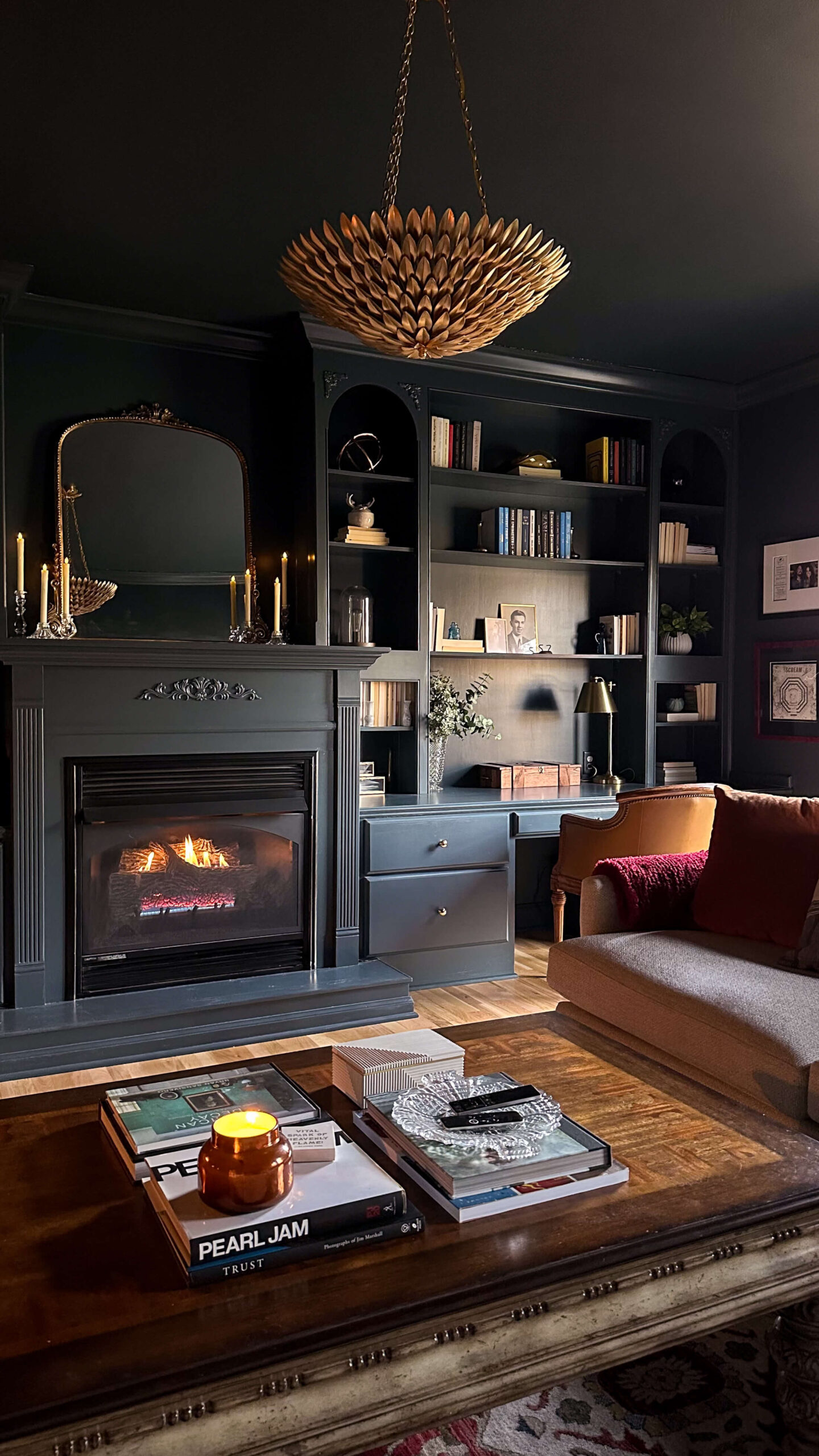
Myth #5: Color Drenching Is Too Bold for Classic or Traditional Homes
Reality: While color drenching can feel modern, it works beautifully in classic and traditional interiors, too. In historic homes, painting walls, trim, and moldings in one cohesive color can highlight architectural details rather than break them up. It also brings a fresh, updated feel while maintaining a sense of timelessness.
Tip: If you have a traditional home, lean into deep, rich hues like moss green, oxblood, or deep navy to enhance classic details. For a softer approach, warm neutrals or muted pastels can achieve a more understated elegance.
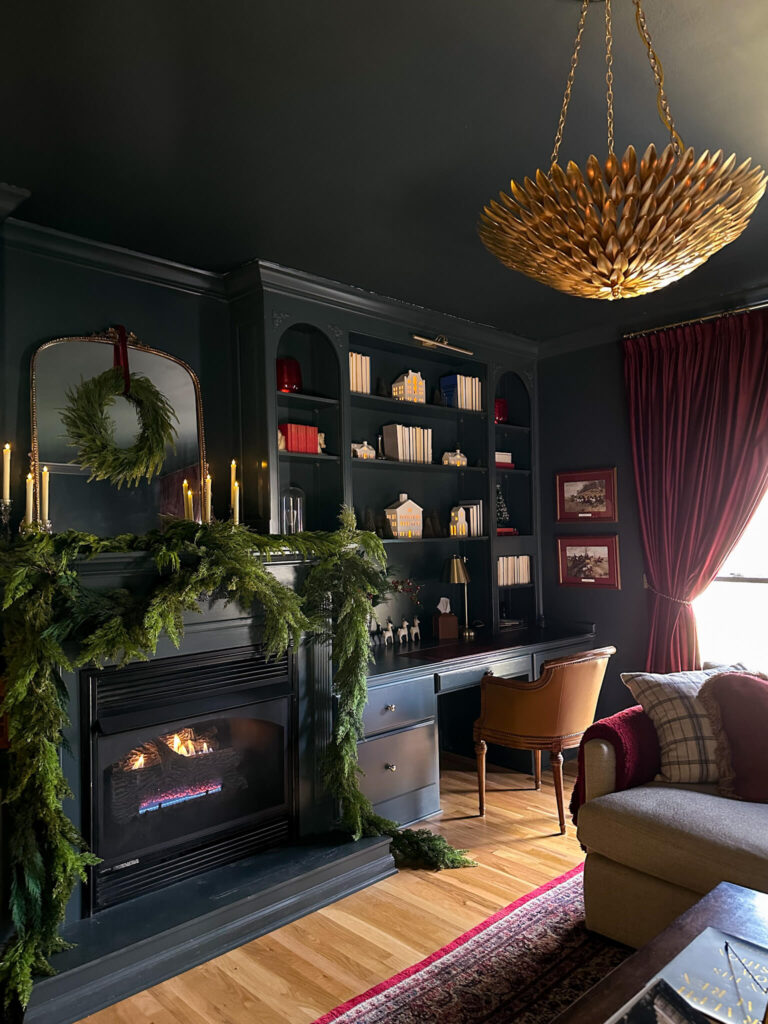
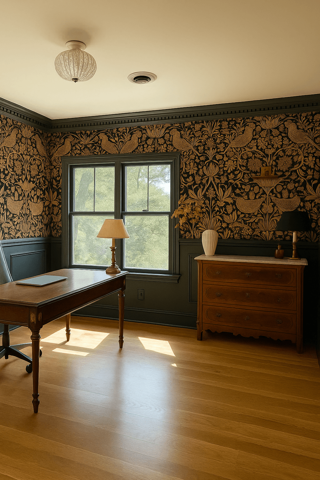
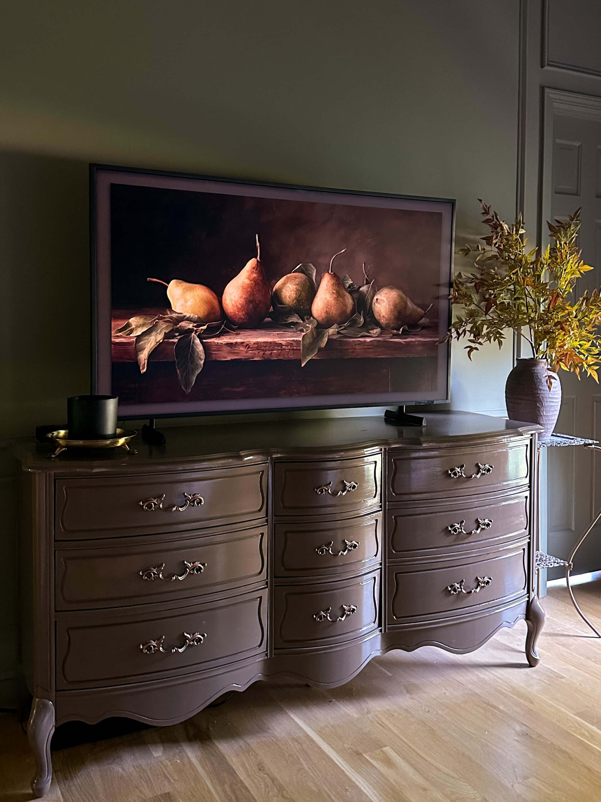
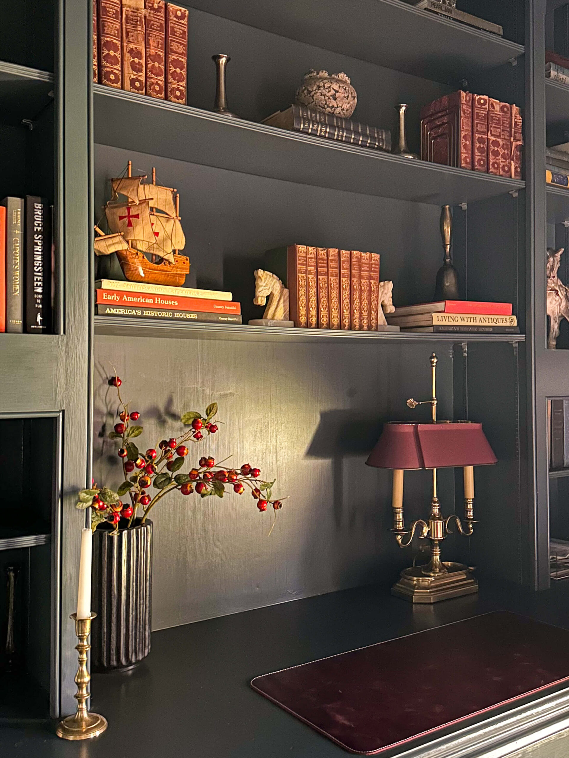
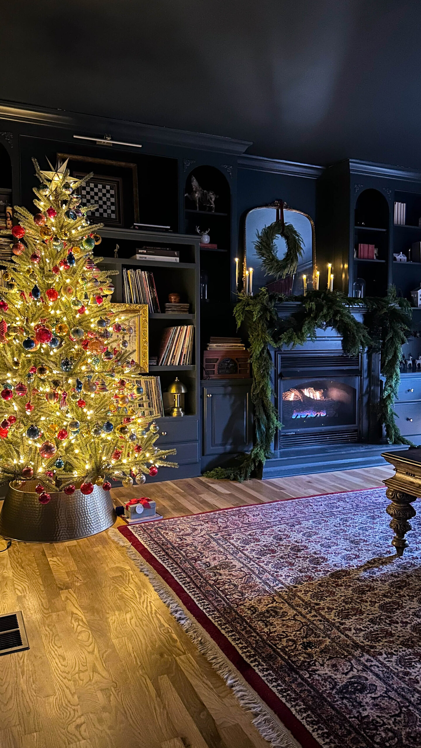
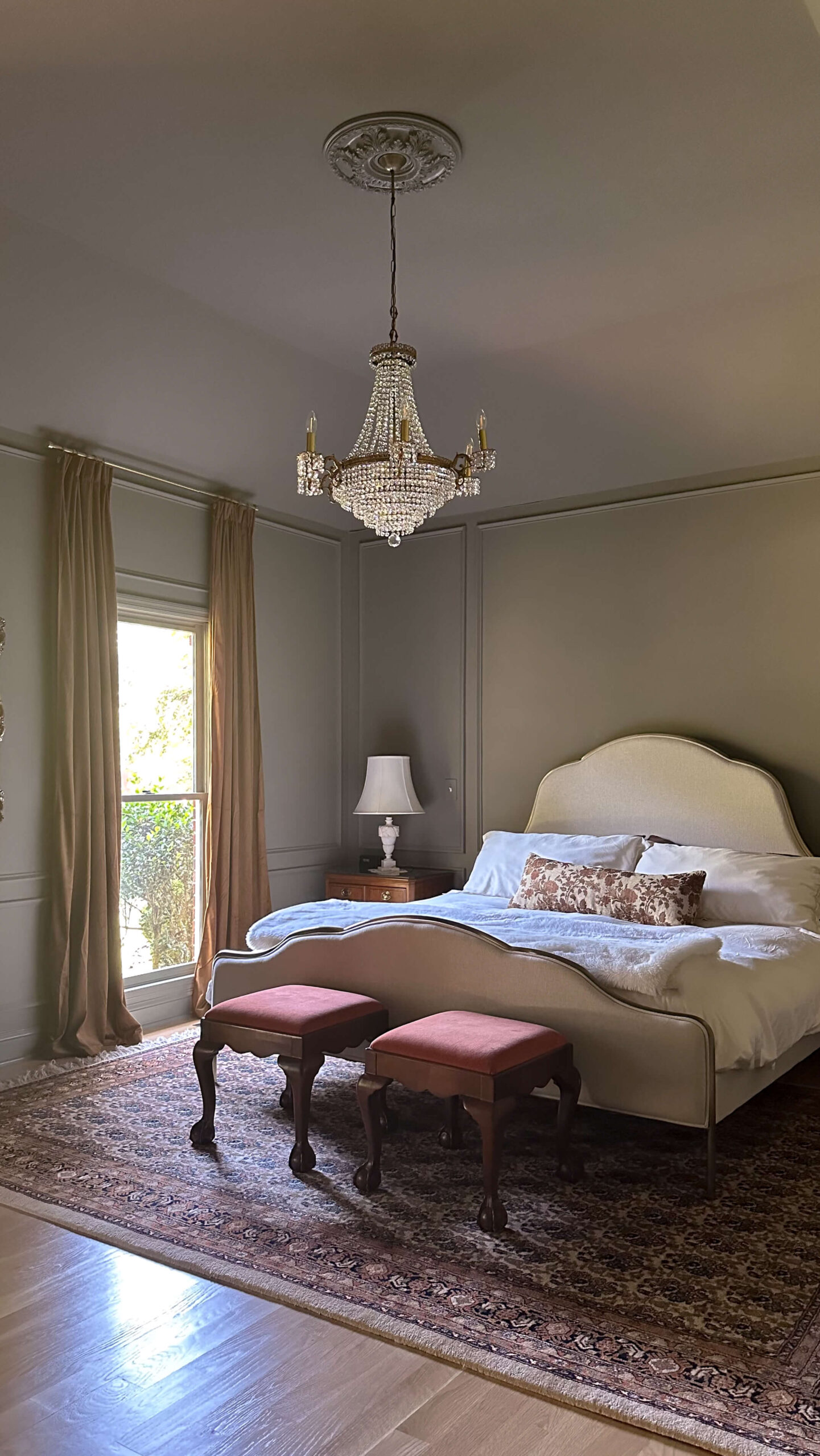
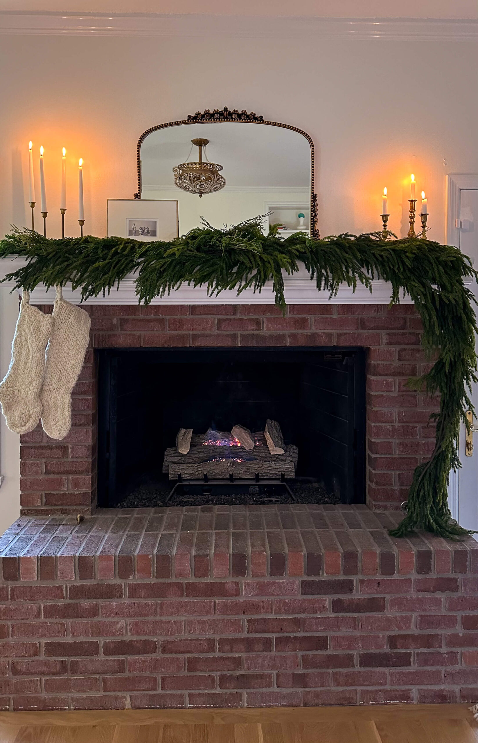
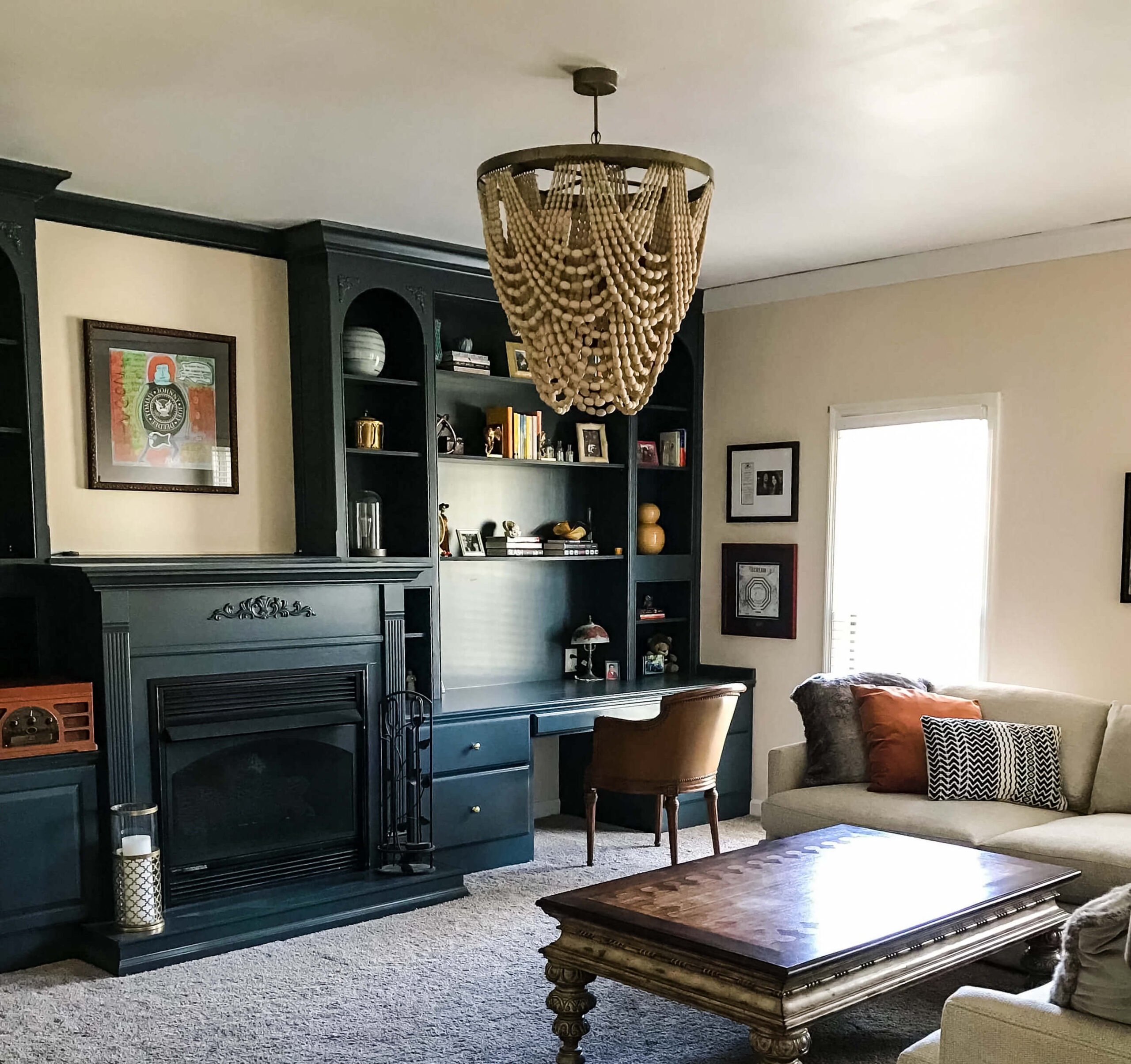
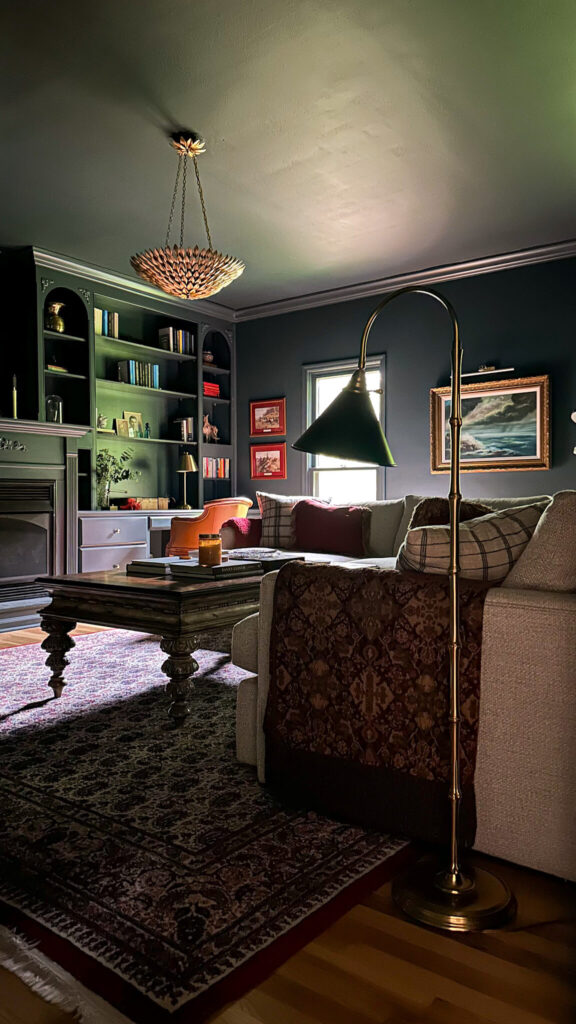
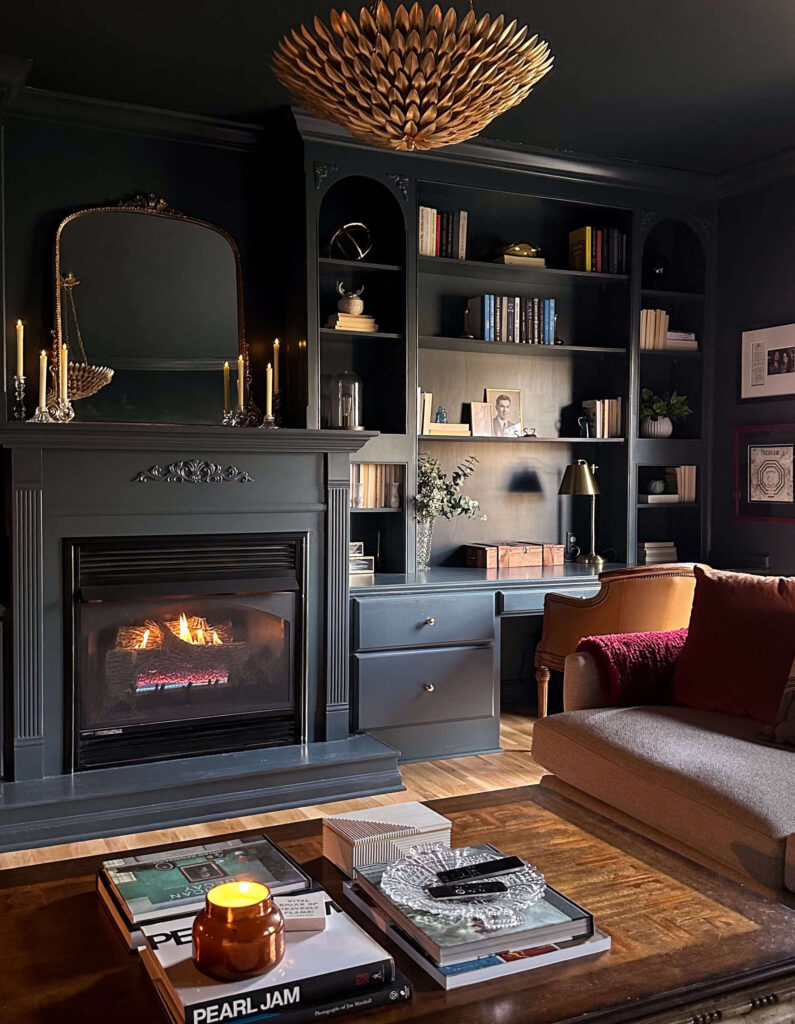
The Cozy TV Room in Lead Grey by Benjamin Moore (the most traditional room in my colonial home)
Shop the Cozy TV Room
Final Thoughts
Color drenching is an incredible way to transform a space, whether you’re going for moody drama or soft sophistication. By understanding the technique—and embracing a little bravery—you can create a space that feels layered, intentional, and beautifully cohesive.
Thinking about trying it in your own home? Start with a small space, like a powder room or an entryway, and see how the magic unfolds. You might just fall in love with the immersive power of color!
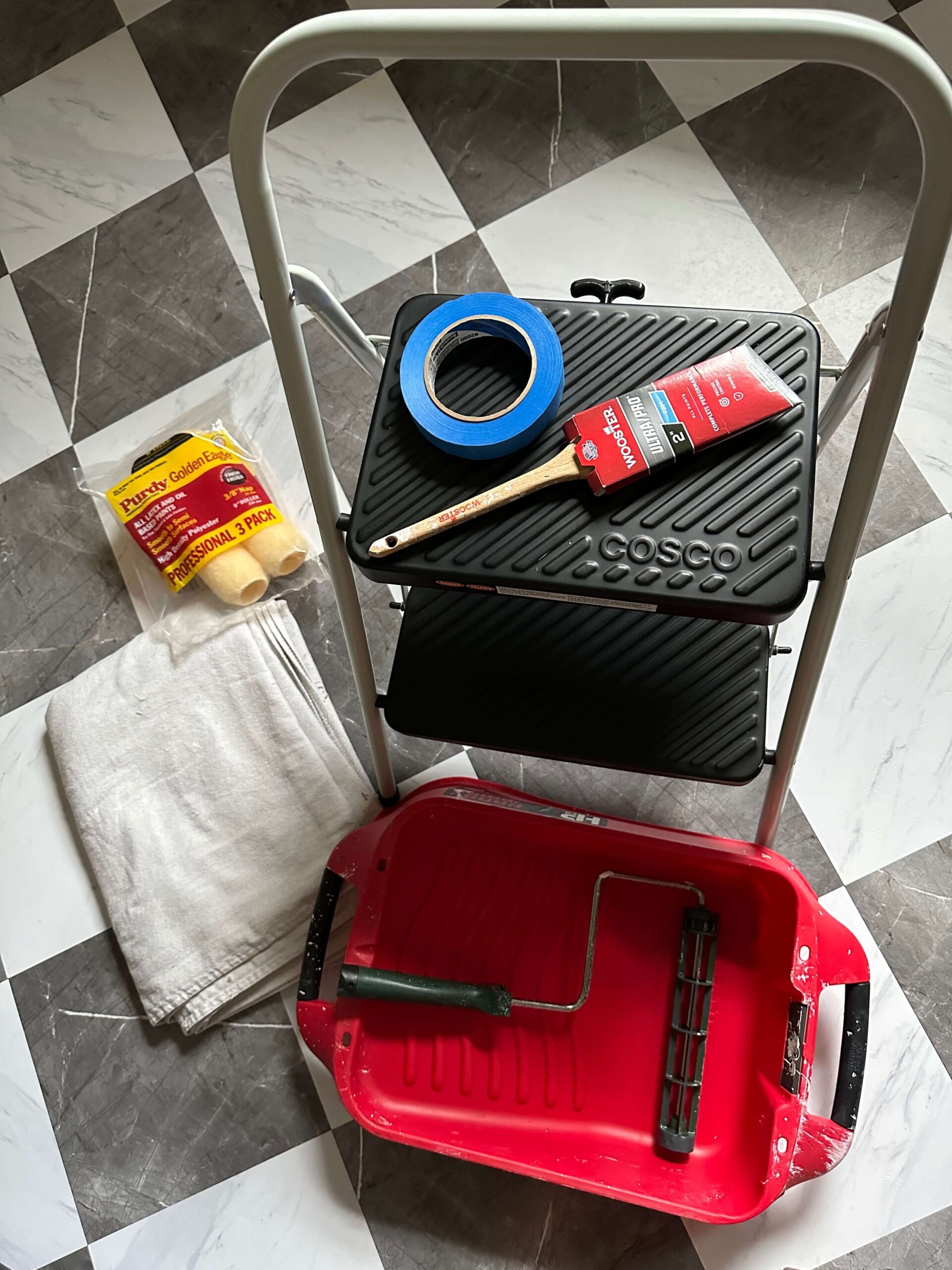
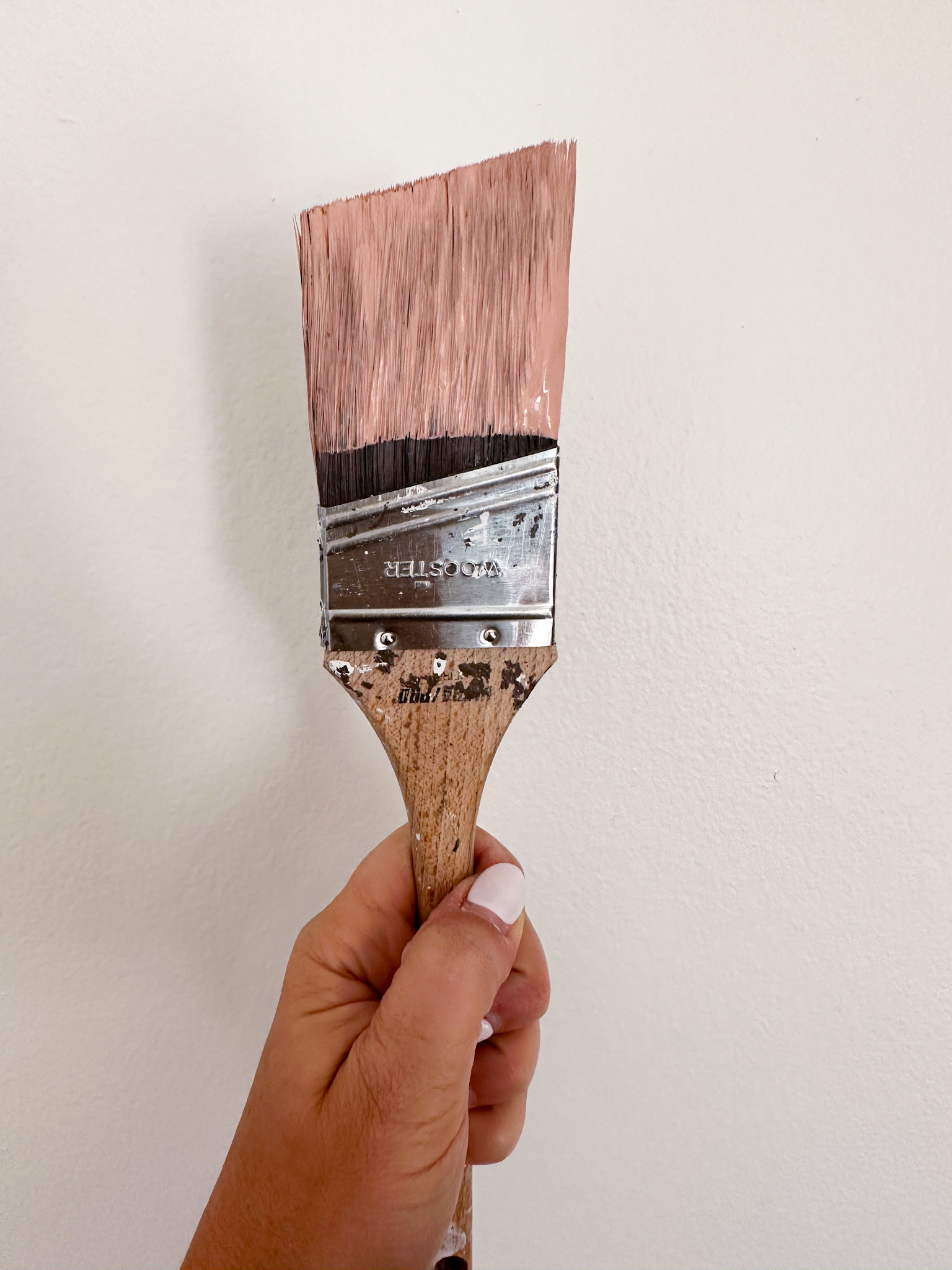
Would you ever try color drenching in your home? Let me know in the comments, and if you need help choosing the perfect shade, I’m here to help! Have your shade already but new to painting? Check out my favorite painting supplies here!