


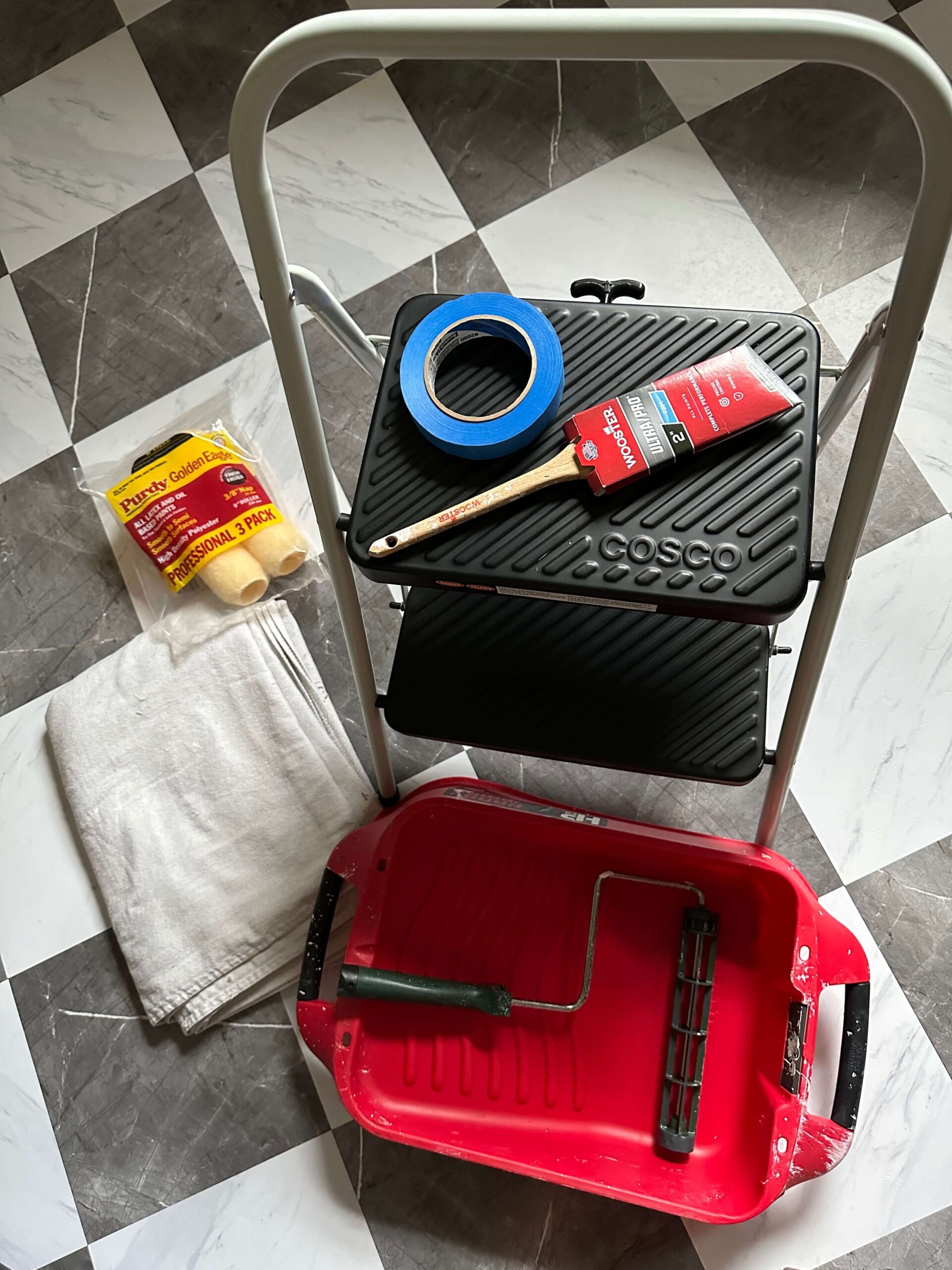
If you read my laundry room design plans post, you know this renovation has been two years in the making. Today I’m giving you the first real progress update: what’s been built, what I learned the hard way, and a proper introduction to the at home dry cleaning machine I designed the entire back wall […]
READ THE POST


This post is sponsored by Dremel. All opinions and project decisions are my own. If you’ve been following along for a while, you know I have a deep love for hunting down vintage pieces and one of my most prized finds is my Lenox Spice Garden set. I searched for months before finally tracking one […]
READ THE POST
If you’ve been around for a minute, you already know this is a long time coming. I’ve been talking about renovating my laundry room for at least two years, and for a while, I was almost afraid to say it out loud in case I jinxed it. But it’s happening. Today I’m pulling back the […]
READ THE POST
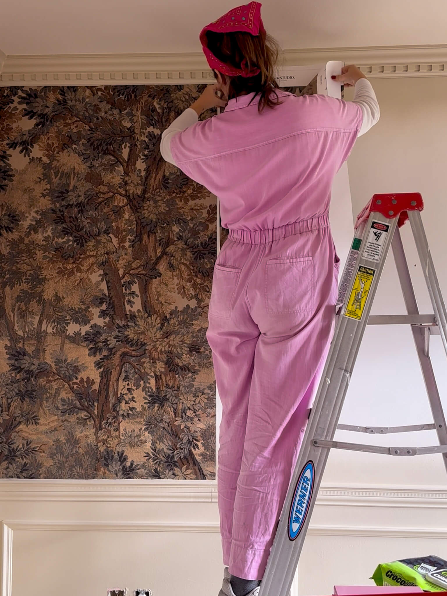
If you’re looking for wallpapering tips for beginners, I want to give you the honest version. Not the one that makes it look effortless in a 30-second clip, and not the overly technical tutorial that assumes you already know what you’re doing. I learned most of these wallpapering lessons the hard way, and my powder […]
READ THE POST

When I bought this house, the exterior was one of those things I kept telling myself I’d get to eventually. The landscaping was overgrown. The trim was a tired yellowish cream that didn’t do the brick any favors. The garage door looked like it belonged on a different decade’s house. There was a lot to […]
READ THE POST

If you’ve been Googling Retique It Liquid Wood FAQ before committing to a project, you’ve landed in the right place. I’ve used this product twice — once to take my dining table from black to a warm pecan finish, and again to transform my bathroom vanity from black to walnut. Here are honest answers to every question […]
READ THE POST
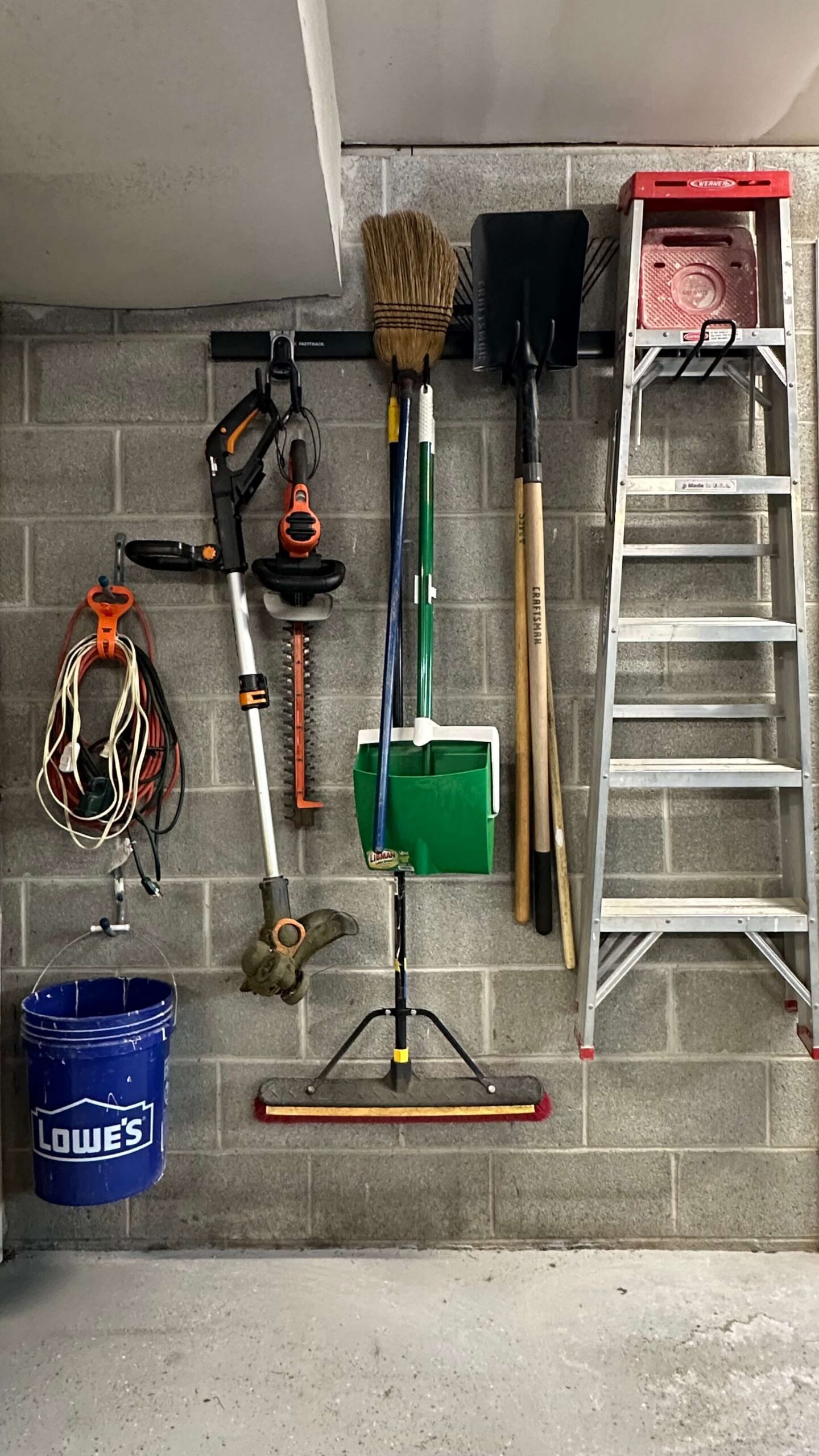
If you’ve been putting off a garage or basement project because you’re not sure how to drill into concrete block to hang things, I completely get it. I avoided doing this in my own garage for years because it felt intimidating. I had a corner where everything just piled up: shovels, rakes, brooms leaning against […]
READ THE POST

It started with one tiny hole in a sweater I loved and I really tried to convince myself it was nothing. Maybe I snagged it. Maybe it had always been there. I genuinely did not want to deal with it. Then I found another one. That’s when I realized I needed to figure out how […]
READ THE POST
If your home still feels heavy, dark, or stuck in winter, you’re not alone. Every year around this time, I start craving a shift, but not a full redesign. The good news? You don’t need one. Learning how to refresh your home for spring is less about buying all new decor and more about making […]
READ THE POST
If you’ve ever found yourself wondering about the paint colors in my home, you’re not alone. I get these questions constantly in my messages and comments. What is the green paint color in your bedroom? What color are your kitchen cabinets? Is the tv room blue or black? Instead of answering one by one, I’m […]
READ THE POST

There is a very specific feeling that happens when you spot something at an estate sale, a thrift shop or on Facebook Marketplace. Your heart skips a little. You try to stay calm. You casually check the price. You mentally measure the wall at home. And then you either walk away proud of your restraint… […]
READ THE POST
If you’ve ever looked around your space and thought, I’ll love this more when it’s finished, this post is for you. These 10 ways to start loving your home right now are not about renovating, replacing everything, or chasing a new trend. They’re about shifting how you interact with the home you already have so […]
READ THE POST

Reflecting on 2025, I couldn’t help but get giddy with excitement about what’s coming next. Last year didn’t go exactly according to plan but I have zero regrets. What I learned is the balance of projects felt manageable, attainable, and most importantly, fun. That’s why my DIY home renovation project plans for 2026 are following […]
READ THE POST
How to design wainscoting is one of those questions that feels deceptively simple until you actually start researching it. Height, spacing, trim sizes, doors, windows, outlets. Suddenly it feels like one wrong decision could throw the entire room off. When I designed the wainscoting in my primary bathroom, I realized that most of the overwhelm […]
READ THE POST
Every time I share my home office, the same questions appear almost instantly. Where is your wallpaper from? Is it custom? Is it wildly expensive? Here’s the honest answer: landscape wallpaper murals for every budget absolutely exist and you don’t need to spend a fortune to create a magical space. Whether you’re decorating a rental, […]
READ THE POST
If you’re searching for how to update your bathroom vanity on a budget, this step-by-step DIY tutorial will show you exactly how I transformed a black bathroom vanity into a warm walnut wood finish without sanding, stripping, or replacing the vanity. This budget-friendly method uses liquid wood and gel stain to create a realistic wood […]
READ THE POST

Every New Year feels like a blank page. I love dreaming about what’s ahead: personal goals, home projects, new skills I want to learn. But just as much, I treasure the quiet ritual of looking back. Celebrating the small wins. Reflecting on what worked, what didn’t, and what surprised me along the way. This 2025 […]
READ THE POST

Some rooms are beautiful, and then there are rooms that move you. The Vintage Moody Traditional Home Office is of the latter. It’s one of the most personal spaces I’ve ever designed, and not because it’s perfect, but because it supports the work that feeds my soul. It’s where I design, think, create, and build […]
READ THE POST

Every year, I add just a little more Christmas decor to my collection, and somehow that always means decorating at least one additional room. Over time, Christmas has slowly expanded throughout my home, and sharing this year’s Christmas decor around the house feels especially exciting. Rather than having one overall Christmas theme, I like to […]
READ THE POST
The home office renovation is officially humming along, and I’m thrilled with how the transformation is taking shape. The first half of this project focused on dialing in the architectural design, installing custom trim work, and prepping the room for a full spray-painted finish. In this back half of the project we’ll start to see […]
READ THE POST
When it comes to picking a paint color for the home office, the decision carries more weight than you might think. This room isn’t just another space — it’s where ideas grow, projects come to life, and creativity needs the right environment to flourish. After weeks of designing and installing chair-rail and box trim, and […]
READ THE POST

A funny thing about my 1989 brick colonial house: it has the traditional crown molding you’d expect to see in a home like this — but only in some rooms. It’s always puzzled me, and lately, it’s started to bug me. The entire upstairs has zero crown molding, while the downstairs rooms — the cozy […]
READ THE POST
We’re a few weeks into my home office renovation, and with all of the box molding, chair rail, and crown molding installed, it’s officially time to think about color. Which means one thing: wallpaper. While I still need to wood fill and caulk all of the trim, I’m finalizing the design plan and today I’m […]
READ THE POST
After tackling three different types of wall molding projects in my home—each a little more advanced than the last— I’m excited to take on my home office. This is now my fourth time installing picture frame molding, and like all the others, I know it’s going to completely transform the space. However, I remember the […]
READ THE POST

There’s something incredibly satisfying about transforming a tired space with your own two hands—especially when the “before” includes dying pine trees and a garden bed filled with dirty rocks and weeds. Earlier this summer, I had my front yard professionally landscaped, but the back pool area? Due to budget that’s been my DIY special. I […]
READ THE POST
If you’ve been following along, you know I just wrapped up my primary bathroom renovation for the spring One Room Challenge. That project took me four months longer than expected—so I swore I wouldn’t sign up for the fall round. But old habits die hard. And here we are: I’m officially announcing that my next […]
READ THE POST
Fall is my favorite time of year to lean into moodier tones, layered textures, and cozy moments at home. Instead of going overboard with pumpkins, I love to take a thoughtful approach — small swaps and seasonal layers that create warmth without clutter. This year, I styled my spaces with moody fall home decor that […]
READ THE POST
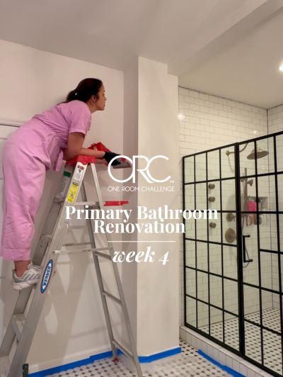
I didn’t plan to renovate my primary bathroom in 2025, but sometimes the best projects aren’t on the list. For my second One Room Challenge, I kept coming back to this space. My bedroom had just been transformed into a warm, layered retreat, but every time I stepped into the bathroom, it felt disjointed, sterile, […]
READ THE POST
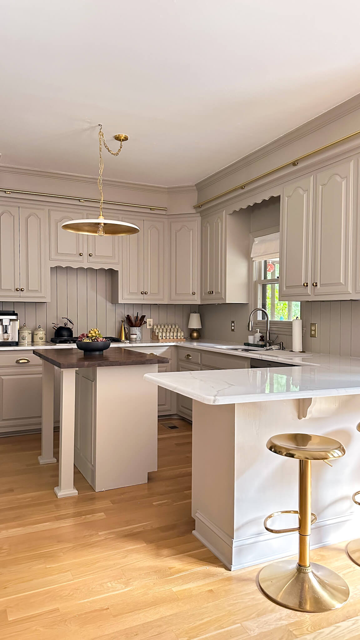
When I started renovating my kitchen, one of the biggest pain points was the dark, speckled granite countertops. They felt dated, busy, and totally out of sync with the lighter, warmer aesthetic I wanted for my home. Real marble counters have always been on my dream list—but with my square footage I was looking at […]
READ THE POST
For the past few years, I’ve been slowly tackling the exterior design of my 1990s brick colonial home here in Nashville. While I’m a DIY enthusiast at heart, I’ll be the first to admit that landscaping is not my strong suit. This summer, I decided it was time for a major refresh—and for once, I […]
READ THE POST
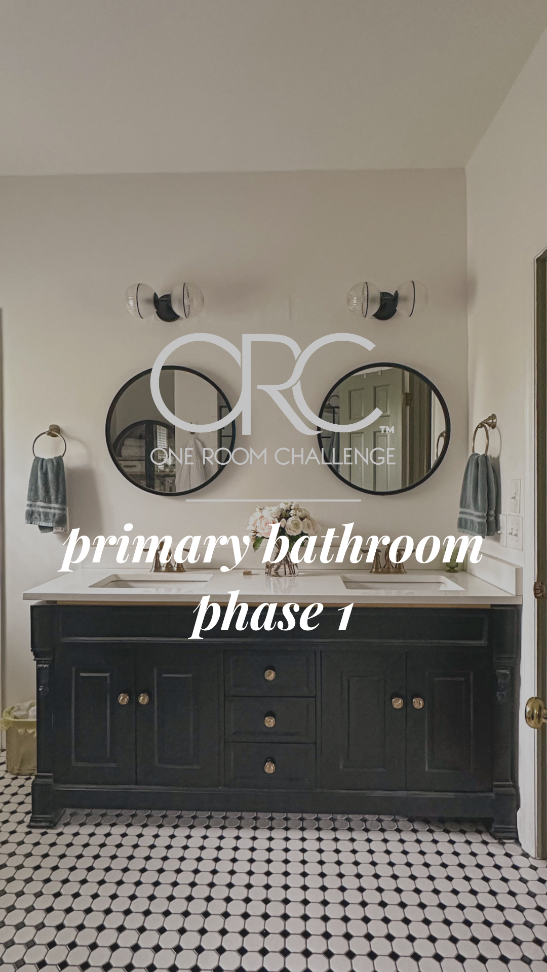
The past couple weeks were big for the DIY primary bathroom renovation—equal parts progress and problem-solving. Here’s where things stand, what’s finished, and what’s coming next. The Vanity: From Black to Walnut Beauty Remember when the countertop installers dripped something down the front of the black vanity drawers? Total mess. But it turned out to […]
READ THE POST

I know there’s great anticipation for the primary bathroom reveal, but I wouldn’t be a real DIYer if I wasn’t starting another project before finishing the current one, right? All jokes aside, the landscaping has been high on my to-do list for a long time now, so I’m excited to share the plans (or rough […]
READ THE POST

Styling bookshelves is one of those home design tasks that looks simple… until you’re staring at a long, empty shelf and thinking, Now what? If you’ve ever felt stumped by the blank slate of built-ins—especially those longer shelves that seem to stretch on forever—you’re not alone. But with the right strategy, any bookshelf (big or […]
READ THE POST
A much overdue update on an overdue project: the primary bathroom renovation. I’ll be the first to admit that my setback with the countertop company took the momentum out of this project, and if I’m being honest, I needed to step away from it for a little bit because it was making me quite sad. […]
READ THE POST

When I decided to makeover my primary bedroom last summer, I knew I wanted to go green—but not just any green. I was looking for that perfect moody, soft-but-rich, earthy green that felt calm and cozy without turning too cold. I swatched no less than 12 different greens and finally narrowed it down to five […]
READ THE POST

Every summer, this Healthy Black Bean Couscous Salad makes its way onto my table—especially around the Fourth of July. It’s hearty enough to eat as a main dish but shines as a flavorful summer side. It’s light, fresh, packed with protein and fiber, and it only gets better after a night in the fridge (aka […]
READ THE POST

Here’s a little-known fact about me: for the past seven years, I’ve been a landlord. So while I spend most of my time inspiring women to take on DIY projects in their own homes, I also have a unique perspective from the other side of the lease. And I’m here to tell you—yes, there are […]
READ THE POST

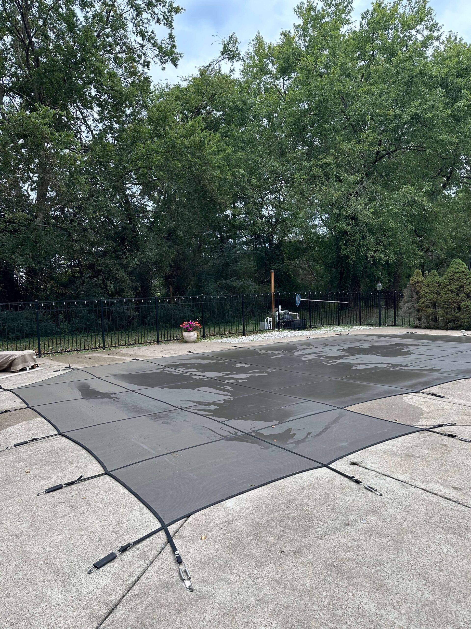
Summer is officially here in Nashville, and after my never ending bathroom renovation and trim work, it felt like time to turn my attention outside. Specifically, to my pool patio—aka the place I spend every free second once the weather warms up. This little corner of my backyard has been a workhorse over the years, […]
READ THE POST
Let’s talk curb appeal. Or more specifically—copper curb appeal. I recently installed these oversized copper lanterns on the exterior of my 90s brick colonial, and I cannot stop staring at them. Truly, every time I pull into the driveway, I feel like my house has leveled up in the most timeless, charming way. If you’re […]
READ THE POST

The bathroom renovation hummed along this week and and I’m getting one step closer to finishing the custom wainscoting. This week it was all about the crown molding, as well as deciding on some of the remaining box sizes. I also dabbled in a little bit of electrical, which I’m quite proud of. Lets dive […]
READ THE POST

I think there are two types of people when it comes to design: those that have a design in their head and those that need to sketch everything out in advance. I’m of the former type, not the latter. In fact the main reason I create mood boards is to showcase my vision to all […]
READ THE POST

This week was a huge turning point for the primary bathroom renovation because I finally started to see some real changes. I gave you a little sneak peek in last week’s post, but a pallet (594 lbs!) of custom trim arrived and I could not wait to get it on my walls. As eager as […]
READ THE POST
Technically, from a calendar perspective, this is the bathroom renovation halfway point. But from an actual implementation standpoint maybe not so much. However, progress is progress, so I’m happy to share what I accomplished over this past week, as well as what I learned. I taught myself a crash course in how to skim coat […]
READ THE POST

The primary bathroom renovation is officially underway! There’s a phase in every renovation where things look really ugly and you make a substantial mess of your space. You might even wonder what you were thinking in the first place. This was that moment for me, but I was truly so excited to finally get started […]
READ THE POST
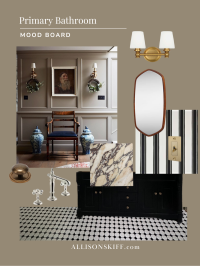
It’s week two of the Spring One Room Challenge and I can say without a doubt, this is my favorite week other than the reveal week! Why? Because it’s design week! I’m so excited to share the primary bathroom design plans with you today. Someone commented last week that the primary bathroom has “great bones.” […]
READ THE POST
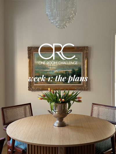
This week kicked off the 2025 Spring One Room Challenge and I’m so excited to be participating again! If you were here last year, you might remember I decided to renovate my kitchen for my first ever One Room Challenge. While it seemed like a lofty endeavor, especially before the holidays, I couldn’t be happier […]
READ THE POST
As the seasons change, there’s nothing quite like the fresh start that spring brings. It’s the perfect time for a spring home refresh by decluttering, deep cleaning, organizing, and updating your decor. If you’re ready to embrace a lighter, brighter space, here’s how I’m preparing my home for the season—along with some easy ways you […]
READ THE POST
This may come as no surprise to you, but I’m one of those people that finds complete joy in organizing and tidying up my spaces. I feel like when my home is clutter free, my mind is clutter free too. Can you relate? These cold winter months are my favorite time of year to declutter, […]
READ THE POST
Color drenching has been making waves in the interior design world, and for good reason. This bold, immersive technique—where walls, ceilings, trim, and even furniture are painted in the same hue—creates a cohesive, dramatic, and deeply atmospheric look. But despite its growing popularity, many people hesitate to try it, often due to common misconceptions. Let’s […]
READ THE POST

Spring cleaning is a time-honored tradition, but let’s be honest—sometimes it feels more like a chore than a fresh start. One way to make the process more enjoyable? Invest in cleaning supplies that are not only functional but also aesthetically pleasing. If your cleaning tools look good, you’ll be more likely to reach for them, […]
READ THE POST

Have you ever seen the movie The Holiday? It’s that one where Kate Winslet and Cameron Diaz switch houses over the holidays, trying to escape from the reality of their love lives falling apart. There’s this one moment in the movie where Kate Winslet enters Cameron Diaz’s bedroom for the first time, and she notices […]
READ THE POST
Who says toilets can’t be pretty? The truth is, I’ve always hated the toilets in my home. I think there’s something about knowing they were here long before me, and no matter how much I cleaned, I couldn’t shake that. However, I’m not one to go ripping toilets out just to rip toilets out. So […]
READ THE POST

This has been spinning in my head for months, but I’ve finally taken the time to put pen to paper, and think about my 2025 project list. I also went back and reviewed my 2024 project list, did an assessment of dreaming vs reality, and publicly checked myself with my 2024 project recap. There’s nothing […]
READ THE POST
Valentine’s Day is right around the corner, and if you feel like it snuck up on you, don’t worry. I’m rounding up some Valentine’s Day gift ideas for just about anyone in your life, and at all price points. Check out the below and add to cart! Valentine’s Day Gift Ideas: For Her (including some […]
READ THE POST

Ever since I finished the kitchen renovation, I’ve been loving getting back into cooking. With it being soup season, as well as the time of year some of us are trying to clean up our diets, I thought it would be the perfect time to share my clean ingredient White Velvet Soup. This five-ingredient vegan […]
READ THE POST
I’ve been dreaming of having the ability to write this post for what feels like years…so I’m SO excited to reveal my One Room Challenge Budget Friendly Kitchen Renovation with you today! I shared a video walk through shortly before Christmas, but I wanted to reset the space with fresh styling before snapping more photos. […]
READ THE POST

I remember sitting down last year to plan out my 2024 project list, and thinking to myself “this is unrealistic, but I’m going to write it down anyhow.” There were some big ticket items on that list, including a few I couldn’t manage without hiring out. Then by the time summer rolled around and I […]
READ THE POST
Merry Christmas! I was a little late getting all my holiday décor out this year, or maybe it just felt that way because Thanksgiving was so late. But even so, with the kitchen renovation, it felt like I didn’t get to savor my Christmas décor as much as I got to last year, so I’m […]
READ THE POST

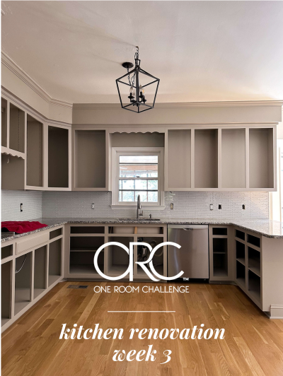
While there’s still a long list of things to do in the budget friendly kitchen renovation, I’m one step closer to having the core of my kitchen back. After painting the counter tops to look like faux carrara marble (still can’t get over this transformation by the way! – this is the kit I used), […]
READ THE POST

Recently I teased on socials that this kitchen is a vicious cycle of painting, sanding, cleaning and sawing. It was a joke but it’s really quite accurate! So naturally I’m back into a painting phase for week 6 of the budget friendly kitchen renovation: transforming the countertops. Yes that’s right, I’m aiming to DIY my […]
READ THE POST

The budget friendly kitchen renovation is humming right along and this week it was all about the backsplash. Well, technically last week was too (did you see the removal process?), but this week we’re making it pretty! The transformation is about to ramp up as we enter Week 5 of the One Room Challenge, but […]
READ THE POST

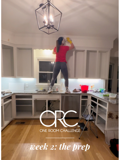
This is my first ever kitchen renovation and I think it’s fair to say that this week might have been the breaking point. While I had a little extra pep in my step last week from the new paint that went on the cabinet boxes, the wave of excitement came crashing down this week as […]
READ THE POST
We are two full weeks into the 2024 Fall One Room Challenge and this is the week where I finally felt I could see my vision taking shape. That’s the power of paint after all – it’s transformative! (did you see my exterior reveal? Say less.) But before we could get into the fun part, […]
READ THE POST
It’s the end of week one of the fall 2024 One Room Challenge and I feel like I’ve already lived 5 months in 5 days. All kidding aside, I knew when I picked the kitchen for my renovation project, that it would be no easy task. These first few days getting started have reminded me […]
READ THE POST
Are you ready for the grand finale of 2024? We’re going out with a bang, and we’re doing it in good company as I join the 2024 Fall One Room Challenge. If you’re not already familiar, the One Room Challenge takes place twice a year and is a way for designers to collaborate and foster […]
READ THE POST

Autumn has been my favorite season basically since I was a young adult. There’s something about the crisp morning air, the way apples taste better and the delicious smelling candles that come with the season. And as a decorator, it brings an entire treasure trove of décor along with it. One of my favorite ways […]
READ THE POST

We all have that thing that bugs us, right? For me, the original exterior trim color on my brick house was that thing, and I’ve been wanting to update it for years. When I was drafting my 2024 project list, I put an exterior makeover on that list. But if I’m being honest, it felt […]
READ THE POST
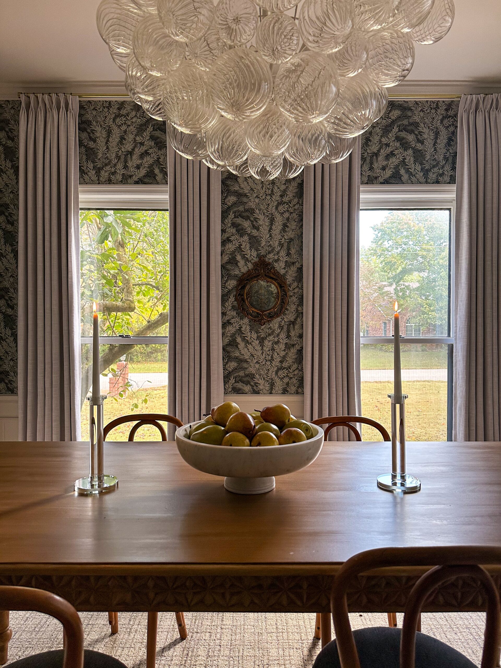
Recently I installed custom draperies in the dining room, and I have to say, the room feels all grown up now. I’ve always planned on removing the venetian blinds that came with the house, but with this room facing the road, having no privacy was not an option. I also just wasn’t in a rush. […]
READ THE POST

I am SO excited for today’s post, because today we’re talking all about the plans for the next project – and it’s a big one! If you’re subscribed to the monthly newsletter, you were the first to find out that the exterior of the house will be getting a facelift this month! While I had […]
READ THE POST
I haven’t been this excited to share photos with you in a while. Are you ready to see my moody color drenched bedroom? I’ve been itching to transform my bedroom into a moody retreat and after a rollercoaster of decision paralysis (you can read all about that here), I settled on a design that felt so […]
READ THE POST

There’s nothing better than tomato season! August means ripe tomatoes and corn on the cob, so the timing is perfect to rotate this healthy summer side salad into your weekly menu. If you’re looking for a quick, healthy and crowd-pleasing side to add to your summer menu, look no further than this healthy corn, tomato, […]
READ THE POST
Not too long ago, a type of paint called “chalk paint” was all the rage. I don’t know if it was the look of the finish that attracted people, or the ease of application, but everywhere you turned, something was being refinished with chalk paint. As with most things, what comes around goes around and […]
READ THE POST
Can you believe we’re nearing the end of July?! Me either! This year has truly flown by and I know (as always) it’s going to speed up as we get closer to the holidays. As I’ve had my head down and deep into projects, I thought it would be a great time for a 2024 […]
READ THE POST

Have you ever had your heart set on building a charcuterie board only to be overwhelmed once you arrived at the supermarket? We’ve all been there. Today I’m going to break it down into snackable pieces for you and we’ll create a charcuterie board that’s as pleasing to the eye as it is to the […]
READ THE POST

A couple months ago when I installed picture frame molding in the dining room, I had a sneaking suspicion that it was going to be addicting. I just didn’t know how addicting! All of a sudden, I wanted it in every room in the house. However, I’m a firm believer that there can be too […]
READ THE POST

Copper! It’s the metal that adds warmth, character, and a touch of timeless elegance to our homes. From gleaming pots and pans to stunning hammered sinks, copper elevates everyday objects into design statements. Recently I found a beautiful copper wine cooler at an estate sale, but it definitely needed a little TLC. Being my first […]
READ THE POST
I’ve been itching to tackle my next big project for what feels like forever. While yes we’ve made some progress with the 2024 project list (hello back entry flip and dining room molding) there are some big spaces that have been calling my name. If you follow along in my monthly newsletter, you’re up to […]
READ THE POST

Thinking about hitting a local estate sale? I absolutely recommend it! Estate sales are a fantastic way to find upscale pieces at bargain prices, and they offer a thrilling sense of adventure. Whether it’s your first time or you’re a regular on the circuit, knowing what to bring to an estate sale can make or […]
READ THE POST

Summer is right around the corner and for many of us that means vacations, busy schedules and longer days. One of my favorite grab-and-go snacks to have on hand are these no bake energy ball bites. With only 5 ingredients and no oven time, they’re a breeze to put together and make for a healthy […]
READ THE POST
Late last year I found myself going to a handful of estate sales, all in the hopes of finding some Shiny Brite vintage ornaments for my Christmas tree. While I was able to find a handful of ornaments, I also found something else: the power of estate sales. You see, estate sales can help you […]
READ THE POST
Have you ever bumped into an object and instantly craved to know its history, find similar styles, or even translate that fancy French label on the back? Well, fret no more! Google Lens is here to be your visual search companion, a digital magnifying glass that unlocks a world of information right through your phone’s […]
READ THE POST

Although we’re in the month of April, I feel like it’s Christmas because I’m THAT excited to share the reveal of the DIY picture frame molding in the dining room. This is a project that is on the 2024 project list but has also been on my mind since I moved into this house. I […]
READ THE POST
Have you ever used Rub N Buff? If you’re not familiar, it’s a metallic paint used for arts, crafts and restoration. It can be used on anything from picture frames to furniture, and can help breathe new life into an old piece or customize something that’s not quite to your liking. The Rub N Buff […]
READ THE POST
As of recently, I’ve been growing more and more obsessed with incorporating vintage finds into my designs. Not only does it add a layer of unique character, but it’s also way more sustainable than buying brand new. While looking for antique trinkets is one thing, hunting for hidden gems such as vintage furniture secondhand is […]
READ THE POST
Planning a DIY project or a remodel? When it comes to interior painting these expert painting hacks, tips & tricks will help save you time, money, paint faster & get better results. Bookmark this page and thank me later! Expert Painting Hack #1: Baseboards If your baseboards don’t have quarter round, you should have a […]
READ THE POST

Today I’m thrilled to share what is quite possibly my most favorite space in my house: my walk-in closet! Or as I like to refer to it: my dressing room. This is what Carrie Bradshaw’s dreams are made of. A closet reminiscent of Cher’s closet on Clueless (minus the computer but maybe I’ll work on […]
READ THE POST

For an interior designer, the thrill of discovering a unique antique piece adds layers of history and character to any space. But navigating the world of antiques can be overwhelming, especially for newcomers. I should know: I’ve had some fantastic wins (specifically with my dining chairs) and I’ve also walked out empty handed. Today, we’ll […]
READ THE POST
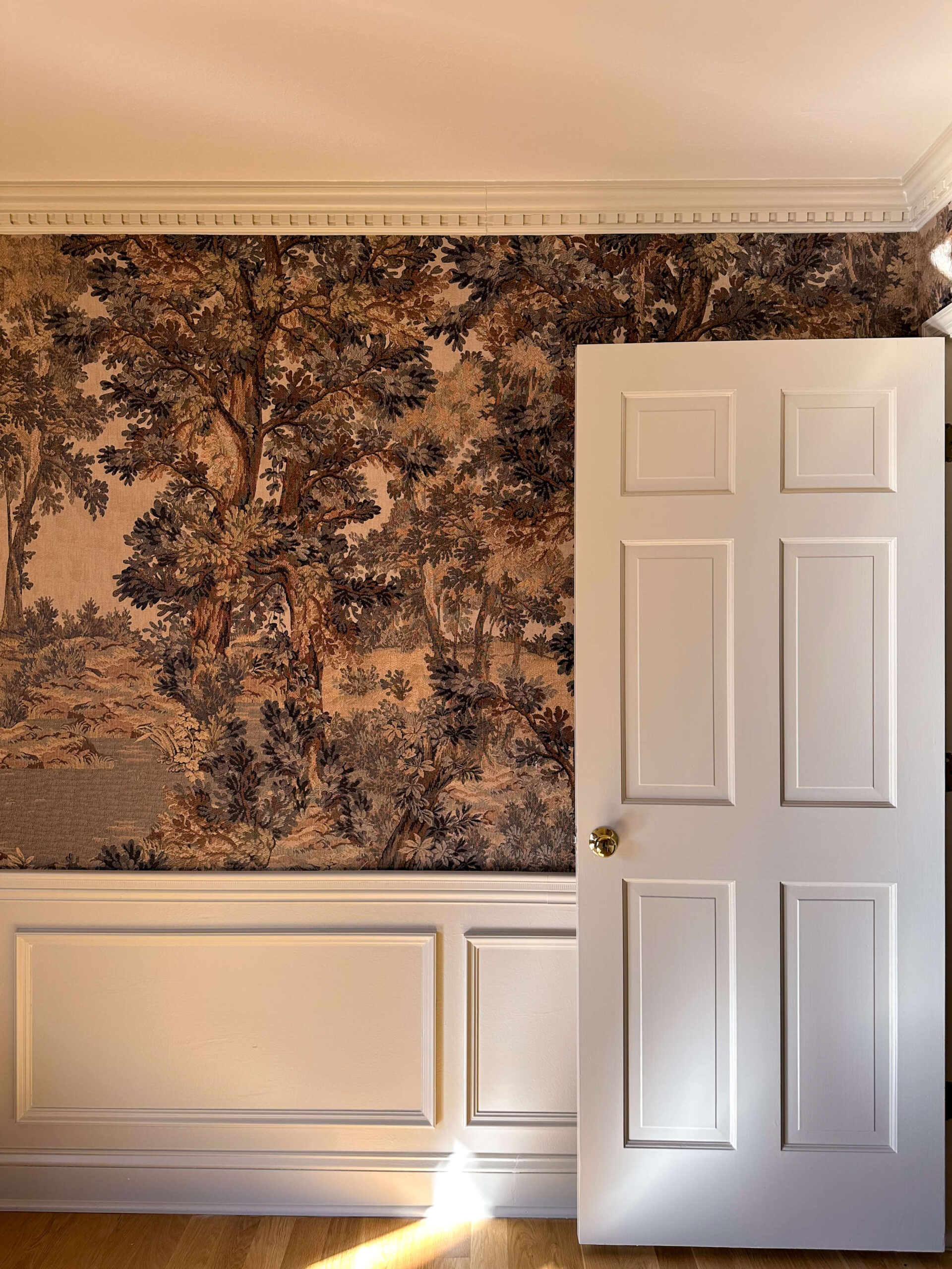
Wallpaper is a powerful design tool, capable of injecting personality and drama into any space. After wallpapering four different spaces in my house (the dining room, back entry, powder room and toilet room) I have one main takeaway to share. Meticulous wall preparation is crucial. When done correctly, it will make your installation a breeze […]
READ THE POST

When I bought this house in 2018, it came with 11 ceiling fans. ELEVEN! No offense against ceiling fans, but that really seemed like such a wasted opportunity to me. You see, I view light fixtures as artwork. They are the true jewelry of a room and in most instances, the only thing adorning your […]
READ THE POST

On a recent trip to my favorite local antique store, I found myself reflecting on the moment when I stumbled across my current kitchen chairs. It was truly love at first sight: they had vintage flair and I knew they’d strike the perfect balance with my new round fluted table. But there was one problem: […]
READ THE POST

Happy Valentine’s Day! Who doesn’t love an excuse for a sweet treat?! Whether you’re celebrating as a couple, with your best gal pals or are declaring it a party of 1, these mini molten red velvet cakes are the perfect way to be a little festive. Single servings, easy to make and beyond impressive to […]
READ THE POST
For me, the journey of transforming my house truly started with a paint brush. While I’ve been painting for decades at this point, it wasn’t until recently that I decided to paint the trim between the cozy room and back entry two different contrasting colors. With that decision, came learning how to get razor-sharp crisp […]
READ THE POST

If you were following along with my 2024 project list, you’ll remember seeing the back entry on the short list. This is a tinier space, but I definitely underestimated its significance last year when I was updating the cozy tv room. A true bridge between the dark moody den and the bright white kitchen, this […]
READ THE POST
Last year I color drenched the cozy tv room a dark moody blue grey, and it’s been one of my favorite spaces to date. I remember when I first shared the concept of color-drenched rooms with some family and friends, I made heads turn (and not in a good way!). People thought I had officially […]
READ THE POST
Lately we’ve been covering a lot of ground in our painting series, and have covered a wide range of topics. From the best painting supplies, to how to choose the right type of paint, and how to paint walls, ceilings and trim. Before we go any further, I thought we should quickly touch on the […]
READ THE POST
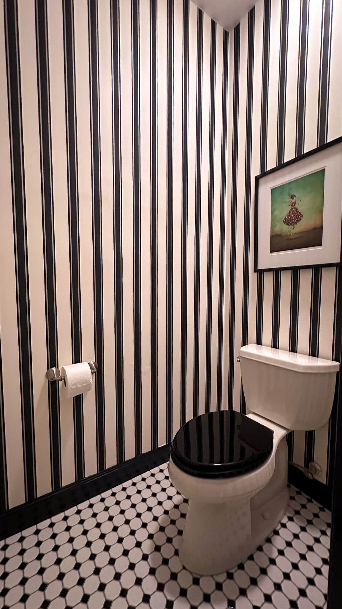
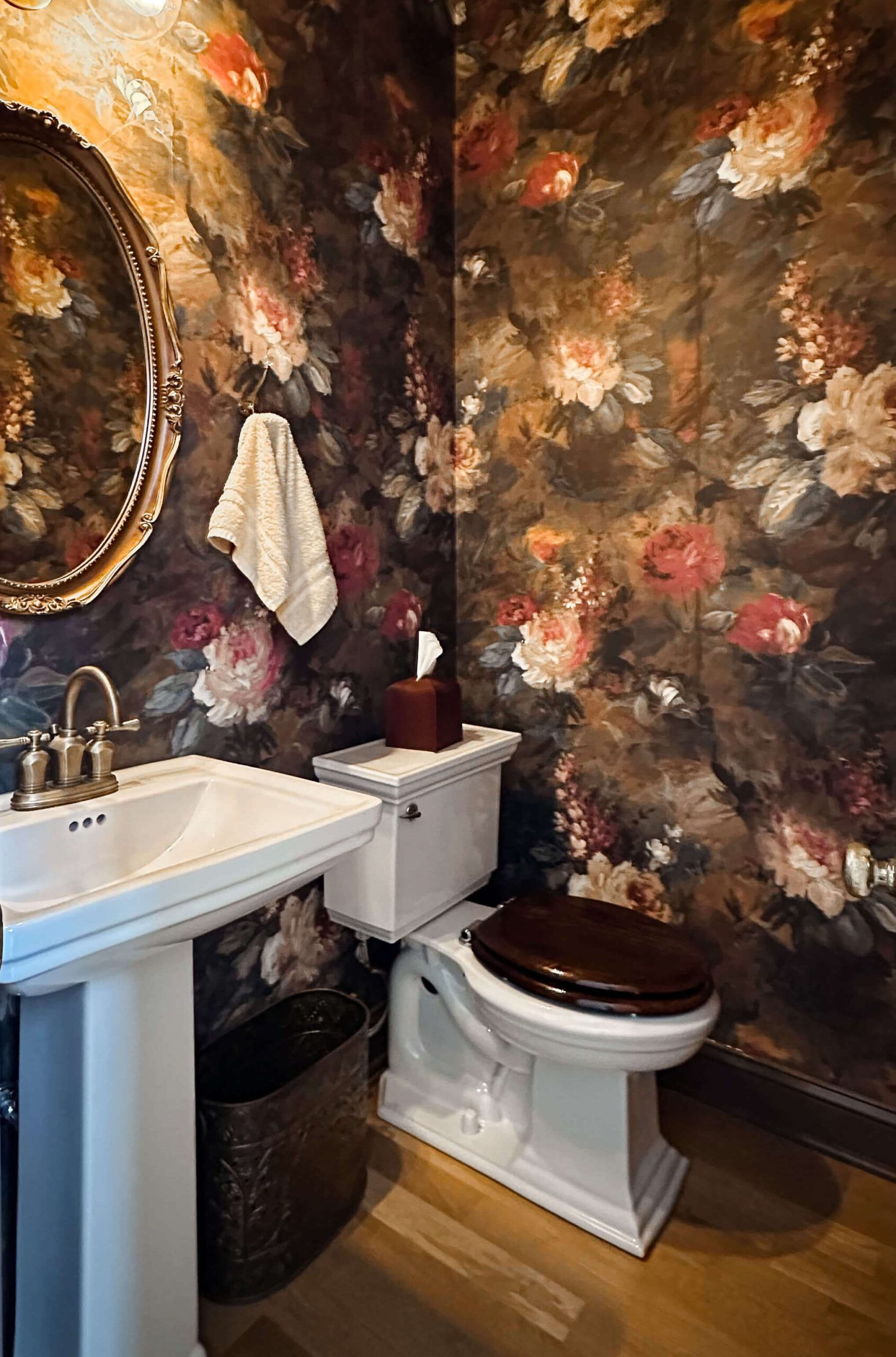
One of the best designs a primary bathroom can have is a separate toilet room and I’m lucky enough to have inherited one. While I immediately went to work renovating the primary bathroom within the first month of closing on the house, I’ll admit that the toilet room was an afterthought. Now with a few […]
READ THE POST
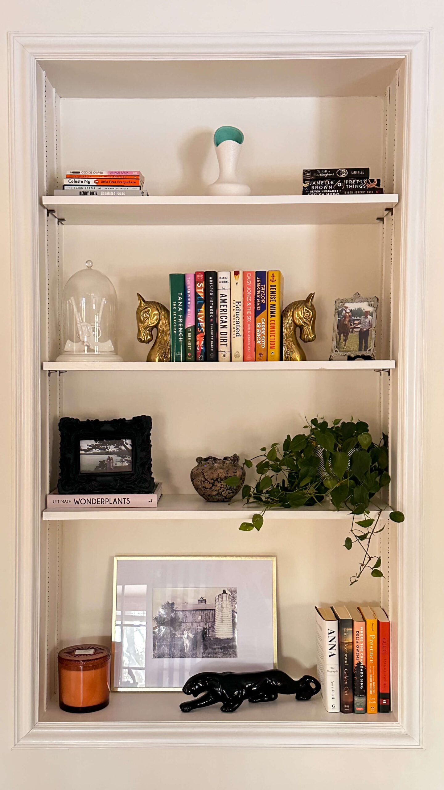
I’ll be the first one to admit it: styling the perfect bookshelf is a lot harder than it looks. Flip through any magazine or take a scroll through Instagram, and the shelfies will look almost effortlessly designed. I can promise you that is not the case whatsoever and each shelf you aspire to create was […]
READ THE POST
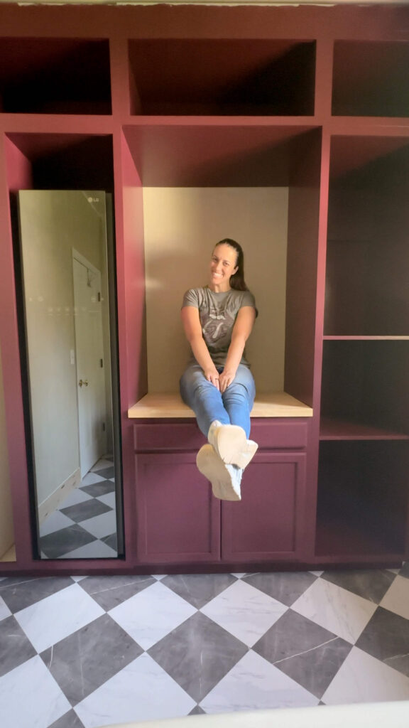
The first project I’m checking off the 2024 project list is the back entry! While this is a small area of the house, it’s the main entry point coming up from the garage and gets a lot of foot traffic. Sometimes it’s also the first impression of the house! While this space was not originally […]
READ THE POST

Cold nights call for warm soups, and this homemade healthy chili recipe is one of my favorite soups to make. It’s a one pot meal with clean ingredients and provides ample leftovers. Grab your favorite pot and get ready to have some cozy soup nights. Healthy Chili Recipe Ingredients: Sources: Serving Bowls Cooking Instructions Brown […]
READ THE POST
Today we’re taking a jaunt down memory lane, as I share the one of the first things I decided to do after buying this house: a primary bathroom renovation. There’s nothing quite like biting off more than you can chew, and I can say I confidently achieved that by renovating the primary bathroom with little […]
READ THE POST

It’s funny how cyclical life can be sometimes. Every year, I get so excited about the holidays for many reasons, but deep down I think I’m welcoming a break from renovating and DIY-ing. I’ve always made myself stop house projects to enjoy the holidays with family, savor the holiday décor and get out of the […]
READ THE POST

If you’re like me, Christmas decorations are magical during the weeks leading up to Christmas, but something happens shortly after December 25th. I feel like I need everything packed up in order to have a fresh start for the New Year. This year I really upgraded my Christmas décor, and that means it’s time to […]
READ THE POST
As we turn the page to 2024, I’m sharing my predictions for the top home decor trends and interior design styles we should expect to see more and more of. These themes will spill into all facets of home, from decorating inspiration to kitchen and bathroom designs. Based on what I’ve observed coming out of […]
READ THE POST

These homemade cinnamon rolls are soft, fluffy and are topped with a gooey cream cheese icing. They rival a Cinnabon and for good reason: I spent months tweaking and perfecting the recipe. Through some trial and error, I’m happy to share the final recipe with you today, as well as some tips and tricks that […]
READ THE POST
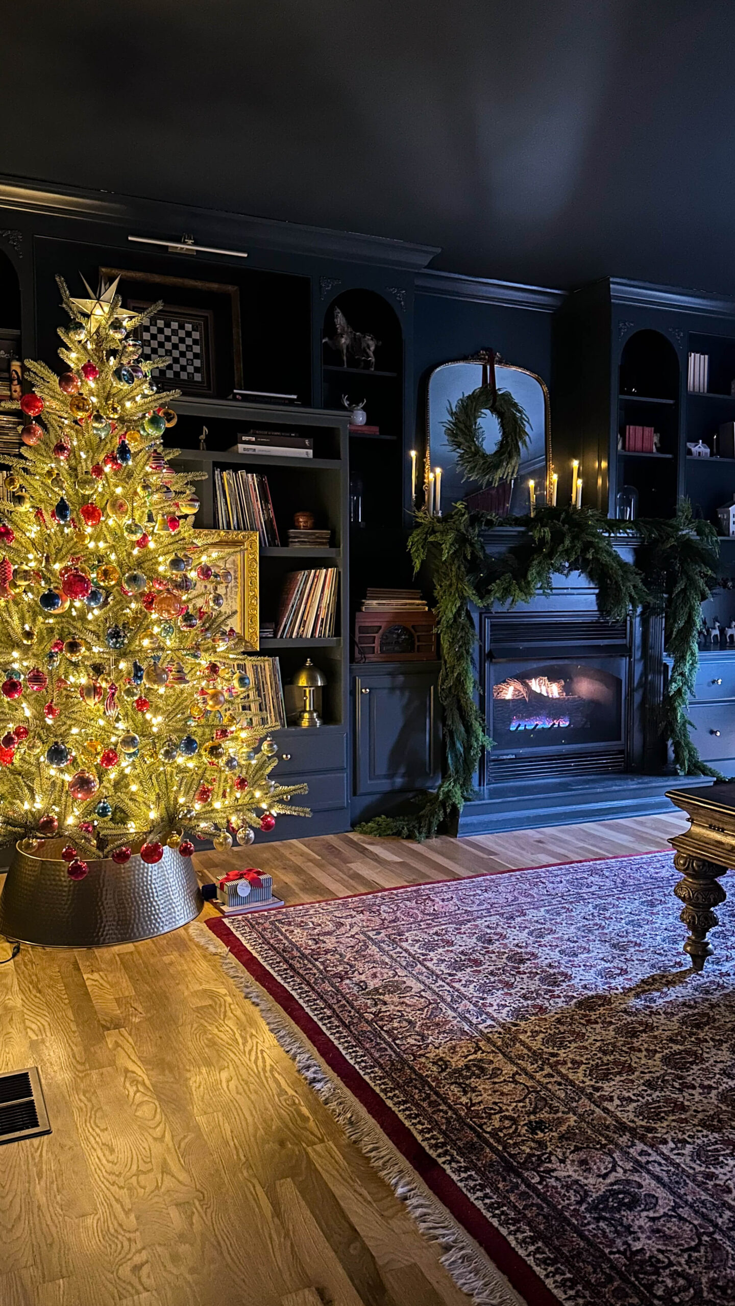
As we inch closer and closer to Christmas Day, I’m soaking up every moment of enjoying the Christmas decorations around my house. The house has seen some big updates this year, most notably the hardwood floors and staircase, so I felt it was only fitting to spring for some new Christmas décor this season. Follow […]
READ THE POST

There are two types of people in this world: those who are excited to buy gifts for others and those who don’t know where to start. I fall into the former category myself, which is why it’s so fun for me to put together holiday gift guides. Whether you need one more item to finish […]
READ THE POST
Last week, I shared I upgraded my holiday garland this year and I took you along for the ride on how I styled my staircase with the Norfolk pine real touch garland. We’re going to keep the garland theme and move onto the fireplace mantles. That’s right, fireplace mantles as in more than one! Since […]
READ THE POST
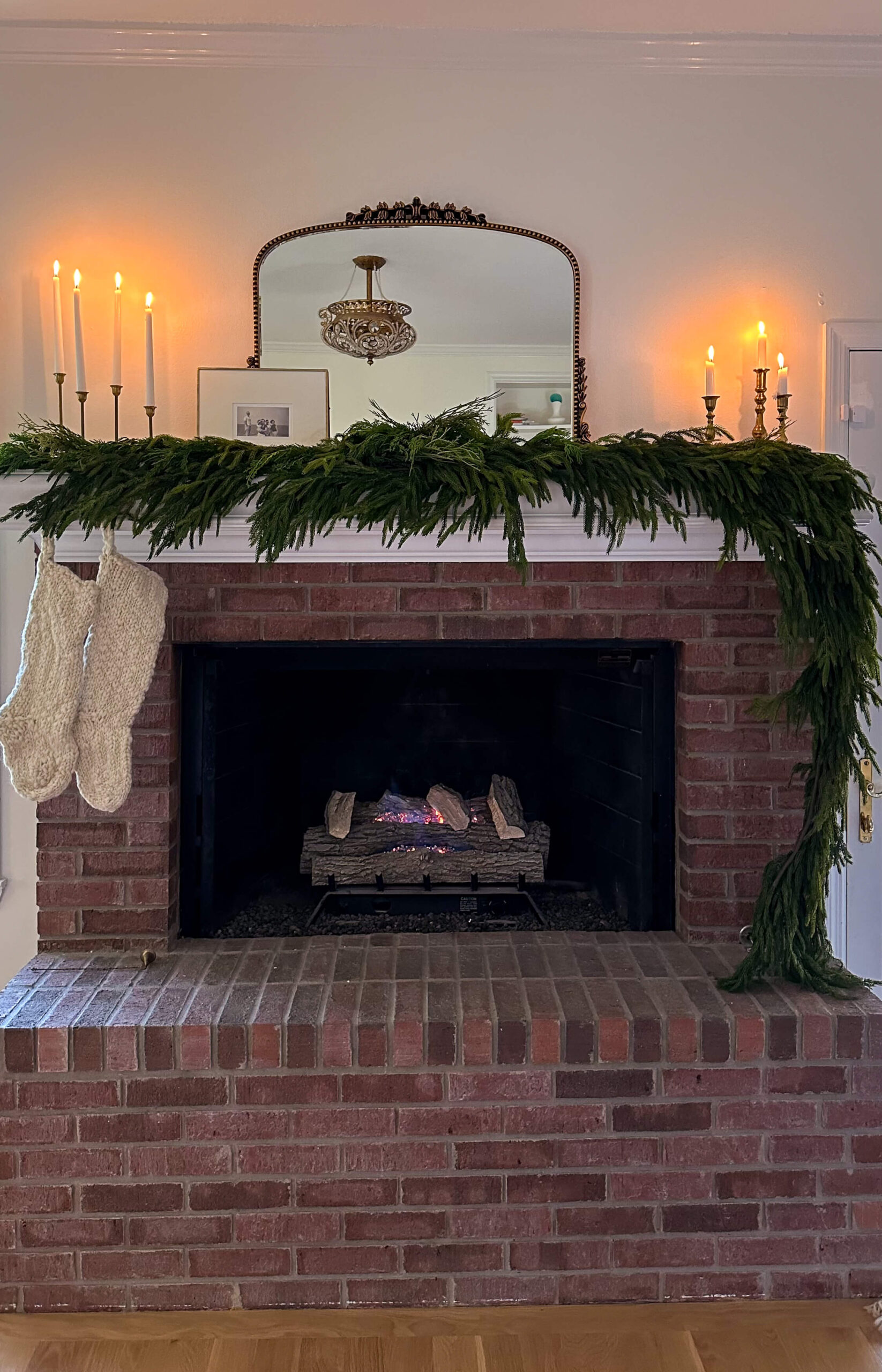
What’s better than decorating your mantel for Christmas? Decorating two mantels! Yes that’s right, I am lucky enough to have two working fireplaces in this house, which was one of things that hooked me from the beginning. Last week, I shared my symmetrical draped look in the cozy tv den. To keep things interesting, I […]
READ THE POST

Let’s be honest, choosing the perfect Christmas tree can be overwhelming and sometimes you can be paralyzed by all the decisions that go into it. I should know, I just went through it this year! But I’m here to tell you it doesn’t need to be difficult. Today I’m sharing all of the things I […]
READ THE POST

If you’ve been following along, it will come to no surprise to you that I’ve decided to reward myself with some new holiday garland this year. After enduring the messiest renovation with new hardwood floors and a new staircase to boot, I’m ready to show it all off. I decided to splurge on Afloral’s Norfolk […]
READ THE POST
Happy Thanksgiving! As I’ve gotten older, Thanksgiving has inched its way to the top of the list as my favorite holiday. I love having the opportunity to spend quality time with my family and being able genuinely enjoy the long weekend. It feels slow, intentional, and warm. This year has been difficult in many ways. […]
READ THE POST
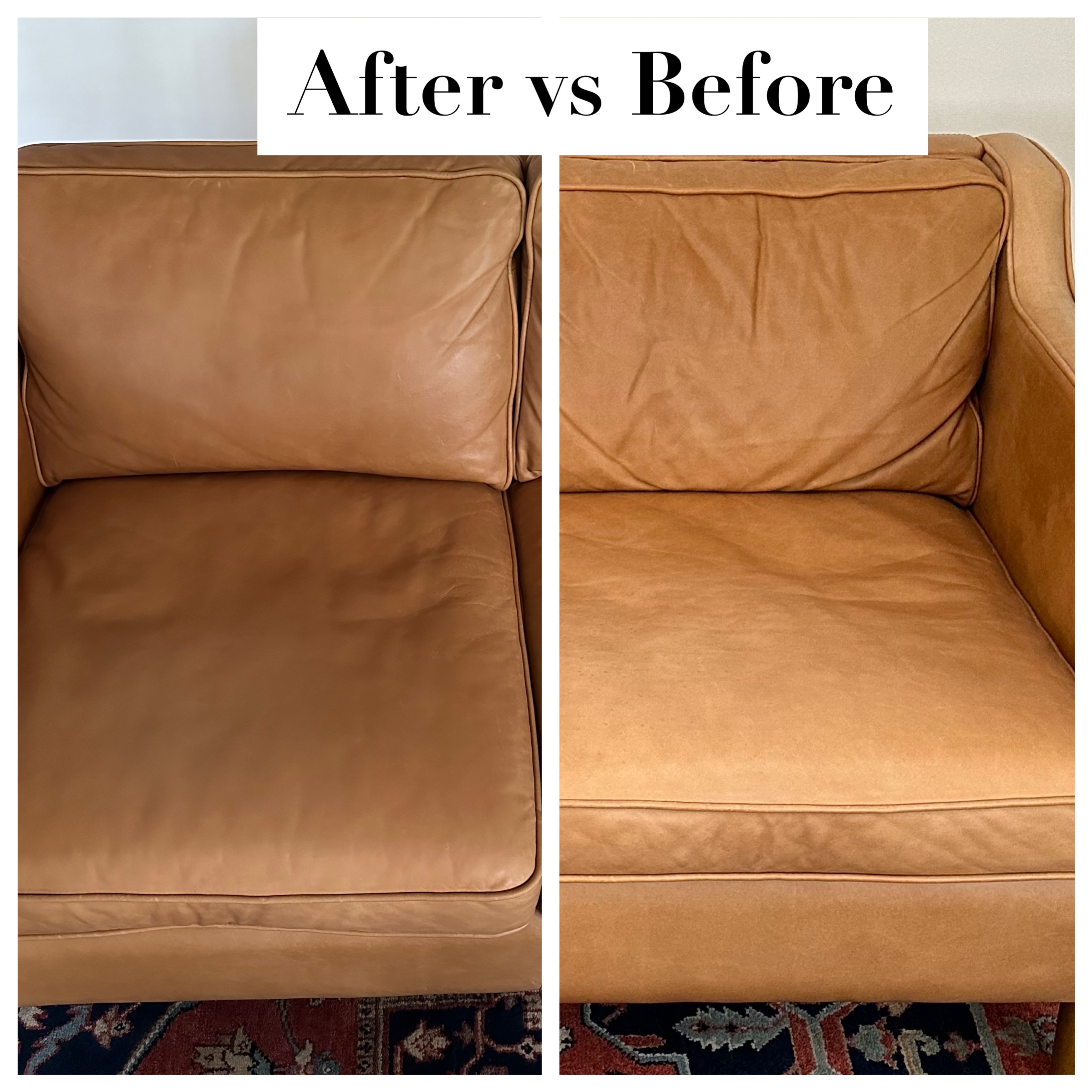
Today I’m sharing something I wish I would have done years ago: protecting my leather sofa. My beautiful camel colored leather couch from West Elm was delivered the week I closed on my house and unfortunately there was so much chaos that I never got around to properly protecting it. Had I done so, I […]
READ THE POST
While I’m no stranger to hosting Thanksgiving, this will be my first time hosting both sides of the family which I’m very excited about. I love to cook, and especially love the excuse to make recipes I don’t get to make every day. Plus there’s just something special about those Thanksgiving staples like my mom’s […]
READ THE POST
With all the updates to the house this year, especially the floors and staircase, I decided this would be the year I would splurge on some new holiday garland. Ever since last year, I have been eyeing the Norfolk Pine garland and I finally decided to “add to cart” this holiday. I’ll admit, it was […]
READ THE POST
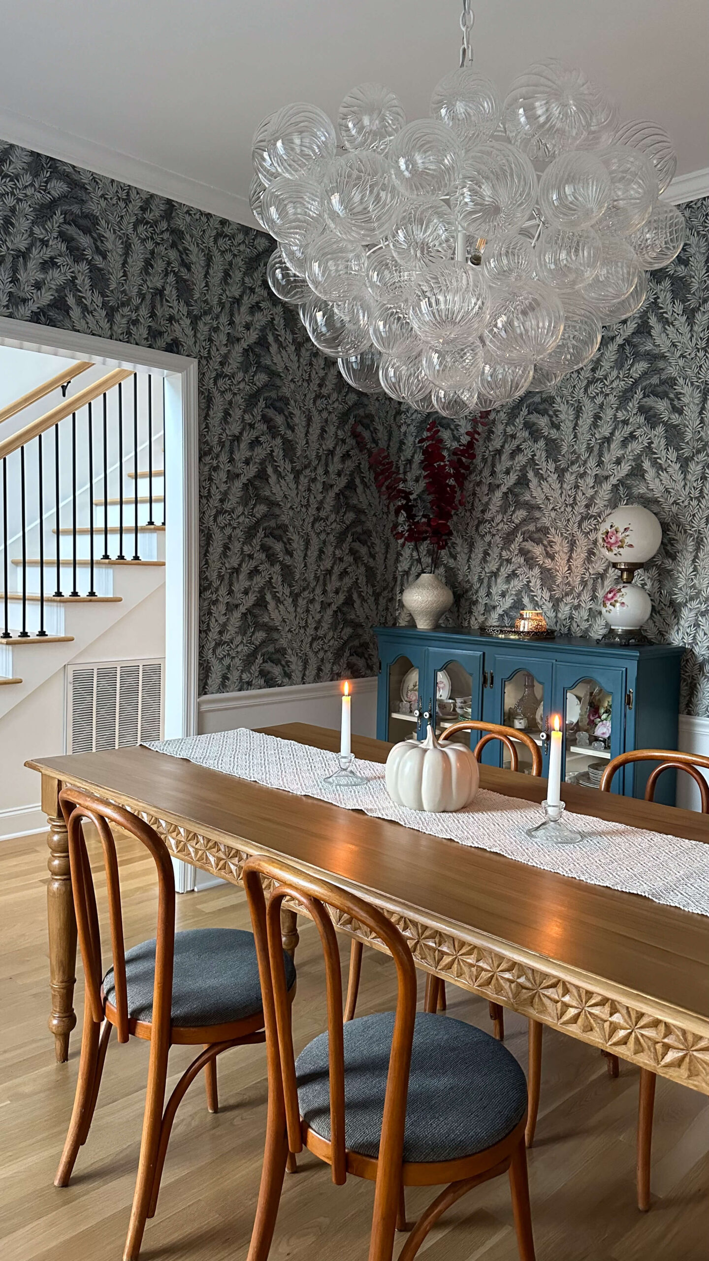
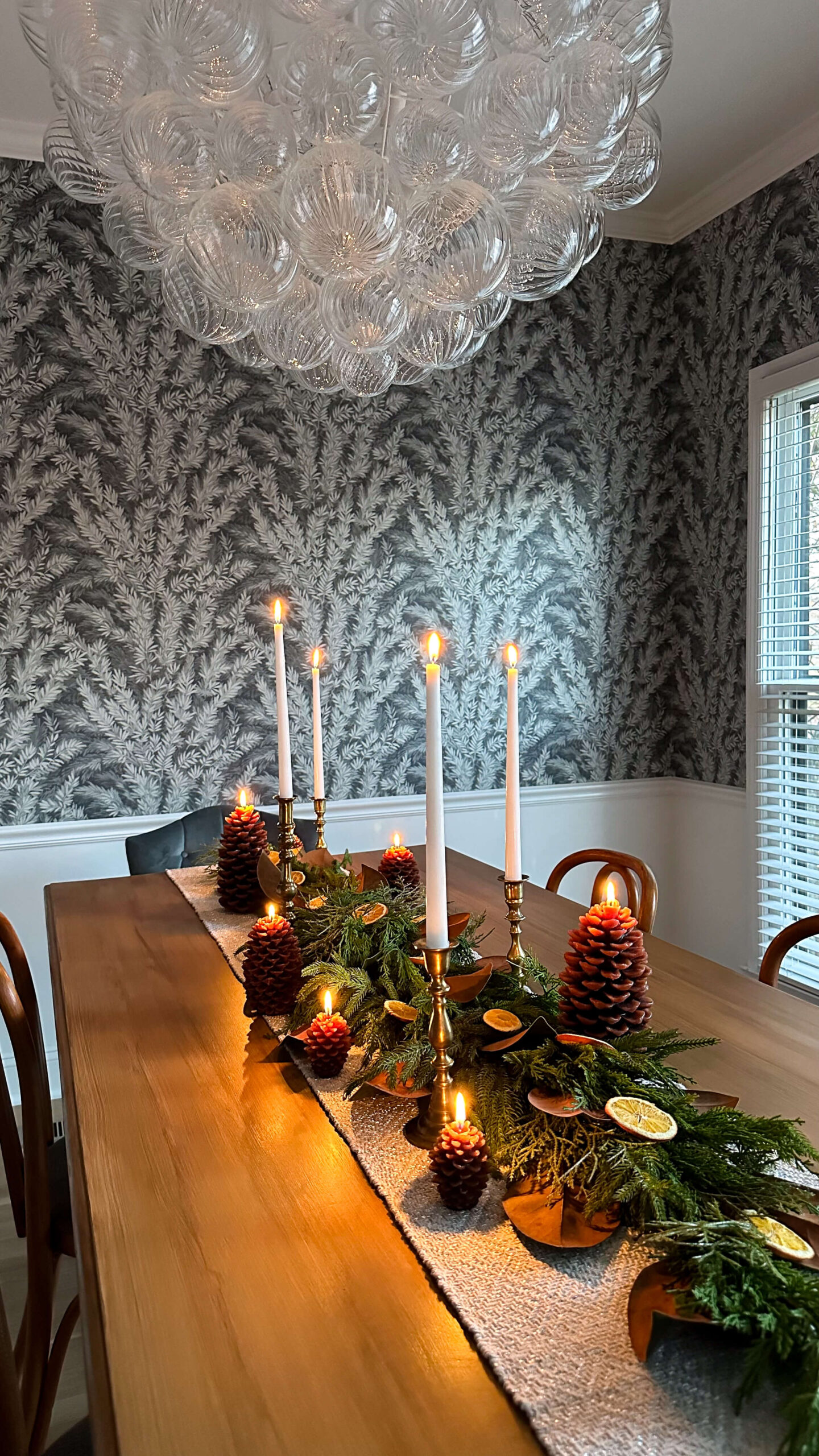
Alright, so I’m taking the excitement I had to share the dining room progress report with you and I’m going to multiply that by ten for the dining room reveal!!! Are you ready for it? I am. I was beyond excited about how transformative the Cole & Son’s wallpaper was for this space, and we […]
READ THE POST
The dining room flip has been one of my most exciting projects to date in this house, however I truly reached a sticking point when it came time to make decisions about the furniture. If you remember, I got a bit tripped up with the design plans for the dining room because of this black […]
READ THE POST
I am beyond excited to share a dining room progress report with you today, as it’s turning out even better than I had ever dreamed! Last week I shared how my initial vision for the dining room did not pan out as I originally planned, but I trusted the process and kept designing until I […]
READ THE POST

Today, I’ve got a fantastic project that will instantly elevate the look of your space: painting interior trim. Whether you’re a seasoned DIY pro or just starting your home improvement journey, this step-by-step interior trim painting guide will help you achieve a polished and professional finish. Let’s dive in! Why Paint Your Interior Trim? Before […]
READ THE POST
When I bought my first house in 2011, I truly wish it would have come with a checklist of things I needed to do each year, and during each season. As with most things, I learned by doing (and failing!). Sometimes this was frustrating, and other times this was expensive. In an effort to help […]
READ THE POST
Just in time for the Thanksgiving holiday, the dining room is about to have the makeover she deserves. This room has been a slow progression, and honestly I wouldn’t have it any other way. While I’ve already finalized much of the design for this space, I want to bring you behind the scenes and share […]
READ THE POST

This one’s for my DIY enthusiasts! Today, we’re diving into a topic that often gets overlooked in the world of home renovation and design: ceiling painting. Sure, we all love a beautifully painted wall, but what about the fifth wall—the ceiling? Trust me, it’s a game-changer when done right. So, grab your paintbrushes and let’s […]
READ THE POST
Tom Petty once said the waiting is the hardest part. Well Tom, you were right. If you remember, I shared I’d be doing my hardwood flooring installation in phases. Due to the kitchen leak, we knocked out the downstairs first, then scheduled the upstairs second. With how I live in the house, I really use […]
READ THE POST

Are you ready to paint?! Follow along below as I guide you through how to paint a wall like a professional. Speaking of professionals, I’ll share the cost savings you can anticipate by choosing to DIY this project. Get excited – we’re about to transform your space! Getting Set Up After you’ve decided on your […]
READ THE POST

As the temperatures in Nashville begin to cool down, and the days become shorter, I’ve gradually started adding fall décor touches from the inside out. It is truly my favorite season of the year – the color palette, the smells, the crisp air, the food, sweater weather and all around general coziness. And something I’ve […]
READ THE POST

Reveal days are my favorite days! I’m so excited about how the powder room redesign turned out and I’m even more excited to share the full room reveal with you today. How we got here If you remember, I realized the pedestal sink wasn’t properly secured to the powder room wall, and after calling my […]
READ THE POST
If you’ve been following along, you’ll recall that I opted to complete my new hardwood flooring installation in phases. In phase one I knocked out the downstairs flooring first, which is where the water leak happened (it was kinda urgent). Now that we have that out of the way, we can focus on the staircase […]
READ THE POST
A couple weeks ago I shared my vision for the Powder Room Makeover, including three moodboards – all featuring different wallpaper designs. In addition to the moodboards, I ordered samples of each which helped narrow down the decision between Moodboard #2 and Moodboard #3. In the end, I decided to move forward with Woodchip & […]
READ THE POST
Paint is one of the most instantaneous and easiest ways to transform a space, but sometimes all the choices can be a bit overwhelming. Today, I’m going to break it all down for you and arm you with everything you need before heading into the paint store. We’ll go over the basics which include an […]
READ THE POST

There’s nothing quite like a gorgeous autumn flower arrangement. The colors are rich but not overpowering, and they blend into the background while still making a statement. If you’re like me, you’ve probably seen a stunning image of one of these autumn arrangements in a catalogue or on social media, and you’ve thought to yourself […]
READ THE POST
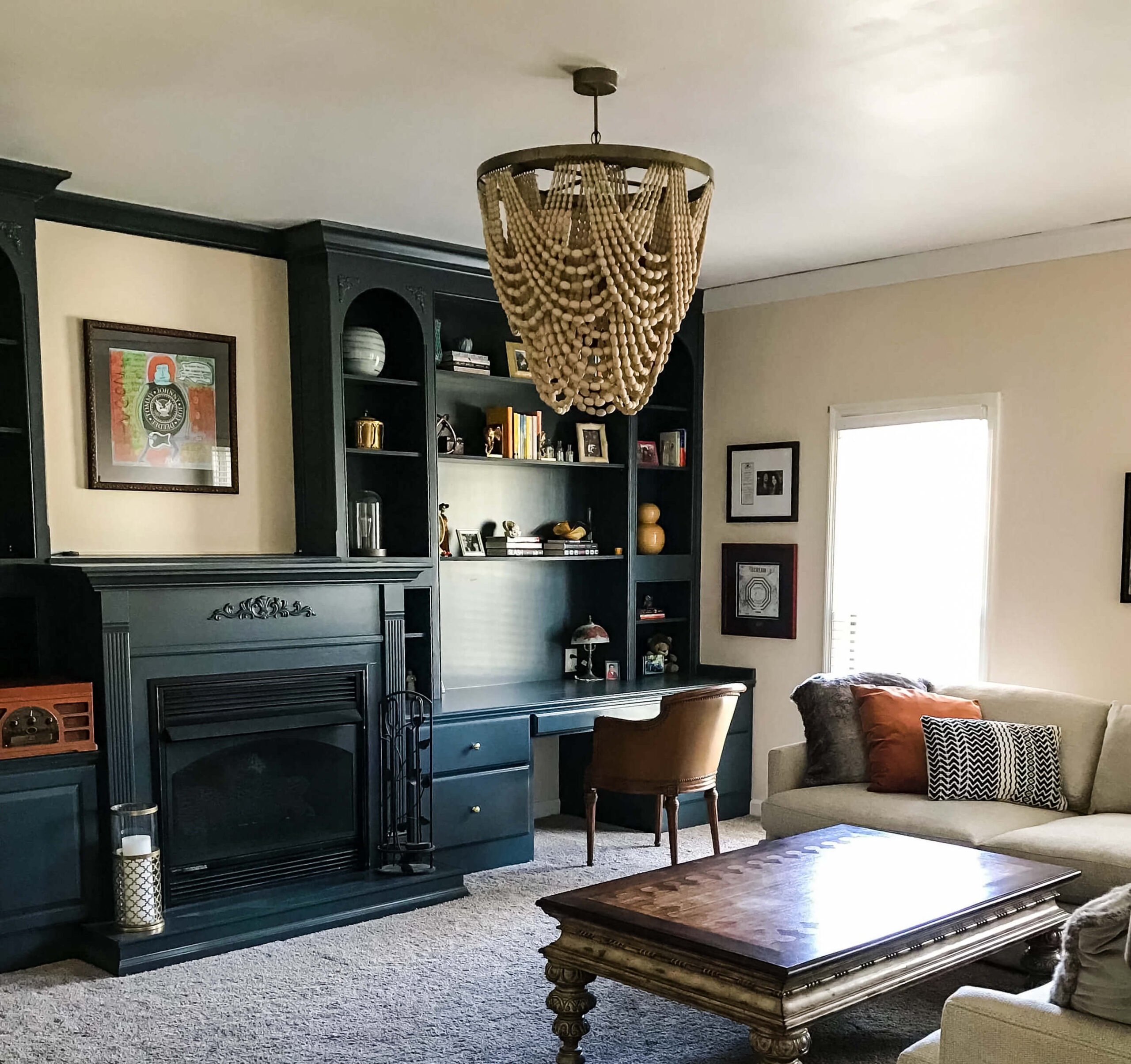
I’ve been daydreaming about a moody dramatic tv room, and it’s official – I think this iteration of the TV Room is “the one”! There are still a few tiny details I need to finish such as putting a medallion above the gold leaf chandelier, changing out the electrical sockets to be black and eventually […]
READ THE POST

Recently, I noticed that the pedestal sink in the powder room was wobbly, and after further investigation I realized it wasn’t connected to the wall! After calling the plumber we came to the unfortunate truth that the sink wasn’t connected to any studs in the wall, but was simply drilled into drywall. The plumber had […]
READ THE POST

In the five years I’ve lived in this house, I can confidently say that the new hardwood floors are the biggest transformation to date. I’m so excited to share the final reveal with you today! The first morning I padded across the new floors in my bare feet, I giggled because it was the first […]
READ THE POST

The initial refresh I did in the TV Room (aka the Cozy Room) was exactly what it needed to make the space feel updated on a limited budget. However the more time I spent in it, the more it didn’t quite feel right. My main sentiment was that it still felt too bright for a […]
READ THE POST
If you’ve been following along, you’re up to speed on how a small leak has changed my entire house (seemingly overnight). After I had a minute to process what was happening and just how much damage it caused, I decided to lean into the situation and look at it as a blessing. In truth I’ve […]
READ THE POST
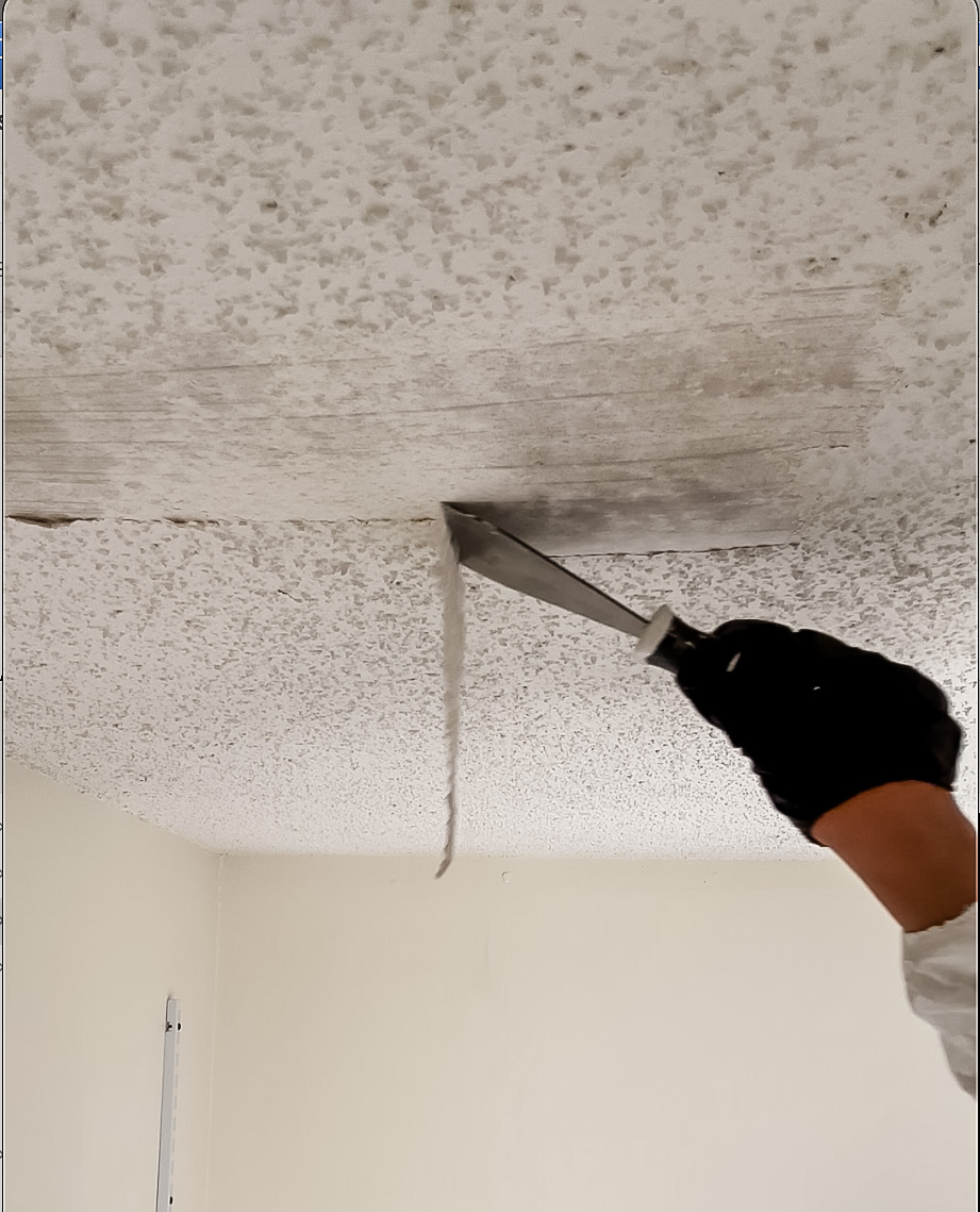
Yes, I bought a house with popcorn ceilings and yes I scraped every square inch of them off, all by myself. 3,222 square feet to be exact. When I bought this house, there was no question that these ceilings were going to get fixed, but it was something I planned to hire out for. I […]
READ THE POST
When I first toured this house, I was so amazed that there were TWO living rooms! Not to mention they were both double the size of my previous and only living room. Before my offer was finalized, I was planning what existing furniture would go where and since “living room” meant two spaces in this […]
READ THE POST
The Latest on the Blog —
read more
If you read my laundry room design plans post, you know this renovation has been two years in the making. Today I’m giving you the first real progress update: what’s been built, what I learned the hard way, and a proper introduction to the at home dry cleaning machine I designed the entire back wall around. It’s been an eventful few weeks!
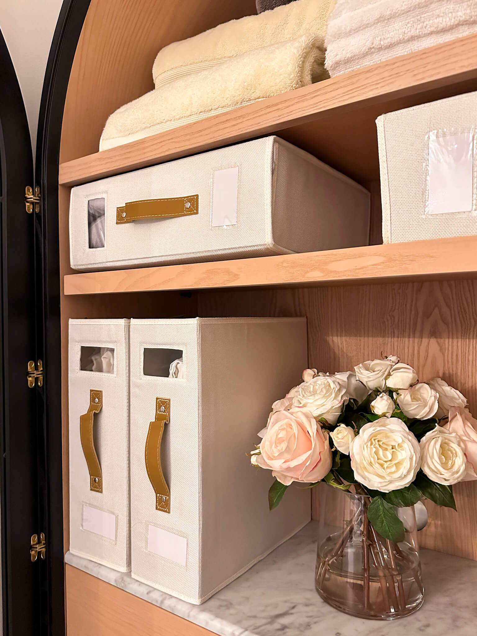
Where the Laundry Room Renovation Stands Right Now
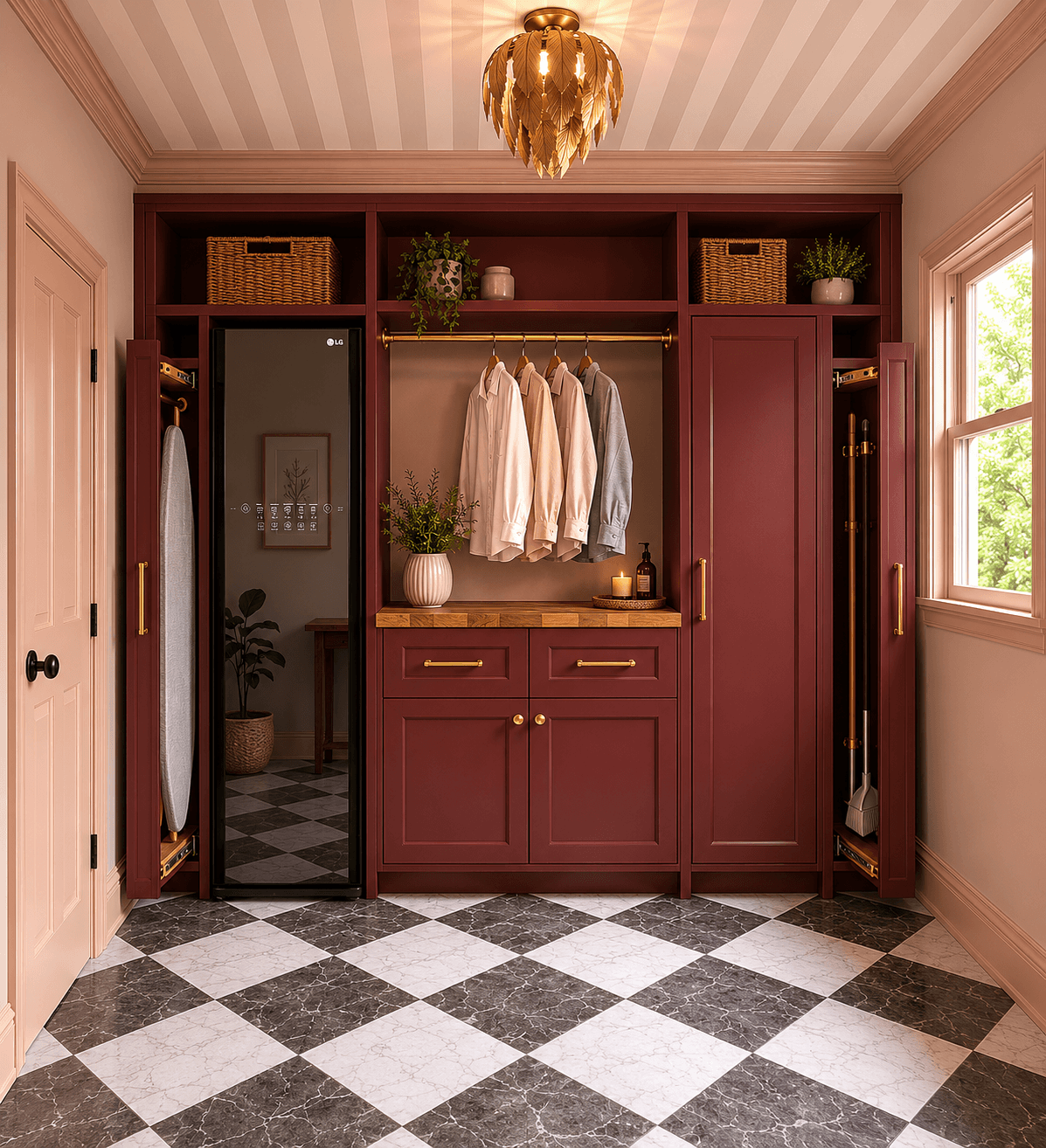
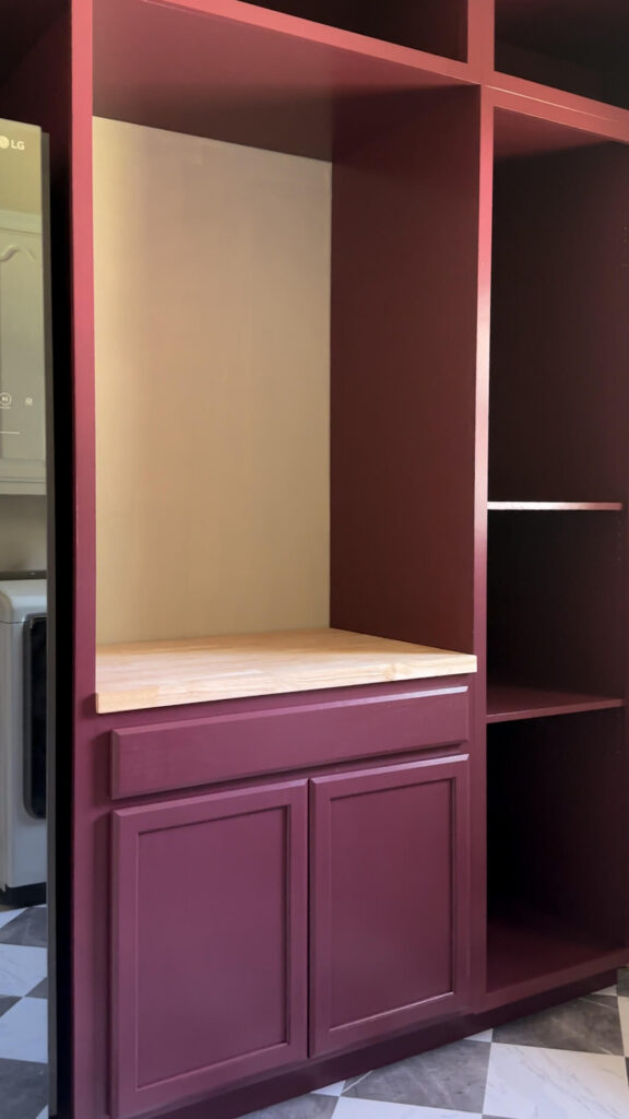
After years of wire shelving and complete chaos, the laundry room is starting to look like a functional command center I always knew it could be. The entire back wall of cabinets are built, face-framed, and painted in a deep burgundy which is a color I’ve been dying to bring into the home for years. The butcher block countertop with Danish oil (after loving it from my DIY Walnut Spice Rack) and is placed on top of the pre-built base cabinet.
I truly can’t believe that this entire wall is starting to look like the design I mocked up and I can’t fully explain what that feels like after sitting on this project for so long. Can you believe this is even the same room?!
Teaching Myself to Build Cabinets (What Went Wrong Before It Went Right)
Building cabinets was one of my goals for 2026, and I knew going in that it wasn’t going to be easy. All of my woodworking so far has been two-dimensional — box molding, wainscoting, crown molding — and three-dimensional is a completely different skill set. I also chose this project to learn two new tools at once: a track saw (I went with a Makita after a lot of research and genuinely love it) and a pocket hole jig. The pocket holes were not going well at first, and I couldn’t figure out why. Turned out I didn’t have the collar set correctly on the jig. Once I fixed that, everything came together.
The hardest part of the whole build was getting cabinets of this scale properly squared. These are 7-foot cabinets, and managing that much weight while keeping everything square is hard with a crew. Solo, with no three-dimensional cabinet experience, it was a lot. I also had to figure out how to get the top cabinets placed above the 7 foot bottom cabinets. My solution for getting them up there was two ladders positioned as a kind of makeshift platform. I got each cabinet up onto them, crawled underneath, and pushed up. It worked.
They are not perfect, and I want to be upfront about that. Things shifted as I went. But I was able to finesse the placement so the row reads as straight, and I am genuinely proud of what I built. Learning in real time, as always.
Why I Pre-Bought the Base Cabinet and I’d Do It Again
The base cabinet under the butcher block (the folding station) I purchased pre-made rather than building myself. At the time I went back and forth on it. Now, having been through the cabinet build, I am so glad I made that call. The custom cabinets were hard, and having a solid pre-built piece to anchor the layout to made everything feel more manageable. Sometimes the smartest DIY decision is knowing which parts to skip.
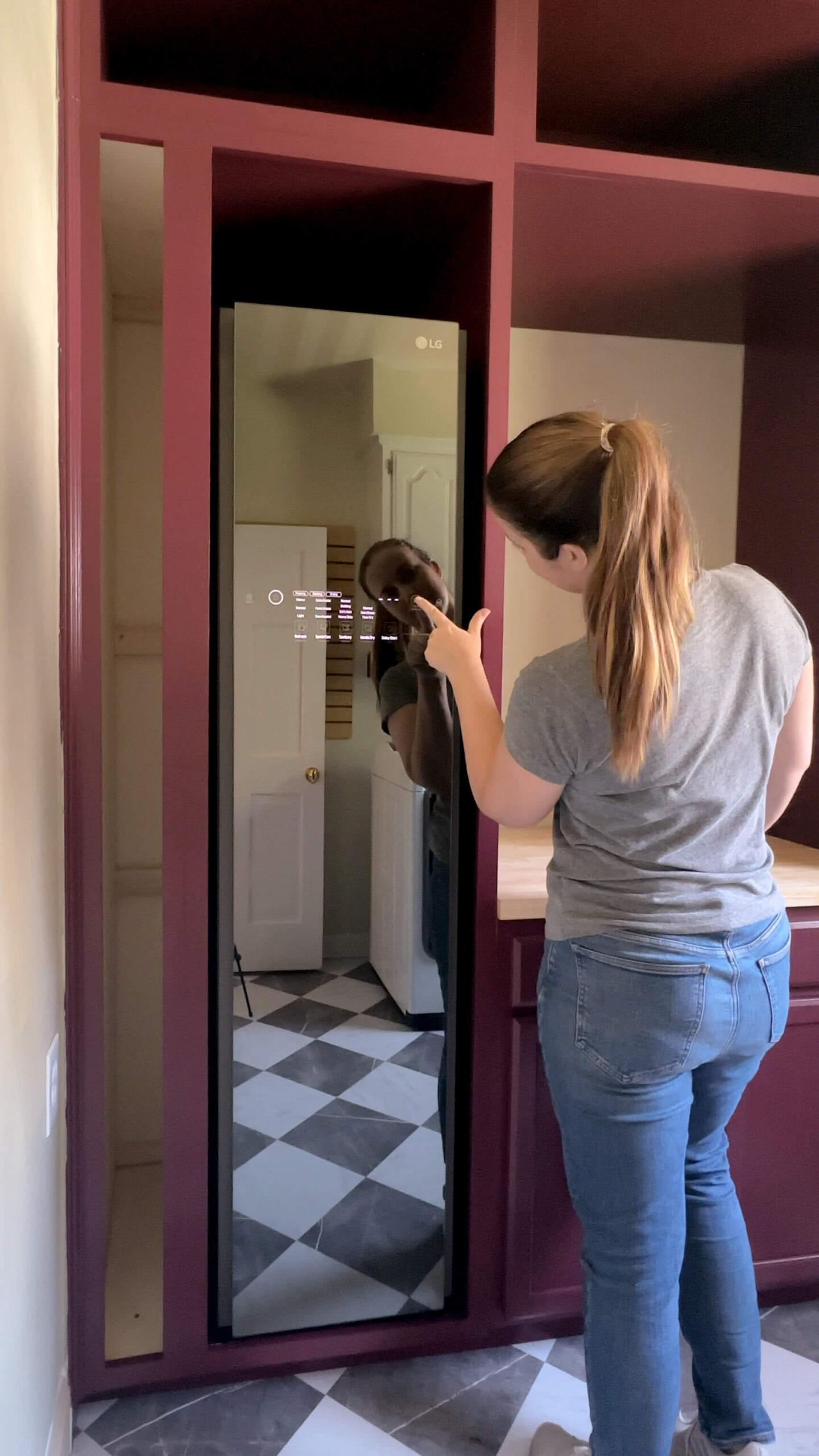
Meet the At Home Dry Cleaning Machine I Built the Room Around
Now for the part I have been the most excited to get to. The LG Styler has arrived, and it is exactly as sleek as I hoped.
Quick backstory for anyone who missed the design plans post: I first heard about the LG Styler on a design podcast a few months ago. They kept referencing an at home dry cleaning machine, and I had no idea something like that existed. I paused the episode, opened my phone up and started researching immediately. Within a few days I knew it was going in the laundry room, which meant designing a dedicated cabinet bay built specifically around its dimensions.

The Styler looks like a slim mirrored closet. When it’s not running, the front reads as a full-length mirror which, for a room that has been the ugliest space in the house for years, feels like a genuinely fun design moment. Getting it seated into the cabinet was tense. I had measured everything to spec, but there is always that split second of “what if it doesn’t fit.” It fit. The cabinet held. We are in business.
What the LG Styler at Home Dry Cleaning Machine Actually Does
For anyone who, like me until recently, had never heard of this kind of appliance: the LG Styler uses steam to sanitize, refresh, and de-wrinkle garments that can’t go through a normal wash cycle. Inside there are three hangers — two for tops and one pants creaser that mounts on the door — plus a shelf at the bottom that is perfect for things like pillows or home items I bring back from estate sales.
Setup is simple. The machine requires a standard outlet, no plumbing hookup required. There’s a small water tank you fill from any sink and a separate drainage tank for used water. That’s all the installation there is.


The at home dry cleaning machine doesn’t need a water hook-up as it has a refillable tank and a drainage tank!
What I’m most excited about is the sanitizing function. There are settings for every garment type and fabric, so I can treat delicate pieces safely without the damage risk of a washing machine. For winter sweaters especially, this is going to be a game changer. Earlier this year I had a close call with clothes moths and spent a significant amount of money at the dry cleaner trying to salvage my wardrobe. Having an at home dry cleaning machine that can sanitize sweaters, estate sale finds, and anything else that can’t easily go in the wash is exactly the kind of thing I didn’t know I needed until I needed it badly. Worth noting: the Styler’s steam also kills moths and their eggs, which for those of us with a winter sweater collection, is genuinely reassuring.
The little aroma filter slot is a nice touch too — you can add a dryer sheet or spray it with your favorite scent so it circulates through the cycle. I’m still in the early days of using it and plan to share more as I put it through its paces. First impressions: intuitive, sleek, and already earning its spot.


The at home dry cleaning machine also has the ability to crease your pants as you clean them!
What’s Still to Come Before the Laundry Room Reveal
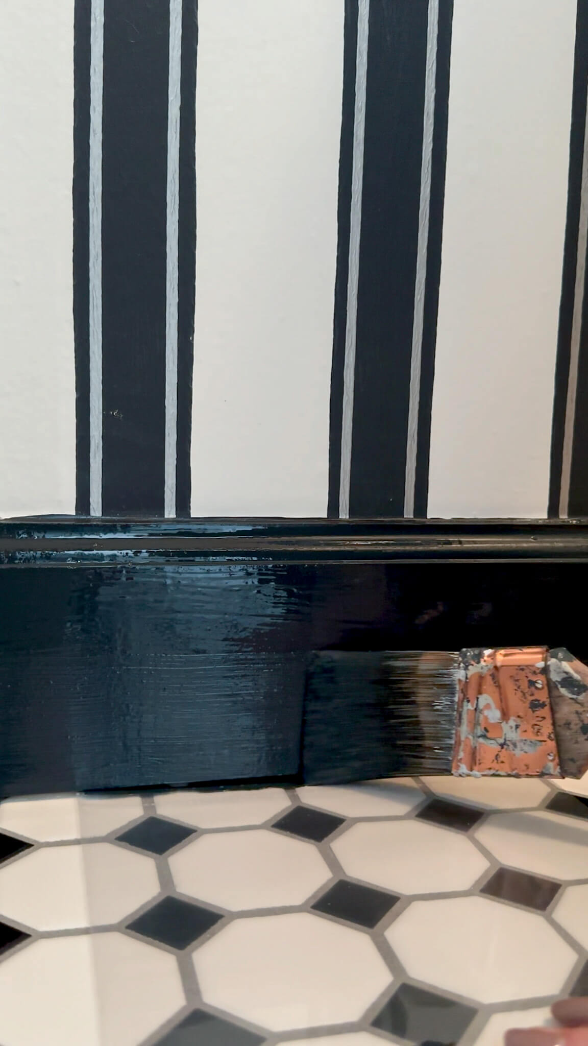
Next up I’ll be wallpapering my first ever ceiling! I’ve wallpapered four times total in this house but never a ceiling, so why not start with stripes right?! I really didn’t realize what I signed up for until after the fact. After that, I’ll add crown molding (the same profile as the primary bathroom), then wall paint — the pink and burgundy color blocking I’ve had planned since the start. After that: window and door trim, tile under the dryer and baseboards. I’ll likely pause there and really take my time with the cabinet doors and the two pull-out storage cabinets since that’s going to be very new for me, but I feel like it will be manageable. After that, it will be the finishing touches — hardware, light fixture, window treatments!
It’s a long list. But it’s the fun kind of long list, where I can actually see the finish line.
Make sure you’re following along on Instagram so you don’t miss the progress in real time. And if you want to shop anything from the laundry room so far, everything is linked here.
Related:
browse more posts
read more
This post is sponsored by Dremel. All opinions and project decisions are my own.
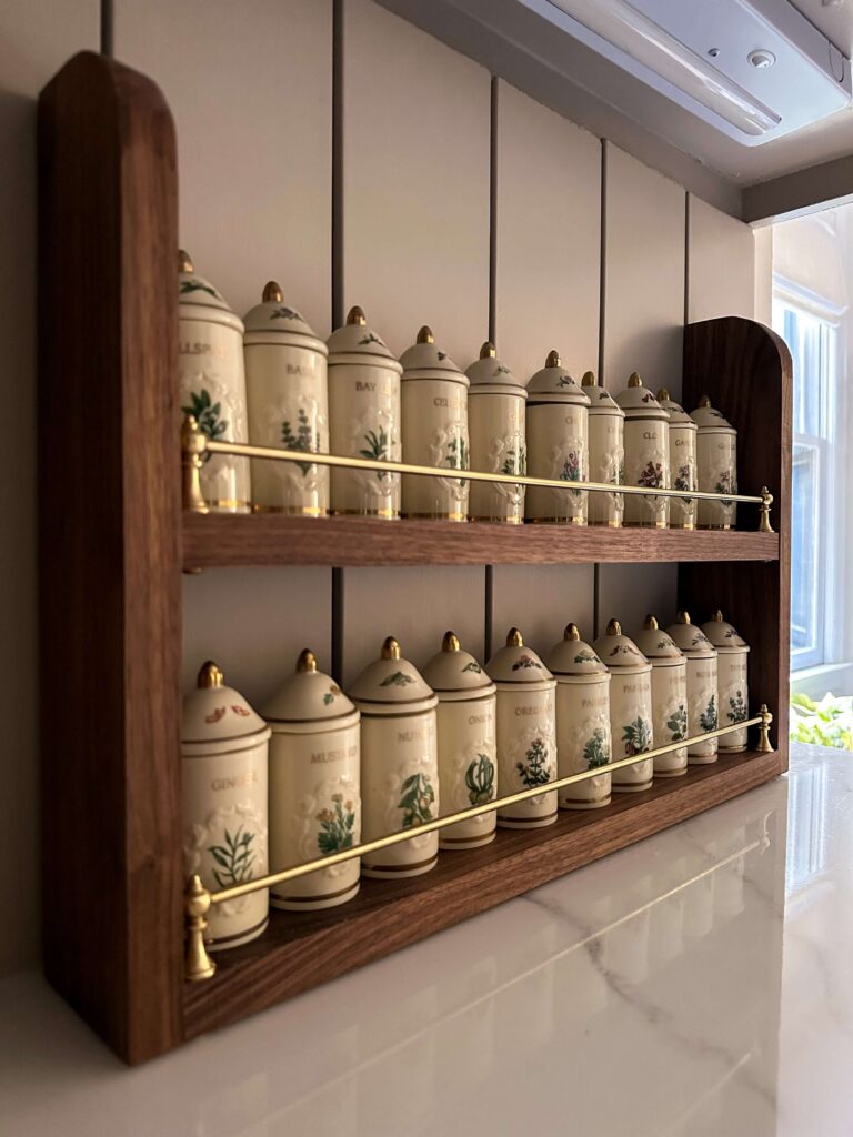
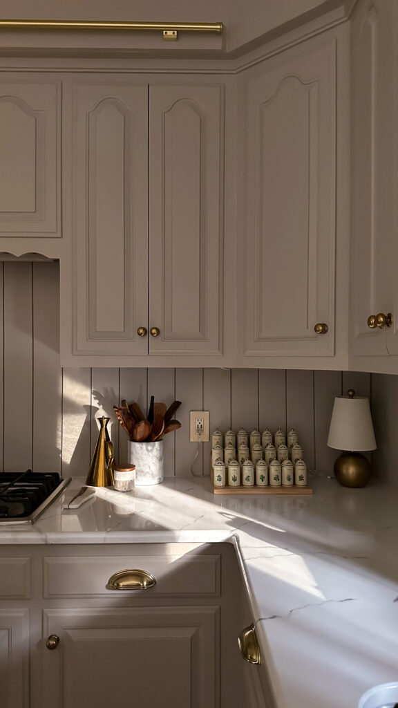
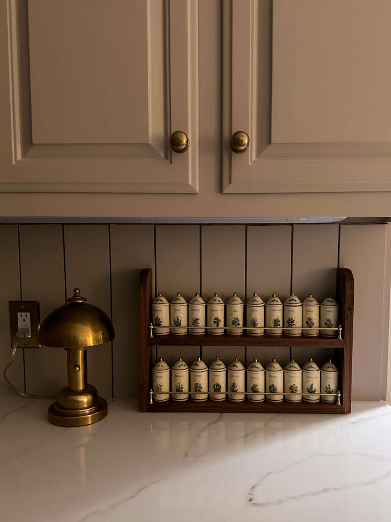
If you’ve been following along for a while, you know I have a deep love for hunting down vintage pieces and one of my most prized finds is my Lenox Spice Garden set. I searched for months before finally tracking one down at a somewhat reasonable price on Facebook Marketplace, and it felt like Christmas when it came time to unbox it.
That’s what led me to build this DIY walnut spice rack, completely custom, built right in my kitchen using the Dremel Portable Saw Station, and more charming than anything I could have found in a store. Today I’m walking you through how I built it step by step so you can build one for yourself too!
What Is the Lenox Spice Garden Set?
If you’re not familiar, the Lenox Spice Garden collection is a vintage fine porcelain spice jar set hand-painted with herbs and florals. They’re incredibly collectible and have had a serious resurgence in popularity. Full sets can run anywhere from several hundred dollars up.
Everything felt a little crammed and the previous spice stadium came out a little further than I would’ve liked.
Mine had been living on a tiered spice stadium from Williams-Sonoma, which is pretty in its own right, but it takes up a lot of counter space and sits right next to an electrical outlet. Every time someone walks near that outlet, I hold my breath. The jars are precious to me, and I needed a safer, more intentional display solution. So I decided to build one myself.
Why I Chose Walnut
The wood choice for this DIY walnut spice rack was non-negotiable for me. I have a walnut island top in my kitchen, and I wanted the rack to feel like it belonged, not like a project I threw together. Walnut has this warm, rich grain that photographs beautifully and holds up its appearance over time. It felt like the right match for a vintage ceramic set that already has so much character.
If you’re taking this project on yourself, you could use another wood type and stain to your liking. Walnut is on the pricier side, but this is also a smaller project, so the cost stays manageable. Totally a personal preference!
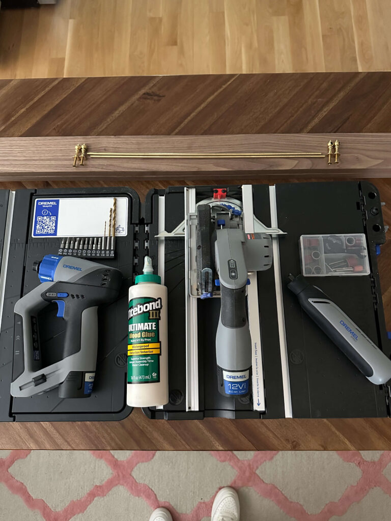
Why I Built This with the Dremel System
I’ll be upfront: this was my first time using any Dremel product. And I’m not exaggerating when I say it changed how I think about DIY builds entirely.
My workshop is in my garage, which because my house is built into a bank, is actually down a full flight of stairs from my kitchen. For a project this custom, that matters. I had originally planned to build three shelves, but while measuring in my kitchen I realized three shelves would be too tall for the clearance between my counter and cabinets. Having the Dremel Portable Saw Station set up right in my kitchen meant I could catch that before making a single cut and pivot to two shelves without wasting any material or making unnecessary trips up and down the stairs. Every decision on this build was thoughtful and intentional because I wasn’t rushed or working in a vacuum.


The Portable Saw Station handled all my straight cuts cleanly and with confidence. The Dremel Screwdriver made quick, precise work of drilling the pilot holes for the brass finials on each shelf. And the Dremel Tool with a sanding attachment genuinely saved this project. I used it to sand and even out the arched tops on each side piece after cutting them with my jigsaw. I’m still working on my jigsaw skills, and the arches weren’t perfectly symmetrical after the initial cuts. The Dremel got them there.
The whole system works smarter, not harder. Coming from someone who bought her first power tool just two years ago, I mean that sincerely. If the Dremel Portable Saw Station had existed then, it’s what I would have started with. It’s portable, beginner-friendly, and versatile enough to grow with you as your projects get more ambitious.
Full Supply List
Materials:
- 2 walnut boards, 3″ × 48″
- 2 thin brass rods
- 4 end cap finials
- Wood glue
- Danish Oil
- Clamps
- Rags
- Brackets for wall (optional)
Tools:
- Dremel Portable Saw Station
- Dremel Screwdriver
- Dremel Tool with sanding attachment
- Tape measure
- Safety glasses
- Jigsaw (only needed if you’re cutting curves)
Everything you need for this project!
How I Built a DIY Walnut Spice Rack: Step by Step
Step 1: Figure Out Your Measurements
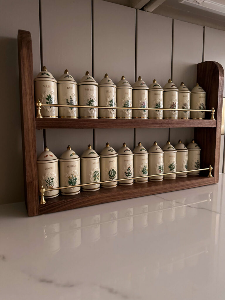
I have 24 Lenox Spice Garden jars and display 20 of them. Depending on your space, you may want three shelves, but for my needs I opted for two. The measurements below will fit ten jars on each shelf neatly.
My final dimensions:
- Shelf boards: 18¼ inches long
- Side pieces: 13½ inches tall
Step 2: Make Your Cuts
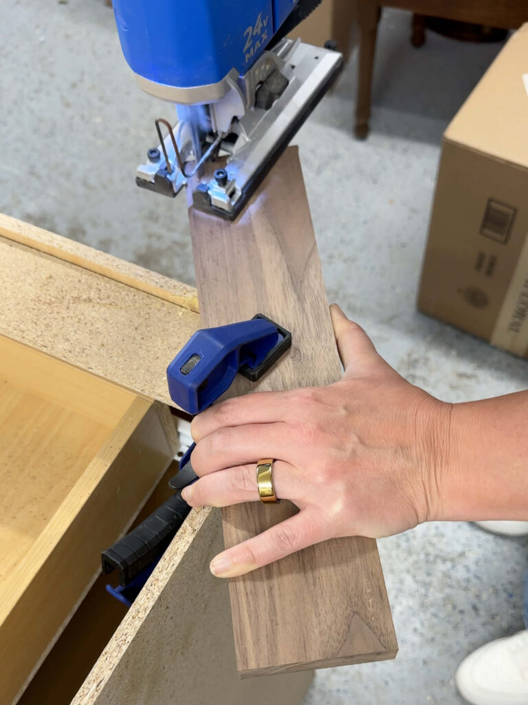
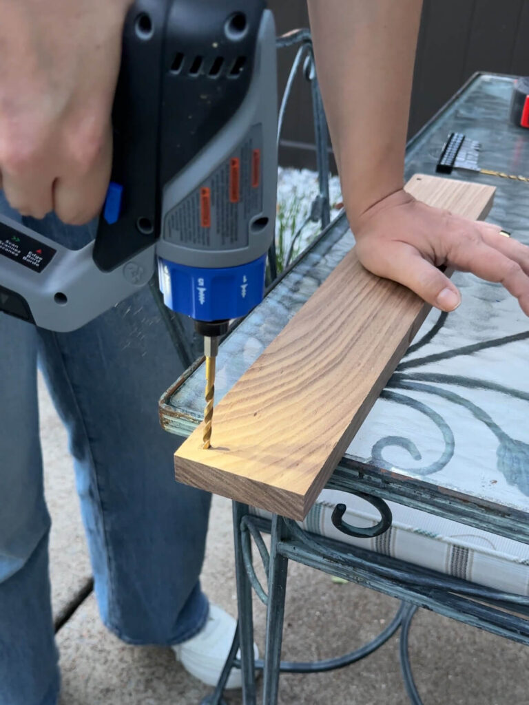
I used the Dremel Portable Saw Station to make clean, straight cuts on all four boards. If you want to add a little extra detail to your version, this tool can also handle mitered cuts or beveled edges. I kept mine straight and simple to let the walnut and brass do the talking.


Cutting made simple right in the kitchen thanks to the Dremel Portable Saw Station!
Step 3: Shape the Side Pieces
This is my favorite design detail on the whole rack. Once the side pieces were cut, I traced a curve along the top of each one using a small bowl as a guide, then cut along that line with my jigsaw. I’ll be the first to admit my jigsaw skills are still a work in progress! After the initial cuts, I used the Dremel Tool with a sanding attachment to smooth and round out the tops and make both sides uniform. It literally saved the day!
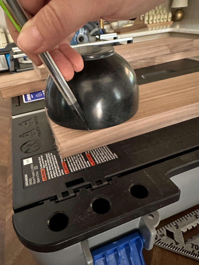
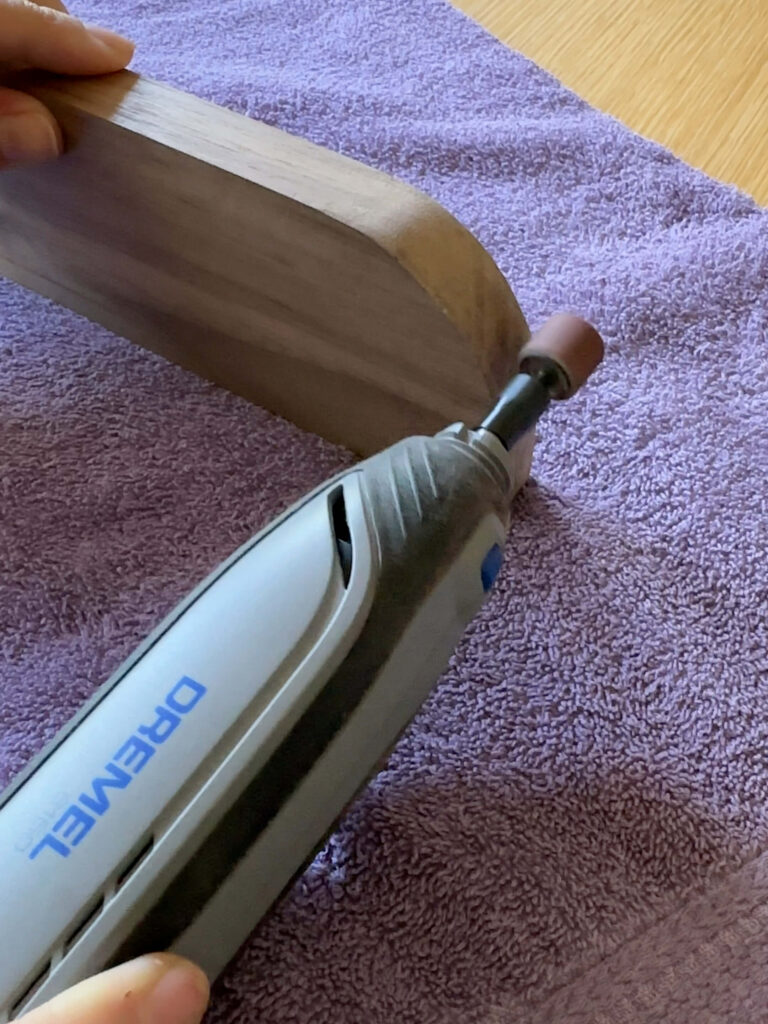
This Dremel saved my arches! It was so much easier to get matching rounded arches thanks to this!
Step 4: Plan the Brass Rod Placement
Before committing to anything, I assembled the brass finials and rods and laid them on the shelves to find the right placement. Once I was happy with the positioning, I marked my spots and drilled pilot holes using the Dremel Screwdriver. Note that you’ll want to drill your pilot holes before assembly since the spacing gets a bit tight. We’ll come back to install the finials and rod after the shelves are glued up.

Drill your pilot holes before assembling, otherwise you likely won’t have room to
Step 5: Apply the Finish
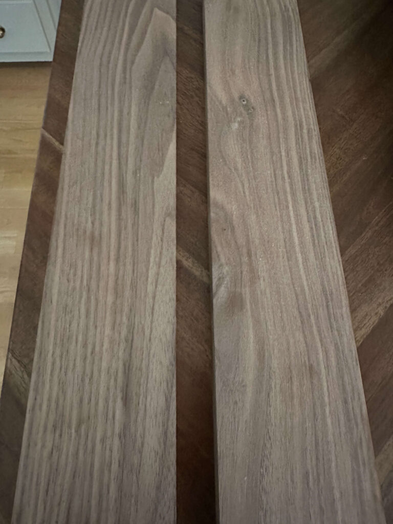
Before assembly, I finished all four board pieces with Danish oil. Walnut is so naturally beautiful that I didn’t want to cover it up, but I did want to deepen the grain a little and give it some protection. I did a lot of research before landing on Danish oil and it was absolutely the right call. I could not get over how beautiful the walnut grain looked after just one pass. I applied it with an old sock, wiped it on, and let it set for 12 hours.
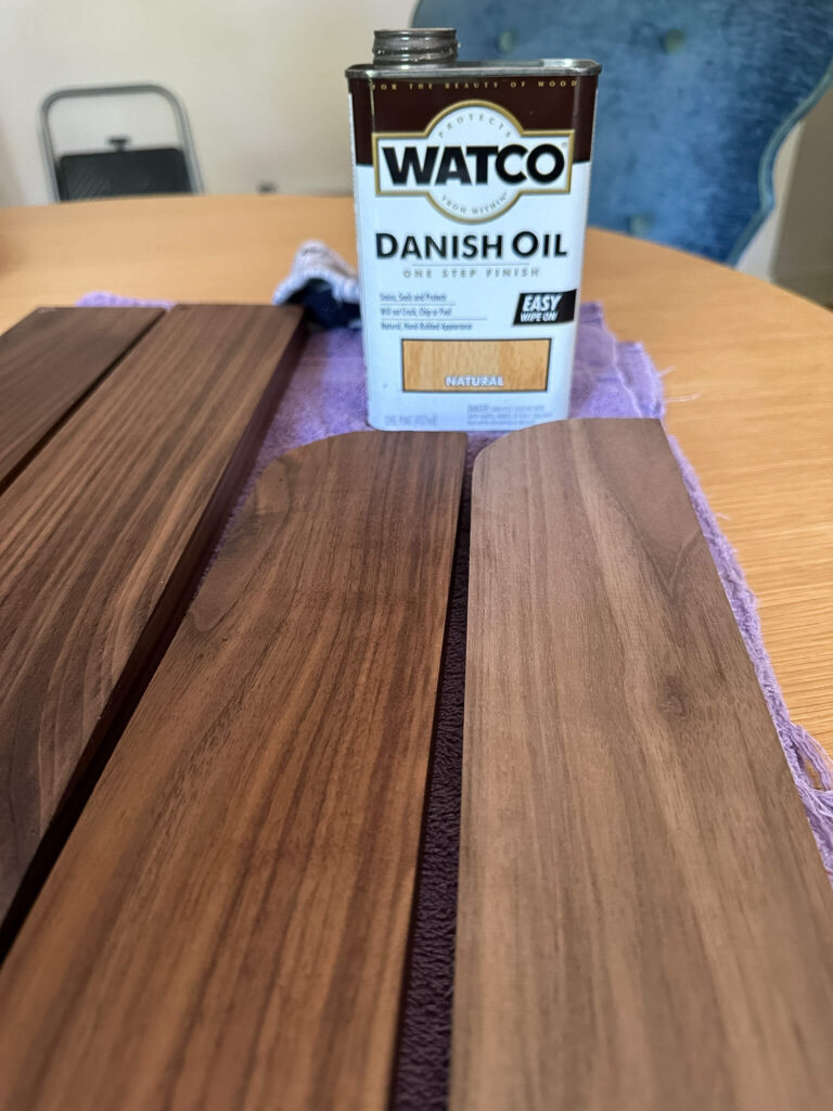
You can see the difference with and without the Danish Oil. It brought out the beauty of the grain!
A couple of alternatives if you’re working on a similar project: food-grade mineral oil is a great easy option (just plan to reapply periodically), or you could go with a wood wax or matte polyurethane if you want more durability.
Step 6: Assemble the Rack
Once the finish was dry, I applied wood glue to the ends of the bottom shelf board and clamped everything together. I used a couple of my spice jars to plan placement and then marked, glued and clamped my top shelf in place. Everything stayed clamped in place overnight before I touched it again.
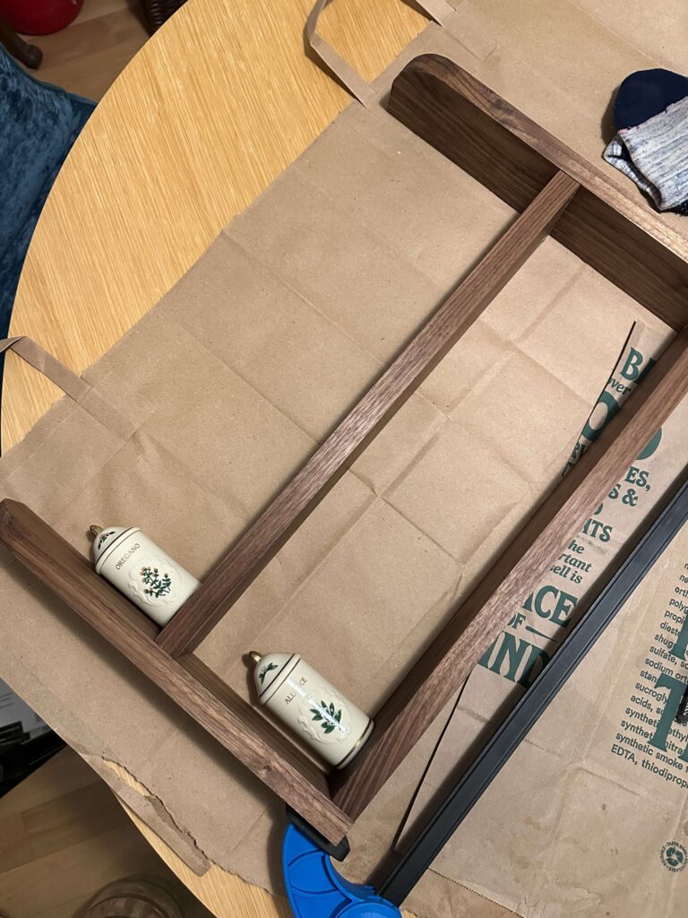

Make sure you have clamps so your wood glue gets fully cured. I just eyeballed the placement of the top shelf based on the jar height and it worked out great!
Because this is a smaller shelf, I didn’t feel the need to add brad nails for extra reinforcement since wood glue is incredibly strong on its own. That said, it’s always an option if you want the added peace of mind.
Step 7: Install the Brass Rods and Finials
To install the brass rods and finials, I found it easiest to insert one screw from underneath into the pilot hole, place the finial on top, and screw it into place so you can hold it in the right position as it tightens. From there, insert the brass rod into the finial, slide the second finial onto the other end of the rod, position it over the second pilot hole, and secure it from the bottom with a screwdriver. Repeat for the second shelf and you’re almost done!
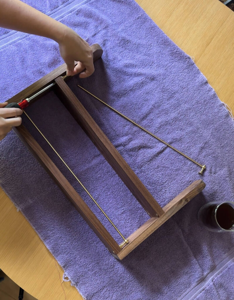
I used a regular screw driver to install the finials as I didn’t want to accidently apply too much force with a drill
There are different types of finials so if you end up building a longer shelf you may need to place one or two in the middle. In that case make sure you’re buying finials that have holes on each side for the rail to slide through. These ones are for the ends only.
Step 8: Mount to the Wall (Optional)
Depending on your backsplash, you may want to mount your spice rack to the wall for extra security. Both command hooks and D-ring hooks would work well here. I’ve placed my shelf in a spot that’s a bit out of the way, so I’m skipping this step for now, but it’s worth considering based on your setup.
The Finished Result
I am so proud of how this turned out! The walnut and brass combination feels warm and elevated, and it fits my kitchen in a way that a store-bought rack never would have. My Lenox Spice Garden jars finally have a home that feels as special as they are.

The best part? I built it right where it was going to live! I could check proportions, test placement, and make decisions in real time all because the Dremel Portable Saw Station made it easy to work in a small space without hauling everything to a garage or workshop.
If you’ve been on the hunt for your Lenox Spice Garden set (or Spice Village — same idea, slightly different era), or if you already have one and are looking for a display solution, I really hope this inspires you to just build something. And remember, you don’t have to have it all figured out before you start, you just have to start!
Supply List for Your DIY Walnut Spice Rack
- Walnut boards, 3″ × 48″ (×2)
- Thin brass rods (2)
- Brass end cap finials (4)
- Dremel Portable Saw Station
- Dremel Screwdriver
- Dremel Tool + sanding attachment
- Danish oil
- Wood glue
- Clamps
- Old rag for applying finish
- Measuring tape
- Safety glasses
- Jigsaw (only if you’re cutting curves)
Have questions about the build? Drop them in the comments — I’d love to help!
Related Woodworking Posts:
How to Measure, Cut and Install Crown Molding
Designing Box Molding for the Home Office
How I Designed Stacked Picture Frame Molding in my Primary Bedroom
read more
If you’ve been around for a minute, you already know this is a long time coming. I’ve been talking about renovating my laundry room for at least two years, and for a while, I was almost afraid to say it out loud in case I jinxed it. But it’s happening. Today I’m pulling back the curtain on my laundry room design plans, and I honestly can’t believe I’m finally typing those words.
Good Bones (Just… Not Much Else)
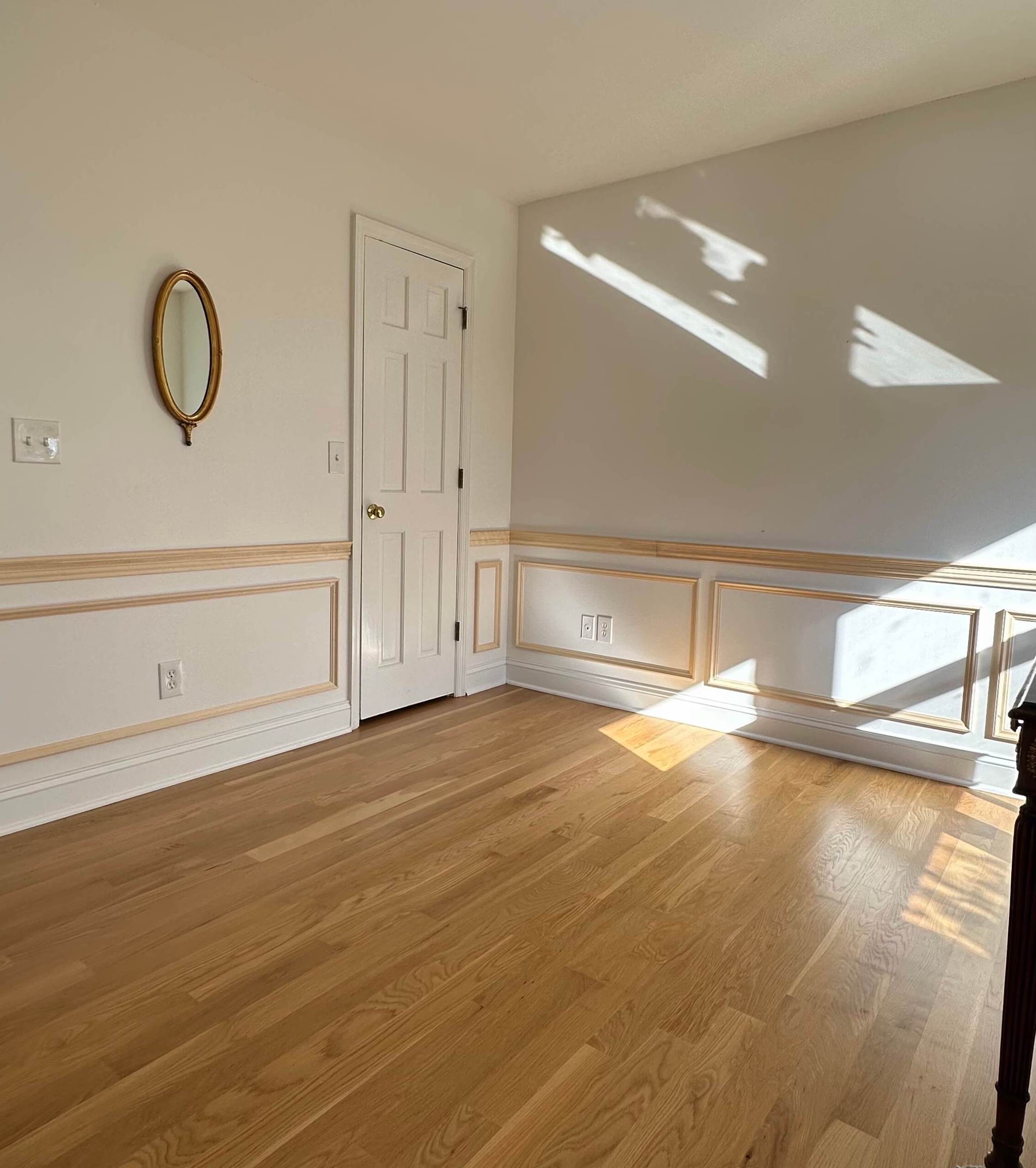
The laundry room is a great footprint, but doesn’t have much else to offer.
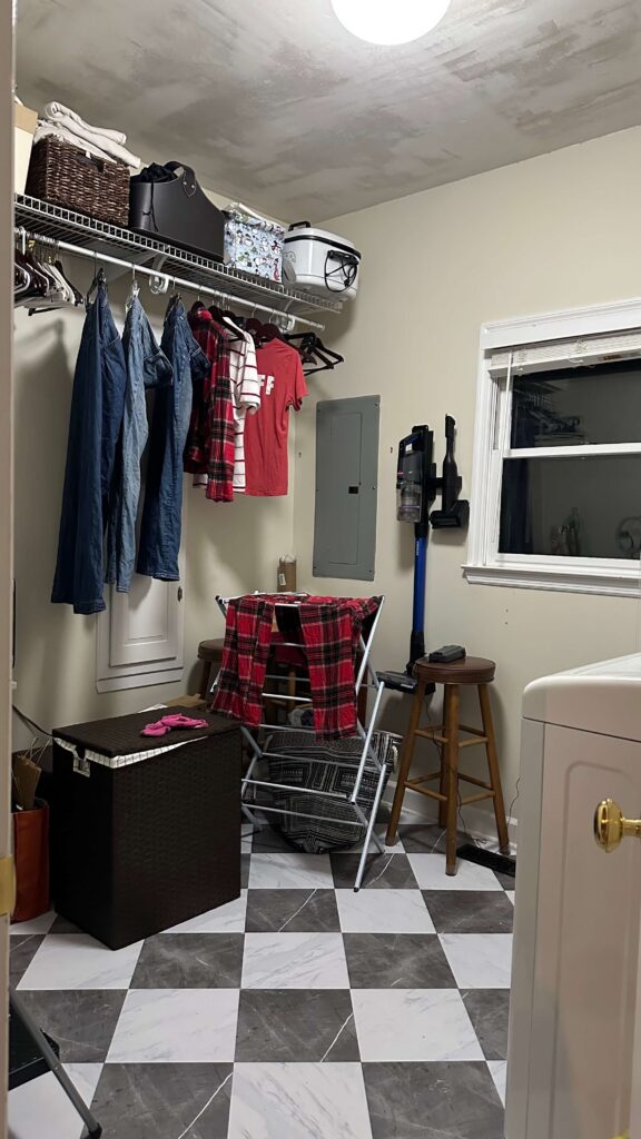
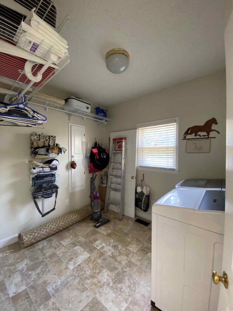
When I bought my house in 2018, the laundry room was (and still is) the ugliest room in the house. Wire shelving, old linoleum that looks dirty no matter how many times you clean it, an exposed electrical panel, beat-up baseboards. The works.
But what I saw when I walked in for the first time wasn’t any of that. I saw space. After years of doing laundry in a closet barely big enough to fit myself, this room felt like a luxury. It’s a generous 8’4″ x 9’9″, and that square footage has always felt full of potential.
The problem? I couldn’t figure out what to do with it. Because this room isn’t just a laundry room — it’s my command center. It houses cleaning supplies, paper goods, beach towels, wrapping paper, and serves as the drop zone for every package coming in and going out. Whatever I designed had to work hard.
So for a couple of years I did… the minimum. I scraped the popcorn ceiling, laid down peel-and-stick marble tiles, and painted the walls with leftover paint. It helped a little. But without any real organizational systems in place, it stayed beautifully chaotic.
A truly unfiltered photo for you. This is the worst room in the house.
Starting with Function, Not Aesthetics
My usual approach to a room is to lead with the fun stuff: wallpaper, paint, trim, decor. This room forced me to flip that completely.
The back wall is generous, and even with an ironing board awkwardly positioned two-thirds of the way down it (a stud placement situation I’ve never loved), I kept coming back to the same idea: floor-to-ceiling cabinetry. I needed somewhere to fold laundry, store the random odds and ends that currently live on the floor, and create a real solution for incoming and outgoing packages that have been cluttering up my kitchen.
I also wanted to build in a charging station. Not necessarily for phones, but for the rechargeable lamps, speakers, and miscellaneous things that always seem to stack up with nowhere to go. I think almost everyone can relate to this.
The Feature I Didn’t Know I Needed
Here’s where the design plans took an unexpected turn.
A few months ago I was listening to one of my favorite design podcasts (Dear Alice) and they started talking about building out dream dressing rooms. They kept mentioning a “styler” — an at-home dry cleaning machine. I had no idea something like this even existed. I paused the episode, opened my Notes app (where I keep a running list of every design idea I’ve ever had), made a note and immediately started researching.

This at home dry cleaning machine only requires an electrical hook-up and you fill the water vessel as needed, making it incredibly versatile!
The LG Styler is essentially a slim, mirrored steam closet. It holds up to three garments, has a pants-creasing function, and uses steam to sanitize and refresh clothing exactly like a dry cleaner would. It only needs a standard outlet, and the water reservoir slides out like a tray, so there’s no plumbing hookup required.
Once I saw it, I knew it had to be part of the laundry room design plans.
The Full Laundry Room Design Plan
With function mapped out and the LG Styler added to the equation, I started measuring and sketching. And I made one more decision: I’m building the cabinets myself.
All of my woodworking so far has been two-dimensional: box molding, wainscoting, crown molding. Building cabinets is a new skill, but it’s been on my list, and there’s no time like a full room renovation to figure it out.
Here’s what I’m planning:
- Floor-to-ceiling cabinetry spanning the entire back wall, approximately 8 feet long
- An open cabinet bay sized specifically to house the LG Styler
- A base cabinet with both doors and drawers, topped with a butcher block counter for folding, staging packages, and general life admin
- Tall, narrow pull-out cabinets to hide the brooms, mops, and scrub brushes that have never had a proper home
- A hidden ironing board solution built into the cabinetry
- Stacked upper cabinets finished with crown molding that runs the full perimeter of the room
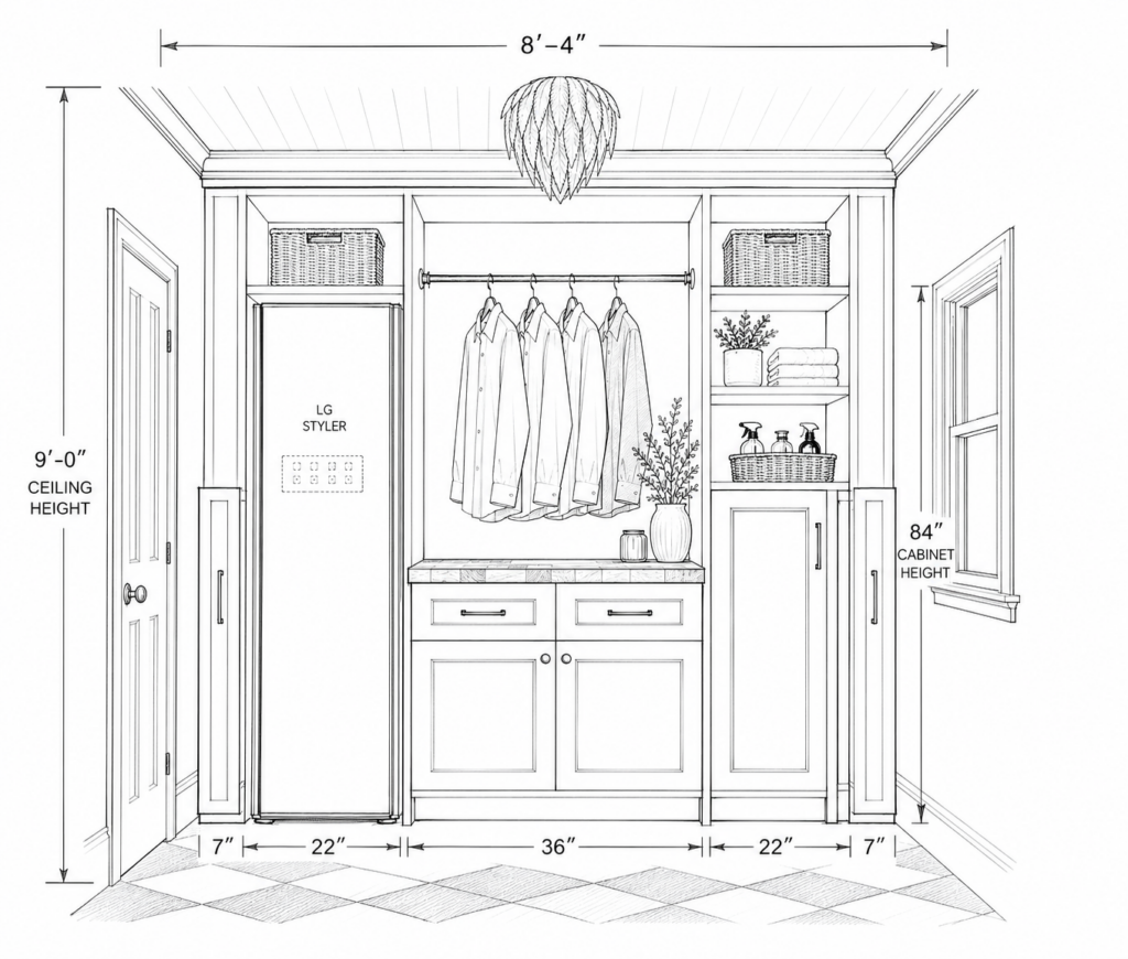
Floor to ceiling built-ins will solve for organization, and will also help me turn this room into more of a command center.
Color, Pattern, and the Pivot That Changed Everything
I spent a long time overthinking the aesthetic. I always imagined this room wallpapered floor to ceiling, and I kept getting stuck trying to find the perfect pattern.
One night I decided to stop shopping for wallpaper and start with a feeling instead. I asked myself: how do I want to feel when I walk in here? The answer was warm, romantic, and calm.
That reframe changed everything.
I’ve been wanting to bring pink into the house, and I’ve also been holding onto a deep burgundy that I haven’t found the right room for yet. Color blocking the two felt like the answer and to scratch the wallpaper itch, I’m adding a striped pattern to the ceiling. Paired with the checkered tile floor that’s already down, it’ll be a fun visual bookend from top to bottom.

It took me a long time to get to this design but I couldn’t be happier with the direction!
The room also needs to thread through to the kitchen and breakfast nook, which are the adjoining spaces so the warmth of the palette will carry that connection naturally.
What’s Next
The LG Styler is scheduled to arrive June 19th, which means this project is moving fast! After clearing out the room and demoing the baseboards, I’ll be getting straight to work on the cabinets and I’ll be documenting every step. Make sure you’re following along on socials so you don’t miss a beat!
This room has been neglected long enough. I can’t wait to finally give it the love it deserves and selfishly, I’m really ready for a command center that actually works.
Related:
DIY Home Renovation Project Plans for 2026
Wallpapering Tips for Beginners
How to Design & Install Picture Frame Molding (with chair rail)
The Latest on the Blog —
read more
When I bought this house, the exterior was one of those things I kept telling myself I’d get to eventually. The landscaping was overgrown. The trim was a tired yellowish cream that didn’t do the brick any favors. The garage door looked like it belonged on a different decade’s house. There was a lot to do, and every time I thought about tackling it, I felt immediately overwhelmed and moved on to something inside instead. What finally shifted things for me was deciding to approach this as a phased exterior home renovation. Not something that had to happen all at once, or even within one budget cycle. One project per year, done in the right order. That was the plan, and it changed everything.
Four years later, I’ve completed a series of projects that have the exterior of my house feeling more cohesive. Here’s everything I did, in the order I did it, and why the sequencing mattered just as much as the budget.

My House on Closing Day (2018)
Why a Phased Exterior Home Renovation Actually Works
I want to be upfront about something: exterior work does not come naturally to me. Interiors make sense to me intuitively — I understand how to layer a room, how to make a space feel right. But the outside of a house? It can feel like a different language, and an expensive one.
My house is three stories in the back. The original landscaping had been growing in the same beds for 30-plus years. Some of these projects genuinely required professionals, and others I just wasn’t ready for yet (financially or mentally).
Doing it in phases meant I could stay in the game. I wasn’t blowing my entire renovation budget in one season and then living with half-finished results. I could think carefully about each project, save for it intentionally, and execute it well. That approach also meant I learned as I went, which changed what I prioritized as the years passed.
Phase 1: The Garage Door
In 2023, the first thing I changed was the garage door. This felt like a small-ish decision at the time, but the impact was anything but.

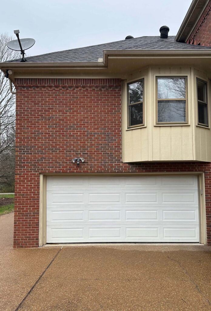
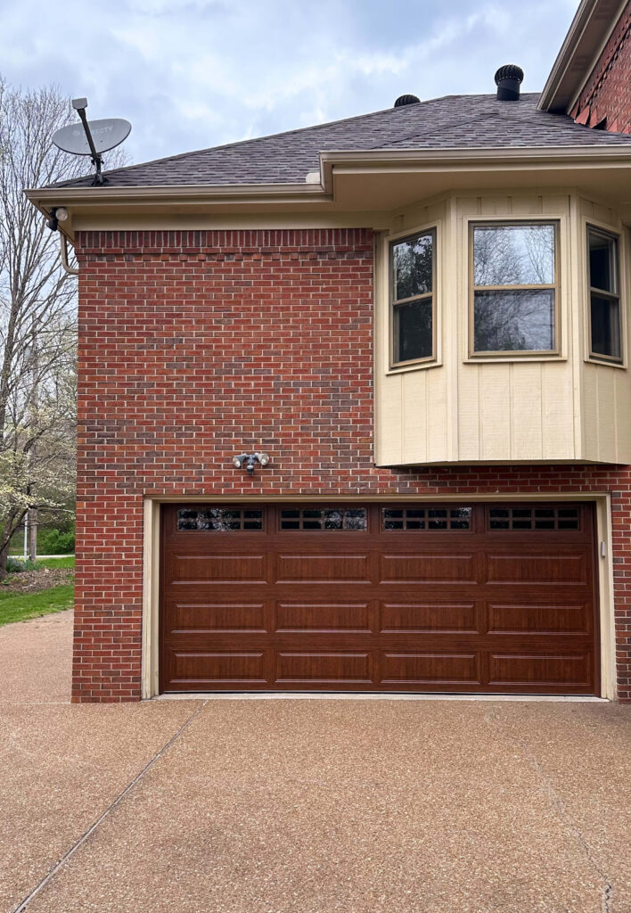
The original garage door, the band-aide door, and the final door
A garage door covers a significant portion of most homes. Luckily mine is in the back of the house but it was still dated and pulling the whole look down. Replacing it was the kind of change that made me walk outside, look at the house, and think “Oh, that’s what’s possible.”
One upgrade, and suddenly the rest of the exterior felt like it was worth investing in. It gave me the momentum to keep going.
Cost: $3,400 | Hired out
Phase 2: The Trim, the Gutters, and the Lanterns
The second year brought the biggest visual transformation, but was also the most expensive.
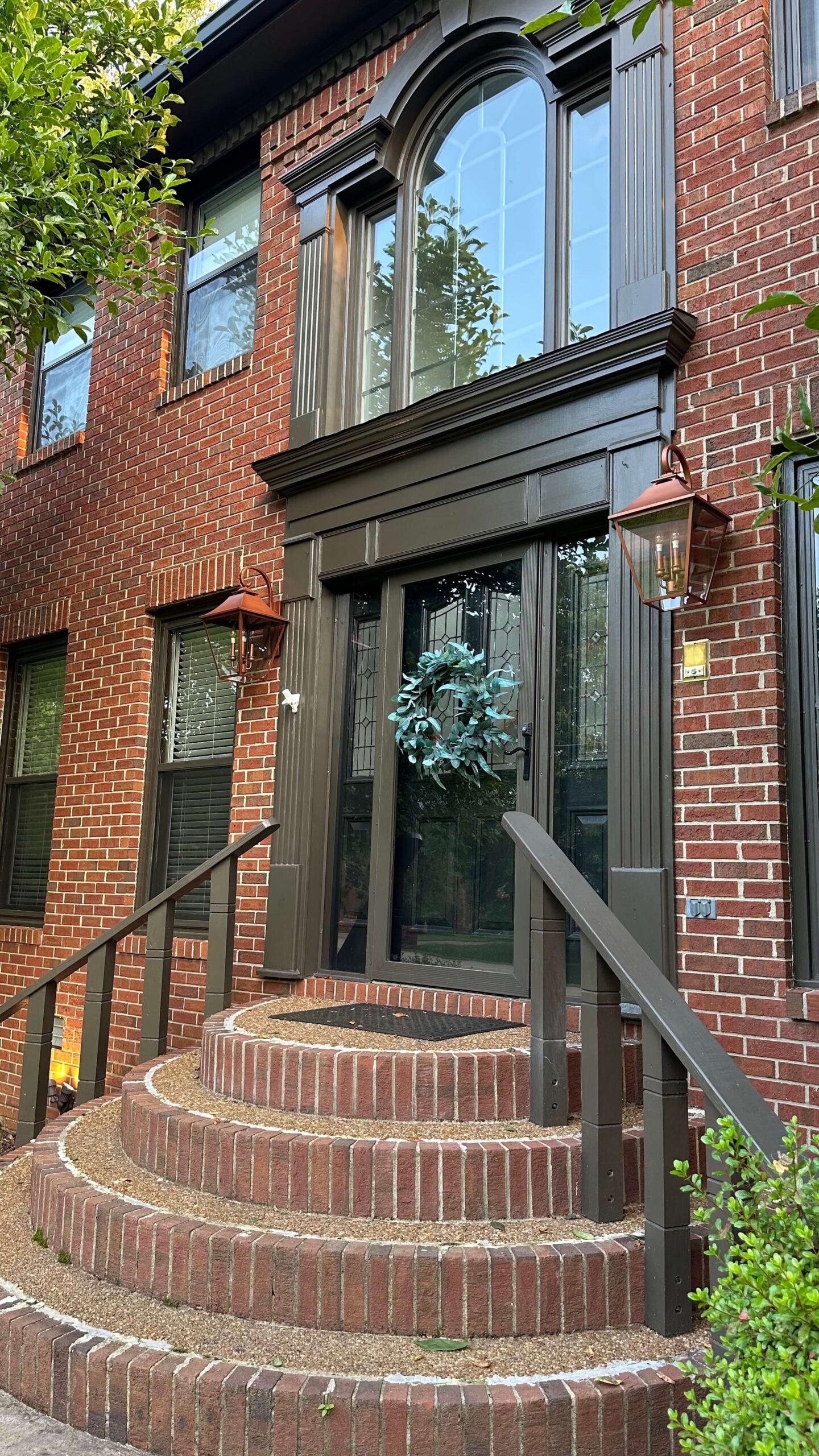
The original trim was that dated, yellowish cream that can make even a beautiful brick home look tired. Nothing about it was intentional. I went back and forth on colors for a while (more on that here) before landing on Black Fox by Sherwin Williams, a smoky gray-brown that reads almost black in certain light. Against the warm brick, it’s exactly the contrast I was looking for — moody without being heavy, modern without abandoning the character the house already had.


The front exterior before and after paint
One decision I felt very settled on: I left every single brick alone. No painting, no limewashing. The brick didn’t need to change, and making a permanent or difficult-to-reverse decision on it wasn’t something I was willing to do. Black Fox on the trim did all the work I needed it to do.


The front exterior before and after paint
While the painters were already on site and scaffolding was already up, I also replaced the gutters and added copper lanterns at the same entry points. If contractors are already there, make it count. Bundling those projects together saved me from paying for a separate mobilization, and the new gutters and lanterns finished the look in a way I couldn’t have planned for if I’d done them separately.
Painting: $6,669 | Gutters: $5,418 | Wood Rot repair: $1200 | Lanterns: $813 | All hired out
Phase 3: The Front Landscaping
The third phase of this phased exterior home renovation required patience more than anything else. And patience, it turns out, is one of the most budget-friendly tools available.


Before and After of the Front Landscaping
I waited until the painters were completely finished before I touched a single plant. That was a very deliberate choice. Contractors trample everything. If I had landscaped first, I would have watched all of it get damaged during the weeks of exterior work. Holding off protected the investment entirely.
When the time was right, I brought in professionals to completely redo the front. The original plantings were overgrown and had long since stopped looking like anything intentional. The new plan is layered and hydrangea-forward, and it works with the updated trim and lanterns in a way the old landscaping never could have. This is the phase where the front of the house stopped looking like a collection of separate decisions and started looking like one cohesive thing.

Cost: $6,800 | Hired out
The Back Patio
The back of my property is its own ongoing chapter.
When I got here, the back was a situation: pine trees that were slowly dying, weeds, a general sense of chaos, and a deck I’ve always known I’ll eventually replace entirely. The full vision for the back is still taking shape, and there are pieces of it that are years away from being realistic. Rather than wait for someday, I decided to tackle the flower beds around the pool with pavers and faux grass to give myself a clean, low maintenance zone.


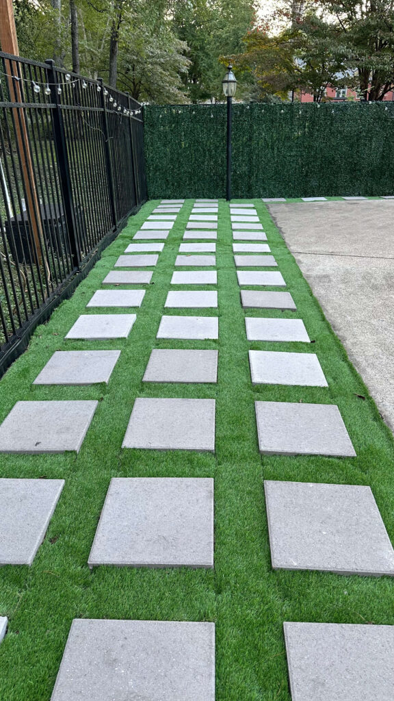
This isn’t my favorite DIY but it’s a good solution for the time being
I laid the pavers myself (you can read about it here), which kept this phase well under budget compared to everything else. Once they were in, I added some updated pool patio furniture and suddenly it felt like a posh hang. This is the first summer the back has felt like a destination rather than something I just look at through the window and feel guilty about.

The bigger vision is still out there. The deck will eventually come down and something better will go in its place. But in the meantime, this works — and “this works” is worth a lot.
Pavers: $1,748 | DIY
Full Cost Breakdown
Here’s every project across three years in one place:
| Year | Project | Cost | DIY or Hired |
|---|---|---|---|
| 2023 | Garage door | $3,400 | Hired |
| 2024 | Trim paint (Black Fox by SW) | $6,669 | Hired |
| 2024 | New gutters + wood rot | $6,618 | Hired |
| 2024 | Copper lanterns | $813 | Hired |
| 2025 | Front landscaping | $6,800 | Hired |
| 2025 | Back patio pavers | $1,748 | DIY |
| Total | $26,048 |
What’s Still on the List
There’s always a next chapter. Right now I’m working on turning the lawn from mostly weeds into actual grass — not glamorous, but necessary. The hydrangeas are getting established and need attention this season. And the back deck is still on the someday list, waiting for the right time and the right plan.
I don’t have a finished exterior. I have an evolving one, and that distinction makes it feel a lot less like a project and a lot more like a home.
How to Plan Your Own Phased Exterior Home Renovation
If you’re staring at the outside of your house feeling unsure where to begin, here’s what I’d tell you based on doing this slowly and intentionally over several years.
Start with the thing that’s doing the most damage. For me, that was the garage door. For you, it might be the front door, the trim color, or overgrown landscaping. Identify what’s dragging everything else down and start there. It builds momentum for everything that follows.
Think about order, not just budget. Sequence matters. If you’re planning exterior paint and landscaping, do the paint first. Contractors on site are an opportunity. If projects make logical sense together, bundle them.
Wait to landscape until after any major exterior work is done. Plants are the most vulnerable piece of the equation, and they don’t need to be sacrificed to the construction process.
Give yourself a long runway. One project per year, done thoughtfully, will get you somewhere beautiful. You don’t have to do it all at once, and trying to may be exactly what’s been keeping you stuck.
Your exterior doesn’t need to be finished. It just needs to be started.
Related Posts:
My New Copper Lanterns + Tips on Exterior Lighting Scale
Budget Friendly Pool Patio Refresh
How to Install Pavers & Artificial Turf Yourself
browse more posts
read more
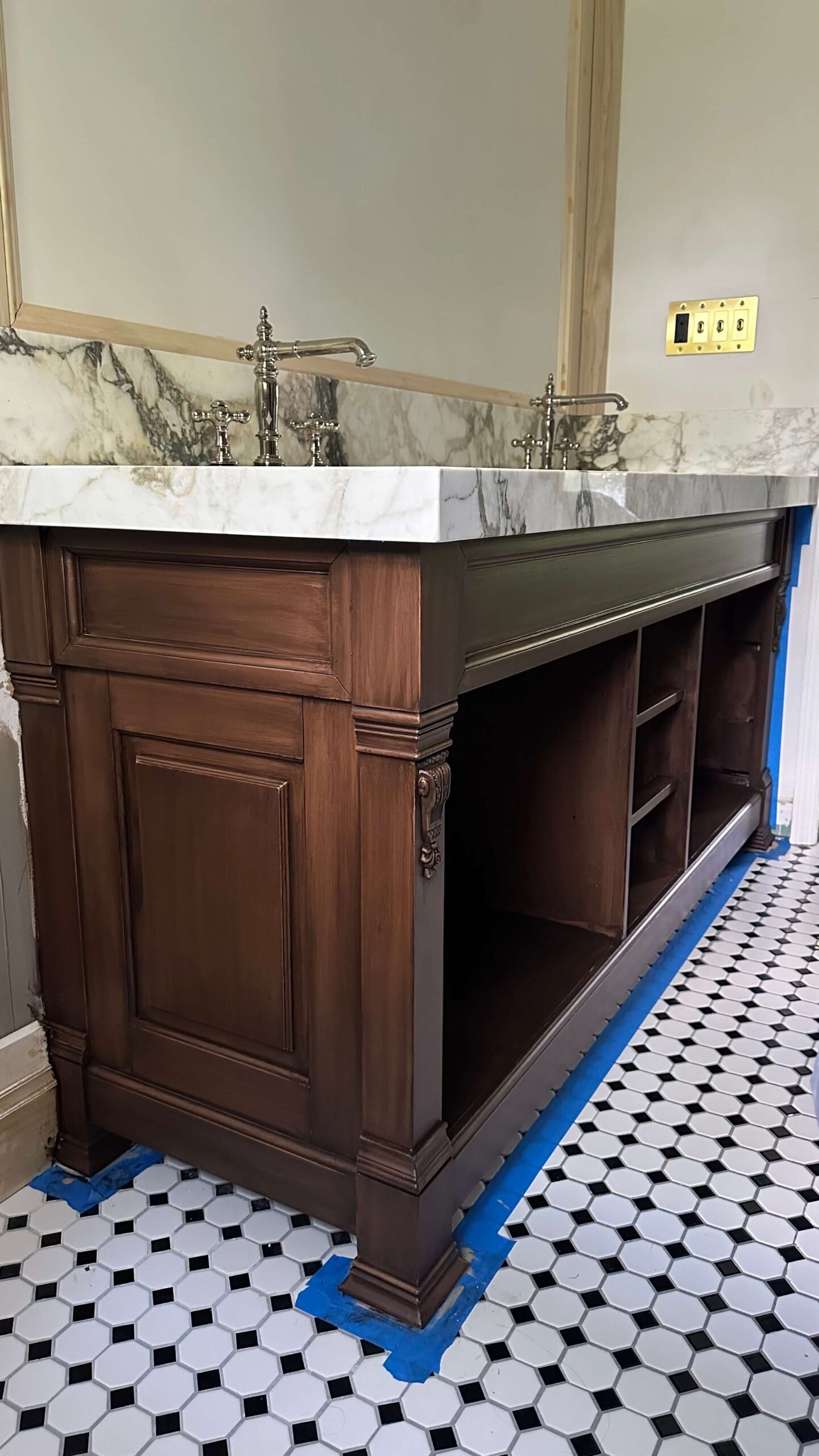
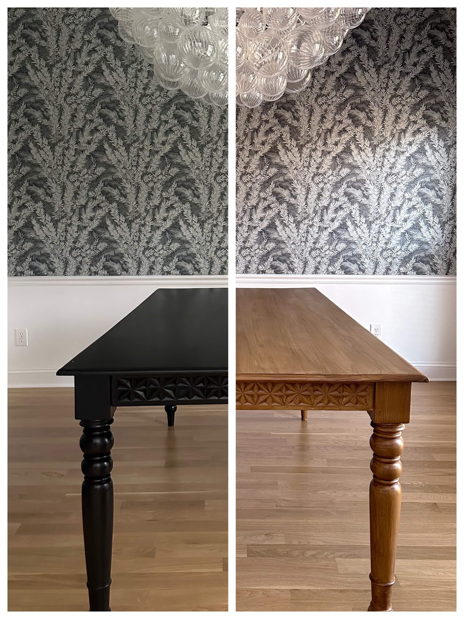
If you’ve been Googling Retique It Liquid Wood FAQ before committing to a project, you’ve landed in the right place. I’ve used this product twice — once to take my dining table from black to a warm pecan finish, and again to transform my bathroom vanity from black to walnut. Here are honest answers to every question I had along the way.
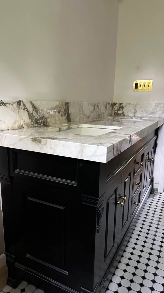
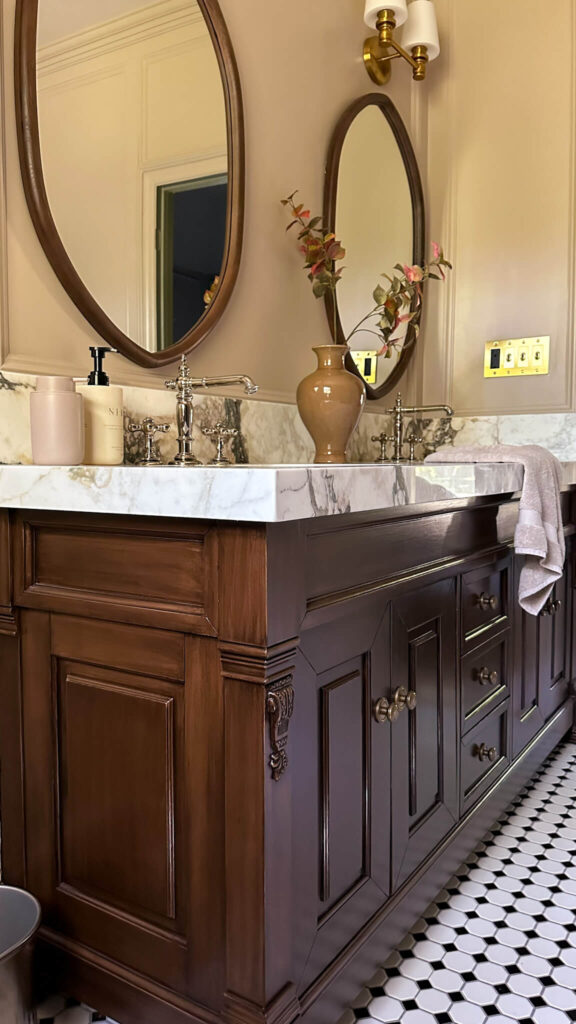
My primary bathroom vanity before and after using Liquid Wood
What is Retique It Liquid Wood and how does it work?
This is the most common question in any Retique It Liquid Wood FAQ, and it’s a fair one because the product does something that sounds a little too good to be true. Liquid Wood contains real wood particles suspended in a paint-like formula. You apply it over your existing furniture surface in several coats, and once it dries, the surface can be stained just like actual bare wood.
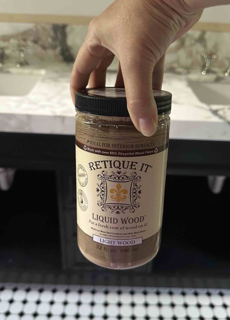
I used the light wood liquid wood for both of my projects and love it!
That means you skip the stripping, the sanding down to raw wood, and the mess that comes with traditional refinishing. You’re essentially building a new wood surface right on top of what’s already there.
Does Retique It Liquid Wood actually look like real wood?
Yes — and this is the part that still surprises me every time I walk past my dining table. Once the stain goes on, the result is genuinely convincing. My dining table now has a beautiful pecan finish, and my vanity has a rich walnut tone.
The grain pattern comes from how you apply the stain, which I’ll cover below. With a little practice on a scrap piece, you can get results that are hard to distinguish from the real thing.
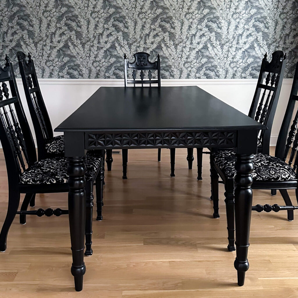
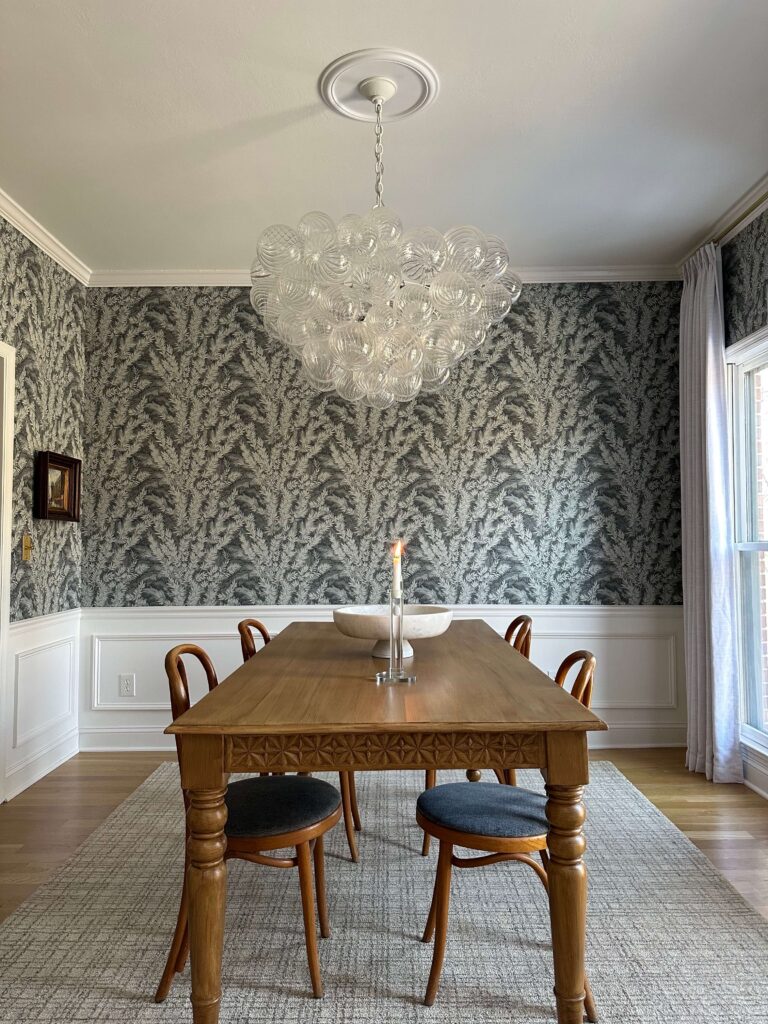
My dining room table before and after. I love that I could repurpose this table from my previous home with this easy DIY project!
Pro tip
Take “before” photos before you start. Once the transformation is complete, it’s honestly hard to believe it’s the same piece — and you’ll want the proof.
Do you have to sand before using Retique It Liquid Wood?
Not in the traditional sense. For both my projects, I cleaned the surface thoroughly and did a light scuff to help the product adhere. That’s really it. You’re not trying to get down to bare wood — you’re just giving the liquid wood something to grip.
Wipe away any dust afterward and you’re ready to start applying. This step is quick, low effort, and nothing like the labor-intensive sanding required by traditional refinishing methods.
How many coats of Retique It Liquid Wood do you need?
For both of my projects, I applied four to five coats. Because both pieces started out black, I wanted full, solid coverage before moving on to the stain. The darker your starting color, the more coats you’ll want to build up.
Don’t rush this part. Taking the time to build a solid base makes a noticeable difference in how evenly the stain absorbs and how convincing the final wood look is.
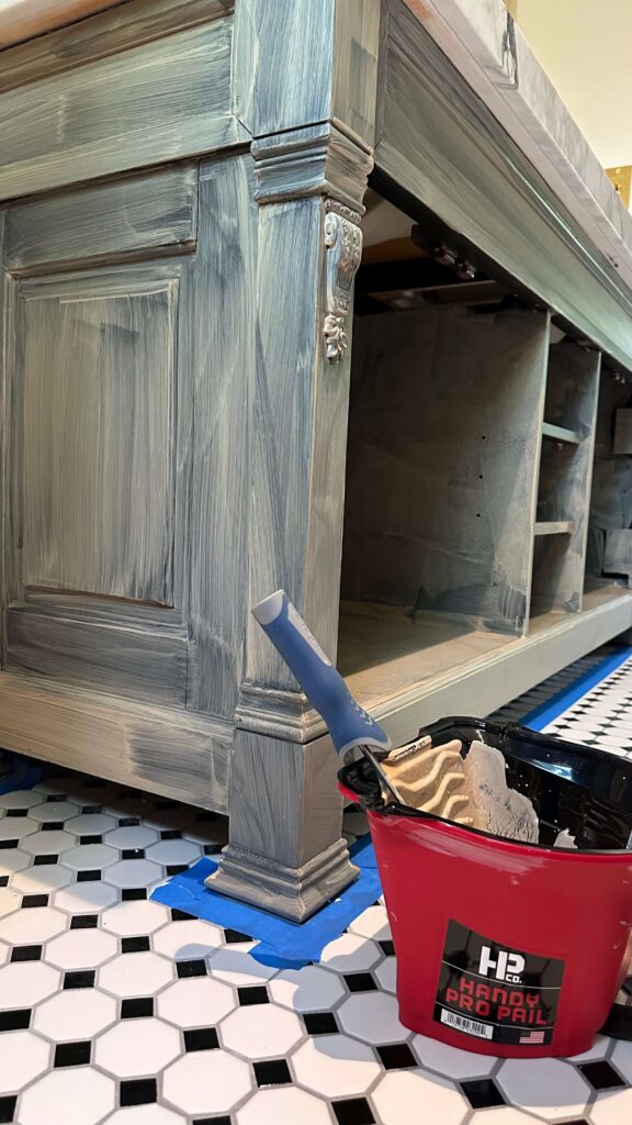
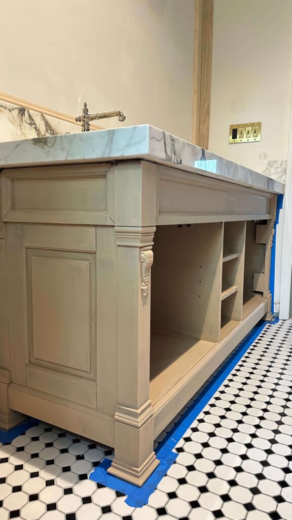
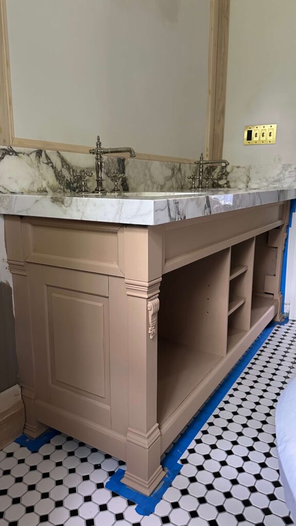
The progression of the bathroom vanity with liquid wood only
How do you choose a stain color and how does application affect the grain?
This is one of the most fun parts of the process. For my dining table I chose a pecan stain, which gave it a warm, lighter wood tone. This was actually a complete Retique It kit that I purchased. For the bathroom vanity I opted with the Retquite It Liquid Wood base coat, but went with a separate dark walnut gel stain on top. It reads darker and richer, and is perfect for that space.
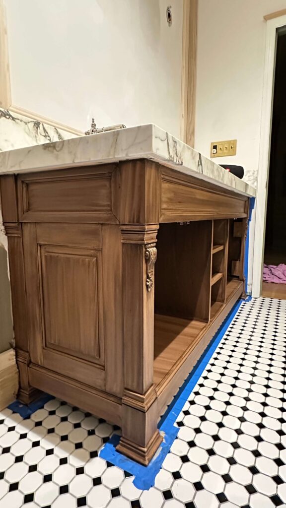

The bathroom vanity with one coat of stain, then two coats of dark walnut gel stain
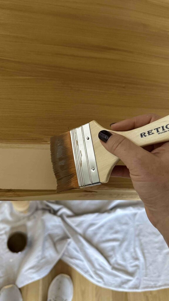
The dining room table stain was part of a tabletop kit and is the pecan color. Here’s a photo of the first coat being applied on top of the liquid wood.
The direction and pressure of your stain application creates the grain pattern. Applying in long, smooth strokes mimics natural wood grain. For curved surfaces like table legs, practice the motion on a scrap piece first — it makes a real difference.
- Apply liquid wood in thin, even coats and let each one dry fully before the next
- Once coverage is complete, apply gel stain using a brush or cloth in long, consistent strokes
- For darker stains, wipe away excess stain before it fully dries to control the depth of color
- Seal everything with a poly top coat — this step is non-negotiable
Is Retique It Liquid Wood beginner friendly?
Honestly, yes and this surprised me. Before my dining table project I read every Retique It Liquid Wood FAQ I could find because I was nervous about messing up a piece I loved. The actual process turned out to be much more forgiving than I expected.
The biggest learning curve is the stain application on curved or detailed surfaces, like legs or raised panel doors. But even that becomes easy once you’ve practiced a few strokes. If you’re new to furniture refinishing, this is one of the best products to start with.
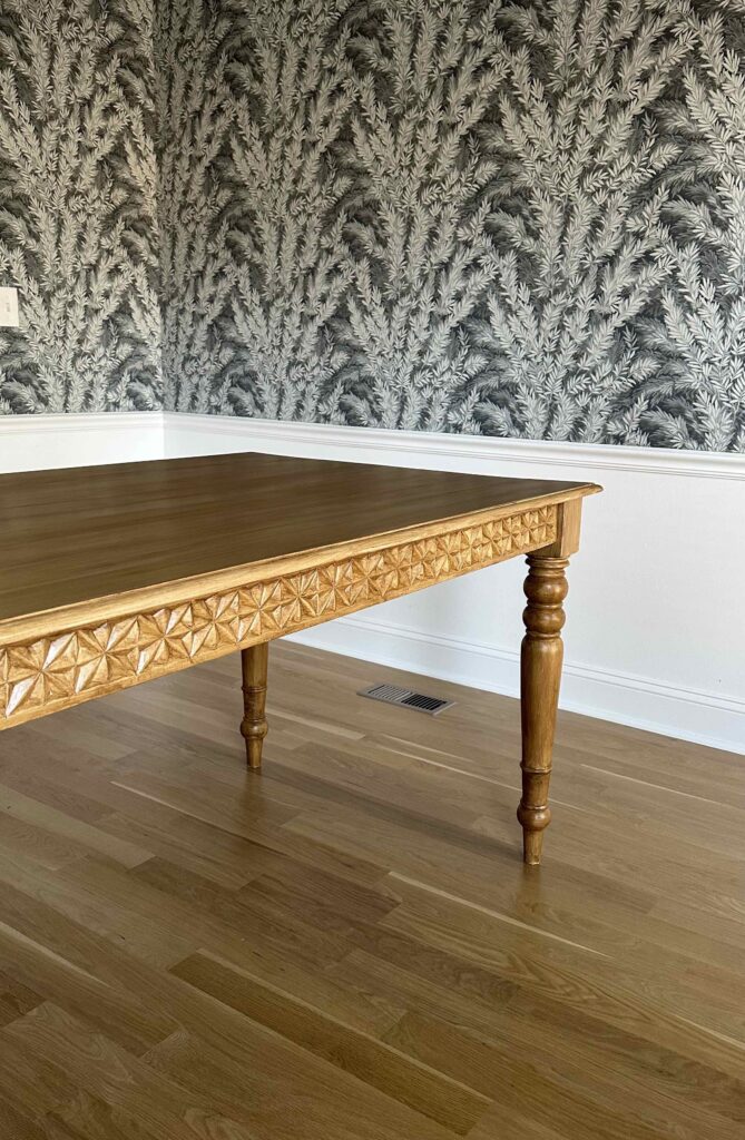
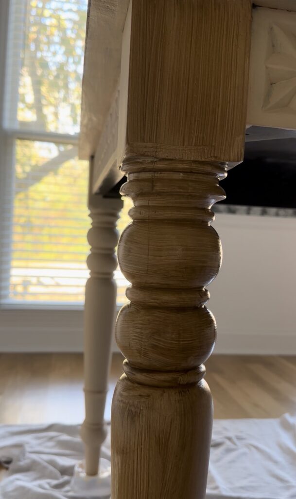
Flat surfaces are easier than detailed areas or legs. You’ll want to practice first!
Heads up
There’s a moment mid-project where the piece looks a little rough, as the liquid wood coats don’t look like much on their own. Trust the process. Once you get several coats of the liquid wood on, and the stain goes on, everything comes together quickly.
Do you need a top coat over Retique It Liquid Wood?
Yes. Full stop. The poly top coat is what protects the entire finish and makes it durable enough for daily use. Skipping it would leave the stained surface vulnerable to scratches, moisture, and wear.
For both my dining table and my bathroom vanity, the top coat is completely non-negotiable. Think of the liquid wood and stain as the look, and the top coat as the thing that keeps that look intact long term. I used a warm satin on my bathroom vanity and absolutely love the look of it – you can find it here.
How durable is Retique It Liquid Wood?
So far, both of my finished pieces have held up perfectly. The dining table is nearly three years in and shows zero signs of wear. The bathroom vanity is less than a year in, but takes a harder daily beating with dings from the hair dryer, kicks, water, etc and hasn’t had a single issue.
As long as you apply the top coat properly, the finish is genuinely durable for everyday furniture. This was one of my biggest concerns before starting, and I’m happy to report it hasn’t been a problem at all.
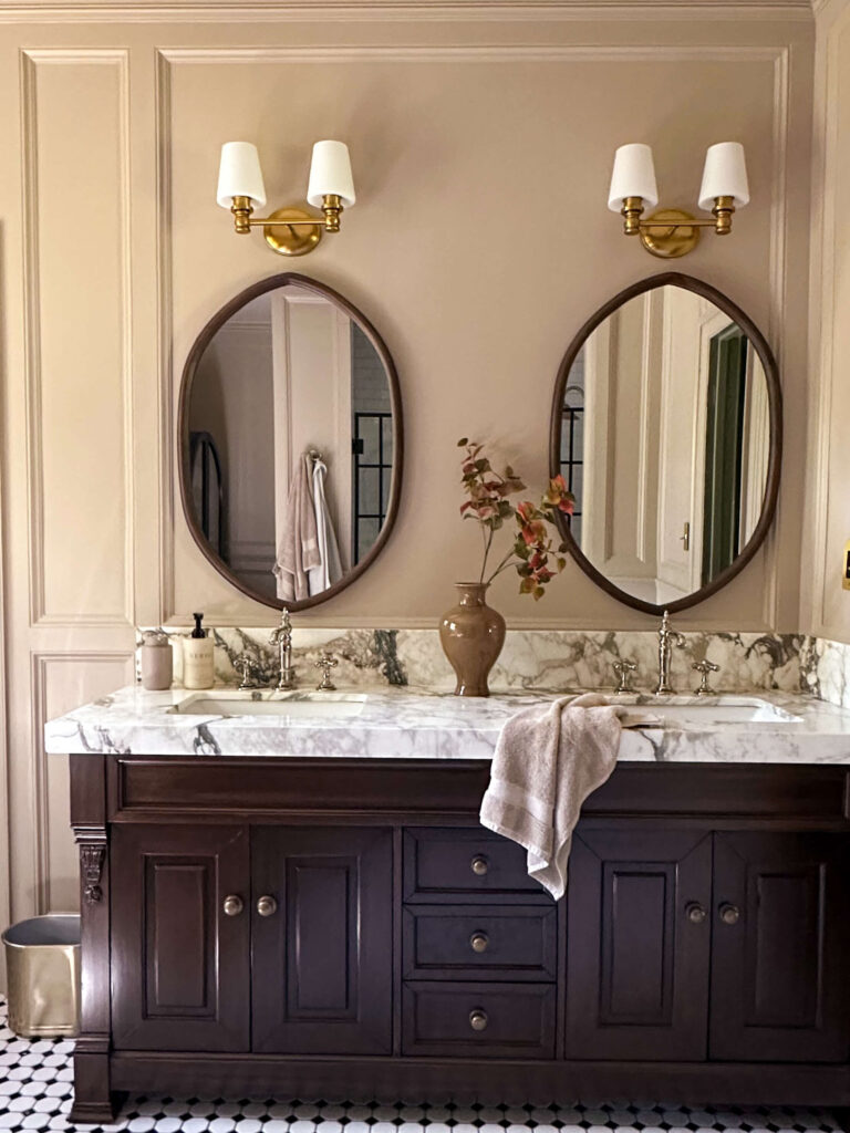
DIY Vanity Flipping Supplies | All Other Bathroom Sources
Retique It Liquid Wood FAQ: pros and cons
After two complete projects, here’s my honest breakdown.
Pros
- Results look like real wood — guests won’t know the difference
- Beginner friendly and very forgiving
- No stripping required — works over existing finishes
- Lets you keep furniture you already love
- Durable with proper top coat
Cons
- Looks worse before it looks better — trust the process
- Curved and detailed surfaces take practice
- Multiple coats required — not a one-day project
- Top coat is essential and can’t be skipped
Would I use Retique It Liquid Wood again?
Absolutely. After using it on a dining table (black to pecan) and a bathroom vanity (black to walnut), I’d reach for this product again without hesitation. I keep looking around my house for the next piece to try it on.
Hopefully this Retique It Liquid Wood FAQ answered everything you were wondering before starting your own project. If you want the full step-by-step breakdown, check out my dining table makeover post and my bathroom vanity makeover post below for photos of the full process from start to finish.
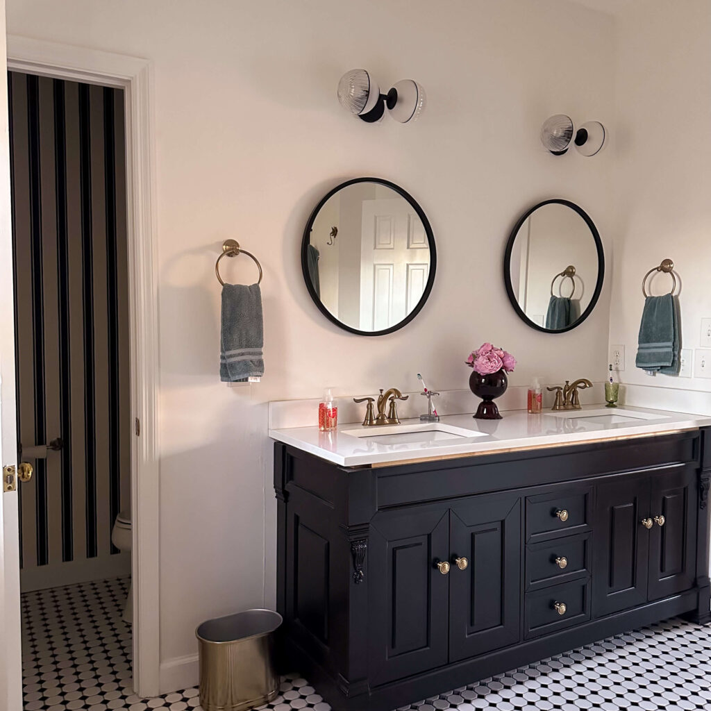
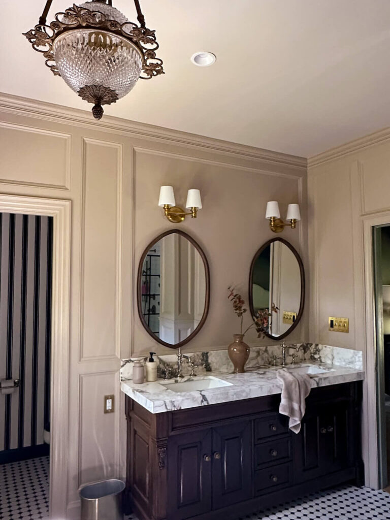
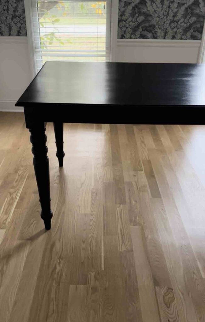

Related Posts:
How to Update Your Bathroom Vanity on a Budget
Retique It Tutorial (Flipping my Black Dining Room Table to a Pecan Finish)
Rub ‘n’ Buff Gold Guide (touching up and refinishing hardware, picture frames & more)
read more
If you’ve been putting off a garage or basement project because you’re not sure how to drill into concrete block to hang things, I completely get it. I avoided doing this in my own garage for years because it felt intimidating.
I had a corner where everything just piled up: shovels, rakes, brooms leaning against the wall with no real system. I knew hanging them would fix everything, but drilling into concrete block felt like a project I wasn’t ready for.

I’m so embarassed to share this but it was the reality!
Turns out, once you understand how to drill into concrete block to hang things, it’s actually a very straightforward DIY. And the payoff? Immediate.
Why Drilling Into Concrete Block Feels So Intimidating
Most of the hesitation comes from not knowing what’s actually required. It’s easy to assume you need special skills — or that you might crack or damage the wall if you do something wrong.
I thought the same thing.
But the real difference comes down to using the right tools and anchors designed specifically for masonry. Once you have those, the process becomes simple, repeatable, and honestly pretty satisfying.
What You Need to Drill Into Concrete Block to Hang Things
Before you start, having the right tools makes everything feel more controlled — and way less stressful.
Here’s what I used for this project:
Wall-mounted tool organizer (or whatever you’re hanging) – This method works for shelves, hooks, storage rails, pegboard systems — you name it.
Hammer drill – This is non-negotiable. A regular drill won’t cut it on concrete block. The hammer drill’s percussion action is what actually gets you through the material without a fight.
Masonry drill bit – Paired with the hammer drill, this bit is designed specifically for concrete and masonry. The bit you use will depend on the size of masonry screws you’re using.
Simpson Strong-Tie Titen Turbo masonry screws – These are the anchors I used, and I can’t recommend them enough. The Simpson Strong-Tie Titen Turbo screws are engineered specifically for concrete and masonry and create an incredibly strong, reliable hold. They drive directly into the hole — no separate anchor sleeve required.
Impact driver or drill – Used to drive the Simpson Strong-Tie Titen Turbo screws into place once your holes are drilled.
Tape measure and level – Essential for keeping everything straight and properly spaced.
Pencil – For marking your drill points clearly before you start.
Safety glasses and ear protection – Always. Drilling concrete creates fine dust and noise, so protect yourself.

Your organizing system will be unique to your project. Otherwise it’s a short list of tools needed for this project.
Step 1: Plan Your Layout Before You Drill
The first step in how to drill into concrete block to hang things is knowing exactly where everything will go before you pick up the drill.
Hold your organizer, shelf, or bracket up against the wall. Use a level to get it perfectly straight, then mark where each anchor point needs to go. Taking an extra minute here pays off big — this is what keeps the final install looking clean and intentional rather than slightly crooked.
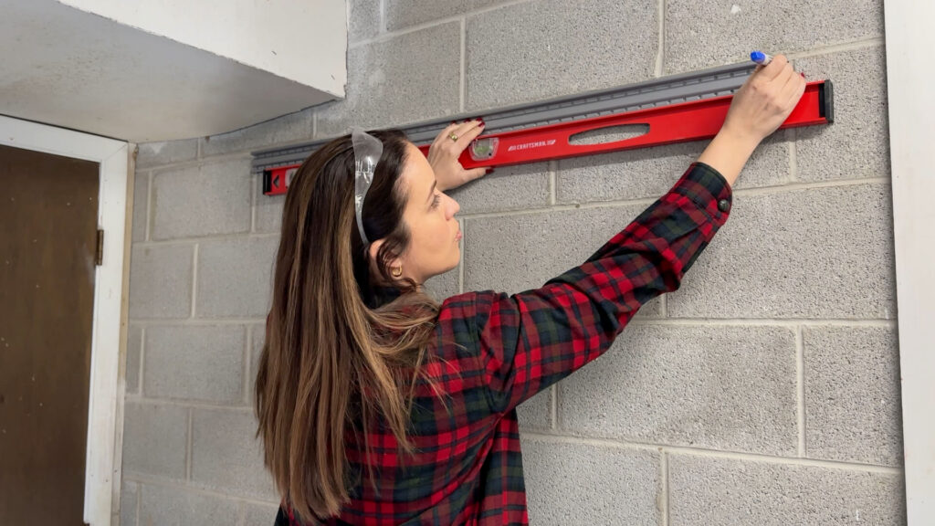
Step 2: Drill Pilot Holes Into the Concrete Block
This is usually the part people overthink the most, but it’s actually where things start to feel really satisfying.
When learning how to drill into concrete block to hang things, the key is to let the hammer drill do the work. Line your masonry bit up with your pencil mark, hold the drill steady and perpendicular to the wall, and start slowly before applying steady, even pressure.

You’ll see some fine dust as you drill — that’s completely normal. Just keep your depth consistent with what your anchors require. For Simpson Strong-Tie Titen Turbo screws, check the packaging for the recommended hole diameter and depth for your screw size.
Step 3: Drive In the Simpson Strong-Tie Titen Turbo Masonry Screws
Once your holes are drilled, it’s time to anchor everything in.
This is where the Simpson Strong-Tie Titen Turbo screws really shine. Unlike traditional anchor systems that require a separate sleeve or insert, the Titen Turbo drives directly into the concrete block hole with your impact driver or drill. Insert the screw, line it up, and drive it in.

The key here is to keep it straight and stop once the head sits flush with the wall. There’s no need to over-drive — once a Simpson Strong-Tie Titen Turbo screw is seated, it’s not going anywhere. You’ll feel the difference in how solid everything becomes right at this moment.
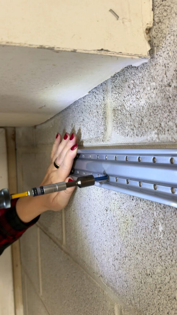
Step 4: Mount Your Item to the Wall
Now you’re ready to hang whatever you planned for.
In my case, it was a wall-mounted tool rail, but this exact process works for floating shelves, storage systems, utility hooks, or pegboard backings. Once you align your item with the driven Titen Turbo screws and secure it in place, the structure should feel rock solid immediately.
Step 5: Hang Your Things and Enjoy the Difference

This is the most satisfying part of the whole project.
I finally got all my tools up off the floor and onto the wall, and the space transformed instantly. It went from a cluttered corner to an organized, functional area I actually want to use. One of those projects where the before-and-after is almost hard to believe.
Just keep in mind that load capacity can vary based on your specific wall and installation, so always follow the load guidelines listed for your Simpson Strong-Tie Titen Turbo screw size and the item you’re mounting.
The Before and After
Before I figured out how to drill into concrete block to hang things, that corner of my garage felt like a lost cause.
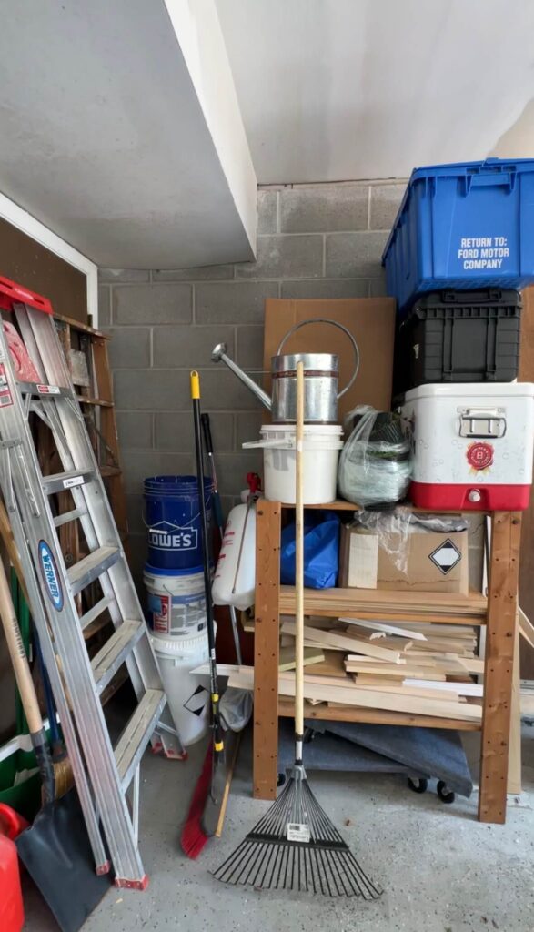
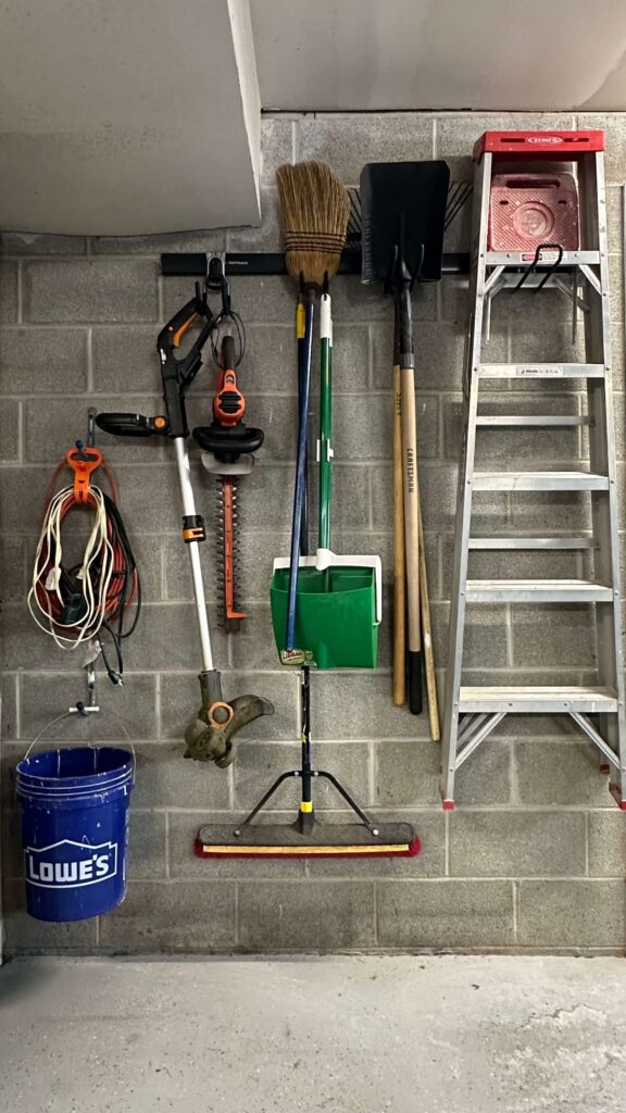
Now every tool has a place, the floor is clear, and it actually looks like a real workspace. And the biggest surprise? Realizing this wasn’t nearly as hard as I’d been making it out to be in my head.
Final Thoughts on How to Drill Into Concrete Block to Hang Things
If you’ve been avoiding this kind of project, you’re not alone. But you also don’t need to keep putting it off.
How to drill into concrete block to hang things really comes down to three things: the right drill, the right bit, and the right anchors. With a hammer drill, a masonry bit, and Simpson Strong-Tie Titen Turbo screws, the process is straightforward enough for a first-time DIYer and repeatable anywhere in your home.
Garages, basements, laundry rooms, workshops…once you know this technique, you’ll start seeing possibilities everywhere.
And more than anything, it builds confidence. This is exactly the kind of project that reminds you that you can handle more than you think.
Tools Used in This Project
- Hammer drill
- Masonry drill bit
- Simpson Strong-Tie Titen Turbo Screw Anchors
- Impact driver
- Tape measure
- Level
- Safety glasses
- Ear protection
- Wall-mounted tool organizer
Related DIY Posts:
How to Install DIY Pavers & Artificial Turf
How To Remove Glass Tile Backsplash (without removing the drywall)
How to Design & Install Wainscoting
The Latest on the Blog —
read more
If your home still feels heavy, dark, or stuck in winter, you’re not alone. Every year around this time, I start craving a shift, but not a full redesign. The good news? You don’t need one. Learning how to refresh your home for spring is less about buying all new decor and more about making a few thoughtful changes that completely transform how your space feels.
This is exactly what I do in my own home each season, and today I’m walking you through it, room by room.
Why Your Home Still Feels Like Winter
Even when the seasons change outside, our homes don’t automatically follow. Winter tends to linger indoors through heavier textures, deeper tones, and a general sense of visual weight that we stop noticing after a while.

If your home feels a little darker than you’d like, slightly heavy, or just not quite right, it’s rarely the entire room. More often, it’s a handful of elements that are still holding onto that winter feeling. The goal isn’t to strip everything back, but to gently shift the atmosphere so your home starts to feel aligned with the season again.
How to Refresh Your Home for Spring (Room by Room)
Living Room: Add Something Light and Organic
One of the simplest ways to refresh your home for spring is to bring in something organic. A vase of tulips, branches, or even grocery store flowers can instantly soften a space and introduce a sense of movement that wasn’t there before.
It doesn’t need to be elaborate. Even one small arrangement on a coffee table or side table can signal that seasonal shift and make the entire room feel more awake.
Shop: Tulips | Glass Vase | Coffee Table | Curtains | Peacock Fireplace Fan
This is also a natural place to incorporate pieces you already own in a new way, or to introduce a simple glass vase that lets the stems and water become part of the visual moment. If you need some ideas for faux stems you can find my favorites here!
Office: Swap Your Scent
This is one of the most overlooked ways to change how a space feels. Scent has a quiet but powerful influence, and switching from warm, woodsy winter candles to something lighter and fresher can completely shift the mood of a room.
In my own home, this is often the first change I make, especially in a space like my home office where I’m spending most of my time. A clean, citrusy or floral candle immediately makes a space feel brighter, even if nothing else has changed visually. It’s a small detail, but it has a disproportionate impact. Need some fresh ideas? I’m currently burning this Holy Rosewater & Basil candle which is so perfect for spring, and I’ve rounded up more of my favorite candles here!
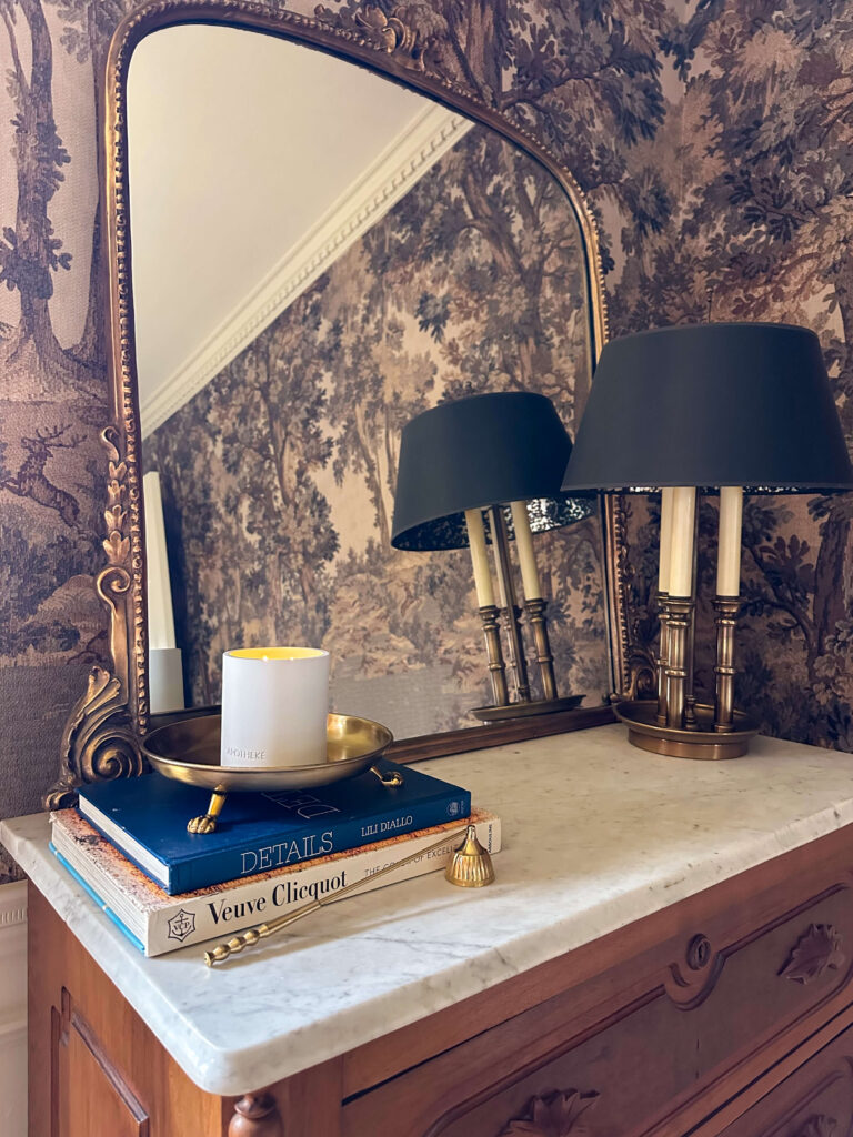
Shop: Holy Rosewater & Basil Candle | Brass Tray | Candle Snuffer | Mirror | Wallpaper | Dresser | Lamp (similar)
Kitchen: Style Something You Actually Use
Refreshing your home for spring doesn’t mean adding more decorative objects. In the kitchen especially, it often means using what you already have in a more intentional way.
A simple bowl of lemons or oranges on the counter adds color, life, and a sense of effortlessness that feels perfectly in season. It’s functional, it’s beautiful, and it doesn’t require buying something purely for display.
These are the kinds of shifts that make a home feel lived-in rather than styled.
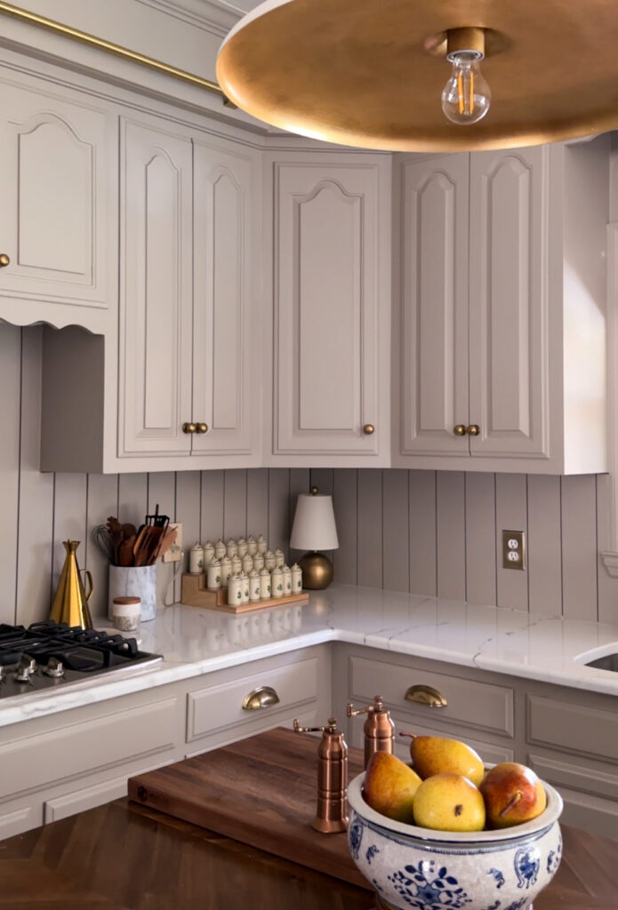
Shop: Light Fixture | Brass Lamp | Marble Canister | Wooden Spoons | Brass Olive Oil Cruet | Cabinet Color | Drawer Pulls
Bedroom: Lighten One Layer
You don’t need to completely change your bedding to make your bedroom feel like spring. In fact, the most effective approach is usually the simplest one.
Removing one heavy layer, swapping in a lighter bed blanket, or changing out pillow covers can make the entire room feel fresher without disrupting the overall design. It’s about creating a sense of ease, not starting from scratch.
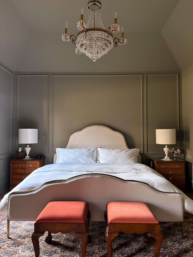
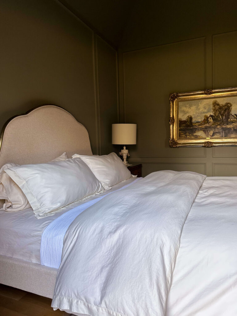
Shop: Bed | Duvet Set | White Bed Blanket | Sheets | Mattress | Lampshades | Lamps | Paint Color | Chandelier
This is one of those changes that you feel immediately, even if it’s subtle visually.
Powder Room: Add Something Unnecessary and Beautiful
Small spaces are where you can lean into beauty a little more freely. A powder room is the perfect place to add something that serves no purpose other than making you smile.
Fresh flowers, a sculptural vase, a pretty hand towel, or a small tray can elevate the entire space in seconds. These details might seem minor, but they’re often what make a home feel layered, personal, and complete.
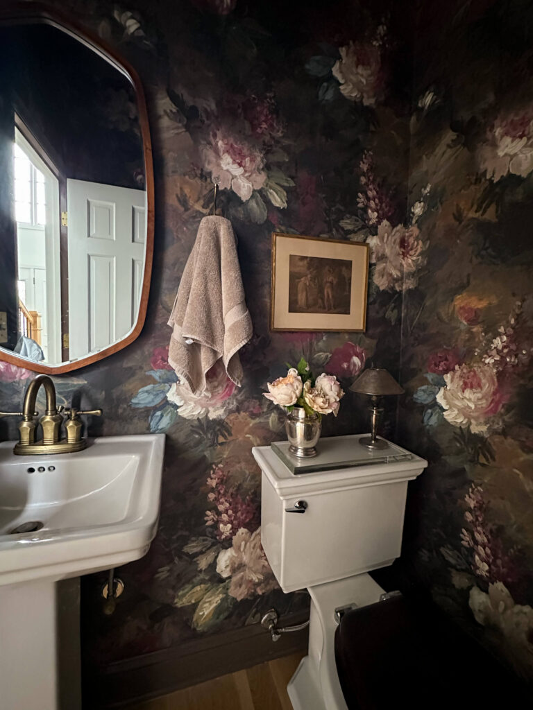
Shop: Wallpaper | Peonies | Silver Vase | Glass Tray | Toilet | Walnut Toilet Seat Cover | Hand Towel | Mirror
You Don’t Need to Redecorate for Spring
This is the part I come back to every year. Refreshing your home isn’t about replacing everything—it’s about shifting the feeling.
If you’re wondering how to refresh your home for spring, the answer is almost always smaller than you think. Start with one surface, one room, or one change. Let that be enough.
Those small shifts build on each other, and before you know it, your entire home feels different.
Shop the Details
If you’re looking for a handful of fresh pieces to rotate into your home, I’ve linked some simple options here so you can recreate the same feeling in your own home. From simple florals to fresh spring candles and everyday elevated kitchen styling pieces, these are the items I reach for year after year.
Shop: Wallpaper | Bubble Chandelier | Draperies | Crystal Candlesticks | Elevated Marble Bowl | Rug
Closing Thought on How to Refresh Your Home for Spring
Refreshing your home for spring doesn’t require a full reset. It’s usually just a few small, thoughtful changes that bring everything back to life.
And in my experience, those are the changes that last.
Related Posts You May Love
If you’re drawn to this layered, lived-in approach, you might also enjoy a few of my other posts where I go deeper into styling and sourcing.
I share more about how I approach bookshelf styling in a way that feels collected rather than cluttered, as well as my favorite vintage finds that bring character into a home. If you’re just getting started with DIY, I also have a guide to beginner-friendly projects that make a real impact without feeling overwhelming.
Beginner Friendly (and Renter Friendly) Easy DIY Projects
browse more posts
read more
If you’ve ever found yourself wondering about the paint colors in my home, you’re not alone. I get these questions constantly in my messages and comments. What is the green paint color in your bedroom? What color are your kitchen cabinets? Is the tv room blue or black? Instead of answering one by one, I’m sharing a complete, search friendly guide to the paint colors in my home so you can find everything in one place.
When I bought this house in 2018, I spent the first year undoing a lot of what the previous owners had done. They loved a farmhouse aesthetic and I very much do not. Rather than trying to design around finishes that didn’t feel like me, I painted almost everything white. I needed a neutral reset so I could see clearly and create a cohesive plan. That fresh start gave me the clarity to thoughtfully choose the paint colors in my home over time.
Since then, the paint colors in my home have evolved room by room. Some choices were bold and dramatic. Others were warm and classic. Each one was selected with lighting, undertones, and flow in mind. Let’s walk through every space.
Dining Room: Dujour by Valspar

Shop: Wallpaper | Bubble Chandelier | Rug | Curtains | Paint | Box Trim
The dining room is painted Dujour by Valspar, a warm neutral white. This room also faces north, so selecting a white with warmth was important. Cooler whites can feel stark in north facing light.
Even after adding a bold botanical wallpaper and picture frame molding, I kept Dujour as the foundation. It compliments the wallpaper beautifully and keeps the room feeling balanced. If you’re searching for a versatile white that works in low light rooms, this is a strong contender.
Shop: Crystal Candlesticks | Marble Display Dish | Brass Toggle Light Switch | Wallpaper | Bubble Chandelier | Rug | Curtains | Paint | Box Trim
Cozy TV Room: Lead Gray by Benjamin Moore

Shop: Paint Color | Bookshelf Lamps | Black Lampshades | Glass Display Boxes (similar) | Brass Picture Easel | Onyx Horse Bookends | Flameless Candles
The cozy TV room was the first space where I took a real design risk with the paint colors in my home. I had seen Lead Gray by Benjamin Moore in a catalog and couldn’t stop thinking about it. It’s a true chameleon color that shifts depending on the light.
This room is north facing, which means the light naturally pulls cooler. Even though it’s called gray, Lead Gray has blue undertones and often reads more blue than gray in this space.
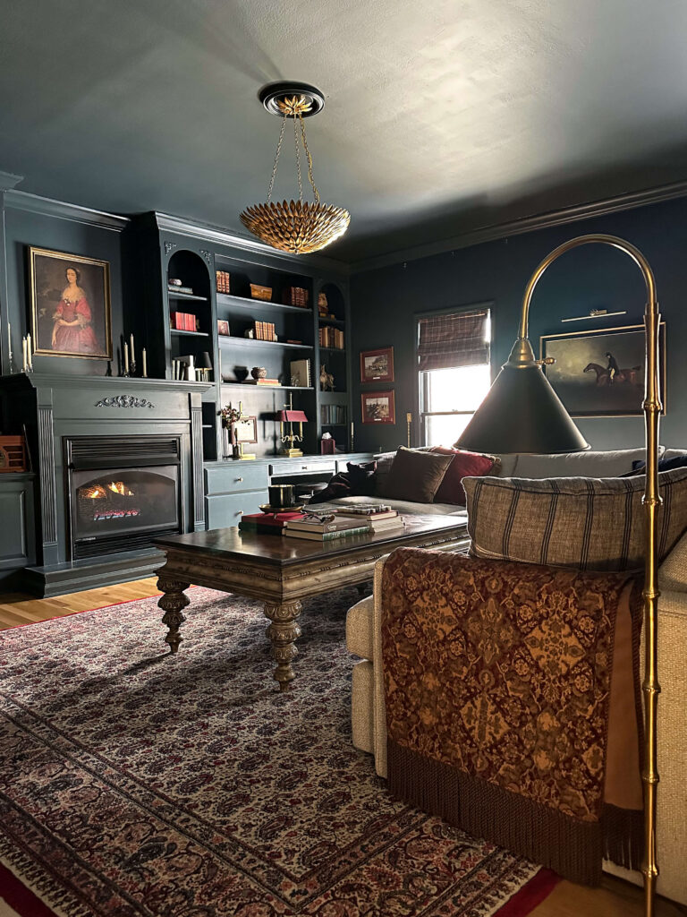
Shop: Gold Chandelier | Floor Lamp (similar) | Sectional | Roman Shades | Picture Frame Lamp | Equestrian Painting | Coffee Table Books
I originally painted only the built ins, which were an outdated wood tone and painting felt like the simplest update at the time. After living with it, I realized the room needed more depth. Eventually I worked up the nerve to fully color drench the space, and it completely transformed the room.
It’s now one of my favorite spaces in the house and one of the most asked about paint colors in my home, especially during the holidays when everything stands out against that rich backdrop.
Back Entry: Accessible Beige by Sherwin-Williams
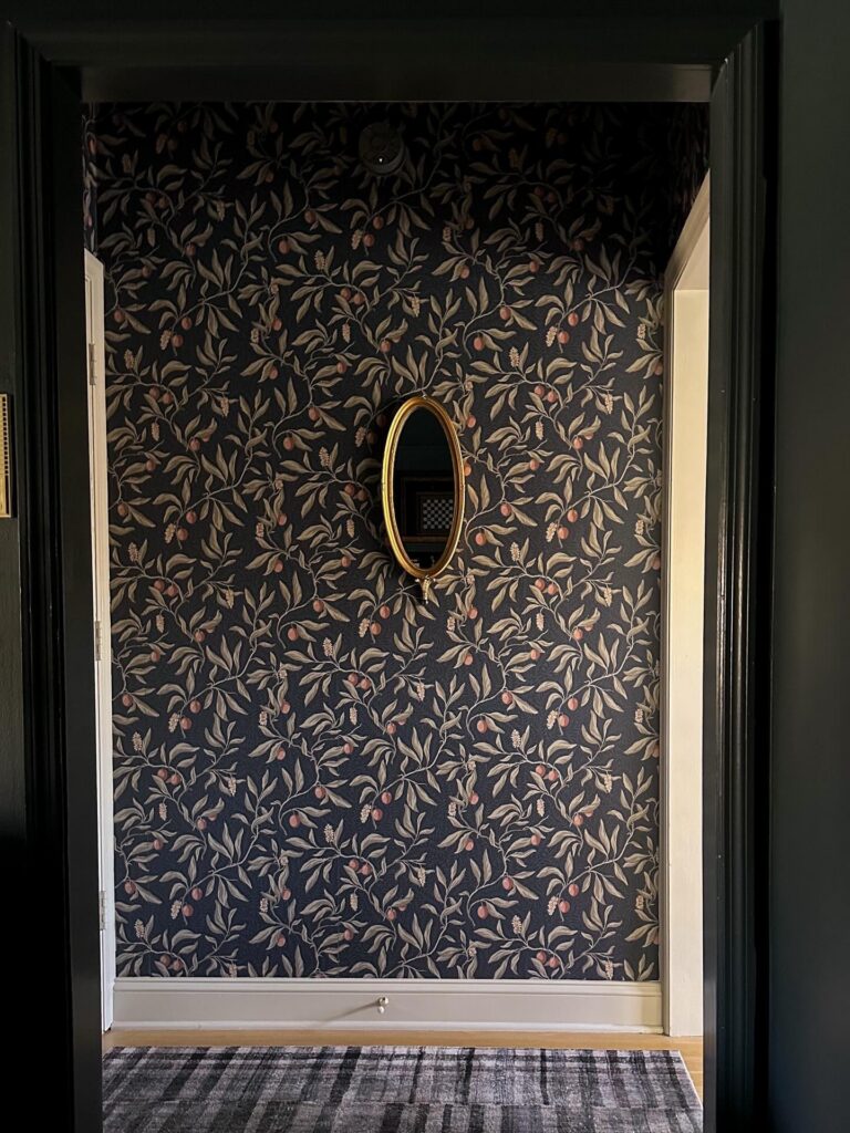
Shop: Wallpaper | Trim Color | Mirror (similar) | Rug
The back entry connects the kitchen and the cozy TV room and is one of the most used areas in the house. When I added wallpaper in this space, I needed a neutral that would tie everything together.
I chose Accessible Beige by Sherwin-Williams, which I had used at my previous home, and in two rooms upstairs. It’s a dependable warm neutral that works well in transitional spaces.
All of the trim, the door, and the ceiling are painted Accessible Beige. Using the same color throughout creates a cohesive and welcoming feel in this smaller area.
Kitchen Cabinets: Stone Hearth by Benjamin Moore
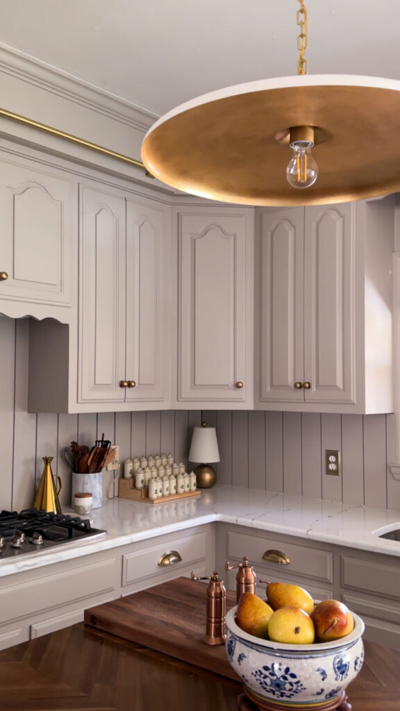
Shop: Cabinet Color | Piatto Pendant | Brass Lamp | Spice Jar Stadium | Olive Oil Cruet | Marble Spoon Holder | Wooden Spoons | Brass Outlet Cover
One of the most frequently searched paint colors in my home is my kitchen cabinet color. During my budget friendly kitchen renovation, I decided to refinish the existing cabinets versus gutting them and buying new.
I was looking for the perfect taupe that felt warm and elevated without going too dark, and Stone Hearth by Benjamin Moore was the perfect choice. This side of the kitchen does not receive abundant natural light, so balance was key.
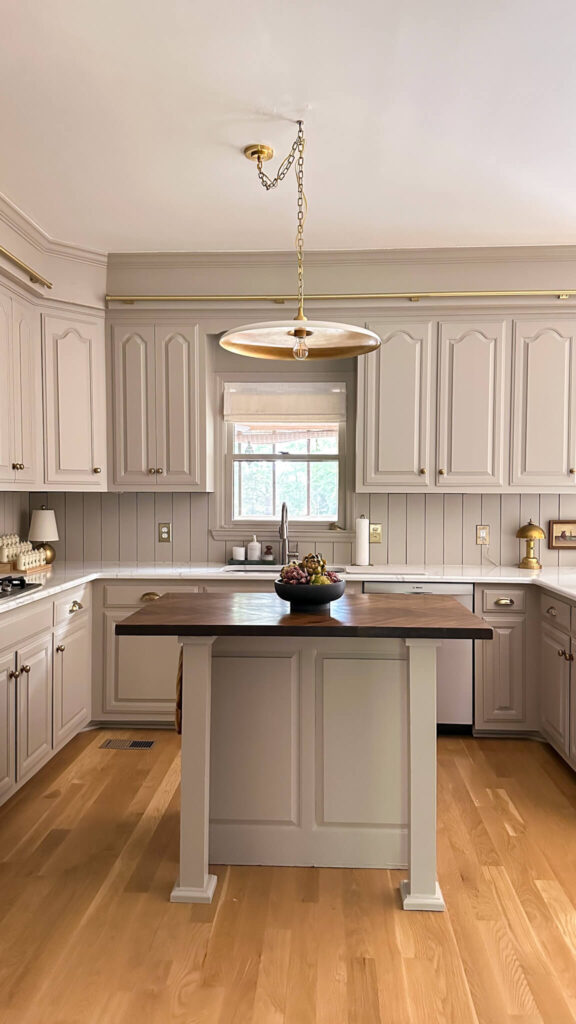
Shop: Cabinet Color | Piatto Pendant | Roman Shades | Brass Outlet Cover | Backsplash Paneling | Artichokes | Brass Totie Task Lamp
Stone Hearth is beautifully saturated without feeling heavy. It adds warmth and depth while still feeling timeless. If you’re searching for a taupe cabinet color that feels classic but not flat, this one is worth sampling.
The kitchen walls are painted Swiss Coffee by Behr, which continues into the living room. It’s a warm neutral that keeps the overall space cohesive and bright.

Living Room: Swiss Coffee by Behr

Shop: Chandelier | Draperies | Buffett | Greek Key Mirror | Pink Cherry Blossoms | Opal Shell Jar | Coffee Table (similar) | Marble Ribbon Bowl | Candle Cloche | Coffee Table Books | Peacock Fireplace Fan | Dragon Jar | Mantel Artwork | Brass Pharmacy Lamp
The living room walls are Swiss Coffee by Behr. I originally used a cooler white in this space, but it did not feel right long term.
Shop: Chandelier | Draperies | Opal Shell Jar Peacock Fireplace Fan | Mantel Artwork | Milo Easel | White Trojan Horse
Swiss Coffee has a soft warmth that works beautifully in this south facing room. With abundant natural light, it creates a bright and inviting environment without feeling sterile. While I have big plans for the living room this year, for now this paint color has been perfect.
If you’re searching for warm neutral wall paint colors that work in bright spaces, Swiss Coffee is a dependable option.
Shop: Marble Lamp | Lucite Easel | Brass Frame w/ Matte | Framed Intaglio | Marble Vase | Staffordshire Dogs | Coffee Table Books | Anni Jar | Horse Artwork | Brown Vases | Schumacher grass cloth wallcovering
Powder Room: London Clay by Farrow & Ball
Shop: Wallpaper | Paint Color | Light Sconce | Brass Outlet Covers
The powder room is where I embraced bold color again. I paired a floral wallpaper with London Clay by Farrow and Ball.
London Clay is a rich brown with subtle magenta undertones. It brings warmth and depth to the space and pairs beautifully with the patterned wallpaper. Small spaces are a wonderful place to experiment with deeper paint colors in your home.
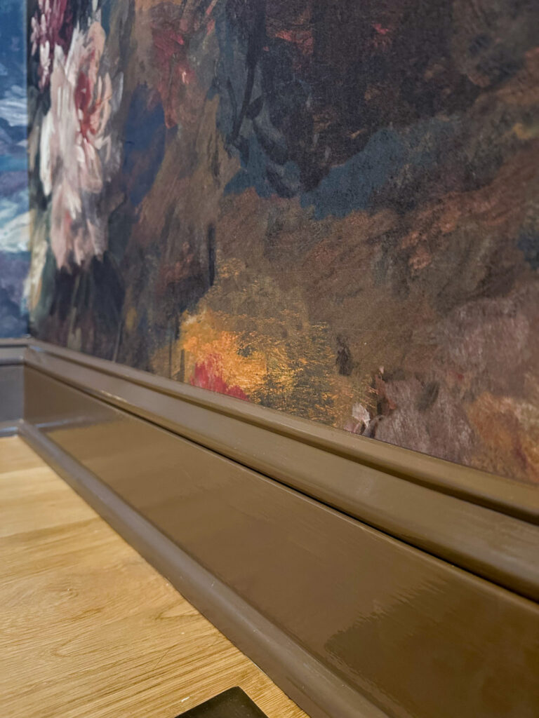
Primary Bedroom: Treron by Farrow & Ball
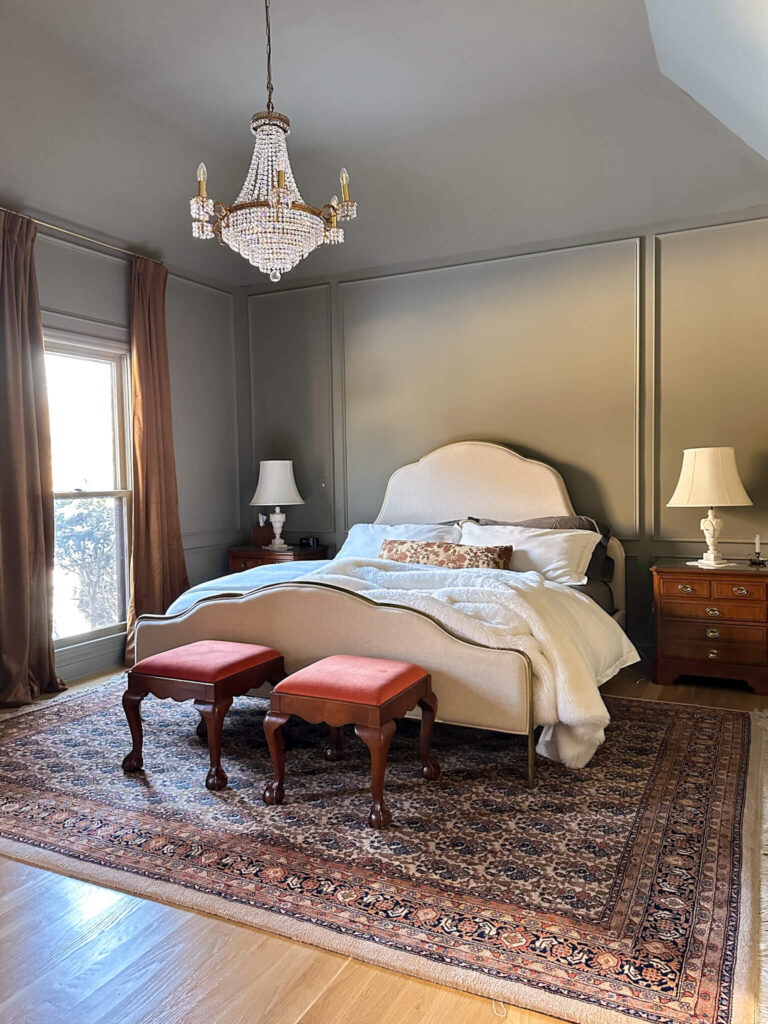
Shop: Paint | Bed | Chandelier | Draperies | Duvet Set | Sheets | Marble Lamps | Rug (similar)
My primary bedroom is color drenched in Treron by Farrow and Ball. This north facing room required a green with warmth to prevent it from reading too blue.
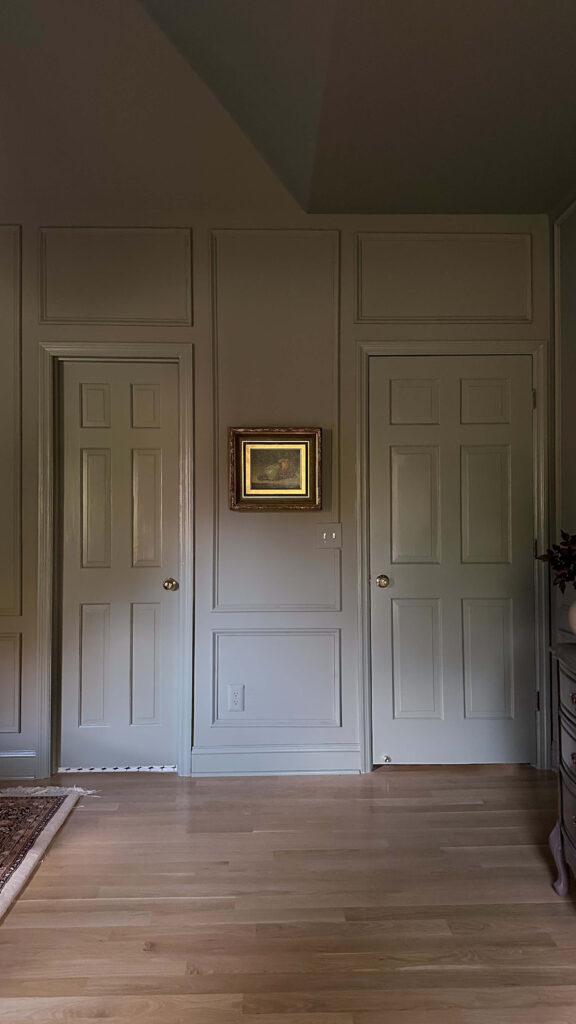
After sampling eleven greens, Treron was the clear winner. Its subtle brown undertones keep it grounded and cozy. It transformed the room into a calm, layered retreat.
If you’re researching green bedroom paint colors for north facing rooms, look for options with warm undertones like this one. Looking for a different green? Check out my other post highlighting 5 green paint color ideas.
Primary Bathroom: Jitney by Farrow & Ball
Shop: Paint | Chandelier (similar) | Vanity | Faucets | Mirrors | Light Sconces | Toggle Switches | Striped Wallpaper | Checkered Floor Tile
The primary bathroom renovation included a careful paint selection process. I ultimately chose Jitney by Farrow and Ball to complement the adjacent bedroom.
Jitney is a warm neutral with soft pink undertones. It feels inviting and pairs seamlessly with surrounding finishes. The ceiling is painted Stirabout by Farrow & Ball, and creates a subtle contrast while maintaining warmth.
Home Office: Joa’s White by Farrow & Ball
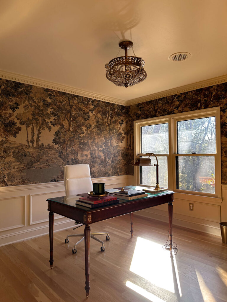
Shop: Paint | Wallpaper | Crown Molding | Desk | Brass Lamp | Brass Candle Tray | Light (similar)
The home office features a landscape mural, so I needed a complementary neutral. I chose Joa’s White by Farrow and Ball, a slightly saturated cream that adds warmth without competing.
This south facing room allows the color to shift throughout the day, which adds dimension. The ceiling is painted Dimity by Farrow & Ball to create gentle contrast and architectural interest.
By the way, if you’re thinking about a landscape wallpaper mural I highly recommend it! I wrote an entire post here featuring a ton of options for every budget.

Shop: Wall Paint | Ceiling Paint | Wallpaper | Crown Molding | Chair Rail | Box Molding
Future Paint Colors in My Home?
Those are the current paint colors in my home, but this is just the beginning! I’m dying to add a deep burgundy somewhere and I think a beautiful French Blue could be so beautiful in the laundry room or even the pantry (both are on my 2026 project list!). This post will continue to evolve as rooms change and new projects unfold. Stay tuned to see what’s next and in the meantime if you’re searching for real life examples of paint colors with honest insight about lighting and undertones, I hope this guide gives you clarity and confidence for your own space.
Related:
Five Green Paint Colors I Considered for My Bedroom
Debunking Common Myths About Color Drenching
Refinishing My Existing Kitchen Cabinets
How to Choose the Right Paint Sheen
How to Get Crisp Paint Lines (when painting two different colors)
read more
There is a very specific feeling that happens when you spot something at an estate sale, a thrift shop or on Facebook Marketplace. Your heart skips a little. You try to stay calm. You casually check the price. You mentally measure the wall at home. And then you either walk away proud of your restraint… or load it into your car grinning. That feeling is exactly why I keep a secondhand home wishlist.
Every January, I make two lists for my home. One is full of projects I want to tackle. The other is my secondhand home wishlist. It lives in my Notes app with measurements and specific brand names / keywords.
This list is not about buying more. It is about buying intentionally. When I am walking through an estate sale (ahem here are some tips on how to find one near you) or scrolling Facebook Marketplace late at night, it keeps me focused. It reminds me what actually fits my home and what is just a passing temptation.
If you love the thrill of the hunt and decorating slowly over time, you are going to understand this list.
Why I Keep a Secondhand Home Wishlist
Shopping secondhand sounds romantic. In reality, it requires clarity.
Without a plan, it’s easy to bring home something beautiful that does not quite work. When I outline my secondhand home wishlist at the beginning of the year, I am giving myself structure. I know my measurements. I know the scale I need. I know which rooms are ready for change and which ones are not.
It makes the process feel calm instead of chaotic, and it makes the wins that much sweeter.
My 2026 Secondhand Home Wishlist
Not in any particular order, here’s a look at everything I’m hunting for this year, along with photos and how I envision each piece coming to life in my home!
1. An Adams Style Vintage Gold Mirror for the Entry
At the very top of my list is a specific mirror for my front entry.
The space is small and the light switch is awkwardly centered. One day I envision adding molding or wallpaper to the entry and a staircase runner to the stairs, but I’m not waiting for someday to make it better now.
Walnut Scalloped Table | Design Books | Wireless Lamp | Crystal Candle Dish | Horse Door Porter
Last year I found the perfect petite table for this spot. Now I want the moment above it. I’m looking for an Adams style gilt mirror with delicate brass florals branching outward. Something feminine but refined. Gilded without feeling heavy.
The plan is simple. Move the switch with a receiver kit (I already bought this one), patch the wall, and finally center a mirror that feels like it belongs there.
It’s a small change, but it would completely shift that first impression.
2. A Reuge Lipstick Carousel
This one is my white whale.

I’m searching for a very specific vintage carousel by Reuge. It was technically made as a cigarette carousel, but I planning to use it to store lipsticks on my bathroom vanity.
You press a button and the doors open and flip inside out. There are tiny storage compartments and a dancing or spinning ballerina inside!

Shop: Reuge Vintage Lipstick Carousel
There are plenty of options on Ebay, Etsy and even on FBMP. But I’m waiting for the right one at the right price, and some very specific colors. This is the long game piece on my 2026 secondhand home wishlist.
3. A Vintage Breakfront China Cabinet
This piece was on my 2026 secondhand home wishlist and is already home!
Shop: Wallpaper
For the past several years, I debated whether I really needed a china cabinet. The hesitation was giving up styling space on my existing blue cabinet. But my grandmothers’ china deserved more than a waist down moment.
I had very specific criteria. No wider than sixty four inches. Breakfront style. A top drawer that folds down into a secretary desk.
I missed one earlier this year because I hesitated. It sold almost immediately. After that, I promised myself that if the right one appeared again, I would not overthink it.
When it did, I brought it home. And it completely changed the room.
4. A Pedestal Dining Table
Now that the cabinet is in place, I’m considering a pedestal dining table in a classic traditional silhouette.
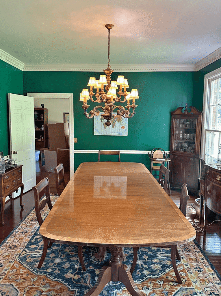
An example of the dining room table I have in mind
This one is still a maybe. It remains part of my 2026 secondhand home wishlist, but only if the wood tones feel right. If I find the right table, my current one will move to the screened porch, which is a set up I’d like to create regardless.
If not, I am perfectly happy waiting.
5. Vintage Runners
During the holidays, I styled a rug in front of my sink in the kitchen for the first time and immediately loved the warmth it added.
Now I’m searching for vintage runners in very specific dimensions and everyday tones for both my kitchen and my bathroom. Both spaces are tricky when it comes to sizing, but I love how a worn runner softens all the hard surfaces.
This is one of those practical but impactful pieces on my list this year.
6. A Giant Ornate Floor Mirror for the Bedroom
I’m envisioning something dramatic. Eight feet tall. An ornate gold frame. Leaned between the bedroom windows. Can you picture it? If not, here’s a little help…

Shop the Primary Bedroom
It would reflect more light and instantly make the room feel grander than it already does. I actually missed out on this at an estate sale recently, and while it’s always frustrating when that happens, I know the right piece is out there waiting for me.
This beauty was at a local estate sale and I missed out on it by minutes!
7. Hardwired Picture Lights
I currently use battery operated picture lights and love the effect they create.
Now that I know they work in my home, I am ready to invest in hardwired brass versions. One will go in the entry leading to the bedroom. Another will highlight equestrian artwork in the television room.
Shop: Cabinet Maker’s Picture Frame Light 30″
Secondhand does not always mean antique. Sometimes it means finding discounted designer pieces that elevate a space in a lasting way. My kitchen pendant that I found on FBMP is the perfect example of this! It’s a Visual Comfort light that was new in the box and 60% off retail.
8. Designer Draperies
Custom draperies rarely show up secondhand because they are tailored to specific windows. Still, I look.
Specifically two rooms that I look for are the bedroom (I would love floral designer drapes) and the living room. I lost out on a pair of Schumacher draperies last year that I still think about constantly.
This one is more of a background search, but it is still part of my 2026 secondhand home wishlist.
9. Staffordshire Dogs
Every time I see a set of staffordshire dogs in someone’s home I get jealous. They’re a little quirky but there’s something about them I just love. I could see a pair fitting in perfectly on the living room mantel or bookcase.
I check estate sales and Facebook Marketplace regularly, and am trying to keep this find to under $100.

Shop: Staffordshire Dogs
10. A Working Mantel Clock
I don’t know the exact style yet. Wood. Brass. Something unexpected.
But I know that when I see it, I will know. That instinct has rarely steered me wrong. I think a vintage clock would be so charming in the living room or cozy tv room.
11. Turkey China for Thanksgiving
With the new china cabinet in place, I would love a full turkey china set for Thanksgiving.

Shop the modern day version here
I’ve seen several sets at estate sales, usually priced slightly higher than I want to spend. This year I’m expanding my search to more local thrift stores and smaller estate sales. Sometimes the best pieces are sitting quietly where fewer people are looking.
The Heart Behind My 2026 Secondhand Home Wishlist
The fun part about my 2026 secondhand home wishlist, is it will evolve as the year goes on.
Some pieces will take months to find. Some may appear unexpectedly. Others may shift entirely as rooms change and develop.
That’s the beauty of decorating secondhand! It is slower. It asks you to pay attention. And it creates a home that feels deeply personal.
Stay tuned on socials as I’ll be sharing the finds, the near misses, and everything I learn along the way!
Related:
How To Find Estate Sales Near You
The Latest on the Blog —
read more
Reflecting on 2025, I couldn’t help but get giddy with excitement about what’s coming next. Last year didn’t go exactly according to plan but I have zero regrets. What I learned is the balance of projects felt manageable, attainable, and most importantly, fun. That’s why my DIY home renovation project plans for 2026 are following a similar rhythm… with one major shift.
Instead of only asking what rooms do I want to renovate, I’m asking something deeper: What skills do I want to learn in 2026?
The Home Office was my last project of 2025: Catch up on all the 2025 projects | Shop the Office
DIY Home Renovation Project Plans for 2026: A Skill-First Approach
When I look at my DIY home renovation project plans for 2026, two skills stand out above everything else:
- Building cabinets
- Installing tile
I have zero experience with either which is exactly why they’re at the top of the list. The goal this year isn’t perfection. It’s momentum. Starting small before going big, learning through doing, and letting each project build confidence for the next.
Spring DIY Projects in 2026
Pantry Renovation
A project I’d love to knockout sooner rather than later is the pantry: a small space that’s been quietly driving me insane.
Right now, it’s functional but chaotic. It’s like no matter how organized it starts, it eventually evolves into constant clutter. And the wasted storage space at the top and bottom are borderline heartbreaking.
Shop Pantry Organization
Pantry Plan Overview:
- Remove all existing shelving
- Install a lower cabinet for concealed storage
- Build open side cubbies on either side of the new base cabinet (beginner-friendly woodworking)
- Add a stone remnant countertop (marble or soapstone if I get lucky)
- Potentially add a tile backsplash above the new cabinet and below the first shelf
This project could potentially knock out two new skills at once:
- Cabinet building (without doors or drawers, so beginner friendly)
- Tile installation above the base cabinet for a little sparkle (if I can find the right thing)
I envision adding some paneling (like this) on the side walls and behind the upper shelves, repurposing my existing shelves but adding corbels for a vintage touch, and painting everything in a full gloss for an extra wow factor.
It’s all living in my head right now, but as we get closer I’ll build a mood board so you can see what we’re in store for!
Living Room Refresh: Trim, Paint & Architectural Drama
The living room is where I get to play.
It’s already decorated which means the transformation will come purely from trim, paint, and architectural details. I think this will be a really impactful before and after which will show you how much trim and paint can change a space.
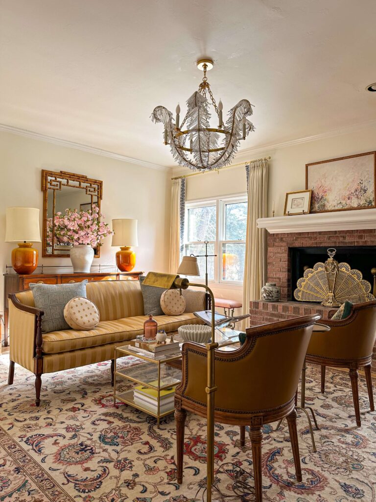
Chandelier | Mantel Artwork | Coffee Table (similar) | Mirror | White Shell Jar | Pink Cherry Blossoms | Curtains | Blue pillows | Peacock Fireplace Fan | Design Coffee Table Books | Rose Candle Cloche | Marble Ribbon Bowl
Living Room Project Goals:
- Box molding (possibly double box for extra depth)
- Dentil molding under crown (or full replacement) similar to what I used in my home office
- Adding molding to the ceiling + a large medallion
- New mantel built around the existing fireplace
- Soft, warm neutral paint (thinking about Stirabout which I used on the ceiling in the primary bathroom)
This will (hopefully) be my Spring One Room Challenge project, and I’m determined to finish on time. Fourth time’s the charm… right?
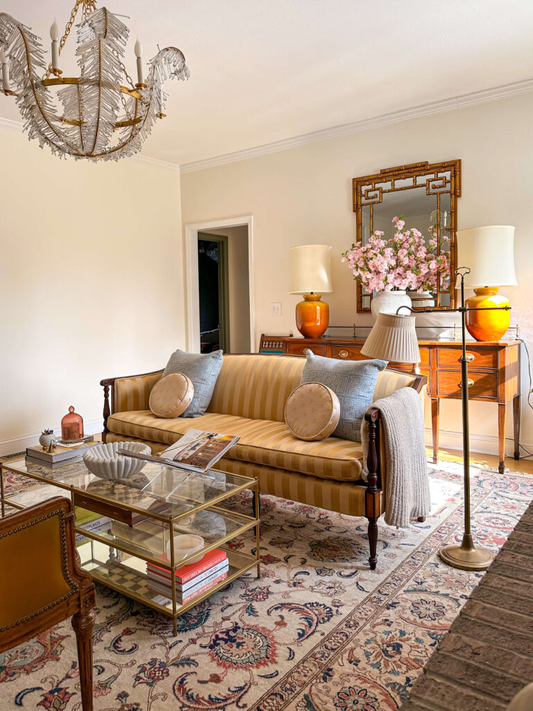
Shop the Living Room
Summer DIY Projects: Finishing the Last 5%
Instead of a massive renovation, summer will be about something different this year: Finishing the last 5%.
Every room has a detail left undone, whether it’s touch-ups, missing trim (so many spots without crown molding), and so many other tiny pesky things. We might try to make this fun and turn it into a series, or put an educational spin on it. DIY summer school anyone?
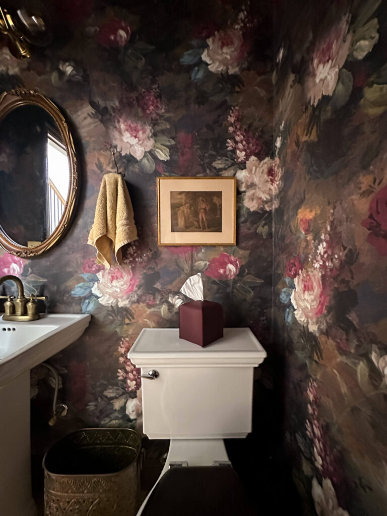
The Powder Room will be part of the DIY Summer School: I’ll add crown molding here and paint the front of the door (which I should’ve done in the first place!)
Expect to see debuts in the cozy tv room, kitchen, primary bathroom, bedroom, back entry, powder room and probably somewhere else I’m forgetting.
Fall 2026 Renovation Ideas: Laundry Room, Bathroom, or Dressing Room?
Fall is where things get flexible. Depending on how confident I feel with tile and cabinets after the pantry, one of these spaces may take center stage for the grand finale of the year:
Option 1: Laundry Room Overhaul
I’ve been teasing the laundry room for years now. It’s not that I’m procrastinating it, but I know it’s going to be the biggest project I’ve ever done (yet).

The Laundry Room: aka ugliest room in my house
The room is essentially a command center for the home. It’s where laundry gets done yes, but it’s where cleaning supplies, tools, wrapping paper, beach towels, packages and so many other random things live. This space needs to be ultra custom so I’ll need to make sure my skills are ready to handle it. Here’s what I’m thinking:
- Total gut
- New tile flooring
- Custom cabinetry
- Storage designed for real life
- Wallpaper (I really want to do something fun!)
- Paint
- New lighting
- Window Treatments
And if I don’t get to a full scale laundry renovation this year I’d at least like to paint it at minimum. Every time I open the door I hear a record screech.
Option 2: Upstairs Middle Bathroom
One of my favorite things about renovating the home office last year was having the mess contained on another floor. This was key especially right before the holidays, and I remember patting myself on the back for the timing. The upstairs middle bath will keep all the plumbing fixtures in the same spots so essentially it could be “easy” right? Here’s what I’d do:
- Full gut renovation
- Remove the sad bathfitter bathtub and install a porcelain bathtub
- Tile surrounding the tub, but maybe also on all the walls? It’s a smaller bathroom so maybe?
- New tile flooring
- Updated baseboards and crown molding
- Updated vanity, lighting, and toilet
- Paint or wallpaper, pending what I decide with how far the tile goes
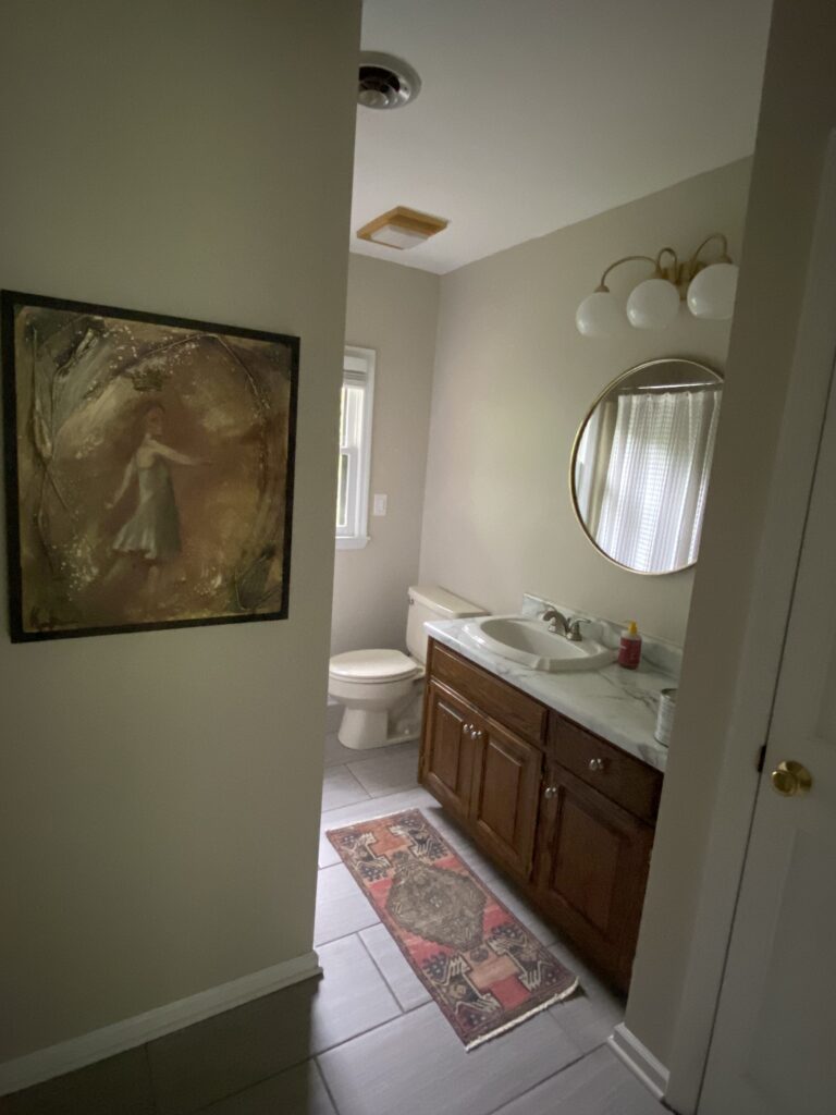
The Upstairs Middle Bathroom: I scraped popcorn ceilings and added a fresh coat of paint 5 years ago
Option 3: Dressing Room

Read more about how I turned an extra bedroom into a dressing room
Do I think this is the year for the dressing room? Probably not. Can a girl dream? YES. I keep going back and forth on exactly what I want to do here but at the minimum I know:
- Added cabinetry on top of existing closets
- Color everywhere
- Wallpapered ceiling
- Possibly a pocket door
- Rolling Library Ladder
- New window treatments
- Large rug
- Vintage tete-a-tete in the center if I’m lucky
Or I’ll get a wild hair and build a completely custom new space. I have some seriously wild concepts that race through my mind on repeat. Some of them require some engineering, so stay tuned on this room. But wow will it be good when I get my hands on it!
My 2026 Plans In Closing
This year isn’t about checking boxes, it’s about becoming more capable.
My DIY home renovation project plans for 2026 are rooted in learning, experimenting, and letting curiosity lead the way. Some projects will go exactly as planned. Others will surprise me entirely.
And honestly? That’s the fun part. Which is why this year we’re going to keep things loose, and follow the design ideas that bring excitement.
If you love following along with real-time renovations, skill-building, and the occasional design pivot stick around. You never know what space I’ll decide to tackle next!
Related:
browse more posts
read more
How to design wainscoting is one of those questions that feels deceptively simple until you actually start researching it. Height, spacing, trim sizes, doors, windows, outlets. Suddenly it feels like one wrong decision could throw the entire room off.
When I designed the wainscoting in my primary bathroom, I realized that most of the overwhelm came from thinking about it as one big decision instead of a series of small, logical ones. Once I broke it down, the process felt approachable and even confidence building.
In this post, I’ll walk you through exactly how I designed my wainscoting layout from start to finish. While my project was in a bathroom, the design approach works for any room: dining rooms, bedrooms, hallways, or other living spaces. The focus is on proportions, layering, and letting the room guide the layout so the finished result looks intentional and timeless.
Sconces | Wall Color | Floor Tile | Brass Light Switches | Mirrors | Faucets | Vase | Vanity | Vanity Knob | Striped Wallpaper | Hand Towel | Chandelier (similar)
Start With Ceiling Height and Design From the Top Down
My ceiling height is 9 feet, and that measurement guided every decision. Instead of measuring wainscoting height up from the floor, I designed everything from the ceiling down.
I started by measuring how far down the crown molding would come once installed. From that point, I added one inch above that line. This allowed my 3.5 inch horizontal board to sit just above the crown molding line. When the crown was nailed on top, the visible portion of that board ended up being 2.5 inches.
That 2.5 inch reveal mattered because it matched the width of my vertical boards (also called stiles). Keeping those proportions consistent made the entire design feel cohesive without needing exact formulas or rigid measurements.

Starting with the top 3.5″ horizontal board, I marked and installed where the crown molding would over lap by 1 inch.
Use Layered Trim to Create a Built In Look
Rather than removing existing trim, I layered new boards on top of what was already there. This saved time and added depth that makes the wainscoting look custom.
At the base, I stacked a 3.5 inch board on top of my existing 4 inch baseboards. Then I nailed a 5 inch baseboard on top of that stack. The result was a 2.5 inch visible layered section, which again matched the stile width.
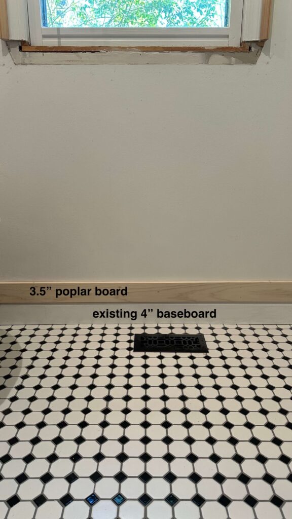
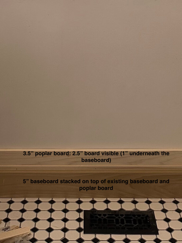
Installing the lower 3.5″ horizontal boards and new baseboards
I used the same approach for the chair rail. It sat centered between two stacked 3.5 inch boards, leaving (roughly) 2.5 inches of board visible above and below the chair rail. Repeating this dimension throughout the room created visual balance without calling attention to itself.
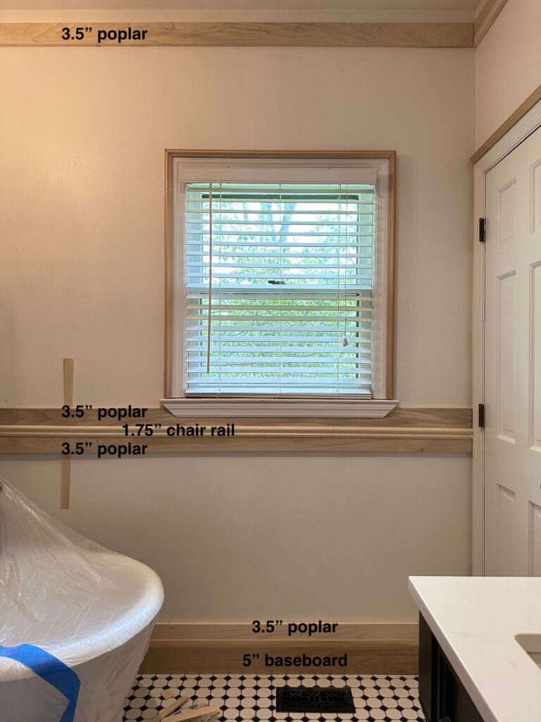
You can see how it quickly starts to create a custom layered look!
Install the Horizontal Pieces First
I did not sketch this out or mock it up digitally. Instead, I started with the above horizontal boards and started layering.
This was one of the best decisions I made during the entire process. Nearly all of the horizontal elements were already determined, with the exception of the chair rail height. I used the vanity and new countertop height as my reference point, since I knew I would be adding box trim above the vanity backsplash. Designing around that fixed element ensured the chair rail lined up cleanly with the box trim throughout the room.
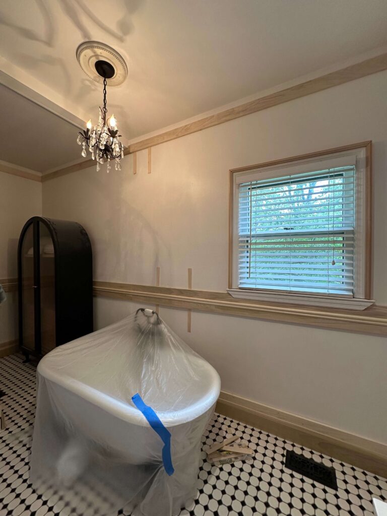
All horizontal woodwork installed! From here we can begin to visualize how big we want our boxes to be.
Let Doors and Windows Dictate Box Spacing
When it came time to design the boxes, I started above doors and windows. Those widths were already decided for me based on the size of the door and window openings. I installed 2.5″ poplar boards vertically in these areas first which gave me a great visual of how the room would start to look. Did you catch the measurements here? With the overlap on the horizontal poplar boards it’s left 2.5″ of visible board, which will now match our vertical pieces!

When designing and installing any kind of box trim, I find it easiest to start around a door or window first. They create pre-defined spacing which helps to get started.
From there, I worked my way around the room. The only wall that gave me pause was the large wall behind the bathtub. That was the one place where I had to decide between fewer wider boxes or more narrow boxes.
I stepped back, looked at the scale of the wall, and chose the option that felt calmer and more balanced, which for me, is a wider box. That moment reminded me that learning how to design wainscoting is as much about trusting your eye as it is about measurements.
Adding Picture Frame Molding Inside the Boxes
Once all of the horizontal and vertical boards were installed, I moved on to the picture frame molding inside each box. These pieces are cut to fit inside the larger boxes that are already built.

Horizontal 3.5″ Poplar | Vertical 2.5″ Poplar | 5″ Baseboards | Chair Rail | Picture Frame Molding
This step is very straightforward, and one that I had already done twice (see the dining room trim project and the primary bedroom trim project). I measured the inside dimensions of each box, cut my picture frame molding on a 45 degree angle, and nailed the pieces in place. Working inside an already defined frame makes this process feel much less intimidating, and this detail is what gives the wainscoting that finished, custom look.
Why I Installed Crown Molding Last
I installed the crown molding at the very end of the project, intentionally. Crown molding was a new skill for me, and I did not want to get discouraged early in the process. Waiting until all of the boxes were built allowed me to focus on one learning curve at a time.
During this phase of the project, the crown molding was nailed directly on top of the initial horizontal board that runs around the top of the room. Installing it last also meant I could see the full design before committing, which made the process feel much more manageable.
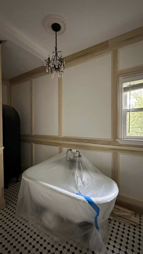
All trim installed in the primary bathroom!
I’ve since installed crown molding in my home office as well, and I put together a full crown molding tutorial that walks through this step in detail. If you’re considering adding crown molding to your house I can attest firsthand that it’s worth the trouble!
Plan Ahead for Windows, Trim Depth & Electrical
One thing I did not fully think through before starting was how the wainscoting would interact with a few existing room features.
Window Sill
In order to properly layer the trim around the window, I had to remove the existing window sill, install the surrounding woodwork, and then build a new sill and trim piece. It was’t difficult, but it did add another day and another trip to the hardware store.
Door Frames
I also had to consider how the new boards would sit against the door frames. The existing door and window trim was not thick enough, so I added backband to increase the depth. This allowed the new boards to terminate cleanly without sticking out past the original trim.
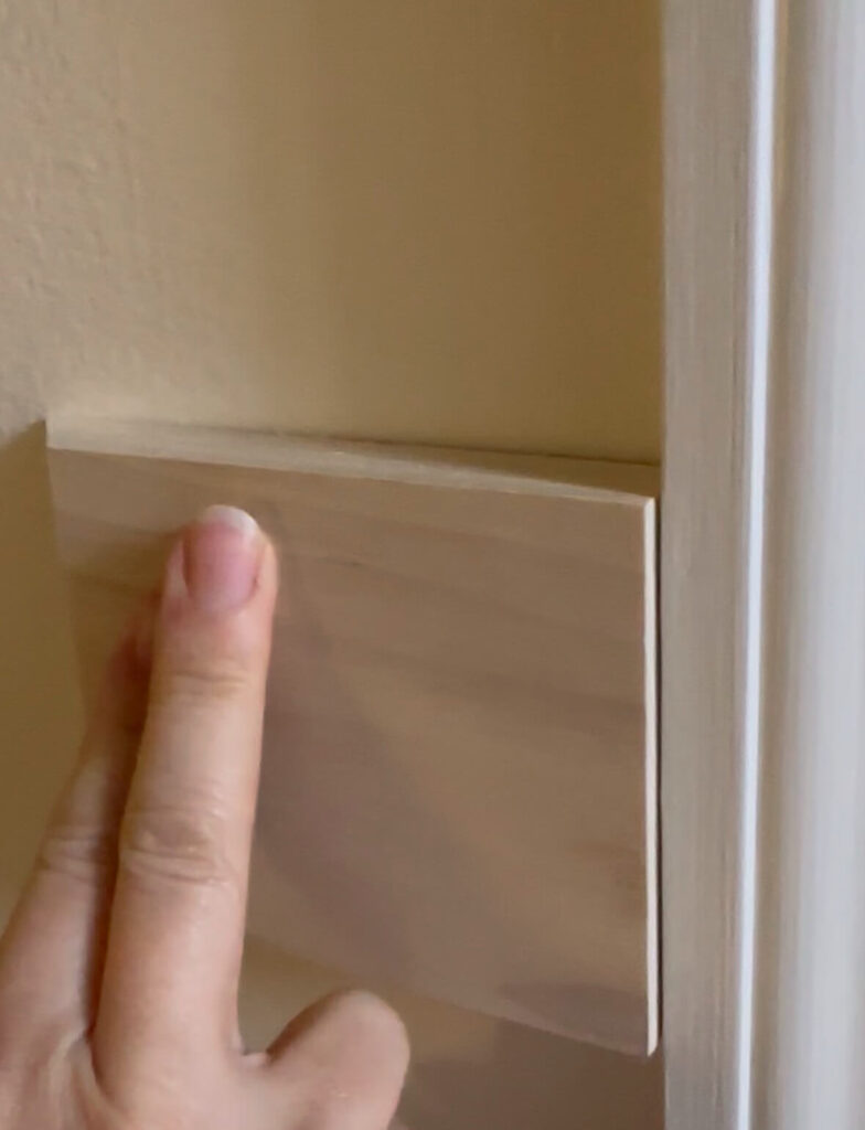
Left: an example of how the boards would extend over existing door frames & windows as is | Right: adding backband around the window frame is an easy solution to extend the profile depth
Electrical Placement
Unfortunately I also overlooked one existing electrical outlet, as it was too close to the door frame and needed to be moved. It ended up being an easy fix, but since I’m learning things as I go, this ate another day up.
A note for you: when designing take note of where your outlets and light switches are located. Some may be easy to move, but others may dictate your trim measurements and placements. Measure to make sure they won’t land awkwardly within a box or too close to a vertical board.
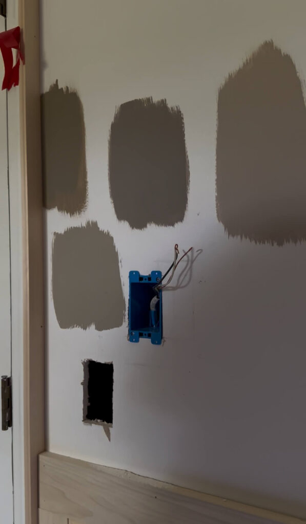
Relocating the existing light switch
Why This Project Was Easier Than I Expected
I was honestly nervous to attempt this project. My experience level did not feel advanced enough, and wainscoting can look intimidating when you see perfectly finished photos online.
However once I started, the process became repetitive in the best way. Measure, cut, nail, repeat. The design decisions felt clearer as the room filled in.
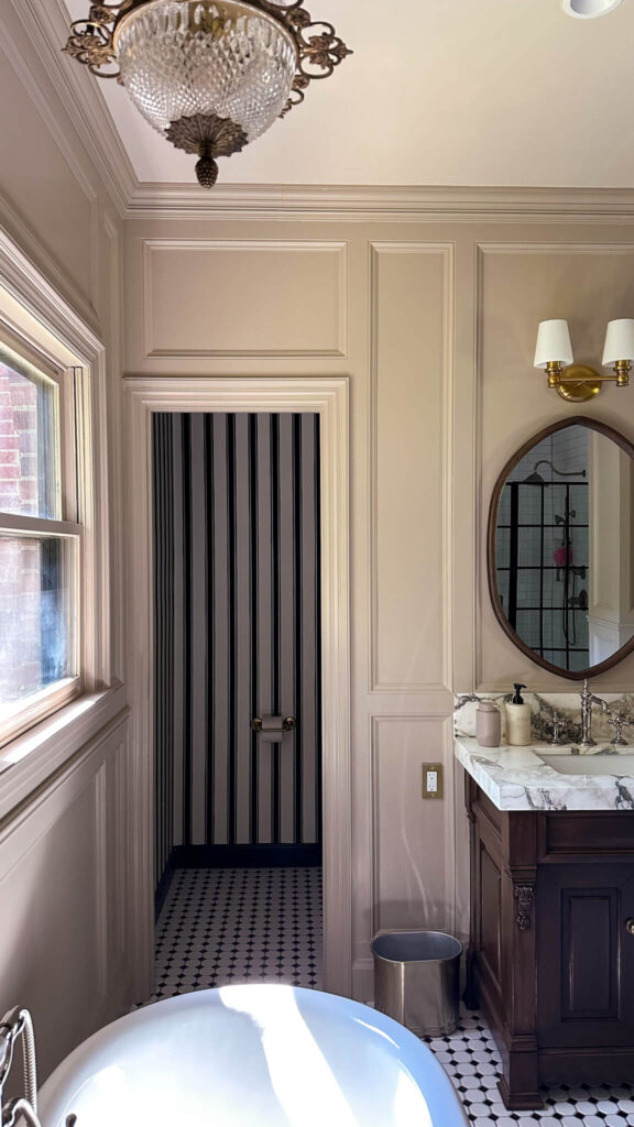
Striped Wallpaper | Sconces | Mirror | Faucet | Faucet Handles | Checkered Tile Flooring | Wall Color
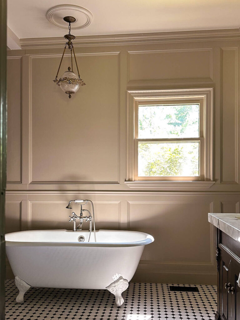
Floor Tile | Wall Color | Clawfoot Tub | English Style Faucet | Light fixture (vintage – similar)
If you’re hesitant because you do not feel skilled enough, don’t let that stop you. With some planning, measuring and determination, you’ll build confidence as you go.

Shop the Primary Bathroom
Final Thoughts on How to Design Wainscoting
Designing wainscoting is less about perfection and more about proportion and repetition. Consistent trim widths, layered details, and letting the room guide decisions make the process far more approachable than it seems at first.
If you take it step by step, you can absolutely design wainscoting that looks custom, intentional, and timeless.
Related Posts:
My Primary Bathroom Renovation Reveal
How To Measure Cut and Install Crown Molding
How to Design Picture Frame Molding (home office edition)
Designing Custom Trim in the Primary Bedroom
Designing Picture Frame Molding with an Existing Chair Rail (dining room)
Home Office Reveal (featuring dentil molding, chair rail and custom box molding)
Shop My Primary Bathroom Wainscoting + Supplies
Ornamental Mouldings Colonial Backband Moulding
Horizontal boards: Ornamental Mouldings 3.5″ Poplar Hardwood Board
Vertical (stiles) boards: Ornamental Mouldings 2.5″ Poplar Hardwood Board
Baseboards: Ornamental Mouldings Charlotte Baseboards (5.5″)
Crown Molding: Ornamental Mouldings Crown Molding
Trim inside boxes: Ornamental Mouldings Picture Frame Molding
Ornamental Mouldings Chair Rail
read more
Every time I share my home office, the same questions appear almost instantly. Where is your wallpaper from? Is it custom? Is it wildly expensive? Here’s the honest answer: landscape wallpaper murals for every budget absolutely exist and you don’t need to spend a fortune to create a magical space.
Whether you’re decorating a rental, refreshing a single wall, or investing in a forever home, I’ve rounded up scenic landscape wallpaper murals ideas that span multiple price points and installation styles. Actual pricing will depend on the size of your space, but if you’re considering adding a wallpaper mural to your home, this will help get you started.
Affordable Landscape Wallpaper Murals for Every Budget
Lark Manor – Toile Landscape Peel-and-Stick Mural
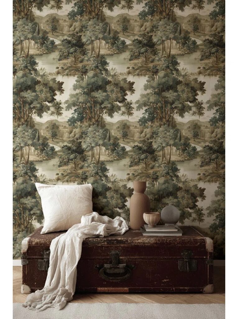
Shop Here
One of the most accessible entries into landscape wallpaper murals for every budget. Peel-and-stick, renter-friendly, and soft in tone, this toile-inspired mural brings instant charm with minimal commitment.
Best for: Rentals, bedrooms, guest rooms, or first-time wallpaper users.
Lark Manor – Serene Nature Landscape Mural

Shop Here
Quiet, classic, and grounding. This mural looks almost like a custom painting! The scene feels calm and timeless, making it an easy choice if you want a scenic backdrop that won’t compete with furniture or art.
Best for: Traditional homes, transitional spaces, or peaceful offices.
Red Barrel Studio – Trees, Birds & Serene Landscape
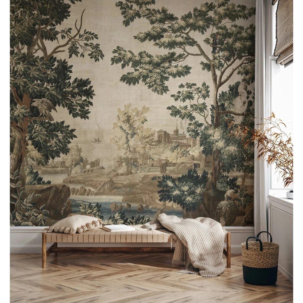
Shop Here
This mural adds a bit more narrative with birds, trees, and gentle movement that gives the room warmth and dimension. It feels cozy and welcoming without leaning overly traditional. I personally love the vintage look it has to it.
Best for: Bedrooms, powder rooms, or spaces you’re looking to add a vintage flair to
Red Barrel Studio – Woodland Path & Tree Canopy Landscape Mural
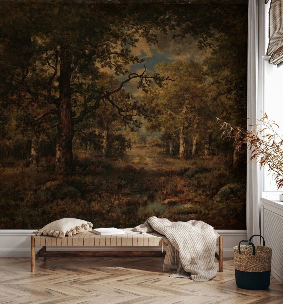
Shop Here
This mural feels immersive in the best way: like stepping onto a shaded woodland path and looking up through a canopy of trees. The perspective creates depth and atmosphere, making smaller rooms feel larger and more layered. It’s scenic without being overly busy, striking a beautiful balance between drama and calm.
Best for: Home offices, bedrooms, or any space that wants a grounding, nature-forward moment without going dark or heavy.
Mid-Range Landscape Wallpaper Murals That Feel Custom
Etsy — Tree & Hill Rural Landscape Mural
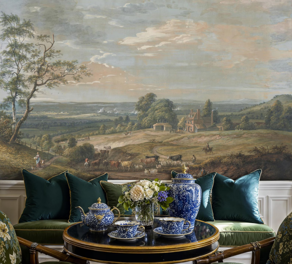
Shop Herehttps://go.shopmy.us/p-39270211
I ordered a sample of this one and it’s truly beautiful. The texture is painterly and tactile, giving it an artisan quality that feels far more expensive than it is. Ultimately, it had a few too many pastels for my personal palette, but it’s a wonderful option if you love softer, romantic color stories.
Best for: Home offices, dining rooms, living rooms
Wayfair (Loon Peak) — Sepia Forest Whispers Mural

Shop Here
Moody, tonal, and incredibly grounding, this mural leans into sepia hues and forest imagery that feels cinematic without being overpowering. It’s elevated, atmospheric, and perfect for those drawn to darker, more contemplative spaces.
Best for: Libraries, moody bedrooms, or offices that need depth and drama.
Milton & King — English Landscape Mural
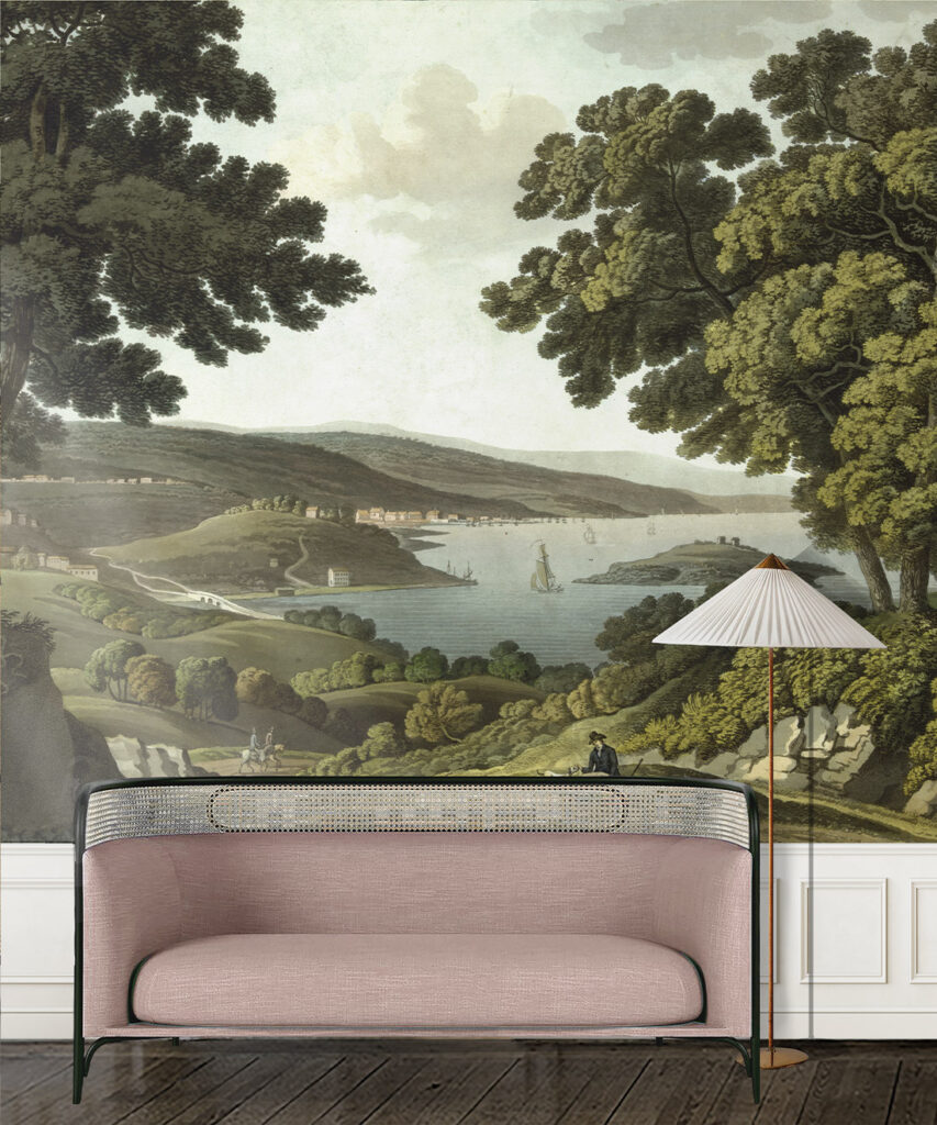
Shop Here
This mural captures the elegance of antique engravings with a restrained, architectural feel. The pastoral imagery feels timeless, especially in the black-and-white version, making it ideal for anyone craving old-world charm without visual overload.
I placed this wallpaper right in the middle as the pricing could go either way. There’s a traditional option that’s more price friendly, but there’s also a grass-cloth finish that’s very high end.
Best for: Home offices, dining rooms, or classic-meets-modern interiors.
Elevated & High-End Landscape Wallpaper Murals
Graham & Brown — “In Richmond Park, 1852” by William Bennett
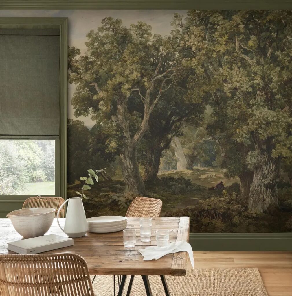
Shop Here
This mural is stunning. Reproduced from a 19th-century landscape painting, it feels romantic, atmospheric, and deeply artistic. The scale is dramatic, the tones are rich, and the result feels closer to a gallery wall than traditional wallpaper.
This is an excellent option if you want something museum-inspired without entering the fully custom realm.
Best for: Dining rooms, statement walls, and art-forward interiors.
Belarte Studio — Tapestry Landscape Wallpaper
Shop Here
This is the wallpaper everyone asks me about and the one I ultimately chose for my home office.
The tapestry-style landscape wallpaper mural from Belarte Studio feels like a textile and a painting combined. The depth, warmth, and texture make it read as art rather than decor, and it instantly anchors the room with a sense of history.
It’s an investment, but one that feels intentional, timeless, and deeply personal.
Best for: Statement spaces, home offices, dining rooms, and forever homes.
Final Thoughts: Landscape Wallpaper Murals for Every Budget Truly Exist
A beautiful space isn’t about spending the most, it’s about choosing what creates the right feeling.
Shop the Home Office Here
From under-$300 peel-and-stick murals to elevated, art-inspired statement pieces, landscape wallpaper murals can bring depth, story, and atmosphere into your home.
If this helped you narrow your search, save this post for later. And if you know someone deep in wallpaper research right now, share it with them because beautiful spaces should feel inspiring and attainable.
Related Posts
Wallpaper Ideas I Considered for the Home Office
My Vintage Moody Traditional Inspired Home Office Reveal
Renter Friendly DIY Upgrades (from a landlord’s perspective)
Looking for more wallpaper ideas? Browse my top peel & stick options here!
The Latest on the Blog —
read more
Every New Year feels like a blank page. I love dreaming about what’s ahead: personal goals, home projects, new skills I want to learn. But just as much, I treasure the quiet ritual of looking back. Celebrating the small wins. Reflecting on what worked, what didn’t, and what surprised me along the way. This 2025 home renovation project recap isn’t just about what I completed. It’s about what each project taught me. Skills I didn’t expect to learn and lessons I didn’t know I needed. And most importantly, the permission I gave myself to pivot when things didn’t go exactly as planned.
When I look at my original 2025 project list, no I didn’t accomplish everything I set out to do. But what I did finish mattered. And some of the most meaningful outcomes weren’t on the list at all.
Let’s get into it…
The Project I Didn’t Plan: The Primary Bathroom Renovation
The first and biggest project of 2025 wasn’t even on the list.
Shop the Primary Bathroom
I renovated my primary bathroom as part of the Spring One Room Challenge, fully believing I could tackle a massive space in eight weeks, working weekends only, while holding a full-time job. Spoiler: that was wildly optimistic.
The bathroom renovation stretched into five months, with my house partially torn apart and my patience tested daily. But I don’t regret a single minute of it.
Funny enough, this was actually the second time I renovated this bathroom. When I first bought the house, I immediately knocked down a wall to combine the bathroom and closet, one month into ownership. I followed trends instead of intuition and ended up with a stark white and black space that never felt like me.
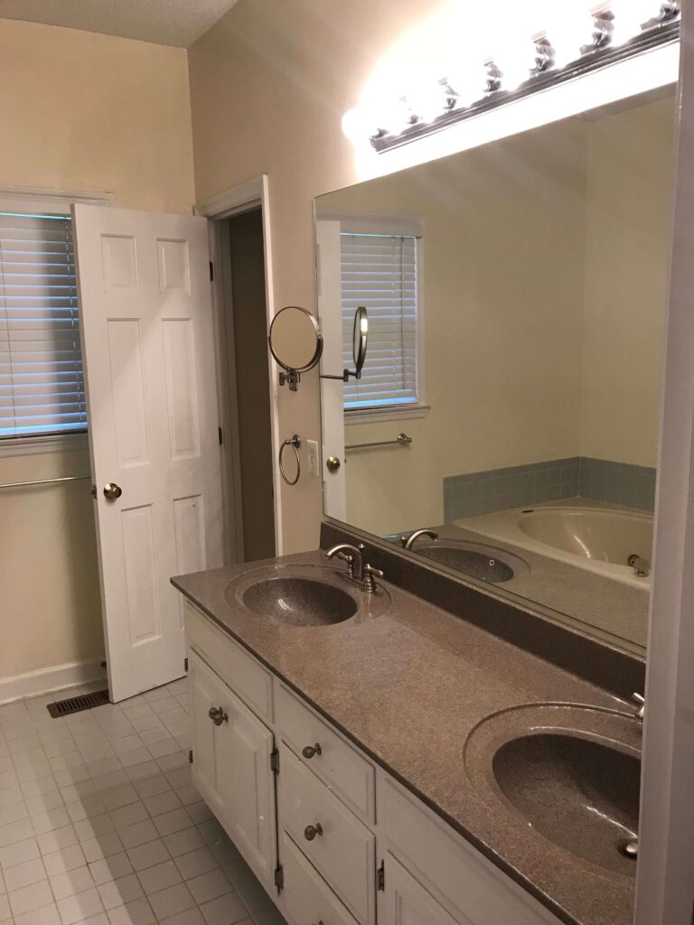
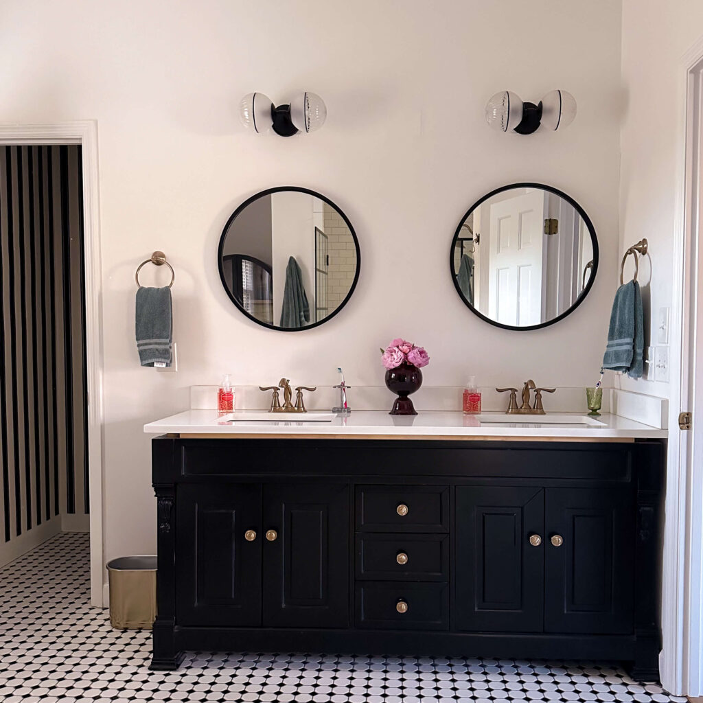
The Evolution of the Primary Bathroom
As the rest of my home evolved, that bathroom felt colder and more disconnected, especially after finishing my primary bedroom, which felt cozy, romantic, and timeless. Walking from that sanctuary into a sterile bathroom became my breaking point.
This year, I finally gave myself permission to redo it.
What I Learned
- How to install wainscoting
- How to add crown molding (a skill I’ll now use throughout the house)
- How to flip a vanity, move an electrical outlet, and patch tile
- How to trust my instincts instead of trends
But the biggest lesson?
It’s okay to change your mind. You don’t need to feel guilty for fixing something that doesn’t make you happy, even if your younger self chose it.
Exterior Updates: Knowing When to Ask for Help
The next phase of my 2025 projects focused on the exterior of the house and this came in two parts.
The front exterior landscaping: absolutely transformative!
After painting the trim last year and swapping out my exterior lights for new copper lanterns this spring, I was eager to get into the next phase of the front exterior makeover: landscaping. I can do a lot of things, but landscaping and keeping up with plants has never been my strong suit. Trust me, I’m waiting for the day where I can say otherwise, but we’ve not reached that mile marker yet.
So what did I do? I hired the project out. And let me tell you what, that was a hard decision for me. Aren’t I a DIYer? I should be tackling this myself! This was a big decision for me. I debated saving plants, repurposing shrubs, and other ways I could save money. But in the end, I chose a fresh start and let the professionals come in and do what they do best.
Everything was removed in one day and replanted the next. The results speak for themselves and six months later, it still looks incredible, even in winter. This has been a long journey so lets take a stroll down memory lane at the evolution…


My only regret is not doing this sooner
The Lesson
It’s okay to know when to ask for help.
Hiring experts doesn’t mean you failed—it means you respected your time, energy, and limits.
The Backyard Reality Check: Pool Garden Beds
Then came the back pool garden beds… and this one I did DIY.
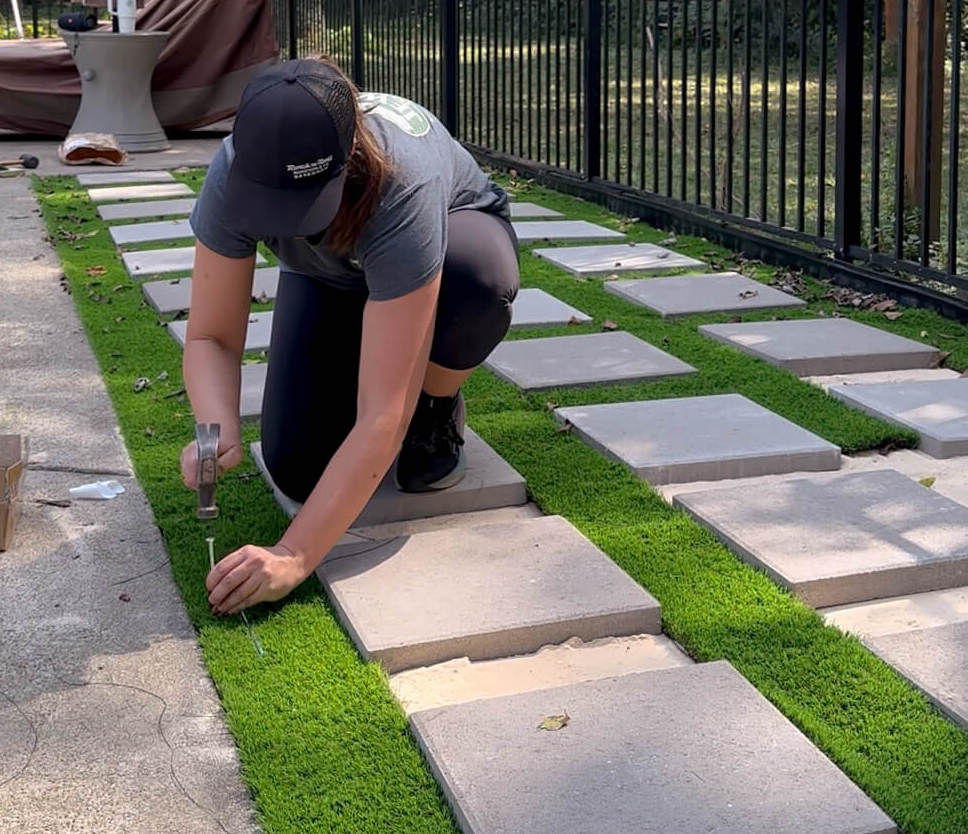
Dead pine trees. Weed-filled rock beds. A constant battle I could never win.
I excavated everything and installed artificial turf with pavers. It was the most labor-intensive project I’ve ever done. It’s not perfect—but it’s infinitely better, and now it’s low-maintenance.
The Honest Lesson
I still hate exterior projects.
And that’s okay.
Some things don’t have to become passions. They just need to be planned with extra time or budgeted out entirely.

It’s not perfect but it’s better than it was and it’s maintenance free!
The Home Office: Following the Nudge
I almost skipped the home office renovation this year, but something told me not to and I’m so glad I listened.
Shop the Home Office Here
What was once a white box is now a space that inspires my design work every single day. I added box trim and chair rail in one weekend—a huge improvement from the month it took me the first time I ever tried box molding in the dining room.
I also installed dentil crown molding, which was new and a bit tricky, but incredibly satisfying once it clicked.
Wallpapering (The Plot Twist)
You may be surprised to hear this, but I fully intended to hire out wallpaper installation. I’ve wallpapered both my powder room and my back entry, and both have glaring mistakes. I see them every time I pass through and I told myself: “you’re just not good at wallpapering.” But when I called my installer (back in October!) he was booked through January.
I didn’t want to wait, so it was time to get back in the saddle and figure this out once and for all. I took time watching some professional wallpaper channels, reading the tutorials on the manufacturers website (reading directions, I know – crazy right?) and vowed not to rush through it to meet some artificial deadline I set for myself.
What I expected to be stressful turned out to be… enjoyable. This is my third self-wallpapered room and the first with zero mistakes.

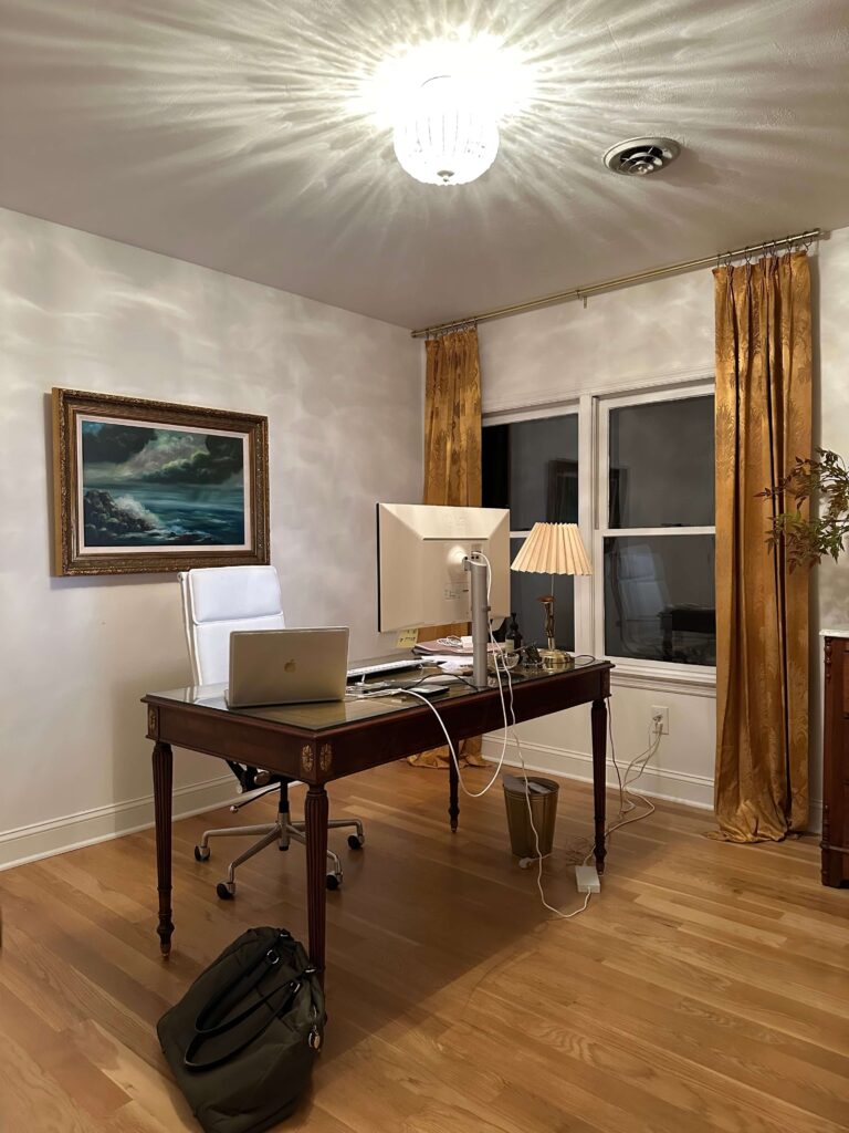
The evolution of the home office: bubblegum pink girls room, peel & stick banana leaf wallpaper, white box and finally a vintage moody traditional home office
The Lesson
Just because you weren’t good at something the first time (or two) doesn’t mean you should give up. Sometimes you just need another chance.
Cozy TV Room + Living Room Evolution
One of my softer goals for 2025 was curating the cozy TV room—being more intentional with collected pieces rather than rushing purchases.
That intention spread. I restyled the bookshelves, found a beautiful credenza on Facebook Marketplace, upgraded to a Frame TV, and unintentionally started reworking the living room too.
A striped sofa resurfaced—the one that got away a year and a half ago—and this time, I didn’t miss it. I rearranged the entire layout, swapped light fixtures, and layered in color and character.
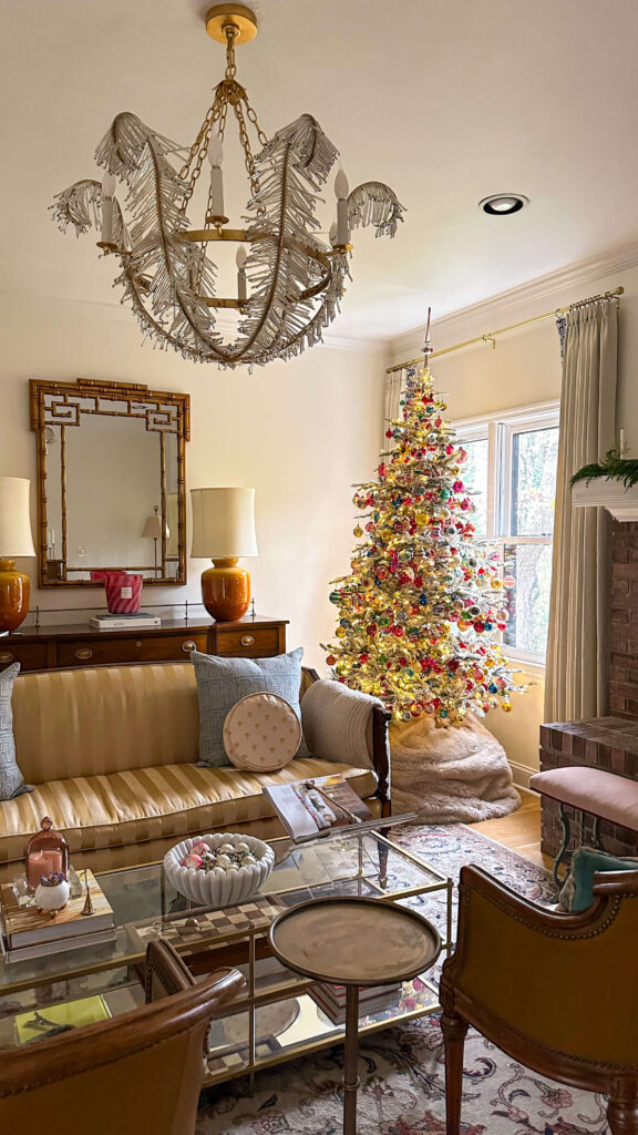
The living room decked out for Christmas! Expect to see lots more of this room in 2026!
Now, both rooms feel collected, lived-in, and more personal.
And in 2026? We’re adding trim to the living room. And trust me – this is going to be my most detailed trim project to date.
Final Reflections: Why This Year Mattered
That’s a wrap on my 2025 home renovation project recap.
More than transformed rooms, I gained:
- New DIY skills
- Confidence in changing my mind
- Proof that learning doesn’t stop with age
- A deeper trust in my creative instincts
These projects reminded me that growth isn’t about perfection, it’s about persistence. About trying again. About allowing yourself to evolve.
I’m still building my 2026 project list, but I already know it will come with new skills (and new lessons) along the way.
Here’s to another year of learning, pivoting, and creating spaces that truly feel like home.
Happy New Year 🤍
browse more posts
read more
Some rooms are beautiful, and then there are rooms that move you. The Vintage Moody Traditional Home Office is of the latter. It’s one of the most personal spaces I’ve ever designed, and not because it’s perfect, but because it supports the work that feeds my soul. It’s where I design, think, create, and build ideas that matter deeply to me. And having a space that truly supports that energy changes everything.
Why This Vintage Moody Traditional Home Office Matters to Me
I’ve completed many projects throughout my home, but the home office feels different. This is where my design work lives and where I spend long, quiet hours creating and refining ideas. I needed this space to be more than visually beautiful; I needed it to feel grounding and supportive.

The Evolution of the Home Office: Original Listing Photo, Peel & Stick accent wall, Plain White Box
When I purchased the house, this room was a little girl’s bedroom with bubblegum pink walls and white Berber carpet. Over time, the room went through several iterations: dark laminate flooring with all-white walls, then a banana leaf wallpaper accent wall that I thought I loved… until I realized how wrong it truly was. Then eventually back to all white walls with a mish mash of thrifted finds. Good, but far from great.
In hindsight, I’m grateful. Those missteps forced me to slow down and approach the home office design with real intention.
Designing With Intention
When I finally began designing this space thoughtfully, two words guided every decision: inspirational and calming. I wanted the home office to spark creativity without overwhelming it: a place where focus feels natural and work feels supported. Productivity mattered, but not at the expense of peace.
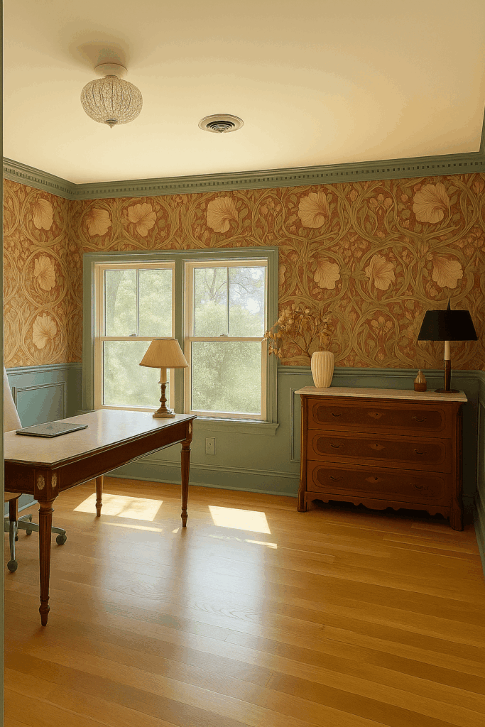

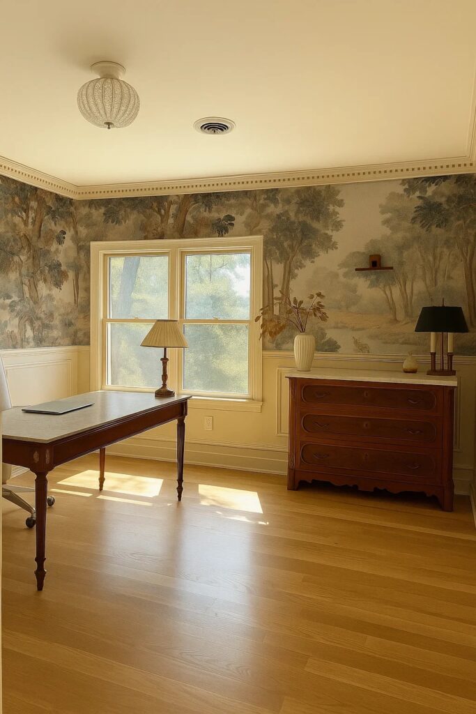
My 3 front runners for the home office design
One of the most meaningful elements of the room is the view. It overlooks the backyard, the pool, and the open meadow beyond my property. That quiet, expansive landscape brings an incredible sense of calm, and I wanted that feeling to flow seamlessly into the design of the office itself.
The Wallpaper That Defined The Vintage Moody Traditional Home Office
I had been dreaming about a wallpaper mural for years — long before this project ever officially began. To me, a home office or a dining room are the most natural places for a mural, and since the dining room is finished, the home office felt like the perfect opportunity.
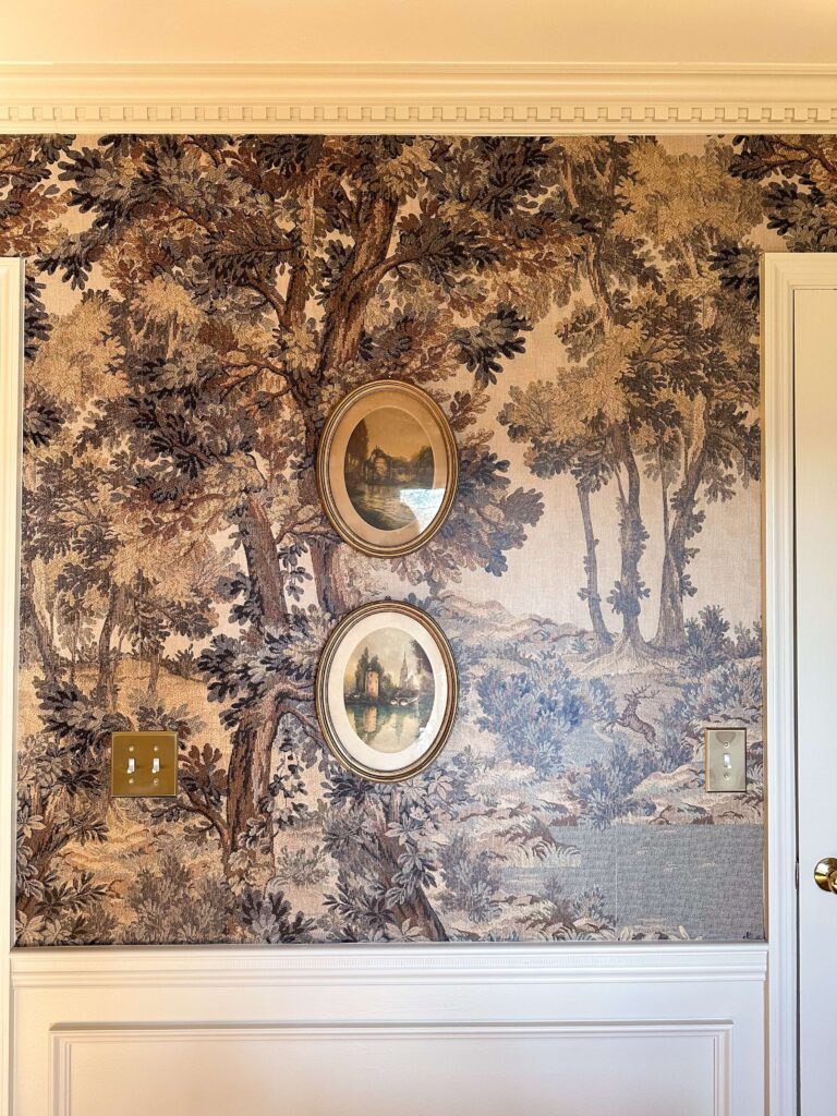
Shop: Vintage Tapestry Wallpaper Mural | Brass Light Switch Covers
When I discovered the vintage landscape tapestry-style mural by Belarte Studio, everything clicked. It felt like an extension of the outdoor view and as if the landscape simply continued inside. The muted, natural palette works beautifully with the rest of my home, reinforcing a sense of cohesion and timelessness throughout the house.
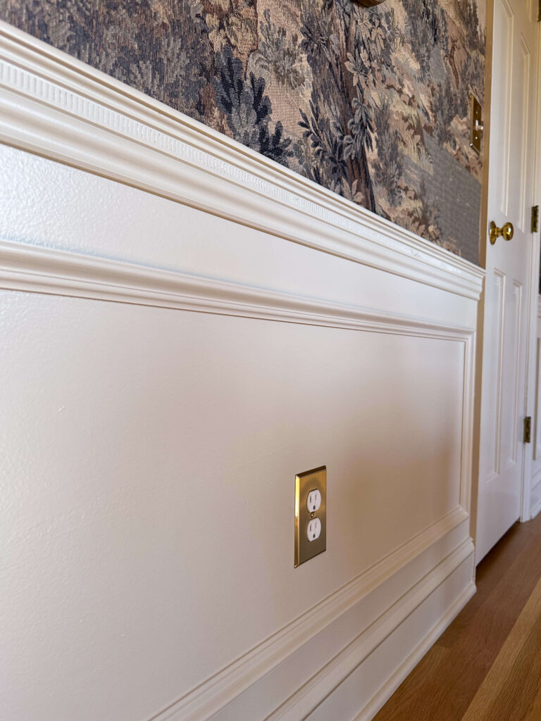
Shop: Joa’s White by Farrow & Ball | Brass Electrical Outlet Cover
To balance the mural, I chose Joa’s White by Farrow & Ball for the remaining walls. I considered going darker or moodier, but ultimately prioritized clarity and calm. This is a space where I work for long periods, and alertness needed to outweigh drama.
Traditional Architectural Details in theHome Office
One of the biggest decisions in the office design was how far to take the wallpaper. I knew I didn’t want it to feel overpowering, so I added a chair rail with box molding below to give the room visual breathing room. If you’re looking to do something similar but don’t know where to start, I put together a simple guide on how to design and install box molding here.
Shop: Chair Rail | Box Molding | Crown Molding
Crown molding was essential. I have it throughout most of the first floor, and continuity matters to me deeply. Since learning how to install it myself, I’ve slowly been adding it throughout the house. For this office, dentil molding felt especially right: formal, classic, and perfectly suited to a traditional workspace.
These architectural details anchor the Vintage Moody Traditional Home Office in a timeless, grounded way.
Vintage Anchor Pieces That Shape This Traditional Home Office
Two key pieces remained from earlier versions of the room and now serve as anchors in the space. The first is my Eastlake-style vintage dresser with a marble top. It’s a beautiful and functional storage piece, holding office supplies while adding warmth and history to the space.
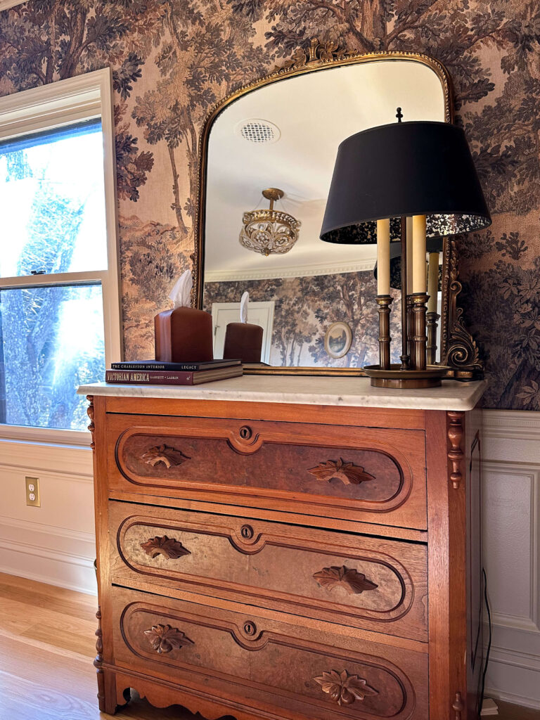
Shop: Dresser (similar) | Mirror | Lamp (similar) | Tissue box cover | Coffee Table Books
The second is my Maitland Smith desk, an estate sale find and a major score. Designing around its rich wood tones helped define the palette and overall feeling of this Vintage Moody Traditional Home Office, giving it soul and permanence.
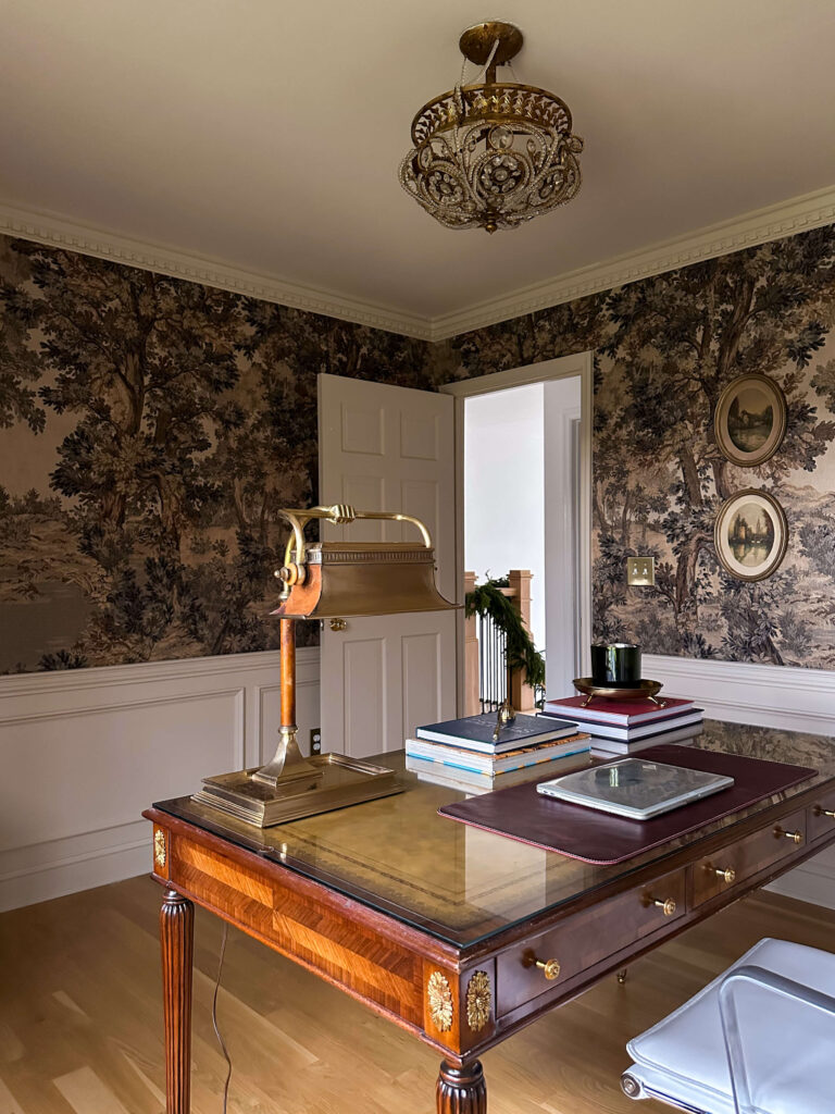
Shop: Maitland-Smith Desk | Brass Curry & Co Lamp | Leather Desk Mat | Coffee Table Books | Brass Candle Tray
I also brought in a light fixture that has followed me from home to home since 2012. The scale and tone feel just right here, adding familiarity and continuity to the room.
Letting This Vintage Moody Traditional Home Office Breathe
I intentionally kept the decor in the home office simple. The wallpaper does the heavy lifting, allowing the rest of the room to remain calm and uncluttered. A large mirror above the dresser, two vintage lamps, coffee table books, a leather desk mat, candles, and a few thoughtful accessories are all the room needs for now.
There are still details to finish – a rug, cord management, and a decision between Roman shades or floor-to-ceiling drapery — but for now, I’m choosing to pause and enjoy the view. Not every space needs to be rushed to completion.
What This Vintage Moody Traditional Home Office Means Moving Forward
I almost didn’t tackle this project in 2025. I considered slowing down and savoring a quieter season instead. But I’m so grateful I listened to the pull to move forward because the new home office design already feels like it’s setting the tone for everything I want to create in 2026.
Now, when I walk past the room, it feels like it gently whispers for me to come in. It feels like an extension of the landscape I love and a reflection of the work I’m proud to do here.


I still get a small skip in my heart every time I see it. And that’s how I know I achieved what I set out to create: a home office that feels calm, inspiring, cohesive, and deeply personal.
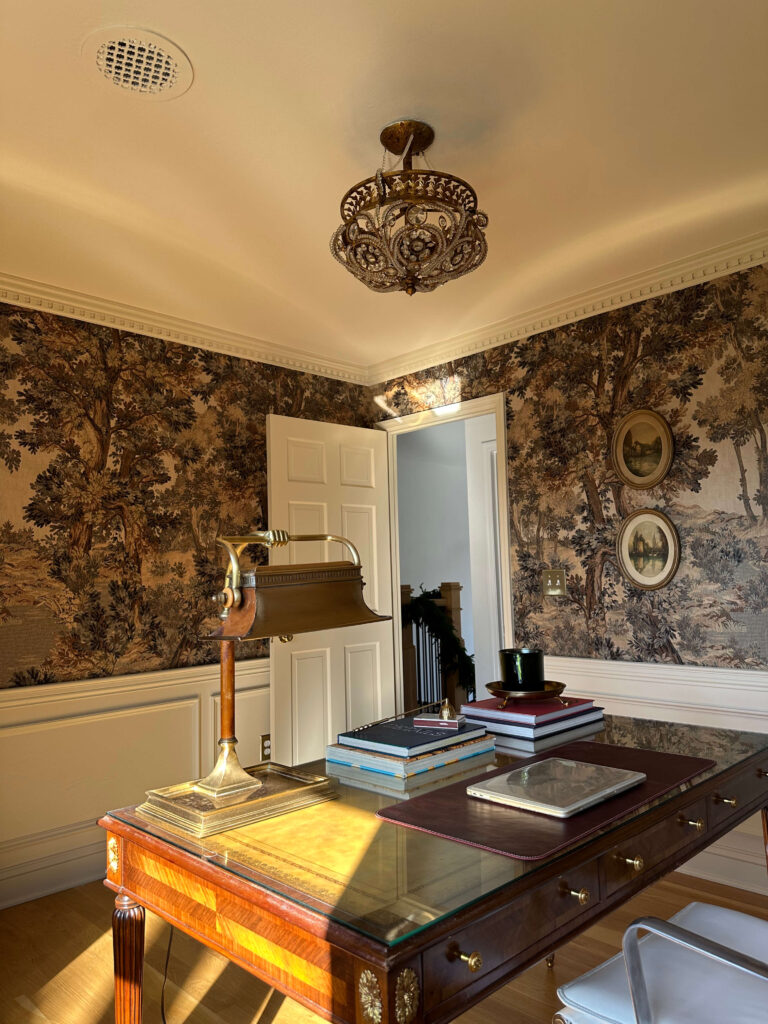
Sources:
Wallpaper (colorway: beige)
Wall Paint: Joa’s White in Flat Eggshell
Ceiling Paint: Dimity in Dead Flat
Light Fixture (discontinued – similar)
French Lamp (vintage – similar)
Wood Cable Box Plate covers (painted)
Related Posts:
Home Office Renovation Progress Report
Picking a Paint Color for the Home Office
How to Measure, Cut & Install Crown Molding
read more
Every year, I add just a little more Christmas decor to my collection, and somehow that always means decorating at least one additional room. Over time, Christmas has slowly expanded throughout my home, and sharing this year’s Christmas decor around the house feels especially exciting.
Rather than having one overall Christmas theme, I like to decorate each room individually and let every space have its own personality. I always change things up just a smidge, and those small updates make all the difference.
This year’s Christmas decor around the house feels layered, intentional, and truly personal.
Styling the Entryway for Christmas
We’ll start in the entryway. This year, I decided to keep the staircase exclusively decorated with Norfolk pine garland. Last year, I used Cypress and Hemlock garland and loved the look, but switching to Norfolk pine this year created a fuller, more refined feel.

Norfolk Pine Garland | Bells | Burgundy Velvet Ribbon | Felt Garland Ties
One of the biggest changes this year was the ribbon. In the past, I used a skinnier burgundy velvet ribbon, but this year I chose a four-inch burgundy velvet ribbon and made larger bows, spacing them throughout the staircase banister.

Shop the Holiday Staircase Supplies
I reused the same bells at the base and added extra garland pieces at the bottom for a fuller look. Overall, I used two deluxe Norfolk pine garlands along the banister and four additional pieces at the base.
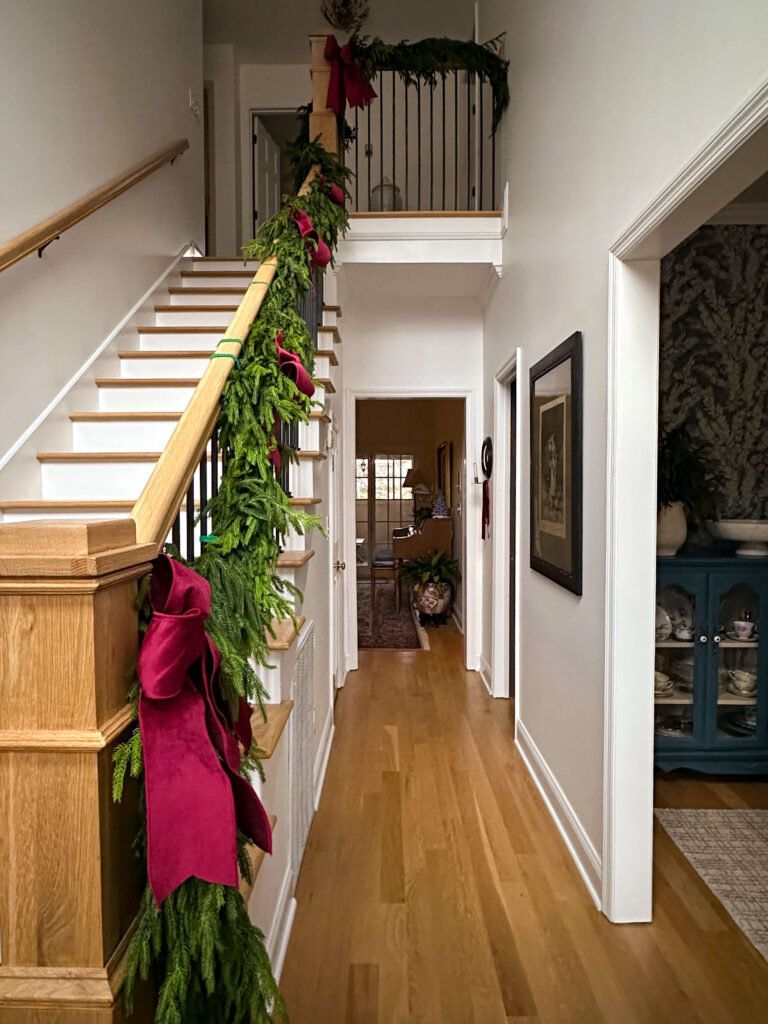
I also switched from plastic zip ties to felt garland ties this year. They hold the weight of the garland beautifully, are reusable, and are much safer for the banisters.
An Elegant & Timeless Christmas in the Dining Room
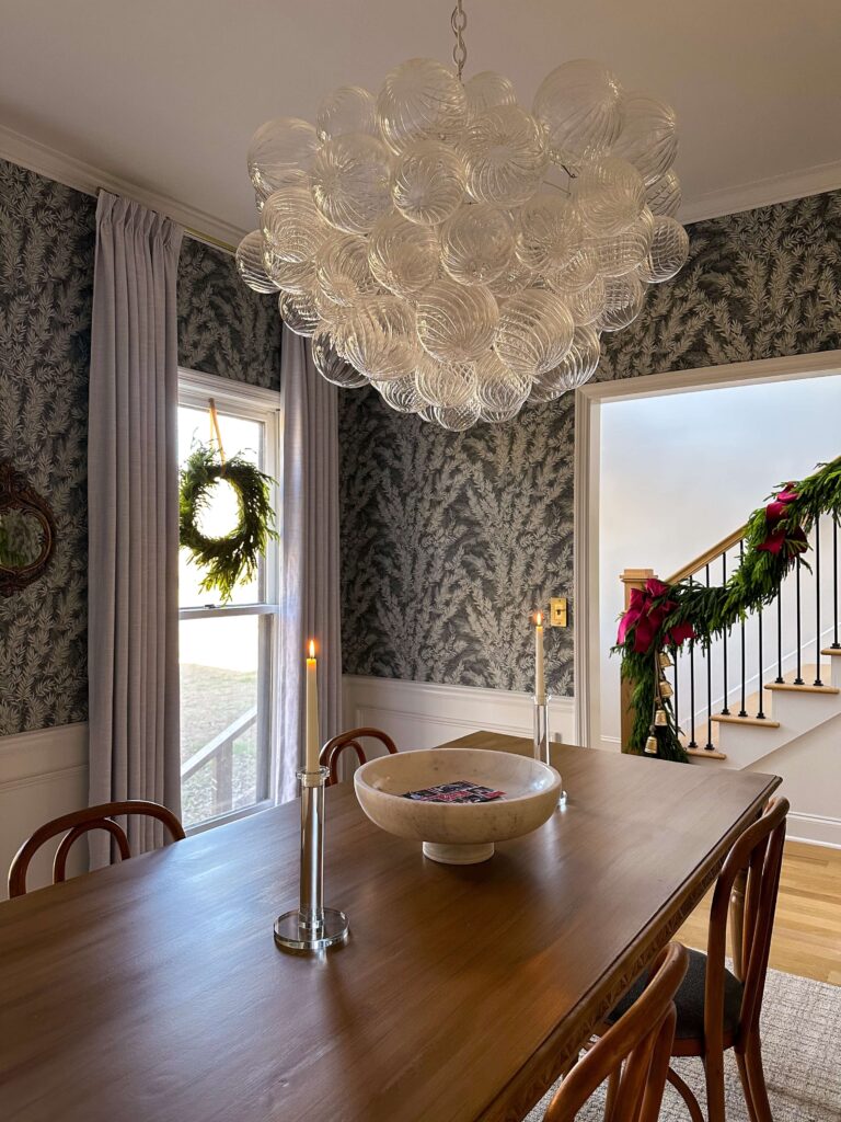
Norfolk Pine Wreath | Khaki Velvet Ribbon | Talia Chandelier | Wallpaper | Rug | Crystal Candle Holders | White Taper Candles | Marble Display Bowl | Draperies
Moving into the dining room, I kept things very classic and simple this year, similar to last year’s setup. I hung Norfolk pine wreaths in the windows using khaki velvet ribbon. Because I have wood window casing, I hammer a tiny nail directly into the trim so the wreaths stay securely in place. It’s a small detail, but it makes hanging and removing them so much easier.
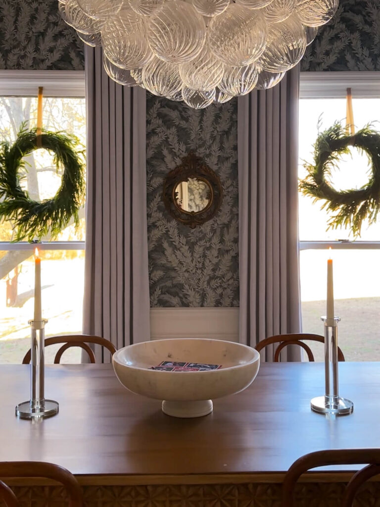
On the dining table, I used simple crystal candlesticks with white taper candles on each side, and a large marble bowl as the centerpiece. On the buffet, I gathered Norfolk pine stems in a large fluted vase and styled them alongside homemade gingerbread houses we made over Thanksgiving break.

Fluted Vase | Norfolk Pine Stems | Wallpaper
This room feels timeless and understated, which I love as part of the overall Christmas decor around the house.
A Very Vintage Christmas in the Living Room
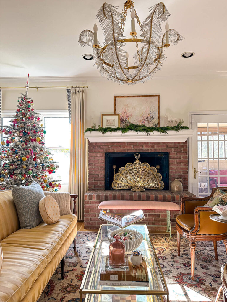
Flocked Tree | Mantel Artwork | Tiered Coffee Table | Marble Ribbon Bowl | Spice Candle Cloche | Match Striker | Blue Couch Pillows | Curtains | Chandelier
The living room is one of my favorite spaces this year and easily the most exciting. The theme in this room is Vintage Christmas! I added an eight foot flocked tree and decorated it exclusively with my vintage ornament collection. For anyone looking to do the same, I choose a tree which was a bit more sparse so I could really stuff it with a lot of ornaments.


Flocked Tree | Faux Fur Blanket | Drapes | Vintage Sideboard | Large Greek Key Mirror
I’ve been collecting vintage ornaments for a little over two years, and this year the tree holds roughly 650 vintage ornaments. For a full, collected look I layered the ornaments deeply throughout the tree. The plain (and more weathered ornaments) went towards the trunk, while the baubles and more unique ornaments were placed front and center. Last year I invested in new ornament storage boxes which came with dividers and it really made decorating so much easier this year. I highly recommend these if you have a lot of ornaments to sort through.
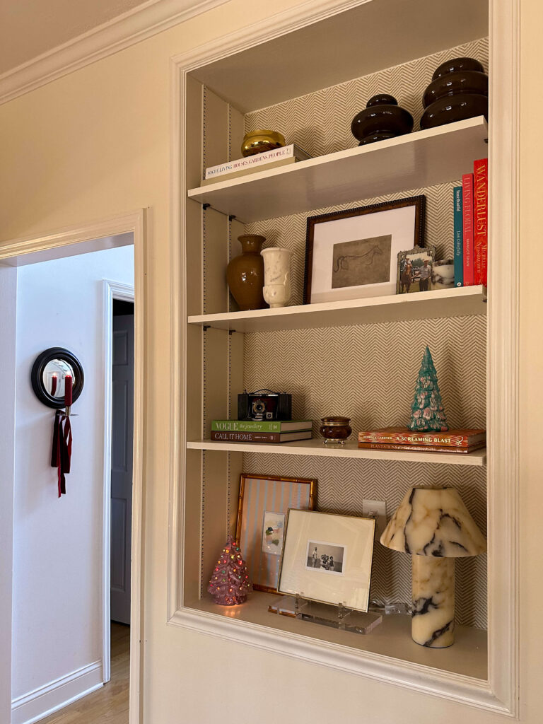

Wall Sconce | Burgundy Ribbon | Burgundy Ribbed Candle | Lucite Display Stand | Calcatta Viola Marble Lamp | Small Marble Jar | Small Marble Vase | Brown Gloss Vase | Coffee Table Books | Matching Brown Vase Set
I kept the mantel simple so it wouldn’t compete with the tree, using just one larger garland as a centerpiece. Throughout the room, I incorporated sentimental pieces, including vintage ceramic trees from my grandmother, a marble bowl of vintage ornaments on the coffee table and reindeer from my great-grandmother on the piano.
This room feels bright, cheerful, and incredibly meaningful.
Adding Ribbon Throughout the House
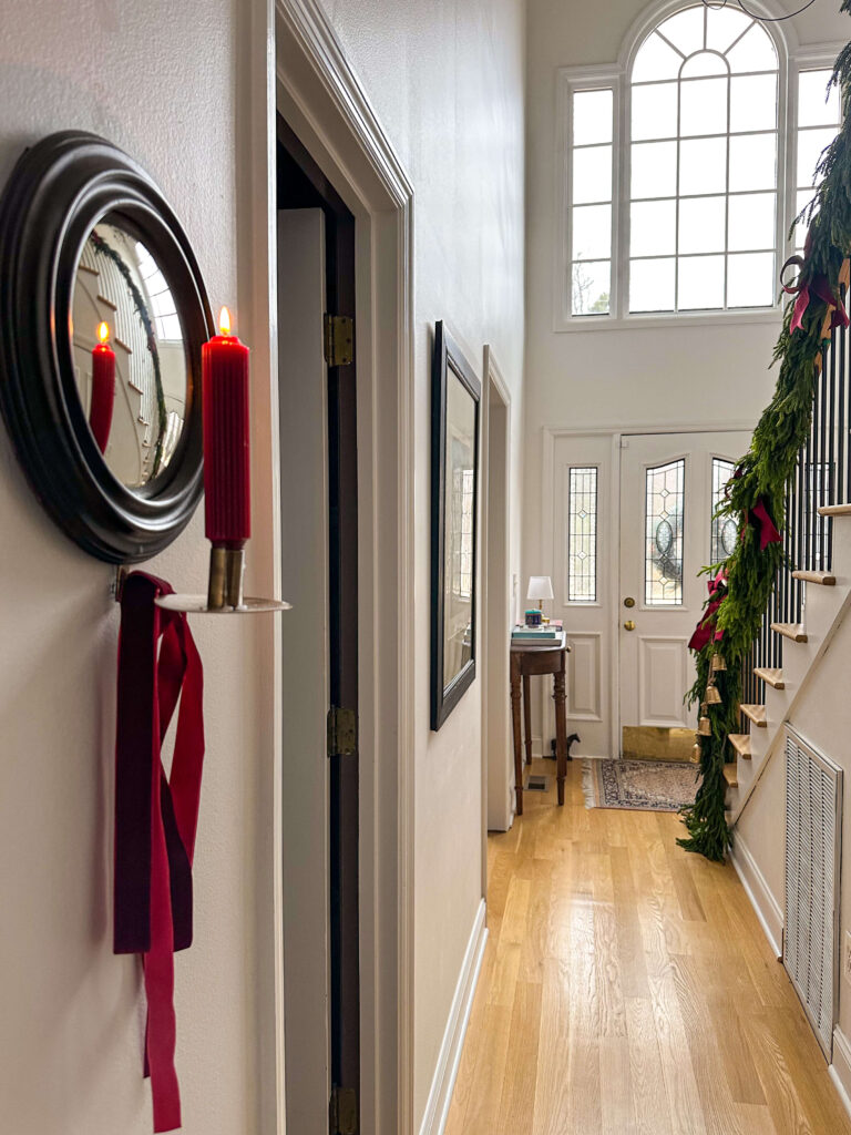
Wall Sconce | Burgundy Ribbed Candle | Velvet Burgundy Ribbon
This year, I added ribbon throughout the entire house. I used burgundy velvet bows anywhere they felt right, including candle sconces, picture frames, lamps, and bathroom lighting.
My philosophy is simple: if it’s available, put a bow on it. This detail helped tie all of the Christmas decor around the house together beautifully.
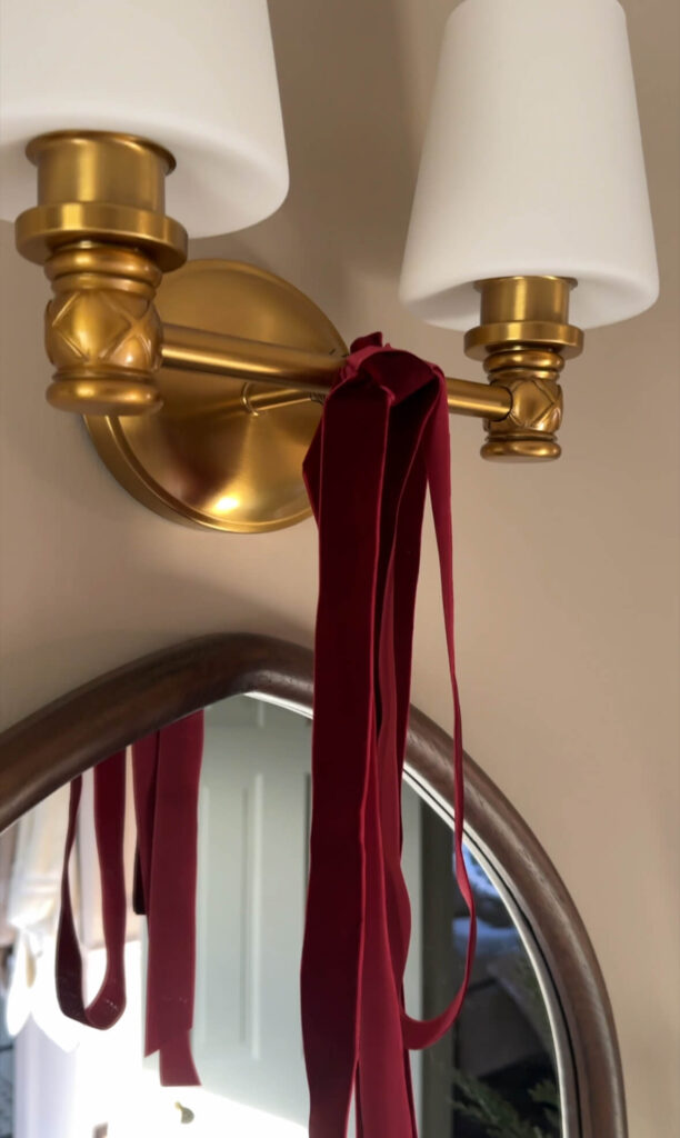
A Cozy Christmas in the Primary Bedroom
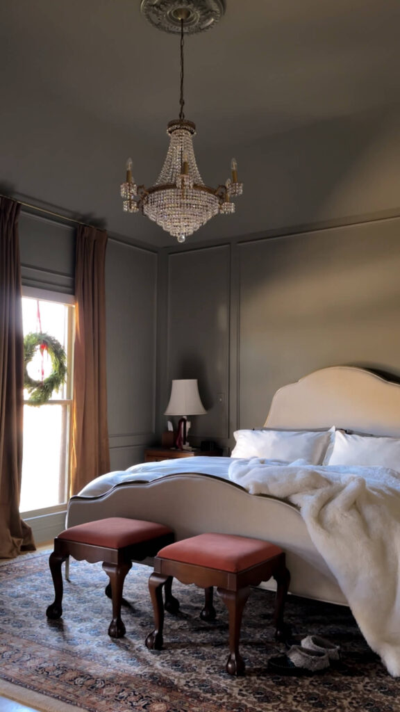
Wreath | Velvet Curtains | Linen Bed | Ivory Duvet | Faux Fur Blanket | Chandelier | Wall Color
The bedroom theme this year is Cozy Christmas. I kept the wreaths on the windows, just like last year, which I absolutely love waking up to each morning. This year, I doubled up the garland on the dresser for a fuller look. I used four total pre-lit Hemlock garlands draped across the top for added depth and warmth.
Prelit Hemlock Garland | Norfolk Pine Tree | 4″ Burgundy Ribbon | Frame TV
For the bedding, I added a faux fur ivory throw. I finished the space by tying burgundy ribbon onto both marble lamps.
The result feels soft, layered, and perfectly cozy.

Lenox Holiday Mug | Velvet Burgundy Ribbon | Ribbed Burgundy Candle | Marble Lamp (similar)
New this Year: Decorating the Primary Bathroom
Decorating the bathroom was new for me this year, and I was so excited to finally add Christmas touches after completing a renovation earlier on. To start, I draped garland over both the window frame and the toilet room doorframe. I drilled pilot holes into the wood trim and installed small cup hooks so the garland could rest securely in place. This made decorating easy and damage-free.
Cypress Garland | Burgundy Velvet Ribbon | Vanity Sconces | Mirrors | Faucets | Mini Christmas Tree | Vanity | Vanity Hardware | Chandelier (vintage but similar options) | Tile Flooring | Wallpaper
To round out the look, I added cedar stems on each end of the garland. A small Christmas tree on the sink, burgundy bows on the light sconces, and red plaid towels throughout the room has this space feeling subtly merry!

Cypress Garland | Block Print Stripe Wallpaper | Wall Color
A Kitschy Kitchen Christmas
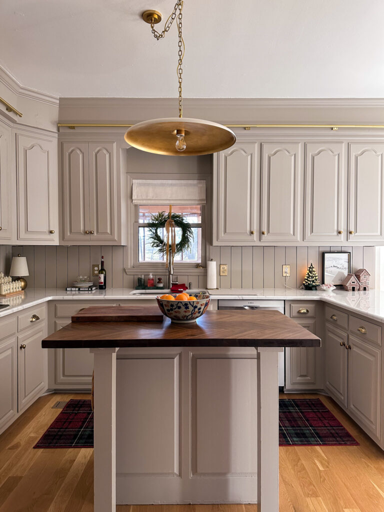
Plaid Rug | Wreath | Khaki Ribbon | Pendant | Brass Lamp | Gingerbread Houses | Winter Artwork | Roman Shades | Chevron Butcher Block Island Top | Backsplash Wall Paneling
The theme in the kitchen this year is Kitschy Christmas. I’m not usually someone who enjoys clutter, but at Christmastime, I love it in this space.
I hung wreaths in the windows again this year using khaki velvet ribbon. I also treated myself to gingerbread houses I’ve wanted for the past two years and finally purchased on sale, and added a small piece of winter artwork behind them. A plaid runner rug in front of the sink, Lenox holiday plates that I happily leave out on the counter all month long, and oranges on the island have the main kitchen feeling festive, fun and lived in.
Gingerbread Cottage | Gingerbread Tall House | Winter Artwork
On the kitchenette table, I used a vintage tablecloth that belonged to my grandmother and added a poinsettia. The kitchen feels joyful, nostalgic, and full of charm.
A Ralph Lauren Christmas in the Cozy TV Room
Cedar Garland | Prelit Hemlock Garland | Christmas Tree | Red Ribbon Bows | White Ceramic Village | Gold Leaf Chandelier | Bookshelf Lamps
The cozy TV room leans into a traditional Ralph Lauren–inspired Christmas. This room saw some new additions this year which I’m really loving including the vintage buffet and a Frame TV, which was so fun to style with Christmas artwork.

Christmas Tree | Red Velvet Bows | Vintage Buffet | Frame TV | Burl Wood Frame | Santa TV Artwork | Juniper Candle | Brass Clawfoot Tray | Viola Marble Tray | Gold Leaf Chandelier | Coffee Table Books
On the mantel, I layered cedar garland as a base and topped it with pre-lit Hemlock garland. I removed everything from the bookcases and styled them with my white Christmas village, adding small tea lights so I can turn them on each night. I also updated the bookshelf lamps with red tartan lampshades, which I may end up keeping out all year long.

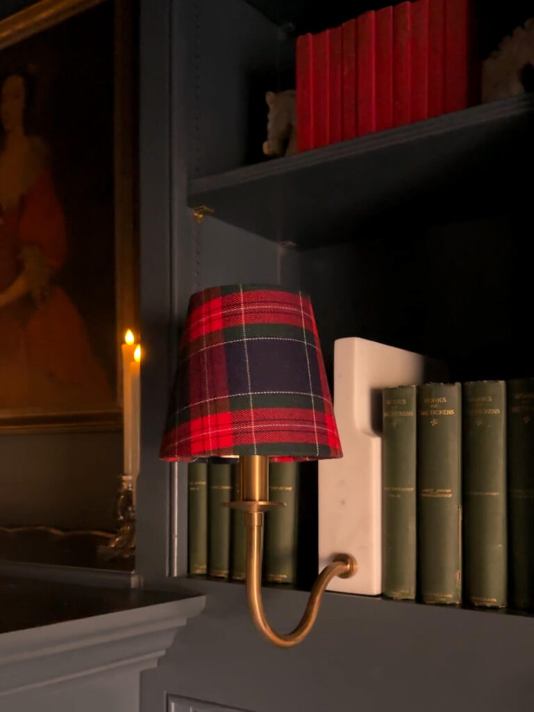
Red Bows | Cedar Garland | Prelit Hemlock Garland | Bookshelf Lamps | Tartan Lampshade | Candles
The tree in this room sticks to a red and gold color palette. I used red beaded garland, candles for the first time, nutcrackers, red bows, sentimental ornaments, and a gold vintage tree topper.
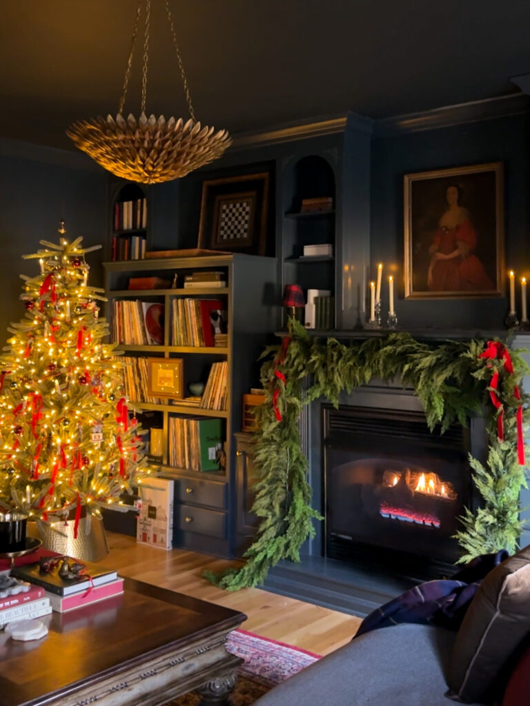
Wrapping Up This Year’s Christmas Decor Around the House
This year’s Christmas decor around the house feels thoughtful, layered, and deeply personal. Every room has its own personality while still feeling cohesive as a whole.
Next year, I plan to decorate my home office for Christmas and perhaps add a full sized tree in the primary bedroom! I hope this tour of our home inspires you to add just one more festive touch where it feels right.

We haven’t had snow this winter yet but hopefully we’ll get a dusting in the New Year!
Wishing you a very Merry Christmas, and a Happy & Healthy New Year!
The Latest on the Blog —
read more
When it comes to picking a paint color for the home office, the decision carries more weight than you might think. This room isn’t just another space — it’s where ideas grow, projects come to life, and creativity needs the right environment to flourish. After weeks of designing and installing chair-rail and box trim, and adding dentil crown molding, the architectural foundation of the room is finally complete. Now it’s time for the most exciting part: choosing the paint.
Before settling on a color, I mocked up several wallpaper options and landed on a beautiful vintage tapestry mural. I’ve been wanting a mural in the house for ages, and the office felt like the most natural fit. The tones are muted, elegant, and filled with layered warmth, which inspired three color directions that each brought something different to the space.
Here’s a mock-up of the the home office with the new wallpaper mural! I’ll be painting first, but this gives us a base to start to visualize the colors.
Here are the three paint colors I seriously considered while picking a paint color for the home office, and why I ultimately chose the one I did.
Option 1: Treron by Farrow & Ball
I really love this design! I’m just worried it will be too relaxing for getting work done.
My first instinct was a deep green — specifically Treron by Farrow & Ball, a color I already used in my primary bedroom. When I held the wallpaper against it, the tones paired beautifully. Treron is rich, cozy, and wonderfully complex in north-facing light.
But that’s also where my hesitation began.
I associate Treron with rest, grounding, and unwinding — all perfect for a bedroom, not ideal for a workspace. While it technically works, it doesn’t evoke the energy I want to feel when I sit down to design or create. So even though it was a strong contender, Treron wasn’t the best choice when picking a paint color for the home office.
The Primary Bedroom color drenched in Treron by Farrow & Ball
Option 2: Farrow & Ball London Clay
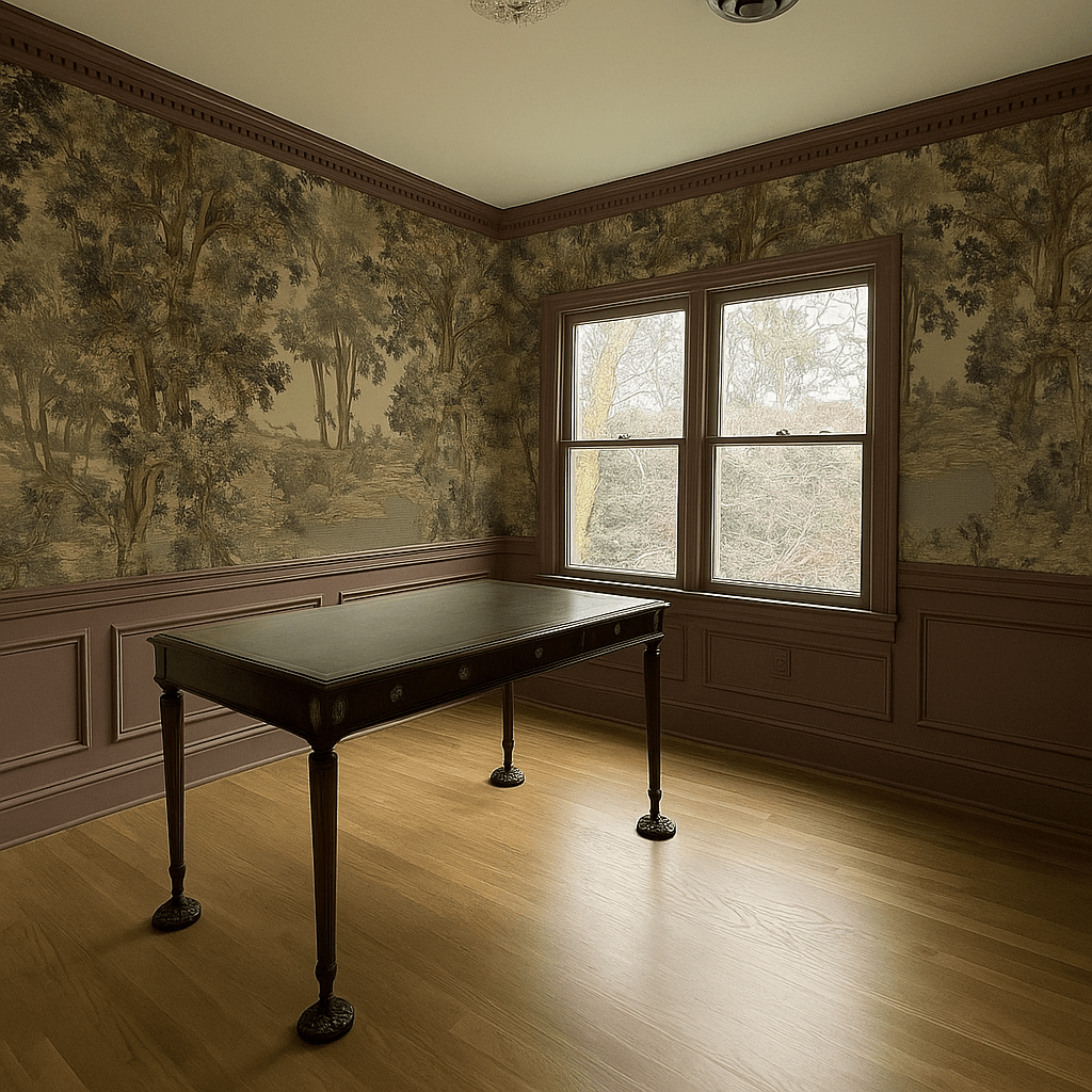
London Clay by Farrow & Ball will forever be my favorite brown!
Next up was London Clay by Farrow & Ball, a color I’ve used throughout the home — including in the powder bathroom and on a high-gloss dresser makeover in the primary bedroom. It’s warm, earthy, and has a timeless depth that works beautifully with traditional details.
When paired with the wallpaper, London Clay came close, but the undertone felt slightly off. More importantly, it brought a richness and heaviness to the room that didn’t quite match the creative, energizing atmosphere I want for the office.
It’s a stunning color — just not the direction for the home office.
The powder room baseboards and door are painted London Clay by Farrow & Ball in Full Gloss.
Option 3: Farrow & Ball Joa’s White
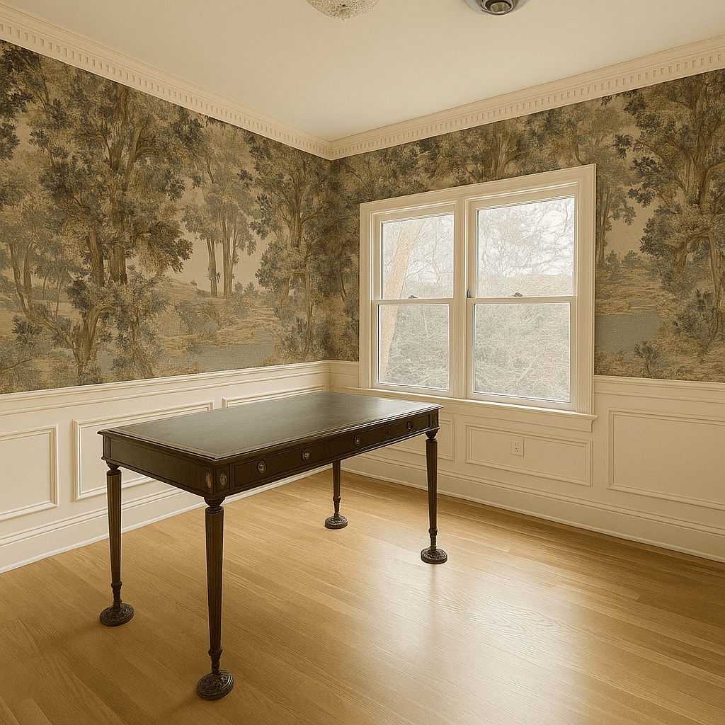
A mock-up of Joa’s White in the home office design. I love how it compliments everything!
Although I do love a mood, I was noticing a trend that I wanted something lighter, but not necessarily white. I tested Joa’s White by Farrow & Ball, a warm near-neutral with a soft, sandy undertone. Immediately, it felt right. It complements the mural beautifully without competing with it, and it brightens the room in a way that still feels calm and grounded. And if we’re being totally honest, it has that Nancy Myers feeling to it.
The Paint Color I’m Picking for the Home Office
I’m sure you could sense where this was headed: I’m going with Joa’s White by Farrow & Ball for the home office design! I think it’s going to do all the heavy lifting with highlighting the trimwork and dentil molding I’ve worked so hard to install, but at the same time it’s not going to compete with anything else in the space. It feels balanced, calm and cohesive.
Ultimately, when picking a paint color for the home office, I wanted something that offered:
- Soft, inviting light without feeling stark
- Visual calm for focus and creativity
- Compatibility with the tones in the wallpaper
- Cohesion with the warm undertones I have throughout the house already
- Flexibility for future décor decisions
Joa’s White checks every box!
What’s Next in the Home Office Makeover
Now that the paint decision is made, the next steps are all about installing! I’ll be using my Graco X5 paint sprayer to apply most of the paint, as both the crown molding and the chair rail are quite detailed. I’ll hand paint the windows, doors and corresponding casing. For a finish, I’m choosing Farrow & Ball’s new finish, Flat Eggshell. I used it in the primary bathroom and I the subtle sheen is perfect for highlighting woodwork but is also incredible durable and easy to clean.
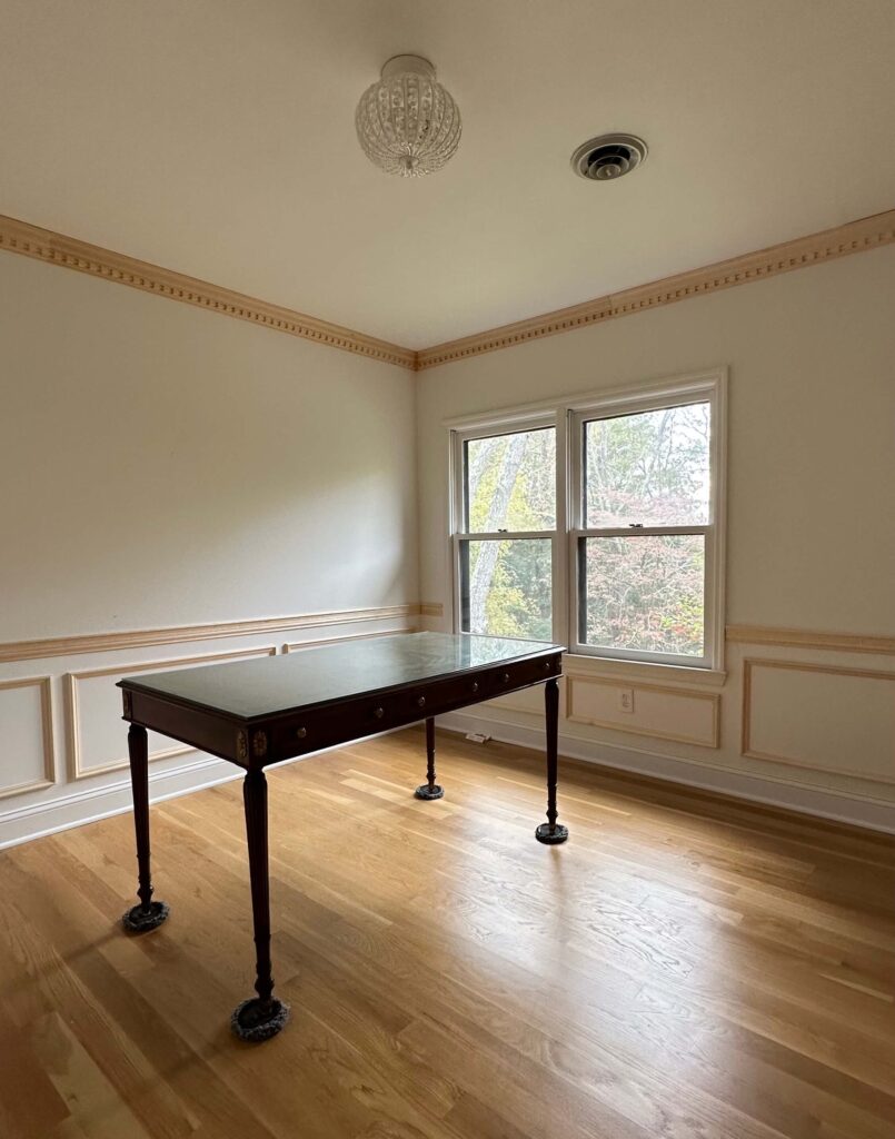
The next time you see this, it will be painted! Shop: Crown Molding | Chair Rail | Box Molding
I’m also going to use this opportunity to repaint the ceiling. Instead of color drenching, or going with a white, I’m going a couple hues lighter than Joa’s White and am using Dimity in Dead Flat. I did a similar pairing in the primary bathroom this summer by pairing Jitney on the walls and Stirabout on the ceiling, and it’s such a beautiful soft contrast.
After painting, it will be time to install the wallpaper mural! I anticipate at least two full days to do this, possibly three, but luckily it lines right up so I’m hopeful it will be straightforward. From there I’ll swap out the light fixture, add the furniture back in and then it will be time to style! My goal is to have everything completed by December.
Follow along to see the rest of the home office makeover come to life! And if you’re new here, you can catch up on the progress thus far below.
Catch Up on the Home Office Makeover:
How to Measure, Cut & Install Crown Molding
How to Design Picture Frame Molding: Home Office Edition
Home Office Makeover Plans & Inspiration
This project is part of the Fall 2025 One Room Challenge! You can follow along with the challenge here.
browse more posts
read more
A funny thing about my 1989 brick colonial house: it has the traditional crown molding you’d expect to see in a home like this — but only in some rooms. It’s always puzzled me, and lately, it’s started to bug me. The entire upstairs has zero crown molding, while the downstairs rooms — the cozy TV room, dining room, kitchen, living room, and now my primary bathroom — all have it. So when 2025 kicked off and I started planning my project list, I decided one long-term goal would be to make the trim work throughout the house cohesive. But before I could do that, I had to learn how to measure, cut, and install crown molding. Now that I’ve completed the process twice (hopefully you saw the install in the primary bathroom), I feel confident enough to share my best tips, tricks, and lessons learned along the way.
Freshly installed crown molding in my primary bathroom
Crown molding is one of those small architectural details that instantly elevates a room. It adds character, polish, and that finished, designer look — but it can also be frustrating if you don’t understand the basics. In this post, I’ll walk you through how to measure, cut, and install crown molding using the beautiful dentil molding I added to my home office as part of my ongoing makeover project.
Step 1: Measuring for Crown Molding the Right Way
Before you make a single cut, you need to understand your space. Here’s the thing — very few walls and ceilings are perfectly straight. Knowing that from the start will save you a lot of frustration later.
Start by drawing a rough diagram of your room and label each wall. Then grab a protractor tool (this also comes with the crown molding jig kit I mention below) and check the angle in each corner by placing it flush against the ceiling. This tells you whether your corner is a true 90-degree angle or slightly off, which will determine how you set up your miter saw for accurate cuts. We’ll get to that in a second.
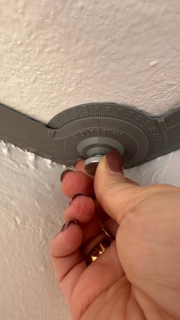
I like to draw a rough diagram of the space and then label all cuts and angles on each wall.
You can also use this opportunity to measure the length of each wall so you order enough crown molding for your project, and mark those measurements on your diagram. I’d suggest adding one additional piece of crown molding to your order, especially if this is your first time working with it.
Lastly is measuring and marking the crown the proper way. You want to measure from the corner and then mark this on the bottom piece of your crown molding. See a photo of me doing this below with my dentil molding: the dentil is pointing up and that’s where I’m marking my measurement. This is how we’ll place the crown on the miter saw when we’re ready to cut.
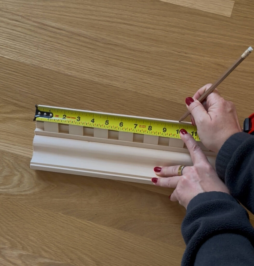
Step 2: The Tools You Need to Cut and Install Crown Molding
If you’re learning how to measure, cut, and install crown molding for the first time, your tools will make or break the experience. I highly recommend investing in a Kreg Crown Molding Jig — it’s worth every penny and also includes the protractor tool you need which I mentioned above. I tried cheaper versions and they simply didn’t hold the molding at the right angle.

A good miter saw and the Kreg Crown Pro Jig are must haves for this job. I’ve had my Bosch miter saw for several months now and have been very happy with it.
You’ll also need a stud finder (my favorite is by Franklin Sensors) to mark your studs before installation. It detects not only studs but also hidden electrical wires, which you definitely don’t want to nail into. Go ahead and mark your studs prior to doing any cutting.
Other tools needed will be a miter saw, specifically one large enough to cut crown molding, a tape measure, triangle tool, brad nailer, two inch brad nails, ladder, safety glasses, wood filler, caulk, nail punches, a hammer and sandpaper.
Step 3: How to Find and Set Your Crown Molding Spring Angle
The next step in how to measure, cut, and install crown molding is understanding your spring angle. This is the angle between the back of the crown molding and the wall. Place your protractor flush against the back of the molding to find this measurement.
Then on the backside of the Kreg Jig, you’ll see the ability to change the spring angle. Adjust it to the proper angle and tighten the screw. This helps you set your jig correctly so you’re cutting at the proper angle every time.
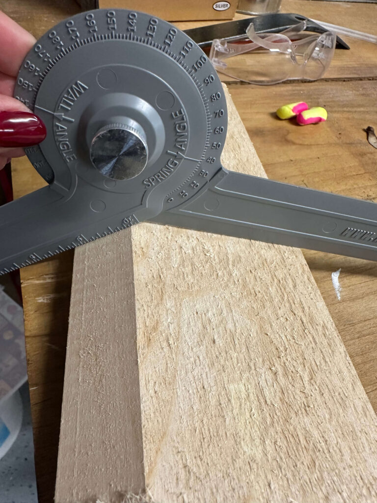


Finding & setting the spring angle: protractor & crown to the left, setting the spring angle on the jig to the right
Step 4: Labeling Cuts When You Cut and Install Crown Molding
This is the step where a little planning goes a long way. Because crown molding is cut upside down and backwards, it’s easy to get confused. It’s easiest if you print out two copies of this diagram to have on your job site, especially if you’re new at this. Keep one at your saw and one in the room.
Mark which side of your molding is the bottom (use a small down arrow) and note each wall section on your diagram. I also label each cut — for example, if I’m installing a piece on the left side of a wall, that’s called a right inside (or interior) cut. Mark this on your room diagram from the start, as keeping your cuts labeled will prevent wasted material and headaches later.
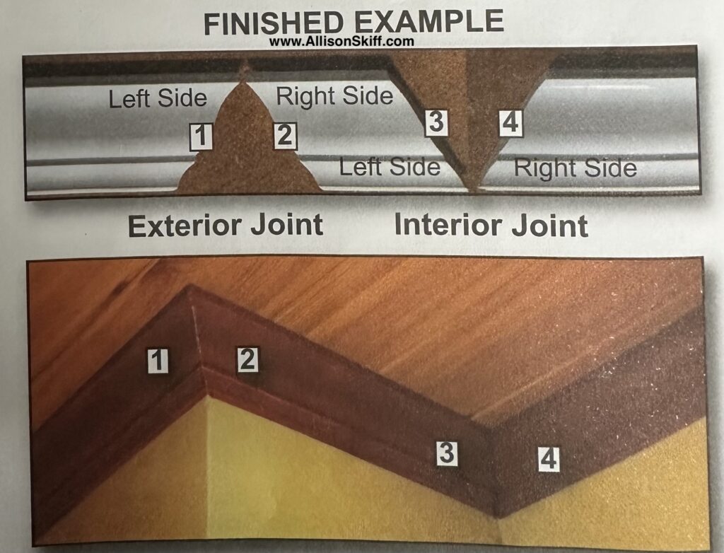
I keep a copy of this crown molding diagram handy at both my saw and in the room I’m working in
Step 5: How to Cut Crown Molding Corners Perfectly
Now that your jig is set to your spring angle (mine was 38° for this project), it’s time to start cutting. If your molding has a pattern like dental molding, remember that the decorative detail faces up when it’s on the saw (i.e. flip the crown molding upside down on the saw, so your saw is hitting the bottom of the crown first). Refer to your room diagram as to which cut you’re making, then match that to your Kreg Jig. It will tell you which direction to set the saw and which side of the saw to place the jig on for each cut.
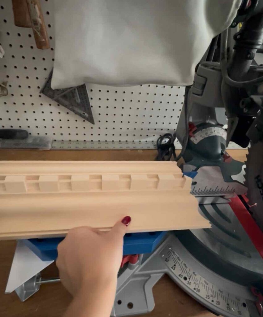
Notice the bottom of the crown molding (the dentil) is pointing up
Start by making two corner cuts that you can dry-fit together before committing to longer pieces. This will help you ensure your corners line up perfectly before moving forward. I like to do one full piece of crown on one side, and then a shorter piece on the other. When installing as one person, this is about all I can manage with two hands.
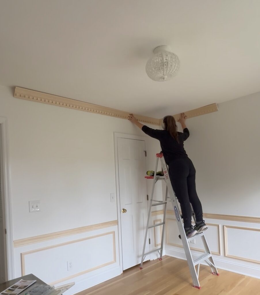
Step 6: How to Install Crown Molding Securely
Once your corners line up, you’re ready to install. Hold the molding so it sits flush with both the ceiling and wall, which is called “rolling” the crown molding. Since no one’s walls and ceilings are perfectly straight you’ll likely have some gaps, but we’ll fix those in the last step. Once your crown is as flush as it can be with both the ceiling and wall, use your brad nailer to nail into the studs — alternating between the ceiling and wall for maximum grip.
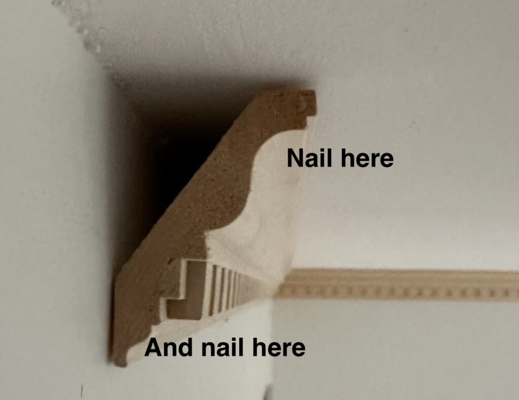
This staggered pattern provides better support and helps your crown molding stay perfectly aligned. Proper installation is just as important as cutting when learning how to measure, cut, and install crown molding.
After you install your first corner pieces, you’ll need to measure for all pieces moving forward. When it comes to measuring, you want to measure from the corner of the room to the edge of the installed piece of crown molding. Take this measurement and you’ll measure on the bottom facing side of your crown molding. Make the mark here, which is where you’ll cut.
Step 7: Caulking and Finishing Your Crown Molding Installation
Even when you know how to measure, cut, and install crown molding, small gaps are normal. That’s where caulk and wood filler come in. A couple rules I like to keep in mind when doing my finishing work:
- Use caulk along the ceiling and wall seams. This brand is my preferred choice.
- Use wood filler for corners and nail holes. I like this kind specifically in the tube.
- For larger gaps, insert a bit of backer rod foam before filling to save product.
You’ll also want to double check that your brad nails went through the wood. If not, use a nail punch and a hammer, and gently tap them in. Otherwise fill as normal and wipe with a crocodile cloth to remove excess wood filler (which makes for an easier time sanding). After the filler dries, lightly sand everything smooth.
Final Thoughts: You Can Absolutely Learn How to Measure, Cut, and Install Crown Molding
If this is your first time tackling crown molding, give yourself grace. Order extra material, practice on scrap pieces, and know that it gets easier fast.
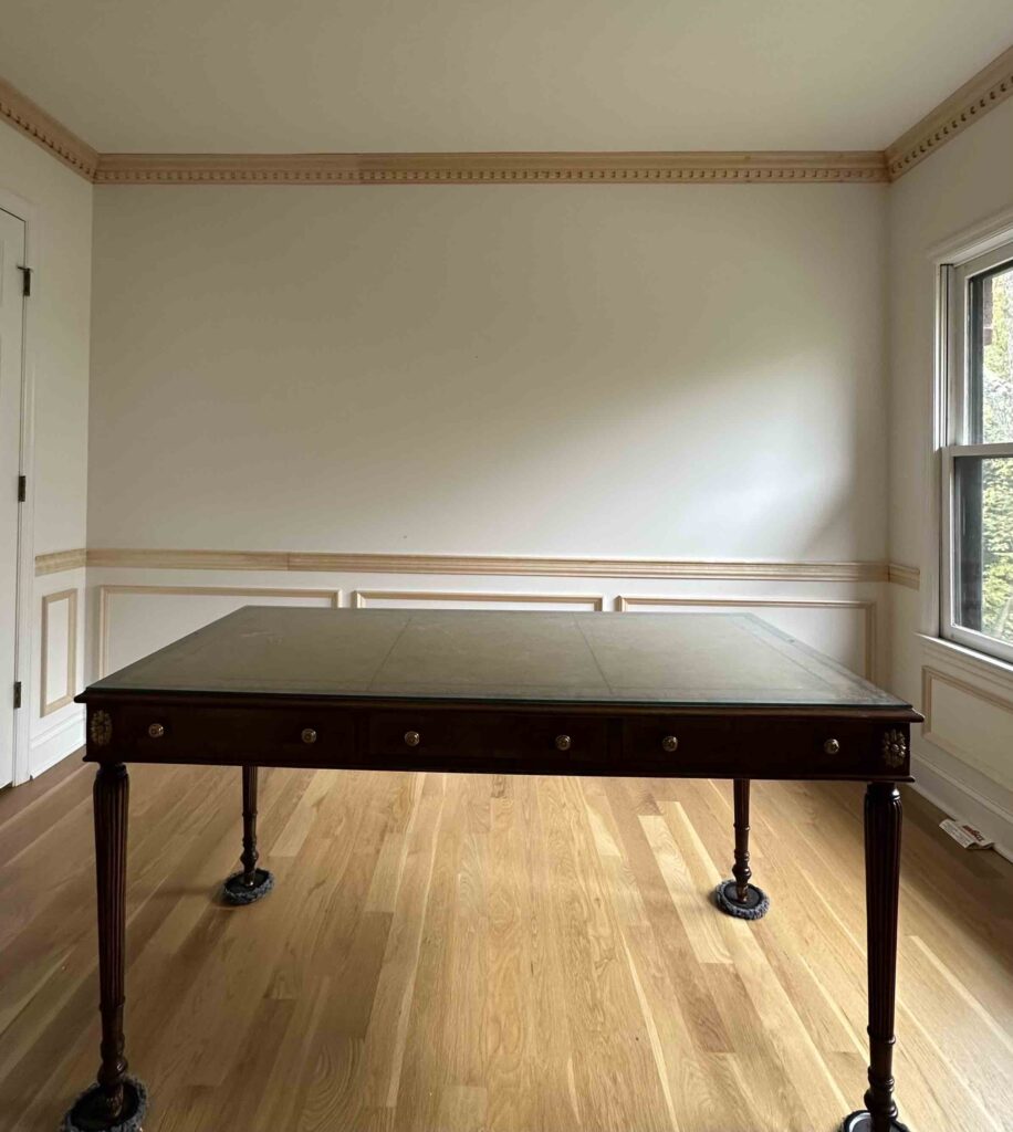
Now that my dental crown molding is up, the next step in my home office makeover is choosing a paint color to go with my new wallpaper choice (see what I picked here). From there, we’ll get to spraying all the trim for a flawless finish.
Follow along for the next chapter — and if you’ve been thinking about learning how to measure, cut, and install crown molding, I promise it’s one of the most rewarding DIYs you’ll ever take on.
Related Posts:
Installing Crown Molding in the Primary Bathroom
How to Design Picture Frame Molding: Home Office Edition
Supply List:
This project is part of the Fall 2025 One Room Challenge! You can follow along with the challenge here.
read more
We’re a few weeks into my home office renovation, and with all of the box molding, chair rail, and crown molding installed, it’s officially time to think about color. Which means one thing: wallpaper. While I still need to wood fill and caulk all of the trim, I’m finalizing the design plan and today I’m sharing the five home office wallpaper ideas I considered for this space.
If you’ve been here for a while, you know that I love a moody, traditional feel throughout my home. My goal for this office is to create a room that inspires me every day—especially when I’m working on design projects and connecting with this community. Every decision, from wallpaper to paint color, is being made with that intention in mind.
1. Pimpernel by Morris & Co. in Bay Leaf and Manila

The first of my home office wallpaper ideas is Pimpernel by William Morris — a true classic. The Bay Leaf and Manila colorway features a soft green background with warm rosy-taupe florals. The pattern feels timeless and layered, the perfect fit between the chair rail and crown molding.
For paint pairing, I’d lean into a warm taupe trim color to let the green shine. If you’re drawn to traditional and classic, this design checks all the boxes.
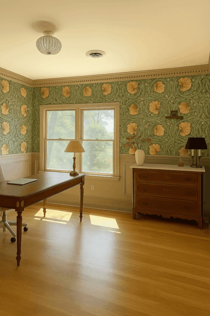
Wallpaper: Morris Pimpernel in Bayleaf / Manilla | Paint: London Stone
2. Pimpernel by Morris & Co. in Brick and Olive

Another home office wallpaper idea that completely shifts the mood is the same Pimpernel pattern in Brick and Olive. The deep red background feels bold and dramatic. I’ve been wanting to bring red into my house for a while, and this wallpaper could be the perfect opportunity.
To balance the warmth, I’d pair it with a contrasting blue green trim. The mix of red and blue would instantly make the space feel collected, intentional, and full of character — exactly what the home office should feel like.
Wallpaper: Morris Pimpernel in Brick / Olive | Paint: De Nimes
3. Brer Rabbit by Morris & Co. in Peacock and Gold

Next up on my list of home office wallpaper ideas is Brer Rabbit by William Morris in the Peacock and Gold colorway. It’s whimsical, traditional, and full of personality with its pattern of rabbits, birds, and vines.
The deep peacock background feels rich and layered, while the golden details add subtle movement. I’d likely pair this one with a warm brown trim to keep the look grounded. If you’re searching for home office wallpaper ideas that blend heritage charm with something unexpected, this one might be it.
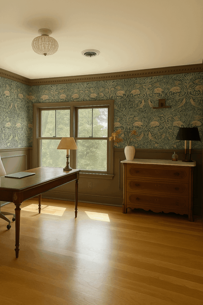
Wallpaper: Morris Brer Rabbit in Peacock | Paint: London Clay
4. Strawberry Thief by Morris & Co. in Charcoal

Another favorite among my home office wallpaper ideas was Strawberry Thief in Charcoal. This paper has a moody charcoal background with copper-toned birds and leaves. It’s sophisticated and a little rebellious — perfect for an old-world feel with modern edge. I would lean into the moodiness and paint all the trim a dark charcoal like this one. Such a mood!
My hesitation is how it would pair with the existing furniture in the room, including my Maitland-Smith desk and Eastlake dresser. While I’m likely ruling it out for this space, Strawberry Thief remains high on my list of home office wallpaper ideas for future projects.
Wallpaper: Morris Strawberry Thief in Charcoal | Paint: F&B Tar
5. Tapestry Landscape by Belarte Studio in Beige

The last option on my home office wallpaper ideas list is Tapestry Landscape in Beige by Belarte Studio. This wallpaper instantly stole my heart. It features muted greens, browns, and beiges in a mural-style design that feels like art for the walls.
I love that it has the appearance of a tapestry texture to it, and I especially love the vintage feel it brings to the table. It comes in several different colorways, but this one spoke to me the most! I think it’s because the color palette organically ties into other rooms in my home like the primary bedroom.
Wallpaper: Belarte Studio Vintage Tapestry in Beige | Paint: Joa’s White
The Final Choice for my Vintage Inspired Home Office
After spending a few weeks with all the samples taped up, I decided that Tapestry Landscape in Beige is the winner. It feels like the perfect mix of everything I love—moody, timeless and inspiring, with a vintage flair.
This will be my first time installing a mural, and I can’t wait to see it come to life. Once the woodwork is filled and caulked, I’ll move on to painting the trim and then hanging the wallpaper. By the way, if you missed how I designed the picture frame molding in the home office you can catch up here!
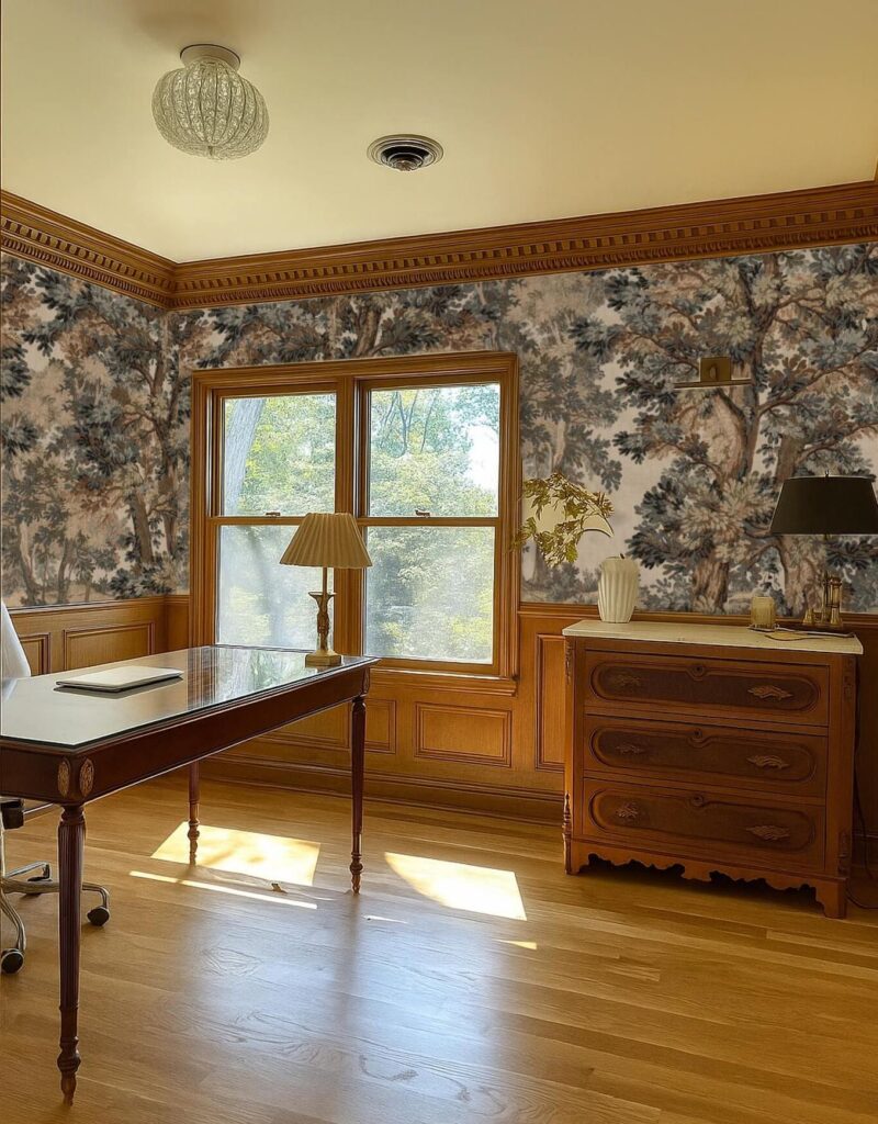
A mock-up of the vintage inspired wallpaper tapestry (it’s reading a bit more blue here than it really is)
For trim color, I’m debating between three directions:
- A rich brown like London Clay (used in my powder room)
- A deep green like Treron (used in my primary bedroom)
- Or a soft cream to let the mural shine
Each of these options connects back to other rooms in my home, keeping the design cohesive while letting this wallpaper remain the focal point.
If you’re currently narrowing down your own home office wallpaper ideas, I hope this list sparks some inspiration and helps you find a pattern that speaks to your space and your style. If you’re still searching, take a look at this post which includes some additional colorways and murals to choose from!
Catch Up on the Home Office Makeover
My Plans for a Moody Traditional Home Office Transformation
How I’m Designing and Installing Custom Trim in the Home Office
This project is part of the Fall 2025 One Room Challenge! You can follow along with the challenge here.
The Latest on the Blog —
read more
There’s something incredibly satisfying about transforming a tired space with your own two hands—especially when the “before” includes dying pine trees and a garden bed filled with dirty rocks and weeds. Earlier this summer, I had my front yard professionally landscaped, but the back pool area? Due to budget that’s been my DIY special. I wanted something beautiful, functional, and low-maintenance, something I could set and forget. That’s when I decided to take on a DIY paver and turf installation project.
Below you’ll find the full tutorial combining both parts of the process—from mockups to pavers to turf—plus every product I used so you can tackle your own backyard makeover.
Step 1: The Vision + Planning
Every good project starts with a plan, and mine began with a few layout mockups. I tested a couple of different designs using large square concrete pavers with strips of artificial turf in between.
I originally envisioned a diamond layout, but once I measured my garden beds, I realized it wouldn’t line up properly—so I pivoted to a clean, straight design that fit the space perfectly.
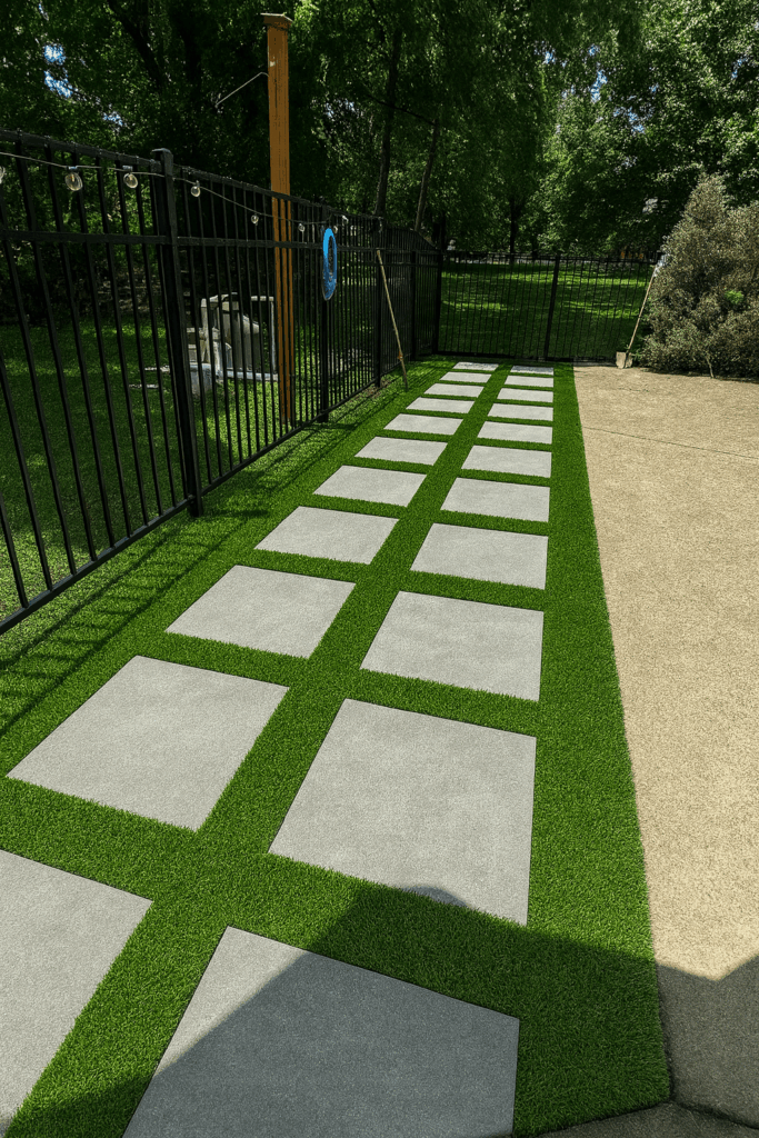
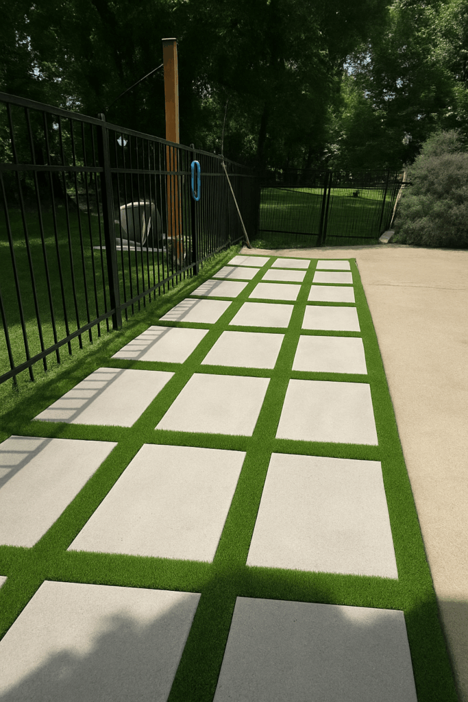
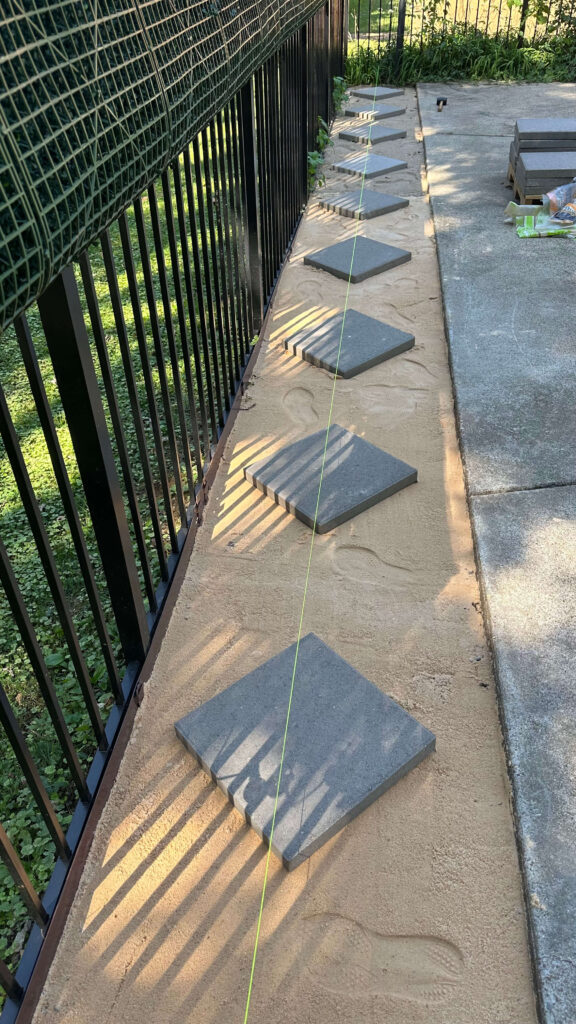
Two mock-ups (one with a row of 3 pavers, one with 2) and my initial install of a diamond pattern. I would end up changing this in the end!
Pro Tip: If your pavers don’t visually align in your mockup, it’s worth reworking the pattern before you start cutting turf later on.
Step 2: Clearing the Space
The next step in my DIY paver and turf installation was getting rid of the mess. I pulled weeds, rocks, and the remnants of some very sad pine trees. Then I worked on leveling the soil as best as possible—trust me, this step makes everything easier later on. You’ll need a pick axe, a heavy rake and a good shovel for this process. I also purchased a special shovel with blades on the side which helped cut through deep roots when removing the pine trees.


The before and after of the area. It felt so good to get everything cleared out!
Step 3: The Decomposed Granite Base
Once the area was clear, I had two tons of decomposed granite dropped in my driveway. (I about died when I saw how much that actually was.) Often referred to as “DC” this type of rock allows for the best drainage for a project like pavers. Luckily you can have it delivered!
Before hauling it over, I should’ve installed a garden edger to contain the material—but I learned that one the hard way. Another thing I didn’t do and should have was tamped down the soil before laying the decompossed granite. When you’re removing roots, the soil needs to settle. Helping it along with a tamp will take care of this for you and you’ll avoid things settling after the fact.
Anyhow, back to the process: Using buckets, I shoveled the granite over to the garden beds, spread it evenly, and raked it level with a heavy-duty rake. A good rule of thumb is about 2 inches of rock for drainage purposes.
Next I tamped everything down by hand to create a solid base for the pavers. You can also rent a tamper, however I didn’t have the ability to haul one myself so I did this by hand. Try to level the rock as much as you can, but don’t get terribly detailed with it, as we’ll do sand in the next step which will help fill in gaps.


Step 4: Sand Layer + Leveling
Next came sand. You’ll want to purchase “paver sand” which is used specifically for this purpose and you should plan on one to two inches total. Since my pavers are aesthetic and are not being walked or driven on, I went for one inch. If your pavers are going to be getting normal use and traffic, you’ll want two to three inches of sand.
The easiest method for installing the sand was dumping one bag at a time, leveling it with a rake, then again with a flat board (a process called screeding). Use a level to ensure everything is even and keep screeding until it is. This step creates an even foundation for your pavers to sit securely without wobbling, which is key to a polished finish.

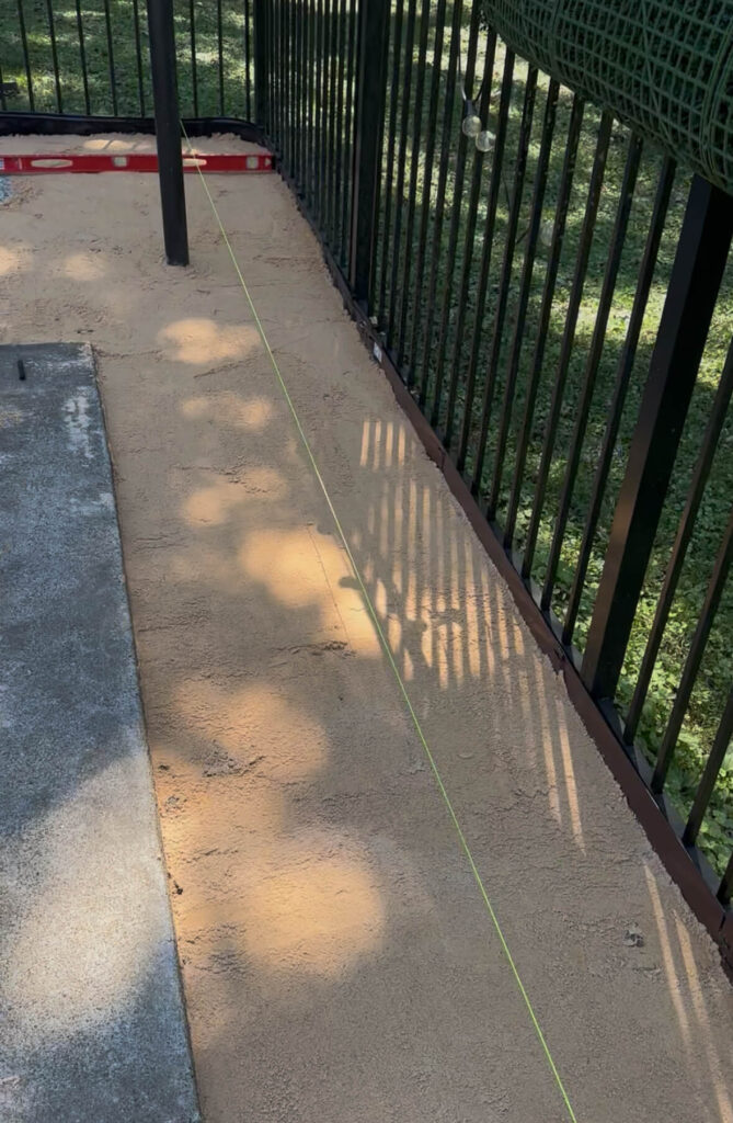
Step 5: Laying the Pavers
Here’s where the DIY paver and turf installation really started to come to life. I began with my diamond pattern in the narrow bed but quickly realized it didn’t translate to the larger area. Half pavers and awkward cuts just weren’t the look I wanted, so I switched to a straight layout that felt cleaner and more intentional.
To keep spacing consistent, I cut seven-inch wooden blocks to use as spacers between each paver—this is key because it makes trimming and fitting the turf much easier later on.
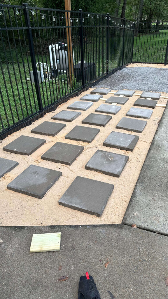
These are the pavers I used (ps – they deliver!)
Each paver weighed about thirty-six pounds, and with sixty total, that’s over two thousand pounds I moved around… and yes, a few of them got set more than once. Once you have your pavers placed, tamp them down with a rubber mallet to help set them.
Step 6: Installing the Artificial Turf
With the pavers in place, it was time for the artificial turf. Using the same wood block spacer, I cut my turf to the width and length for the longer pieces first. I used scissors to do this, but would highly recommend a good utility knife like this one instead (I learned that towards the end). It’s so much faster!
An important step to note when you’re installing artificial turf is to make sure all of the blades are pointing in the same direction. Make sure to plan this during your cuts, otherwise you’ll end up with a lot of waste. Dry fit the turf in the spaces first (some pavers may need slightly shifted) and then follow these steps to lock it all in place:
- Join the pieces of turf together with seam tape. I used this kind and it’s EXTRA sticky, which gave me peace of mind. Place it on both pieces of turf you’re joining and then press down.
- Next using a hammer, you’ll want to hammer a staple over the seam. This is going to add extra reinforcement through weather. Brush over the blades with your hand to hide the staple after you’ve hammered it in place.
- Last is hammering 5 inch galvanized nails throughout. I really focused on doing this every foot along the perimeter of the garden beds, as well as where I saw the turf shifting near the pavers. A good test is to get your leaf blower out and see if any turf lifts when you blow over the area. If it does, drive a nail into that spot.
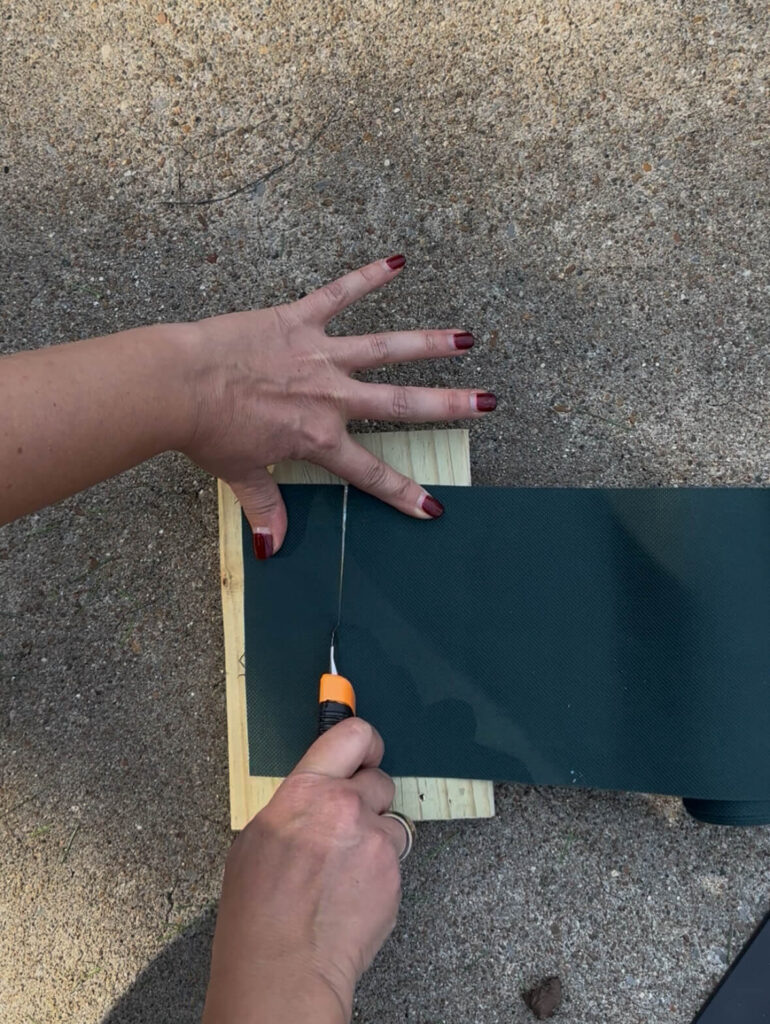
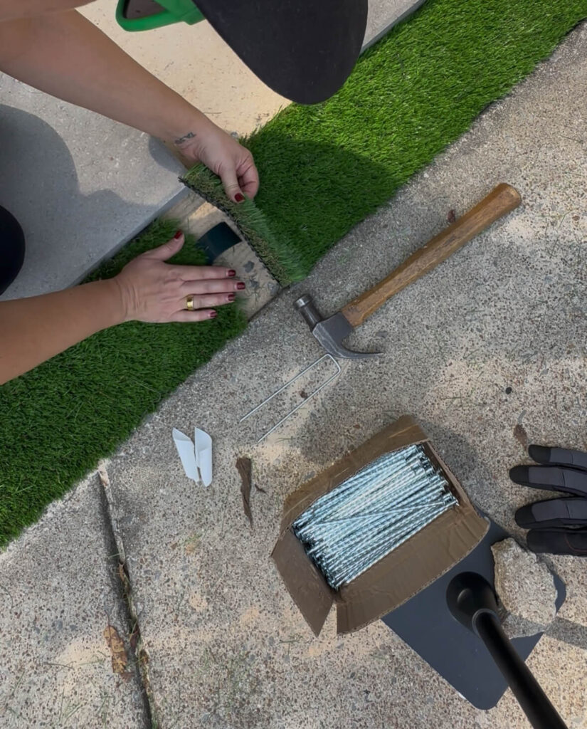
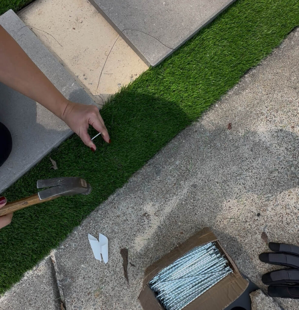
From top left to bottom: cutting the seam tape, installing the seam tape, installing the staples, adding the 5 inch nails throughout
The Final Reveal
The before-and-after speaks for itself. What was once a neglected corner of the yard is now a polished, functional extension of my outdoor living space. For some extra privacy from the neighbors, I also opted to add a faux boxwood privacy fence on one side. For the time being, this has been a fantastic solution.
This DIY paver and turf installation took some muscle and a few learning curves, but the result was absolutely worth it. It’s proof that with a little planning, persistence, and a few trips to Lowe’s, you can completely transform your outdoor space.

Shop the DIY paver and Turf Installation Project
You can shop every item from this project directly below and start your own backyard transformation.
- Level
- Bucket
- Shovel
- Speared shovel (for removing roots)
- Pick axe
- Heavy-duty rake
- Tamper
- Hammer
- Rubber mallet
- Measuring tape
- Scissors
- Utility Knife (use this to cut your turf and your seam tape)
- Gloves
- Concrete pavers
- Artificial turf
- Decomposed granite
- Paver sand
- Seam tape
- Staples
- Galvanized Nails
- Garden edger
- Wheelbarrow
- Boxwood Privacy fence (I used 4 panels)
Related Posts:
My Front Yard Exterior Makeover
Budget Friendly Pool Patio Refresh
browse more posts
read more
If you’ve been following along, you know I just wrapped up my primary bathroom renovation for the spring One Room Challenge. That project took me four months longer than expected—so I swore I wouldn’t sign up for the fall round. But old habits die hard. And here we are: I’m officially announcing that my next big project is a Fall One Room Challenge home office makeover.
This space has been begging for attention, and honestly, I’ve been robbing Peter to pay Paul—stealing curtains, artwork, and accessories from my office for other rooms in the house. What I’m left with now is essentially a white box. And that’s where I’m supposed to do my most creative work? No thank you. It’s time to give my home office the layered, moody, inspiring feel it deserves.
The Starting Point
The home office is already better off than when it started. Originally this was a pink bedroom with carpet, popcorn ceilings and a dated ceiling fan. Shortly after moving in I decided to paint it white and add an accent wall of peel and stick wallpaper. Needless to say, I’m glad it was peel and stick.
Right now, the space is full of promise but painfully uninspiring. My favorite pieces are already in place:
- A Maitland Smith desk I scored from an estate sale earlier this year
- A vintage Eastlake dresser from Facebook Marketplace for $150 (the perfect storage for files, fabric swatches, and paint samples)
- A mix of vintage lamps and small décor pieces
But aside from that, it’s basically just a white-walled holding pen. My goal with this home office makeover is to create a space that sparks creativity every time I walk in the door.
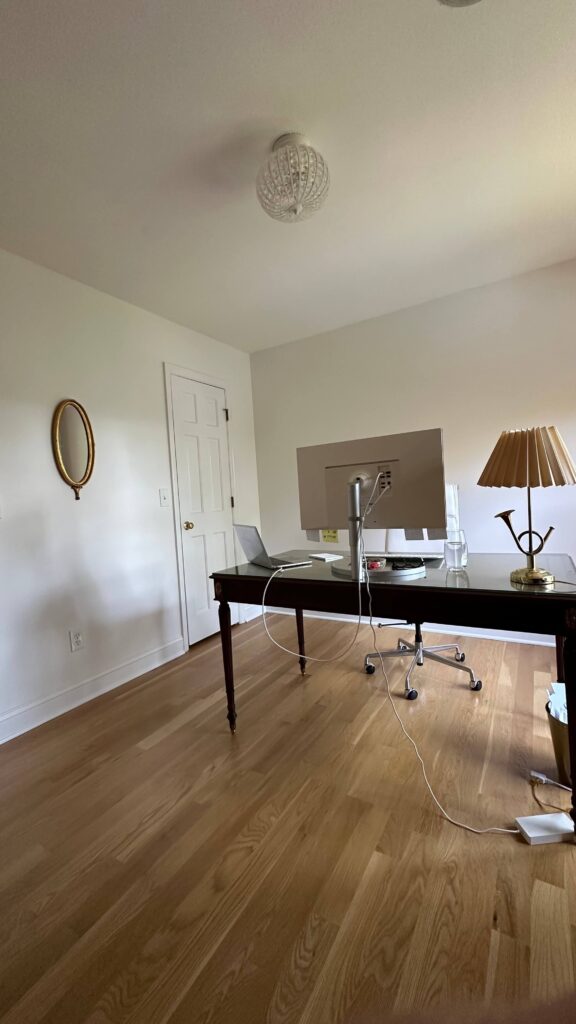
The Plan
I’m pulling out my DIY tool belt again, and here’s what I have in mind for this Fall One Room Challenge home office makeover:
1. Trimwork with Character
Unlike the elaborate wainscoting I just completed in the bathroom, this time I’m keeping it simple:
- A chair rail
- Picture frame boxes below
- New crown molding to top it all off
Fun fact: none of the upstairs rooms in my house have crown molding. It’s always bothered me. But after learning how to install it during my bathroom renovation, I’m ready to add it to this room—and eventually every other one upstairs.
2. Wallpaper with Personality
Instead of color drenching, I’ll add wallpaper between the chair rail and crown molding. I’ve already ordered samples and I’m excited to land on something that feels bold and inspiring. This will be the moment the room stops being a white box and starts being a true creative space.
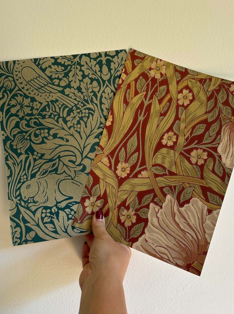
Two (of many) wallpaper samples I’ve been starring at for the home office makeover
3. Cohesive Paint Palette
The trim, woodwork, and crown molding will all be painted the same color for cohesion. For the ceiling, I’m leaning toward a complementary cream for warmth and depth.
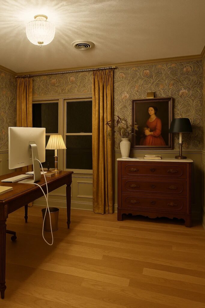
One of the mock-ups I’ve started playing with for the home office makeover
4. Lighting Upgrade
The current light fixture is too small for the room. I’ll be swapping it out for something more to scale and something that balances function with a little design drama. This light fixture has been on my wishlist for a while now and I’d love to find an excuse to bring it into the office.
5. Vintage Rug Hunt
No room feels complete without a rug that grounds the design. I’ll be on the hunt for a vintage option that ties all the colors and textures together.
The Challenge
On paper, it doesn’t sound too complicated. But there’s a twist: the first week of the challenge, I’ll be traveling. That means zero head start for me. I’m truly committing to the eight-week timeline this time around. Seriously, I’m pointing at the finish line from the very beginning.
Why the Home Office Makeover Project Matters
Unlike a kitchen or bathroom, this project feels lighter and more fun. But it also matters deeply. This is where I do the kind of work that feeds my soul—designing, writing, and creating. A Fall One Room Challenge home office makeover is my chance to build an inspiring environment that reflects my style and supports my creativity.
I hope you’ll follow along, and if you’re feeling extra inspired, join in! The One Room Challenge is all about inclusivity, connection and community.

Related Content
read more
Fall is my favorite time of year to lean into moodier tones, layered textures, and cozy moments at home. Instead of going overboard with pumpkins, I love to take a thoughtful approach — small swaps and seasonal layers that create warmth without clutter. This year, I styled my spaces with moody fall home decor that feels elevated, timeless, and perfectly collected. Here are all the ways I’m decorating for and celebrating fall this year!
Moody Artwork & Seasonal Touches
One of the easiest ways to set the tone is through artwork. For my Frame TV, I swapped in a still life print of pears — the warm browns and shadows feel so quintessentially fall. The best part? I grabbed a package of 30 moody artwork prints for under $7, and they’re mine to keep forever. It’s such an affordable way to change the atmosphere of a room without investing in more decor.

Moody Frame TV Artwork | Frame TV | Charcoal Candle | Brass Tray | Nandina Leaf Stems | Terracotta Vase
In the kitchen, I added styled a set of faux artichokes in a darker serving bowl. Their muted greens and hints of purple add a sculptural element and tie right into my moody fall home decor palette.
Faux artichokes | Charcoal bowl
Small Swaps That Make a Big Difference
Sometimes the simplest changes have the biggest impact. I swapped my glass cloche for an orange one on the coffee table, instantly warming up the space. Layered books, a sculptural bowl, and warm-toned accents create depth and texture.
Orange Cloche | Crystal Candle Dish | Marble Match Holder | The Finer Things Coffee Table Book | The Well Loved House Coffee Table Book | Marble Handerchief Bowl
Throughout the house, I’ve tucked in my favorite fall stems — golden leaves, deep burgundy branches, and moody greenery. They bring movement and life into every corner while still keeping the overall vibe sophisticated and cozy. Ps – if you’re not sure how many stems to use in an arrangement, I created this guide last year that might be helpful!
Plum Stems | Ruffled Vase | Charcoal Candle | Brass Clawfoot Tray | Wallpaper
The Scents of Fall
Fall scents are non-negotiable when it comes to creating atmosphere. I rotate through a few favorites depending on my mood:
- Apotheke Charcoal (3-Wick) – A sexy, black-on-black candle that’s smoky, modern, and moody.
- Apotheke Cardamom Chestnut – Think roasted chestnuts and spice layered with a hint of sweetness, like a cozy Paris café in candle form.
- Votivo Spiced Chai – not into pumpkin but still feeling festive? This one’s for you! All the cozy feelings of fall but without the expected pumpkin.
- Apotheke Bitter Cherry – Tart and unexpected with a rich fruitiness that feels elevated and modern for fall.
- Anthropologie Pumpkin Clove – A classic blend of pumpkin, cinnamon, and vanilla that will forever be the heart of autumn.
All of these scents instantly warm up the house and make my home smell as cozy as it looks.
Styling the Outside Entry
Fall starts at the front door, and I love creating a warm welcome. This year, I styled my entry with a mix of real and faux pumpkins for layered texture and longevity (no mid-October rotting). To finish it off, I swapped my front door wreath for a burgundy option that ties into the moody palette I’ve used inside. If you need tips for styling your front stairs with pumpkins, these tips help make things simple.

Cozying Up the Bedroom
The bedroom is where I embrace seasonal layering the most. I start with Boll & Branch sheets and the waffle blanket both in Juniper, add my cream signature duvet set, and bring in a lumbar pillow with fall tones of browns and reds. On top, I toss a big cream faux fur throw for texture and warmth. The result is a cocoon of moody fall home decor that feels just right as the nights get cooler.

Faux Fur Blanket | Cream Duvet Set | Juniper Sheets | Juniper Waffle Blanket | Rust Draperies | Wall Color | Chandelier
Fall Movie Nights
Once the house is styled and the candles are lit, the only thing left is a good fall movie lineup. My go-to favorites:
- You’ve Got Mail – the coziest depiction of New York in the fall
- Practical Magic – witchy, romantic, and moody
- When Harry Met Sally – timeless autumn in Central Park
- Dead Poets Society – nostalgic and inspiring
- Knives Out – quirky, mysterious, and full of fall vibes
And for movie night I highly recommend a Popsmith Popcorn maker. It’s nostalgic and makes the BEST popcorn! One of Oprah’s favorite things for a reason.
More Ways to Embrace Moody Fall Home Decor
Here are a few more ways to lean in:
- Layered Textiles – Bring in velvet pillows, wool throws, and chunky knits.
- Ambient Lighting – Add candles, table lamps, and sconces for a warm glow.
- Fall Playlist – Fleetwood Mac, jazz standards, or even an acoustic mix set the mood (vinyl is best!)
- Pantry Staples – Stock chai, cider, and baking spices so you’re always ready for a cozy night in.
Shop the Cozy TV Room
Closing Thoughts
Leaning into fall doesn’t mean filling every corner with pumpkins. It’s about layering warmth, mood, and texture so your home feels like a retreat. From a $7 package of moody Frame TV art to cozy bedding swaps, from a bowl of faux artichokes to a perfectly spiced candle, these little changes add up to a home that feels deeply autumnal. If you’re craving inspiration for moody fall home decor, this is your sign to start layering.
Shop My Favorite Moody Fall Home Decor Staples
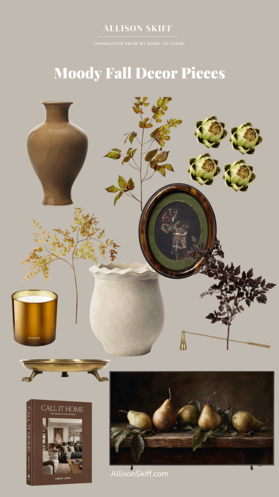
Call It Home Coffee Table Book
The Latest on the Blog —
read more
When I started renovating my kitchen, one of the biggest pain points was the dark, speckled granite countertops. They felt dated, busy, and totally out of sync with the lighter, warmer aesthetic I wanted for my home. Real marble counters have always been on my dream list—but with my square footage I was looking at roughly $20,000, and that just wasn’t in the budget. So instead of waiting, I decided to work with what I had by using this DIY marble countertops kit.
For under $200, I completely transformed my kitchen counters into a bright, faux marble finish that looks high-end, feels durable, and has given me the freedom to love my kitchen right now while I save for the real thing someday. If you’ve been wondering how to paint granite countertops to look like marble, this guide is for you.
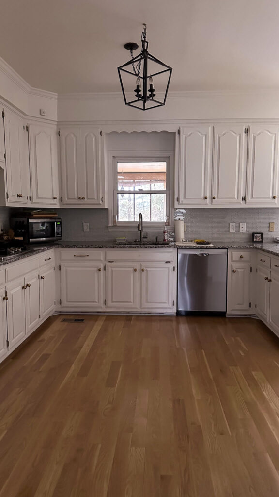
Before and After of my budget friendly kitchen renovation.
DIY Marble Countertops: Step by Step Guide
Step 1: Prep and Protect
The Giani kit comes with everything you need, but prep work is key. I started by giving my counters a deep clean with dish soap and water, then wiped everything down with lacquer thinner for extra insurance against grease or residue.
Next, I taped off the backsplash, sink, appliances, and cabinets, then draped the provided plastic sheeting over everything. Don’t skip this part—the epoxy topcoat drips as it levels, so extra drop cloths on the floor will save you cleanup stress later.

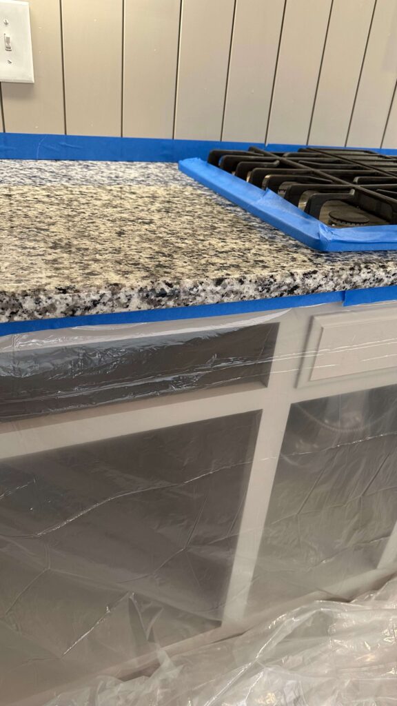

Step 2: Prime the Counters
Since I was covering dark granite with a white marble kit, it took me Four coats of primer to get full coverage. Each coat dried in about two hours, and the process went quickly. Think of this stage like painting walls—primer sets the foundation for everything else.
Pro tip: don’t forget the underside edges of your counters if they’re visible from an adjacent room.
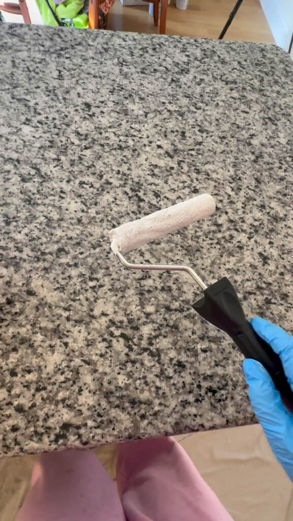
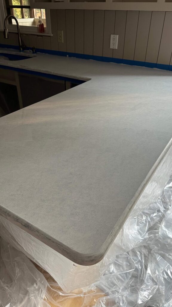
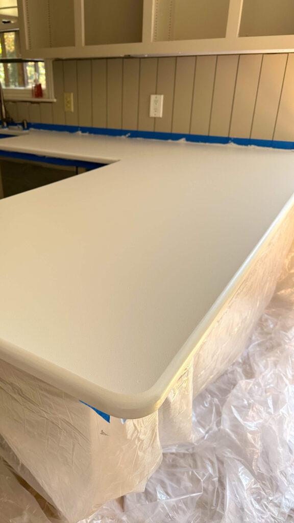
Step 3: Create the Marble Veining
This is the part that feels intimidating, but it’s also the most fun. The kit includes grey paint, a fine artist’s brush, a spray bottle, and a larger brush for blending.
To mimic real marble veins:
- Dip the artist brush in the grey paint (included in the kit)
- Lightly drag the brush across the surface while twisting it between your fingertips for natural movement.
- Mist with water to soften and feather the line.
- Tap gently with the larger brush to blend.
- Vary your vein shapes (long, crescent, or branching) to avoid repetition.
At first, I tried to replicate the exact slab of Carrara marble I’d been eyeing—and that made me overly critical. Once I let go of perfection and embraced the organic look, the process became easier and more enjoyable.
If you’re feeling extra nervous about this I can completely relate. The good news is that it’s not immediately permanent. If you hate your vein, you can spray water on it and wipe it right off (I did this a lot). And if you really hate what you did, you can re-prime over it and start over (I also did this!).
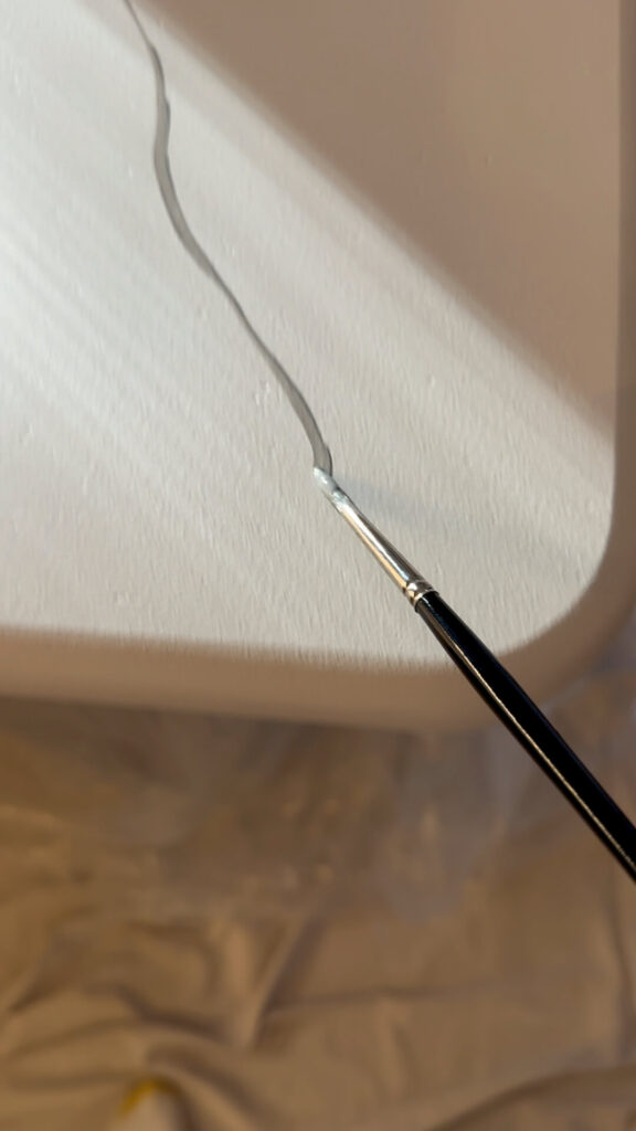
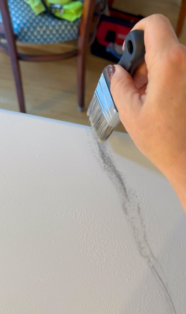
Step 4: Add Highlights
After the grey veining dried for a few hours, I used the sponge and white highlight paint included in the kit to add some dimension. Dab this sporadically over veins for added depth and dimension, which will make your DIY marble countertops look more realistic.
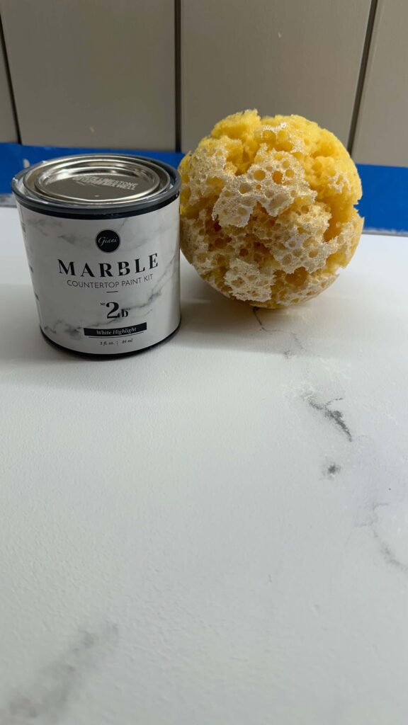
Step 5: Epoxy Topcoat
The epoxy is what seals the deal—literally. This clear, glossy topcoat gives the counters durability and a smooth stone-like feel.
Here’s what to keep in mind:
- Each can of epoxy covers 6 sq. ft., so measure ahead and plan your pours.
- Mix thoroughly with the activator before applying. The kit gives instructions for how long you need to stir the epoxy + activator. Set a timer and take it seriously.
- Pour in an S-shape, then guide the epoxy with the roller and brush.
- Continuously wipe drips along the edges for the first 1–2 hours (otherwise they’ll harden).
- Remove painter’s tape within 1–2 hours so it doesn’t get sealed in.

I let the epoxy cure for 24–48 hours before touching the surface and gave it a full week before setting appliances back in place. Keep in mind, anything the epoxy touches will turn rock hard. So paint brushes, rollers, etc will all get tossed. The kit comes with plenty of these so use what’s provided and nothing personal that you love.
The Final Results: Your New DIY Marble Countertops
The difference is dramatic. What once were dark, speckled granite counters now look like bright, timeless Carrara marble countertops—all for under $200. This budget-friendly kitchen renovation project proves you don’t need to wait for a dream budget to achieve a dream look.
There are a few small imperfections, but overall I’m thrilled. The counters complement my new cabinet color, backsplash, and brass hardware beautifully, and I love walking into a kitchen that feels completely refreshed.
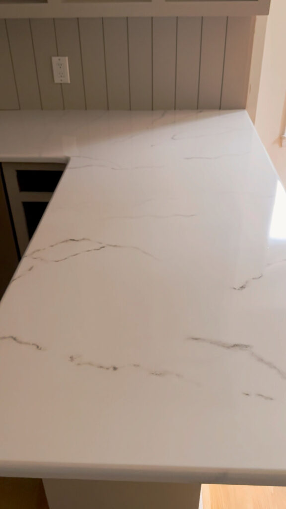
Would I Recommend DIY Marble Countertops?
Yes, with a few caveats:
- Be patient with the veining—don’t rush.
- Wipe down your counters again before epoxy to prevent dust.
- Plan for a few days of kitchen downtime.
If you’re willing to put in the time, this is one of the most transformational DIY home projects you can do on a budget.
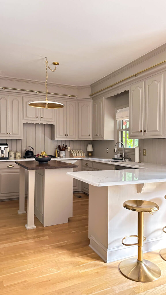
Brass barstools | Vintage Lenox Coffee & Tea Canisters | Artichokes | Black Serving Bowl
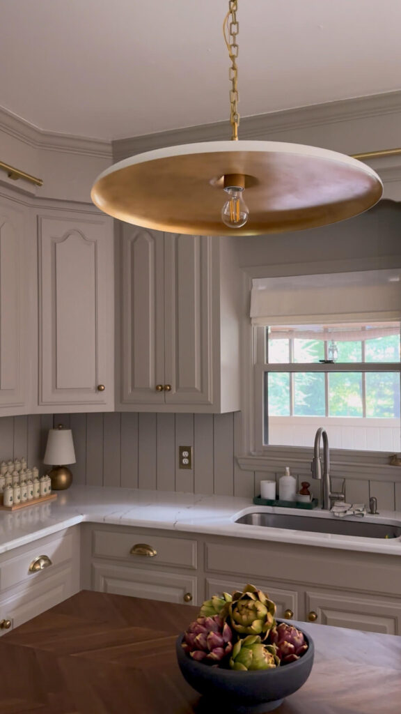
Brass Lamp | Vintage Lenox Spice Set | Artichokes | Black Bowl | Brass Outlet Cover | Cup Pulls | Paneled Backsplash
Large Piatto Pendant | Brass Task Lamp | Walnut Butcher Block Island Top | Linen Roman Shade
Shop the Project
Want to try this in your own home? Here’s the exact kit I used:
Related Content
DIY Budget Friendly Kitchen Reveal
browse more posts
read more
For the past few years, I’ve been slowly tackling the exterior design of my 1990s brick colonial home here in Nashville. While I’m a DIY enthusiast at heart, I’ll be the first to admit that landscaping is not my strong suit. This summer, I decided it was time for a major refresh—and for once, I hired out the work. The result? A classic, low-maintenance landscaping design that perfectly complements the traditional colonial vibe of my home. Today, I’m walking you through the before, the process, and the final reveal of my new colonial-style front yard landscaping makeover.
The Starting Point: Overgrown and Outdated
When I bought this house in 2018, I inherited very mature landscaping—and not the good kind. The deep garden beds stretched across the front of the house and were filled with:
- Tall holly bushes that had grown leggy and difficult to maintain
- Large yews (which I loved!) but sadly lost in a severe frost
- Pachysandra groundcover that, unfortunately, became a hiding spot for snakes
- Azaleas that were fading year after year, leaving me with more bare branches than blooms
the picture on the right was AFTER pruning if you can believe it!
Every summer I tried to hack back the weeds, trim the bushes, and salvage what I could. But honestly, it had reached a point where no amount of DIY could bring it back to life.
Phase One: Updating the House Exterior
Before tackling landscaping, I wanted to finish updates to the house itself. Last year, I painted the trim in Sherwin-Williams Black Fox, a rich, moody neutral that feels timeless and was so much better than the outdated cream / yellow I inherited with the house. I also replaced the gutters with sleek new black ones and painted my exterior doors in Tricorn Black to match. You can see the full reveal here!


Shop: Copper Lanterns
This spring I added these stunning copper lanterns that are perfectly scaled to the size of the house (see my guide here if you’re in the same boat). These changes gave the house the architectural presence it deserved, setting the stage for landscaping that would actually highlight the home instead of hiding it.
The Magnolia Dilemma
The toughest decision of this project was whether to keep or remove the two pink magnolia trees flanking my front entry. They hold so much sentimental value—I closed on this house in April 2018 when they were in bloom, and I have a photo of myself with the “sold” sign standing right beneath them.


Unfortunately, one tree lost a major branch in a storm, leaving it lopsided, and both had grown so tall they were nearly touching the roofline. I mocked up two exterior landscaping design scenarios: one with the magnolias and one without. After talking it through with my landscaping team, we decided we’d start by trimming them back heavily with the hopes of salvaging them and reassess.
The New Front Yard Landscaping Makeover
Once the magnolia decision was made, everything else fell into place. Here’s what we planted:
- Baby boxwoods along the front for evergreen structure year-round
- Snowball hydrangeas (my dream plant!) in the middle section—these will grow into big, lush shrubs covered in large white blooms each summer
- Pencil hollies in the back for subtle height and evergreen interest when the hydrangeas go dormant
- Arborvitae anchoring the far ends of the house
- Japanese maples flanking each side of the front stairs for a pop of color and soft texture
- Hostas in the side bed for easy greenery with room for me to add tulips and peonies down the line
My New Front Yard Landscaping Makeover!
We also cleaned up my existing dogwood and kept one of my original yews that (thankfully!) survived.
The end result is a layered, classic front yard design that’s both low maintenance and true to the traditional colonial style I love.
Can you believe the before and after of the left side bed? I’m part embarrassed and part relieved!
What’s Next: Backyard Landscaping Dreams
Shop: Umbrellas | Chaise Lounge Cushions | Umbrella Tables | Chaise Loungers (similar)
The front may be complete, but I still have big plans for the back. My short-term list includes a poolside refresh: removing dead fir trees and installing concrete pavers with faux grass in a diamond pattern for a clean, low-maintenance look. I mocked up a couple scenarios and am loving the option with 3 pavers (but I think I’ll flip them to be diamond patterned).


Before / Now / The End Goal: DIY Paver details coming soon but I ordered 60 of these
For a short term privacy solution I added a faux boxwood fence while I troubleshoot why the original firs failed before investing in more trees. I’ll add pavers in front of this area as well, plus will continue the string lights around the entire fence line for some ambience at night.

This faux boxwood is a great short term solution for this area where the little pine trees died off.
Longer term, I have dreams of updating my back sun porch and deck—but for now, I’m focused on enjoying the fresh curb appeal this landscaping brought to the front of my home.
Final Thoughts
Hiring out for this project was the best decision I could have made. My front yard landscaping transformation has given my home new life, boosted curb appeal, and created a welcoming entry that finally feels like “me.”
If you’re looking to refresh your own exterior, my biggest advice is this: don’t be afraid to start fresh. Sometimes letting go of overgrown, outdated plants is the only way to create a design you truly love.
read more
The past couple weeks were big for the DIY primary bathroom renovation—equal parts progress and problem-solving. Here’s where things stand, what’s finished, and what’s coming next.
The Vanity: From Black to Walnut Beauty
Remember when the countertop installers dripped something down the front of the black vanity drawers? Total mess. But it turned out to be the push I didn’t know I needed. I used Retique It Liquid Wood and Varathane gel stain in Dark Walnut to completely flip the finish—and now I’m in love.

Here’s how I did it:
- Removed all doors, drawers, hardware, hinges, and sliders
- Lightly sanded everything (no stripping necessary—just enough to rough it up)
- Applied 4 coats of Liquid Wood for full coverage (you may need fewer coats if your piece starts lighter)
- Stained everything with Dark Walnut gel stain using a regular paint brush and wiped it back with a paper towel
- On the recessed drawer and door fronts, I needed 3 coats to even things out
- Finished it all with 2 coats of Minwax Polycrylic in Satin for durability
Shop: RetiqueIt Liquid Wood | Varathane Gel Stain | Poly Top Coat | Handy Paint Pail Supplies
I’ve used this method before on my dining table, so I trusted the process—and it paid off again. The walnut tone completely transformed the space and adds warmth I didn’t realize was missing.
Other DIY Primary Bathroom Renovation Progress Highlights
Here’s everything else that happened in the bathroom this week:
Electrical + Drywall
- Had the chandelier socket over the tub moved to center it correctly
- Brought in a drywall pro to patch the ceiling and smooth everything out (because a lumpy ceiling is not the look)
- Moved the electrical outlet next to the vanity to sit under the counter—no more awkward wall plug floating mid-height
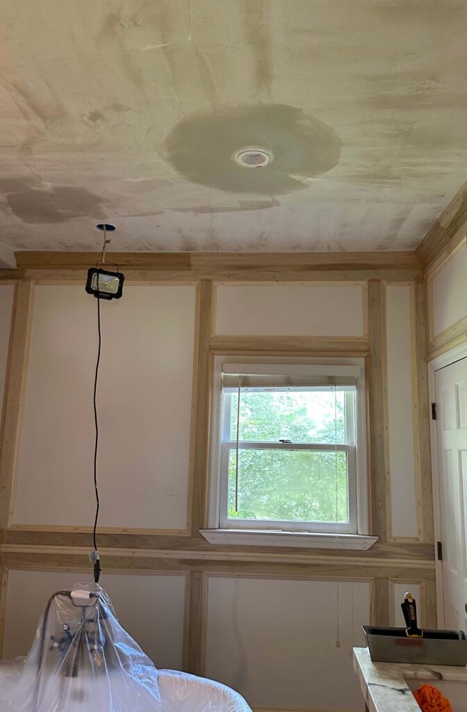
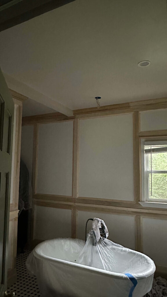
Feels so good to have a fresh ceiling!
Trim + Wall Boxes
- Finished installing the last piece of back band around the bathroom door
- Built out the wall boxes surrounding the doorway—only one left to go
- That last box? It’s going to require a precision cut around the detailed vanity trim. Still puzzling that out, but I’m close. I ordered this, and I think it’s going to help me fill gaps without requiring precise cutting. I’ll be sure to report back!
Small Repairs + Paint
- Repaired cracked grout on the shower bench with Mor-Flexx by Sashco in gray—simple fix, looks brand new
- Painted the bathroom ceiling in Farrow & Ball’s “Stirabout”
- Used their light-toned primer first (highly recommend if you want their paints to perform well)
- Followed with 2 coats of Stirabout for a clean, bright finish.
- Some notes on painting supplies: I tried a new painting tool for the ceilings (this paint pad) and I’m officially hooked! It was faster, less messy and resulted in the smoothest finish! I’m buying refills and plan to use this for the walls. I also used this Handy Paint Pail Cup with a liner and a lid which was perfect for a job that has multiple coats. It made clean up a breeze and I was able to leave my paint in the cup overnight without worrying about it drying out. Highly recommend Handy Paint Pail products for any painting project you have lined up!
- I also painted my new ceiling medallion which will go above the bathtub. I think it’s going to add that extra special touch to the finished space!
Shop: Mor-Flexx Sealant | Ceiling Medallion
Filling the Gaps & Cracks
Perhaps one of the most unexciting parts of any custom millwork projects is filling the gaps, holes and whatnots. However taking time to do this part of the project the right way is what’s going to give you a seamless professional finish. Here’s what I did:
- All nail holes and miter joints (the inside corners of every single box) got filled with wood filler (I like this option) and then sanded. I also added wood filler where I butted up two pieces of trim on the outside corners. Given there were over 1500 nail holes, this was daunting!
- All seams got a fresh bead of caulk. I like Big Stretch for this, as it stretches as the house will expand and contract with temperatures, and it’s paintable.
- Seams include the top and bottom of the crown molding, the top of the baseboards, and the top, sides and bottoms of all the poplar boards, picture frame molding and chair rail. I went through 9.5 bottles of Big Stretch for this!

Shop: Big Stretch Caulk
What’s Next for the DIY Primary Bathroom Renovation?
This coming week is all about details:
- Finish that final wall box next to the vanity
- Prime the walls and apply 2 coats of paint
- Install the vintage chandelier above the tub and wall sconces above the vanity
- Reinstall vanity drawers and doors, plus new hardware
- Schedule the plumber to reinstall the freestanding tub and switch out the faucet from oil-rubbed bronze to this vintage polished nickel version
The paint for the primary bathroom will be Farrow & Ball’s Jitney! I’m using a new finish: Flat Eggshell.
It sounds like a lot, but we’re solidly in the homestretch now. The transformation is starting to really take shape, and I can’t wait to share the final reveal.
Thanks for following along! More pretty details and finished shots coming soon. If you’re tackling your own vanity flip or bathroom renovation, drop your questions in the comments—I’m happy to share tips.
Catch Up on the Primary Bathroom Renovation Journey
Spring 2025 One Room Challenge Week 1
Spring 2025 One Room Challenge Week 2
Spring 2025 One Room Challenge Week 3
Spring 2025 One Room Challenge Week 4
Spring 2025 One Room Challenge Week 5
Spring 2025 One Room Challenge Week 6 & 7
The Latest on the Blog —
read more
Styling bookshelves is one of those home design tasks that looks simple… until you’re staring at a long, empty shelf and thinking, Now what? If you’ve ever felt stumped by the blank slate of built-ins—especially those longer shelves that seem to stretch on forever—you’re not alone. But with the right strategy, any bookshelf (big or small) can become a curated focal point full of warmth, personality, and story. Today, I’m sharing my go-to tips for how to style long bookshelves beautifully, using a mix of old and new, cozy and collected, and always personal. These are the exact techniques I used to style the built-ins in my own cozy tv room, and trust me—they make all the difference.
Whether you’re styling a single shelf or an entire wall, these styling tips will help you create shelves that feel intentional, balanced, and uniquely you.
1. Start With Coffee Table Books (Yes, Even on Shelves!)
If you’re styling long bookshelves, think of coffee table books as your secret weapon. Their generous size helps ground the shelf visually, especially when you’re working with deep, dark cabinetry like mine (painted in Benjamin Moore’s Lead Grey, if you’re wondering). Use them as a base to stack decorative items or to break up rows of vertical books.

Shop My Favorite Coffee Table Books
I like to keep a mix of topics—design, history, travel, art—and stack them horizontally to add height where needed. Bonus points if the spines bring in a pop of color or texture.
2. Alternate Book Orientation for Visual Movement
One of the easiest ways to avoid a monotonous look? Switch up how your books are placed. On my shelves, you’ll see some books standing upright and others laid flat in tidy stacks. This keeps your eye moving and adds visual rhythm to the overall design.
For longer shelves, I recommend using upright books toward one end and stacks at the other—or even centered—so you don’t fall into the trap of everything feeling too symmetrical or stiff.
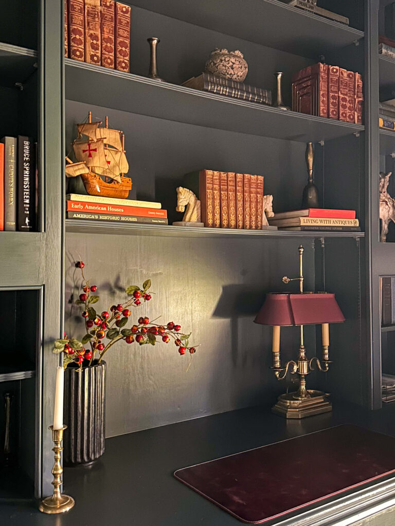
Black marble vase | leather desk mat | vintage lamp (similar) | vintage onyx horse bookends (similar)
3. The Most Important Tip for How To Style Long Bookshelves: Change the Midline From Shelf to Shelf
Here’s a styling trick that makes a huge impact: vary the center of gravity (you can see how I did this in the above photo). Don’t center every shelf the same way. On one shelf, you might anchor with a larger item slightly left of center, and on the next, cluster things toward the right. This gives the whole unit a natural, collected feel—like it came together over time (even if it didn’t).
4. Group Items in Threes
The rule of threes is popular for a reason—it just works. Our brains are naturally drawn to odd numbers. Try pairing a small vase with a sculptural object and a stack of books for an effortless vignette. Or use three different candlesticks at varying heights to add a vertical element. I love these ones that are battery powered and flicker!
You don’t need to be rigid—just aim for asymmetry with balance.
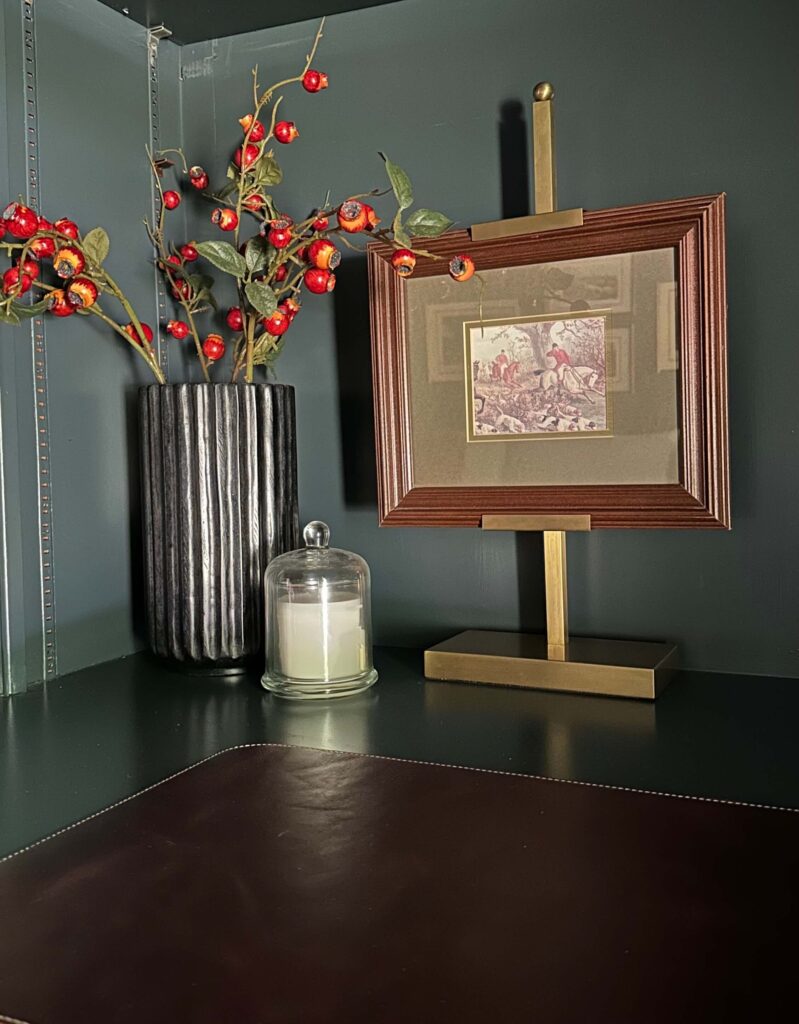
black marble vase | candle cloche | brass art easel | leather desk mat
5. Mix Old and New for That “Collected Over Time” Look
This is so key to avoiding a showroom feel. I love mixing thrifted treasures, family heirlooms, and modern pieces for contrast and charm. A vintage lamp next to a deep rich leather desk mat. A modern marble vase next to a piece of thrifted artwork. It’s all about that tension between eras.
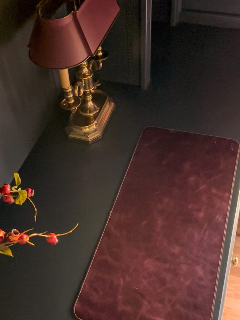
I love the contrast not only between old & new, but with textures as well. Mixing things up is key!
On my shelves, I’ve layered vintage ships, marble bookends, and newer sculptural pieces with antique finds. This mix brings soul and storytelling into every corner.
6. Layer Personal Items: Photos, Collectibles & Art
Bookshelves are one of the most underrated spots to tell your story. That framed black-and-white family photo? Put it front and center. A meaningful souvenir from your travels? Display it like art. A small painting or framed letter? Lean it behind a stack of books for depth.
This is how you make your shelves feel like your home—not a Pinterest replica. If you need some help getting started you can find some of my favorite decor pieces here.

These onyx horse bookends are one of my favorite vintage finds! They’re artwork in an of themselves. Shop similar ones here.
7. Play With Height, Shape & Texture
A truly beautiful shelf isn’t just about what you put on it—it’s also how you layer it. Use objects with different heights (tall candlesticks, low bowls), varied shapes (round vs angular), and contrasting textures (brass, wood, marble, linen).
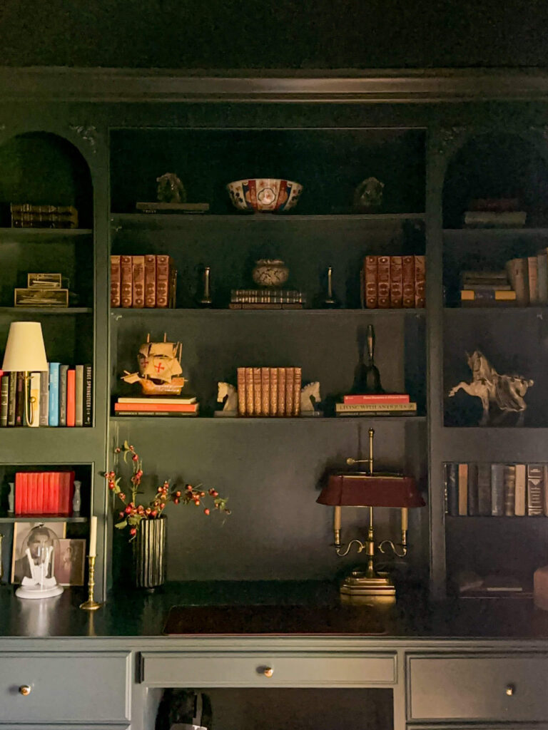
In my shelves, you’ll notice how a spindly stem in a black vase softens the edges, while a glossy ceramic bowl catches the light. These moments of contrast help each item shine and prevent the shelves from feeling flat.
Bonus Tips From My Shelf to Yours:
- Use bookends strategically—not just to hold books, but to punctuate a section or bring in sculptural interest.
- Leave breathing room. Don’t overfill! Negative space is your friend.
- Add lighting. A bookshelf lamp or tucked-in puck lights can elevate your shelf styling (and your mood).
Shop the Cozy TV Room
Final Thoughts on How to Style Long Bookshelves
There’s no right or wrong way on how to style long bookshelves, and it isn’t about perfection. It’s about layering in meaning, beauty, and function until it feels just right. Trust your instincts. Edit as you go. And don’t be afraid to change it up with the seasons or your mood.
These are more than shelves—they’re your story on display.
If you loved these tips, be sure to pin this post or share it with a fellow design lover. And if you’re styling your own shelves, tag me on Instagram—I’d love to see how you bring your shelves to life!
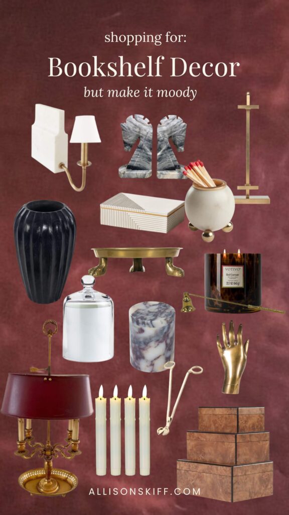
browse more posts
read more
A much overdue update on an overdue project: the primary bathroom renovation. I’ll be the first to admit that my setback with the countertop company took the momentum out of this project, and if I’m being honest, I needed to step away from it for a little bit because it was making me quite sad. But alas, I’m really getting tired of doing my make-up in my closet, brushing my teeth in the kitchen sink, and having a mountain of bedding and toiletries piled on my bedroom floor. So today, I’m going to hold myself accountable to finish this project by publicly sharing a deadline for the primary bathroom renovation.
Here’s everything I need to knock out, along with my estimated time to complete each task, and finally my “new” deadline for the project.
Refinishing the Black Vanity Cabinet to a Walnut Finish
If you followed along on Instagram, you’re aware of the drama with my bathroom vanity. Refinishing this was never part of the plan (I was going to work with the black color scheme) however the countertop company spilt a chemical on the vanity and I can’t get it to it’s previous finish. Plus now the finish on the base doesn’t match the doors and drawers.
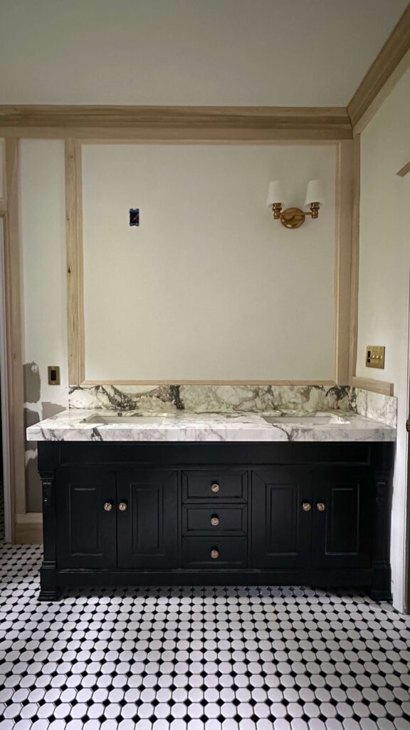
So, the options are to leave it alone (I’m not chill enough to do that), repaint it black or refinish it to a wood tone. I refinished my dining room table from black to wood tone a couple years ago by using a kit from RetiqueIt, so I’m going to give that a whirl in the bathroom. The table has held up great and I think my skills have come a long way since then so I have high hopes.
Estimated Time: 5 days with drying time
Remaining Trim Work
I’m waiting to finish the vanity before I finish the last few remaining pieces of trimwork. It’s going to be easier to paint the vanity vs working around some tight spaces with the wood, so I’ll zip right through this as soon as the last coat is on the vanity.
Estimated time: 2 hours
Wood filling & Sanding
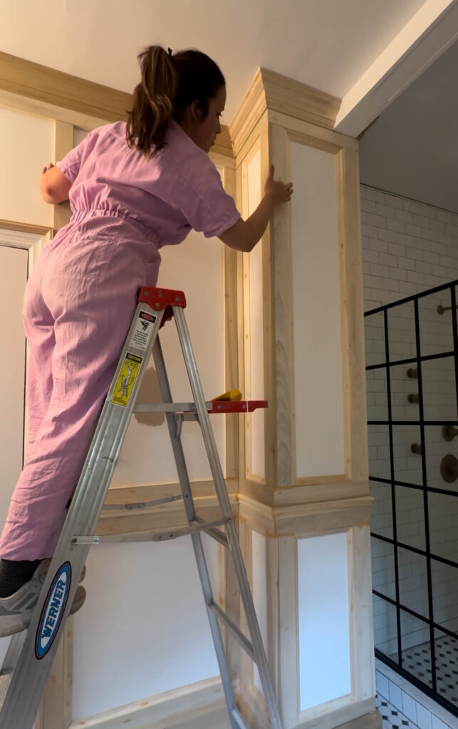
Jumpsuit (similar)
The good news is that I’ve already done a first pass at filling every single nail hole (there’s about 1500 of them), as well as all the seams. The bad news is I need to go over some spots more than once. While this is my least favorite part of any woodworking project, I’ve learned the hard way how important it is to get this part right (I have a couple bumps of wood filler in the primary bedroom I can’t unsee). So I’m going to be meticulous and take as many passes as I need on this part of the project.
Estimated Time: 2 days
Patching the Ceiling
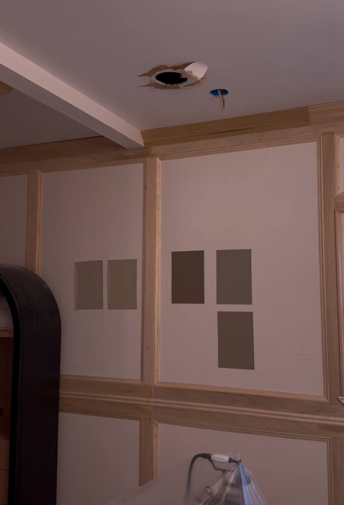
Last week I had an electrician come to relocate the junction box for the chandelier over my bathtub. I’ll be moving the bathtub just a little bit to the right and then back towards the wall, but the existing light was already a bit off centered so this was definitely necessary.
Since my drywall abilities are a 5/10, I’m choosing to hire out for the ceiling patchwork. I have a great drywall guy that worked on my kitchen a few years back when I had a refrigerator leak, and I’m going to have him do this. But just know I’m going to be shadowing him and asking a ton of questions along the way, as this is something I hope to get good at eventually.
Estimated Time: 1 day (scheduled for this Friday!)
Caulking
This is something I always underestimate! With this project, there’s so many layers of trim, so it’s definitely going to take some time. I’ll be using Big Stretch by Sashco and will be caulking in between the crown, picture frame trim, baseboards and horizontal/vertical boards I’ve installed.
I’m also going to be repairing some grout in the shower with Sashco’s Mor-Flexx product which I’m quite excited to try. The shower will eventually get updated but I’m probably a year out from that. In the meantime, this is going to be a great solution to clean up some grout lines on the shower bench and seal up some cracks on the floor.
Estimated Time: 1 full day (8 hours)
Priming & Painting
Oh I dream of the day I get to paint! For this room I’ll need to do one coat of primer, and then two coats of topcoat. The walls and trimwork will all be the same color, and the ceiling will be a complimentary cream. I’m also going to update the baseboards in the toilet room. TBD if I keep it consistent with the rest of the room or if I go with a burgundy. I’ll also need to paint the bathroom door and I think I’m going to paint both sides the same color.
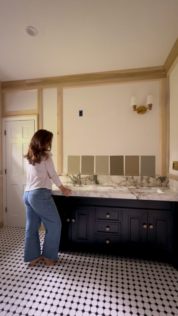
Still deciding on a paint color but I *think* I know which one!
Estimated Time: 3-4 days
Bathtub Installation
The bathtub has been disconnected for a couple weeks now, and I’m leaving it like this until I have everything painted. There may be some touch ups afterwards, but it’s making it so much easier for me to properly wood fill everything, and I know it will make painting easier too. When it’s time to reconnect everything, I’m going to have them swap out my oil rubbed bronze fixtures to a polished nickel set (see photo for what I ordered). This will match the new sink faucets and I think will create a really pretty and cohesive look.
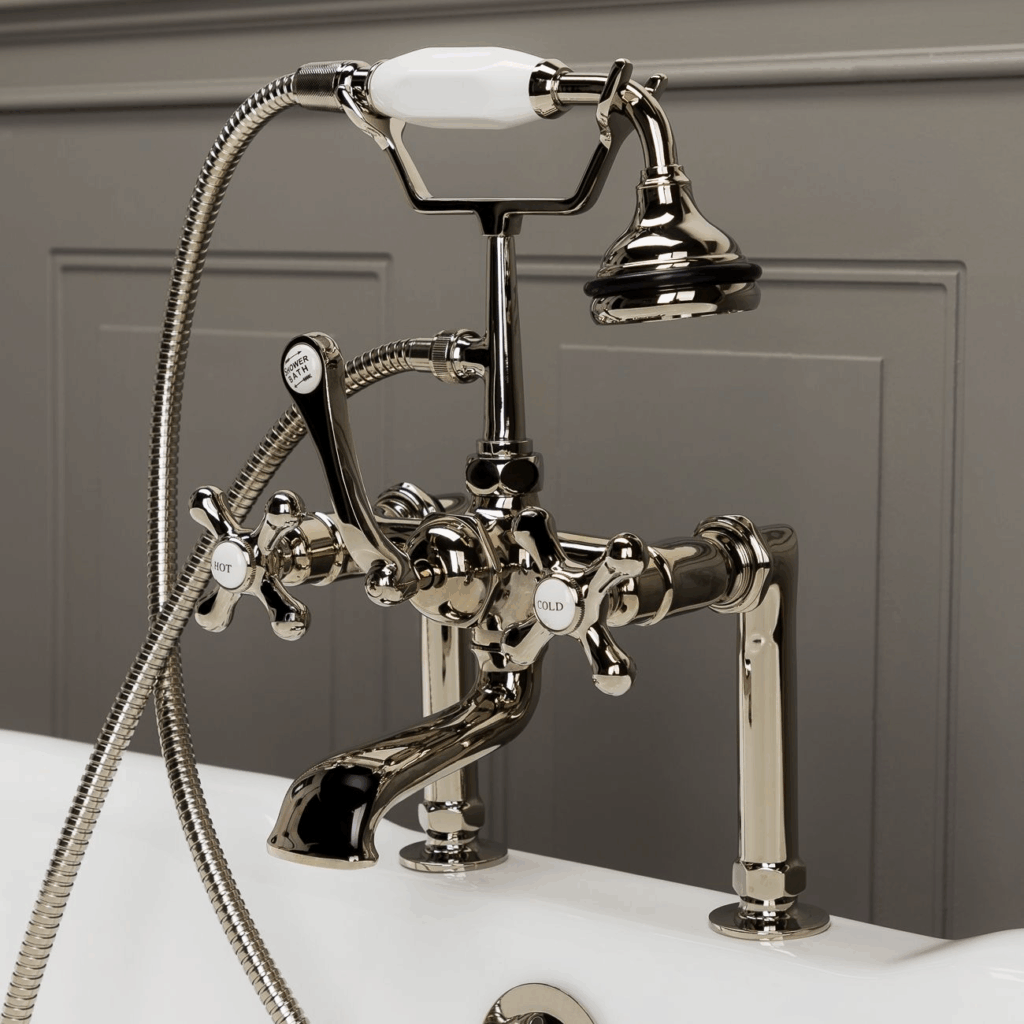
Vintage Clawfoot Tub Deck Mount English Telephone Faucet With Handshower
After the plumbers are out of the house, I’m planning to paint the feet of the clawfoot tub a high gloss white. At least that’s what I’m thinking right now. I reserve my right to change my mind, which I very well could do after the entire space is painted. I’ve seen bathtubs and feet painted all one color before and that could be a beautiful option too! Stay tuned on this.
Estimated time: 2 days (to include painting)
Installing the Pretty Pieces
I fantasize about this moment. I have the most beautiful sconces to install from Lighting Design Company (one has been up for a while as I wanted to make sure my spacing for the woodwork looked ok) and I just know they’re going to add so much charm to this room. The lights are capped on the bottom and open on the top which means you’re not getting that harsh downlight like you do from most overhead sconces. Instead it’s a soft warm glow which is just what I want.
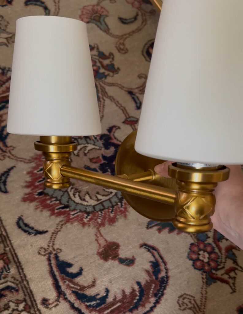
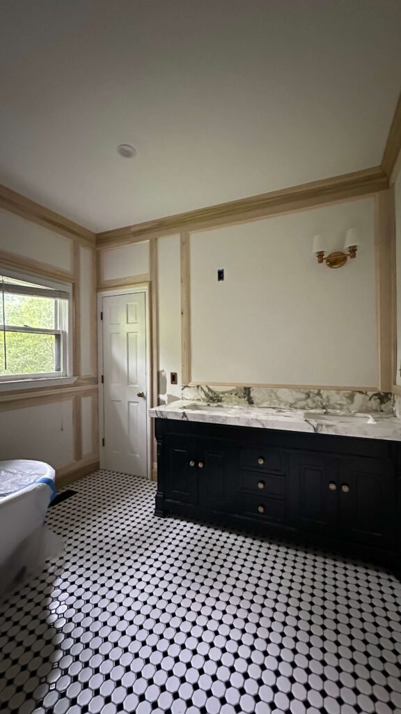
Visual Comfort Xavierre Two Light Vanity Sconce
Additionally, I have new hardware for the vanity (so glad I didn’t install that and have it ruined by the counter company!). I think the new knobs with the backplate are going to look so luxe against the new walnut finish I’m planning.
Crewe Cabinet Knob | Roanoke Backplate
Lastly, I’ll hang new mirrors and will need to figure out the placement of the towel hooks. I picked up this gorgeous vintage chandelier in Pittsburgh back in February and will hang it above the bathtub, and I just know it’s going to be a whole moment!

Picture this vintage pendant (left) above the bathtub! Worth the wait in my opinion.
I’m planning to swap out the venetian blinds for a roman shade, but I want to get the room painted before deciding on a color or pattern. I do think a pattern would be quite fun!
Estimated Time: 3 hours
My Deadline for the Primary Bathroom Renovation
Now that it’s all written down, I’m wondering if this is realistic, but you know I love a good challenge so let’s just go for it. Having only nights and weekends to work on this project, I’m going to push to have final photos ready to share by Monday August 11th. That sounds a little aggressive, but I also want to get to landscaping outside so we’re going to push.
Make sure you’re following along on socials for the play by play. I’m excited to get back into the swing of things and finally knock this project out!
Related
Spring 2025 One Room Challenge Week 1
Spring 2025 One Room Challenge Week 2
Spring 2025 One Room Challenge Week 3
Spring 2025 One Room Challenge Week 4
Spring 2025 One Room Challenge Week 5
read more
When I decided to makeover my primary bedroom last summer, I knew I wanted to go green—but not just any green. I was looking for that perfect moody, soft-but-rich, earthy green that felt calm and cozy without turning too cold. I swatched no less than 12 different greens and finally narrowed it down to five green paint colors I felt excited about.
My bedroom is north-facing, which means the light in there leans cool and can make colors feel a little icy if you’re not careful. I wanted a green that could hold its own and still feel warm even when the sun wasn’t shining directly in.
If you’re on the hunt for the perfect green for your bedroom, here are the top contenders I considered, complete with notes on undertones and which direction of light each one works best with. And spoiler alert: I have no regrets about the green I chose!
Rosemary by Sherwin-Williams
Undertones: Deep herbal green with gray and olive undertones
Best for: South- or west-facing rooms
Photo: Sherwin-Williams
Rosemary is such a beautiful, traditional green—think vintage botanical prints or the perfect English garden. It’s darker and more saturated than a typical sage and really comes to life in warm light. If your bedroom gets a lot of afternoon sun, this color will feel lush and dramatic without going too forest green. In cooler light, though, it can read a little muddy, so keep that in mind.
Dried Thyme by Sherwin-Williams
Undertones: Dusty green with sage and gray undertones
Best for: East-facing or balanced light
Photo: Sherwin-Williams
Dried Thyme is soft and serene, like a gentle sage with just enough depth to feel grown-up. It’s a great choice if you want something a little more subtle. Because of its slightly gray base, it adapts well to a variety of lighting conditions—but it really shines in morning light. In a north-facing room it can lean a bit too cool unless you bring in plenty of warm textures and lighting.
French Grey by Farrow & Ball
Undertones: Green-gray with a subtle warmth
Best for: East- or west-facing rooms
Photo: Farrow & Ball
Don’t let the name fool you—French Grey reads green, especially in natural light. It’s one of those beautifully nuanced colors that shifts throughout the day. It feels soft and airy in the morning and slightly moodier in the evening. If you’re working with a room that gets softer side-light (like east or west), French Grey will add a gentle, timeless elegance without overwhelming the space.
Evergreen Fog by Sherwin-Williams
Undertones: Muted green with gray and a whisper of blue
Best for: South- or east-facing rooms
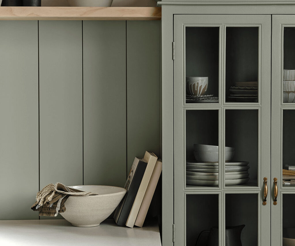
Photo: Sherwin-Williams
This was the 2022 Color of the Year for a reason. Evergreen Fog is that perfect blend of sage, gray, and a hint of blue. It feels modern but grounded. In warmer light, it reads as a soft green-gray. In cooler light (like a north-facing room), the blue undertones become more pronounced, which wasn’t quite the vibe I wanted—but it’s still a gorgeous option if you’re going for a calm, spa-like feel.
Treron by Farrow & Ball (the one I chose!)
Undertones: Green with brown-gray undertones
Best for: North-facing rooms
Shop the Primary Bedroom
Treron was the clear winner for me. It’s an earthy, muted olive that somehow manages to feel both classic and moody at the same time. What really sold me is how beautifully it plays with the cooler light in my north-facing bedroom. Where some greens start to feel sterile or flat in low light, Treron keeps its warmth thanks to its brown undertones. No matter what time of day you walk into the room, it feels soft, grounded, and rich—not too cool, not too yellow. Just right.
Final Thoughts on Green Paint Colors
If you’re trying to choose a green for your bedroom, my biggest advice is: test it in your own light and on multiple walls. What looks cozy and inviting on a paint chip or Pinterest board might feel totally different in your space depending on the direction of your windows, the time of day, and even what flooring and trim you have. Also I highly recommend the paint stickies by Samplize. They’re made with real paint and you can move them all over your room.
For me, Treron checked every box. It made my bedroom feel like a hug—warm, moody, and timeless. If you’re drawn to greens that feel earthy and elevated, I highly recommend giving it a swatch.
Let me know if you’ve used any of these in your own home—I love seeing how they show up in different spaces.
Related
Designing Custom Trim in the Bedroom
The Latest on the Blog —
read more
Here’s a little-known fact about me: for the past seven years, I’ve been a landlord. So while I spend most of my time inspiring women to take on DIY projects in their own homes, I also have a unique perspective from the other side of the lease. And I’m here to tell you—yes, there are renter friendly DIY upgrades you can make, without risking your security deposit (or your landlord’s goodwill).
Below are some of the most impactful and reversible renter-friendly upgrades—plus exactly what to do before you move out, so you stay in the clear.
1. Swap Out Cabinet Hardware
Changing cabinet knobs and pulls is one of the fastest ways to elevate a kitchen or bathroom. After all, cabinet hardware is the jewelry of the space, and something you use every day! Plus, think of this as an investment: you can take this with you when you move or buy your own place.
What to Do:
- Save the original hardware in a labeled bag.
- Reinstall it before move-out—super easy with a screwdriver.
- Use existing holes to avoid damage.
Pro Tip: Choose knobs or pulls in trending finishes like matte black or unlacquered brass.
Last year I updated my drawer pulls in the kitchen and it was an instant elevated upgrade!
Related: My Budget Friendly Kitchen Renovation – Installing Soft Close Drawer Slides
2. Upgrade Door Hardware
Swapping a dated doorknob for something more elevated can give your space a more curated feel. As long as your new door hardware is the same size, this is a relatively easy DIY you can do on your own without the need of a handyman. Trust me, I was intimidated by this for years and after I tried, I laughed at myself for being so scared! I’m excited to update all of my doorknobs in my own house.
What to Do:
- Keep the original hardware and screws.
- Make sure the replacement fits the same bore hole size.
3. Paint—With Permission

Some landlords are more flexible than others when it comes to paint. The key is to ask first and plan to share the color you want to use with your landlord. Keep in mind you’ll need to return it to the original color upon move out, or pay for the cost of having that room(s) repainted by a professional.
What to Do:
- Get written approval for any color changes.
- Save the original paint color (or color match it) so you can repaint before moving out.
- Stick to lighter hues if you want to minimize the repainting effort later.
Related:
- How To Paint A Wall
- How To Paint A Ceiling
- My Favorite Painting Supplies
- How To Get Crisp Paint Lines (every time!)
- Choosing The Right Paint Sheen
- How To Paint Trim
4. Swap the Light Fixtures
A dramatic pendant or sconce can completely transform a space—even in a rental. Plus this is another item you can take with you when you move out someday.

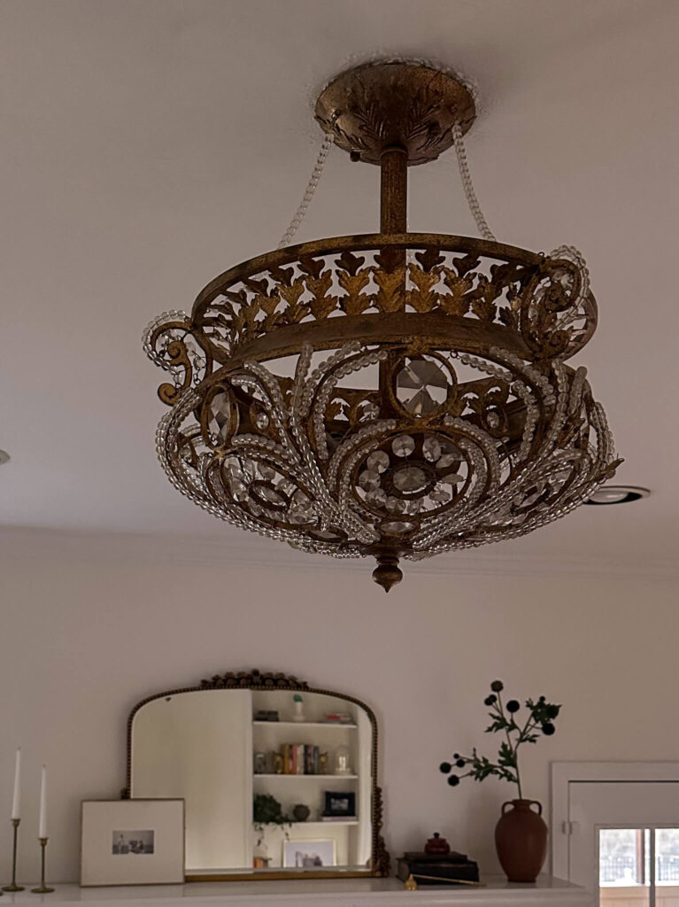
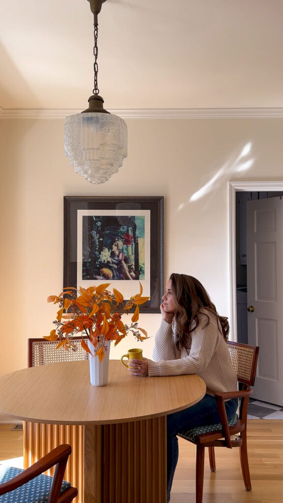
Never underestimate the power of a unique light fixture!
What to Do:
- Store the original fixture safely in a labeled box.
- Hire an electrician to make the swap, and make sure they’re licensed and insured (you don’t want to be responsible for a house fire)
- Swap it back before you leave, or offer the upgrade to your landlord—they may love it enough to let it stay!
Related: Using Light Fixtures As Artwork
5. Peel & Stick Wallpaper
There are tons of removable wallpaper options that are actually removable—no glue, no damage. Additionally, depending on your relationship with your landlord, and his/her personal taste, you might even get approval for real wallpaper. If someone had asked me to do this in my rental I definitely would have considered it, pending we could have agreed on the paper.
I’ve rounded up nearly 100 peel & stick wallpaper options (that look expensive!) right here.
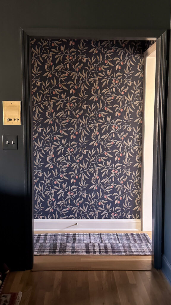
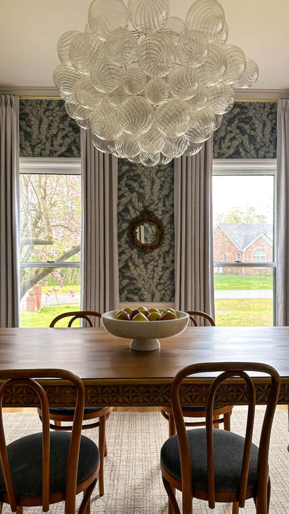
Shop Wallpaper in my House: Back Entry Wallpaper | Powder Room Wallpaper | Dining Room Wallpaper
What to Do:
- Choose high-quality brands that are known for clean removal.
- Apply to smooth, primed walls (textured walls can reduce adhesion and removability).
- Remove slowly at a 45-degree angle to avoid damage.
Related: How to Prepare Walls for Wallpaper
6. Try FloorPops or Removable Tile
If your rental has a tiled area or concrete flooring, this could be a fun and easy upgrade. Peel-and-stick floor tiles or vinyl sheets can make a big impact. I actually installed these black and white checkered floor pops in my laundry room at my current house and I love them. They’re not meant to be permanent but they’re holding me over while I wait to redo the laundry room.
Shop: Black & White Checkered Floor Pops
What to Do:
- Avoid installing over carpet or hardwood flooring.
- Test one tile first to ensure clean removal before covering an entire area.
- Remove slowly and clean up any residue when moving out.
7. Hang Curtains with No-Drill Brackets
Curtains instantly make a room feel cozy and finished. Use no-drill curtain rod brackets or tension rods to skip the wall damage. Or if you want to hang curtain rods in the drywall, just be prepared to either leave the curtain rods behind or repair the drywall upon move out. Either way, draperies have a way of completely changing a space!
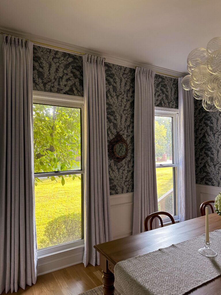

Swapping out my venetian blinds for proper window treatments completely changed my rooms. Shop: Dining Room Drapes | Velvet Rust Bedroom Drapes | Rolli Motorized Shades | Brass Curtain Rod | Brass Curtain Rod Rings
What to Do:
- If using screws or anchors, patch and paint holes upon move-out.
- Save all hardware for reinstalling or reusing in your next place.
Related:
8. The Easiest DIY Renter Friendly Upgrades: Add Flowers & Container Plants
One of the easiest ways to boost curb appeal? Flowers! Even in rentals, potted plants on patios, balconies, or front steps go a long way.

Flowers like Black Eyed Susans are easy to care for and come back annually
What to Do:
- Stick with movable planters or container gardens.
- Avoid planting anything permanent in the ground unless explicitly allowed.
9. Use Command Hooks & Picture Rails for Art
Rather than drilling into walls, try Command Strips, picture rails, or leaning art on shelves or furniture.
What to Do:
- Clean the wall surface before applying.
- Remove strips slowly and follow product instructions to prevent peeling paint.
I use Command Strips in my house especially when I’m not 100% sure on artwork placement. This little painting is being held up with a Command Hook!
10. Create “Built-In” Looks with Bookcases
Flank a window with two tall bookcases or place bookshelves around a bed to mimic built-ins—no drilling required.
Bonus Tip: Use wallpaper or fabric as a backdrop for even more visual interest.
These are NOT Renter Friendly DIY Upgrades
Even if it feels tempting, steer clear of these common renter DIY mistakes:
- Don’t remove or replace permanent fixtures without permission. That built-in vanity might not be your style, but it’s part of the lease.
- Avoid structural changes. That includes removing walls, widening doors, or adding built-ins.
- Skip the tilework. Even peel-and-stick tiles need to be chosen carefully—check if the adhesive is safe for your floor type.
Final Thoughts About Renter Friendly DIY Upgrades: Always Ask First
Even if a project feels harmless, always check in with your landlord or property manager before making changes. A quick email with your proposed plan can save you major headaches later—and most landlords appreciate tenants who care enough to improve the space. Also remember there may be some PTSD from the tenants before you, so if you get a “no”, don’t take it personal. Chances are, it’s not.
With the right approach (and a little creativity), you don’t have to wait until you own a home to love where you live.
Related:
Landscape Wallpaper Murals for Every Budget
How to Prepare Walls for Wallpaper
A round-up of nearly 100 peel & stick wallpaper options!
Choosing & Installing Custom Draperies
Installing Motorized Shades in the Bedroom
How To Get Crisp Paint Lines (every time!)
Choosing The Right Paint Sheen
Using Light Fixtures As Artwork
My Budget Friendly Kitchen Renovation – Installing Soft Close Drawer Slides
browse more posts
read more
Summer is officially here in Nashville, and after my never ending bathroom renovation and trim work, it felt like time to turn my attention outside. Specifically, to my pool patio—aka the place I spend every free second once the weather warms up. This little corner of my backyard has been a workhorse over the years, but after seasons of sun, storms, and a fringe umbrella that finally gave up on me last summer… it was time for a budget-friendly pool patio refresh.
While I have big dreams for this space long-term (black cast iron loungers with wheels, I see you), this year was all about doing what I could within a budget—and spoiler: I’m so happy with how it came together.
Keeping My Teak Loungers
Let’s start with what stayed. I’m still using my trusty teak lounge chairs from a few years back. They’ve aged beautifully and still have that classic, resort-style charm I love. Would I love to eventually swap them for black cast iron loungers with wheels that give off a retro Palm Springs vibe? Yes, absolutely. But teak is timeless, and for now, they’re still working hard and looking good.
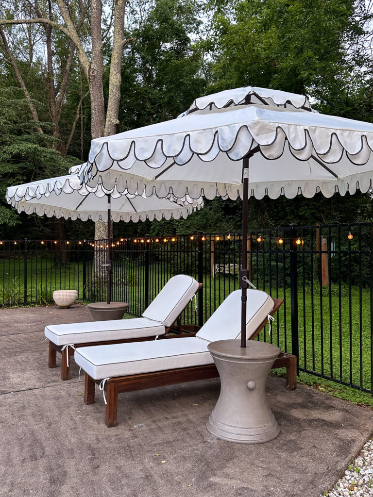
The Cushions: Luxe Look, Not Luxe Price
The biggest upgrade this year? New chaise cushions. I found these white ones with beige piping and was immediately impressed by how plush and tailored they look. They’re thick, comfortable, and the piping gives them a custom, designer vibe without the custom price tag. They instantly elevated the look of the entire patio.
Oh, and if you’re getting new cushions or umbrellas, make sure you protect them right out of the gate! I like to use Scotchguard spray made for fabric. It will extend the life of everything for me!

Shop Chaise Lounge Cushions
The Umbrellas: Scalloped & Showstopping
I also swapped in two new double valance umbrellas, and I’m obsessed. The double scallop detail feels vintage and elegant, and they provide the perfect amount of shade without blocking the view. Last year, my umbrella couldn’t handle even the slightest gust of wind—and honestly, I was tired of it blowing over.
There are so many cute patio umbrellas on the market I had such a hard time picking one, but I thought this one was classic and would go well with the updated house exterior colors. Simple, timeless and I can dress up the rest of the area later with some accessories. Here are just a few of the umbrellas I was pining over when designing the new patio set up!

Scalloped tiered umbrellas
The Best “Look for Less” I Can’t Gatekeep
So let’s talk about my favorite find of the summer: the umbrella tables. I had my eye on these beautiful ones from Frontgate—gorgeous, cast stone, and $529 each. But I needed two, and the math was mathing… in the wrong direction.
Then I stumbled on an almost identical version at Sam’s Club for $150. Yes, $150. Same weight, similar silhouette, and multiple styles to choose from. They’re heavy enough to keep the umbrellas stable in wind and look just as high-end. I nearly did a cartwheel in the parking lot.

Umbrella Table (several shapes and finishes to choose from)
What’s Next for the Budget-Friendly Pool Patio Refresh?
Eventually, I’d love to layer in an outdoor rug to keep the pavement from getting quite so hot (and to ground the whole seating area visually), but I’m letting the new core pieces settle in first. I’ve learned that outdoor spaces evolve just like interiors—layer by layer.
For now, I’m enjoying slow mornings with coffee out here, weekend pool dips with friends, and a setup that feels elevated and achievable.
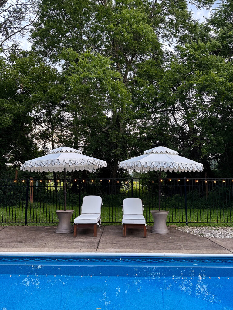
Shop the Look
Here’s a roundup of what I used in this year’s budget-friendly pool patio refresh:
- Teak lounge chairs – similar style
- White + beige piped cushions
- Double scalloped umbrellas
- Frontgate-style umbrella table look-a-like – Sam’s Club
Pin this post for later, or follow along on Instagram where I’m sharing more behind-the-scenes on this summer’s outdoor projects. And if you’ve been waiting to upgrade your outdoor space on a budget—consider this your sign.
Related:
read more
Let’s talk curb appeal. Or more specifically—copper curb appeal. I recently installed these oversized copper lanterns on the exterior of my 90s brick colonial, and I cannot stop staring at them. Truly, every time I pull into the driveway, I feel like my house has leveled up in the most timeless, charming way. If you’re hunting for elegant outdoor lighting that plays well with warm tones, traditional architecture, and moody trim, let me introduce you to my new favorite fixtures.
Why I Chose Copper Lanterns for My Exterior
These copper lanterns were love at first sight—but it wasn’t just a pretty face that sold me. I wanted something that would complement the darker, earthy brick of my colonial home, and these lights check all the boxes:
- Warm copper finish that patinas beautifully over time
- Classic silhouette with just the right amount of drama
- Open lantern design that mimics high-end historic homes
- Large scale for that designer-worthy “wow” moment
They also pair so beautifully with the Black Fox trim by Sherwin Williams that I painted last year. Black Fox is a dark, warm brownish-black that adds depth and contrast without going harsh. The copper against that dark trim? Pure magic. It creates a warm, moody palette that feels both elevated and cozy—basically everything I want my home to say.

Shop My New Copper Lanterns
Design Tip: Size Matters for Outdoor Fixtures
Here’s a little designer rule of thumb when it comes to selecting outdoor lighting: go bigger than you think you need. Most people undersize their lanterns, especially around the front door. But large-scale fixtures are what give that custom, high-end look.
A good guideline is:
- For one lantern: it should be about ⅓ the height of the door.
- For two lanterns flanking the door: aim for each to be ¼ the height of the door.
These Galena lanterns are generously sized, and that’s exactly what makes them look so intentional. They don’t just light the entrance—they frame it. It’s like giving your home its very own jewelry.

What a difference the right scale makes!
A Cohesive Exterior Color Palette
I’m always thinking about color harmony, and with this project, I wanted to stay true to my home’s naturally moody palette. The dark brick, deep Black Fox trim, and glowing copper lanterns all work together to create a layered, collected exterior that feels inviting and warm. This isn’t a bright-white-and-black farmhouse moment. This is a timeless colonial with charm.
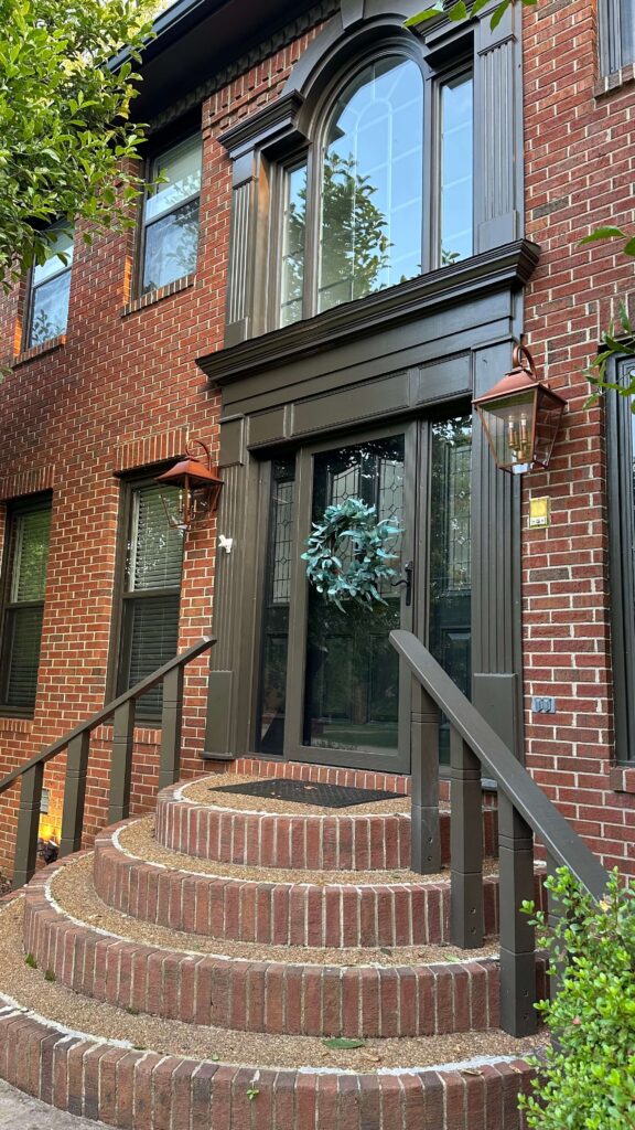
My New Copper Lanterns – Final Thoughts
If you’re renovating or refreshing your exterior, don’t overlook the power of great lighting. The right fixture doesn’t just add function—it adds ambiance, contrast, and architectural character. These copper lanterns did all of that and more.
Whether you’re updating a traditional colonial like mine or just craving a little glow-up (literally), consider going bold with oversized copper lighting. And always remember—when in doubt, size up!
Shop the Look
Lanterns: Galena Lanterns in Copper Finish + the sealant I used to protect them
Trim Paint: Sherwin-Williams Black Fox
Wreath: similar
Related Posts
The Latest on the Blog —
read more
I think there are two types of people when it comes to design: those that have a design in their head and those that need to sketch everything out in advance. I’m of the former type, not the latter. In fact the main reason I create mood boards is to showcase my vision to all of you! With all that said, there is always part of me that’s a little nervous about tackling a new room and then there’s a moment of relief when I see it start to take shape in real life. It’s this moment where I think “okay the reality is matching the vision.” That moment for the primary bathroom renovation was these past two weeks, because I finally started to create the boxes on my custom wainscoting project. Plus my new marble countertop was installed!
Building the Actual Boxes For My Custom Wainscoting
I plan to create a dedicated blog post with the measurements, plans and materials for my wainscoting design in the future, but for now, I want to go ahead and share the progress. Last week I started to place the 3.5″ horizontal boards, which means this week it was time to install the 2.5″ vertical boards (and make the actual boxes!).
Since there was plenty of math already happening with the horizontal board placement, I decided to keep things simple for myself and start my vertical boards on walls where I didn’t need to make any decisions about the number of boxes. A small space = one box. This gave me a little bit of momentum, because I was able to see the boxes come to life and I was eager to keep going.
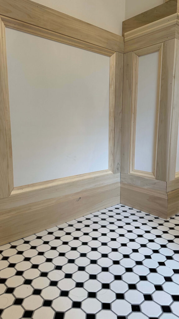
The tricky part was when I got to the corners of my walls. Ideally you’d bevel your boards (just like you do for baseboards, crown molding, chair rail, etc) but I don’t have a table saw and I also don’t have the budget to buy one right now. So instead, I chose to butt my boards up against one another. For inside corners I extended each board about 0.75” from the corner until they were just barely touching. For outside corners I extended one of the boards 0.75” so it was flush with the adjacent board. It’s hard to explain but hopefully these pictures help a little. I’ll caulk the seams and you’ll never know the difference!
After I had some boxes, I installed picture frame molding on the inside of each box. This is now my third time working with picture frame molding, so I felt confident with this part of the job and really hummed along!
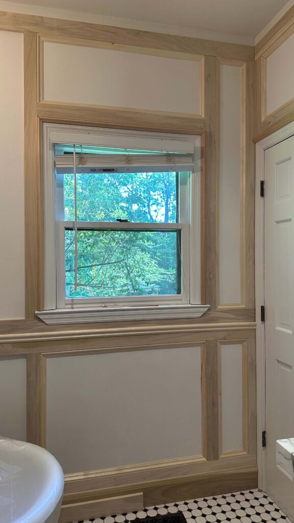
Another big decision was the wall next to the shower. I had to decide if I wanted to keep the tile border, or if I wanted to risk removing it (and finding a surprise!) in hopes of making a cohesive look. I’ll always roll the dice when good design is on the line, so I got to chiseling and luckily there were no surprises. The finished look is to die for!
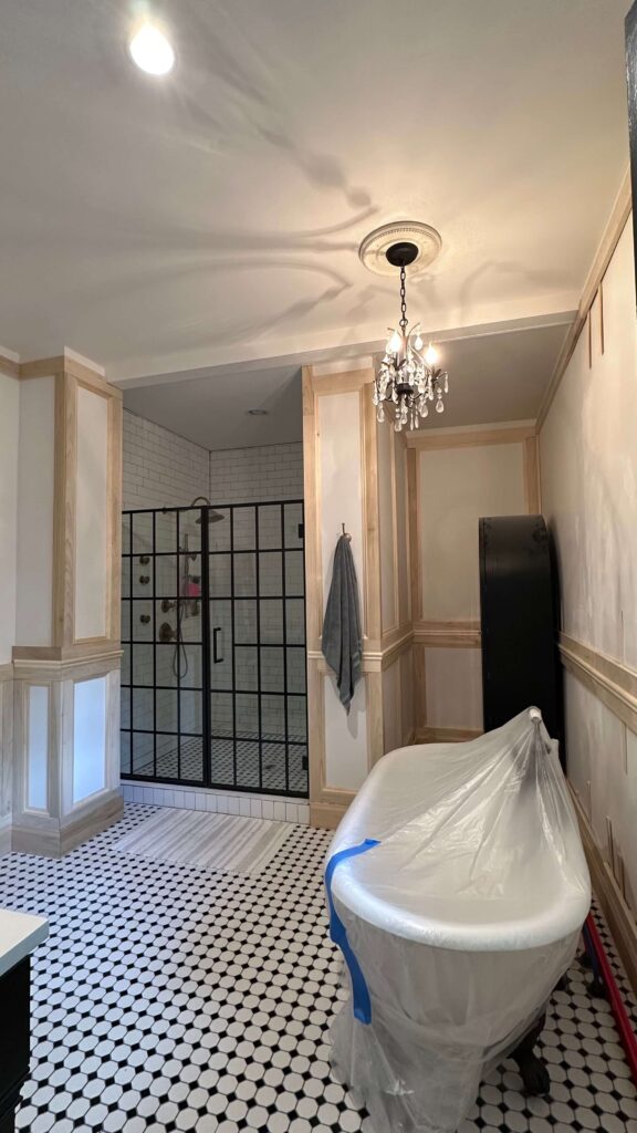
The New Marble Countertops
The most exciting update to share is the installation of my new Calacatta Fiorto marble countertops. I’m in love with the veining, the colors and how much personality it’s bringing to the room already.
I was waiting for the countertop to be installed before doing any custom trim on the walls near the vanity, so now that we’re past that, I’ll get to work designing, cutting and installing.
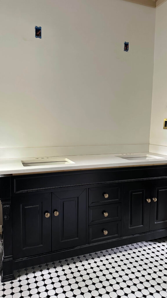
The Vanity + Original Quartz Countertop
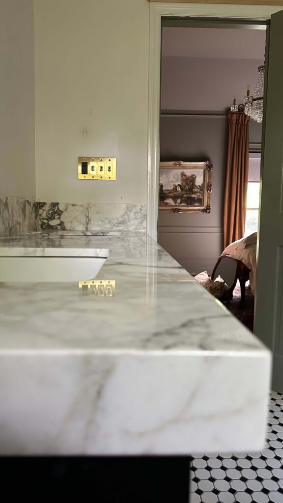
Still to Come
Don’t worry, there is plenty more in store for this bathroom makeover. I’ll be installing the crown molding which will really finish off the custom trim. I also need to figure out how many boxes to make on the wall behind the bathtub. Either 3 or 4, I’m not sure yet.
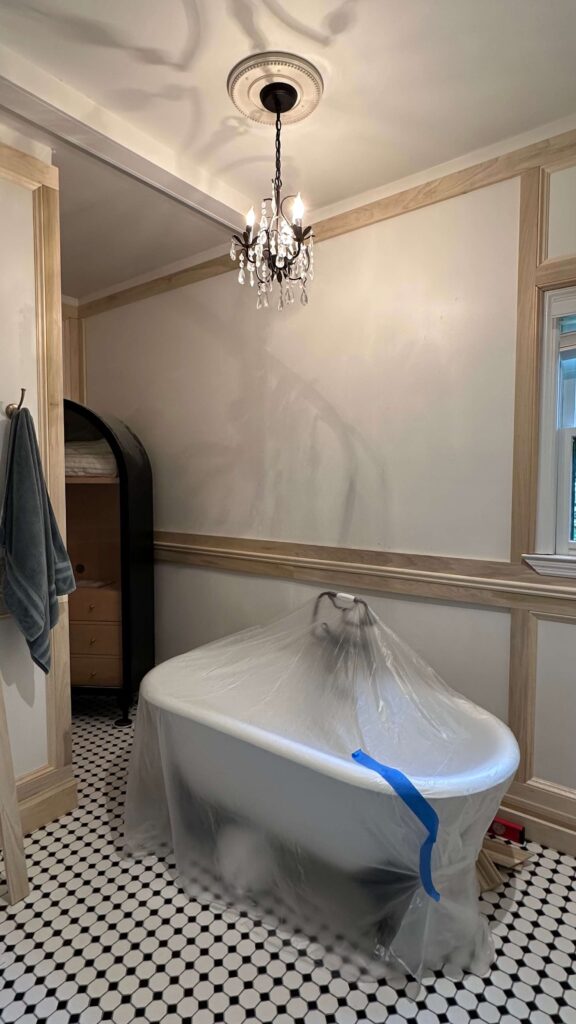
Something I’m dying to figure out is the paint color for the room. While my initial choice was Mouse’s Back by Farrow & Ball, I’m a little worried it will end up being too dark. I’ve ordered several more samples from Samplize (including some F&B archive colors!) and can’t wait to add them into the mix. If you’ve never heard of Samplize before they’re giant paint swatches made with real paint, and stick right to the wall so you can envision the paint in different light (without painting!). Check them out here (ps – ALLISON10 gets you 10% off!)
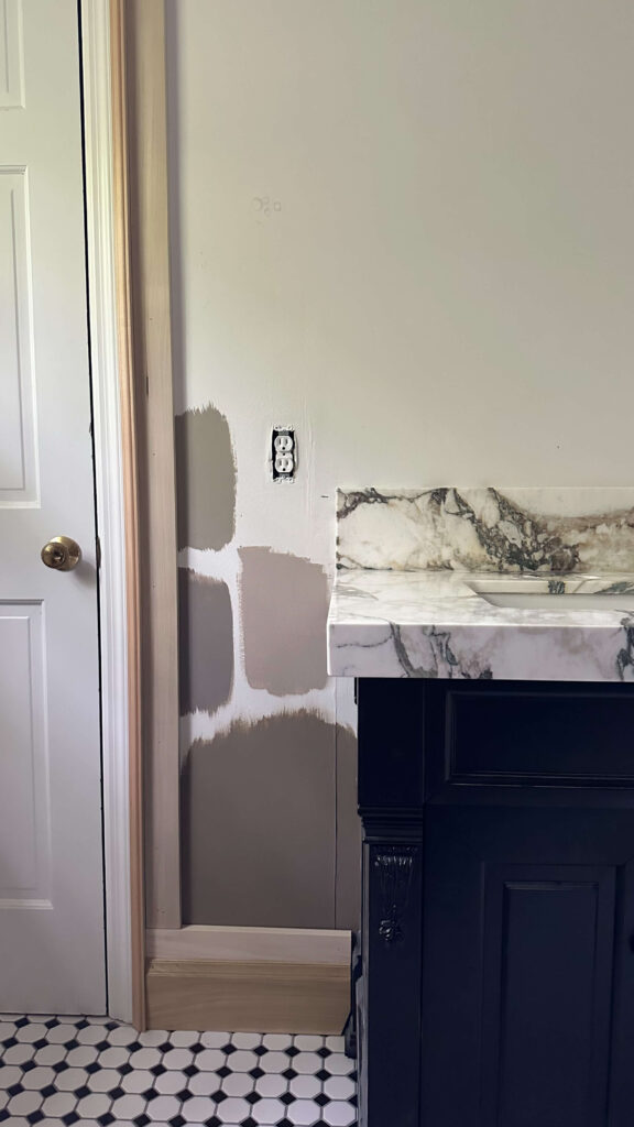
Still mulling over these 4 paint samples…but maybe the “one” isn’t one of these?
Lastly I need to pick a faucet out. I’ve never mixed metals before but am ready to take the plunge for this design. I already have some brass incorporated throughout the design (the light fixtures, the knobs and the toggle light switches) so I feel like a polished nickel would look best. Again, I may wait until the counters are here before I click add to cart, but so far, these are my contenders.
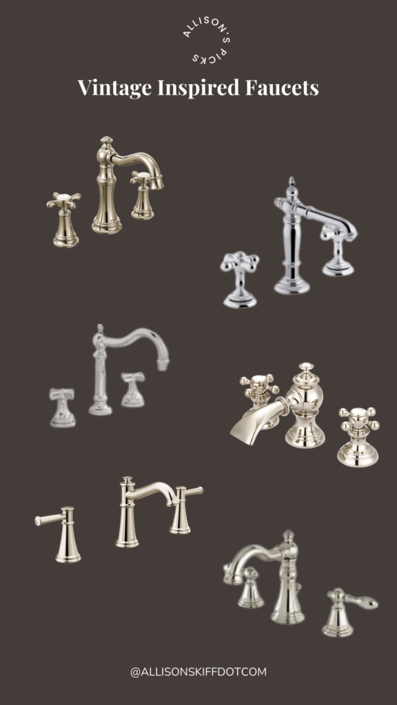
Visit the One Room Challenge page to follow along with our DIY and designer community! You’ll find everything from small to large projects, at all skill levels.
Catch Up On the Spring One Room Challenge:
Spring 2025 One Room Challenge Week 1
Spring 2025 One Room Challenge Week 2
Spring 2025 One Room Challenge Week 3
Spring 2025 One Room Challenge Week 4
Spring 2025 One Room Challenge Week 5
Related:
browse more posts
read more
This week was a huge turning point for the primary bathroom renovation because I finally started to see some real changes. I gave you a little sneak peek in last week’s post, but a pallet (594 lbs!) of custom trim arrived and I could not wait to get it on my walls. As eager as I was to get going, I had to coach myself on slowing down because there are so many moving pieces (and so much math!) that went into designing wainscoting in the primary bathroom.
I also needed to buy, set up and learn how to use a new miter saw to cut these thicker pieces of wood, so that took some time too. (Ps – I chose this one and am so happy with it!). This will be a two part post, as I haven’t completely finished the wainscoting yet, but for part one I want to focus on the wainscoting design, everything I ordered and the progress to date.
Designing Wainscoting in the Primary Bathroom
If you’ve been following along with me over the past year, you know I installed picture frame molding below my existing chair rail in the dining room last spring, and then double boxed picture frame molding in my primary bedroom last summer. This time, I want to mix things up by creating more of a wainscoting look in the primary bathroom. I think it will be a nice compliment to the primary bedroom trim and I’m oddly excited about challenging my DIY skills.
To achieve this look, I’ve partnered with Novo Building Products and Ornamental Mouldings, who are known for providing the best in moulding and millwork offerings. I’m thrilled be to working with their beautiful profiles and I know the trim is going to create the warm and welcoming room I’m envisioning.
Left: Wainscoting Inspiration | Right: Primary Bedroom Custom Trim
Wainscoting Product List
To achieve the wainscoting look, this was everything I ordered and how I plan to use it:
Ornamental Mouldings White Hardwood Colonial Backband: we’ll get into this below, but I ordered backband to place around two existing door frames, as well as one existing window frame.
Ornamental Mouldings 3.5” poplar boards (8 ft length): these will be for the horizontal trim pieces. The bottom and top boards will be overlapped by 1” by both the baseboards and crown molding, resulting in a 2.5” profile.
Ornamental Mouldings 2.5” poplar boards (8 ft length): these will be the vertical boards for my boxes, which are also referred to as stiles.
Ornamental Mouldings 5.5” Charlotte Baseboards (8 ft length): oddly enough, the existing baseboards in my bathroom are 1 inch shorter than all of the baseboards in my house and it drives me nuts. These new 5.5” baseboards will bring continuity to the overall flow of the house.
Ornamental Mouldings Unfinished White Hardwood Colonial Chair Rail Moulding: I love the profile of this chair rail! It will sit about 41” up from the floor and on top of the horizontal molding.
Ornamental Mouldings White Hardwood Colonial Base Cap Moulding: this will be for the picture frame molding, which will be cut to go inside of each box of the poplar frames. This is an extra step but will give everything an elevated and finished look.
Ornamental Mouldings White Hardwood Cornice Crown Molding: last but certainly not least, the bathroom will be dressed with crown molding. I think this is going to add the layer of luxury I’m craving for this room.
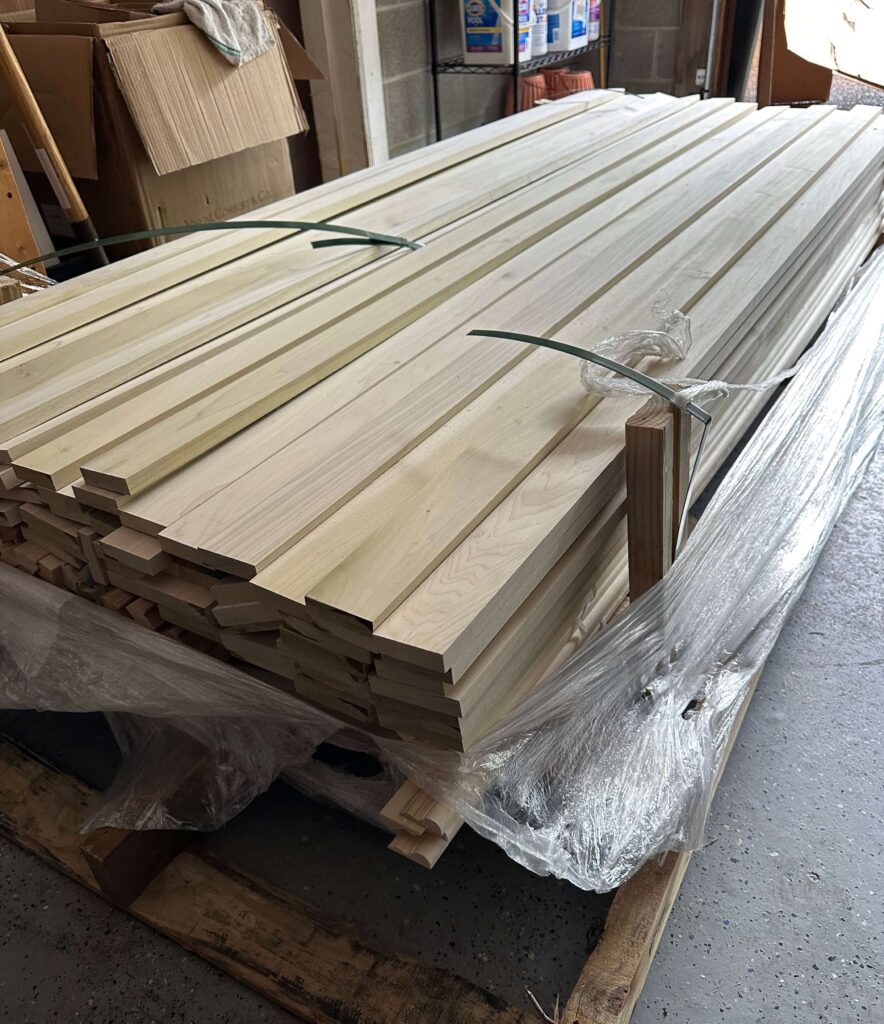
All of the Ornamental Moulddings custom trim I’m using for the wainscoting in my primary bathroom!
Installation Step 1: Adding Backband
Before I could get started with installing any of the wall paneling, I needed to install backband around the door and window casings. If you’re wondering what backband is, it’s essentially a decorative strip of trim that’s installed in front of or around another piece of moulding. Some people use it to enhance their existing trim, but for my purposes I’m installing it to extend the profile of my existing trim. If I didn’t do this, the new wall paneling would not sit flush against the door or window frames. And that wouldn’t be a good look.
I also ripped out the existing window sill trim and installed a new longer window sill so it would extend past the new backband. Generally a good rule of thumb is anywhere from 0.5” to 1 inch past your window casing.


Left: an example of how the trim would extend past any existing trim | Right: Back band installed around my bathroom window
Installation Step 2: Adding the Horizontal Wall paneling
I think there could have been a few different ways to start this project, but I opted to start with the horizontal boards first and from the bottom up. My existing baseboards sit 4.5” high, so I simply placed my 3.5” poplar boards on top of them and nailed them into place using my brad nailer and 2 inch brad nails. This allowed me to ensure everything was level out of the gate.
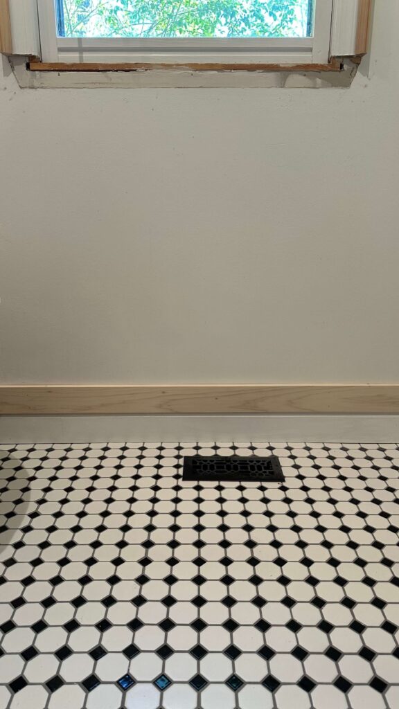
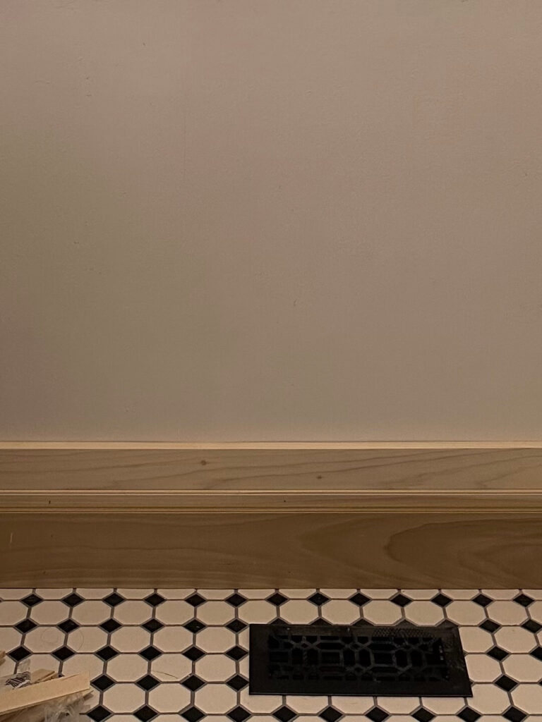
Left: 3.5″ Poplar board installed on top of existing 4.5″ high baseboard | Right: New 5.5″ baseboard installed in front
From there, I added my new baseboards on top. I placed shims in between the old baseboards and the new baseboards to seal up any spacing, and to allow an extra grip for the nails. You’ll also see some shims in between my walls and the horizontal boards in these photos. My walls are not even, so this helped fill the extra space when I went to nail everything in place. Don’t worry, these snap right off and I’ll be adding the picture frame molding inside of the boxes and then we’ll caulk.
Installation Step 3: Determining the Chair Rail Height
The hardest part of this installation was determining the chair rail height, which would determine where I placed the middle horizontal boards. The new vanity countertop has not been installed yet, so I was doing a little bit of guess work on my measurements. I know I want a box around the vanity area so the base of that board would need to start where the new and yet to be installed backsplash ends. In the end I decided to have the middle of the chair rail sit at 41” above the floor. I have 9 foot ceilings so this is a little bit higher than 1/3 of the height of the room, but I had to work around some existing features like the vanity and window that didn’t have any flexibility.
After I figured out my measurements, I installed the top 3.5” poplar board with the base sitting at that 41” mark off the floor. The second 3.5” board went right below that, and using my new laser level, I centered the middle of the chair rail to sit right in the middle and installed that on top. Can you start to see the vision now?
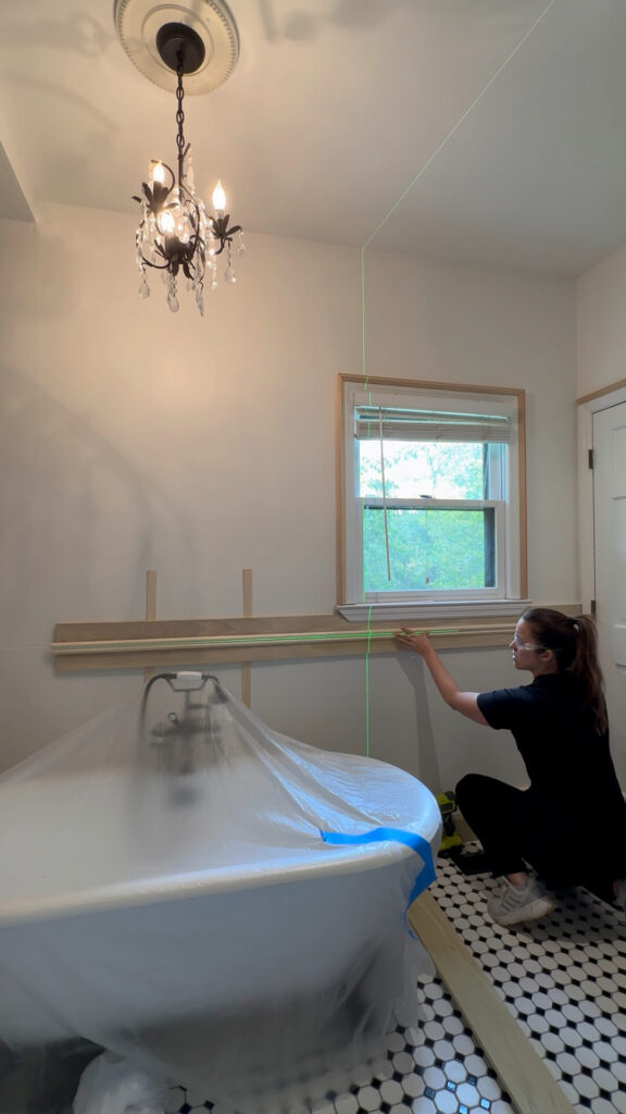
Installation Step 4: Installing Around The Bathtub
Installing long pieces of wood by yourself is tricky enough – the boards are heavy, and you’re trying to keep everything level while nailing things into place without them moving. Add to the challenge of working around a clawfoot tub that your ladder doesn’t reach around and you’ve got yourself a bit of a pickle.
If you run into this, I figured out a great solution (that worked!). Measure where you want the base of your board to sit and tap nails halfway into the wall at that point. I did about 4 nails total which allowed me to rest the left side of the 8 ft board, while keep it level on the left and nailing it into place. I then moved my ladder to the left side of the tub, checked the level and finished nailing on that side. I removed the nails and I’ll be installing the picture frame molding inside this box, so there’s no need to worry about filling the holes.
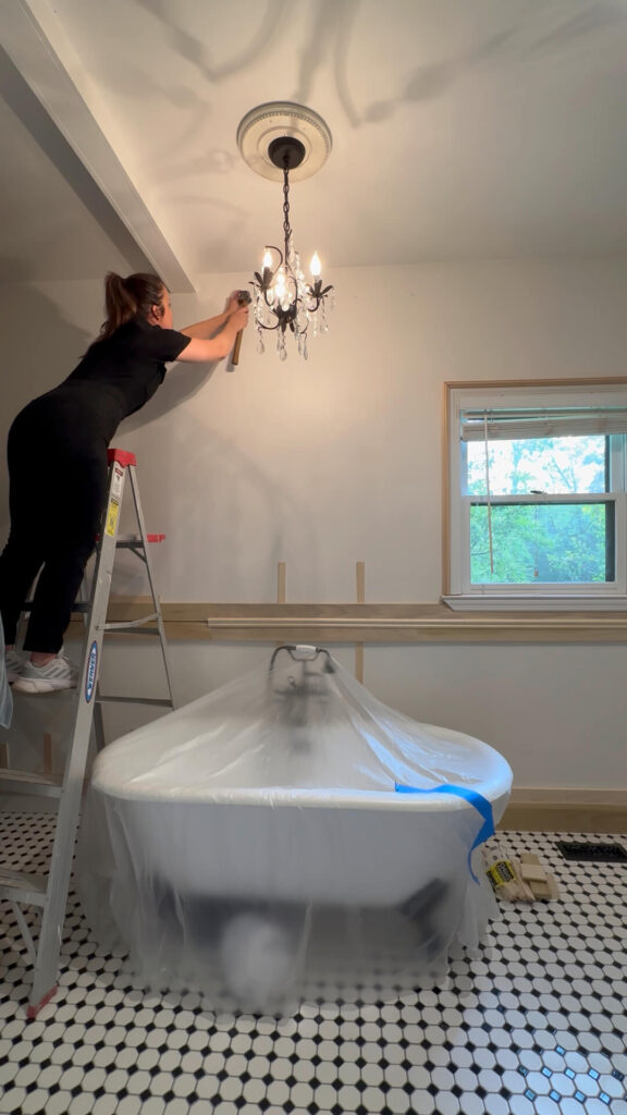
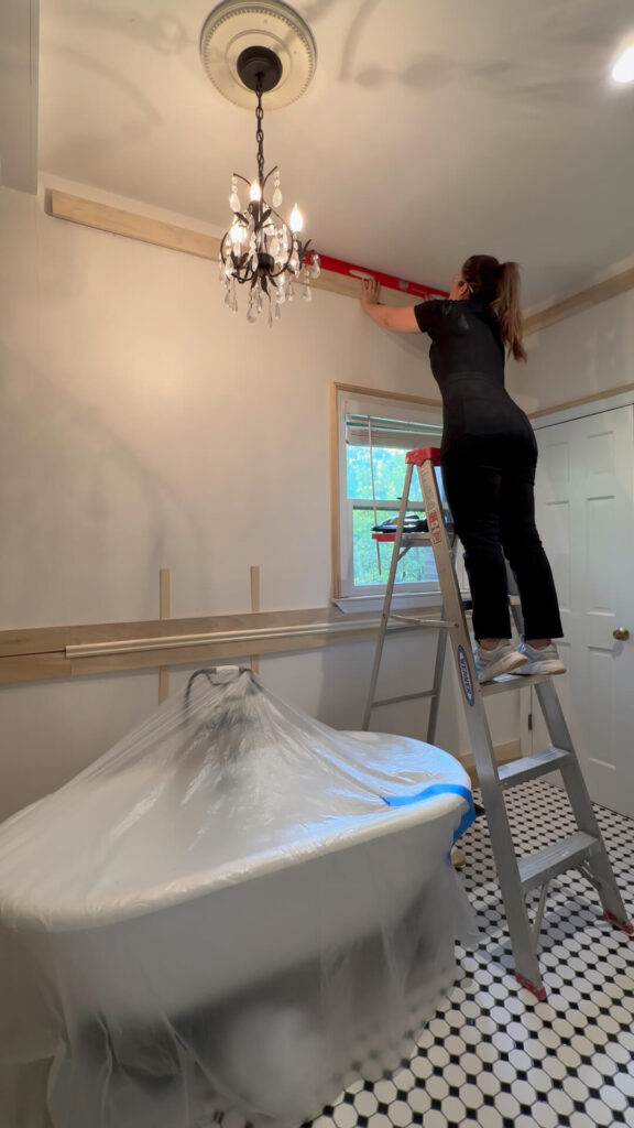
From left to right: tacking nails 6″ down from the ceiling allowed me to rest an 8 ft long board to ensure it was level before nailing it in place
Looking ahead to week 6: Designing the Wainscoting Pt 2
This past week I got most of the horizontal molding installed around the room! I have a few more pieces to go and then we’ll get to figuring out our box sizes. I did not bother drawing this out in advance, as I think it’s going to be best to design for each particular wall itself. I’ll cut some vertical 2.5” boards and move them around a bit, and see what looks best. From there I’ll make some quick decisions and we’ll get to making these boxes.
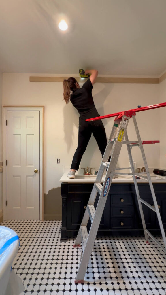
My goal is to get all of the boxes created, and then knock out the picture frame molding that goes on the inside. I’ve done this twice now, so I anticipate this to go mostly smooth (hopefully!). Lastly, it will be time for the crown molding. I’m excited for the end result, however I’ve heard this can be quite challenging. This is why I’m saving this for last, as I don’t want it to take the wind out of my sails!
Some other odds and ends that will be happening: I still need to decide on paint color, so keep an eye on socials for some paint swatching. And while determining the chair rail height, I realized I need to move two more electrical boxes in the room, so there will be some more drywall patching (but also some more pretty brass electrical switches!).
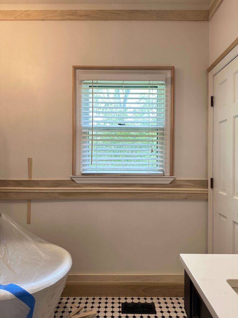

Everything I’m Using for the Wainscoting in the Primary Bathroom:
Bosch Sliding Compound Miter Saw
Ornamental Mouldings 3.5” poplar boards
Ornamental Mouldings 2.5” poplar boards
Ornamental Moulding 5.5” Charlotte Baseboards
Ornamental Mouldings White Hardwood Colonial Backband
Ornamental Mouldings Unfinished White Hardwood Colonial Chair Rail Moulding
Ornamental Mouldings White Hardwood Colonial Base Cap Moulding (Picture Frame Molding)
Ornamental Mouldings White Hardwood Cornice Crown Molding
Visit the One Room Challenge page to follow along with our DIY and designer community! You’ll find everything from small to large projects, at all skill levels.
Catch Up On the Spring One Room Challenge:
Spring 2025 One Room Challenge Week 1
Spring 2025 One Room Challenge Week 2
Spring 2025 One Room Challenge Week 3
Spring 2025 One Room Challenge Week 4
Related:
read more
Technically, from a calendar perspective, this is the bathroom renovation halfway point. But from an actual implementation standpoint maybe not so much. However, progress is progress, so I’m happy to share what I accomplished over this past week, as well as what I learned. I taught myself a crash course in how to skim coat walls, received some exciting deliveries and started mapping out the wainscoting for the walls.
I shared last week about doing some drywall patching on the main wall above the vanity, and it was wash, rinse and repeat after getting all the electrical switches consolidated. Here’s another look at that new brass toggle switch plate in case you missed it.

The next thing I wanted to tackle was smoothing out some of the bumps and lumps on my other walls that the orbital sander couldn’t take care of. These were due to a combination of some bad tape jobs as well as spackle that was not previously sanded down before being painted over. I had never skim coated an entire wall before, so this was a first, and there was a learning curve.
Bathroom Renovation Week 4: Skim Coating Walls
When getting ready to skim coat, the first thing you want to do is to tape off all your floors and any other big objects you’ll be working around. The joint compound will go everywhere! Next you’ll want to get your joint compound mixed up. I chose this joint compound and scooped out several scoops into a bucket, and then using my drill and a mixing wand, I added water and mixed just like you’d mix cake batter. You want the consistency to look like yogurt in the end, so just add a little bit of water at a time until it looks like yogurt.
Next is applying the compound to the walls. Similar to painting walls, you’ll use a paint roller and paint skin with a 3/8″ nap to apply the joint compound. I added this grid to my bucket, which ensured I didn’t have too much on my roller, and then rolled it onto the wall. What’s different about this vs painting is you can go any direction you need to: vertical, horizontal, diagonal – you just want a thick and even coverage.

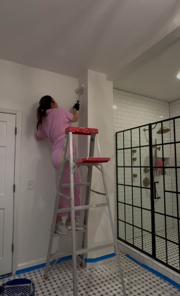
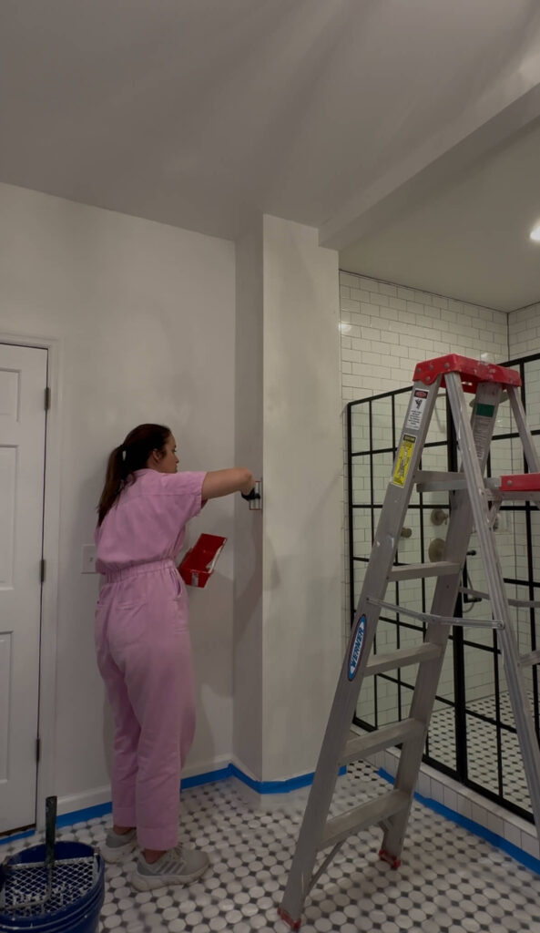
Note that this phase is going to make you question what you’re doing because it looks like you’re adding texture to your walls, not removing it! Work in small sections because you don’t want the joint compound to dry before you get a chance to smooth it out.
After it’s applied, you’ll use the blade of your choice (usually either a 12-inch blade or smaller) and gently glide it across the wall, leaving a smooth finish. You’ll likely have some small lines, but don’t obsess over these. They can be smoothed out during sanding and if you try to smooth them out during this phase of the process you’ll make things worse not better. I found that going horizontally was easier for some reason than vertically, but again, this was my first time doing this so I’m sure it gets easier with more practice.
Allow the compound to dry for 24 hours and then you’ll be ready to sand. I used a piece of sand paper vs my orbital sander, because I wanted to make sure I wasn’t taking too much off, especially with this being my first time doing this.
A change of plans
I’ll be honest, I did not like skim coating at all, and I think this was largely due to the fact that the two walls I skim coated were uneven in the first place. I figured this out after the fact of course. While these two walls were in rough shape, the process made me step back and assess if I really needed to do every single wall in the bathroom and the answer is NO.
Instead, I went through and spackled holes and cracks where necessary and I think the primer will help to smooth out any smaller discrepancies with texture. While the ceiling could definitely use a skim coat, I’m going to save this for when I do the next phase of the bathroom (involving the shower, as I’ll need to make some changes to lighting and this will be most efficient to do all at once.
Special delivery!
It always helps to balance out the not so fun parts with some deliveries, so I was excited to receive my new light fixtures this week! I’ve been a long-time fan of Visual Comfort (that’s the brand that did my bubble chandelier in the dining room) so I was excited to find a way to incorporate them into the bathroom. These double brass sconces are the perfect warm brass and I love the little X detail on the posts. Topped with frosted glass shades I think these are going to add so much warmth to my vanity area. I cannot wait to get them up!
Shop: Vanity Sconces
The final measurements for the new marble countertops also took place and installation should be in the next two to three weeks, which will be right on time! I’m starting to explore what I want for a faucet and I’m leaning towards this pretty one as my front runner.
Also arriving this week was 594 pounds of woodwork!!! I’m partnering with Novo Building Products for this project and they’ve generously supplied everything I need for my custom wainscoting. I’ll be adding crown molding, new baseboards, a chair rail, wainscoting and then picture frame molding inside the wainscoting for an elevated look.
What’s Next?
You probably got the hint from the above, but the next step will be adding the wainscoting to the walls! I’m really excited for this, because we’ll finally start to see the transformation take shape. While I’ve added custom trim in both the dining room and primary bedroom so far, this design will be a little bit different. I’m excited to push my DIY skills and have a finished result that adds so much dimension to the space.
Stay tuned on socials over the next week to see the entire process unfold. I’ll also be sharing my vision for phase 2 of the primary bathroom renovation, as it will impact the trim design and installation. I’m excited to share more with you soon! And if you haven’t already, make sure to visit the One Room Challenge page where you can follow along with dozens of talented designers that span across every type of project and style you could imagine.
Catch Up On the Spring One Room Challenge:
Spring 2025 One Room Challenge Week 1
Spring 2025 One Room Challenge Week 2
Spring 2025 One Room Challenge Week 3
Related:
The Latest on the Blog —
read more
It’s week two of the Spring One Room Challenge and I can say without a doubt, this is my favorite week other than the reveal week! Why? Because it’s design week! I’m so excited to share the primary bathroom design plans with you today.
Someone commented last week that the primary bathroom has “great bones.” I smiled and thought to myself “yes it does, because I’ve already renovated it once.” If you need a refresher, you can catch up on what the bathroom looked like when I bought the house in 2018 here, and you can read more about why I’m giving it a second go here. Now that we have that out of the way, let’s get to the fun stuff…
the primary bathroom design plans
What’s Staying
This is phase one of two for this renovation, and I’m happy to share many elements are staying intact. I’ll be keeping the black and white checkered floors, as well as the striped wallpaper in the toilet room. I’ll also be keeping the black vanity, although TBD if it stays black, or if I flip it to a wood tone like I did with my dining room table a couple years ago. For now, the tub is staying where it is, but that will change in phase two of this renovation.
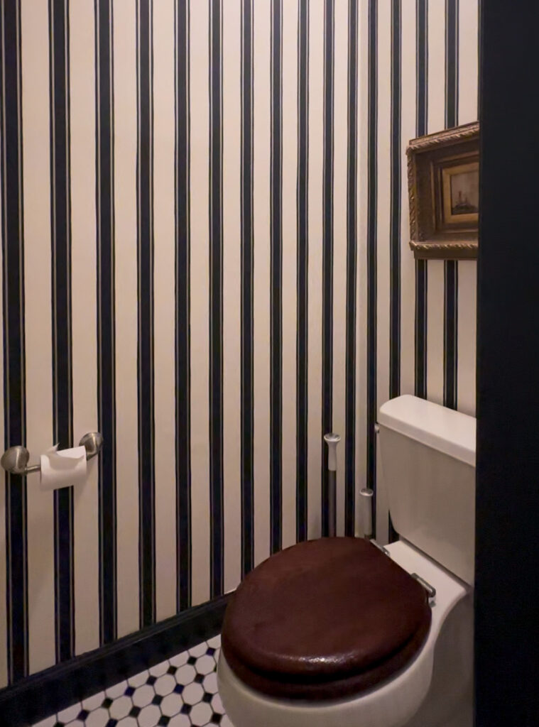
The striped wallpaper in the toilet room will be staying. It’s one of my favorite features!
What’s Leaving
The sconce lights, mirrors, vanity hardware, faucets, counters, baseboards, venetian blinds and black trim will all be finding new homes. I’ll also be cleaning up the outdated electrical switches (one light switch goes to a garden tub that doesn’t exist anymore!) and replacing everything with a four gang customized version of this. If I must have everything in the center of a wall, it’s at least going to be pretty!
Most everything except the vanity itself will be getting swapped out during phase one of the primary bathroom renovation.
What’s Coming
Wall treatments
I teased last week that I’d be adding lots of wall moldings in this room, and I wasn’t kidding. I’m no stranger to picture frame molding – I’ve done it twice now (dining room + bedroom) – but I knew I wanted the primary bathroom to have its own special flair.
After pinning lots of inspiration photos on Pinterest, I found exactly what I was looking for and I haven’t stopped thinking about it ever since! What you’re looking at is full height wainscoting, with a chair rail, crown molding and baseboards on top. This creates an extra level of dimension and depth, and I know it’s going to make the bathroom feel incredibly elevated.
Vanity Glow up
The vanity will be the main focal point of this project, and I’m really excited with how it’s shaping up. These pretty sconces by Visual Comfort will add a touch of elegance and charm to the space (I just love the shades!) and I’ll make the wall more functional by adding taller mirrors. I was looking at this one by McGee & Co but couldn’t stomach the price point. I found this one from Birch Lane that is nearly identical, and I think will work perfect!
One thing I’ll be tackling this week is researching costs for a new countertop. Recently I ordered this pretty little tray in Calcutta Viola Marble and it’s so beautiful I can’t stop looking at it. Shortly thereafter I ordered a lamp for my kitchen in Calcutta Viola Marble, and I guess we have a bit of an obsession on our hands, because this is what I want for my countertops! I’ll be visiting a few different spots around Nashville I’ve been researching and am hoping I’ll be able to find what I want.

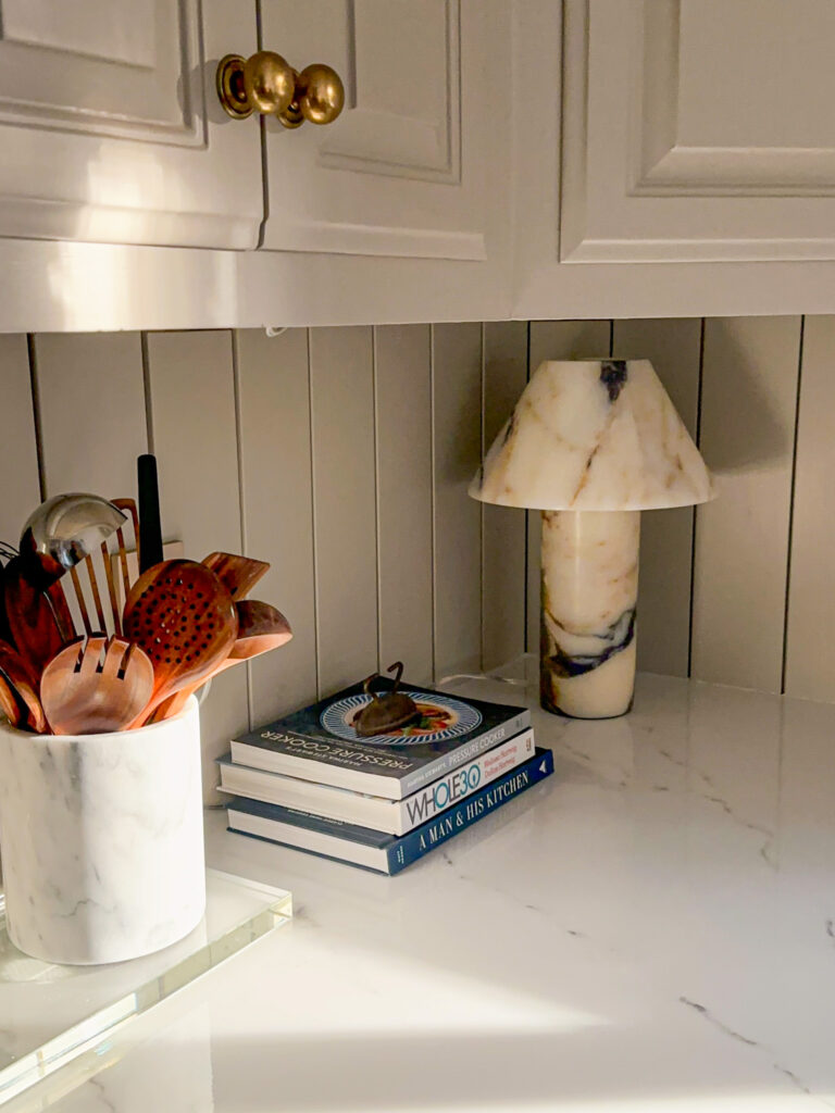
Inspiration for the new bathroom countertops: Calcutta viola marble! Shop: Amore Tray | Athena Lamp
The hardware on the vanity will also be getting swapped out. I found these beautiful knobs and matching backplates from San Diego Hardware Company, and I’m so excited to get everything updated. They’re going to add such a level of sophistication to the space!
the primary bathroom design plans – to be determined
A few things on the mood board are still a bit up in the air, and I think all of this will depend on what the counters end up looking like. The first is a wall color. I’m leaning towards a warm brown or taupe for this space, but I don’t want to go too dark. I ordered four samples from Farrow & Ball: Jitney, Mouse’s Back, Charleston Gray and Light Gray. I also ordered a pot of Preference Red to test out on the toilet room trim.
A big thing I’m struggling with is the faucet finishes. I think mixing brass from too many sources starts to get a bit tricky and I already have three different ones (sconces, light switches and vanity hardware). I’m partially tempted to mix metal finishes and go with a polished nickel for the faucets but I’m not quite there yet. In the meantime, I’ve been having heart eyes for these ones from the Kohler Artifacts Collection. If you have an opinion on mixing metals, I’d love to hear it!
And finally will be the window treatments. I think either a roman shade or café curtains could both work in this space, but this will likely be the very last design decision I’ll make and I’ll go with whatever will compliment the other bigger elements I decide on.
Shop the Primary Bathroom Design Plans
the primary bathroom design plans – what’s next?
Now the work begins! As I wait for my lumber to arrive there are a few things I can work on. First I’ll start smoothing out some of the bumps in the walls with some drywall patching, mudding and a lot of sanding.
I’ll also draw out the dimensions for my wall moldings. I have a rough sketch of this, but I’d like to get everything dialed in more precisely. The sketches will also include plans for phase two of this renovation which includes the shower area. Maybe just for fun I’ll give you a little peak of what I’m thinking next week!
Lastly, I’ll be heading to Lowe’s to purchase a new miter saw. I already own one, but with the crown molding and thicker baseboards, I’ll need one that is a sliding compound miter saw (meaning I can slide the saw out and in for deeper cuts). The goal is to be ready to go when the lumber arrives so I can maximize my weekend days!
Stay tuned for much more over the next 7 weeks! And make sure to visit the One Room Challenge page where you can follow along with dozens of talented designers that span across every type of project and style you could imagine. The creativity and ambition are contagious!
Related:
Adding Picture Frame Molding in the Dining Room
Designing Custom Trim in the Primary Bedroom
browse more posts
read more
This week kicked off the 2025 Spring One Room Challenge and I’m so excited to be participating again! If you were here last year, you might remember I decided to renovate my kitchen for my first ever One Room Challenge. While it seemed like a lofty endeavor, especially before the holidays, I couldn’t be happier with the end result.
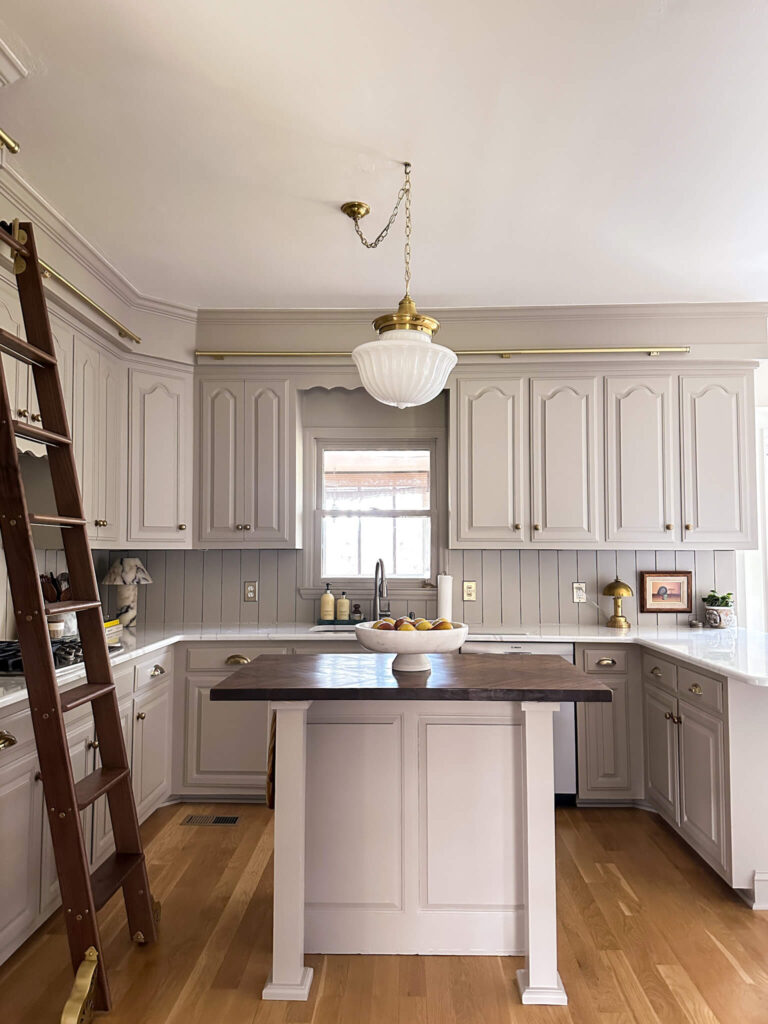
Last year’s ORC project was a bit aggressive!
What I’m embarking on for the Spring ORC may surprise you, because it certainly surprised me! And if you subscribe to my newsletter, you already know what I’m about to say. I originally had every intention of renovating my home office, but ultimately, I wasn’t as excited as I wanted to be about the wallpaper samples I picked out. In fact, I felt fatigued by it all. So, we’re going to pause on that project for the time being.
I cycled through a few different areas of the house that I intend to renovate, but none of them felt like they were scratching the itch. And then one night as I was brushing my teeth, it hit me: I’m updating my primary bathroom.
My Biggest Renovation Mistake
Now I know what you’re thinking: isn’t the primary bathroom already done? Yes, and no. The quick backstory is I had some friends help me renovate my primary bathroom inside of my first 30 days of owning this house (never do that by the way). I didn’t know what I was doing. I didn’t draw anything out or even present any measurements! I explained my vision, ordered the materials and they knocked it out in 5 days. It was such a glow up from where I started, and I was elated. You can see all the photos and read about the process here.
But I made the biggest mistake I think anyone could ever make when renovating a space. I made a concession and settled, when I knew I shouldn’t have. For some context: the room itself was originally a primary bathroom and a primary closet. I knocked down the wall in between the two rooms and expanded it to make one large bathroom (don’t worry – my new closet is awesome!). Because of the original layout, there is an air vent on the floor in the back half of the room (where the closet was). Instead of closing this off and tiling over it, I let it dictate everything. How big the shower was going to be. Where the tub got placed. Everything.

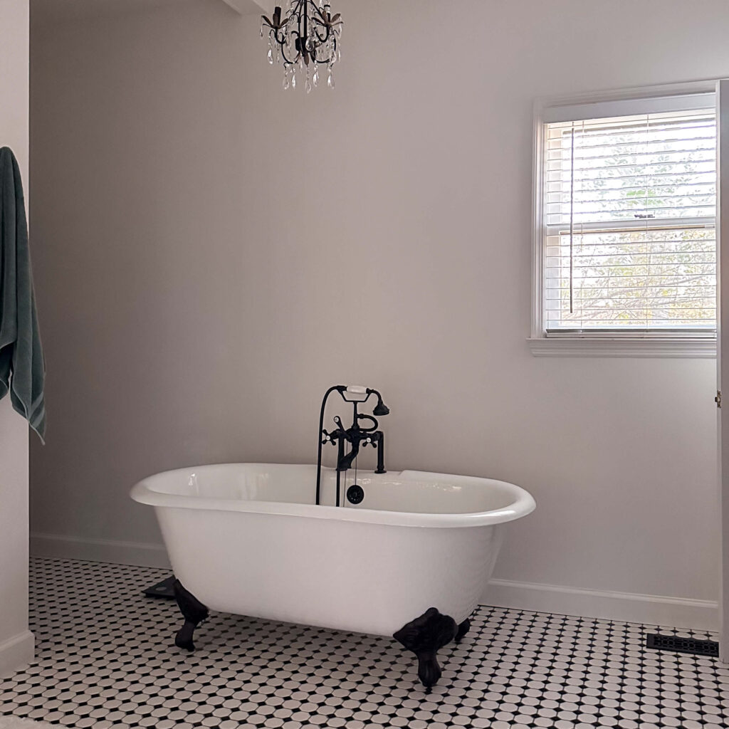
You can see how unnecessarily cramped everything is with this layout
The result is a weird layout in the back half of the room that doesn’t function in a streamlined way. The linen closet sits back in this deep recessed corner and there’s so little space in between the shower wall and tub, I have to shimmy sideways to get back there.
Creating Cohesive Design
Last year I flipped my primary bedroom by adding picture frame molding, color drenching it and updating the décor to fit my current style. Everything feels so perfect. I realized recently that my style from 2018 vs my style in 2025 are two completely different people, and I feel that disconnect when I cross the line from bedroom to bathroom daily.
The flow between the primary bedroom and primary bathroom is not as cohesive as I want it to be
My goal for updating my primary bathroom is to create a more cohesive design not only between the primary bedroom and bathroom, but with the rest of the house as well. The bathroom currently feels like an odd mix of farmhouse (vanity area), vintage (tub & tile) and traditional (toilet room).
Updating My Primary Bathroom
Before you get too excited, just know this is phase one of a two phase project. I learned my lesson with the kitchen last year! For phase one, I’m focused on a mix of clean up and design.
The clean up will include patching and smoothing the walls and ceilings – there’s a mix of bad drywall patches by yours truly, leftover popcorn from the ceilings that fell into the paint and is now stuck on the walls, and random dents and dings. There are also several poor electrical jobs that I’m going to have a professional come in and clean up.
From a design standpoint, I’ll be adding molding throughout the entire room, and I couldn’t be more excited. I know it’s going to give this white box the personality it’s craving! This will be the third time I’ve done molding (the dining room was the first and the bedroom was the second). I’m still working on the design but ultimately I plan on trying something a little bit new. More on that in next week’s post!
This will be my 3rd time adding molding to a room. I’m excited to mix it up a little this time!
The walls, trim and doors will all be painted the same color which is TBD, and I think I’ll be keeping the ceiling white. I’ll also be focusing my efforts on the vanity area and will be swapping out the lighting and mirrors and am currently exploring a new countertop as well. Depending on the final colors I choose, I’ll decide on whether vanity stays black or if it looks better in a new finish. The tub and shower will be part of a later phase of the project (at least for now!).
What to Expect
With this design and decision happening so fast, you can expect to see a lot more decisions being made as I go. While I admire many designers for having the ability to fully flush out their designs in advance, I’m leaning into the benefit of being both the designer and the muscle on my project and will be embracing slow design. I’ll decide as I go and will make the best decisions as I’m updating my primary bathroom.
To be perfectly transparent, this was something I’ve been wanting to do for quite some time, however I did not want to appear as being wasteful or ungrateful. But ultimately, I want to share this story and transformation because it’s an example of a mistake. Ultimately, if you don’t like something then you should change it, and we all deserve to love where we live.
Stay tuned for much more over the next 8 weeks! And make sure to visit the One Room Challenge page where you can follow along with dozens of talented designers that span across every type of project and style you could imagine. This community we’ve fostered is what the One Room Challenge is all about!
Related:
Fall 2024 One Room Challenge – Kitchen Reveal
Adding Picture Frame Molding in the Dining Room
read more
As the seasons change, there’s nothing quite like the fresh start that spring brings. It’s the perfect time for a spring home refresh by decluttering, deep cleaning, organizing, and updating your decor. If you’re ready to embrace a lighter, brighter space, here’s how I’m preparing my home for the season—along with some easy ways you can do the same!
Spring Home Decor Refresh
A seasonal refresh doesn’t have to mean a complete overhaul. Thoughtful touches like fresh florals, scented candles, and updated bedding can transform your space and bring in the essence of spring.
1. Spring Florals: A Simple Yet Stunning Update
Nothing says spring like beautiful blooms! While I love fresh flowers, I also like to sprinkle faux florals throughout my home to keep things looking lively year-round. Two of my absolute favorites are my white gardenias displayed in a vintage champagne bucket and my limelight hydrangeas arranged in a vintage urn I found at an estate sale. These pieces add a timeless, romantic touch to my decor while requiring zero maintenance.
Whether you opt for fresh or faux, placing florals in unexpected spots—like the bathroom vanity, bedside table, or kitchen island—can instantly brighten a space and bring a hint of spring indoors.
White Gardenias | Limelight Hydrangeas | Shop Living Room | Shop Kitchen
2. Candles with a Spring Scent
Scent plays a huge role in setting the mood of a home, and spring calls for fresh, airy fragrances. My go-to candles for the season are from Votivo—specifically Honeysuckle and White Tea & Bergamot. These scents strike the perfect balance of floral and citrusy freshness, creating a light and inviting atmosphere. Whether you place them in your entryway, living room, or bedroom, they provide an instant seasonal uplift.
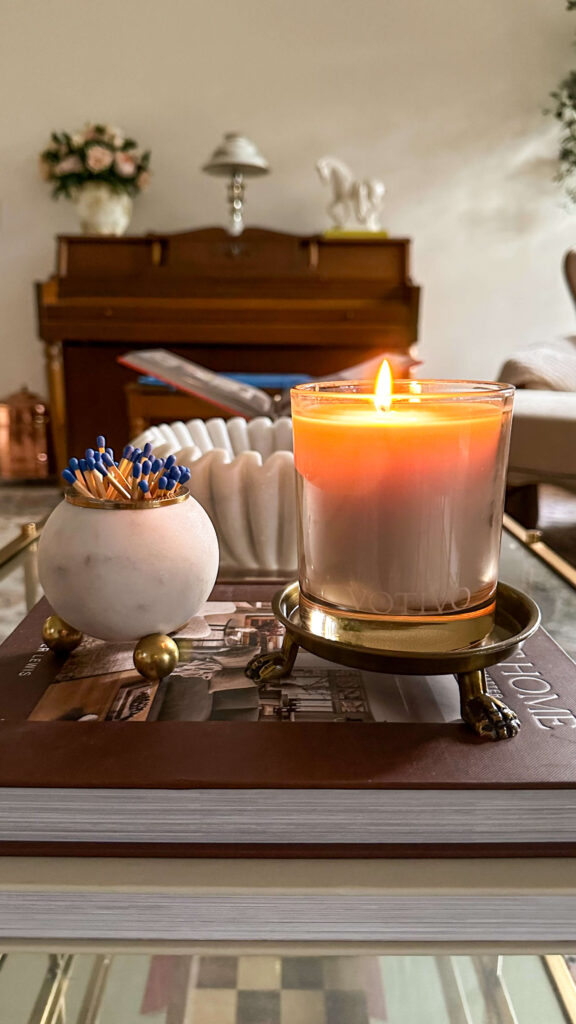
Spring Candles | Brass Candle Tray | Match Striker | Marble Fluted Bowl | Call It Home Book | Coffee Table
3. Fresh Bedding for a Crisp New Start
One of the easiest ways to refresh your bedroom is by updating your bedding. I recently swapped mine out for Boll & Branch’s Dream Blanket in White and the Signature Hemmed Sheet Set in White Textured Stripe—both of which feel as luxurious as they look. The breathable, organic cotton keeps things cool and comfortable, making it perfect for the warmer months ahead. Plus, there’s nothing better than slipping into crisp, fresh sheets at the end of the day! Ps – you can always use my Boll & Branch code: ALLISONSKIFF for 15% off your entire order!

Boll & Branch Bedding | Lumbar Tapestry Pillow | Bed
4. Spring Home Refresh by Simplifying
Sometimes you don’t even need to add anything new, but rather you can just take some things away for a new look. For right now, I’m going for a lighter look in the dining room and to be quite honest, it feels light and refreshing!
Wallpaper | Bubble Chandelier | Draperies | Marble Display Bowl | Lamp (similar) | Rug | Opal Shell Jar
Other Ways I’m Resetting My House for Spring
A clean home is a happy home, and spring is the perfect time for a deep clean. If you need inspiration, check out my previous blog post on cute cleaning supplies as well as my favorite home organizers. All of these make my home more functional and enjoyable.
Lastly, spend some time decluttering, donating and even reselling. I love to list clothing on Poshmark, or if it’s a bigger brand I’ll cosign with ThredUp or TheRealReal. Facebook MarketPlace is my go-to for selling furniture and home décor. It’s a little extra work but it’s usually worth it especially when you’re trying to stretch your budget.

ThredUp will send you a “clean out kit” and do all the work for you! Get started here!
Spring is all about fresh starts, and by decluttering, organizing, and incorporating a few seasonal updates, you can create a home that feels renewed and inviting. Whether you’re adding florals, swapping out your bedding, or deep-cleaning your space, these small changes can make a big impact.
Are you refreshing your home for spring? Let me know your favorite seasonal swaps in the comments below!
The Latest on the Blog —
read more
Color drenching has been making waves in the interior design world, and for good reason. This bold, immersive technique—where walls, ceilings, trim, and even furniture are painted in the same hue—creates a cohesive, dramatic, and deeply atmospheric look. But despite its growing popularity, many people hesitate to try it, often due to common misconceptions.
Let’s set the record straight by debunking some myths about color drenching and I’ll share some expert tips to help you pull it off beautifully in your own home.
Myth #1: Color Drenching Makes a Space Feel Smaller
Reality: While it’s true that darker colors can absorb light, making a room feel more intimate, this doesn’t mean it will feel cramped. In fact, color drenching blurs the visual boundaries of a room, making walls and ceilings blend seamlessly. This trick eliminates harsh contrasts and creates the illusion of depth, often making a space feel larger and more expansive.
Tip: If you’re worried about the room feeling too enclosed, opt for a mid-tone or earthy shade rather than an ultra-dark hue. Soft greens, warm taupes, or dusky blues can add depth while still feeling airy.

The Primary Bedroom Before & After Color Drenching
Myth #2: You Can Only Use Dark Colors
Reality: While deep, moody shades are often associated with color drenching, this technique works just as well with lighter colors. In fact, you’ve probably already done it…do you have an all white space? I’m sharing my entry way as an example below. If you’re ready to take the next step, muted pastels, soft creams, and warm neutrals can create a serene, enveloping effect without feeling heavy. The key is to choose a color with enough depth to create impact.
Tip: If you love neutrals but want a sophisticated, layered look, try a warm beige, greige, or muted blush. Painting walls, trim, and even built-ins in the same tone can create a rich and elegant space without overpowering it.
Related: designing the staircase
Myth #3: Color Drenching Only Works in Large Rooms
Reality: This technique is actually a secret weapon for smaller spaces! When a single color is used throughout, it eliminates visual breaks, making the room feel more cohesive and expansive. Color drenching can be especially effective in awkwardly shaped rooms or spaces with low ceilings because it minimizes visual contrast, reducing the emphasis on irregularities.
Tip: If you’re working with a small space, choose a color with a slight sheen for added light reflection. Satin or eggshell finishes can help bounce light around, keeping the space from feeling too heavy.
Myth #4: Everything Has to Be the Exact Same Shade
Reality: While the idea of color drenching is to create an immersive effect, that doesn’t mean every surface needs to be identical in tone. Playing with different finishes—like a matte wall and a satin trim—adds subtle contrast while maintaining a cohesive feel. You can also layer slightly varied shades of the same color for added depth and interest.
Tip: If you’re hesitant about committing to full color drenching, start with the walls and trim in the same color but in different sheens. Or try painting built-ins and doors to match the walls, leaving the ceiling neutral for balance. Not sure which sheen to use? Check out my guide on paint sheens here.

A satin finish for the trim and matte finish for the walls gives everything dimension
Myth #5: Color Drenching Is Too Bold for Classic or Traditional Homes
Reality: While color drenching can feel modern, it works beautifully in classic and traditional interiors, too. In historic homes, painting walls, trim, and moldings in one cohesive color can highlight architectural details rather than break them up. It also brings a fresh, updated feel while maintaining a sense of timelessness.
Tip: If you have a traditional home, lean into deep, rich hues like moss green, oxblood, or deep navy to enhance classic details. For a softer approach, warm neutrals or muted pastels can achieve a more understated elegance.
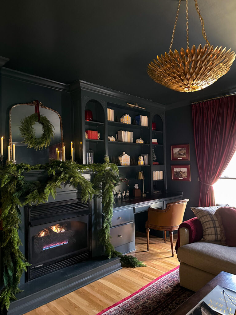
The Cozy TV Room in Lead Grey by Benjamin Moore (the most traditional room in my colonial home)
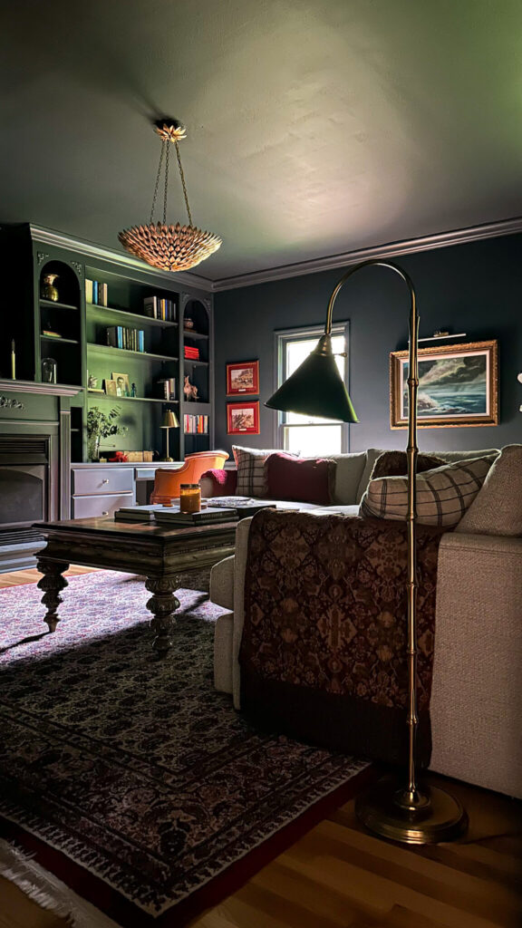
Shop the Cozy TV Room
Final Thoughts
Color drenching is an incredible way to transform a space, whether you’re going for moody drama or soft sophistication. By understanding the technique—and embracing a little bravery—you can create a space that feels layered, intentional, and beautifully cohesive.
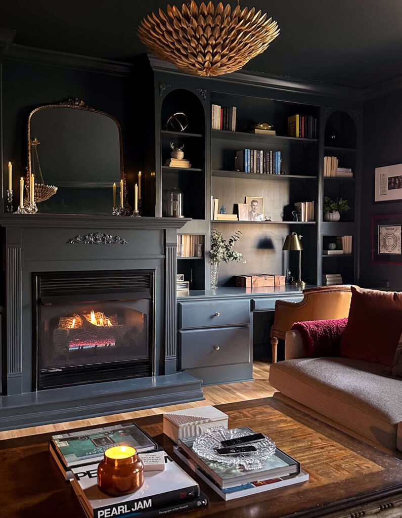
Thinking about trying it in your own home? Start with a small space, like a powder room or an entryway, and see how the magic unfolds. You might just fall in love with the immersive power of color!
Would you ever try color drenching in your home? Let me know in the comments, and if you need help choosing the perfect shade, I’m here to help! Have your shade already but new to painting? Check out my favorite painting supplies here!
Related
browse more posts
read more
Spring cleaning is a time-honored tradition, but let’s be honest—sometimes it feels more like a chore than a fresh start. One way to make the process more enjoyable? Invest in cleaning supplies that are not only functional but also aesthetically pleasing. If your cleaning tools look good, you’ll be more likely to reach for them, and your home will feel more curated even in the midst of tidying up. Here are some aesthetic cleaning tools to elevate your spring cleaning routine:
1. Washable Microfiber Duster in White

Dusting can be a breeze with a sleek, washable microfiber duster in white. Unlike traditional dusters that can look worn and dingy over time, this elegant option stays fresh with regular washing. The soft microfiber traps dust efficiently, keeping your surfaces spotless without the need for harsh chemicals.
2. Cream Broom and Dustpan with Adjustable Handle

A broom and dustpan set doesn’t have to be an eyesore. This cream-colored duo blends seamlessly into modern or minimalist spaces. The adjustable handle ensures a comfortable grip for any user, making sweeping up messes a little more effortless and a lot more stylish.
3. Conair Handheld Steamer

Say goodbye to wrinkled linens and drapes with the Conair Handheld Steamer. Its compact design makes it easy to store, and the sleek finish ensures it won’t be an eyesore in your laundry room. Plus, steaming is a great alternative to ironing, making your fabrics fresh and crisp with minimal effort.
4. HOTO Electric Spin Scrubber

Scrubbing stubborn grime is no longer a tedious task with the HOTO Electric Spin Scrubber. This cordless tool does the hard work for you, effortlessly removing dirt from tile, grout, and bathtubs. Its modern design makes it a cleaning tool you won’t mind keeping on display.
5. Pink Rubber Cleaning Gloves with Hook

Who says cleaning gloves can’t be cute? These pink rubber gloves add a touch of charm to your cleaning routine while protecting your hands from harsh chemicals. They even come with a convenient hook for easy storage, keeping your space tidy even when they’re not in use.
6. Simple Human Plunger and Toilet Brush Set

Even bathroom essentials deserve a design upgrade. This sleek and discreet set by Simple Human keeps your toilet cleaning tools neatly contained. The high-quality materials ensure durability, while the modern design blends seamlessly into any bathroom aesthetic.
7. OXO Shower Scrubber with Extendable Handle

Reaching those high or awkward shower corners is no longer a struggle with the OXO Shower Scrubber. Its extendable handle allows for easy cleaning without excessive bending or stretching. The durable bristles effectively remove soap scum and grime, leaving your shower sparkling clean.
8. HOTO Electric Mini Vacuum

Perfect for quick clean-ups, the HOTO Electric Mini Vacuum is compact, cordless, and sleek. Whether you’re tackling crumbs on the counter or dust on your shelves, this stylish little vacuum makes cleaning effortless and efficient. Its minimalist design makes it a countertop-worthy gadget.
9. Dyson V8 Cordless Vacuum

If there’s one cleaning tool that combines performance with aesthetics, it’s the Dyson V8 Cordless Vacuum. Lightweight, powerful, and designed to look as good as it functions, this vacuum makes deep cleaning floors and carpets a joy. Plus, its wall-mounted dock keeps storage simple and streamlined.
10. Brass Step Stool Ladder

For those hard-to-reach places, a brass step stool ladder is both practical and chic. Unlike traditional bulky ladders, this one doubles as a stylish accent piece when not in use. Use it to access high shelves, dust crown moldings, or even as a display piece in your home when cleaning is done.
Make Spring Cleaning a Pleasure, Not a Chore With These Aesthetic Cleaning Tools
Spring cleaning doesn’t have to feel like a dreaded task. By incorporating beautifully designed, high-quality, aesthetic cleaning tools into your routine, you can turn a once-daunting job into an enjoyable, even satisfying experience. Treat yourself to these chic cleaning essentials and make cleaning a part of your home’s curated aesthetic. After all, a beautiful home deserves beautiful tools!

- Cream Adjustable Broom & Dust Pan Set
- Brass Step Stool Ladder
- White Microfiber Duster
- Dyson V8 Cordless Vacuum
- Pink Rubber Cleaning Gloves
- Conair Handheld Steamer
- HOTO Electric Spin Scrubber
- OXO Adjustable Tile Scrubber
- HOTO Mini Electric Handheld Vacuum
- Simple Human Plunger & Toilet Brush Scrubber
Related
read more
Have you ever seen the movie The Holiday? It’s that one where Kate Winslet and Cameron Diaz switch houses over the holidays, trying to escape from the reality of their love lives falling apart. There’s this one moment in the movie where Kate Winslet enters Cameron Diaz’s bedroom for the first time, and she notices a button on the side of the nightstand. She presses it and the shades automatically glide down in synchronized motion. I remember the first time I saw this and how I thought it was the coolest thing ever. And of course, I automatically dreamed one day I could have the same thing. Well fast forward to the present day and the dream is becoming reality. Recently, thanks to Rolli Shades, I installed my own set of motorized shades in the bedroom and I’m just as giddy as the first time I watched The Holiday. And today, I’m going to tell you all about them!
Picking a Shade Type & Color
The first step in the process was deciding on a shade type and color. Rolli Shades offers two options: black out (suggested for sleeping) or light filtering (for privacy). Since these were going in my bedroom, this was an easy decision, and I chose the blackout.
The second step was choosing a shade color, and this was a bit more difficult for me. Recently I color drenched my primary bedroom in a dark green that reads warm and I also installed these camel colored velvet drapes on the windows. The drapes are staying put – I just won’t have to open and close them each day now. So, I wanted to pick a color that would work with the drapes, the wall color and read warm.
I ordered a bunch of samples from Rolli and narrowed it down to four choices: Truffle, Slate, Baltic and Pepper. While Slate was the closest match to the walls themselves, I was worried it was reading a little cool, so I opted for Truffle.
Measure twice, order once
The next step was measuring my windows for my custom shades. Just like anything you measure, it’s best to measure more than once to ensure you get the most accurate numbers. Last year I invested in this tape measure that has the fractions listed out, which in my opinion, makes measuring a bit easier.
First was the inside of my windows, measuring from inside the casing, side to side. The second was measuring from top to bottom. I decided to measure both windows just to be safe, as my house is 37 years old, and I didn’t want to assume everything is equal.
Production & Installation
After I sent my measurements into Rolli, the turn-around time was surprisingly quick. I had my custom shades inside of a week, which I was super impressed with! The shades arrived with everything I needed to install and included my coveted remote (I could not wait to press the button!).
So, here’s the best part of this entire process: installing these rolling shades went faster than installing my draperies. Seriously it was so easy. Rolli included a link to the installation instructions (there’s also a video if you’d rather go that route) and it couldn’t have been easier. The instructions walk you through pairing your shades with the remote, then you install the brackets on your window casing, and then you set the shade start and stop points. Literally I was done inside of 30 minutes and without any hiccups!
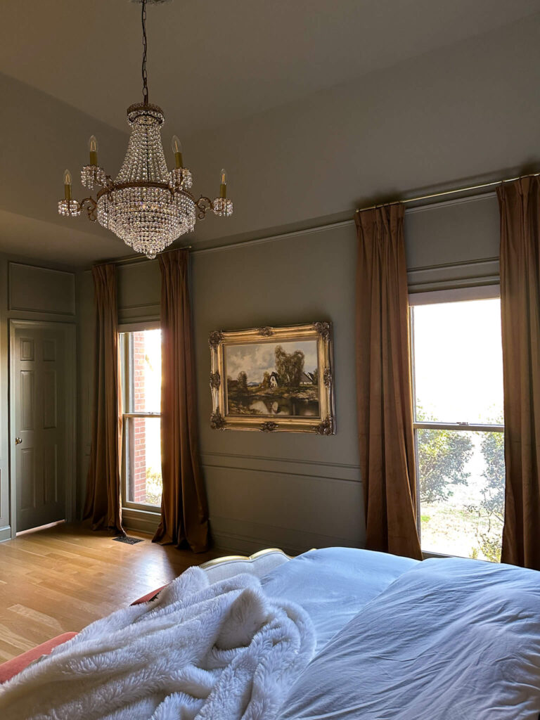
Using My New Motorized Shades in the Bedroom
I can’t explain how excited I was to press the down button on these motorized shades for the first time. I felt like a kid at Christmas and the entire experience gave me all The Holiday vibes. After sleeping with these shades for several weeks now, I can share that it’s a true blackout experience just like my drapes were. And waking up in the morning has never been so exciting! I roll over, press the button and watch my new motorized shades roll up in sync!


If you’re thinking about installing motorized shades I couldn’t recommend Rolli Shades enough. You can learn more about them here, and you can also use the code ALLISONSKIFF to get 5% off your entire order. Let me know if you have any questions!
Related:
The Latest on the Blog —
read more
This has been spinning in my head for months, but I’ve finally taken the time to put pen to paper, and think about my 2025 project list. I also went back and reviewed my 2024 project list, did an assessment of dreaming vs reality, and publicly checked myself with my 2024 project recap. There’s nothing like the internet to keep you honest, right?
With all that said, I’m deciding to break my 2025 project list into “big priorities” and “nice to have’s.” Will I do more than two projects this year? I would like to think so! But organizing everything this way will help me stay focused on what’s going to make me happiest to look back on when the end of the year rolls around.
My Big Priorities For The 2025 Project List
Exterior Makeover Phase 2:
Last year one of my larger projects was updating the exterior trim and door color to my colonial brick house as well as installing a new garage door. I’ve always been drawn to brick houses with darker trim colors…something about them always has me do a double take. So I was really excited to finally work up the nerve to do this to my own house! I shared all about that process here, and also revealed this was phase one of a multi-phase exterior upgrade I’d be making.

With that said, this year I’m tackling phase 2 of the exterior upgrade, and I must say I’m quite excited about it! This will include new copper lanterns flanking the front door, as well as the side man door. They arrived in December and spoiler alert: they are SO beautiful. I’m using this protective coating to make sure they’re sealed and don’t oxidize (and turn green!), then I’ll have them installed. So hopefully I’ll have something to share with you in February!
The other big update for the exterior will be new landscaping. While there’s a lot of things about my current landscaping I like, one of the things I don’t like is how unmanageable it is to maintain. Some of the bushes have died off, and others haven’t been cared for properly and are too leggy. I plan to keep some things intact (like the pink magnolia trees) but for the most part I’m planning for a fresh start. There will be a lot more to come on this, and I’ll be sharing updates along the way!
The Laundry Room:
Alright I’m literally airing my dirty laundry here. This is my most embarrassing room in the house. It was the last popcorn ceiling I scraped off, and I left the ceiling raw. Not that you asked for my excuses, but really it was because I didn’t know whether to prime it light or dark because I didn’t know what the overall room design was going to be. At one point I decided to put lipstick on a pig and laid these black & white peel & stick checkered tiles down over the existing linoleum. I will say I really like them, but they were never intended to be a forever decision.
The big update with the laundry room is that it’s going to be a utility room. Its function has always been more than just laundry, so I want to design it in a functional way. This is the part that I want to really spend time with and map out, and to be honest, I’m still catching my breath from last year’s kitchen renovation. When I get my excitement back, this project will be so fun to design, but it may be one for later in the spring or even in the fall. But it’s happening.
The Projects Next in Line
Primary Closet:
Did this surprise you? Technically I’ve considered the primary closet to be a finished space, but after the primary bedroom transformation last year, I’ve changed my tune a bit. I’ve been imagining a color drenched space, with high gloss paint. Wallpapering on the ceiling? I think this would be the room for that.
I’m dreaming up taking the existing built-in’s to the ceiling and adding crown molding to them (think of little boxes or cupboards on top). And the library ladder in my kitchen has me wanting more…how amazing would a rolling ladder be in this room?!?


There’s a lot more to flush out, but I can’t think of a more fun space in the house to daydream about.
Home Office:
Ah the home office. This room is the smallest room in the entire house but it has my favorite view. It sits high up on the backside of the house and overlooks the entire backyard, which includes the pool, and at certain times in the year I can also see the giant meadow that sits beyond my property.
At one point, I decided it would be fun to have an accent wall, so I installed peel & stick wallpaper to the wall behind my desk. I’m so thankful it was peel & stick because I quickly lost interest in the design (and the concept of an accent wall). Right now, I’m trying to decide if I want to install a mural in my house because if I do, this would be the room for it. Otherwise, I’ll repaint everything and add some fun vintage pieces to warm it up.
This is a space that doesn’t necessarily need to be done this year, but I think I would flourish more creatively if it was finished. No matter what way the design ends up leaning, I know I want swap out my existing white desk for a vintage wood one. I’m hunting for something specific and lately I’ve been on marketplace daily hoping to find the perfect desk. I’ll be sure to keep you posted on socials once I find the one!
Pantry:
If we’re being honest, I’m dying to do the pantry yesterday. I don’t have a walk-in pantry, but I do have a nice size wall pantry that’s more than enough on top of the kitchen storage I have. Unfortunately, it’s been a casualty of the kitchen renovation, especially when I was moving everything out of the kitchen. And it’s never quite bounced back. I’m of the mindset of if I’m pulling everything out to reorganize it, I at least want to make it prettier.
Everything is painted a basic cream and I think this could be a really beautiful and functional space. I’m currently trying to decide if I want to paint everything the same color, or paint the shelves and wall brackets one color and wallpaper behind them. I also think I’ll switch up my storage with more glass containers (like these) and perhaps some baskets (I’m liking these ones).
Cozy TV Room:
Don’t worry! I’m not renovating the cozy tv room but I am prioritizing it from a decor standpoint. I’d like to be more intentional about my bookshelf styling this year, and given how much fun I’ve been having at estate sales over the past year, I think this could be a fun project to start collecting for. I ordered a Ralph Lauren coffee table book over the holidays and am using it for inspiration as I build my wish list for estate sale hunting. I think something like this will be a nice reprieve from some of the projects that are going to require a bit more labor.
Shop the Cozy TV Room
Stay tuned throughout the year and follow along on socials to see all the action unfold. And if you’re not already, be sure to subscribe to my monthly newsletter for more sneak peeks, behind the scenes and candid thoughts. I fell a bit off schedule with the newsletter during the fall one room challenge, but plan to get things back on track in the coming month.
browse more posts
read more
Valentine’s Day is right around the corner, and if you feel like it snuck up on you, don’t worry. I’m rounding up some Valentine’s Day gift ideas for just about anyone in your life, and at all price points. Check out the below and add to cart!
Valentine’s Day Gift Ideas: For Her (including some home décor winners)
Amore Tray
One of the pretties home décor pieces I’ve seen in quite some time is the Amore Tray by Alice Lane Home. Made of Calcutta viola marble, this tray has a ruffled edge and is a showstopper. Add some chocolates on top for the perfect Valentine’s Day Gift idea that’s sure to impress! Also available is the Alice Lane Home Dolce Tray which is just as stunning if not more so!

Shop: Amore Tray | Pink Peony
Princess Hand
A conversation starter, the Princess Hand is a unique home décor piece that can serve as a ring holder (standing up) or as a decorative object (think placed on top of a stack of books). In a pretty brass finish this is a fun buy for the home décor enthusiast in your life.

Shop: Princess Hand | Book Display Stand | Crystal Candle Dish | Candle | Coffee Table Book | Burled Wood Tray
The Ultimate Candle Gift
Looking to stack a few gifts into one? This bundle would make just about anyone’s day: start with a candle tray or crystal dish, add a candle (I like this one) and top off with a glass cloche. Extra points for a vintage brass candle snuffer. If that’s too much, you can always do the candle and one accessory rather than all of them.
Shop: Brass Tray | Glass Cloche | Candle | Match Holder | Coffee Table Book | Marble Bowl
The Softest Pajamas
These viral pajamas are viral for a reason – they’re the softest pj’s you’ll ever own! This recent drop includes new colors that are perfect for Valentine’s Day.

Shop: Pajama Set
A Cozy Blanket
When in doubt, a new cozy blanket is sure to be a crowd pleaser for any woman in your life. This one from Luxome is faux fur with a beautiful finish, and is available in two sizes. The perfect gift while we’re all still waiting for Spring.

Shop: Faux Fur Blanket
Flowers (but not the kind you think)
Hear me out…fresh flowers are amazing, but faux flowers last forever. These peonies from Alice Lane Home look and feel like the real deal. Other favorites include pre-arranged roses, fuchsia peonies and these pretty tulips all from Afloral.

Shop: Pink Ivory Peony | Pink White Peony | Vase | Candle | Candle Diffuser | Candle Snuffer
Valentine’s Day Gift Ideas: For Him
A Photo of Us
Simple but classic. A brass frame, with a thick matte and personalize it with a photo of yourself or you as a couple. Timeless and elegant.
Shop: Brass Picture Frame With Matte
Ferrari Book
A classic cool book that will also look good while it’s setting out on the table? Yes please. Also available for Harley Davidson or Porsche, if Ferrari isn’t his thing.

Shop: Ferrari Book
Cozy Earth Robe
Bring the spa to your house with this waffle robe from Cozy Earth. Known for their soft fabrics this simple robe is available in both men’s and women’s sizes, making it the perfect matching opportunity!

Shop: Waffle Robe
Adidas Gazelles in Red
Stylish sneaks but make them red for Valentine’s Day. These Gazelle’s by Adidas never go out of style!

Shop: Red Gazelles
Mini fire pit
This mini fire pit is functional and adorable. Fire it up and have a smore’s night, or just enjoy the glow without the hassle of a big production.

Shop: Mini Fire Pit
What I Love About You
A meaningful gift for anyone in your life, this book comes with prompts that you fill in about the recipient. Buy this and fill it out in advance for the most thoughtful and memorable gift ever.

Shop: Personalized Book
We’re Not Really Strangers Game
Play at your own risk! This game includes prompts for each partner to answer about one another. Also available in a friend’s version.

Shop: We’re Not Really Strangers
Love Vouchers
One of the cutest ideas I’ve seen lately! These love vouchers add some excitement into the mix, and don’t break the bank. Perhaps offer these up after playing the We’re Not Really Strangers Game (noted above).

Shop: Love Vouchers
Valentine’s Day Gift Ideas: Under $25 (perfect for a Galentine or gift exchange)
Under Eye Masks
A girl’s best friend. Eye masks are perfect to have on hand for those mornings when you just don’t want to. While there’s lots of options on the market, these ones have great reviews plus they’re pink and red…making them the perfect Valentine’s Day gift idea!

Shop: Under Eye Masks
Rifle Paper Co Mini Journal
Available by birthday month, these little journals are perfect to take on the go or to leave out on a desk or nightstand. Grab this for your bestie in her birthday month to make it feel like a personalized gift.
Shop: Mini Journal
Laneige Lip Mask
A must have for me, this lip mask feels like a million bucks but will cost you less than $25. Available in different flavors (I like the pink pot) this is the perfect gift for these cold dry winter months.

Shop: Lip Mask
Heart Candle
These cute candles come in a couple different colors and have a soft neutral vanilla scent (a crowd pleaser if I do say so!). When the candle is finished, the dish can be repurposed for jewelry, paperclips, etc.

Shop: Heart Candles
read more
Ever since I finished the kitchen renovation, I’ve been loving getting back into cooking. With it being soup season, as well as the time of year some of us are trying to clean up our diets, I thought it would be the perfect time to share my clean ingredient White Velvet Soup.
This five-ingredient vegan soup isn’t one to overlook: It’s as rich and velvety as its dairy-full counterparts, just without the extra carbs and saturated fats. What’s even better than the nutrition factor is the level of ease this clean ingredient white velvet soup recipe takes: it’s a one pan roast followed by an all-ingredient blend. Served piping hot and silky-smooth, you’ll keep this soup on repeat all winter long.

Ingredients:

Shop: Bowl Set | Marble Salt & Pepper cellars
1 large head of cauliflower
3 cloves garlic
1 yellow or white onion
2 cans great northern beans
4 cups vegetable stock
Salt
Pepper
You’ll also need a baking sheet and a large blender. Smoked paprika for garnish is optional but recommended.
clean ingredient white velvet soup Directions:
1. Preheat oven to 425
2. Chop cauliflower and onion and place in large mixing bowl, drizzle with olive oil and mix in chopped garlic. Add a dash of salt and pepper, mixing until everything is evenly coated.
3. Place all ingredients on a greased baking sheet and bake for 30 minutes or until slightly browned
4. Remove from the oven and transfer to the blender. Add white beans and vegetable stock (you may need to blend down and add vegetable stock as room permits.
5. Serve with a drizzle of olive oil on top and dash of smoked paprika
Honestly, I think this clean-ingredient white velvet soup is just as decadent as the potato soup I used to have growing up as a kid. I love that it’s vegan and gluten-free, which makes it a perfect choice for dinner parties with friends that have dietary restrictions. But the best part is, you’d never guess it was healthy!
Related recipes:
The Latest on the Blog —
read more
I remember sitting down last year to plan out my 2024 project list, and thinking to myself “this is unrealistic, but I’m going to write it down anyhow.” There were some big ticket items on that list, including a few I couldn’t manage without hiring out. Then by the time summer rolled around and I did a midyear project report, I felt really behind. But now I look back on the year as a whole and I can’t believe how much I accomplished, and how different my house feels. Really, it finally feels like “me.” So before we dive into the plans for 2025, lets take a look at the final 2024 project recap.
Toilet Room Trim & Door
The first project on the year wasn’t even on the list! Really, I just wanted a bit of an easy project to get started, and it doesn’t get much easier than paint. The primary bathroom was one of the first renovations I did after buying the house in 2018, and I’ve since wallpapered the toilet room with this pretty block stripe print.
The white trim really wasn’t doing much in this space, so I decided to go dark and paint the baseboards, trim and door Inkwell Black by Sherwin-Williams. I added a fresh toilet seat to the room and voila! The tiny space has its own character! You can read all about the makeover in my reveal post here.
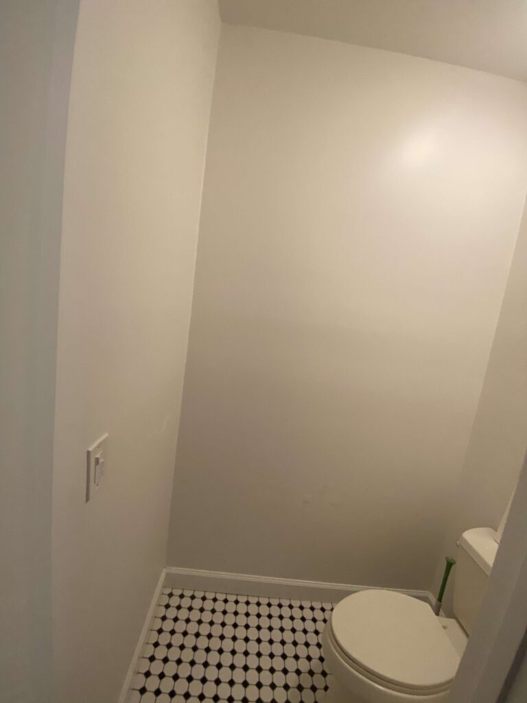
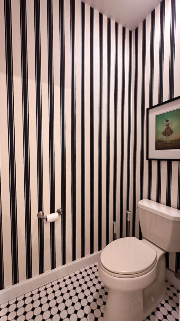
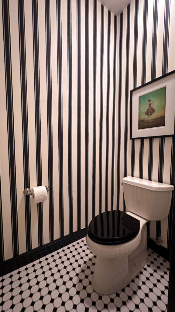
Block Stripe Wallpaper | Tile | Soft Close Toilet Seat | Toilet Paper Holder
The Back Entry
The back entry is the bridge between the cozy tv room and the kitchen and is the most used entrance in the house. When I first bought the house I focused on repainting most of the spaces, so I had a clean canvas to work from. This little space had been painted beige ever since and was in some real need of character.
I knew I wanted to literally bridge the gap between the moody cozy tv room which is Lead Grey by Benjamin Moore and my yet to be designed updated kitchen, so it was a tricky design project. I ended up choosing this beautiful wallpaper by Sandberg, which has a similar dark blue as the cozy tv room, as well as some warm beiges which felt safe for the pending kitchen design. I painted the trim and back door Accessible Beige by Sherwin-Williams and added a brass bee door knocker and brass switch plates for some sparkle. A geometric runner rug helped ground the space and add contrast.
Wallpaper | Runner Rug | Brass Bee Knocker | Brass Switch Plate
I love how this space has so much character now, and serves as such a fun “welcome home” for me every time I come through the back door.
Adding Picture Frame Molding in the Dining Room
In 2023 I was very intentional about getting the formal dining room up to speed by adding my dream wallpaper by Cole & Sons, as well as a knockout of a chandelier from Visual Comfort. I transformed my black dining room table to a wood finish (you can read all about it here), found the perfect vintage chairs and grounded the room with a geometric area rug. But it was still missing something.
The dining room already had a chair rail installed; however I thought adding picture frame molding underneath would really elevate the finished look of the space. I purchased my first ever power tool (a miter saw by Kobalt) and after a lot of math I got to cutting trim for my molding.


Molding | Kobalt Miter Saw | Step-by-Step Installation Instructions
The finished result is the elevated look I knew the room needed. Later in the summer I would end up adding custom draperies, some fun brass light switches and a handful of estate sale pieces. I can’t believe I’m saying these words but I think we can finally call the dining room “finished”!

Bubble Chandelier | Wallpaper | Brass Light Toggle | Draperies | Rug | Limelight Hydrangeas
Primary Bedroom Flip
The dining room makeover would end up being a gateway for what was to come, and that would be the primary bedroom. Similar to other spaces I did some work on this room including removing popcorn ceilings, switching out carpet for white oak hardwood floors and painting it a beige color. But I was craving more.
The Primary Bedroom Before | Installing Picture Frame Molding
I set out to moodboard the space with the intention of creating a cozy, relaxing retreat for myself that I would both love waking up to and enjoy coming home to each day. The design included adding more picture frame molding, color drenching the entire room, refinishing the existing dresser and adding a new pretty ivory linen bed, nightstands and lamps.

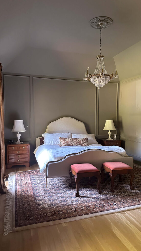
Linen Bed | Draperies | Duvet Set | Lumbar Pillow | Nightstands (similar) | Marble Lamps (similar) | Chandelier (similar) | Ceiling Medallion
The finished result is the dreamiest space and I’m absolutely in love with it. It’s both calming yet magical, and I feel like I’m in a boutique hotel!
Exterior Makeover
Since buying the house I’ve been working diligently on updating it, but to be honest I’ve really neglected the outside of it. My work outside has mostly been to keep things up to speed from a maintenance and necessity standpoint, and I haven’t had the ability to do much designing outside. I really wanted to make this year different for the exterior.


Front Exterior Before | The New Garage Door | Back Exterior Before
Since most of this work is a bit out of my ability (my house is 3 stories high on the backside!), I decided to split the exterior wish list into chunks and start with updating the main portion of the house. I started by adding a new garage door in the early part of 2024, and then in late summer hired a crew to paint the trim and decking a warm black / brown. The color is Black Fox by Sherwin-Williams and I love how it plays with the darker bricks in my house.


The house feels instantly updated and is truly propelling me to plan the next phase of the makeover which is the landscaping. But first I’ll be adding some copper lanterns out front and along the side man door. Stay tuned for more on that soon! You can read all the details about the exterior makeover in my blog post here.
Kitchen Renovation
As the exterior makeover was happening, I was looking at the calendar and realized I had one project left in me for the year. With the One Room Challenge kicking off in October, I decided I was done waiting for the “right time” and committed to attacking the kitchen.

The Kitchen Before
I have a full reveal post coming soon (with all the pictures!) but I’ll share now that my intention for this makeover was to keep things relatively budget friendly by focusing on all of the cosmetic updates I could do myself. This included repainting the existing cabinets a warm taupe color, refinishing my existing granite counters to look like marble, replacing my glass tile backsplash with wood paneling painted the same color as the cabinets and updating the doors and drawers to be soft close.
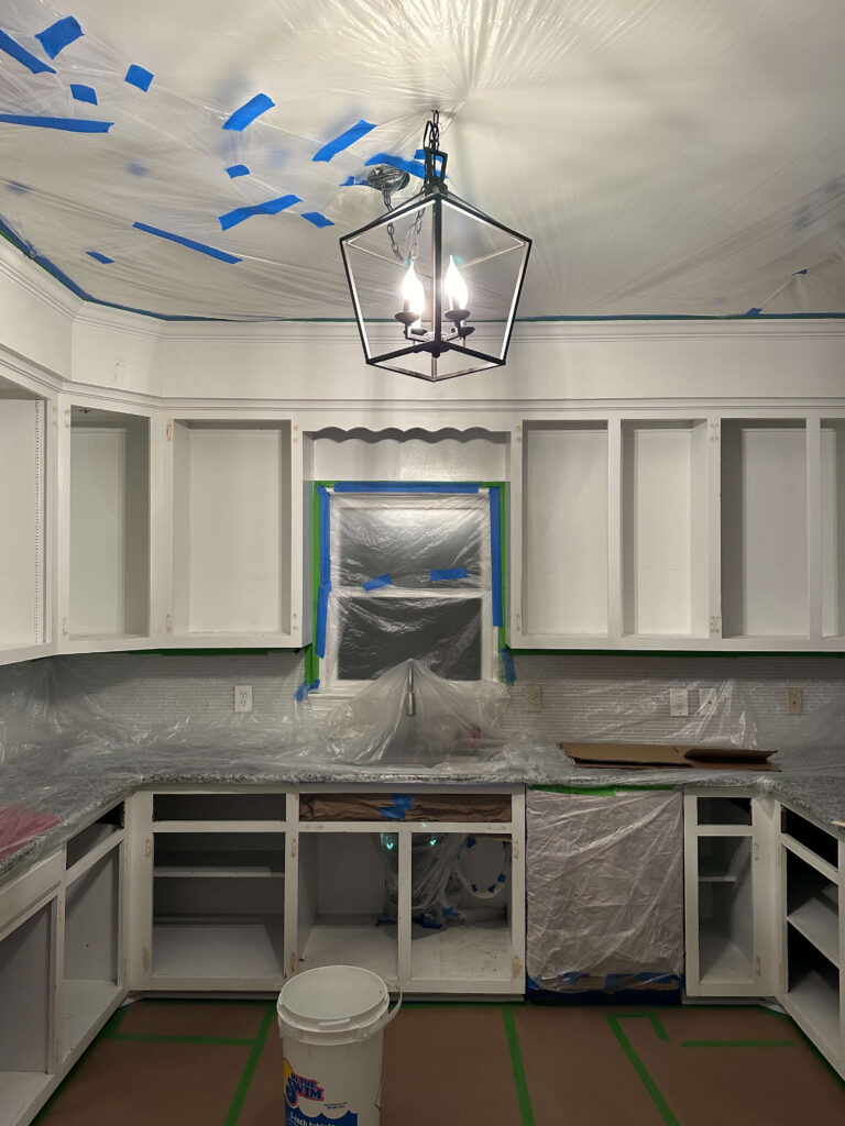
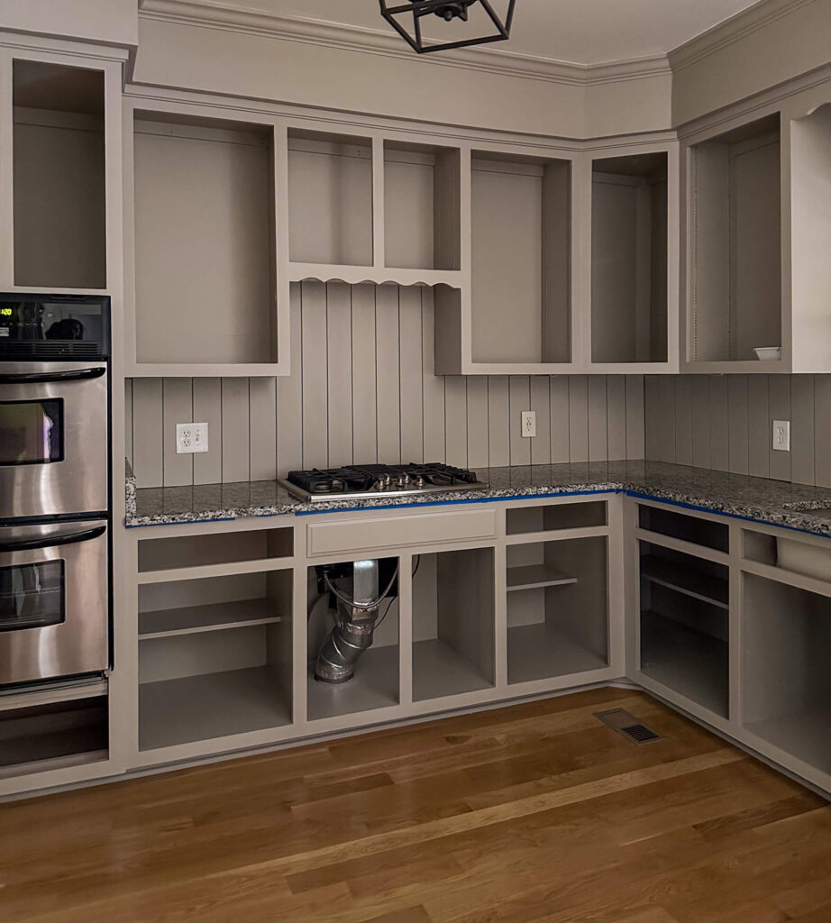
Prepped for Painting | Fresh Paint + New Paneled Backsplash | Countertops Transformed to Marble
Then came all the pretty things! The drawers got pretty new pulls from EMTEK, I added in the old kitchen island and topped it with a new butcher block countertop, swapped the old farmhouse light fixture for a pretty milk glass pendant and installed the rolling library ladder of my dreams.

Brass Cup Pulls | Walnut Butcher Block Counter | Milk Glass Pendant | Marble Elevated Bowl
I have some tiny touch ups left to do, and eventually I hope to swap out the faucet for a new one, but all in all the kitchen feels like it’s finally mine. Would I recommend doing a kitchen renovation right before the holidays? Probably not. But it also really kept me moving! This past weekend I worked on some non-holiday neutral styling and took some professional photos of the space, so stay tuned for lots more on the kitchen soon!
2024 Project Recap + Looking Ahead to 2025
When I look back, I’m so proud of my 2024 project recap and all that I accomplished. This year I learned so much about myself, DIY and I feel like I really pushed my design skills.
Stay tuned in the coming weeks for what’s to come for 2025. I’m dreaming bigger and have plans to revisit some spaces that you’ve already seen and might not expect. All I’m going to say is that I’m more excited than I’ve ever been about the possibilities and what’s to come.
xo,
Allison
browse more posts
read more
Merry Christmas! I was a little late getting all my holiday décor out this year, or maybe it just felt that way because Thanksgiving was so late. But even so, with the kitchen renovation, it felt like I didn’t get to savor my Christmas décor as much as I got to last year, so I’m eager to share the love and take you through the house room by room.
Front Entry: Garland on the Staircase
Last year I used real touch Norfolk pine garland on my staircase, and while I loved that, I wanted to try something different this year. This year I opted for a mix of cypress garland as a base with a pre-lit hemlock pine garland on top. What I love about the hemlock garland is that it’s battery powered and on a timer. So every night at dusk it automatically turns on, and after 8 hours it turns off. No cords, no forgetting to turn things on/off. Just magic each night.
I topped things off with some velvet burgundy ribbon tied into bows, and a cluster of brass bells at the newel post at the base of the staircase.


Shop The Front Entry Holiday Decor
The Dining Room
The dining room has so many standout features on its own, that I didn’t feel the need to go too crazy with the Christmas décor in this room. I kept things simple with a set of Norfolk pine wreaths in the windows, hung with a gold velvet ribbon and a cluster of Norfolk pine stems arranged in this stunning black marble vase as my table centerpiece. I swapped out my normal candles for ribbed burgundy candlesticks and added a massive 5 wick candy cane candle from Voluspa for the most magical smell.
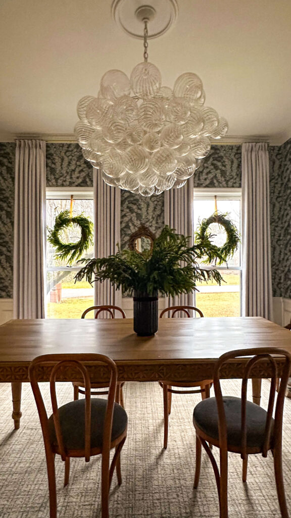
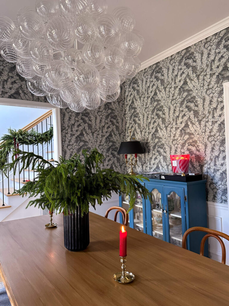
Norfolk Pine Wreaths | Khaki Velvet Ribbon | Norfolk Pine Stems | Black Marble Vase | Burgundy Ribbed Candles | Candy Cane 5 Wick Candle
I think this room is an example where less can be more. After I finished the picture frame molding this spring and hung custom draperies, the dining room really feels complete. I love how the deep red candles play with the wallpaper, and I think some of my estate sale finds really get a chance to shine.
Holiday Décor in The Living Room
Last year I put up two trees, including a flocked tree in the living room, which was where I hung my vintage ornaments. I didn’t have a lot of ornaments and have been collecting ever since, but what I did have was hard to hang with the flocking. So, this year I decided to forego the flocked tree and keep this room a little simple. I draped 15’ Norfolk pine garland over both main doorways, and then also created a dramatic asymmetrical garland display on my living room mantle. Like last year, I used a combination of these command cord bundlers, as well as some screws (my mantle is wood) for extra reinforcement.
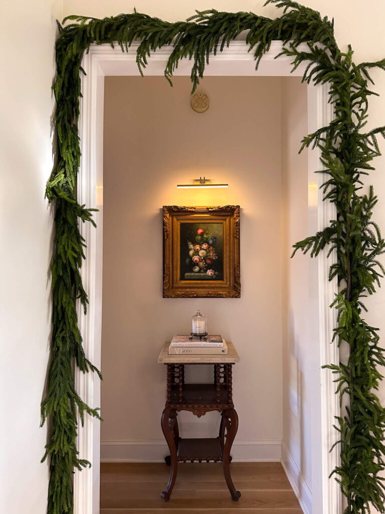
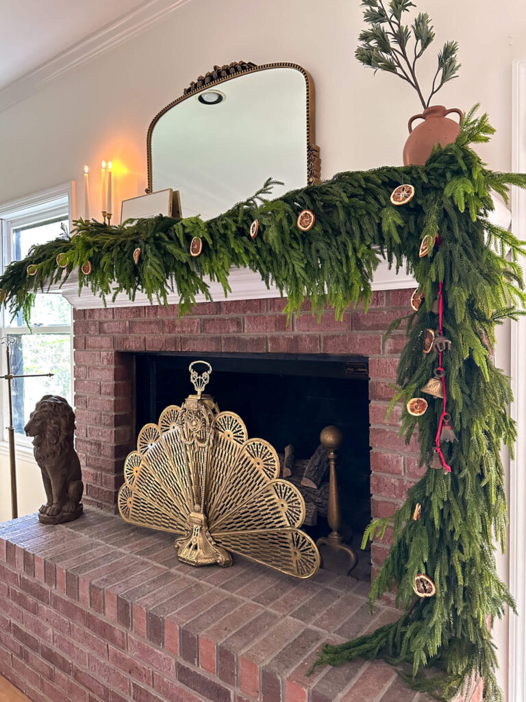
Deluxe Norfolk Pine Garland | 5′ Norfolk Pine Garland | Command Cord Bundlers
To achieve the mantle look, I used a base of the deluxe Norfolk pine garland, as well as five additional 5’ Norfolk pine garlands. It’s a lot, but keep in mind you can build year over year. I used Christmas ornament hooks to hang dried oranges throughout the garland, and added some vintage bells that were my Great Grandmother’s to the swooping side.
The rest of the room is filled with little touches including a mini-Norfolk pine tree, a marble bowl of vintage ornaments and this unique blue and white ceramic tree that was my Gramma Margie’s. It turns purple when you light it up!

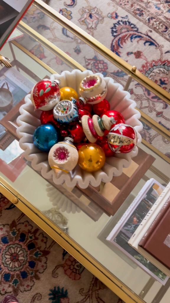
Khaki Ribbon | Cedar Swag | Marble Handkerchief Bowl
Decorating the Primary Bedroom
This past June I renovated my primary bedroom by color drenching it a deep warm green, adding a gorgeous cream linen bed and flipping my dresser to a glossy chocolate. While I was working on it, I kept daydreaming about decorating it for Christmas for the first time ever, so I was extra excited to take a first stab at it this year.
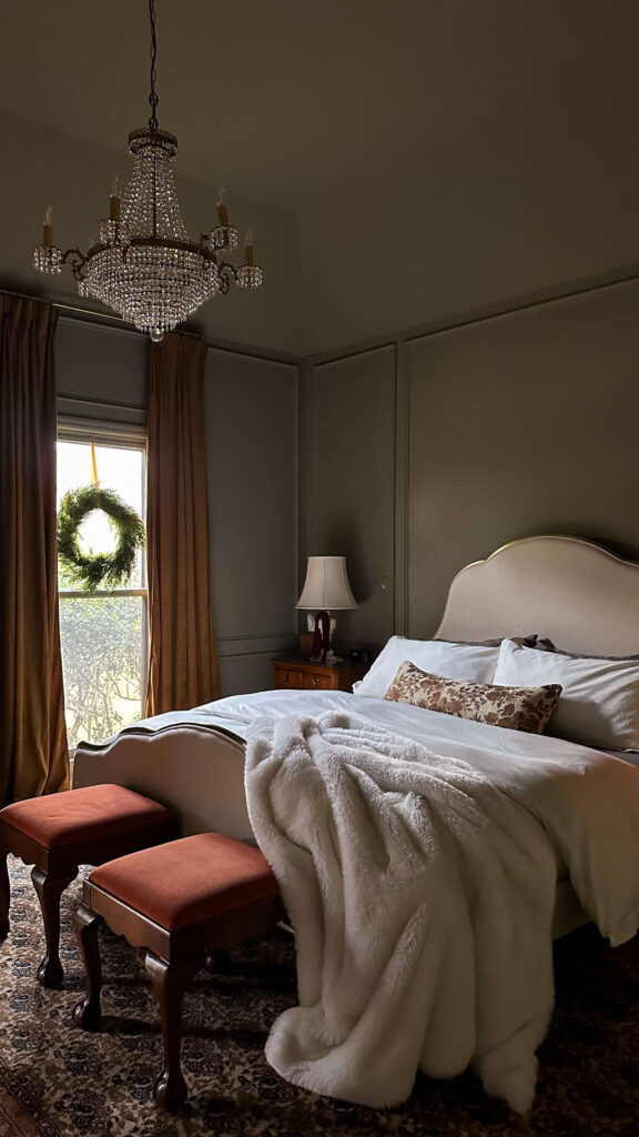
Wreaths | Ribbon | Draperies | Linen Bed | Duvet | Sheets | Fur Throw
The background of this room was really already set for Christmas with the pretty green, but I took it a step further by updating my bedding to match the walls. Boll & Branch’s signature sheet set in Juniper is the perfect warm green and these sheets are so soft and luxurious! I topped the bed off with Boll & Branch’s signature hemmed duvet set in cream, along with a cream faux fur throw I already had on hand. I tied some burgundy velvet bows around my vintage marble table lamps, added a set of wreaths in the windows with velvet ribbon and draped pre-lit hemlock pine garland across my dresser.


Every morning and night feels extra magical! If you’ve never decorated your bedroom for Christmas as an adult, you should add it to your list for next year. It can be simple but still impactful!
Decorating the new Kitchen!
I have a full blog post reveal coming in the New Year, but the meantime I shared a reveal of my kitchen renovation on Instagram (you can see it here if you missed it!). I’ve always dreamed of decorating my kitchen for Christmas, but honestly I absolutely hated it and the cool white and dark granite counters made it feel so cold and sterile. I’ve tried bringing out some festive towels and adding in poinsettias but it didn’t change my feelings about the space. With that said, this year feels extra special to have a finished kitchen that I’m proud of, and to get to enjoy a little bit of holiday décor in it for the first time.
Shop the Kitchen
I added these beautiful wreaths from Crate & Barrel in the windows, placed a little Christmas tree in the breakfast nook, and have one of my grandmother’s ceramic trees on the counter top. I also added this large marble bowl to the kitchen island and filled it with some faux pears which I thought was still Christmas-y.
Holiday Décor in the Cozy Room
If there was a room in the house made for Christmas, it’s the cozy room. This dark color drenched room got several updates this year including new velvet burgundy custom draperies, as well as a ton of exciting estate sale finds which make the room feel even richer.

Shop Holiday Decor in the Cozy Room
Last year I invested in my first ever Balsam Hill Tree and I have to say, they are worth the hype. The tree not only looks real, but the branches are spaced in a way that allowed me to go deep with the ornaments, which ultimately created an extra full look. The tree is exclusively decorated with vintage ornaments which are a combination of ones from my grandparents and many from estate sales throughout the year.
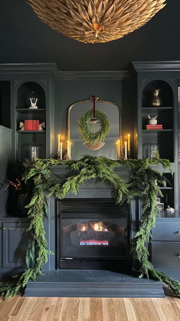
The mantle is draped with deluxe cedar garland, and I hung a matching cedar wreath on the mirror above the mantle (again with more burgundy velvet ribbon). I also pulled most of my normal décor off my bookshelves, flipped my books around for a cream neutral look, and added this little village of white ceramic houses and pine tree candles. I have battery powered tea light candles that I can turn on with a remote and I love how warm everything feels at night, especially with the fireplace lit!

Wishing you and yours a magical Christmas filled with friends, family and loved ones. I hope your holiday was merry, bright, and full of love.
read more
While there’s still a long list of things to do in the budget friendly kitchen renovation, I’m one step closer to having the core of my kitchen back. After painting the counter tops to look like faux carrara marble (still can’t get over this transformation by the way! – this is the kit I used), the next step was to revisit my doors and drawers. Since I’m keeping this budget friendly, I’m repainting the existing doors and drawers, but am installing soft close drawer slides and hidden soft close hinges. I think those little changes will help things feel more updated without breaking the bank.
Prepping the doors & drawers
The weather was not on my side this week, but luckily, I was able to clean, sand and tack everything on one of the nicer days. I was also able to set up my spray tent outside and was able to get one coat of primer on each side of the doors (all 28 of them!). Because the doors are all different sizes, it was important to keep them numbered. Since I was applying paint, I decided to number red solo cups, and then as I painted each door I would set it on the corresponding solo cup. I didn’t know if this was going to work but it actually did! I have a little map of my cabinets that I sketched during week 1 of the challenge, so I know what goes where.
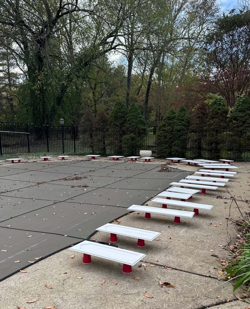
Applying the Color
Eventually due to rain, I needed to move the spraying operation inside the garage. The spray tent I purchased off amazon has more than paid for itself, so if you’re thinking about spraying I’d highly recommend grabbing one of these. I set up a little turn table on a 5 gallon bucket inside the tent. and using my Graco X5 paint sprayer, I applied a light coat of paint on the backside of each cabinet door (about 3-4 passes each). Each door was placed back on the corresponding solo cup and I allowed for 4 hours of drying time before flipping them to do the other side. I did two coats total on each side and decided to take my time with it rather than rush the drying process. So, I took two days to apply the color.
After everything was dry, I relabeled the appropriate number on the backside of each door in pencil, and tucked my solo cups away for another project someday. I decided to leave the doors alone for a few days to make sure they were fully cured before I started the drilling for hinges, so we’ll come back to that in a second.
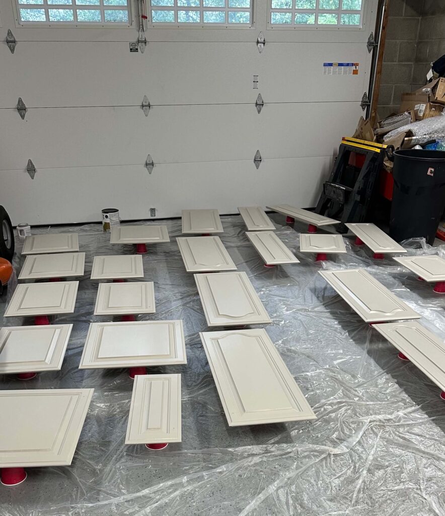

Installing Soft Close Drawer slides
While I let the doors rest, I decided to tackle the drawers. A couple years back I attempted to install soft close drawer slides, however the drawers were uneven and have never shut right since. So, I was nervous and anxious about this. And if you remember, I also demoed the drawer rails inside my cabinets early into the renovation process. Mostly out of frustration and irritation that they were never built properly. With that said, I had to figure out how I was going to add my drawers back in!
After a little research, I discovered you can buy drawer slide extenders which allow you to mount the slides to the back of the cabinets. Given my previous experience, I also decided to invest in a set of Kreg drawer slide jigs, clamps and a new set of power drills.

Everything You Need To Install Soft Close Drawers
Step 1: The right size drawer slides
If you’re installing soft close drawer slides, you want to make sure the slide is as close to the same length of your drawer as possible, but not longer. So for example my drawers are 23” deep, so I purchased these 22” slides.
Setting Up and Installing the soft close drawer slides
To make things easier vs fighting gravity, I clamped the Kreg drawer slide jigs to be flush with the drawer opening. This allowed me to rest the drawer slides on the jigs, vs holding with one hand and drilling with another.
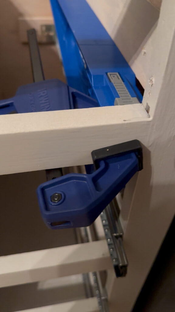
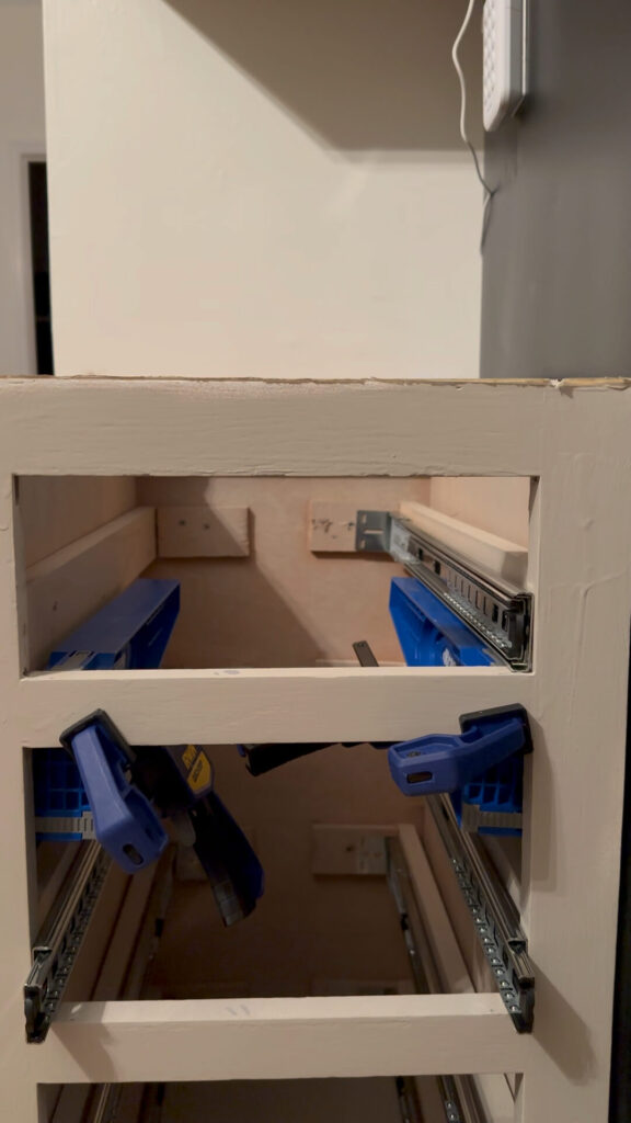
Clamp the jigs inside of the cabinet frame to install your sliders
I attached the drawer slide extender to the back of the drawer slides, and then rested the front of the slides on the opening of the drawer frame (setting back about 1/8” from the opening). Once I made sure the slides were 100% level, I drilled a screw in the front face frame, double checked the level and then drilled into the rear slide extender.
The key to getting your drawers to slide smoothly and evenly is make sure everything is level and evenly spaced. Using a tape measure, make sure the distance between both drawer slides is exactly the same from front to back. Once it is, repeat the same exact process for the 2nd drawer slide.
The coolest part about the drawer jigs is they flip around! So once your drawer slides are screwed in, you can unclamp the jigs and flip them to face out towards you. This allows you to rest the drawer in a level position while you drill the drawer slides into them.

The jigs flip around to allow you to install the glides directly on the drawer without fighting gravity. Just make sure everything is level first!
With the first couple drawers I had to make a couple adjustments to get things fully level, but once I got going it really got much easier. And I fully credit it to the drawer jigs and clamps! If you do this and find your drawers are sticky or not soft closing, that means something isn’t level or spaced evenly. Take your time to double check the space and adjust the leveling on the slides if need be. It’s usually a small adjustment that makes all the difference.
Adding the jewelry
I’ll be honest, my new drawer pulls from EMTEK were motivating me through this entire project. As much as I didn’t want to deal with drawer slides, I was SO excited to update my hardware. You’ll hear designers say this all the time, but the hardware is truly the jewelry of the home. It’s what you touch countless times a day. It’s what shines against your paint color. And choosing the right hardware can make all the difference in your every day life.
I previously had regular handles on my drawers and they never felt quite right. Some even felt like they might rip right out of the drawers! Adding EMTEK’s cup cabinet pulls to my drawers has completely elevated both the look and the experience of using these drawers.
EMTEK Cup Cabinet Pulls in French Antique
If you’re thinking about adding any type of pull to your drawers, a good rule of thumb for selecting the size is choosing a pull that’s about 1/3 of the length of your drawer face. So for me, I chose EMTEK’s four inch cup pulls for my longer drawers, and the three inch cup pulls for the smaller drawers. I used this handy little template, drilled pilot holes and screwed the drawer pulls in without any problem.
For an extra special touch, I used some leftover wallpaper from my dining room to line the drawers and make the insides feel a little bit more special. With the dining room being adjacent to the kitchen, I love how this ties the spaces together, and I also think the print works so beautifully with the cabinet color and the new drawer hardware.
What’s next for the budget friendly kitchen renovation?
Looking back I feel like I didn’t accomplish everything I had hoped this past week, but I also recognize I underestimated the amount of time it would take to clean, sand and paint all 28 doors on both sides.
This week I’m going back to the doors and will be installing hidden soft close hinges from Rockler Woodworking. We’ll get into cabinet types and door faces next week, but as a preview, my very old cabinets require a very specific hinge type to be both hidden and soft close. I was so thankful to find a solution at Rockler and have some special tools that will help make installation a little bit easier.
I’ve also started sketching out plans for the island and new wine fridge. Once I have my dimensions finalized I plan to visit a stone yard to look at remnants for the counter top. Originally I was planning to paint the island a warm brown, but now I’m thinking about making it the same color as the existing cabinets and looking for a soapstone top.
Other things on the list include caulking, installing the light pendants and the cherry on top will be my new rolling library ladder from Putnam Ladders! It arrived last week and I must say I’m “Christmas excited!” Make sure you keep an eye on socials to see how everything comes together this week.
To see and cheer on other designers, you can follow the One Room Challenge weekly progress reports here!
Catch up on the budget friendly kitchen renovation:
One Room Challenge Kitchen Renovation – Week 1
One Room Challenge Kitchen Renovation – Week 2
One Room Challenge Kitchen Renovation – Week 3
One Room Challenge Kitchen Renovation – Week 4
One Room Challenge Kitchen Renovation – Week 5
One Room Challenge Kitchen Renovation – Week 6
The Latest on the Blog —
read more
The budget friendly kitchen renovation is humming right along and this week it was all about the backsplash. Well, technically last week was too (did you see the removal process?), but this week we’re making it pretty! The transformation is about to ramp up as we enter Week 5 of the One Room Challenge, but before we talk about what’s next, let’s look back at Week 4.
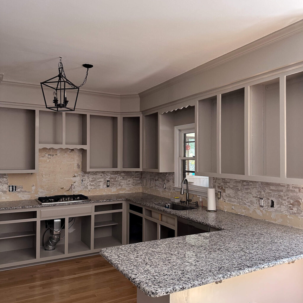
Progress, slowly but surely!
The New Backsplash
If you remember my original moodboard, I teased that I would be installing vertical wood paneling painted the same color as the kitchen cabinets (you can catch the painting update here). My goal of the design is to create a seamless look, which I think can be achieved by either doing what I’m doing (budget friendly option) or continuing the countertops up the backsplash. Ideally someday I’ll do the latter and have continuous marble counter and backsplash, but since this is a budget friendly kitchen renovation, that’s not part of the current plan.
The tongue and groove panels I chose are five inches wide and come in eight foot long planks. Using my miter saw, I cut each piece down to size, then painted two coats of my paint (Stone Hearth by Benjamin Moore) on each piece, sanding in between. After that, it was time for install!
Using my brad nailer, I secured each plank into the wall, double checking they were level as I went. One thing I learned quickly was to keep my nails away from the side of each plank that the next plank would slide into. When I installed my very first plank, I had nailed right to the edge and then I was unable to get the next plank flush. I had to pull everything out and remove the nails from the plank, and start over. Just a word to the wise if you plan to do this!
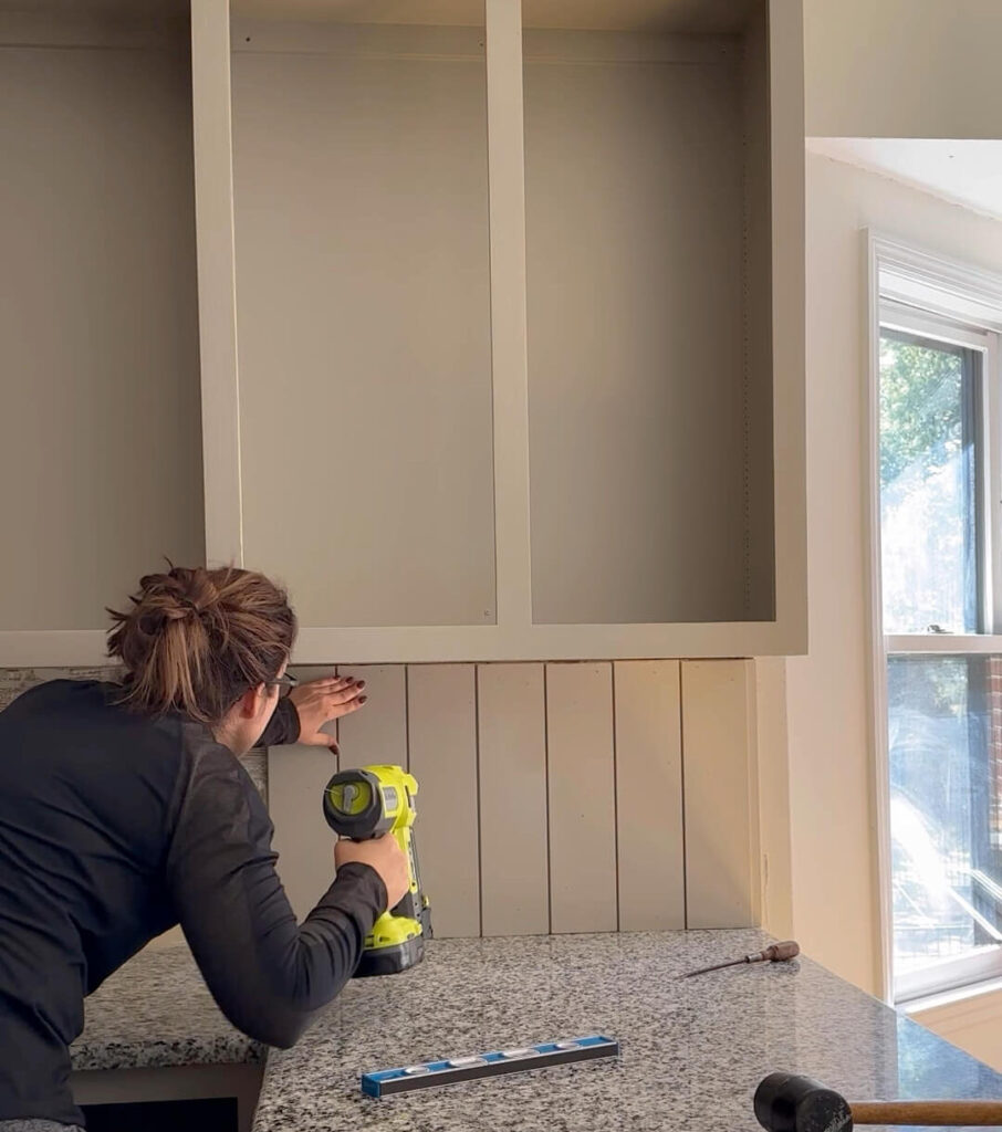
Learning Time: Electrical, Trim and Jig Saws
How to Extend Outlets
As easy as the install started off, I slowed down a little bit as I had to learn a few new things as I went. The first was how to properly extend my electrical outlets and light switches. I also realized that the previous owner had used drywall screws to adhere the electrical, so I was thankful I caught this and made it right.
After I turned the power off, I unscrewed the outlets from the electrical boxes and gently pulled them out. If you have a drywall backsplash or wood backsplash like mine, you’ll want to use outlet extension boxes like these. If you have a tile backsplash you can use outlet spacers like these. Either way these fit in between the outlet and the electrical box. No need to unwire anything at all. This allows the outlets to be extended from the wall, but they remain still (and secure) when you’re plugging into them.

Working around existing Trim
The next big thing I learned was how to carefully remove existing trim. I realized after the fact the new wood paneling was thicker than the base of my window sill trim, and would look a little too DIY if I didn’t come up with a solution. After cutting the caulk around the trim, I was able to gently pry the trim off with a pry bar and hammer. I continued installing the paneling under the existing window ledge, and will mount the old window sill trim on top. This will create a much more seamless look. I also decided I’m going to go ahead and paint the window the same color as the cabinets.
Lastly, and most intimidating, I needed to learn how to cut holes in my panels for the electrical outlets / light switches, but also to fit around some of the cabinetry above the cooktop. I was generously gifted this Kobalt Jigsaw from Lowe’s Home Improvement and it ended up being so easy and fun to use! Assembly was super quick, and after double checking my measurements I got right into cutting for the outlets.
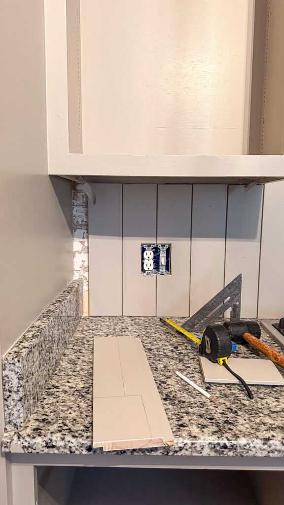
I felt incredibly lucky because when I got to the corner of the backsplash, the panels magically met up and I didn’t need to make any cuts whatsoever! There was a little bit of math when I got to the very end (pictured above) but it was totally doable. I felt like that was a gift from the universe after the back breaking work of removing the backsplash last week!
The Final Results
After filling nail holes and sanding everything down, I was so in awe with the change this backsplash is bringing to the room. Everything looks more streamlined and warm, and the elements aren’t fighting with one another. They just blend.
Now that the backsplash is fully installed, I’m wrestling with the idea of leaving the little wavy cut outs above the sink and cooktop. Part of me thinks they’ll be complimentary with the vintage pendants I’m installing above the new island (I still need to build!). The other part of me thinks this might look too cottage core with the paneling. Don’t get me wrong, I love cottage style, but I’m always going to stay true to the architecture of the home I’m designing, and this is a colonial style home. I’m going to sleep on the decision but it’s something I’m thinking about almost daily.
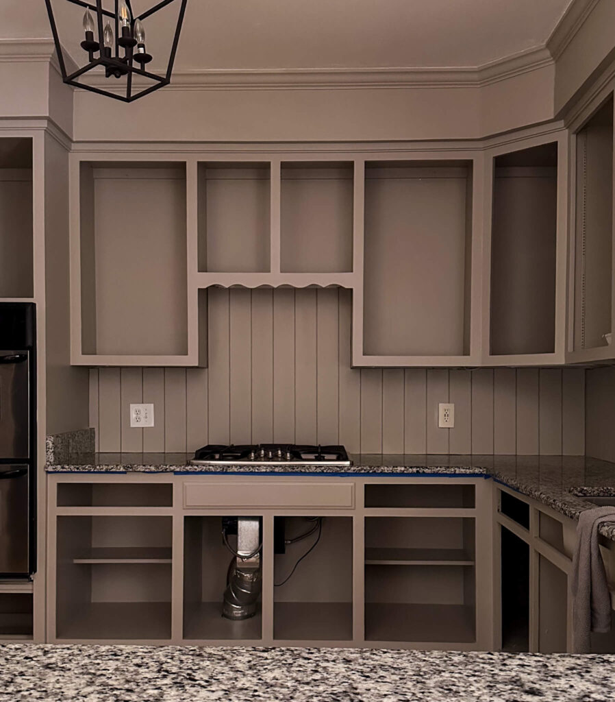
What’s next?
While I had hoped to tackle the countertops this week, they’ll need to move into Week 5 of the One Room Challenge. In case you missed it, I’m using a kit from the brand Giani to paint my existing granite countertops to look like marble. After the actual prep and painting, I expect most of Week 5 will be spent waiting for the epoxy to cure, which will give me time to focus on a few other things…
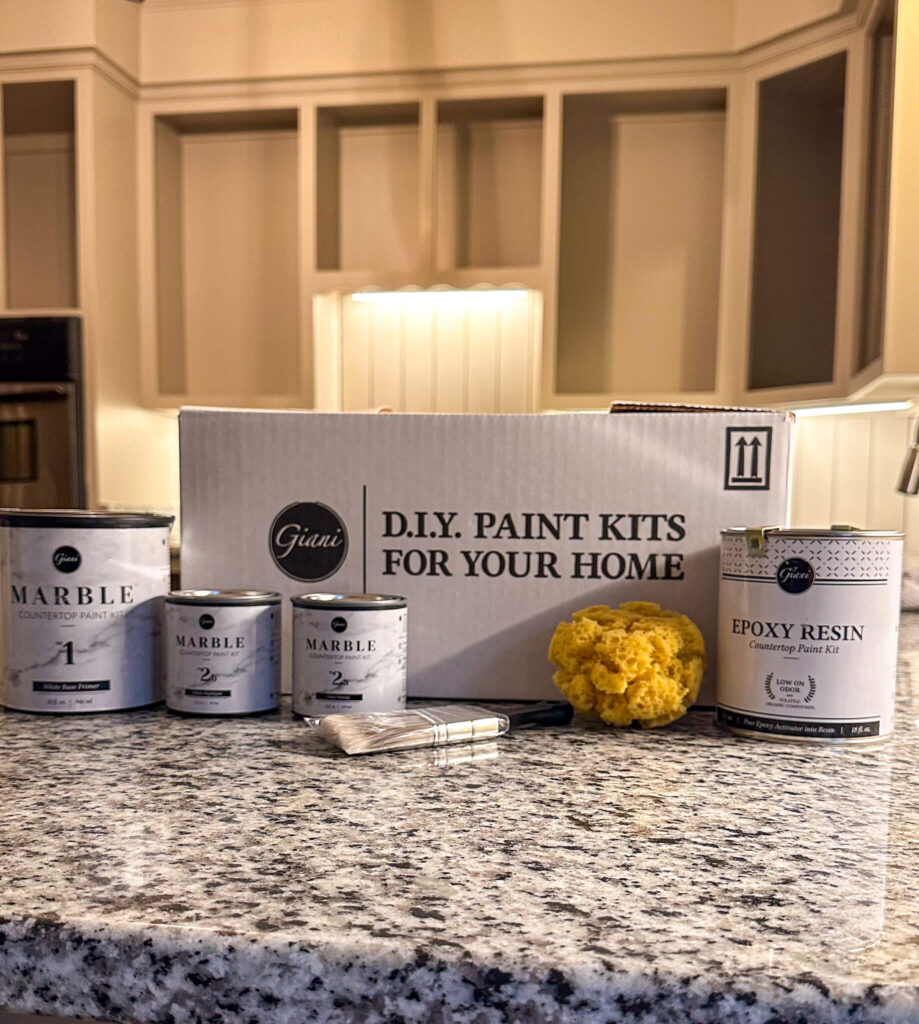
Drawers, doors and an island build! It will be dealer’s choice on what I tackle next, but I’m very motivated to start putting things back in the cupboards. I’m hoping I can get the drawers out of the way first and then begin moving onto drilling for the new door hinges, which will be hidden and soft close!
Make sure you’re following along on my instagram account to see all the behind the scenes in stories, and weekly recaps in feed. To see and cheer on other designers, you can follow the One Room Challenge weekly progress reports here!
Catch up on the budget friendly kitchen renovation:
One Room Challenge Kitchen Renovation – Week 1
One Room Challenge Kitchen Renovation – Week 2
One Room Challenge Kitchen Renovation – Week 3
One Room Challenge Kitchen Renovation – Week 4
One Room Challenge Kitchen Renovation – Week 5
One Room Challenge Kitchen Renovation – Week 6
browse more posts
read more
This is my first ever kitchen renovation and I think it’s fair to say that this week might have been the breaking point. While I had a little extra pep in my step last week from the new paint that went on the cabinet boxes, the wave of excitement came crashing down this week as I worked to remove the existing glass tile backsplash. As I look at my original mood board, there’s still so much left to accomplish with this budget friendly kitchen renovation and I feel like this past week set me back a bit. Lets recap…
I know some people probably liked my glass backsplash. It was not dated, and is relatively new. However my goal of the budget friendly kitchen renovation is to warm the kitchen up and give it more continuity with the rest of the home (which has a warm tone). The backsplash, as well as the previous white cabinet color and granite countertops are all very cool toned. So that’s why I chose to remove it and replace it with wood paneling which will be painted the same color as the cabinets.
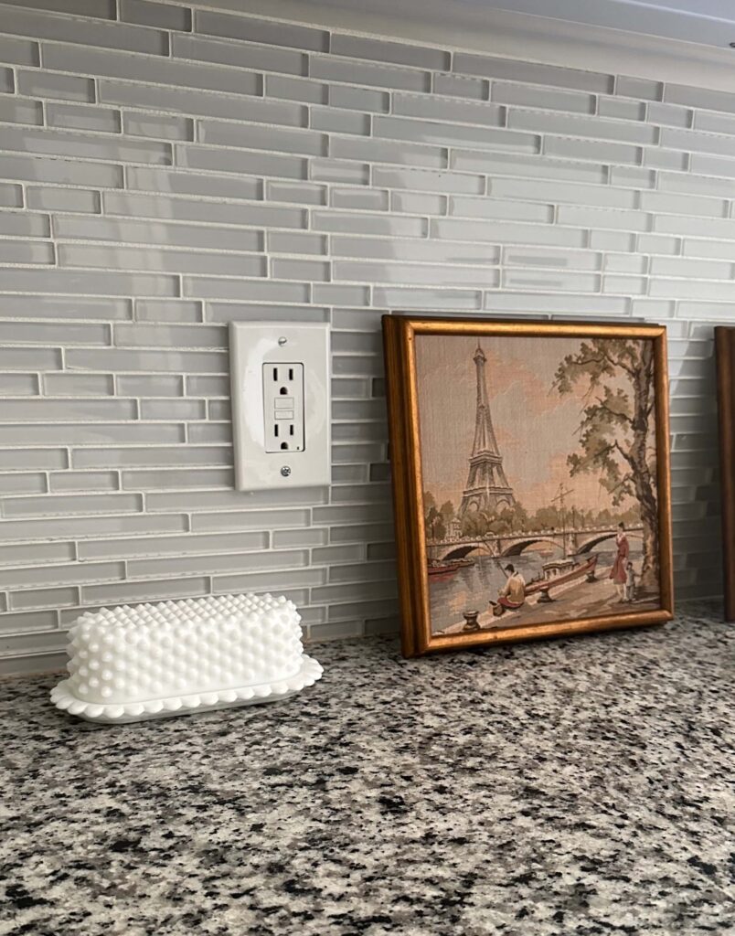
If you’re also looking to remove a glass backsplash without ripping out your drywall, I’m here to share that it IS possible to do. Yes, ripping out the drywall might be quicker, but that also opens itself up to potential hidden surprises. Which I’m not in the mood for! So lets get into how I removed this backsplash and then we’ll reassess the rest of the renovation schedule.
How to remove an existing backsplash without ripping out the drywall
Before you demo anything, it’s important to understand how it’s originally installed. For my backsplash, it comes in sheets with spaces in between each piece of tile. You skim grout on the wall first, and then place your sheet of tile on top. Once placed on the wall, grout is skimmed overtop of each sheet and pressed into each space around each piece of tile.
So when you think about it that way, there is grout on all sides of tile (except the top) holding it to the wall. To remove the tile without removing the drywall with it, you need to break up each line of grout first. Admittedly, this was trial and error for me, as I’ve never demo’d anything before, but with a little patience and the right tools, it was certainly doable.
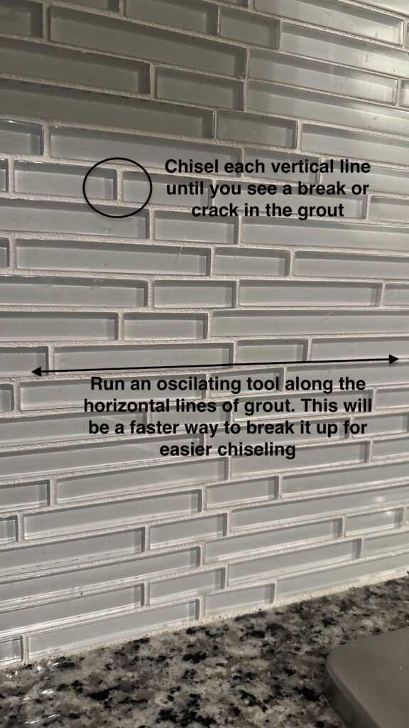
Before you get started make sure you’re wearing long sleeves and pants, have protective glasses and safety gloves. You’ll also want to lay drop cloths on the counter and floors, and have some kind of waste bucket near by for the old tile and grout. Tool wise, you’ll need a hammer, chisel and I highly recommend an oscillating tool.

I did not own an oscillating tool before this project, but after two hours of chiseling and not getting very far, I ordered this Kobalt oscillator from Lowe’s. It was $99 and came with multiple blades including one specifically for grout, as well as a battery and charging dock. I know I’ll use it for so many more projects in the future.
I used the oscillating tool to grind away at the long horizontal strips of grout first, working in 1 foot sections at a time (top to bottom). From there, I went in and chiseled each vertical line of grout until I saw a break in the line. After that, I was able to wedge my chisel behind the end pieces of tile and gently pop them out piece by piece.
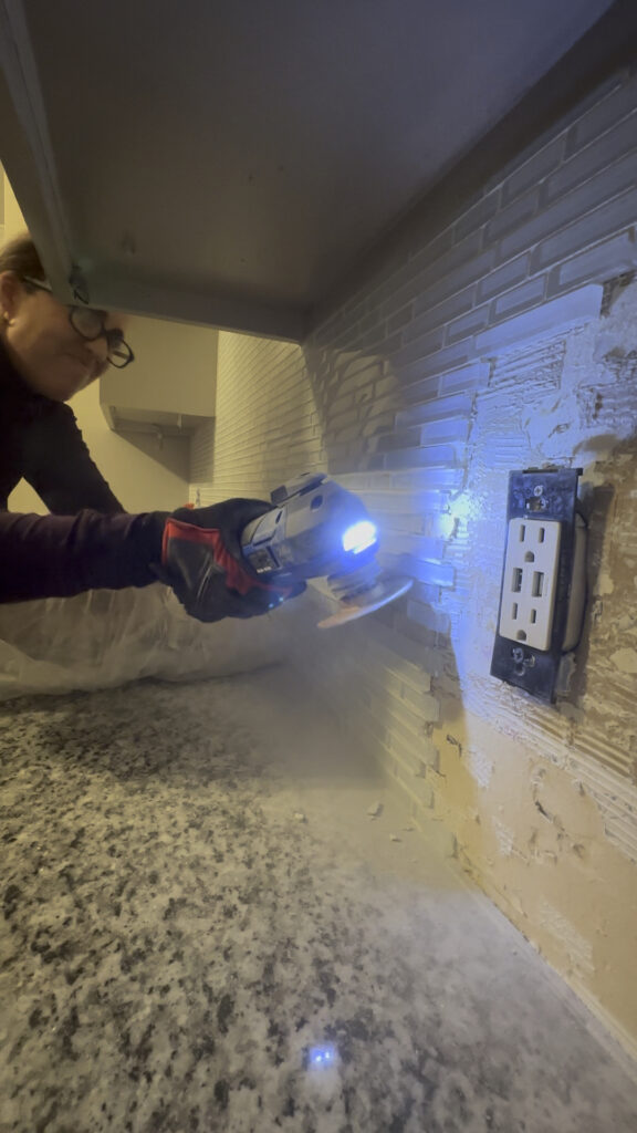
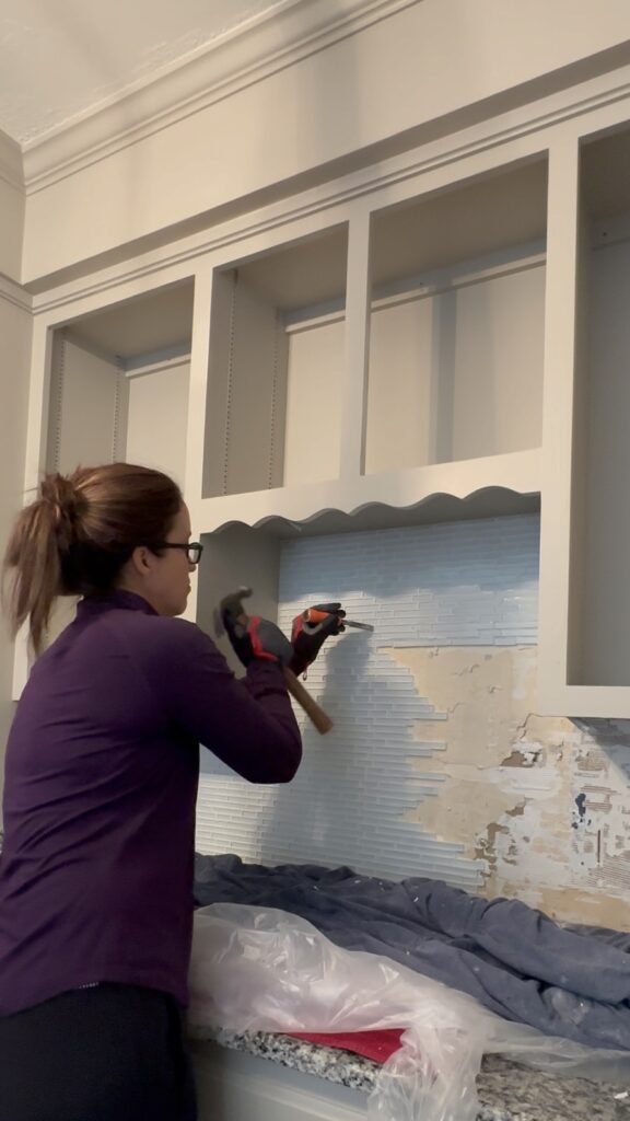
There were definitely moments during this process that I questioned my decisions, but I’m so proud to say I was able to demo this entire backsplash myself without making a single hole in the existing drywall! It was a very long and tedious process, and probably the best upper body workout I’ve ever experienced. So if you’re thinking about doing this, just know that it can be done, but be prepared for a very serious work out and pack your patience.
Budget Friendly Kitchen Renovation – what’s next?
Week 4 Plans
As we enter into week four of the One Room Challenge, we’re approaching the half way mark. And I’m definitely not halfway through my to do list. This past week was supposed to include both the backsplash demo and the new backsplash install, but obviously that was not the case. To make up for lost time, I’m going to aim to double down in week four and try to install the new backsplash as well as start the countertops. Here’s everything that needs to happen:
The New Backsplash
The new backsplash is going to be vertical wood paneling painted the same color as the cabinets. I’m going to cut each piece first using my miter saw, then add two coats of paint, and then install. I’ll need to teach myself how to pull out the electrical outlets and light switches so there’s enough depth to be flush with the paneling. I’ll also be learning how to use a jigsaw for the first time to cut the panels to fit around the outlets, window trim, etc.
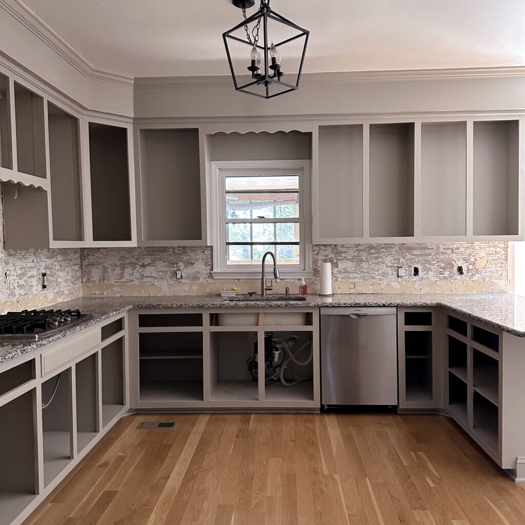
New Countertops
I shared in my initial mood board and plans, but didn’t go into a ton of depth around the plan for my countertops. In a perfect world I’d be upgrading to real marble countertops, but as you know, this is a budget friendly kitchen refresh. New countertops for my square footage would cost somewhere between $8k-$10k, so that was out of the question for the time being. Instead, I’ll be using a kit from the brand Giani to paint my existing granite countertops to look like marble. I’ve spent a ton of time this week watching videos and reading tutorials about how others have done this same exact thing, as well as some pitfalls to avoid. I’m a mix of nervous and excited for this!
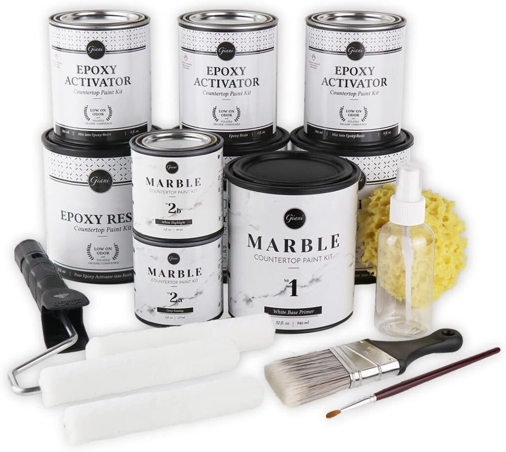
Other odds and ends that I’m trying to tackle during weeknights include painting all the shelves, prepping the cabinet doors for paint and finding a solution for new hidden soft close hinges. I’m not quite to the point of sketching out the new island plans and dimensions yet, but that’s not too far behind.
One thing that’s keeping me going right now is my new hardware that just arrived! I’m trading out my old handles on my drawers for these beautiful cup cabinet pulls by EMTEK. I chose the French Antique finish and I love how warm they look, and how substantial they feel. I’ll be installing a mix of 4″ center set pulls and 3″ center set pulls on my drawers. More to come on that soon!
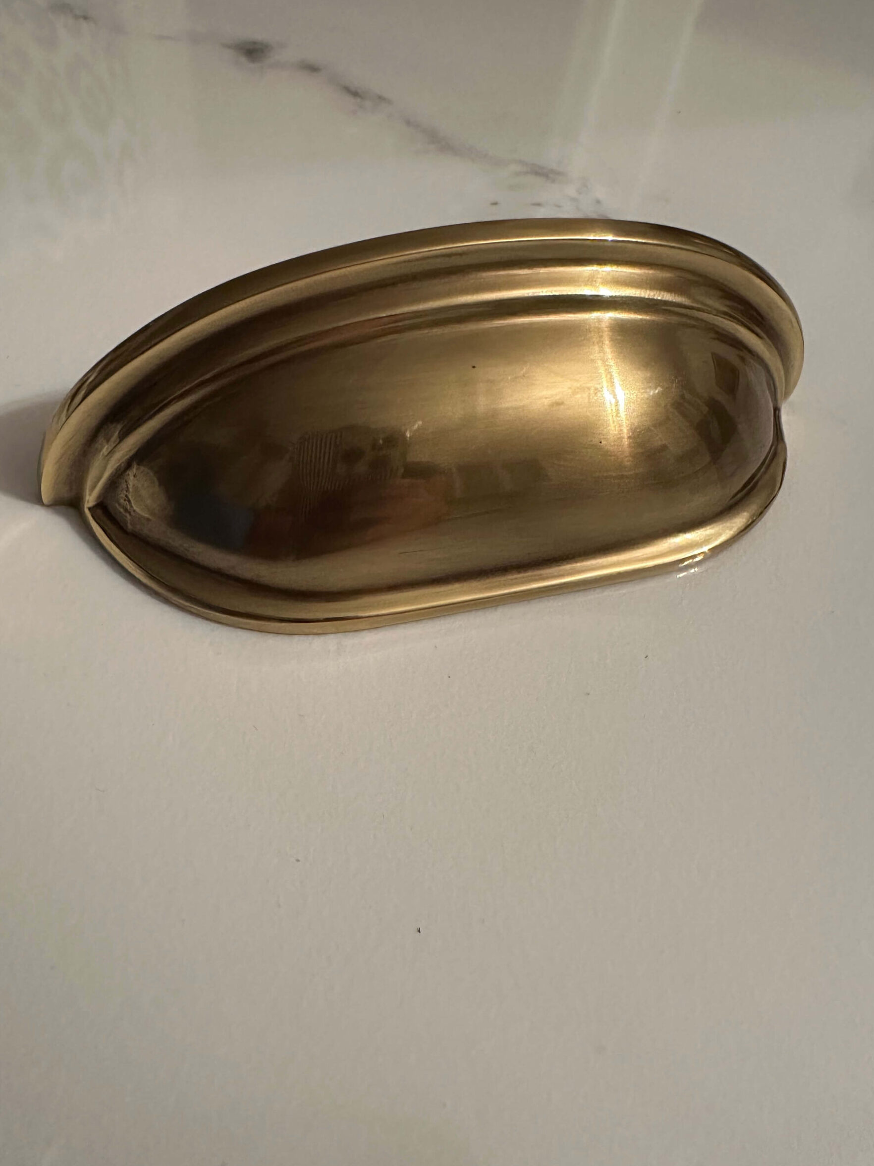
I’m still optimistic that I can finish this budget friendly kitchen renovation by Thanksgiving, but I’m painfully aware that I need to make every minute count. I’ll be working on the project before and after work, and then of course over the weekends too.
Make sure you’re following along on my instagram account to see all the behind the scenes in stories, and weekly recaps in feed. To see and cheer on other designers, you can follow the One Room Challenge weekly progress reports here!
Catch up on my budget friendly kitchen renovation
One Room Challenge Kitchen Renovation – Week 1
One Room Challenge Kitchen Renovation – Week 2
One Room Challenge Kitchen Renovation – Week 3
One Room Challenge Kitchen Renovation – Week 4
One Room Challenge Kitchen Renovation – Week 5
One Room Challenge Kitchen Renovation – Week 6
read more
We are two full weeks into the 2024 Fall One Room Challenge and this is the week where I finally felt I could see my vision taking shape. That’s the power of paint after all – it’s transformative! (did you see my exterior reveal? Say less.) But before we could get into the fun part, there was still a little bit of prep left to do. I know you thought we probably covered that last week, but there was a little bit more to ensure the paint really sticks.
Kitchen Renovation – Prepping the Space
Sanding the Cabinets
After cleaning and wood filling all holes / dents, it was time to sand everything smooth. If you’re wondering why we do this, it’s to give the new paint something to really grip to. It’s tedious, but there is nothing worse than bumping into a freshly painted surface and seeing a chunk of paint chip off. Trust me, I’ve done it. And guess what? I didn’t sand first.
Since there is so much area to cover (don’t forget we still have shelves, cabinet doors and drawer fronts!), I decided now was the time to invest my first sander. After quite a bit of research I landed on the DeWalt random orbital sander with varying speeds. I liked that I had the option to adjust the speed for not only this project but projects in the future. It also came with a little dust bag that clipped on, which I appreciated!
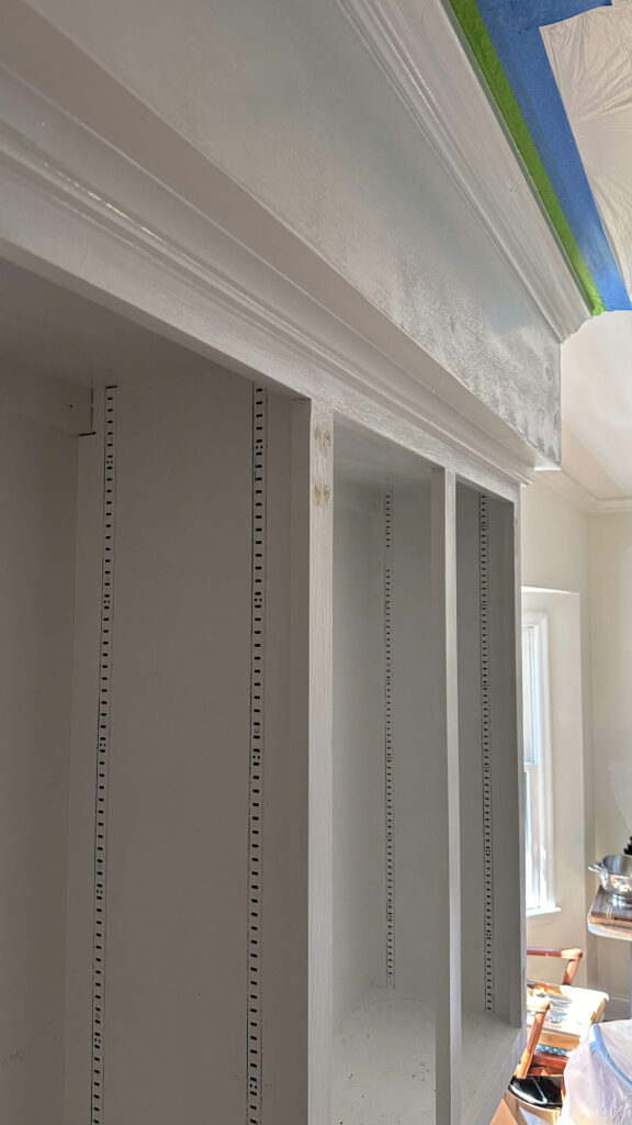
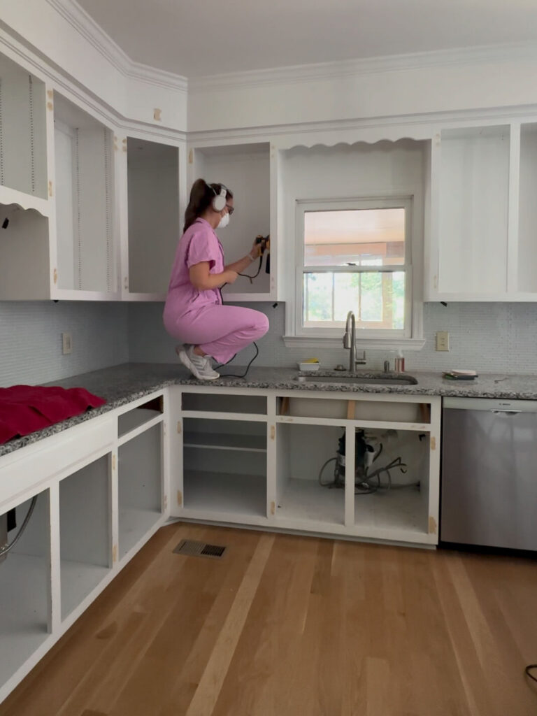
DeWalt Random Orbital Sander | 120 Grit Sandpaper | 220 Grit Sandpaper | Tack Cloth
Anything the sander was too big for (the crown molding, the detail at the bottom of the soffits, etc) I ran over by hand with a 120 grit sand paper. After all the sanding was done, I ran a shop vac over all the surfaces followed by a tack cloth to pick up any loose particles. I also vacuumed the floors and counters thoroughly. We don’t want specs of dirt flying into our freshly painted cabinets!
The Paint Color!
To keep myself motivated in between the never ending prep work, I took a trip to the paint store to grab a sample of paint. I still can’t believe this, but I nailed it on the first try! My initial mood board hinted at a warm taupe, and I found just that in Stone Hearth by Benjamin Moore. It’s dark enough to add warmth but not too dark to end up feeling dated. I painted a small area and then got a bit braver with a shelf just to make sure. It was love at first sight!
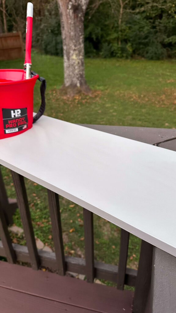
Supplies: Handy Paint Pail
Sealing the Space
As I was cleaning every square inch of these cabinets, I decided this would be the time to learn how to use a paint sprayer. There’s just too much surface to do by hand and I want a smooth factory finish to make these cabinets look like new. With that decision came the obligation to really mask off anything in the kitchen that wasn’t getting painted.
I hung plastic across the ceiling, covered the appliances, taped and covered the plumbing under the sink, the piping under the stove and finally made walls by suspending plastic sheets from the ceiling. From there, I used painter’s paper to roll across the floor and thoroughly taped then down with painter’s tape. And lastly I extended some drop cloths into neighboring rooms just to be safe. I read that 30% of your paint from a sprayer will travel so I was a touch paranoid to say the least! This took 12 hours which was much longer than I expected.
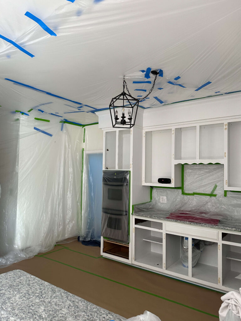
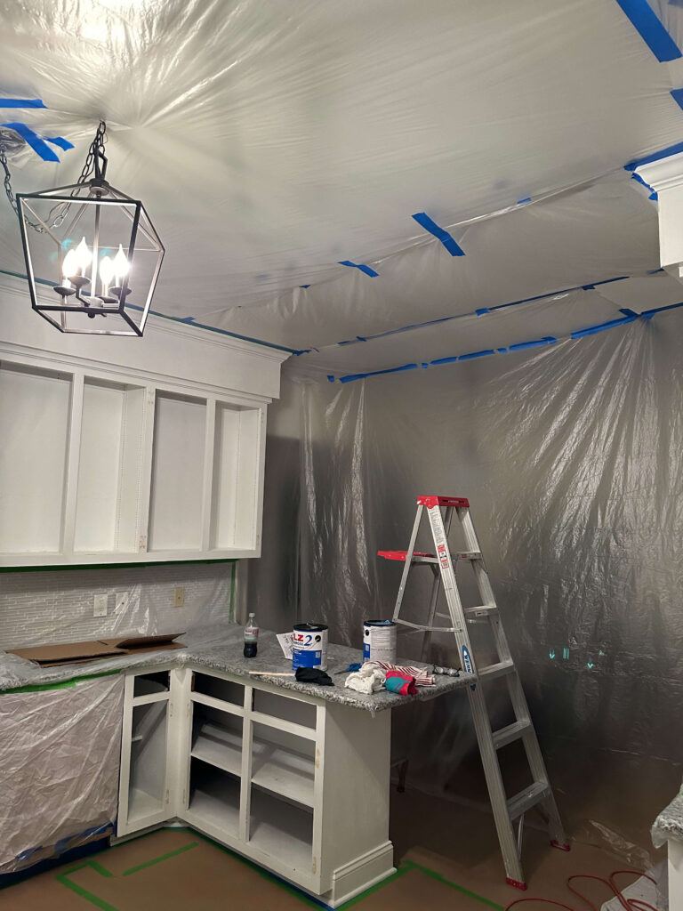
Kitchen Renovation – Painting the Cabinets
Prime Time!
Before it was time for color, it was time for primer. It’s an extra step but again, think of it as laying the canvas for your masterpiece. This will ensure your paint looks the same on every single surface, and will give it a little something extra to grip onto. I always use Killz primer, which is inexpensive and is ready to paint over in about 3 hours.
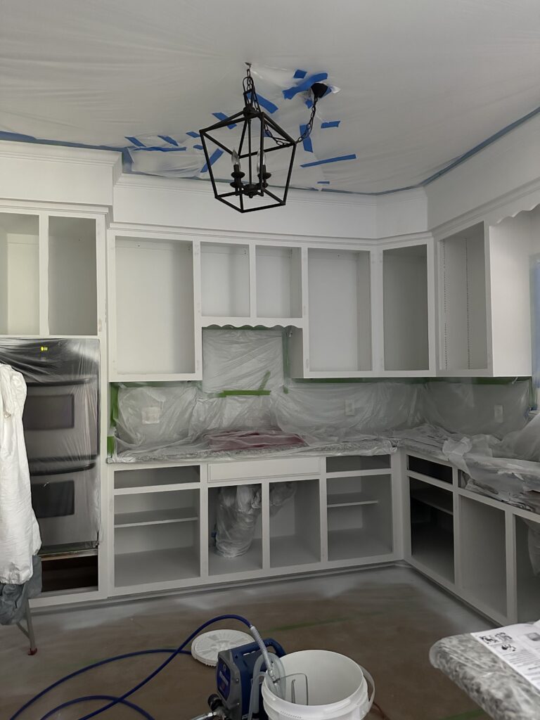
Killz Primer | Graco X5 Magnum Airless Sprayer | Painter’s Tape | Painters Paper | Plastic
This also gave me an opportunity to get familiar with my new paint sprayer, the Graco Magnum X5 Airless Paint Sprayer. The sprayer was relatively easy to set up, and once I got the hang of it, it was so fun to use! I have never used a paint sprayer before and it took me less than hour to spray the crown molding, soffits, insides and outsides of the cabinets and drawers. If I had been doing this by hand it would have taken me a full day!
Using the Paint Sprayer
Finally the moment I’ve been waiting for – the paint! I shared above I went with Stone Hearth by Benjamin Moore, but I didn’t share what type of paint. At the recommendation of a friend I decided to try the COMMAND Corotech which is a waterborne acrylic urethane. The selling point of this stuff is that it dries within 15 minutes, is ready to recoat in an hour and you can allegedly drive a forklift on it within a day. (I’m not driving a forklift on my cabinets!)
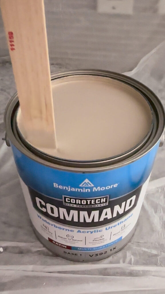
Here are my candid thoughts on the product:
Pro’s: The paint does dry very quickly but my cabinets were not ready to recoat within an hour. I waited 6 hours just to be safe and that still felt better than needing to wait a full day which is what I normally do. The finish came out buttery smooth and the satin finish is the perfect amount of shine for the space.
Con’s: This type of paint is “self leveling” which means exactly how it sounds. With that, you cannot go heavy on vertical surfaces. Unfortunately, being a newbie sprayer, I didn’t know this and should’ve dialed my spray back a bit. I have some runs from the first coat, and most of them I was able to catch in time with a brush to avoid sagging. A couple of them got past me and I’ll need to go back and fix them. The fumes from this paint are INTENSE. Plan to open a window if possible because it’s a lot to handle.
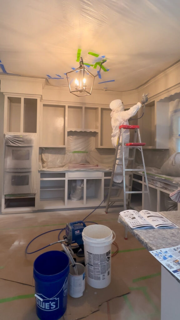
Graco X5 Magnum Airless Sprayer | Painter’s Paper | Painter’s Tape | Plastic
The Moment of Truth
After the paint was dry, I started to remove the plastic and paper. Unfortunately some of my ceiling paint came off with the tape, so I’m working on fixing those patches. I have a few areas to touch up (both wall paint and cabinet paint) but for the most part, my prep work paid off and there was no damage to the floors or surrounding rooms!
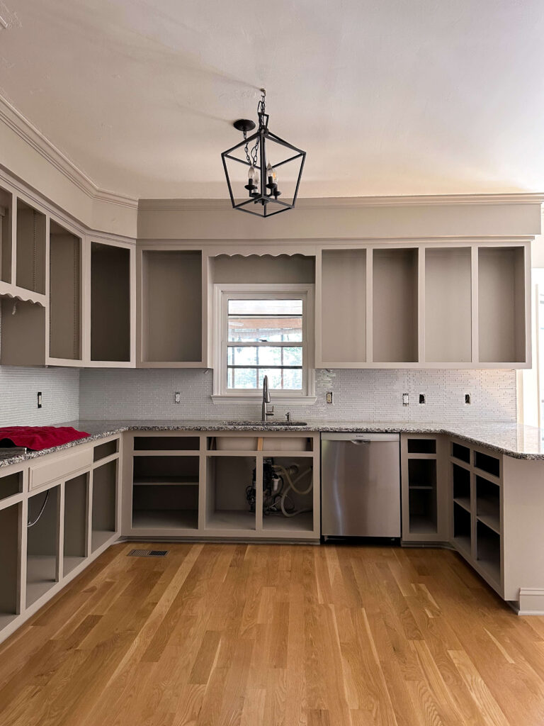
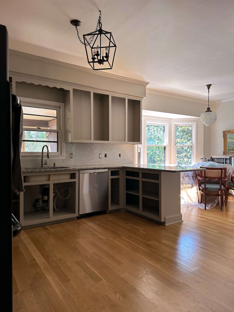
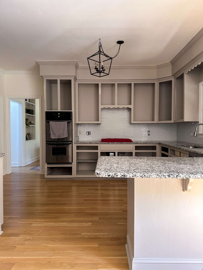
Budget Friendly Kitchen Renovation – What’s next?
We’re about to turn up the dial on the transformation and next up will be the backsplash. I’ll be removing the existing glass tile backsplash and installing this pretty wood paneling I found at Lowe’s. The paneling will be painted the same color as the cabinets to create a seamless look.
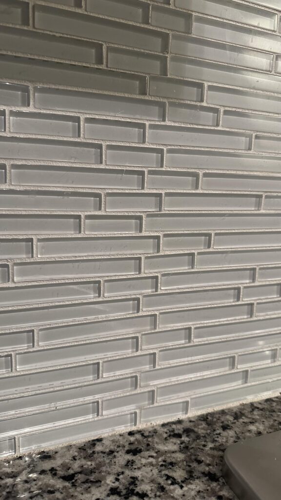
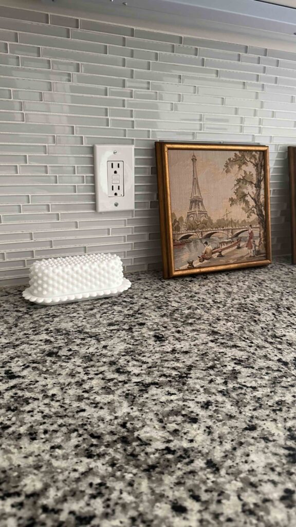
I also still have all the cabinet shelves, drawer faces and cabinet doors to clean, sand and paint. I anticipate doing this in waves while doing other pieces of the renovation so I can stay on target. I’ll see how easy or difficult the backsplash is this week and we’ll play it by ear from there.
Make sure you’re following along on my instagram account to see all the behind the scenes in stories, and weekly recaps in feed. To see and cheer on other designers, you can follow the One Room Challenge weekly progress reports here!
Catch Up on the Budget Friendly Kitchen Renovation:
One Room Challenge Kitchen Renovation – Week 1
One Room Challenge Kitchen Renovation – Week 2
One Room Challenge Kitchen Renovation – Week 3
One Room Challenge Kitchen Renovation – Week 4
One Room Challenge Kitchen Renovation – Week 5
One Room Challenge Kitchen Renovation – Week 6
One Room Challenge Kitchen Renovation – Week 7
One Room Challenge Kitchen Renovation – Reveal
My Project Supplies:
The Latest on the Blog —
read more
Are you ready for the grand finale of 2024? We’re going out with a bang, and we’re doing it in good company as I join the 2024 Fall One Room Challenge. If you’re not already familiar, the One Room Challenge takes place twice a year and is a way for designers to collaborate and foster friendly competition and collaboration as we all aim to finish a project in an eight week time period. I had planned to join the Spring One Room Challenge, but could not quite nail down the primary bedroom design (if you saw the reveal you know it was worth the wait) so I’m quite excited to join this fall’s challenge as we tackle THE KITCHEN!! That’s right, I’m going all in with a budget friendly kitchen renovation. We might even call it a facelift. Here’s the plan:
The Kitchen Before
I’ve shared very limited photos of the kitchen, mostly because it’s been in disarray ever since I had the refrigerator leak which prompted a full mitigation, insurance battles and finally some new white oak hard wood floors. During mitigation, we had to break the top of the kitchen island in order to get it out for the flooring installation. It’s been in the garage ever since (topless) and for a while I thought about not having an island. But after living without it for nearly two years, I really miss the storage and the prep space that’s in close proximity to the stove top. So we’re bringing the island back (more on that below).
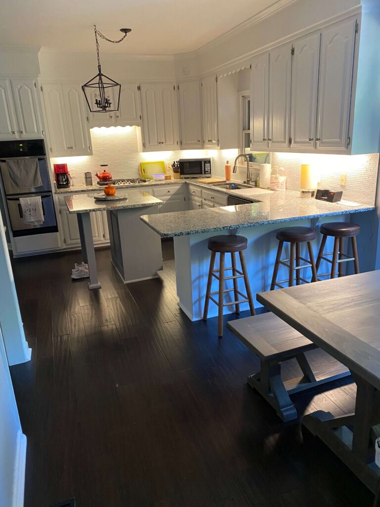
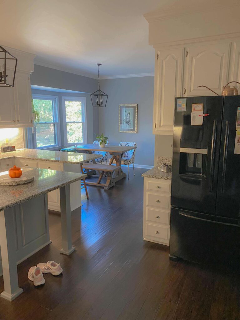
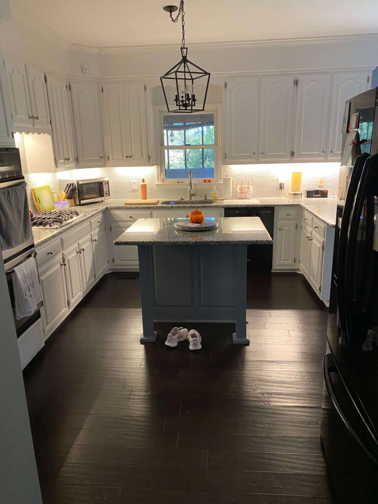
As you can see from the “before” photos, the space was previously made over with cooler tones. A cool white on the kitchen cabinets, a tile backsplash that reads cool and a blue/grey/black granite countertop that used to go with the dark blue walls I inherited when I bought this space.
The Kitchen Today
Since the hardwood flooring install, the kitchen has been in flux. I have exposed wood on the bottom of the cabinets that I make eye contact with every time I pass through. The island light has been swagged to the side for longer than I’d like to admit. And the previous owner did some handy work sawing off one of the drawer faces below the double oven and has literally glued it onto the face frame of the cabinet.
I’ve made some tiny attempts to breathe some life into this space by painting the walls to a warm cream (Swiss Coffee by Behr) and have also swapped out the brushed nickel hardware for some pretty brass knobs from DeVol Kitchens. I made a cute little breakfast nook for myself, however the main hub of the kitchen really needs attention at this point.
My budget friendly kitchen renovation plan
I’ve alluded to this a few times, but I’ve gone round and round on what to do with this space. Part of me wants to gut the entire thing and reconfigure where the appliances live. I’ve even thought about bumping the kitchen out (there’s a screened in porch on the other side). But I like the idea of challenging myself to see if I can make my current kitchen into my dream kitchen on a budget (and in 8 weeks). So how will I do this?
This project will involve a lot of painting and a lot of woodworking. I’ll first take to ripping out the existing backsplash and replacing it with wood paneling. All existing kitchen cabinetry as well as the new wood paneling will get a coat of fresh paint in this pretty warm taupe (Benjamin Moore’s Stone Hearth).
I’ll also bring back the existing kitchen island and will build onto the backside of it, creating a cabinet for my microwave as well as a cut out area for a wine fridge. This will free up both a large amount of counter space as well as cabinet space. I’ll need to have electrical routed through the floor for this, but it will be worth it. The existing farmhouse lantern will be replaced with two milk glass fluted pendants from the 1920’s which were actually from our former family business (so that will be special).
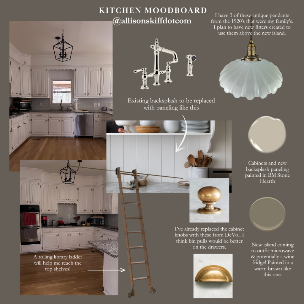
And the countertops? I’m going to keep them, but I’m going to paint them! Yep that’s right. I’m going to paint them to look like real marble. I’m very nervous but also very excited to see how it goes. Quite honestly I think almost anything will be better than what I currently have.
Last but certainly not least, I plan to install a rolling library ladder around the kitchen soffits. This will allow me to reach the top shelf without needing a step stool, plus it will add a charming touch to the space.
What’s First for the Budget Friendly Kitchen Renovation?
We are getting right into the wood working first, as it will allow me to keep the kitchen in tact and use it for a little while longer. I’ll be adding some shelving in one of the upper corner cabinets which I hope will get me feeling confident with the woodworking tools.
Second we’ll be tackling the mystery drawer underneath the double oven and seeing what’s behind it. It may just get glued back on depending what I find ha ha! In all seriousness I am going to try to make it functioning again. I just don’t expect that to go smoothly.
Simultaneously I’ll be building the new backside of the island, as well as additional frames and pieces to adjoin the new with the existing island. I’ll likely put the first few coats of paint on this in the garage before bringing it all upstairs, as I’d like to have that open space to paint the existing kitchen cabinets with.
Be sure to follow me at AllisonSkiffDotCom on Instagram for sneak peaks of my progress over these next eight weeks. And stop back here on my blog for weekly updates where I’ll be sharing the design process, key learnings and more.
And you can check out the design plans of the other guest designers on the One Room Challenge Blog.
Thanks for following along!
Related:
ORC Budget Friendly Kitchen Renovation Week 2
ORC Budget Friendly Kitchen Renovation Week 3
ORC Budget Friendly Kitchen Renovation Week 4
ORC Budget Friendly Kitchen Renovation Week 5
ORC Budget Friendly Kitchen Renovation Week 6
browse more posts
read more
Autumn has been my favorite season basically since I was a young adult. There’s something about the crisp morning air, the way apples taste better and the delicious smelling candles that come with the season. And as a decorator, it brings an entire treasure trove of décor along with it. One of my favorite ways to seasonally decorate is by incorporating faux fall stems into rooms around the house. So today I want to share that with you! We’ll look at a few different arrangements that include my favorite faux fall stems (plus how many I use in each arrangement).
Artificial Nandina Leaf Branches
New for me this season is the Artificial Nandina Leaf Branch. I really fell in love with the shape of these, as I liked that they covered a wide area, but were sparse at the same time. For this grand look on top of my grandmother’s piano, I have four of these branches in this large mauve clay vase. Similar to the Cimicifuga stems, I’ve bent each one at the base to create various heights, and also bent each branch in a different direction. I love the warmth they bring to this room and also think they compliment the Olive Tree in the corner!
Nandina Stems | McGee & Co Clay Vase | Vintage Trojan Horse | Faux Olive Tree
Plum Cimicifuga Stems
These beautiful deep plum Cimicifuga Stems from Afloral have been on my wishlist for a couple years now, and I finally purchased them for this year. I love the deep plum color of these and find them so striking and perfect to get you in the mood for fall! The company has recently redesigned this stem to be fuller, which is fantastic because now you don’t need quite as many to achieve that dramatic look.
Of course, I still wanted a dramatic look so I opted for the best of both worlds. I created a larger arrangement with five Cimicifuga Stems in this pretty tall taupe vase, bending the stems at the bottom to create varying heights for each piece. The result is a layered a full look which is perfect for this corner in my dining room.
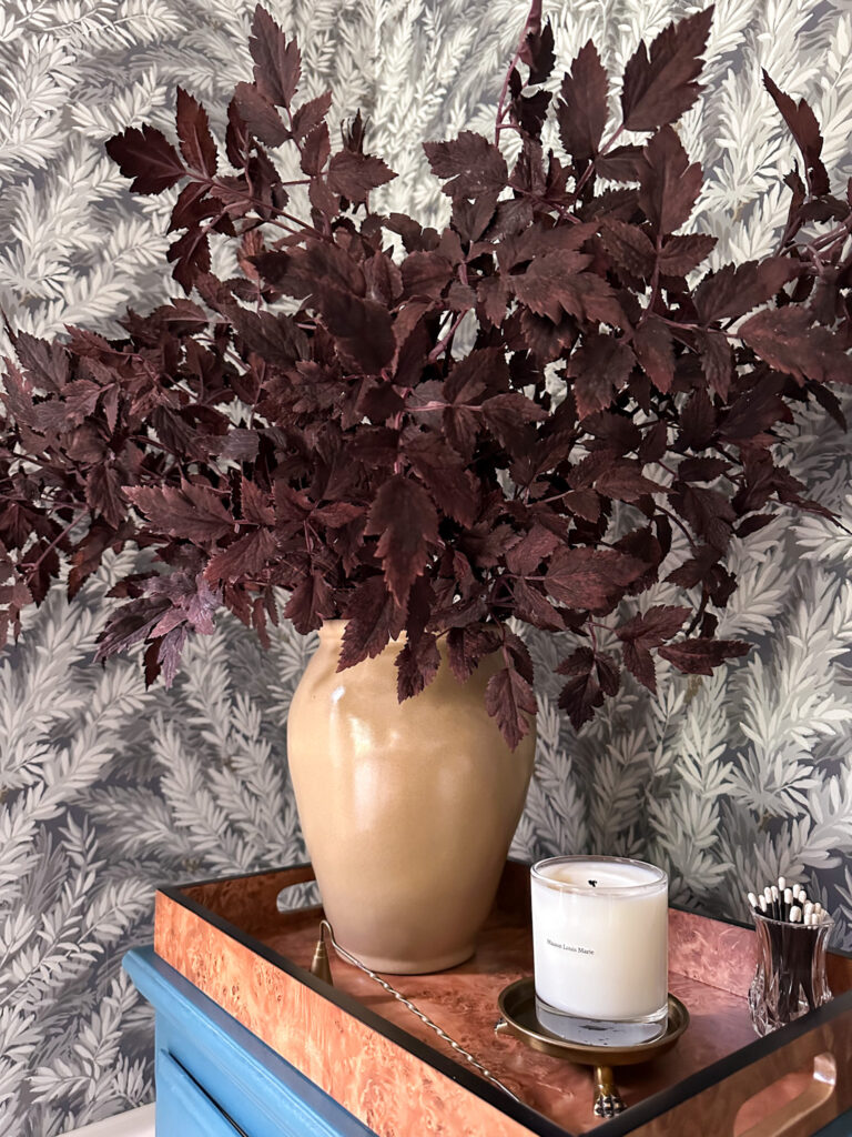
Wallpaper | Plum Cimicifuga Stems | Tall Vase | Candle | Claw Foot Brass Dish | Candle Snuffer (similar) | Burled Wood Tray
As an alternative, you can see an example with just a single stem flanked in a shorter vase. I love this option too and think it’s perfect to add a little flair to my primary bedroom.
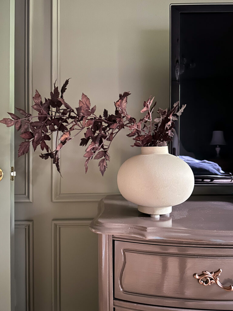
Single Fall Stem
I cannot for the life of me remember where I got this single stem. I think it was from Crate & Barrel but they no longer show it in stock. I still wanted to show this because I think it’s a lovely example of how a tall single stem can create a little drama all on it’s own. The key (in my opinion) is making sure your vase opening isn’t too big so it doesn’t flop over. This one is absolutely perfect for the task!
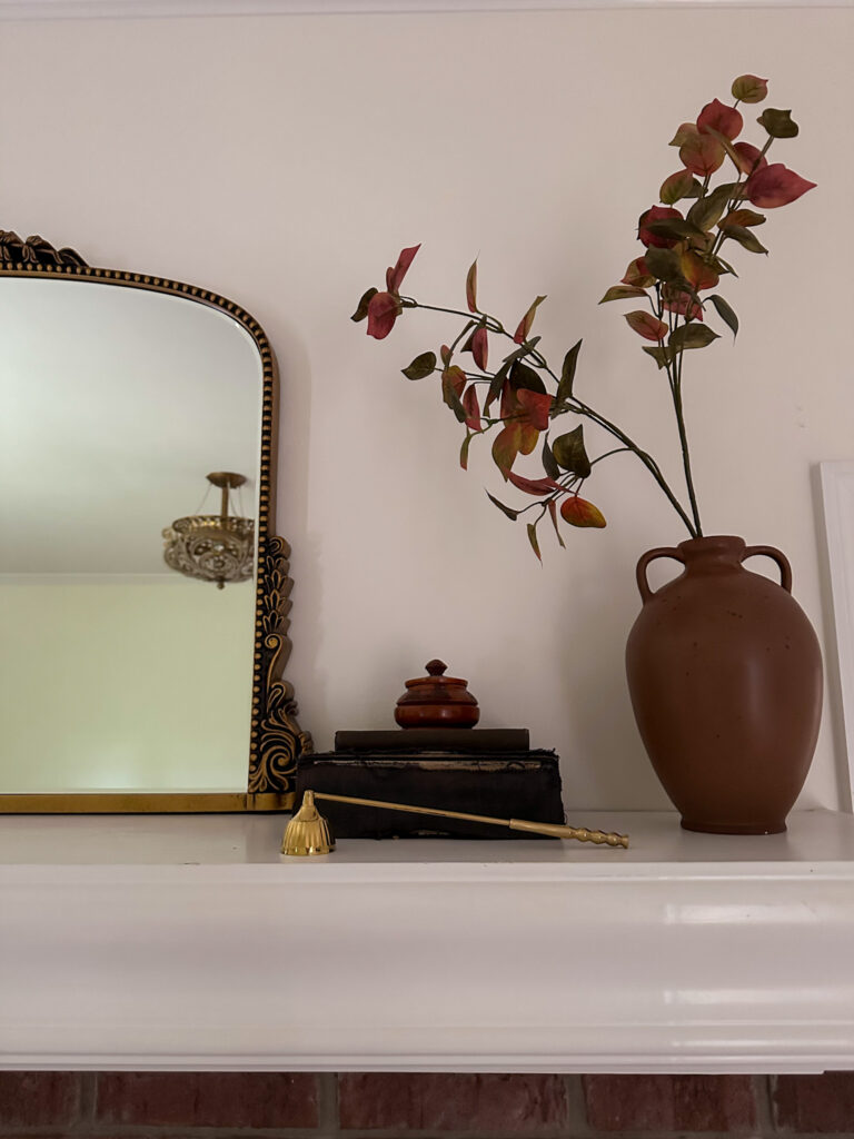
Stem (similar) | Mirror | Candle Snuffer (similar) | Vase (similar)
Dried Hydrangeas
Quite honestly I think dried hydrangeas are relevant all year round, but I do think they shine during the autumn season. I have eight dried pink hydrangeas in this larger vase, as well as a wire flower grid to hold everything in place.

Dried Hydrangeas | Large Round Vase | Brass Totie Task Lamp | Tripod Lamp (similar)
Burgundy Eucalyptus Stems
If you’re looking for scale, you need to look for some eucalyptus stems. I love the pretty burgundy color of these but you can find them in lighter colors as well like this warm golden option or even a light beige like this one. For this arrangement I have three eucalyptus stems.

Eucalyptus Stems (similar)
My Favorite Faux Fall Stems
When it comes to faux fall stems, they can be an investment, but like any of my home décor, I like to think of it as building a collection. Each year I add a few new pieces as I dust off the old ones, and I test arrangements out in different areas of the house. It keeps things fresh and interesting!

I’m rounding up everything I currently have in my collection below, as well as a few wish list pieces I’m eyeing for next season. Happy fall styling!

Sources:
(from top left to right)
read more
We all have that thing that bugs us, right? For me, the original exterior trim color on my brick house was that thing, and I’ve been wanting to update it for years. When I was drafting my 2024 project list, I put an exterior makeover on that list. But if I’m being honest, it felt like more of a daydream than a reality. And then when I went through my 2024 progress list it really started to feel out of reach with the remaining (nice) months left in 2024. But as I was finishing the primary bedroom project and thinking about what would be next, I decided to decide. After finishing the garage door install earlier this year, I was itching to add some more curb appeal to the exterior. So the exterior makeover jumped to the top of the list and here we are, reveal day!
The Moody Exterior Design
If you read my post last month about the design plans for the exterior, you already know that I had a darker trim color in mind but was still undecided on exactly which one it would be. After some serious paint sampling, and literally watching paint dry for days, it came down to Black Fox by Sherwin-Williams.

Shop the Exterior Mood Board
Don’t let the name deceive you! Black Fox is more of a charcoal grey with brown undertones. The deciding factor for me was how nicely it played with my new wood colored garage door, as well as with the darker bricks in the exterior. It was the best of both worlds! I got busy designing a mood board for the project and was able to see my vision take shape.
A change of plans
While I was gathering quotes for this project (and more on that later – I plan to share a full budget breakdown post in the future), I had also reached out to a local gutter company just to see what new gutters would cost. I had already hired the painters and they began pressure washing and even painting, but when the gutter quote came in much lower than expected, I decided to jump on it and just get it out of the way.

I never knew I could be so excited about gutters! Love how these black gutters compliment the rest of the exterior.
So the design changed just a touch, as originally the old gutters were going to be painted Black Fox, just like the trim and windows. But with the new gutters I had the option of a fresh color, so I opted for Black! The gutter company asked me several times if I was sure haha. I was very sure, and after installation they commented how beautifully the black gutters pop against the new dark trim.
The Final Touches on the Moody Exterior Makeover
After the professionals were done, I only had a few minor touches left to do myself. I chose to repaint the back deck flooring with a fresh coat of Cabot Deck Correct in Mission Brown. The old flooring had been weathered and with all these pretty updates to the exterior the deck stuck out like a sore thumb. This fresh coat of paint not only brings it up to speed from an aesthetic standpoint but will also protect the decking from the winter elements we’ll be getting soon. I also opted to add brass kickplates to both entry doors to protect the paint from dirt and debris that gathers. And I’m officially on the hunt for a vintage lion head door knocker. I think that will be the chef’s kiss on the front entrance!


The back deck Before + After
An update that will be coming later this year will be lighting. I decided that the existing exterior lights are scaled way too small for the size of this house. A general rule of thumb is they should be ¼ to 1/3 the size of your door. I had been thinking about ordering some fresh black lanterns like these, but after a little bit of online shopping I found some copper lanterns that I got instant heart eyes for. The bad news is they’re backordered until December 11th, so I’ll have to practice some patience. I’ll be sure to update everyone as soon as they arrive and I unbox them!
What’s Next?
As I had previously mentioned, the exterior project is so massive that I need to break it into different phases. With the painting (and ladders!) out of the way, the next phase will be focusing on landscaping. I’m going to spend the winter months really diving into research and thinking about what some of my dream flowers / greenery include. As well as due diligence to ensure they will perform well for my climate zone.
I also plan to give the pool deck more attention next year! I’m envisioning some new pool loungers and umbrellas, removing some of the existing gravel by the deck and replacing it with bricks or pavers, and maybe even an outdoor kitchen! The best part of design is letting your imagination run wild with possibilities. So with a fresh new exterior to be proud of, I’m going to do just that.

Still can’t get over this before + after. Here’s the front view.
And a before + after of the backside
Stay tuned for more updates on the exterior in the coming months and be on the lookout for more news on the next interior project. I promise, you won’t want to miss it!
A special thank you to Lowe’s Home Improvement, who sponsored this project by providing the paint.
The Latest on the Blog —
read more
I am SO excited for today’s post, because today we’re talking all about the plans for the next project – and it’s a big one! If you’re subscribed to the monthly newsletter, you were the first to find out that the exterior of the house will be getting a facelift this month! While I had some other great options left on the 2024 project list (and have already made some great progress), the outside has been on my mind ever since I got a new garage door this spring.


Do you see what I mean? The new garage door was the gateway for this project!
Where we Started
When I first bought my house, I was so focused on the fact that I owned a giant brick house that reminded me of the Home Alone house (really, it was something I got so excited about) that I didn’t pay a lot of attention to exterior or even think I’d ever want to change it. But over time you start to notice things. And once I noticed that the trim of the house matched the mortar in between the bricks, I honestly couldn’t unsee it. It drove me up the wall.
On top of that, there’s been quite a bit of wood rot on the fascia and even around the front door way. They’re issues that are out of my scope to DIY and when I see them, I’m embarrassed by them. Literally the house is rotting in some spots.
A photo of the front during the winter so you can see all of the (yellow) trim
The Plans for the Exterior Makeover
So since we know how transformative paint can be, I’ve been daydreaming about covering up this dated yellow trim with something more stately. Originally I didn’t know what color family I was leaning towards until I started to think about some of the work I’ve been doing inside the house over the past couple years. It should come as no surprise I like things a little moody (did you see the primary bedroom flip?!), bold (ahem, the dining room) and classic (the primary bathroom and especially the wallpaper in the toilet room are the perfect examples). So I wanted the exterior to almost be a preview of what you could expect to find inside. And I’ve ALWAYS wanted a shiny black front door so that’s definitely on the list.
Earlier this year one of my neighbors did exactly what I had been daydreaming about and it reinforced my idea of going to the dark side. Her trim and windows were painted a dark charcoal grey and it instantly added a whole new shine to her home. That was all I needed to see to know I was on the right path.

My neighbor’s house with fresh charcoal trim. I love the updated look!
When it comes to my own house, as I’m sure you noticed, there’s a lot of trim work on the back side of the house, primarily on the deck. So I’m keeping that in mind as I think about colors. Going with a traditional black might be too jarring and may look blocky. But going too light might look dated quickly with the amount of sun this area gets. Just a few things I’m keeping in mind as I dive into a color palette rabbit hole!
Next Steps
Bricks in every house are completely different, so although I like my neighbor’s color choice, I know it may not necessarily work on mine. So I headed to Lowe’s and picked out a handful of color swatches (did you know they carry Sherwin-Williams paint now?!) and I got busy holding them up against the dark bricks on my house. I think we have a handful of front runners so far, so next steps will be getting some samples and painting trim on all sides of the house to see how they look with the different lighting throughout the day. I’m also dreaming of some new exterior lighting but that’s a post for another day.
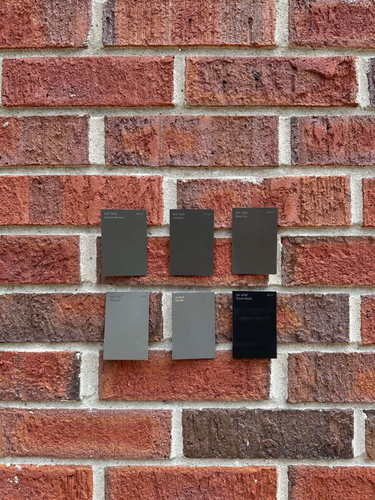
Make sure you’re following along on socials to see how this project unfolds over the next month. I’ll be sharing the entire project from start to finish!
browse more posts
read more
I haven’t been this excited to share photos with you in a while. Are you ready to see my moody color drenched bedroom? I’ve been itching to transform my bedroom into a moody retreat and after a rollercoaster of decision paralysis (you can read all about that here), I settled on a design that felt so right. My bedroom has been light and airy for the last several years, and while that worked for a moment in time, I was feeling like I hadn’t given it the attention it deserved. I was more so focused on washing away the previous owners and just resetting the room. So I added it to the 2024 project list and knew it was a “must do” for the year.
When I started thinking about designing the space, I focused on how I wanted the room to feel. And here, I wanted the bedroom to feel romantic, relaxing, and maybe a little historic. To start, I added custom box trim on the walls which added so much depth to the room. But the rich, dark green paint color with brown undertones really set the tone.
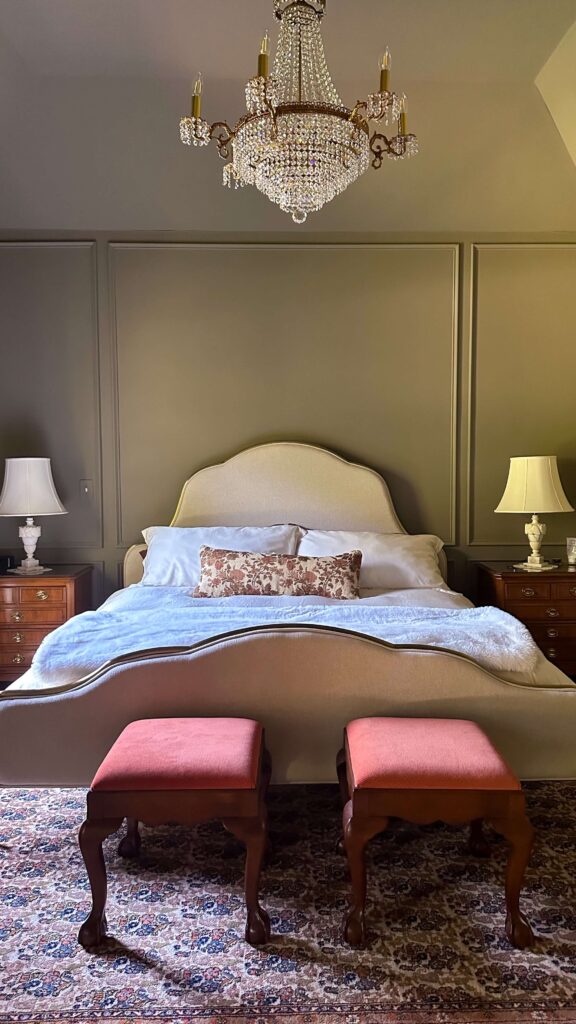
Ivory Linen Bed | Faux Fur Throw | Chocolate Bamboo Sheet Set | Tapestry Pillow
As a reminder, here’s how the bedroom looked beforehand:
Again, the beige served its purpose and I still love this specific color (Accessible Beige by Sherwin-Williams), but I knew there was so much more potential for this space.
Same angle, color drenched transformation:
Velvet Draperies | Ceiling Medallion | Vintage Chandeliers
Without really meaning to do so, a pair of vintage nightstands I found on Facebook Marketplace helped set the color palette for this space. I loved the rust color against the dark green, so I mirrored that with floor to ceiling blackout velvet draperies in the same pretty rust color. The marble lamps were also found on FBMP but needed fresh shades, which I was lucky to find at a local estate sale ($12 each!). Speaking of lighting, I knew I needed a bit of a statement light for the room and I found this gorgeous antique chandelier on Etsy. What a showstopper right?!
I went back and forth on bedding for a while, and originally I had thought about pulling in another brown or rust tone, but in the end I opted for a classic ivory duvet, a new down duvet insert and brown bamboo sheets. I accented it all with this beautiful tapestry lumbar pillow and I think it’s all so perfect together.
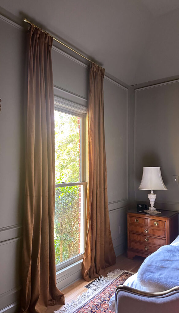
Blackout Velvet Draperies | Nightstands | Lamps
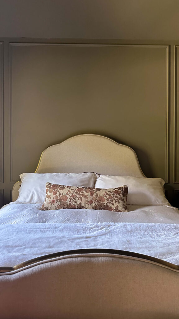
Faux Fur Throw | Tapestry Pillow | Ivory Linen Bed
The final piece (and the hold up!) was figuring out a rug. Ultimately, I relocated this Sarouk rug from my living room and while I knew it would work, I had no idea how well it would work in the space. Not only does it pull out the greens and rusts, but it also highlights the chocolate brown dresser I flipped.
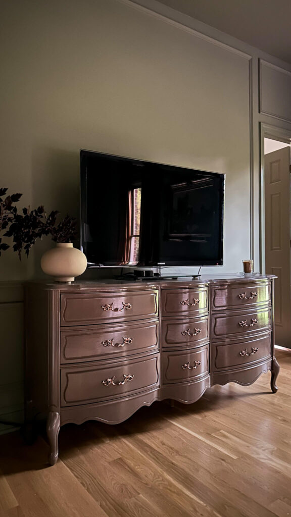
Glossy Brown Paint | Copper Hardware Paint | Plum Stems | Teak Candle
Note: For the dresser I used Farrow & Ball in London Clay Full Gloss. I used Farrow & Ball Treron in Modern Emulsion for the walls and Modern Eggshell for the trim.
This room feels moody, dramatic, and memorable. Cozy, yet inspiring. I love the mix of old and new items, as well as color combos I haven’t played with before. There’s some work to do styling the dresser but I’m honestly in no rush. I love this room so much already I never want to leave.
Moody Color Drenched Bedroom Sources:
Wall & Trim Color: Treron by Farrow & Ball
Lamps (vintage) – similar
Dresser (vintage) – painted in F&B London Clay (full gloss)
Foot Stools (vintage)
Rug (vintage)
Paintings (vintage)
Chandelier (vintage) – similar options
read more
There’s nothing better than tomato season! August means ripe tomatoes and corn on the cob, so the timing is perfect to rotate this healthy summer side salad into your weekly menu. If you’re looking for a quick, healthy and crowd-pleasing side to add to your summer menu, look no further than this healthy corn, tomato, and avocado salad. Packed with vitamins and flavor, this dish tastes even better after a day in the fridge.

Healthy Corn, Tomato & Avocado Salad Recipe
Serves 6-8
Ingredients:
- 2 cups Roasted corn (fresh off the cob is best – about 2-3 ears)
- 1 small red onion, diced
- 1 English Cucumber, diced
- 2 pints cherry tomatoes quartered
- 2 large avocados, cubed
- 2 Limes, juiced
- ¼ cup olive oil
- 1 tsp salt
- 1 tsp pepper
- 1 tsp garlic powder

Instructions:
Prepare corn by either grilling cobs and slicing kernels off the ears, or preparing as instructed from frozen. While corn is grilling, quarter your cherry tomatoes, slice cucumbers, and dice onion avocados. Add to large bowl.
In a separate bowl, whisk together lime juice and olive oil. Add salt, pepper and garlic powder.
Combine all ingredients and mix well. Chill for 1-2 hours.
Dish can be served on its own as a side, or on top of a bed of baby spinach greens. Keeps in the fridge for 2-3 days.

Shop similar cabbage ware dish here
Other Recipes:
How to build a charcuterie board
The Latest on the Blog —
read more
Can you believe we’re nearing the end of July?! Me either! This year has truly flown by and I know (as always) it’s going to speed up as we get closer to the holidays. As I’ve had my head down and deep into projects, I thought it would be a great time for a 2024 project list progress report. How have I done? What can I still do? And what do we need to move to next year? Lets see…
Completed:
Dining Room Molding – check!
While this was a smaller project in concept, it was a big moment for me personally. I conquered my fear of power tools and it gave me the momentum to dream bigger for upcoming projects.
The dining room was also the perfect room to give this kind of work a test drive so to speak. With the chair rail already in place, and plenty of doors and windows, there wasn’t much planning needed and there was limited math to do.
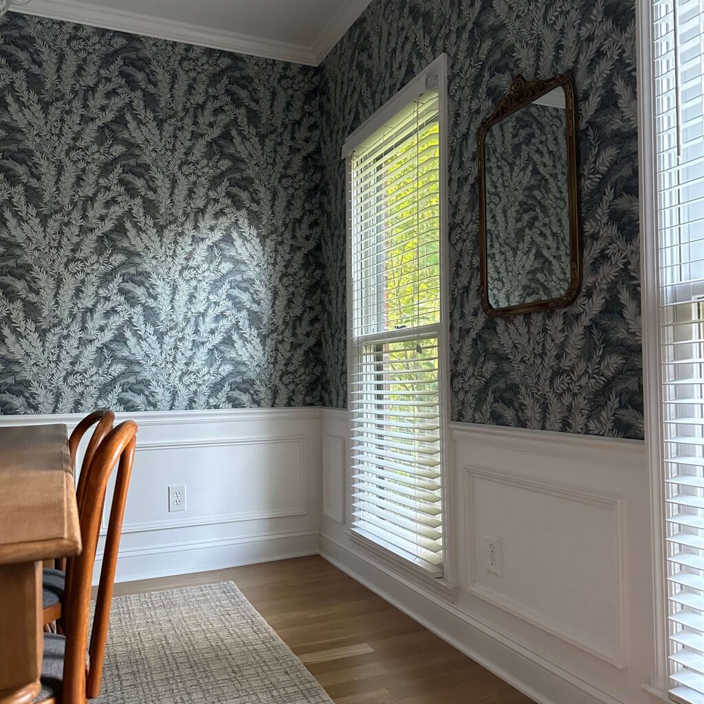
shop the dining room here
I love how this custom trim really elevates the already traditional space and I couldn’t be happier with how this turned out. If you’re thinking about planning custom trim in one of your spaces, I’ve put together everything I used for this project right here.
Back Entry Way – check!
This was one of the first projects I tackled this year and it’s had such a gigantic impact on flow. The wallpaper and fresh trim color really bridge the gap between the cozy tv room and kitchen. When I look at before photos of this space I shudder and can’t believe I didn’t tackle this sooner. It feels so welcoming and it gave me a chance to add some more wallpaper to the house. A win-win!
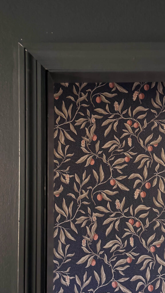
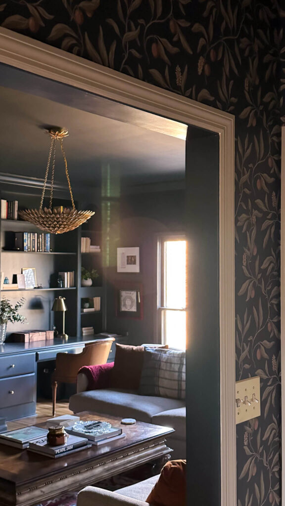
shop the back entry here
In Progress
Primary Bedroom – in progress but almost check!
I went through a rollercoaster ride of designs for the primary bedroom but finally landed on color drenching the space. And I’m so glad I did. After I decided I would add custom molding in this space and color drench it in a deep green, I really tried to let go of getting into any more details. Aside from ordering a new bed in advance, I wanted the design to guide me as I worked.
shop my custom trim supplies here
I’m so close to being as close to finished as I can be at this point, and I can’t wait to share photos and videos with you. You can see a sneak peek above of the color drench in Farrow & Ball’s Treron (it’s so good!). I plan on collecting some pieces (lamps, a rug, and a chandelier) so won’t be a full reveal, but it will still be a dramatic before and after. I’m not in a rush to “finish” this room as I really want everything to feel perfect. And so far it does.
Exterior – in progress
The exterior of the house is going to get an “in progress” sticker. I was able to add a new garage door into the mix, and while it’s not the most fun way to spend your money, the addition has been a huge upgrade both visually and functionally.
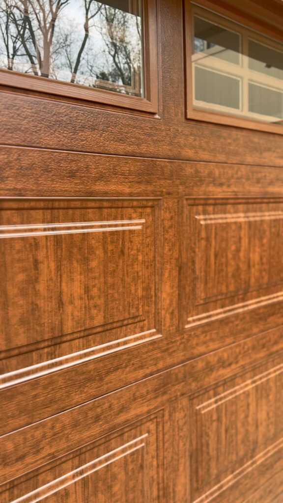
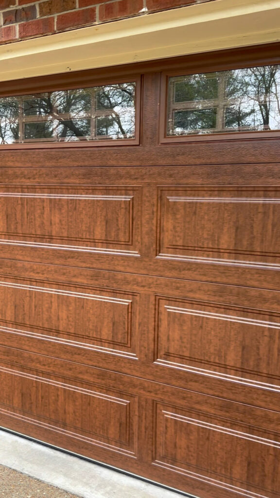
What’s left to do otherwise? Well, quite a bit. I really hope to get my trim and gutters painted by the end of 2024. I found someone doing exactly what I envisioned for my house literally right across the street, but he has yet to call me back. I’m going to keep on him and see if I can get a quote before moving onto another contractor.
If you can believe it, this photo was AFTER I landscaped. It’s time to bring in some pro’s.
After the painting, I’ll still need to do landscaping. At this point, I’m going to table that for 2025 as I want any new plants to have the best chance of surviving. It doesn’t make sense to install new landscaping only to have it trampled by painters. It also doesn’t make sense to install new landscaping right before winter.
I’ll be adding a couple more things to this category for 2025 as well. I’m in need of a new front and side door, so those will be new additions. And I also need to decide what I’m doing with my front steps. The bricks keep falling out and I’m worried someone is going to get hurt. I also really don’t like the look of them and would prefer a more traditional staircase with a black wrought iron railing. This is a new department for me so I have a bit of research to do before I let my imagination run wild!
To Do:
Laundry Room
I had every intention of tackling the laundry room this spring but a podcast stopped me in my tracks. The episode I was listening to challenged listeners to think about how they use their spaces and what they need out of them before they jump into the designing process. I sat with that thought for a while and realized my laundry room is the command center for the first floor. It’s not just a laundry room. It’s storage for cleaning supplies, wrapping paper, pool towels, a turkey cooker, tablecloths and every day tools. And quite frankly I have many more odds and ends that should be living in this space.
I’m now realizing this is going to need to be a VERY customized space where I need to max out every inch, and I need to ensure it’s functioning in the most optimal way. I’m not saying the laundry room won’t make the cut in 2024, but it may be wisest to move it to 2025.
My Office
My home office is still on the agenda for 2024, and I’m feeling really confident about checking it off the list. I’m currently in the middle of deciding if I want to do more custom molding (like a chair rail and box trim) with a wallpaper mural on top. Or if I want to just repaint and focus on collecting antique pieces that inspire me for this space. Either way, I’m so excited to tackle this space next. I’m considering doing this for the fall One Room Challenge!
The Kitchen
The kitchen. Perhaps my most exhausting thing to think about. I’ve gone round and round with what to do here. One day I’m ready to rip out all of the cabinets and start over. Another day I’m daydreaming about bumping out the house altogether. And then I consider just repainting the cabinets and getting new countertops. Last week I was daydreaming about attaching a rolling library ladder to the 90’s soffits. At least they’d be good for something then, right?
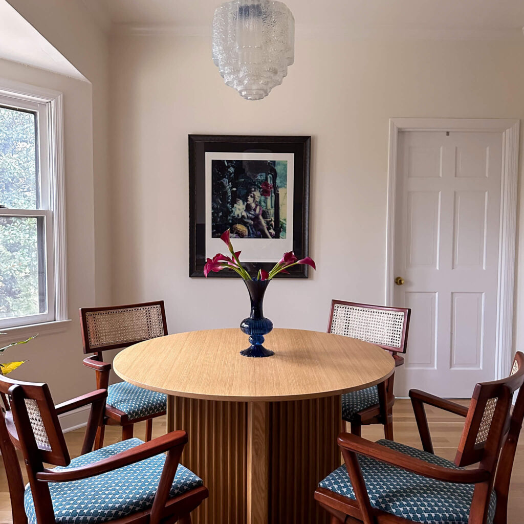
What I know for sure, is that I need to take EVERYTHING out of my cupboards, and I need to think about how I use the space, what I need out of it, and what I’m not currently getting out of it. And also, could I be doing anything better from a storage perspective? From there I hope I’ll know what to do next. I want this to be a truly intentional design, as it’s going to be the biggest renovation to date. Stay tuned to see what happens in the heart of the home!
How are your 2024 goals and projects coming along? I always find it helpful to look back and it gives me some momentum to move forward. If you haven’t checked in with yourself lately, I encourage you to give it a try!
browse more posts
read more
Have you ever had your heart set on building a charcuterie board only to be overwhelmed once you arrived at the supermarket? We’ve all been there. Today I’m going to break it down into snackable pieces for you and we’ll create a charcuterie board that’s as pleasing to the eye as it is to the palate! This how to build a charcuterie board guide will walk you through every step, from choosing the perfect serving board to curating a balanced and beautiful selection of treats. Let’s get to work!

Large Teak Serving Board | Banswara Bowl | Soapstone Bowl
Setting the Stage: The Board Itself
Your serving board is the foundation of your masterpiece. Consider what kind of mood you’re setting and how big your gathering is. One of my favorite pieces is the large teak serving board from Alice Lane Home. Paired with the banswara marble and soapstone bowls, this set up creates a stunning foundation. Choose a size that comfortably fits the amount of food you plan to serve, leaving enough space for artful arrangement.
The Accompaniments
Now, let’s talk about the supporting cast that will make your cheeses and meats shine!
- Fruits: Fresh seasonal fruits like grapes, berries, or sliced figs add pops of color and sweetness. Dried fruits like apricots, cranberries, or dates offer a delightful textural contrast.
- Nuts: Almonds, walnuts, pistachios, and Marcona almonds provide a satisfying crunch and a touch of healthy fats.
- Spreads/Dips: Jams, chutneys, and mustards add bursts of flavor and complement different cheeses. A simple honey drizzle adds a touch of elegance.
- Starches: Crackers in various shapes and textures are essential for building delicious bites. Consider rustic bread slices, breadsticks, or even thinly sliced baguette for a touch of variety.


Not pictured: red & green grapes; strawberries
The Cheese Selection
Here’s where the flavor party truly begins! Aim for a variety of textures and milk types for a well-rounded experience.
- Soft Cheeses: Think creamy Brie, decadent goat cheese, or a spreadable mascarpone.
- Semi-Soft Cheeses: Gruyere, Havarti, or Monterey Jack offer a delightful balance between smooth and firm.
- Hard Cheeses: Aged cheddar, Manchego, or Parmesan add a sharp bite and a salty contrast.

All of these cheeses are from Aldi. I also used an Aged White Cheddar and sliced it (not pictured here)
The Meat Selection
Cured meats add a savory dimension to your board. Choose 3-4 options with a mix of textures and flavors.
- Prosciutto: This thinly sliced Italian ham is a crowd-pleaser with its delicate and buttery taste.
- Salami: Explore different varieties like peppery Genoa salami, mild soppressata, or a smoky chorizo.
- Capocollo: This cured pork shoulder boasts a rich and complex flavor profile.

I opted to create a rose out of the sandwich pepperoni to add some interest to the board. You can do this by folding the slices over the rim of a drinking glass! I only ended up using one of the salami’s after this.
Putting It All Together: How To Build A Charcuterie Board
Now for the fun part – creating a visually stunning and delicious spread!
- Start with the Cheeses: Place your cheeses strategically around the board. Cut hard cheeses into wedges or slices,crumble softer ones, and arrange them in a visually interesting way.
- Fold in the Meats: Drape prosciutto slices elegantly, fan out salami slices, and arrange folded capocollo in a visually appealing manner.
- Fill the Gaps with Color and Texture: Scatter fruits, nuts, and dips throughout, leaving breathing room between elements.
- Carbs for the Win: Arrange crackers and bread slices in clusters or fan them out for easy grabbing.
- The Finishing Touches: Tuck in fresh herbs like rosemary or thyme for a touch of fragrance. Drizzle honey over cheese or fruit for a touch of sweetness.

Remember, balance is key! Aim for a variety of colors, textures, and flavors. Don’t be afraid to get creative and have fun with the arrangement. After all, the most important ingredient is the joy of sharing a delicious spread with loved ones!
Serving Ware Sources:
Other Recipes / Cooking
read more
A couple months ago when I installed picture frame molding in the dining room, I had a sneaking suspicion that it was going to be addicting. I just didn’t know how addicting! All of a sudden, I wanted it in every room in the house. However, I’m a firm believer that there can be too much of a good thing. After wrestling with the primary bedroom design for months, I decided it would be the perfect space for my next round of custom trim. With a blank canvas to work from and vaulted ceilings to consider, I had a lot of design decisions to make. Today I’m pulling the curtain back and sharing how I designed custom trim in my primary bedroom.
Defining the Plan
If I’m being honest, I went round and round designing the primary bedroom for months. At first I was going to do a mural with colored trim, doors and ceiling. But after ordering some samples it didn’t feel right. I couldn’t let go of the idea of wallpaper quite yet, so I thought about installing a chair rail and box molding on the lower third of the wall with wallpaper on the top two thirds (similar to the dining room). I mocked it up and that didn’t feel right either.
Enter the plan to add floor to ceiling molding and color drench the space. This finally felt right, and I felt less boxed in with the initial concept (pun intended). From this point, the decisions were if I wanted a chair rail to separate the boxes, or if I wanted to go with just boxes. If just boxes, then two stacked or three stacked. Seriously, there were a lot of decisions to make.
How I designed Custom Trim
To help narrow down the options, I took some still photos of the space and uploaded them into the design program Canva. I started on the wall with the windows first, placing boxes on top of each window. Seeing the larger space above the windows (which stretch to the floor) helped me realize this design makes the most sense with two boxes vs three. I think if my ceilings were 10 feet vs 9 feet, stacking three boxes would’ve worked.
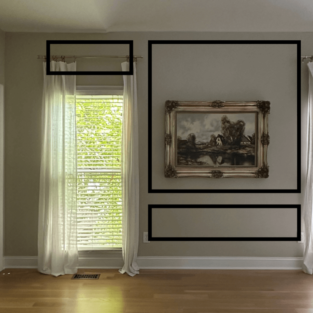
To keep things balanced, I copied the height of the boxes above the windows and mirrored that height on the bottom portion of each wall. So if there was a box above a door frame or a window, on the next windowless/doorless area, there would be the same height of box on the bottom of that wall, and then a larger box on top.
Measuring and Spacing the Custom Trim
When I designed custom trim in my dining room trim, I used a leftover piece of my white oak hardwood flooring, which measures 3.5” in width as my “spacer.” This helped simplify the measuring of the boxes because all I had to do was add this spacer in between the top, bottoms and sides of all boxes.
So for example, there is 3.5” in between the top of my baseboards and bottom of my picture frame trim. There’s 3.5” in between all boxes next to one another. There’s 3.5” between the top of the picture frame trim and the ceiling. The only exception is when you get to corners of the room, as there’s a total of 7” in between the trim. 3.5” from trim to corner, and another 3.5” from corner to the next piece of trim. It’s a bit easier to follow visually so you can see the measurements in the photos below!
The two biggest measuring decisions I had to make was on the wall behind the bed, as well as the wall behind the dresser. Starting with the bed, I decided I wanted the trim to frame both my nightstands and the new bed. So I started with the nightstands and measured wide enough to stretch just past my nightstands. Then used the 3.5” spacer, and the remaining middle space stretch just outside of the bed. I thought it would look a little odd to have the molding placed inside of the bed, and now seeing it after the fact I stand by this decision.
The wall behind my dresser was the biggest head scratcher, simply because the dresser is centered on the wall, however the door to my closet is also on this wall. So I had a box above the closet door and then an uneven amount of wall to play with. Ultimately, rather than do two equal sized boxes, I decided to mirror the narrow / long box with the wider box design as the wall behind the bed. The door to the closet serves as it’s own version of the third narrow box.
Installing the Custom Trim
For me, the profile of trim really makes or breaks it from a design perspective. I want something visually interesting, especially in such a large space like this bedroom. I found this primed trim at Home Depot and love the profile of it, and the price was on point as well!
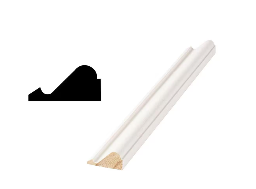
After I measured the boxes, I drew them onto the wall in pencil just to be sure. This also helped me measure twice so I could cut once. I used the same miter saw I purchased for the dining room project (this is truly a great beginner tool if you’re in the market!) and cut my trim to length.
Using my brad nailer and 2” brad nails, I nailed each piece into place, one box at a time. Even though I had lines drawn on the wall, I made sure to use both my wood spacer as well as a level just to make sure everything lined up. Sometimes the nails don’t always go all the way in, so this handy nail tap set will help you make sure they’re flush. These come in three sizes and thanks to a small bevel on the tip, they stay on the brad nail head while you tap in with your hammer.
I filled all nail holes with wood filler, caulked inside & outside each box, and then sanded until everything was smooth. I’ll admit, this is not the most exciting part of the process, but it’s so essential for achieving that high end look.
Next Steps
The next steps will be color drenching! We’ll prep the entire space by filling all nail holes in the walls and sanding to make sure everything is smooth. From there we’ll wash the walls, trim and ceiling to ensure there won’t be any dust in the paint, and then we’ll be ready to prime everything. And then it’s the fun part: color drenching the entire room! The space is 18′ x 14′ with a vaulted ceiling, so it will certainly be a process, but I know it will be worth it. Make sure you’re following along on socials to watch everything unfold!
If you’re interested in giving this project a try, here is everything I used to DIY my own. I stand by each of these products and would highly recommend them!
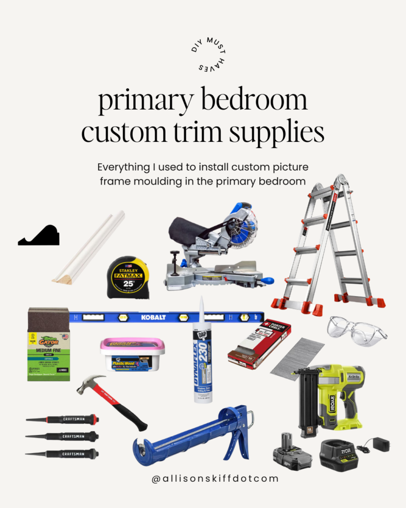
Ryobi Brad Nailer (make sure you get the battery and charger too if you don’t already have one!)
The Latest on the Blog —
read more
I’ve been itching to tackle my next big project for what feels like forever. While yes we’ve made some progress with the 2024 project list (hello back entry flip and dining room molding) there are some big spaces that have been calling my name. If you follow along in my monthly newsletter, you’re up to speed on the design block I’ve been struggling with over the past few months. I went round and round trying to land on my next design and it was so frustrating. But rather than try to push through it, I slowed down and let my intuition guide me. And it guided me right into designing…
The Primary Bedroom!
The Primary Bedroom Design Now + Then
Similar to the rest of the house, the primary bedroom has already undergone a mini-transformation from when I bought the house in 2018. I’ve removed the popcorn ceilings, ripped up the shag carpet and installed white oak hardwoods and re-painted the blue grey walls to a calming neutral (Accessible Beige – one of my favorites!). I also took down one of 11 ceiling fans and added a pink fringe chandelier. There was really no thought process there, I just liked it.
Was it ever intended to be the final design? No. But it was enough to stop my eyes from bouncing all around the room, and served as a band-aid while I tended to some other larger projects like the cozy tv room, dining room and the rest of the primary suite (closet and bathroom).
The Primary Bedroom 2.0
So what does the next chapter look like for this space? Calming. Relaxing. Retreat like. And a touch of luxe. After installing picture frame molding in the dining room, I know I want to do the same in this space. I’m working through exactly what the boxes will look like, but I’ve started sketching and am so excited about how it’s going to look in this large room.
And we’re certainly going to color drench. I’ve been bookmarking some warm dark smoky greens and can’t wait to buy some samples to start painting swatches on the walls. Right now Vintage Vogue by Benjamin Moore is my front runner, however I have a sample booklet on the way from Little Greene which I’m very excited to review.
Furniture wise it’s a bit of a mixed bag. I’ve had a saga in this room from the get go. To make a long story short, I rushed a decision out of desperation and ordered a bed that I’ve hated since it arrived. As painful as it is to correct a mistake like this from a financial perspective, it’s the right choice. I ordered the Finnea Bed from Anthropolgie and know that it’s going to be absolutely perfect in this room! The feeling I had after I clicked the “purchase” button was confirmation this was the right decision.

Shop the Primary Bedroom mood board
Looking Forward…
Rather than fully flush out the entire design, I’m going to focus on these 3 core elements and allow the design to guide me as I work. As I visit estate sales over the next several weeks, I hope to source new nightstands, lamps (I’m dreaming of marble lamps against smoky green walls), a vintage rug and some artwork. I’ll fill in the rest of the design with draperies and bedding based on what colors and patterns I need (when we get to that stage).
One thing I’m still working through is the plan for my dresser. I purchased my current dresser off Etsy over a decade ago and love the furniture piece itself, but the color is going to need to change. Part of me is considering painting it the same color as the walls & trim, but in a high gloss sheen. Add a little Rub ‘n’ Buff to the handles and I think it would really pop in the room!
For now, I’m going to focus on getting the molding ironed out and take this project one step at a time. Be sure you’re following along on socials to catch all the action. It’s never a dull moment around here! I can’t wait to share the journey with you and watch this space transform into the charming retreat I know it can be.
browse more posts
read more
Thinking about hitting a local estate sale? I absolutely recommend it! Estate sales are a fantastic way to find upscale pieces at bargain prices, and they offer a thrilling sense of adventure. Whether it’s your first time or you’re a regular on the circuit, knowing what to bring to an estate sale can make or break your experience.
After you’ve identified which estate sales you’re going to go to, you’ll want to make sure you’re prepped for a successful day. Here are my top recommendations on what to have handy before heading out the door.
Tape Measure
If you only remember one thing I highly recommend a small tape measure. Depending on the scale of the house you’re going to, things can look much larger or smaller in different environments, so sometimes eyeballing can be tricky.

Bungee Cords
In the market for a rug or furniture? Bringing along a couple bungee cords will help secure furniture and/or keep large rugs rolled up tightly for easier transport.
Blankets
Blankets are excellent for placing in between and stacking pieces of artwork, mirrors or even wrapping around lamps. I highly recommend having at least 2-3 on hand for any sale you’re going to visit.

Newspapers / Boxes / Reusable bags
You’ll quickly learn every estate sale is very different. I’ve been to some which have provided packing paper for fragile items, but none of them have provided a way to carry your items. You are truly on your own! If you’re eyeing smaller items (especially glassware) it’s wise to bring your own boxes and packing paper to keep items secure.
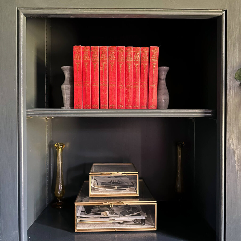
Screwdrivers
A set of screw drivers isn’t the worst idea, especially if you have a small car. Recently I picked up a long entryway bench and when I flipped it over to lift it into my car I noticed the legs screwed into the top. If I would’ve brought a screwdriver with me the loading process would have been so much easier with my 2 door car.
Disposable Gloves
Estate sale companies do not clean the houses before the sales. Often times houses are dusty and sometimes even dirty. If you think you might be buying a rug, expect it to be quite dirty, as most often the rugs are in the middle of high traffic areas and everyone at the estate sale is walking on them! Same goes for any garage or outdoor pieces. Pack a few safety gloves just in case you find yourself in this position.

Handheld vacuum
If you already have a small handheld vacuum it may be worth bringing for the same reasons I mention above. Especially if you don’t have a truck or other large vehicle.
Your measurements
One of the most important things! Take measurements of all your spaces. Empty walls you want artwork for. The height of your ceilings and width of your windows. The size of your rooms for both rugs and furniture. Again, the scale of other people’s homes can skew the perception of the size of the pieces. Keep your own measurements on your Notes app in your iPhone for easy reference.

Photos of your home
This may sound silly because of course we know our own homes, but it’s so helpful to have snapshots of each space for easy reference. If you’re on the fence about a certain item based on color or style, having a photo of your own space to quickly reference could be the deciding factor on whether you buy it or leave it!
Cash / check / credit card
Most estate sale listings will note whether they have particular payment preferences. I like to have cash, checks and credit cards on hand just in case. Some sales also take venmo which is very easy (but sometimes the wi-fi doesn’t work at the house). Keep all payment methods handy for a quick check out (and sometimes you can negotiate further with cash).

Part of the fun of estate sales is the sense of adventure and the thrill of the hunt! Going in with a little preparation and the items listed above will make it easier on yourself from a logistical standpoint, and you can truly enjoy the experience.
read more
Summer is right around the corner and for many of us that means vacations, busy schedules and longer days. One of my favorite grab-and-go snacks to have on hand are these no bake energy ball bites. With only 5 ingredients and no oven time, they’re a breeze to put together and make for a healthy (and easy) on-the-go snack. Save this recipe to indulge your sweet tooth without sabotaging your diet!
Ingredients
(makes 12 servings)
1 Cup of rolled oats
½ Cup flax meal
2/3 Cup almond butter
5 Tablespoons maple syrup
½ Cup dark chocolate chips
Directions
- Line baking sheet with parchment paper
- Add all ingredients to bowl and mix with a spoon
- Roll 12 equal sized balls and place on baking sheet
- Refrigerate 2-4 hours or until firm

You can store these no bake energy balls in a sealed container for up to a week. I like to double the recipe and freeze half for future use. This recipe is gluten free and has minimum added sugar (save the dark chocolate chips).

Nutrition Facts (per 1 serving):
Calories: 206
Total Fat: 12.7g
Total Carbohydrates 21g
Protein 5.9g
No Bake Energy Ball Variations
There are many ways to customize this snack and it all depends on your taste. Some ideas to get you started…
Spice it up: adding spices like cinnamon, pumpkin pie spice or even all-spice could add a seasonal flare to this snack.
Even easier prep: not into rolling individual balls? Press the batter into a lined 8×8 pan, chill and then cut into bars. If you have a pan with a lid, then you can store as is.
Play with flavor: in addition to spices you can substitute other nut butters for the almond butter. You can even add in toasted coconut, dried cranberries, sunflower seeds or another chocolate variation. Sea salt on top never hurt either!
Explore My Other Recipes:
Healthy Corn, Tomato & Avocado Salad
The Latest on the Blog —
read more
Have you ever bumped into an object and instantly craved to know its history, find similar styles, or even translate that fancy French label on the back? Well, fret no more! Google Lens is here to be your visual search companion, a digital magnifying glass that unlocks a world of information right through your phone’s camera.
Whether you’re a seasoned thrifter hunting for vintage gems, an interior design enthusiast seeking inspiration, or simply someone curious about the world around you, Google Lens can be a game-changer. In this comprehensive guide, we’ll delve into everything you need to know to become a Google Lens pro!
Unveiling the Power: What Can Google Lens Do?
Google Lens boasts a range of impressive functionalities, making it a versatile tool for various situations. Here are some of its key features:
- Object Recognition: Point your camera at an object, and Lens will identify it. This can be anything from a specific plant species to a type of furniture or a historical landmark. It even deciphers text, so no more struggling with foreign language labels!
- Similar Product Search: Found a dress you love on someone else or spotted a stunning lamp in a magazine? Capture it with Lens, and it will scour the web for similar styles you can purchase online.
- Text Extraction and Translation: Need to copy text from a physical document, business card, or even a poster in a foreign language? Lens can extract the text and allow you to copy it or translate it to your preferred language.
- Shopping Assistant: See an item you want to buy but can’t find any information about it? Lens can identify the product and provide links to online retailers where you can purchase it.
- Identify Landmarks and Artwork: Traveling or simply curious about a building or piece of art? Lens can provide historical information, reviews, and other relevant details.
Accessing Google Lens: There’s More Than One Way!
The good news is that Google Lens is readily available on most modern devices. Here’s how to access it depending on your setup:
- The Dedicated Google Lens App: This is the most straightforward option. Download the free “Google Lens” app from the App Store (for iPhone) or Google Play Store (for Android). Once installed, open the app and point your camera at the object you want to identify.
- The Camera Icon within the Google App: No matter what type of smartphone you have, you likely have the google app installed on it. Open the app and you’ll see a search bar, and then a microphone icon and a camera icon to the right of it. The camera icon is Google Lens. This is how I personally use Google Lens.
- Integration with Your Camera App: Many Android phones (including some Samsung models) have Google Lens built directly into the camera app. Look for the Lens icon (it might be a magnifying glass symbol or say “Lens” next to it). The exact location may vary depending on your phone model.
Using Google Lens: Mastering the Visual Search
Once you’ve accessed Google Lens, using it is delightfully simple! We’ll use a real example of a horse I found at an Estate Sale that was priced at $450. I ended up getting it for $70 because of Google Lens!

Here’s a step-by-step guide:
Point and Focus: Open the Google Lens app or activate the Lens feature in your camera app. Aim your camera at the object you want to identify or get information about. A white box will appear around the detected item for better focus.


Capture or Select: If using the dedicated app, you can either tap the shutter button to capture an image or use a photo already saved on your device by tapping the gallery icon. If using Lens in your camera app, capturing the image might happen automatically.

Analyze and Explore: Google Lens will analyze the image and display relevant information on your screen. This could include the object’s name, a brief description, links to similar products, translated text, historical details (for landmarks or artwork), or even solutions to math problems (depending on the complexity).


Advanced Tips and Tricks: Unleashing the Full Potential
Now that you’ve grasped the basics, here are some additional tips to maximize your Google Lens experience:
- Multitasking with Multiple Objects: Google Lens can often detect and analyze multiple objects within a single image frame. Simply tap on the specific object you’re interested in to get detailed information.
- Offline Mode (Limited Functionality): While an internet connection is ideal for optimal results, Google Lens can recognize some objects and translate text even when offline. However, the range of functionalities will be limited.
- Context Matters: For optimal results, try to capture clear and well-lit images. The more context you provide within the frame (like including the brand logo or surrounding details), the better Lens can understand and analyze the object.
Beyond the Basics: Google Lens for Inspiration and Everyday Life
Here are some creative ways to integrate Google Lens into your daily routine and fuel your design inspiration:
- Interior Design Inspiration: Spotted a gorgeous living room layout in a magazine? Snap a picture and use Lens to identify furniture styles, lighting fixtures, or even paint colors. You can then use this information to recreate the look in your own home.
- Thrifting Like a Pro: Stumbled upon a vintage treasure at a flea market but unsure of its value? Use Lens to research its origin and identify similar pieces currently for sale. This helps you negotiate a fair price and score amazing deals.
- DIY Projects and Upcycling: Have an old dresser that needs a refresh? Take a picture with Lens and find inspiration for paint colors, hardware updates, or even decoupage ideas. Trying to sell old clothes or home goods? Find similar items and corresponding pricing.
- Travel Companion: Visiting a new city and curious about a historical building? Aim your camera at it, and Lens can provide historical context, reviews, and opening hours.
- Learning on the Go: Spotted an interesting plant species on your hike? Use Lens to identify it and learn about its care needs.
The Future of Google Lens: A World of Possibilities
Google Lens is constantly evolving, and with advancements in artificial intelligence, its capabilities are expected to expand further. Imagine using Lens to translate menus in real-time, identify ingredients in a recipe, or even get detailed instructions on how to repair something around the house – all through the magic of your phone’s camera.

So, the next time you encounter something intriguing in the real world, don’t just walk by. Whip out your phone, activate Google Lens, and unlock a world of information and inspiration. With this powerful tool at your fingertips, the possibilities are truly endless!
browse more posts
read more
Although we’re in the month of April, I feel like it’s Christmas because I’m THAT excited to share the reveal of the DIY picture frame molding in the dining room. This is a project that is on the 2024 project list but has also been on my mind since I moved into this house. I knew it would be perfect in a formal space like the dining room: it gives it that extra wow factor in my opinion. Today I’m sharing the reveal but I’m also breaking this project down with a step-by-step outline of how to add DIY picture frame molding.
So before we dive in, why add picture frame molding? This decorative trim adds architectural interest and instant sophistication to any room. It’s like putting your walls in a fancy frame. It’s high impact and a relatively friendly DIY that looks impressive.
Finding Your Vision
Before we dive into the nitty-gritty, let’s chat about the look you’re going for. Picture frame molding comes in various styles, from classic chair rails to more modern profiles. Start a pintrest board (here’s mine) for inspiration and get to pinning styles that make you pause. It will help keep you focused later on in the project when you may be facing decision fatigue. For my dining room, I was lucky to already have a chair rail in place and the top half wallpapered. That left me with minimal decisions to make for the actual boxes.
When choosing the molding size, consider the scale of your room. Wider molding makes a bolder statement and works well in larger spaces, while thinner profiles are perfect for cozy nooks. For this grand room I wanted something a bit wider and with some visual interest. I found a thicker piece of trim that had a pretty bevel to it, and that’s what I ultimately decided on. Also consider if you think you may continue this to other rooms. For me, I anticipate doing just that, so I’ll continue this particular style when the time comes.
Taking Measurements & Planning
Now, let’s get down to business! You’ll need to measure your walls to determine the layout and amount of molding needed. Before you get overwhelmed by this step, I’ll let you in on a little secret. The measurement that matters the most is the distance between the top of your boxes, bottom of your boxes and sides of your boxes. You want that to be consistent throughout the entire room.
A time saving measuring method I utilized was finding a “spacer” to help draw the boxes on the walls. I used a spare piece of flooring which was 3.5″ wide and that was my distance around all sides of each box. This pre-determined width helps create those perfectly proportioned “boxes” on your wall.
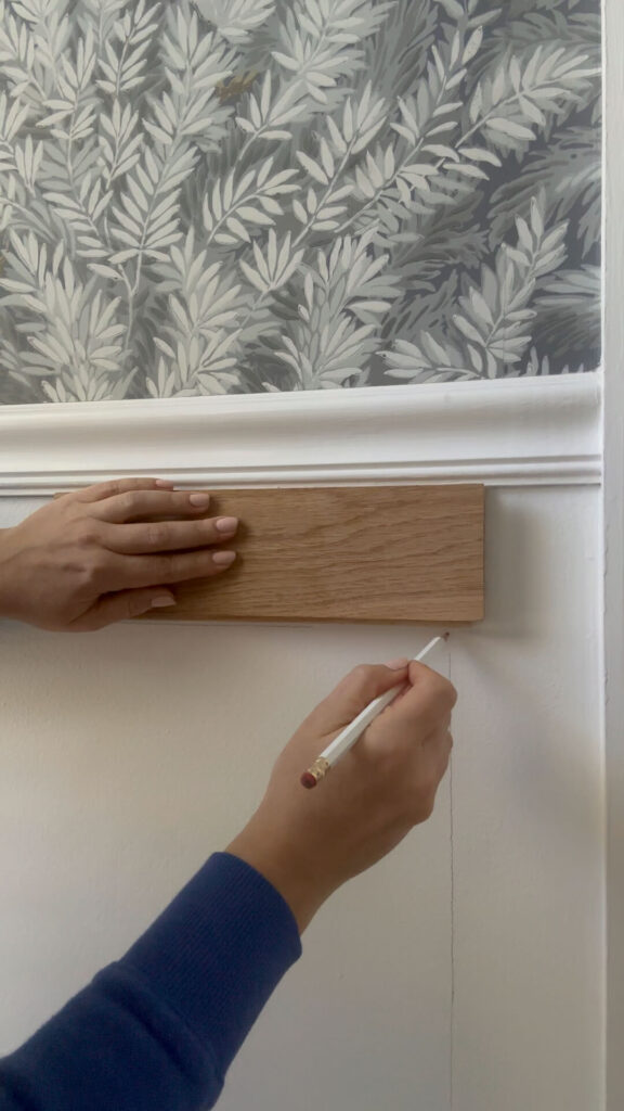
Drawing it Out:
Using your spacer of choice, grab a pencil and level to lightly sketch out the molding layout on your wall. This gives you a visual representation and helps ensure everything is nice and balanced. To get visual you can even put painters tape up first to visualize the thickness of the molding on your walls. I opted to skip this step because I felt confident and I’m also a bit impatient!
Measure the lines on your walls and add anywhere from 10-15% more to the linear total. This is how much you’ll need to buy from the hardware store.
Cutting with Confidence:
What you use to cut your trim will depend on the type of molding you select. An MDF style molding will work great with miter shears (I have these ones), and you won’t need any power tools. It will be as easy as using scissors!
For me, the molding I chose was oak which is a thicker cut of wood. Because of that, I needed to purchase a miter saw to do the job accurately. This trusty tool makes precise angled cuts for those crisp corners. Double-check your measurements and practice on scrap wood before tackling the actual molding.
Mock Up Magic
Here’s the magic trick that saves frustration: using painter’s tape, tape the cut molding pieces onto the wall to mimic the final design. This lets you visualize the layout, adjust spacing if needed, and ensure everything looks stellar before permanently attaching anything.
Nail It!
Time to secure the molding to the wall. A brad nailer is your best friend here. It uses tiny nails that disappear easily, leaving a clean finish. While some folks opt to add wood glue to their molding for an extra hold, I found the brad nails worked just fine. I used 2” brad nails and this Ryobi brad nailer was incredibly beginner friendly! Plus it’s battery operated!
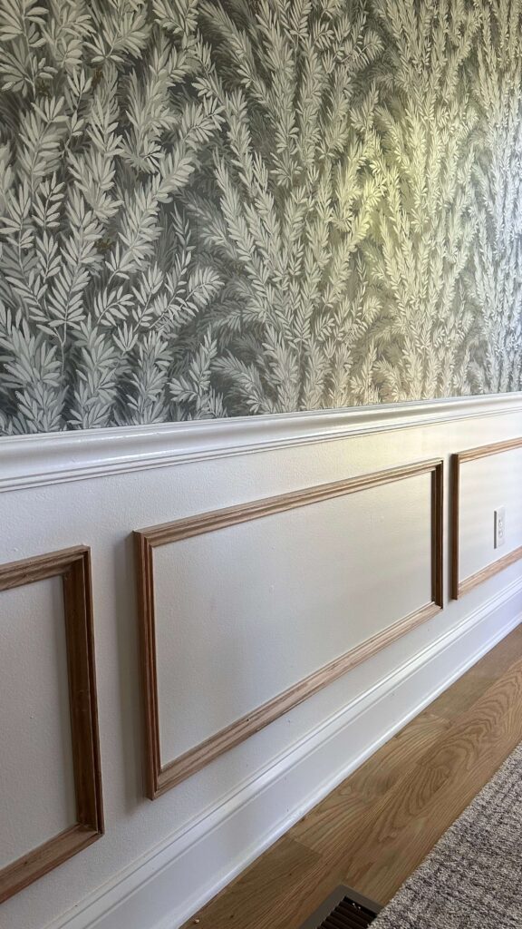
Filling & Sealing:
Once the molding is in place, it’s time to tackle those tiny nail holes. Use a good quality caulk to fill the holes and create a smooth surface. Let it dry completely, then apply a light coat of spackle to camouflage any imperfections. Sand everything smooth once dry (I made the mistake of not sanding on one piece – make sure you don’t skip this step!). You’ll also want to run a bead of caulk along all edges of the molding for a seamless look.
Prime Time
Now for the painting prep! Apply a coat of primer to the molding and the wall where it meets the molding. This ensures even paint application and helps prevent the molding from soaking up all the paint.
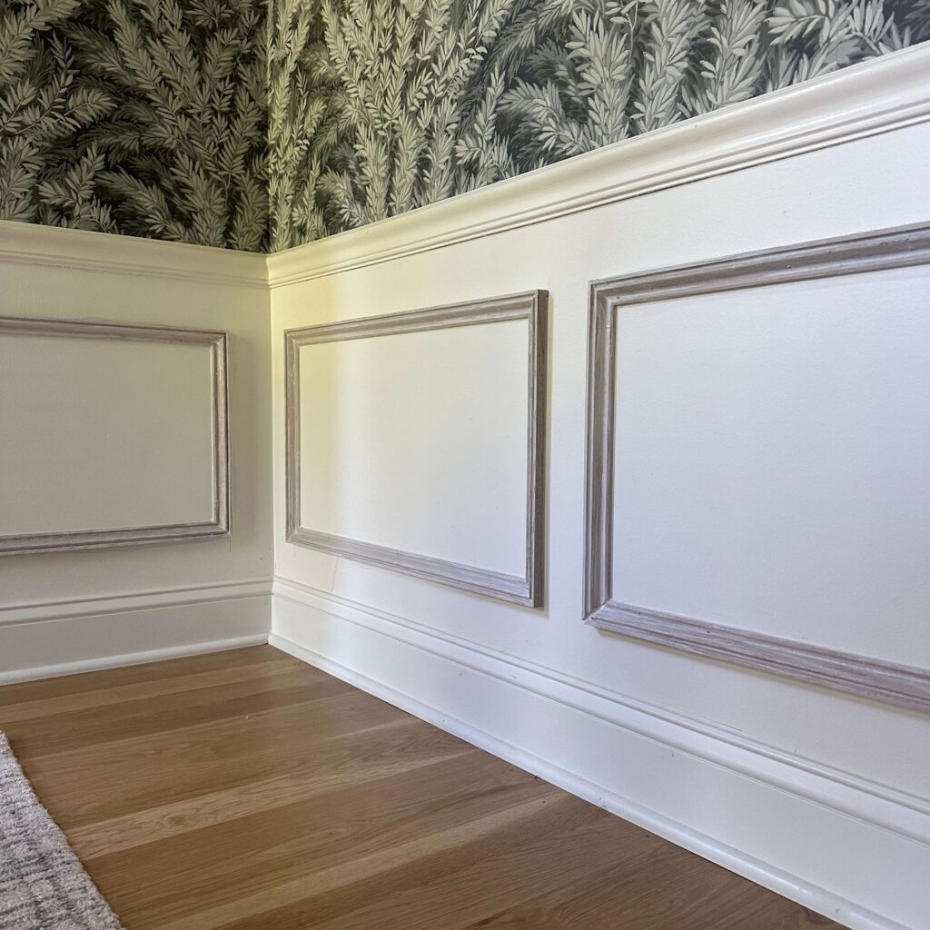
Painting Perfection
Finally, the moment you’ve been waiting for: painting! Choose a color that complements your space – either match the wall color for a subtle look or go bold with a contrasting shade. For my room, I chose to use the same white (Du Jour by Valspar) as I have on the walls. I wanted the wallpaper to still have its moment in the overall space, and wanted a seamless look on the bottom half. Because I was working with raw wood, I used three coats on the molding for a nice, even finish.
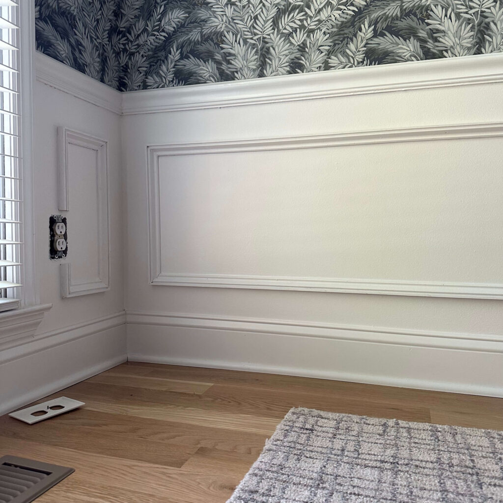
Picture Perfect DIY Picture Frame Molding
Before I started, I had the sneaking suspicion picture frame molding could be addicting, and I’m here to tell you it is. It instantly elevates the space and adds a touch of elegance and architectural detail to the room. Given my house is a traditional style home, I think it feels timeless and classic.
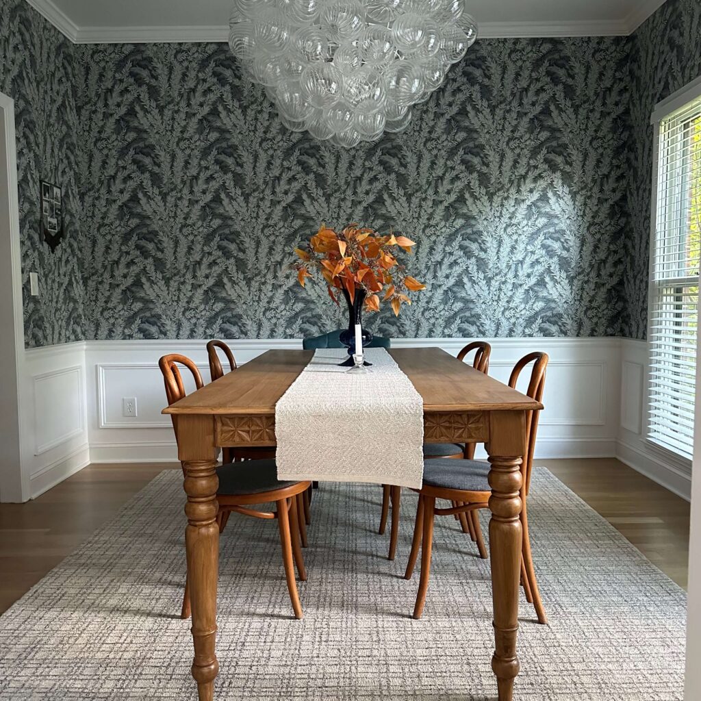
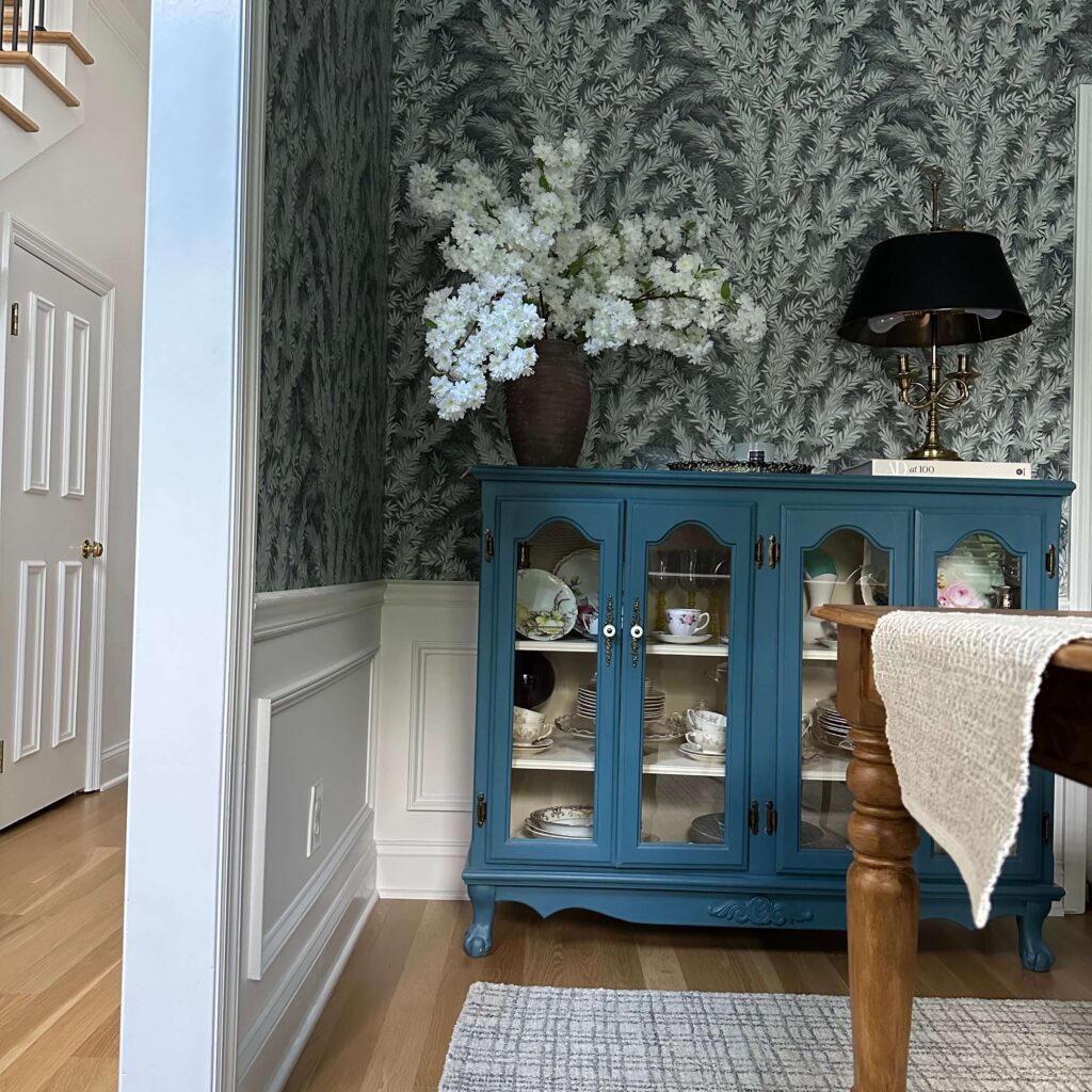
This project was one where I advanced some of my skills. I’ve never done any type of woodworking, and never operated a power tool outside of a drill, so I’m having quite a proud moment right now. I have plans to add a chair rail and molding in the primary bedroom later this year (with some fun wallpaper on top) as well as beadboard in the laundry room, so I know this is just the beginning!
What do you think? Do you have picture frame molding in your home? Would you try this project? Let me know if you have any questions!
read more
Have you ever used Rub N Buff? If you’re not familiar, it’s a metallic paint used for arts, crafts and restoration. It can be used on anything from picture frames to furniture, and can help breathe new life into an old piece or customize something that’s not quite to your liking. The Rub N Buff collection comes in a variety of colors which is great but I’ll admit, it can be a bit overwhelming. Today I’m sharing an overview of the Rub N Buff gold collection & color guide which will hopefully help you narrow down your options.
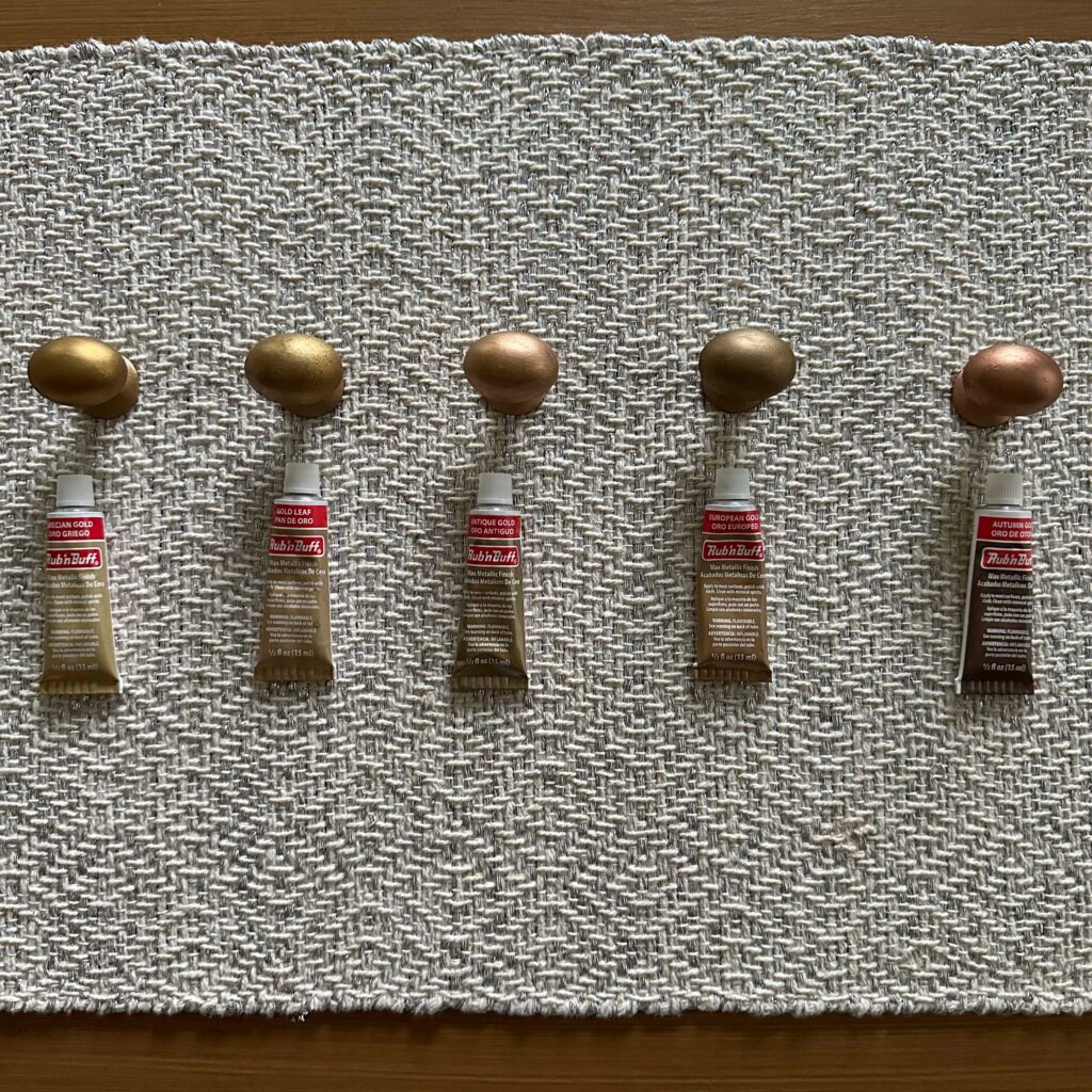
The Rub N Buff Gold Collection
Antique Gold: The Timeless Touch
Let’s begin with the ever-popular Antique Gold. This warm, inviting hue is a fantastic choice for achieving that classic, timeworn look on furniture or frames. Think of it as an aged gold, perfect for projects with a touch of vintage charm.
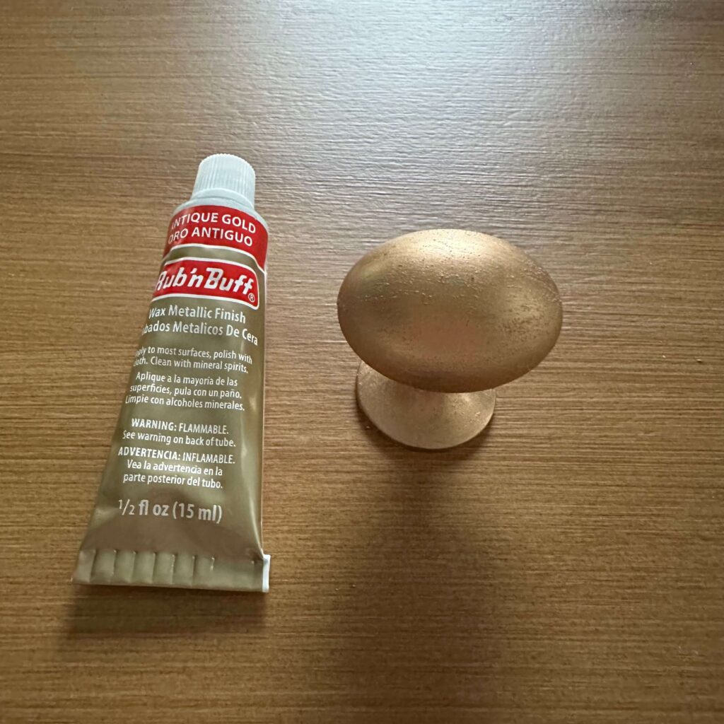
Autumn Gold: A Rich, Earthy Shimmer
Craving something a little more unexpected? Autumn Gold might be your perfect match. This radiant shade leans towards a coppery warmth, with hints of red peeking through the golden sheen. It’s a beautiful way to introduce warmth and depth into your design scheme. Imagine it accenting a dark wood table or adding a touch of fiery elegance to a picture frame.
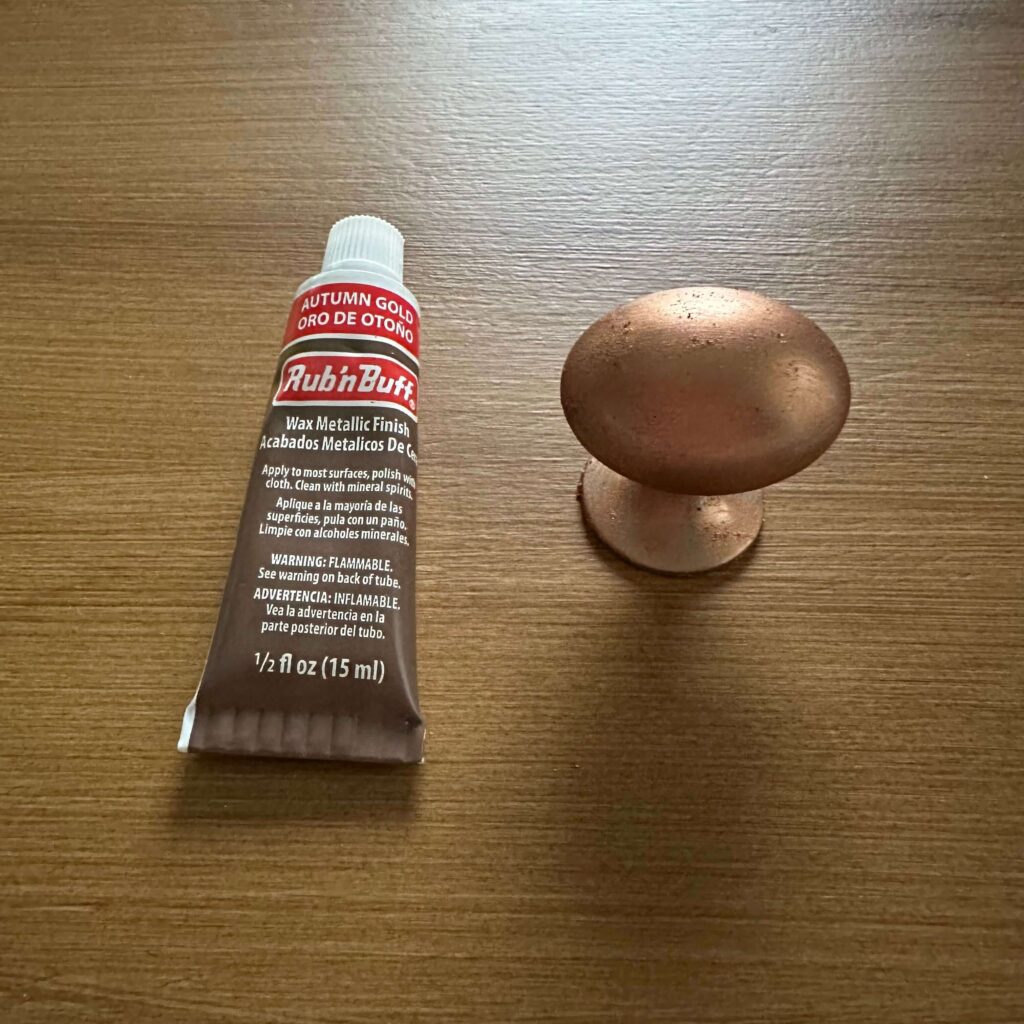
European Gold: A Subtle Sophistication
If understated luxury is your aesthetic, then European Gold is calling your name. This cool-toned gold boasts a subtle champagne nuance, making it ideal for projects where you want a hint of gold without overwhelming shine. It pairs exceptionally well with lighter colors and clean lines, lending a touch of Parisian chic to your space.
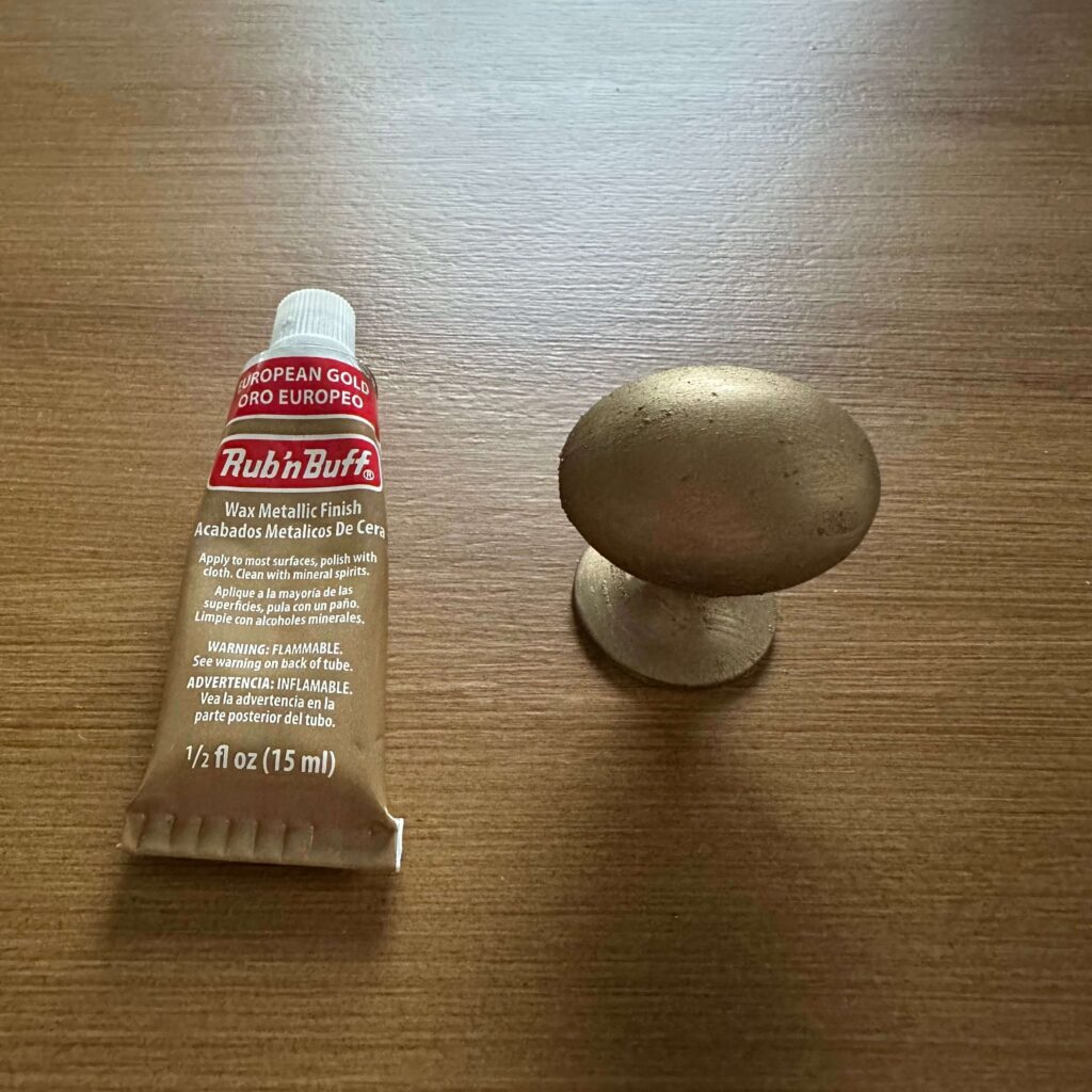
Gold Leaf: The Classic Gleam
For those who love the radiance of pure gold, look no further than Gold Leaf. This bright and bold shade offers a rich, brassy gleam that instantly elevates any surface. It’s ideal for adding a touch of drama to a room or highlighting decorative details on furniture or millwork.
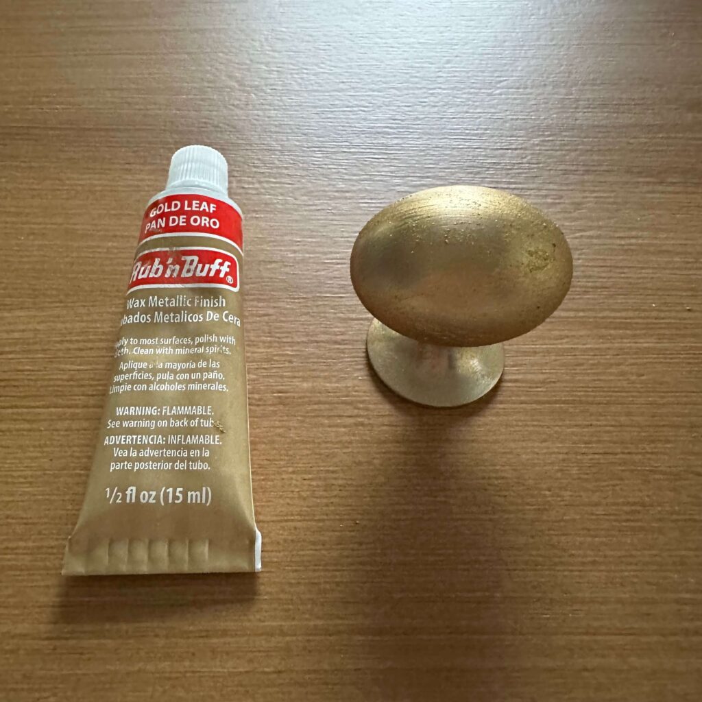
Grecian Gold: The Dark and Mysterious
Grecian Gold is a deep, bronzy gold with a hint of warmth. It would work wonders on dramatic furniture pieces or as an accent on picture frames or decorative objects.
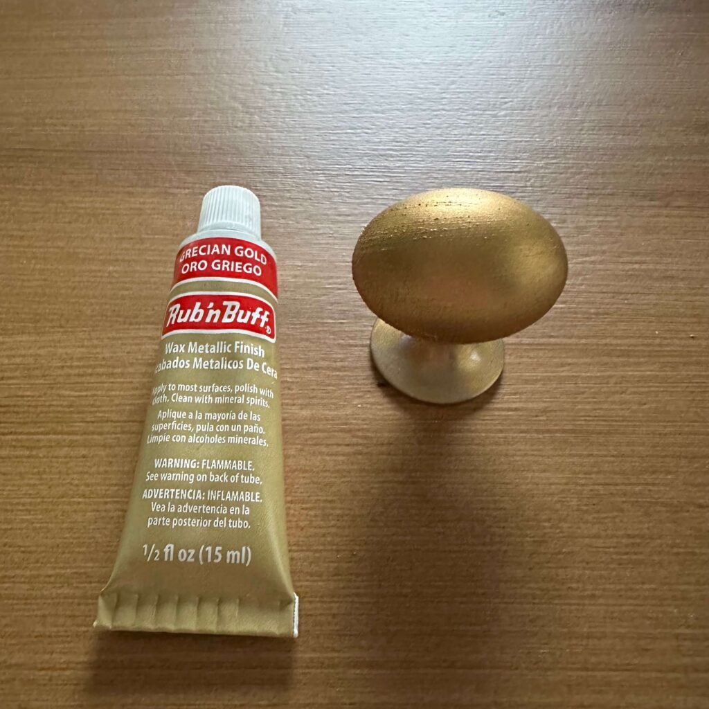
Choosing Your Perfect Rub N Buff Gold
So, which Rub N Buff gold is right for you? Consider the overall tone of your space and the feeling you want to evoke. Remember, with Rub N Buff, a little goes a long way. You can always build up the intensity for a more dramatic effect. Don’t be afraid to experiment on a hidden surface before committing to your final design. If you’re still not sure, you can buy the Rub N Buff Gold Sampler Pack.
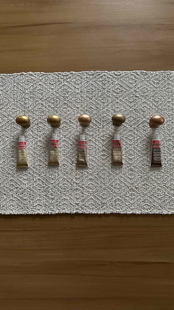
Pro Tip: Rub N Buff can be buffed to a high shine or left more muted for a softer effect. This allows you to further customize the final look to suit your taste.
With its easy application and wide range of colors, Rub N Buff golds open up a world of design possibilities. So, don’t be afraid to test out different colors and even mix & match!
Rub N Buff Gold In My House
So why have I shared all this? Well recently I was on the hunt for a little side table to put next to my clawfoot tub in the primary bathroom. The Visual Comfort Martini Table I really wanted was a bit out of my price range at $479. However I was determined to recreate the look for less and found a similar option at Home Depot for only $60. The only downside was it was black instead of brass (the brass was indefinitely sold out).
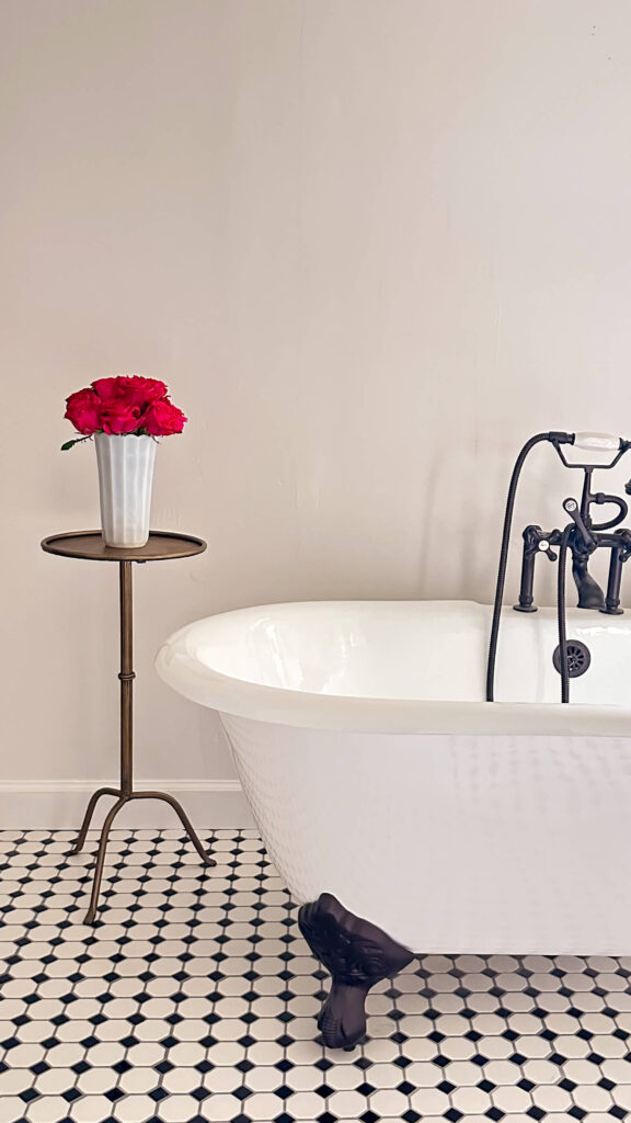
Being unsure about which Rub N Buff Gold to use on my own table, I purchased the sampler kit and tested out all the options. In the end I went with European Gold with Gold Leaf lightly rubbed on top. I was able to achieve the look for less and saved $400 thanks to Rub N Buff. What do you think? Would you try this?
The Latest on the Blog —
read more
Planning a DIY project or a remodel? When it comes to interior painting these expert painting hacks, tips & tricks will help save you time, money, paint faster & get better results. Bookmark this page and thank me later!
Expert Painting Hack #1: Baseboards
If your baseboards don’t have quarter round, you should have a slight gap in between the baseboards and your floors. Rather than tape off your flooring, you can save time by sliding a piece of acetate paper in between the baseboards and floors. Slide it with the paint brush as you paint for a smooth, no mess finish!
Expert Painting Hack #2: Avoid Cleaning Your Paint Brush
Planning on applying more than one coat of paint? If so, you can save time with clean up by wrapping your paint brush with plastic wrap. Leave a little bit of paint on the brush to keep it moist. Wrap paint brush in plastic wrap. Wrap an additional piece of plastic wrap around the base where the handle meets the body. The goal is to keep air out, which will prevent the paint from hardening. You can leave brushes wrapped for 3-5 days.
Painting Tip #3: Stretch the Life of Your Paint Rollers
If you’re painting more than one coat of paint on the walls or ceiling, you’re likely using a paint roller. You should plan on waiting at least 12 hours for your paint to dry to avoid any peeling, but you don’t necessarily need to use a new roller for each coat. Instead, wrap your paint roller in a plastic bag and tie off the end to prevent air. I usually like to wrap mine in 2 bags just to be safe.
Painting Trick #4: Skip Washing the Paint Tray
Same as your paint brush and paint roller, if you’re painting more than one coat of paint and are using a roller brush and paint tray, you can avoid clean up here too. Take a garbage bag and place paint tray inside. Twist and tie the garbage bag to prevent air from getting inside.
Expert Painting Hack #5: Get Crisp Paint Lines
Are you painting two different colors? Try this hack to get the crisp paint lines. Apply frog tape as you normally would and press firmly using a putty knife to seal off. Now before you paint the new color, you’re going to paint the base color ON TOP of the frog tape. This is going to completely seal the tape. Allow to dry and then paint your new color on top. Remove painters tape while the top coat is still wet. For a longer tutorial you can see a full blog post on this method here.

Have you tried any of these painting hacks, tips & tricks? Are there any that I missed? Sound off in the comment section below!
browse more posts
read more
Today I’m thrilled to share what is quite possibly my most favorite space in my house: my walk-in closet! Or as I like to refer to it: my dressing room. This is what Carrie Bradshaw’s dreams are made of. A closet reminiscent of Cher’s closet on Clueless (minus the computer but maybe I’ll work on that!). It’s my Barbie dream closet. And my favorite thing about this space? I created it. Read on for the full story.

The Before: A Surprise Room
When I first toured this house, this room was a complete surprise. Left adjacent to the main entryway, the space was set up as a guest room. I believe that it was originally designed to be a home office, however with an extra bedroom upstairs, I had already decided on making my home office on the second level.
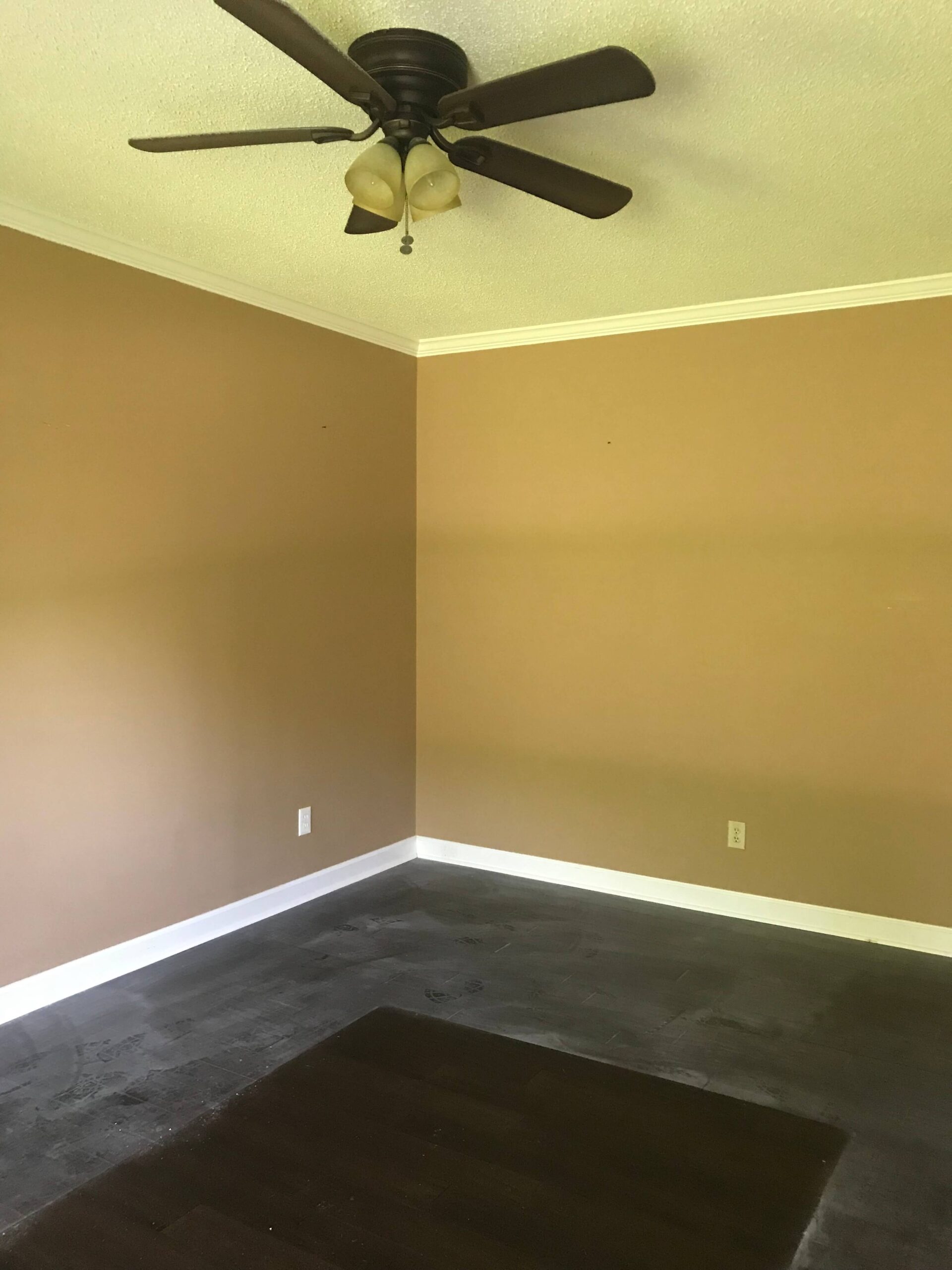
This room was not in the listing and was a complete surprise the first time I toured the house.
After touring the house further, I realized this “surprise room” backed up to the primary bedroom. I also realized the original master closet backed up to the primary bathroom. My wheels started turning immediately. I could combine the original closet and bathroom to create one giant bathroom. And I could turn this “surprise room” into my own private dressing room experience. I was sold.
Walk-In Closet Design
If you followed along with my primary bathroom renovation, you’ll remember this was the first thing I did upon moving in. It was truly inside of 30 days I had the bathroom completely gutted and renovated. During that time, I had the original doorway to the “surprise room” sealed off and a new doorway to my primary bedroom created. We repurposed the original trim and door to save on costs.
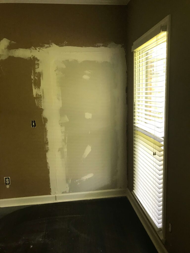
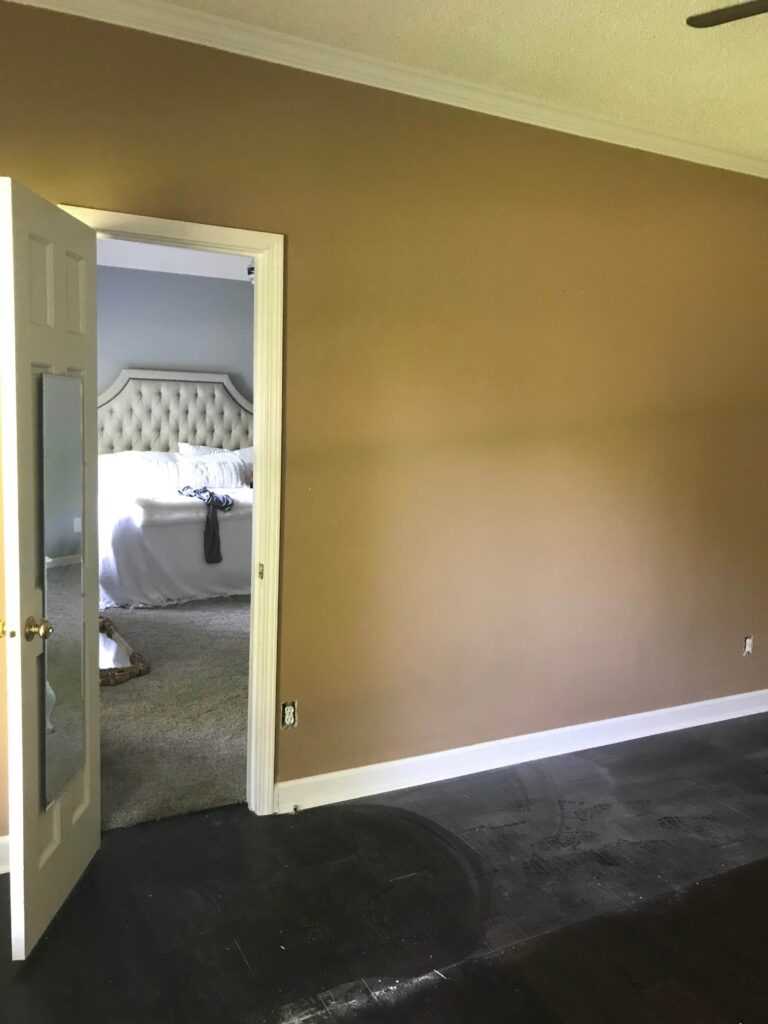
Sealing up the old doorway (adjacent to the entry) and creating a new doorway to the primary bedroom.
Having used California Closets for several projects at my previous house, I called on them again for the design. Being this was such a large space and I had just spent a healthy amount of money on the primary bathroom renovation, I was focused on the functionality of the design more than the bells and whistles.
The designer was really pushing for an island in the center of the room, but quite honestly I love having this space open for a clean walk way. You can see a couple of my design renderings I was reviewing below.

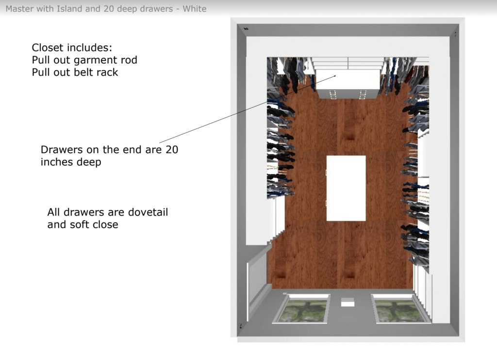
The Reveal Day
After California Closets had installed everything, I remember tiptoeing into my walk-in closet for the first time. I gasped. I truly could not believe it was mine. Never in my wildest dreams would I have thought I would own something as magical as this space.


During the design process I opted for a more open storage concept vs drawers and cupboards. It’s a personal preference but I love being able to SEE all my pieces. It makes deciding on an outfit each day such a fun treat.
The Upgrades I Chose and the Ones I Left Behind
The small upgrades I added were a valet rod which I highly recommend for many reasons. A sliding hook rod for belts and scarves made so much sense for smart storage (see similar here). Soft close drawers on the back wall are plenty deep for things like pajamas, workout clothes and under garments. And last but certainly not least are the plastic shelf dividers. These might look unnecessary but they have been so helpful for displaying and storing my handbags. I had some of these from the previous house, but you can buy them on Amazon (linked here – no need to pay more at a closet company).
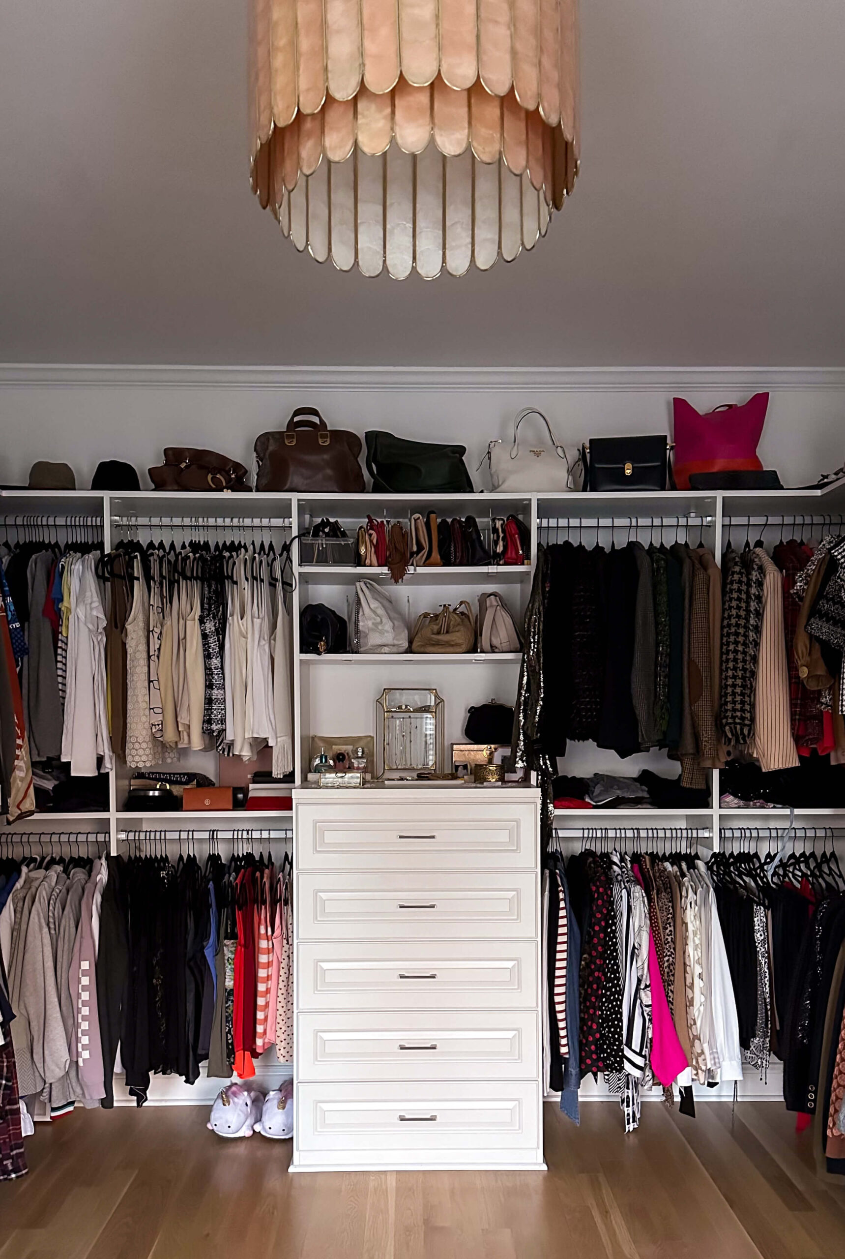
The upgrades I passed on were the island as well as a hidden hamper. I couldn’t see taking up valuable real estate for either of these. I also opted for flat shoe shelves vs angled display shelves to save on costs.
My Walk-In Closet 6 years Later
This June will mark 6 years since I designed this room and I love that there’s still so much opportunity to add some personality. There are plenty of other spaces in the house to work on, but when I want my imagination to run wild, I let it drift into the closet and daydream about wallpapered ceilings, painted shelving and vintage rugs.
Sources:
Closet Design: California Closets
read more
For an interior designer, the thrill of discovering a unique antique piece adds layers of history and character to any space. But navigating the world of antiques can be overwhelming, especially for newcomers. I should know: I’ve had some fantastic wins (specifically with my dining chairs) and I’ve also walked out empty handed. Today, we’ll delve into my personal tips for successful antiquing adventures, ensuring you return home with treasures, not regrets.
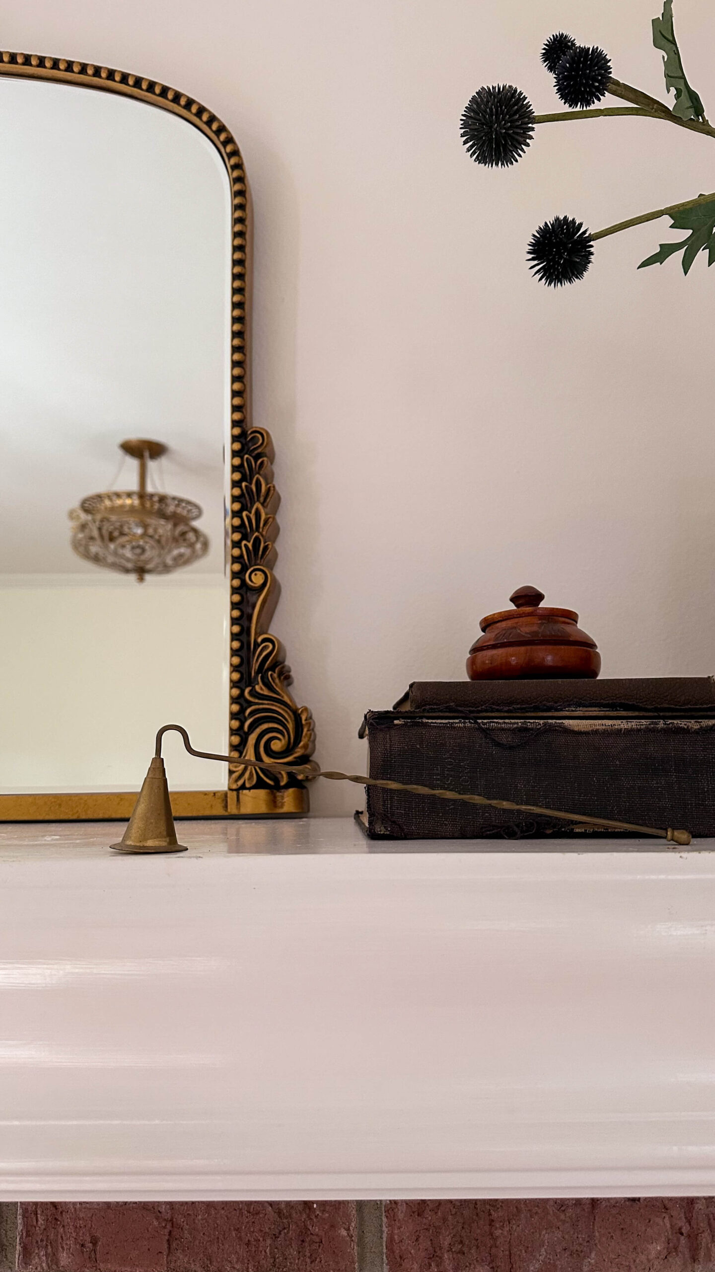
1. Know Your Objective:
Before embarking on your quest, define your goals. Are you seeking a statement piece for your living room, or are you on the hunt for smaller accents? Having a clear vision will guide you towards the right shops and prevent impulse purchases.
2. Get Your Measurements Straight:
In the event you’re hunting for a specific piece, you may be confined to particular measurements. Keep a running list on the notes app in your phone for these items. For example, I was looking for chairs to match a newer table. I had the measurements saved and ready to go in my phone. When I found these chairs that caught my eye I was able to pull the trigger while traveling. I’m currently looking for an antique mirror for my dining room and I have the ideal height and length saved in my notes. Same for the vintage hallway runner I hope to score.
3. Educate Yourself:
Knowledge is power! Familiarize yourself with different periods, styles, and materials. Online resources like Kovels and auction house catalogs are valuable allies. Understanding the context of a piece not only enhances its value but also informs your restoration decisions. For example I knew my dining room antique bentwood chairs were worth far more than what they were listed for. Having this information on hand allowed me to cut to the chase with negotiating!
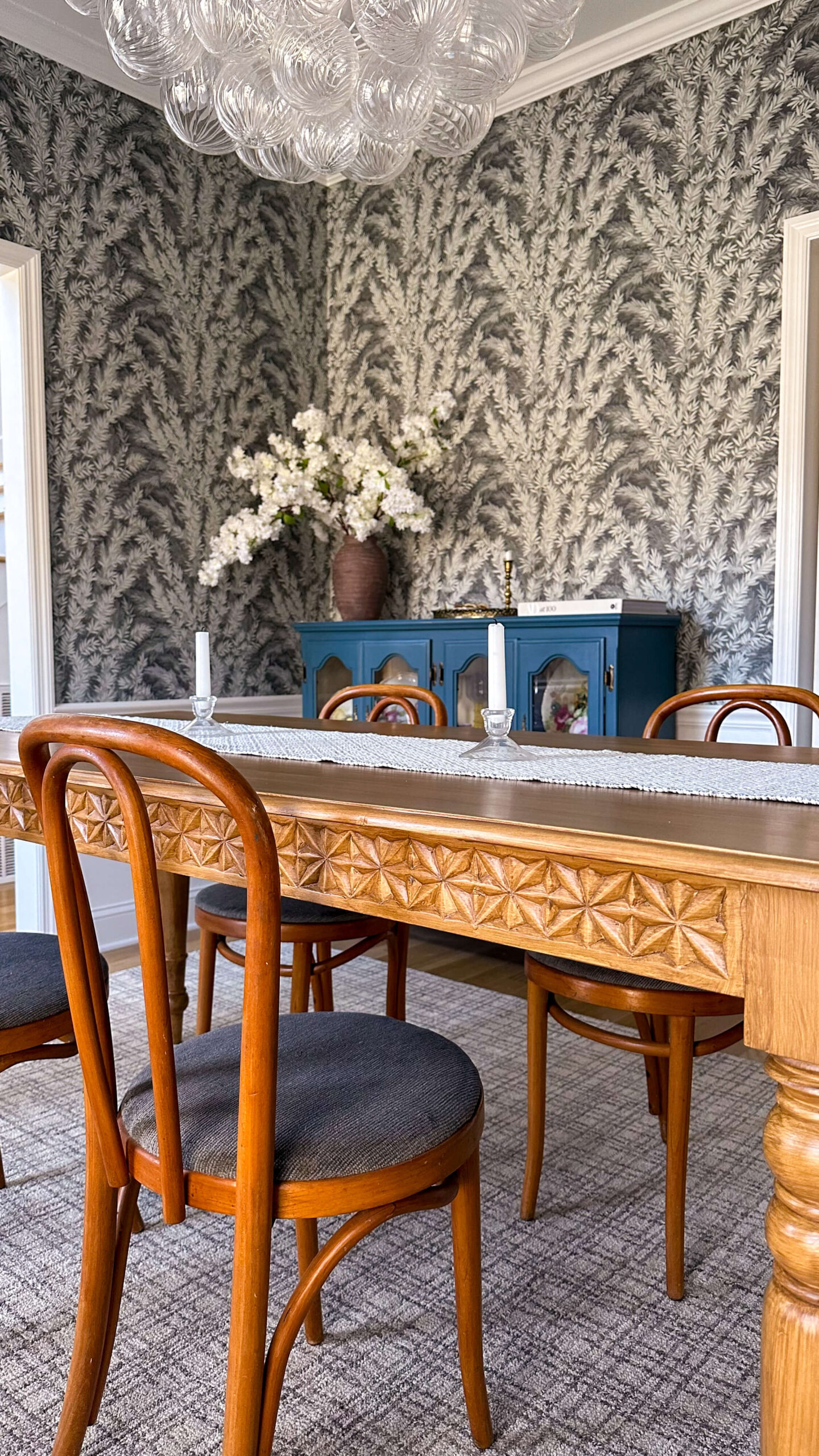
4. Inspect Like a Detective:
Don’t be afraid to get down and dirty! Inspect furniture for structural soundness, loose joints, and woodworm damage. Check for cracks in ceramics and tarnishing on metals. Be meticulous, as restoration costs can quickly outweigh the initial bargain.
5. Befriend the Dealer:
Vendors are a wealth of information. Engage them in conversation! Ask about the piece’s history, origin, and potential for restoration. Their insights can be invaluable, and a friendly rapport may even lead to a better deal.
A real life example of this was when I showed a local dealer a photo of the light I was searching for. She knew exactly what it was called and when it dated back to, which allowed me to zero in my online search more precisely. And now this beautiful skyscraper pendant is the star of the show in my kitchen!
6. Negotiate with Confidence:
Don’t be intimidated by haggling. Research fair market values beforehand and be prepared to negotiate. Remember, a polite and informed approach goes a long way. And in the end it’s okay to walk away if the item is overpriced.
7. Think Beyond the Obvious:
Embrace the potential for transformation! Look for pieces with good bones that can be repurposed. An old dresser can become a chic bathroom vanity, or vintage suitcases can be stacked to create a unique coffee table. Or another example below: repurposing a spittoon as a vase!
8. Embrace the Imperfections:
Don’t shy away from pieces with minor flaws or wear. These imperfections tell a story, adding character and warmth to your space. Remember, true beauty often lies in the subtle imperfections.
9. Document Your Journey:
Capture photos of pieces that catch your eye, even if you don’t purchase them immediately. Reflecting on your finds later can spark inspiration for hunting online on facebook marketplace, etsy or other trade sites. I found the below bronze horse statue on an antique trip and recently spotted it on eBay for more than half off!

Remember, antiquing is an adventure, not a sprint. Enjoy the process, trust your instincts, and don’t be afraid to experiment. With these tips and a little practice, you’ll be well on your way to unearthing unique treasures that will add character to your home and spark conversation.
Happy hunting!
The Latest on the Blog —
read more
When I bought this house in 2018, it came with 11 ceiling fans. ELEVEN! No offense against ceiling fans, but that really seemed like such a wasted opportunity to me. You see, I view light fixtures as artwork. They are the true jewelry of a room and in most instances, the only thing adorning your 5th wall. This is an amazing opportunity to dazzle!
Today I’m rounding up my top four spaces where I believe the light fixtures act as a true work of art. Lucky for both of us, I have plenty of spaces left to finish so this is simply the beginning of a very long love story.
The Bubble Chandelier
We may as well start things off with a bang. When I was designing my dining room, I knew I wanted it to feel traditional but not stuffy. Once I settled on a wallpaper, I set my sights on finding a chandelier that was a statement but one that wouldn’t necessarily overpower the wallpaper.
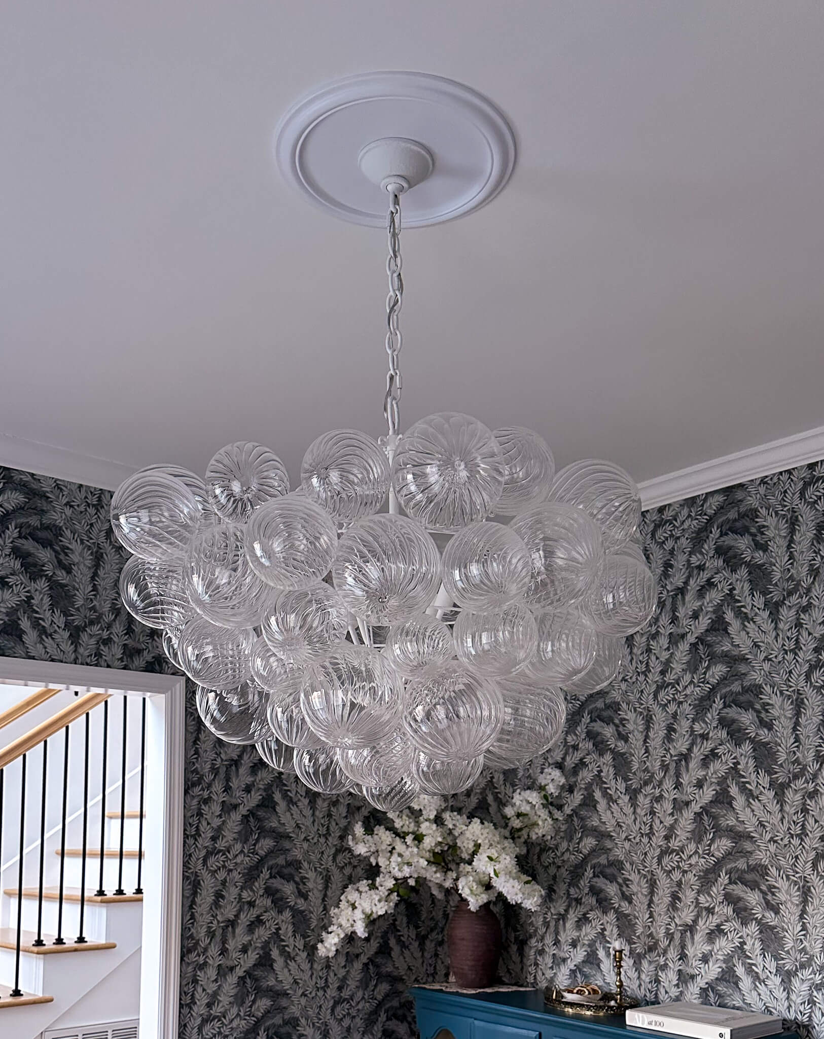
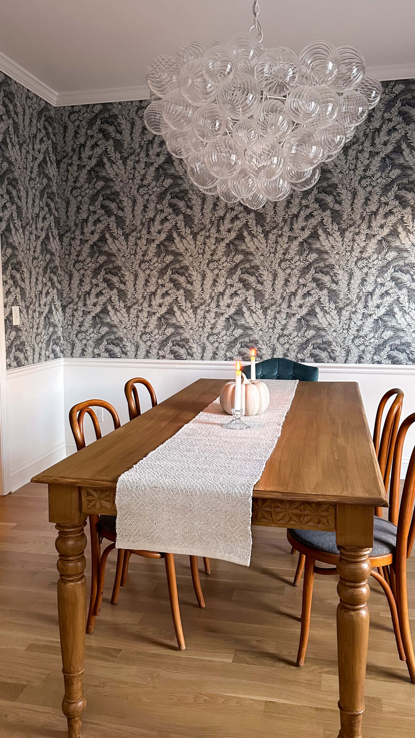
Shop the Dining Room
The Talia Chandelier by Julie Neil for Visual Comfort truly strikes that balance in a way I’m not sure another light fixture could. It is like a cloud floating in the middle of my dining room and elicits a WOW from any newcomer that walks in. A true work of art, I’m still head over heels in love with it.
Priscilla
Everyone, meet Priscilla. She is the only light fixture in my house that is so special, I felt she deserved to be properly named. I did not stumble across Priscilla, I actively hunted for her.
I had been visiting my local Salvage shop here in Nashville quite regularly. In between those visits I’d find myself scrolling through their Instagram page. One day my scroll completely stopped when I found this beautiful blue light fixture. I went into the shop and showed them the picture, hoping to learn more about the light. I learned this specific light fixture is called a skyscraper pendant, and is from the 1930’s. Unsurprising, they are quite rare to find (and are priced accordingly).
Shop the Kitchen
Determined to find my own, I began to actively search Google. After several weeks, I finally found a small shop in Phoenix that had several of these exact blue skyscraper pendants. The best part? They were priced for 75% less than what my store in Nashville had priced theirs. I called the shop owner and to his dismay and my delight, the pricing was old and had not been updated. He honored the pricing and the rest is history. Priscilla is the perfect addition to my little breakfast nook.
The Golden Leaf
After I decided the cozy tv room needed to be color drenched, I also knew the previous boho beaded chandelier had to go (we all make mistakes, okay???). With the new dark paint as a backdrop, I felt this would be the perfect opportunity for something brass. It would pop against the dark ceiling but also compliment the other brass pieces in the space (the Primrose Mirror, Brass art lamp, etc).
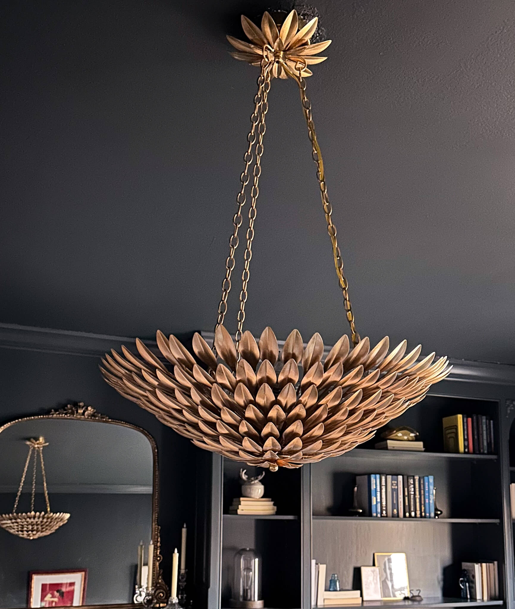
Shop the Cozy TV Room
Enter this beautiful golden leaf chandelier. It is eye catching but not dominant, and with 8 lights gives off plenty of brightness for the dark space. Who could ever want a ceiling fan in place of this beautiful light fixture?!
The Crown Jewel
Last but certainly not least is my little crown jewel, located in the living room. I purchased this light fixture for my previous house, and it was one of the things I insisted was coming with me. And it will continue to move with me shall I ever move again.

Shop the Living Room
It really looks like royalty to me, with both its shape and it’s jewels throughout. I think this piece strikes the perfect soft balance for the overall living room aesthetic and couldn’t imagine anything else that could be more perfect in this space.
Light Fixtures as Artwork
Do you see what I see now? The ceiling is truly a canvas to use light fixtures as artwork. Yes, there are places such as bathrooms and kitchens where task lighting is essential, but in the majority of your spaces I hope you can see this as an opportunity to elevate your design. Good design does just that: it’s the balance between beauty and function. You can in fact have your cake and eat it too!
browse more posts
read more
On a recent trip to my favorite local antique store, I found myself reflecting on the moment when I stumbled across my current kitchen chairs. It was truly love at first sight: they had vintage flair and I knew they’d strike the perfect balance with my new round fluted table. But there was one problem: I had no idea if they would be the right height. With more and more people shopping used these days, the concept of mixing and matching furniture is here to stay (I called it in my 2024 trends predictions!). With that in mind, I wanted to round up a guide to chair heights for every table scenario. Keep this guide handy and you’ll be ready to buy with confidence when the time comes.
The Golden Rule: Room to Breathe, Legs, and Opinions
First, let’s establish a universal truth: comfort reigns supreme. While aesthetics are important, a chair that’s uncomfortable won’t impress anyone (not even your most design-obsessed friend). So, the number one key in your guide to chair heights lies in finding a chair that allows for comfortable legroom and proper posture.
Standard Table Heights:
- Most dining tables hover around 29-30 inches tall.
- For these tables, aim for chair seat heights between 17-19 inches.
- This leaves a comfortable 10-12 inch gap between your thighs and the table, allowing for legroom and easy scooting in and out.
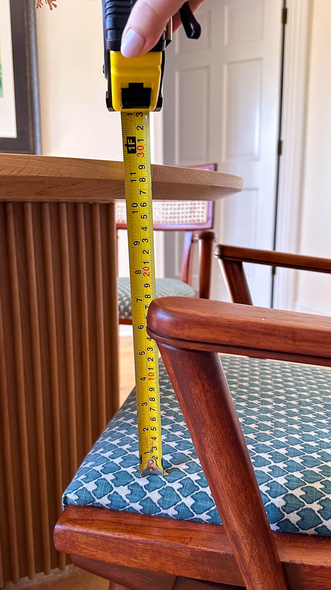
Counter Height Tables:
- These beauties stand tall at 34-36 inches.
- Match them with chairs boasting seat heights of 23-26 inches.
- This creates a casual, barstool-esque vibe, perfect for quick meals or open-concept kitchens.
Bar Height Tables:
- Calling all cocktail enthusiasts! Bar tables reign supreme at 40-42 inches.
- Here, you’ll need chairs with seat heights of 28-30 inches.
- Remember, bar stools should offer good footrests for long chats and perching sessions.
Mixing and Matching: A Balancing Act
Now, let’s talk about mixing and matching tables and chairs. Choosing chairs and tables isn’t always about matching numbers. Mixing and matching can add personality (remember my dining room chairs + wallpaper?!), but keep these handy tips in mind:
- Think about legroom: Even if the seat height works, ensure the table apron (the horizontal piece under the tabletop) doesn’t impede your knees.
- Armchair adventures: Armrests shouldn’t bump the table, hindering comfort and access.
- Visual balance: Taller chairs with a standard table can look unbalanced. Consider chairs with higher backs or opt for a slightly taller table.
- Function first: If your counter is for casual meals, lower stools might be comfier. For taller tasks, go higher.

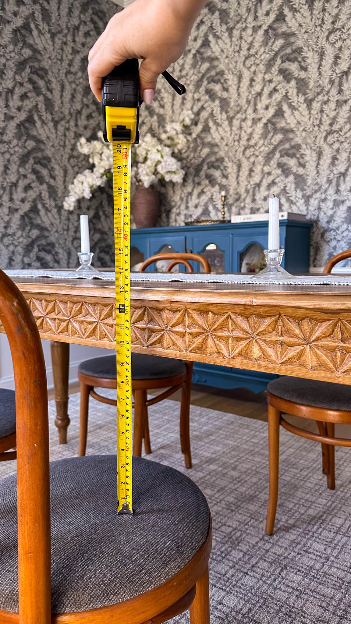
Guide To Chair Heights Conclusion
Remember, comfort is key! Sit in the chairs before you buy, ensuring good posture and legroom. And when in doubt, don’t hesitate to ask a design professional for help. With a little planning and these handy tips, you’ll find the perfect chair height to create a space that’s both stylish and comfy.
read more
Happy Valentine’s Day! Who doesn’t love an excuse for a sweet treat?! Whether you’re celebrating as a couple, with your best gal pals or are declaring it a party of 1, these mini molten red velvet cakes are the perfect way to be a little festive. Single servings, easy to make and beyond impressive to look at, these cuties only take 20 minutes to bake. Get ready to impress with this easy yet decadent recipe!

Serves: 4 | Prep Time: 2 hours | Bake Time: 20 minutes
Ingredients
Cakes
- 2 oz semisweet baking chocolate
- 1/4 cup heavy cream
- 1 cup flour
- 1 1/2 teaspoons unsweetened cocoa, plus more for ramekins
- 1/4 teaspoon baking soda
- 1/4 teaspoon salt
- 1 tablespoon powdered sugar
- 1/2 cup salted butter, melted
- 1/2 cup granulated sugar
- 6 tablespoons buttermilk
- 1/2 teaspoon vanilla extract
- 1/2 teaspoon apple cider vinegar
- 1 large egg yolk
- 1 1/2 teaspoon red liquid food coloring
Cream Cheese Whipped Cream
- 1 cup powdered sugar
- 1/2 teaspoon vanilla extract
- 2 Tablespoons unsalted butter
- 2 ounces cream cheese, softened
Additional Notes:
- You will need four 8oz oven safe ramekins.
- The chocolate center will need 2 hours to chill & firm up. You can make this in advance if need be.
Directions
Prepare the Chocolate Center
- Chop 2oz of semisweet bakers chocolate and place in microwave safe bowl
- Add ¼ Cup of heavy cream
- Microwave on High for 30 seconds
- Whisk until blended and smooth
- Let stand for 1 minute
- Immediate cover with seran wrap and place in fridge
- Chocolate will need a minimum of 2 hours to firm, but can be stored for up to 48 hours in advance if necessary.
Prepare the Mini Molten Red Velvet Cakes
- Preheat oven to 400°F
- Using butter, lightly grease four 8-ounce oven safe ramekins. Dust with a pinch of unsweetened cocoa then tap out excess.
- Combine wet ingredients and whisk:
- ½ Cup of Salted Butter
- ½ Cup granulated sugar
- 6 Tablespoons of Buttermilk
- 1 egg Yolk
- ½ teaspoon vanilla
- ½ teaspoon apple cider vinegar
- 1 ½ teaspoons red food dye
- Combine dry ingredients and whisk:
- 1 Cup flour
- 1 ½ teaspoons baking cocoa
- ¼ teaspoon baking soda
- ¼ teaspoon salt
- Combine wet and dry ingredients and whisk together. Divide equally across the four ramekins.
- Divide chilled chocolate into four equal sections, roll into balls and gently drop in the center of each batter filled ramekin. (as the cakes cook the chocolate will sink so just gently tap into the center for now)
- Place ramekins on a baking sheet and bake in preheated oven for 18 minutes. (cakes will be springy in the center when fully cooked)

Left: Chocolate Balls Placed in cake batter | Right: Chocolate balls start to drop as cakes bake
Prepare the Cream Cheese Frosting
- Mix the following ingredients:
- 2oz softened cream cheese,2 Tablespoons unsalted butter½ teaspoon vanilla
- Add 1 Cup of powdered sugar to mixture and beat with an electric mixer on medium-high speed until blended (roughly 1 minute)
Plate the Mini Molten Red Velvet Cakes
- Immediately run a rubber spatula or thin knife around the ramekin edges to loosen cakes
- Invert each red velvet cake onto a serving plate
- Dust cakes with a sprinkle of powdered sugar
- Top each cake with Cream Cheese topping
- Serve immediately
Other Recipes:
The Latest on the Blog —
read more
If you were following along with my 2024 project list, you’ll remember seeing the back entry on the short list. This is a tinier space, but I definitely underestimated its significance last year when I was updating the cozy tv room. A true bridge between the dark moody den and the bright white kitchen, this space was dying for some attention. And today that’s just what it’s going to get as I share the back entry reveal with you!

The plan
Once I figured out that what was bothering me about the space was the starkness from light to dark, I knew the answer was finding the perfect wallpaper. I needed this space to marry the light kitchen (plus the renovation of the kitchen I haven’t designed yet!) with the dark moody tv room. There was no question that once I found Vinnie Blue by Sandberg, that it was the answer.
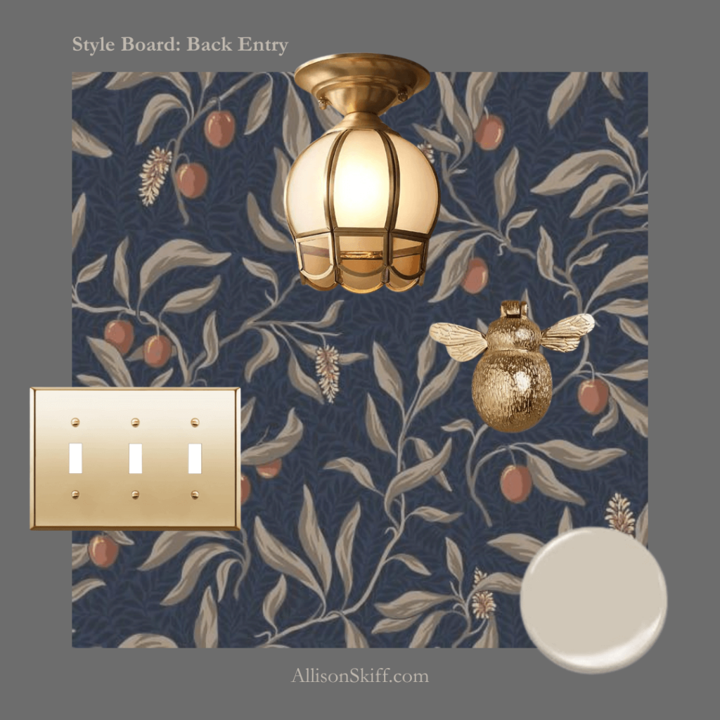
I put together a mood board just to be sure, and added in the fun bells and whistles like the brass finishes and the trim color, which really pulled everything together. I was so confident in my design that I didn’t even order wallpaper samples, I just placed the order! I would not advise anyone to do this by the way…it is truly a roll of the dice.
The prep
Although this was a small space, there was a lot of prep work involved. Since the walls were a light cream, and I was using a dark wallpaper, it behooved me to prime the walls with a dark primer. This would ensure no seams would show in the event things weren’t 100% perfect. And since I’m a novice installer I felt it was a safe bet they would not be perfect.

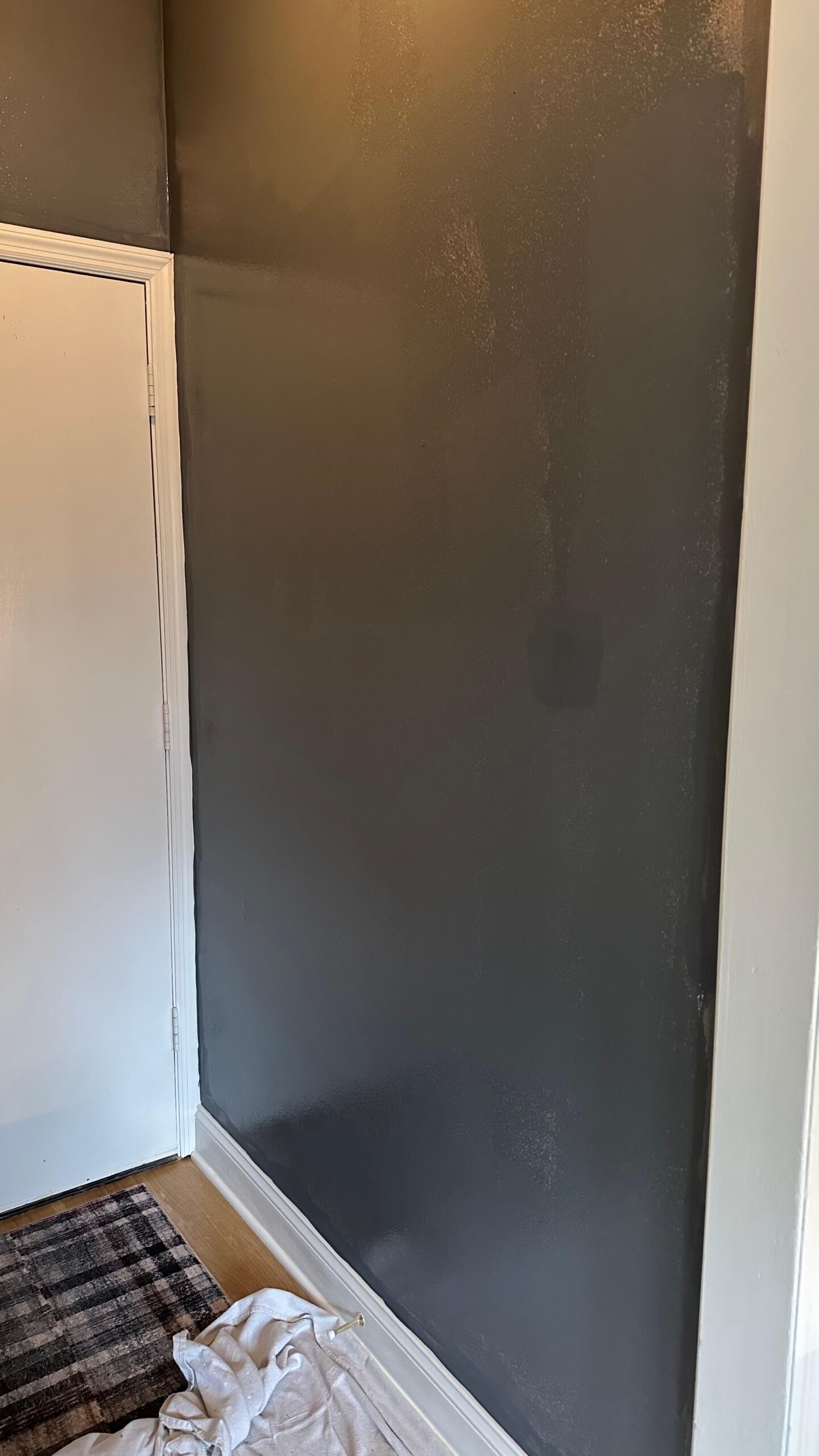
In addition to the primer, this was also the time to pain the trim. Since I was wallpapering, things didn’t need to be perfect where the trim met the wall, which meant a little less prep work. I opted to paint the baseboards, ceiling, back door and transoms Accessible Beige by Sherwin-Williams in a Semi-Gloss finish. It’s the perfect color with the lighter colors in the wallpaper and I think will blend seamlessly into the new TBD kitchen design.
The installation
Once I was done with the paint it was time to wallpaper! This was my fourth time wallpapering and in hindsight I can say it was the best thus far. The quality of this paper by Sandberg was above and beyond, which really makes all the difference. It was heavy enough not to tear while I was placing it, but also not overly stiff and was easy to manipulate as needed.
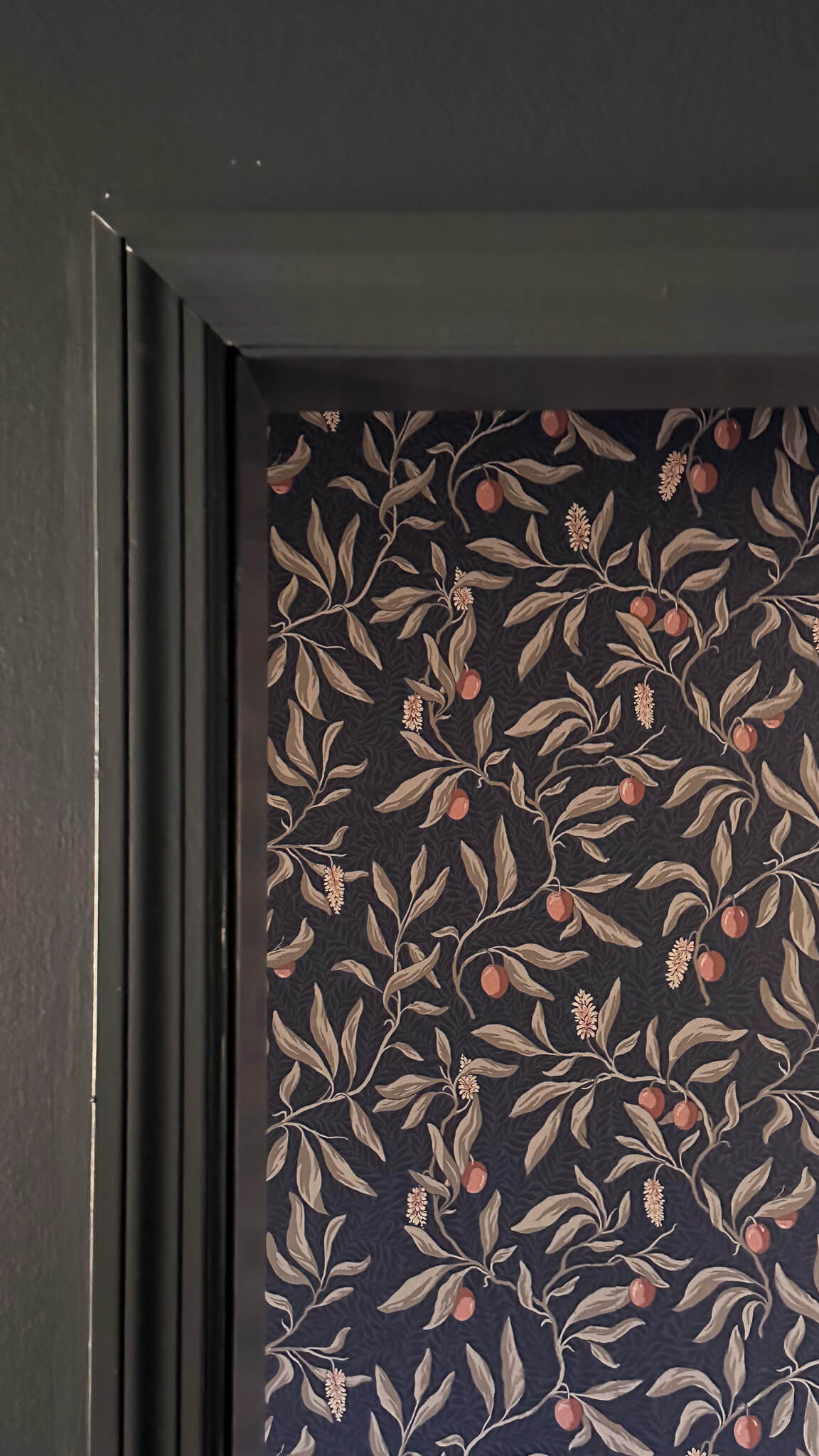
The wallpaper installation itself took about 7 hours from start to finish. I used two rolls for this project with very little scraps to spare. There was certainly a moment when I thought I was going to run out of wallpaper but luckily I was able to make it work with what I had!
Finishing touches included a new brass switch plate cover and installing the cutest little brass bumble bee door knocker on the inside of my back door. Since the door itself is so plain, I thought this would be a fun way to jazz it up.
Back Entry Reveal
I’m absolutely in love with how the back entry turned out! Now when I sit in the kitchen or the cozy room and look towards this area, it is so pleasing to look at. My eyes want to stay on it, rather than move away from it.
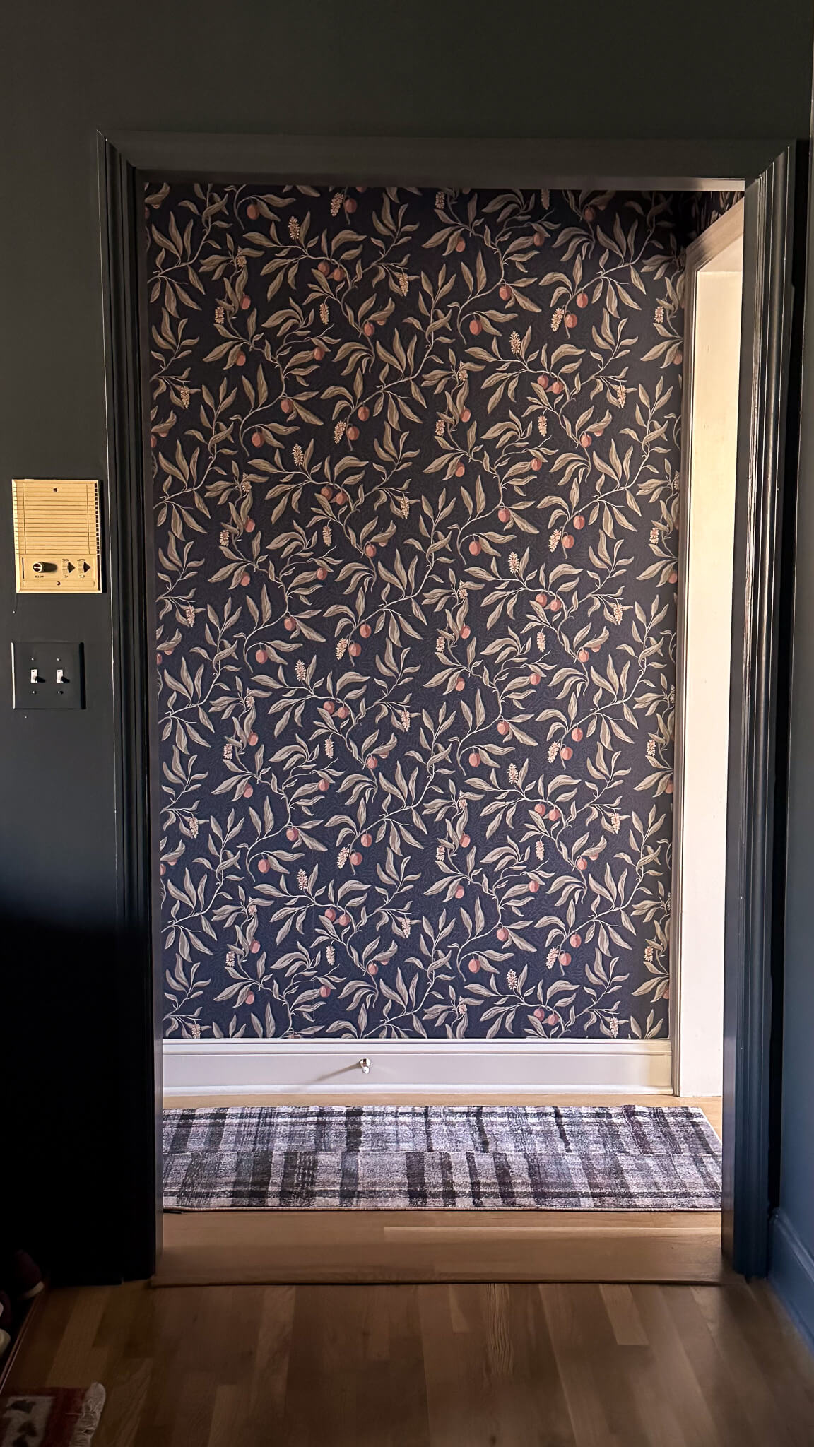
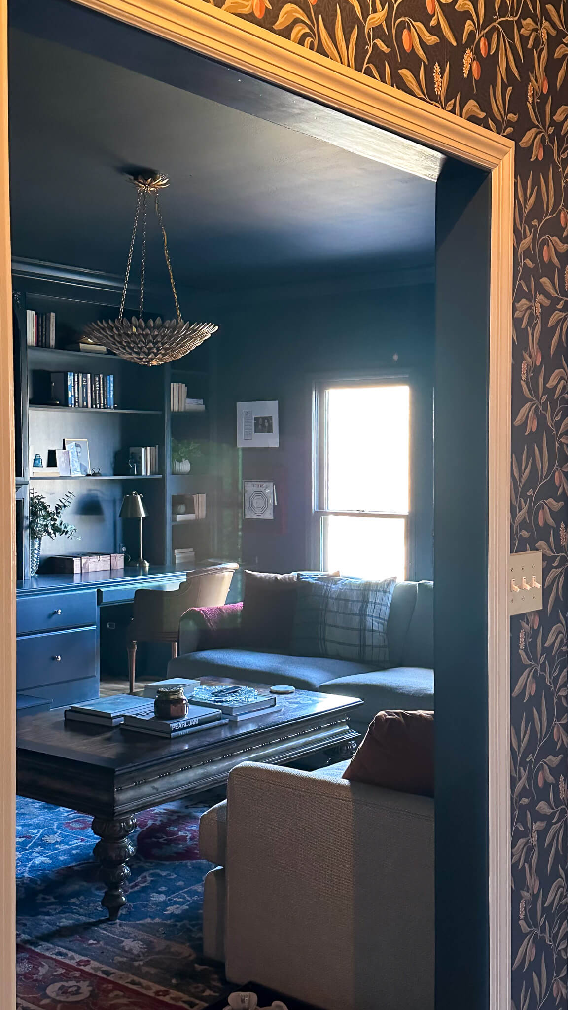
It is still a bit surprising to me the impact such a small space can have on the overall flow of a home, but I agree that it’s all about details. The thoughtful details of this space and how it truly connects the rooms around it through bridging colors gives a more finished feeling to my downstairs floor plan. I hope you love it just as much as I do!
Sources:
browse more posts
read more
Last year I color drenched the cozy tv room a dark moody blue grey, and it’s been one of my favorite spaces to date. I remember when I first shared the concept of color-drenched rooms with some family and friends, I made heads turn (and not in a good way!). People thought I had officially lost it. I understood the concern – it’s a strange concept to wrap your head around if you’ve never seen it either virtually or in person.
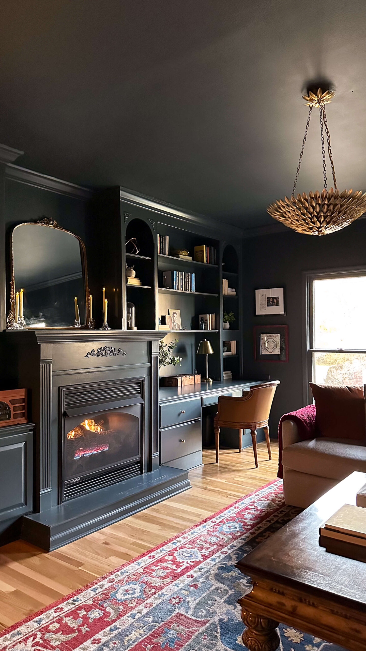
Sources: Gold Leaf Light | Mirror | Candles | Brass Lamp
As I plot my next space to color drench, I thought I’d pause today to share more about the science of color drenching and why it works from a design perspective.
What are color-drenched rooms?
But first, what exactly is color drenching? Imagine taking one luscious color and painting your walls, ceiling, trim – all of it – the same color. It’s a monochromatic masterpiece, a color commitment that pays off in surprising and delightful ways.
Now, I know what you might be thinking: “Isn’t that a bit…much?” But trust me, color drenching isn’t just about making a statement (although it does that effortlessly!). It’s about unlocking hidden potential in your space and creating unique visual effects that will leave you saying “wow!” every time you step inside.
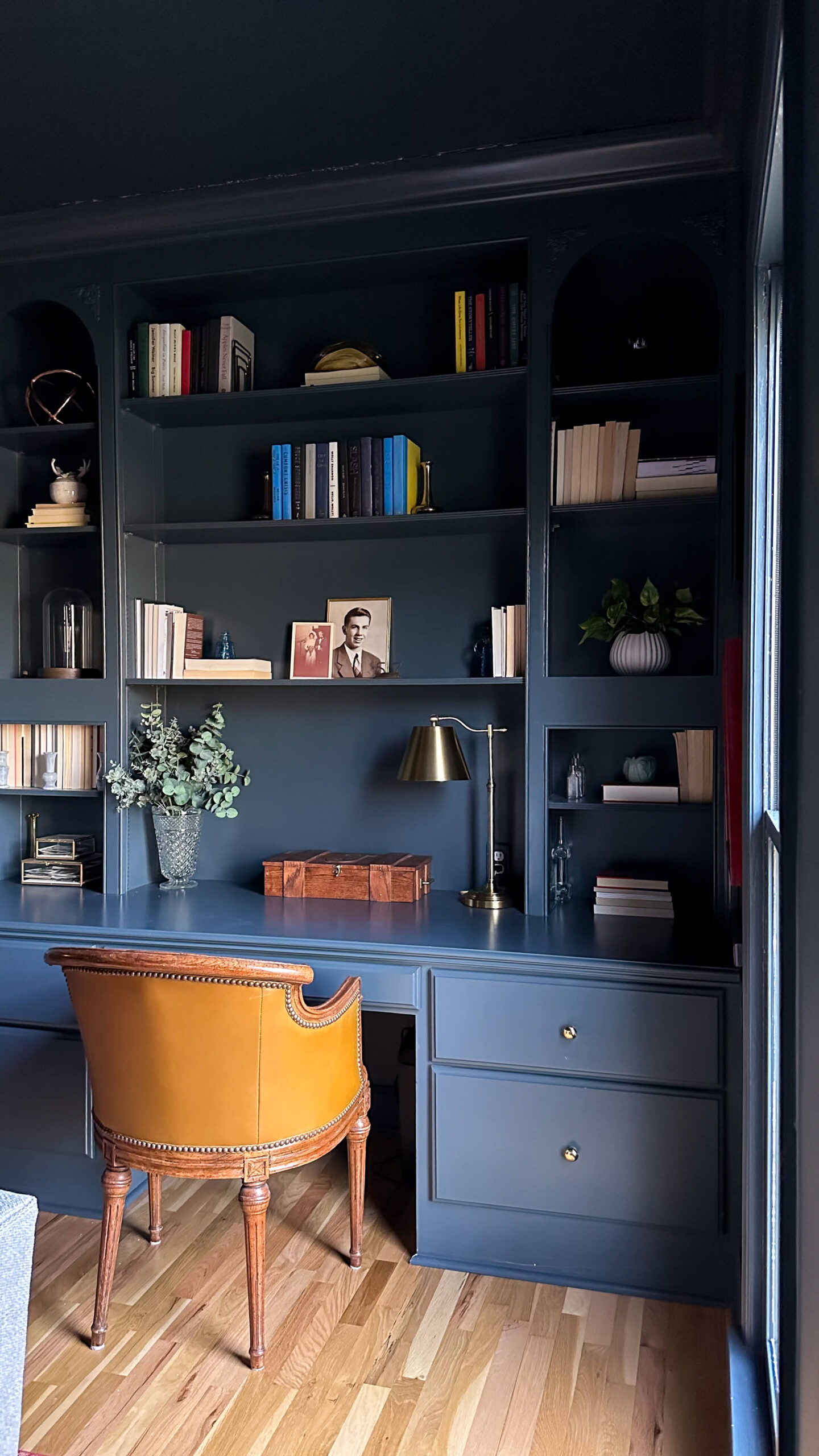
Sources: Brass Desk Lamp | Brass Bookends
Here are some of the amazing things color drenching can do:
- Spacious Surprise: Believe it or not, drenching a room in the same color can actually make it feel bigger! The uninterrupted flow of color blurs the lines between walls and ceiling, creating an illusion of expansiveness.
- Highlight architectural details: When everything wears the same color, architectural features like moldings and beams pop out, adding depth and character to your space.
- Create a serene escape: Monochromatic palettes have a calming effect, perfect for bedrooms, nurseries, or meditation corners. Imagine a tranquil lavender haven or a soft, sage-green retreat.
- Highlight Reel: Color drenching is a blank canvas and a calming backdrop that lets your furniture, artwork, and other design elements truly shine. It’s like hitting the spotlight on your favorite pieces! Play with textures, patterns, and furniture to add personality and avoid a flat look.
- Drama on Demand: Want to create a bold, show-stopping space? Drenching in a dramatic color like charcoal gray or deep navy blue is your answer. It’s a guaranteed head-turner that exudes sophistication and elegance.
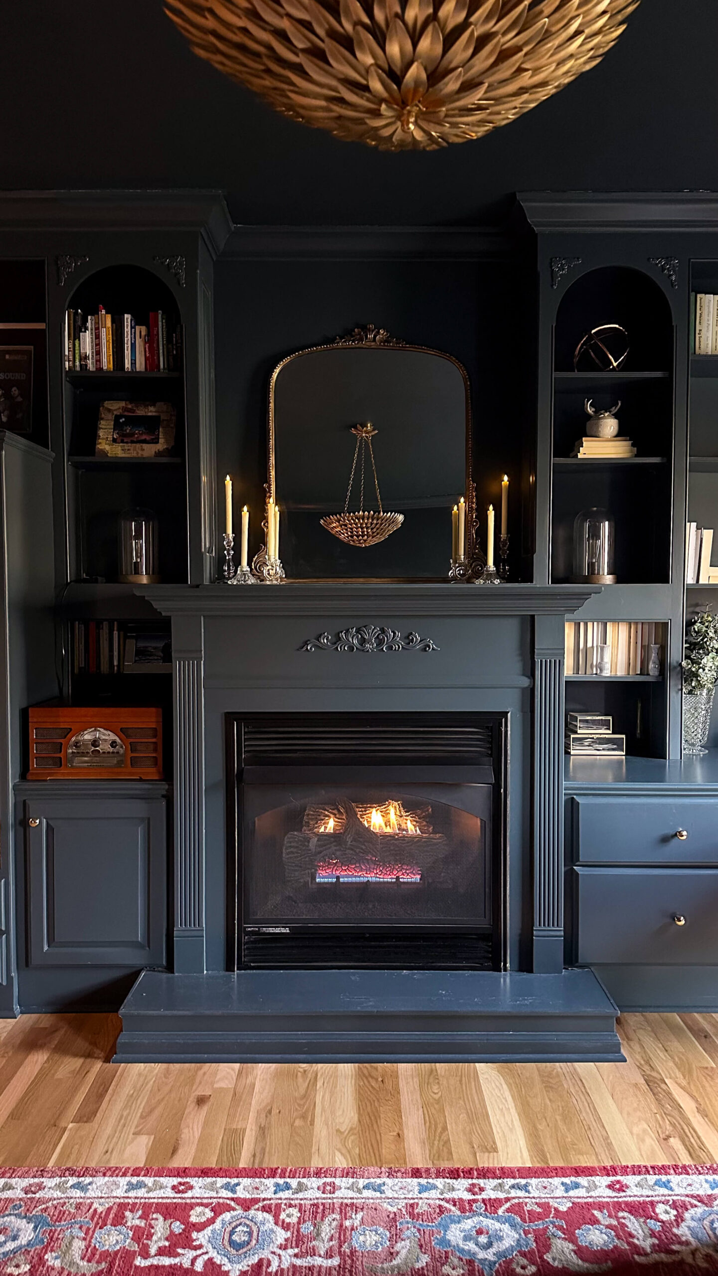
Sources: Gold Leaf Light | Candles | Record Player | Mirror
Ready to take the plunge? Here are some tips for color drenching success:
- Consider the light: Natural light plays a big role. Choose lighter colors for north-facing rooms and richer colors for south-facing ones.
- Sample, sample, sample: Don’t just rely on the paint chip! Paint large swatches on your walls to see how the color interacts with your lighting and furniture.
- Think beyond paint: Don’t be afraid to extend the color onto curtains, rugs, or even furniture for a truly immersive experience.
- Accessorize with intention: Since your walls will be taking center stage, keep your accessories minimal and impactful. Play with textures and materials to add depth and interest.
Shop the Cozy TV Room
So, are you ready to embrace the bold and beautiful world of color drenching? Remember, it’s all about experimentation and having fun! So grab your paintbrush, unleash your inner artist, and get ready to be amazed by the transformative power of color.
read more
Lately we’ve been covering a lot of ground in our painting series, and have covered a wide range of topics. From the best painting supplies, to how to choose the right type of paint, and how to paint walls, ceilings and trim. Before we go any further, I thought we should quickly touch on the right way to clean your paint supplies, as well as how to properly store them. Taking these little steps can help your paint supplies last a lifetime and truly make them a one-time investment.
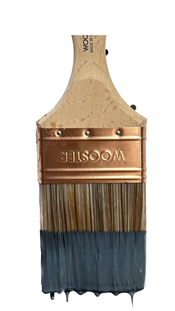
If you’re like me, you probably think this is a very straightforward task and why is there even a blog post about this. I know some of you are nodding. Well not so fast…when it comes time to clean up after your paint project, there’s a right way and a wrong way to clean your paint brushes (and I bet you never knew this). Lets quickly dive into the do’s and don’ts of properly cleaning and storing your paint supplies
It’s all about timing
If you’re able to clean-up immediately following your paint job, it will be much easier to remove the paint from your supplies, as you won’t allow it the chance to harden. In the event you cannot clean-up right away, you can wrap the brush with plastic saranwrap, and you can place the paint roller and tray in a garbage bag. This will prevent air from hardening the paint, and allow you more time to properly clean your tools.
Assuming you’re able to clean your supplies following the job…
Paint brushes:
Most paint brushes can be cleaned with water alone. The most important thing to note is to NOT turn your paint brushes upside down and run water through them. The paint brushes have spacers at the base, and allowing water to penetrate these will loosen the spacers and allow the bristles to fall out over time. Always keep your bristles pointed towards the bottom of the sink and run the water from top to bottom of the brush.
How to Clean Your Paint Brushes:
- Remove excess paint with a paper towel first to help expedite the cleaning
- Run warm water from the top of the brush to the bottom. Gently massage with your hand, ensuring your getting the front, back and both sides of the brush.
- Use a wire paint comb to further loosen any stubborn paint from the brush. Gently brush from top to bottom as needed as you run water over both the brush and the comb.
How to Store Paint Brushes:
- Pat paint brush dry with a paper towel or microfiber cloth
- Place paint brush in it’s jacket, which will help maintain the shape of the brush
- Always store upright (again, preventing moisture from impacting the spacers)
How To Clean Paint Trays, Paint Cups & Rollers:
Paint tray, paint cups and roller clean-up is generally quite simple.
- A garden hose will easily do the job in the warmer months of the year.
- If you’re painting in an area without access to a garden hose, you can use warm water and dish soap to clean both tools.
How to Clean Drop cloths:
- Before storing a canvas or plastic drop cloth, wait for paint drips and splotches to completely dry.
- If necessary, canvas cloths can be machine washed in cold water and then air dried before storing.
Conclusion
That’s all there is to it! By slowing down and taking a little bit more time to clean and store your paint supplies the right way, they’ll be a one-time investment and will last you a lifetime. Happy painting!
Related Posts
The Latest on the Blog —
read more
I’ll be the first one to admit it: styling the perfect bookshelf is a lot harder than it looks. Flip through any magazine or take a scroll through Instagram, and the shelfies will look almost effortlessly designed. I can promise you that is not the case whatsoever and each shelf you aspire to create was meticulously planned.
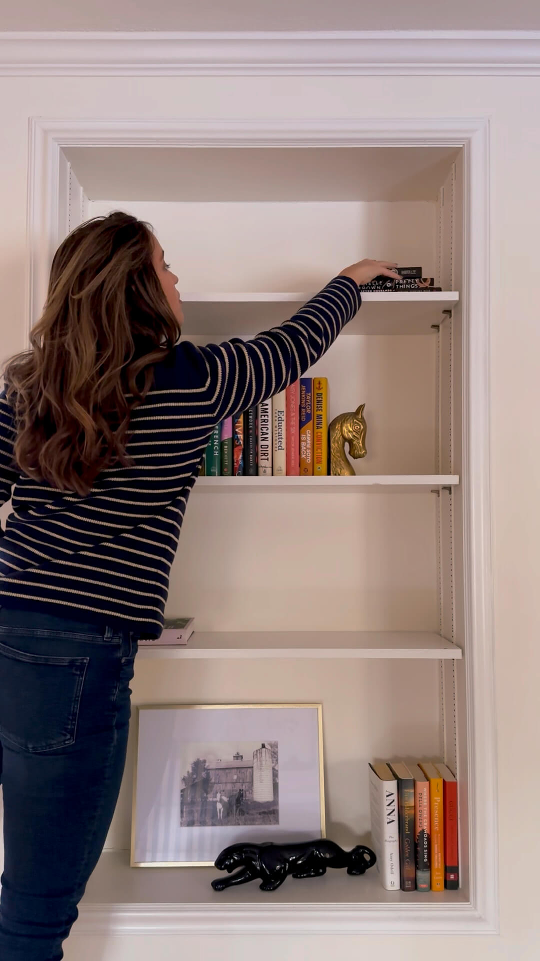
After some trial and error over the past couple years (especially in the cozy tv room), I’ve found implementing a handful of design rules can be the saving grace for styling the perfect bookshelf. Follow along below as I share my design learnings.
Phase 1: Develop a plan
A perfectly styled bookshelf requires a little upfront planning. Two of the most important things to think about are your color palette and the style of the room the bookshelf is in.
Color palette: When deciding on a color palette, you want to take inventory of the rest of the room and tie in colors from your existing decor to keep a cohesive flow. If you want to play it safe, plan to use a white as your base color, one metal finish, one wood finish and 1-2 accent colors.
Style: Similar rule of them when considering the style of the bookshelf. If your living room leans more traditional, then your shelf décor should have traditional elements rather than sleek ultra modern pieces.
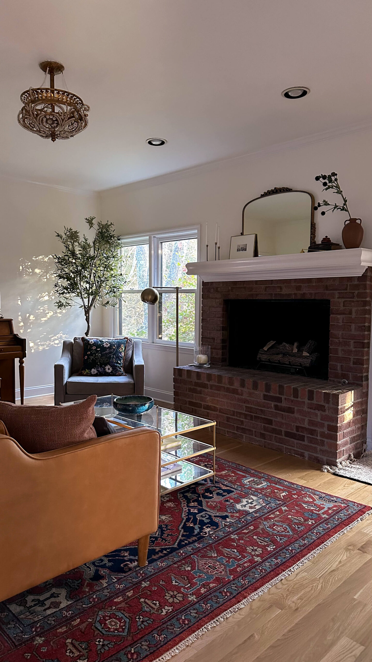
As an example you can see my living room, which is where one of my bookshelves lives (on the opposite wall). This is a traditional space, but has modern elements such as the couch, chair, table and lamp. My primary accent color is a rust / orange / brass, so I’ll look to that color family first when thinking about decorative accents for my bookshelf.
Bookshelf Décor
Whether you’re shopping your house, a thrift store or online, you’ll stay organized and on track by keeping the bulk of your items to a handful of categories.
- Books: the most obvious item on the list is books! As you gather books, consider various sizes. We’ll be stacking these, standing these and more later on. If you’re able to stick to hardcover books that will make things easier (more on that below).
- Picture frames: I love a larger picture frame with a wide matte. Consider frames of various sizes and options for both leaning against the back of the shelf as well as standing. If you’re able to add black and white photos to the frames, this will help keep things cohesive in your design.
- Vases: vases are a great way to add some variety into your shelves. With their various finishes you can implement glass, metal, and ceramic, bringing both texture and color into your shelf design.
- Plants: Whether they’re real or artificial, adding some plants onto your bookshelves will truly bring them to life. Consider how much natural sunlight your shelf gets and plan accordingly.
- Sculptural items: plan to add a couple fun sculptural items into the mix. This could be a bust (traditional style), marble links (modern), coral (coastal), etc. As you can see, let the style of your room and shelves guide these decisions to keep things cohesive.
- Candles: candles are great fillers and can add some varying height to your shelves. Depending on the distance between shelves this may be more of a decorative decision and not necessarily a candle that you’ll be lighting regularly.
- Decorative boxes: decorative boxes are wonderful because they can be stacked which allows us to create some height variation. They can also provide an opportunity to bring different color and texture into the space.
Styling the Bookshelves
Once you have a handful of items gathered, it’s time to style your bookshelves! Be patient and have fun. You’re going to move things around and that’s okay. Below are some key design rules to help you style your perfect bookshelf.
Start Big
Place your largest item(s) first and work backwards from there. This can be a large picture frame, or sculptural item. This is going to ground the shelves and we’ll work around them in the next steps.
The triangle method
Create triangles across your shelves using similar items. This method guides the viewers eye across the shelves and creates cohesiveness without us even realizing it. Look for triangles amongst your like items and shift them around if they’re not achieving a triangle.
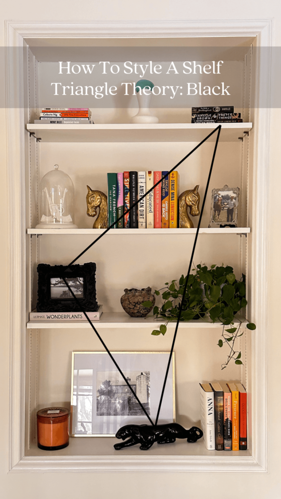

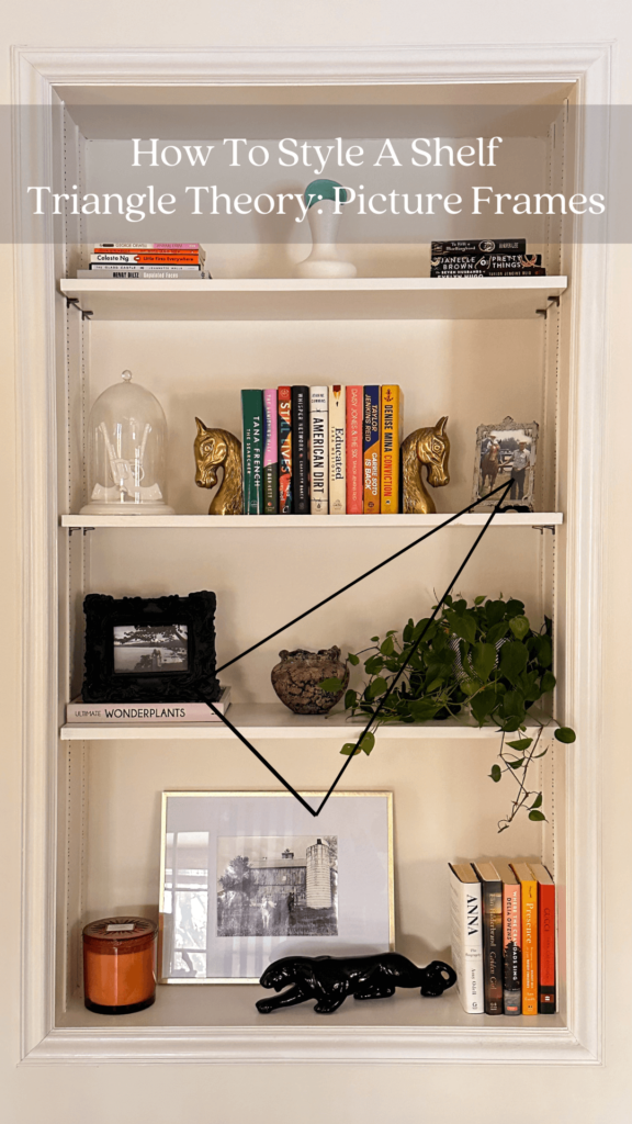

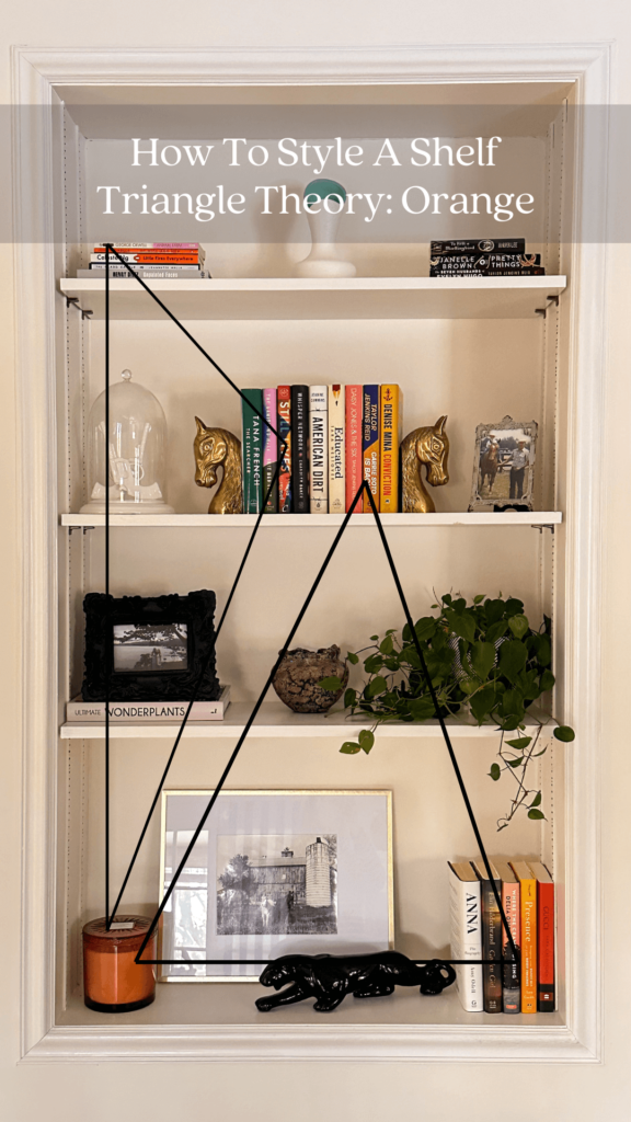
Be Odd
A standard in all design is to cluster items in odds, as it’s more aesthetically pleasing. Place things in groups of three’s or five’s. We’re also going to use the triangle method above to create a variation in height while we’re doing this. Too many big items together look too uniform and too many small items can look cluttered.
Mix textures and colors
Too much of the same looks unnatural, while mixed pairings create more visual interest for the eye. Specifically when you’re adding books onto your shelves, consider removing the jackets of your hardcover books. This will allow for a more cohesive look vs having all the colors of the rainbow. Outside of books, aim to pair brass alongside a warm wood. If you’re working on a white background, add something black to create some contrast.
Your Perfect Bookshelf
A perfectly styled bookshelf is in the eye of the beholder and for many of us, happens over time. Don’t be afraid to step away for a moment and then come back to your bookshelf and rearrange items. As you add new books to your collection, or discover some new vintage treasures, your bookshelf may need to shift and that’s okay. These “rules” are not rules at all and are truly meant as a wireframe to help you plan and design your perfect space. Happy styling!
browse more posts
read more
The first project I’m checking off the 2024 project list is the back entry! While this is a small area of the house, it’s the main entry point coming up from the garage and gets a lot of foot traffic. Sometimes it’s also the first impression of the house!
While this space was not originally on my radar to beautify, I’ve recently had a change of heart while enjoying myself in the cozy tv room (especially during Christmas!). For context, the back entry is the bridge between the tv room and the kitchen.
The Current Back Entry
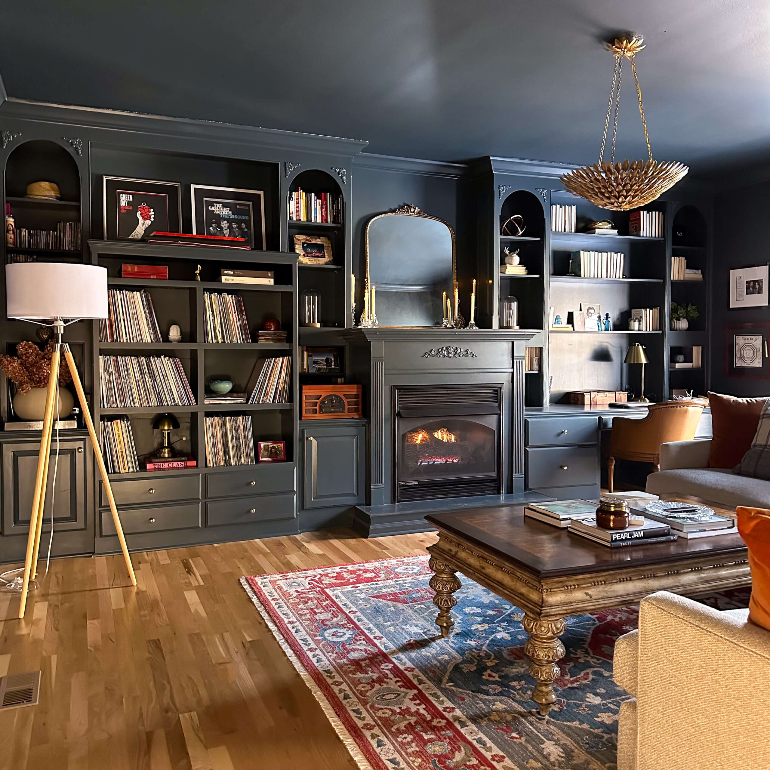
Last year when I color drenched the tv room a dark moody grey blue, I had to make a design decision about where to stop the dark color on the door casing that adjoins the back entry. I couldn’t wrap the dark blue paint the entire way around the trim, as the back entry is a warm cream color and the trim around all three door openings is white. I also didn’t want to paint the back entry the same dark color, as I thought that would be too jarring to walk into. In hindsight I don’t think there was a right choice. The contrast between the cozy tv room and the neutral back entry is just too vast.
The New Back Entry Plans
While I’m just starting to plan out my inspiration for the kitchen renovation (the biggest item on the 2024 project list) I can confidently say I’ll be incorporating a mix of woods, brass, beiges and creams, all of which will have a warm undertone. This is important because the back entry connects to this space.
Knowing that, I felt adding a wallpaper into the back entry that included the same dark moody grey blue, as well as some warm beiges would be the perfect bridge to the space. I’ve landed on this beautiful wallpaper by Sandberg. I love how there are two dark blues in the background of the paper, with some warm greens and pinks in the floral design. This paper will also compliment the other organic wallpaper choices I’ve made in nearby spaces like the dining room and powder room.
Sources: Brass Light Switch Plate | Wallpaper | Light | Brass Bee
Originally, I anticipated just carrying the lead grey paint color from the cozy tv room trim into the back entry. However after the wallpaper arrived and I opened it up (it truly felt like Christmas by the way) I was so drawn to the warm greens, beiges and pinks. I’m changing my plans and am going to opt for a warm beige on the trim and possible back entry way door. I think this will compliment any direction I decide to go in the kitchen and will also be a true bridge from a dark moody room to a warm collected kitchen. I’ve used Accessible Beige by Sherwin-Williams in the past and think it’s the perfect match.
Finishing Touches
I’ll top things off with a vintage light fixture similar to the ones I’ve pinned here for inspiration. I’ve just started a search on facebook marketplace and am hoping to give new life to something old. Lastly, I’ll change out the light switch plate to a brass finish.
I’m still deciding on which color to paint the ceiling, but I know it will be changing from it’s current white to either the dark Lead Grey (cozy tv room) or Accessible Beige (the new trim color). What do you think?
read more
Cold nights call for warm soups, and this homemade healthy chili recipe is one of my favorite soups to make. It’s a one pot meal with clean ingredients and provides ample leftovers. Grab your favorite pot and get ready to have some cozy soup nights.
Healthy Chili Recipe Ingredients:
- 1 lb lean ground beef
- 1 yellow onion diced
- 1 red bell pepper diced
- 1 Tablespoon minced garlic
- 1 teaspoon mustard powder
- 1 teaspoon paprika
- 1 teaspoon cumin
- 1 teaspoon chili powder
- 1 teaspoon salt
- ½ teaspoon pepper
- 3 bay leaves
- 4 cans diced tomatoes
- 1 can black beans
- 2-3 cups beef broth

Sources: Serving Bowls
Cooking Instructions
Brown the Beef
Using a cast iron pot, cook your ground beef on medium heat until browned. Typically 4-5 minutes. Using a slotted spoon, remove the beef from the pot and set aside in a separate pan.
Sauté
You’ll have leftover beef fat in the pot and we’ll use this to sauté our vegetables. Add diced onion, diced red bell pepper, garlic, salt, pepper, mustard powder, cumin, paprika and chili powder to the pot. Continue stirring until onions are translucent (typically 3-4 minutes).
Assemble Soup
Add cooked ground beef to the pot of vegetables and spices and stir together. Mix in canned tomatoes, beef broth and bay leaves. Turn heat to high and bring to a boil. Once soup begins to boil, turn heat to low and simmer for 45 minutes, stirring occasionally.
After 45 minutes, add in the can of black beans without draining. Stir thoroughly and continue to cook for an additional 15 minutes.
Garnish & Serve
Remove bay leaves from the pot and your healthy chili is ready to serve! Garnishes for this dish are optional and can quickly turn the recipe a bit unhealthy. If you want to sprinkle in some additional flavor you can never go wrong with some shredded sharp cheddar cheese or a dollop of sour cream. Serve warm and enjoy!
Sources: Serving Bowls
Other Healthy Recipes
The Latest on the Blog —
read more
It’s funny how cyclical life can be sometimes. Every year, I get so excited about the holidays for many reasons, but deep down I think I’m welcoming a break from renovating and DIY-ing. I’ve always made myself stop house projects to enjoy the holidays with family, savor the holiday décor and get out of the house. At the same time, each year around mid-December I start dreaming up the following year’s project list. This year was a little bit different, because the 2024 project list daydreaming started at the beginning of December.
There is so much I want to accomplish this year, but I had to reel myself back a bit and try to make this as realistic as possible. In no particular order, here’s my condensed 2024 project list.
Dining Room Molding
The dining room has seen a lot of change over the past year and we’re almost complete at this point. As I was setting the space for Thanksgiving this past year, I couldn’t help but think about how traditional the space is and how it’s really missing molding below the chair rail.
Molding is on my list for at least two additional projects this year, so I plan on diving into some tutorials and getting familiar with power tools. I’ll likely start my molding journey with the dining room because it’s a smaller amount of molding that will need cut. Stay tuned for more on this space!
Laundry Room
Okay, everyone has this one room and this one is mine. The laundry room is the catch all space. The unsightly room that just can’t seem stay organized no matter how hard I try. I need to start moodboarding color schemes for this space but my initial plans include adding a chair rail and wainscoating to the bottom 2/3 of the space, and then wallpaper on the top 1/3.
I recently laid these floorpops just to make the space a little less of an eyesore when the door is open, and while I’m happy with them, I’m daydreaming about tile for this space. Learning how to tile has been on my list and I’m fantasizing about a classic penny tile with a fun border.
Back Entry Way
Last year, I color drenched the cozy tv room and ever since then, I’ve been questioning my decision on where I stopped the color around the doorway casing. I think I should have gone in a little bit deeper.
Well, wandering minds can’t be helped. I’m officially going to carry the color into this back hallway trim, and then wallpaper the space. We’ll add a new light, paint the ceiling and this existing rug I purchased last year will still be perfect. I’m still a TBD on whether or not I’ll paint the back door the same trim color, or if I’ll attempt to strip it down to it’s natural wood finish.
My Office
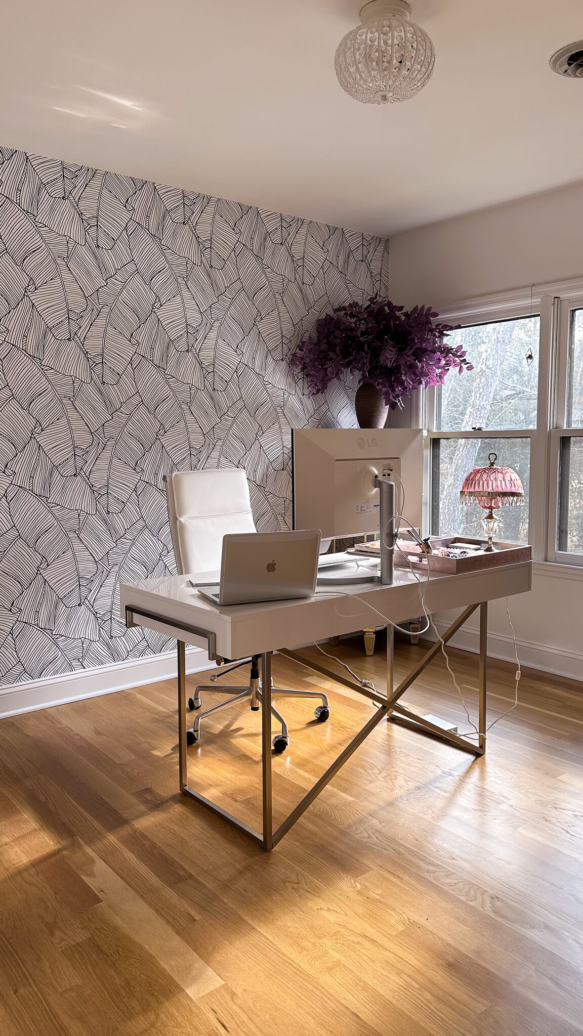
Similar to so many, back in 2020 I officially converted an upstairs extra bedroom into an office space for myself. Since then, there’s no going back as I love being able to separate work from my other living spaces. However with the new flooring, I want something a bit more elevated and refined vs the peel and stick banana leaf wallpaper I hung.
I plan to add wallpaper to all four walls, paint the trim / doors / ceiling an actual color, swap out the light fixture and add in a new rug. I’m truly so excited to convert this space and feel more inspired while I’m doing work at home.
Primary Bedroom

Similar to a lot of spaces in my house, the primary bedroom has gotten several band-aides since I bought the house nearly six years ago, however it’s time for a full makeover. I plan on fully color drenching this space, adding in new blackout curtains, updating the bedding, switching out the nightstands and adding a cozy rug. Once I fully moodboard everything out, we’ll see if the pink fringe chandelier will still work for the new space.
Exterior

This has been bugging me for years. At one point in time, it must have been trendy to match your trim color to the color of your brick mortar. I’m itching to update the exterior trim color and am leaning towards a dark charcoal grey.
I’ll be photoshopping this in the coming months and would love to have this completed in the first half of the year. For better or worse, the exterior work is going to cause a domino effect of work, as there’s some wood rot along some of the casing and I’ll likely need new gutters. And if you subscribe to my monthly newsletter, you’re already aware about the drama with the garage door. So I’ll be getting a new one of those as well this year. We may as well landscape while we’re at it, right?!
The Kitchen

Am I saving the best for last? Maybe. The previous owners had partially updated the kitchen by adding granite counter tops and painting the existing cabinets. Since I’ve moved in, I’ve scraped the popcorn ceilings, updated the cooktop, replaced the refrigerator and dishwasher, and added new hardware to the cabinets.
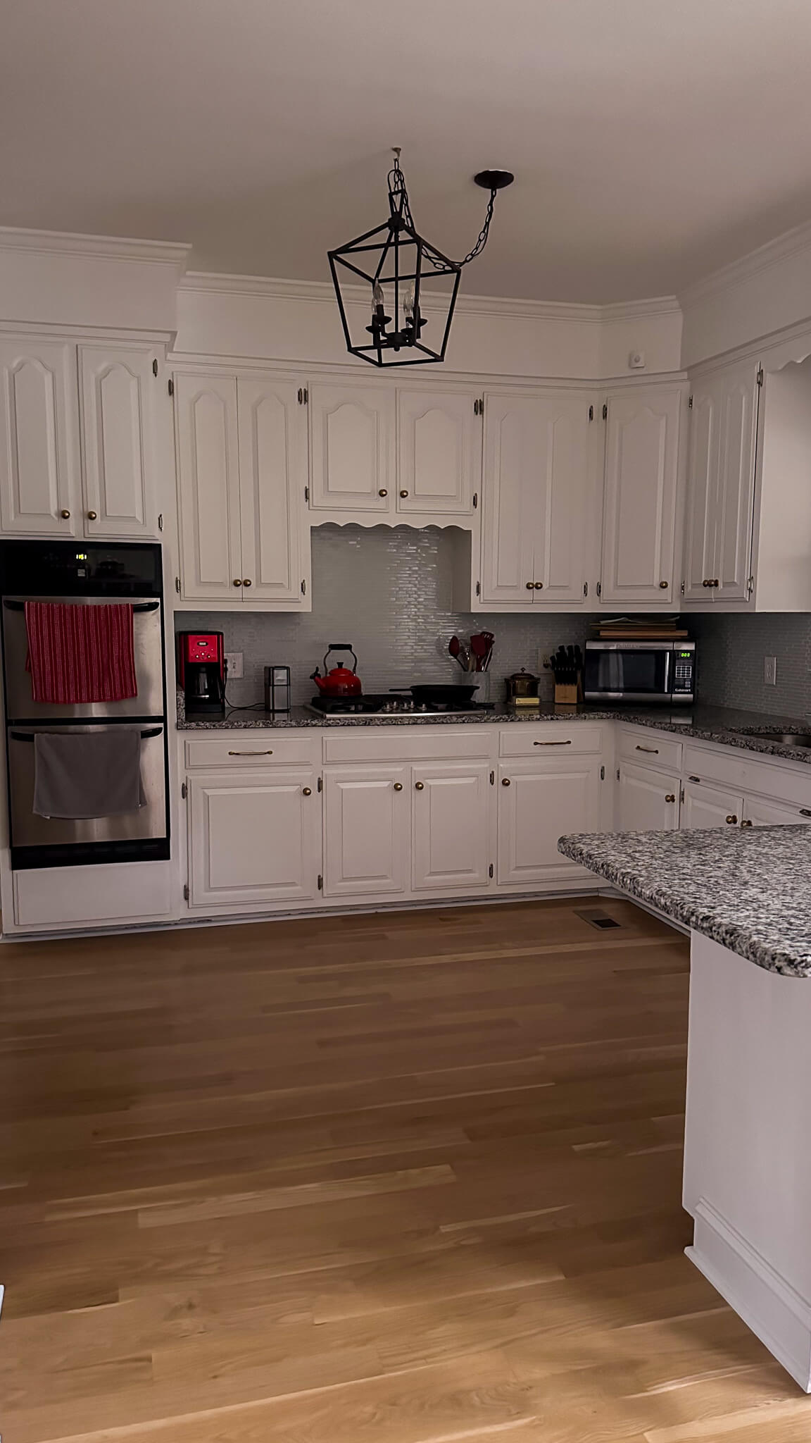
As much as I had hoped that would get us to a good place with this kitchen, we’re just not there. After the new hardwood flooring installation, and all the updates to the surrounding spaces like the cozy tv room, dining room and powder room, the kitchen needs to catch up to the rest of the house.
I’ve updated the little breakfast nook with a new table, some antique chairs and a beautiful antique art-deco light fixture. This tiny space that feels completed is giving me just enough of a tease that I’m finally ready to attack the larger portion of the room.
Since the kitchen is truly the heart of the home, I’m not taking this design lightly. Expect to see more in the coming months as I work through a few final big decisions I’m struggling with. In the short term, expect to see some progress on the back entry way to give me a little momentum as I work up to these bigger areas.
browse more posts
read more
If you’re like me, Christmas decorations are magical during the weeks leading up to Christmas, but something happens shortly after December 25th. I feel like I need everything packed up in order to have a fresh start for the New Year. This year I really upgraded my Christmas décor, and that means it’s time to update my Christmas storage and organization. Follow along as I share my best tips and tricks to keep everything tidy and ready to go for next season!
Proper Christmas Storage Systems: Bins and Bags
First things first, ditch the cardboard boxes. Invest in sturdy, stackable bins or fabric bags. Clear ones let you see what’s inside (no more rummaging for the tree topper), while opaque ones are perfect for hiding sentimental treasures that might stay tucked away.
Ornaments
Fragile baubles deserve a spa day, not a landfill. Line compartmentalized bins with tissue paper or bubble wrap, and nestle your ornaments inside. Pro tip: sort by theme or color for next year’s decorating breeze. Don’t have fancy bins? No worries! Repurpose cardboard egg cartons or shoeboxes – just be gentle!
For less fragile ornaments, utilize clear plastic totes with lids. If you have a lot of ornaments, create a bin for each color to stay even more organized.
Garland

No Christmas is complete without a swanky garland, but storing them can get overwhelming. Here are two genius hacks to keep your garlands gleaming:
- Coil and Conquer: Gently coil your garland and secure it with twist ties or ribbon. Place garlands in a wreath storage bag with an interior clip for extra protection. This method is perfect for artificial garlands or those made with delicate materials.
- Hang it High: If you have the space, hanging your garlands is a fantastic option. You can use sturdy hooks or nails in your garage, attic, or even a closet. Just be sure to cover them in fabric bags to keep dust and pests at bay.
Wreaths
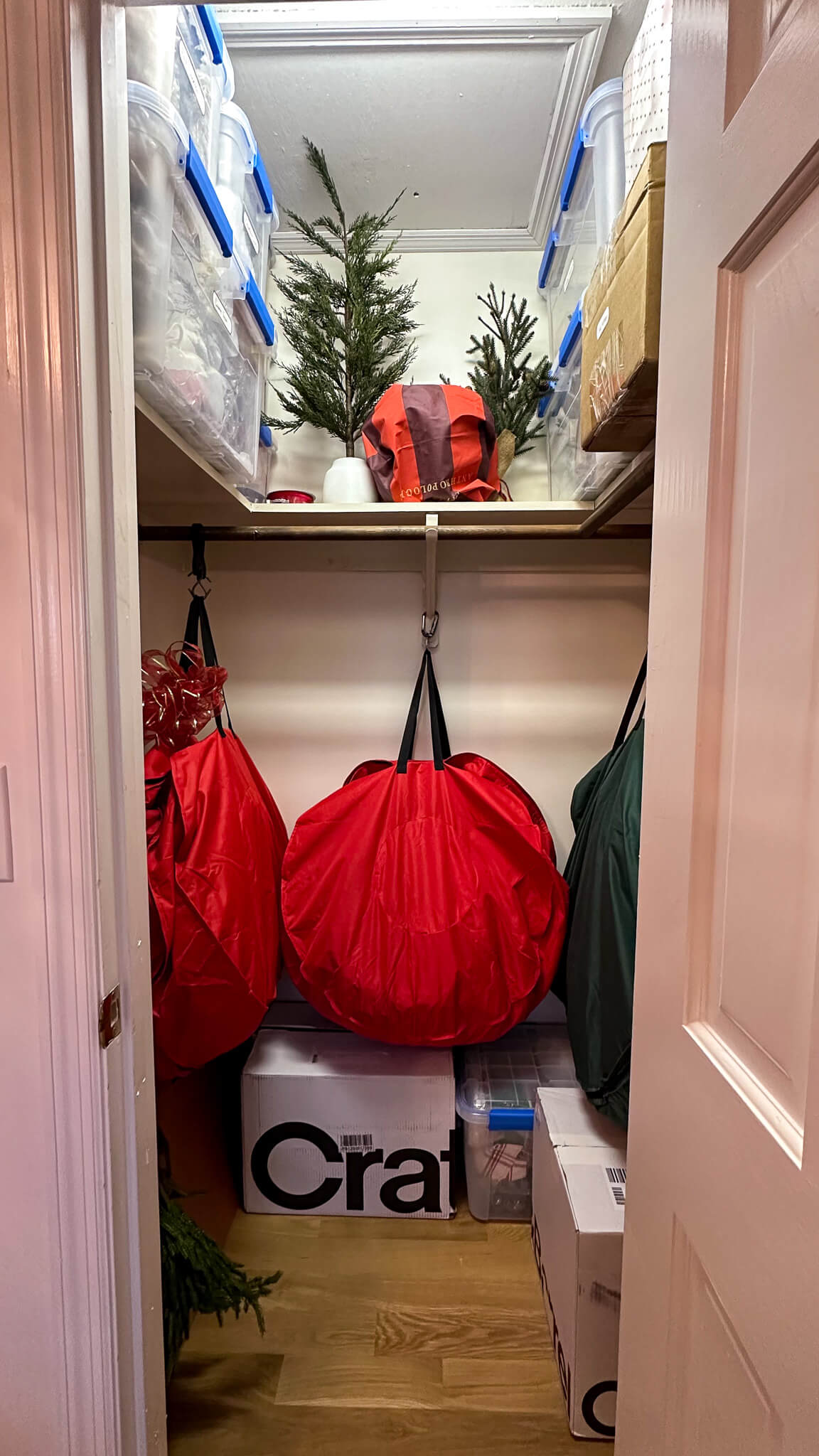
Wreaths add a touch of festive cheer to any door, but storing them can be tricky. Here’s a tip to keep your wreaths looking their best:
Similar to garlands, invest in heavy duty wreath bags to properly protect wreaths. Hang wreath bags on a hook to keep wreaths off the floor and prevent them from being smooshed.
Holiday Dishes
With holiday dishes usually only seeing the light of day for one month out of the year, I don’t like to waste precious kitchen real estate on them. I carefully wrap each piece of dish ware in bubble wrap and with holiday towels, then store in a large clear tote with a lid. This particular tote stays on the floor of the closet as it’s so heavy.
Christmas Tree(s)
Artificial trees? Disassemble them like a pro, wrap branches in paper or fabric, and secure them in their original box or in a heavy duty tree bag. Real tree needles? Vacuum like your life depends on it, then invest in a sturdy tree bag for next year’s shedding extravaganza.
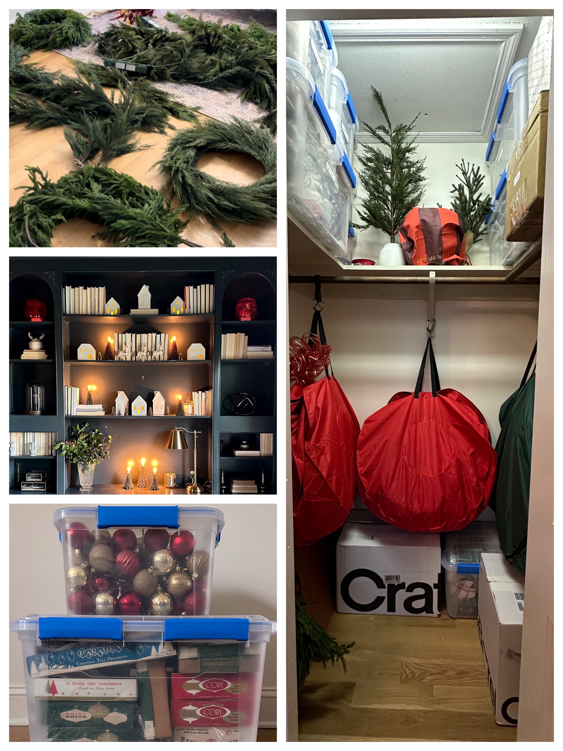
Can you believe everything on the left fit on the right?!
Remember, Christmas storage and organization is not about perfection, it’s about sanity. This is about making next year’s decorating a joy, not a chore. So invest in the clear bins, grab some pretty labels, and spend the time organizing your items. It will make decorating for the next Christmas a truly joyful experience!
read more
As we turn the page to 2024, I’m sharing my predictions for the top home decor trends and interior design styles we should expect to see more and more of. These themes will spill into all facets of home, from decorating inspiration to kitchen and bathroom designs.
Based on what I’ve observed coming out of the 2024 fashion previews, as well as simply paying attention to common themes I’m noticing across social media, I feel confident sharing these predictions for the coming year. And let me just say, I’m not mad about any of them! In fact, I feel this just might be my year, as many of these truly resonate with my own style. Without further ado, lets get to it!
Prediction #1: Color
Image Source: Benjamin Moore
When I say color, I mean COLOR. Get ready for bold and rich hues of blues, reds, greens and yellows. Green made a big splash last year, and I think we’ll continue to see it stick around, but get ready to see more reds. Specifically, I’ve been noticing an earthy, brown hue of red popping up more and more. It’s a bold choice, but when done correctly it’s high impact.
Prediction #2: The return of Chrome & Nickel

Brass fixtures have been reigning supreme over the past several years, and while brass certainly isn’t going anywhere, you should expect to see more and more silver tones coming into the fold this season. We’re seeing this in fashion and I think it’s time for the cycle of home finishes to start to slightly shift. Expect to see more and more mixed metals as part of many interior designs.
Prediction #3: EXTRA!
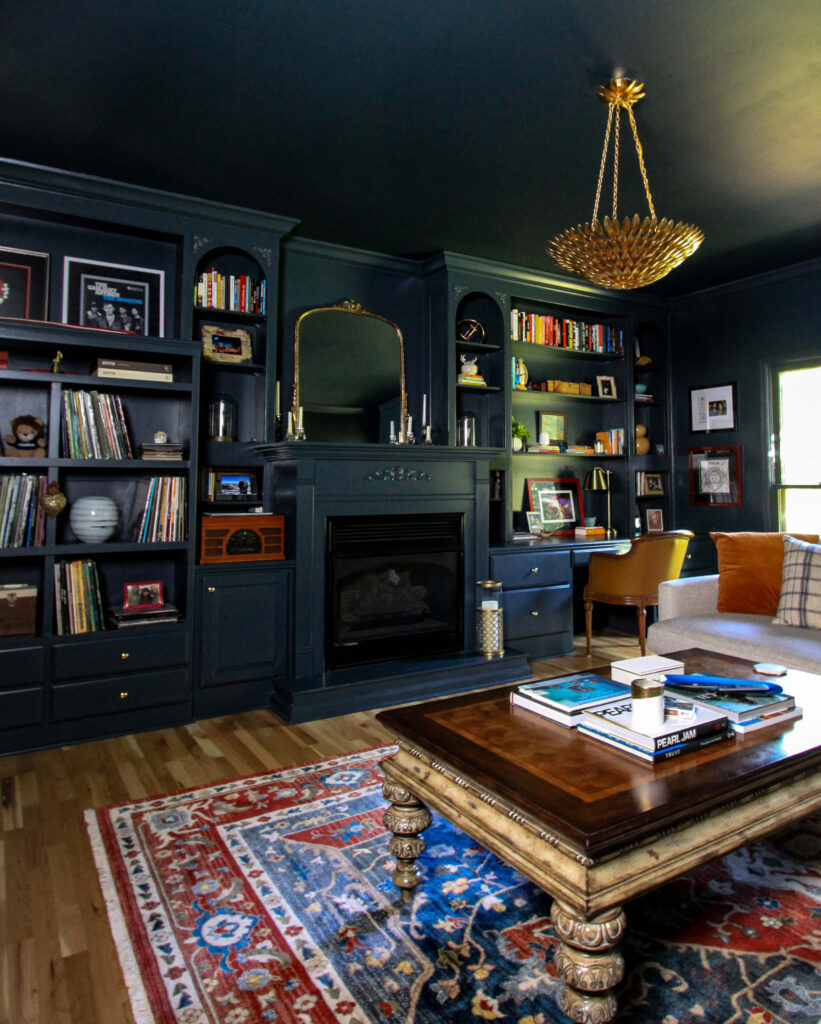
The days of minimalism and white boxes for rooms is gone. Get ready to swing hard in the other direction with a new trend of maximalism. Think layered textures, bold colors and a truly collected space.
Prediction #4: High Gloss
High gloss trim is here to stay
We’re seeing the return of patent leather in fashion and I expect to see this trend translate into home design through high gloss finishes. This could be with high gloss paint or even more mirrored backsplashes. Expect to see some shine in 2024!
Prediction #5: Pattern

Pattern has made its way back into the fold via the comeback of wallpaper of the past few years (more on that below) but expect to see more and more of it. Patterned drapes and even pattern coming back on furniture. I anticipate seeing pattern on pattern as well, whether a patterned sofa in a wallpapered room or a juxtaposition of geometric prints against floral designs. While this could leave some of us that lived through the late 80’s and 90’s a little shook, I encourage you to get excited. I think there is a tasteful way to do this and I’m excited to see how this trend emerges with a new spin!
Prediction #6: Wallpaper to the max!

Image Source: Rebel Walls
Spilling off the theme of pattern, wallpaper is here to stay. We’ve seen it making a slow comeback over the past few years leading as a solution to add texture into rooms and then finally incorporating pattern. Get ready to see it make a big splash this year, and watch people get bolder with it. I’ve been seeing more and more wallpaper on the ceilings and its been quite fun.
Prediction #7: More natural woodwork
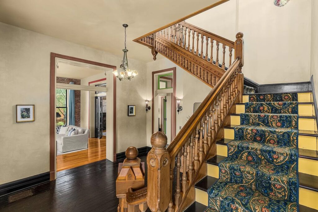
Image Source: Zillow
This past year we started to see the return of wood cabinetry and I expect that trend to continue into 2024. Along the overall theme of rich colors, I think we’ll start to see some rich and warm wood tones come back into the fold via cabinetry, furniture and even trim.
Prediction #8: Secondhand + upcycling
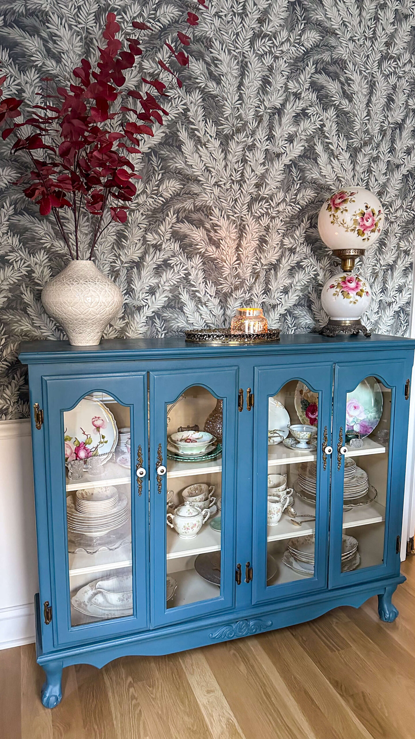
My blue hutch above was sourced from facebook marketplace
This should come as no surprise but expect to see more and more people embracing giving new life to old items. Whether sourced through Facebook marketplace, estate sales or thrift stores, the trend to shop used vs buy new is here to stay.
Prediction #9: Less Trends
How exciting is this one? I hope I’m right about this. I think we’ll start to see more of an “anything goes” mentality to design, as long as it’s in good taste.
Prediction #10: The re-invention of Traditional
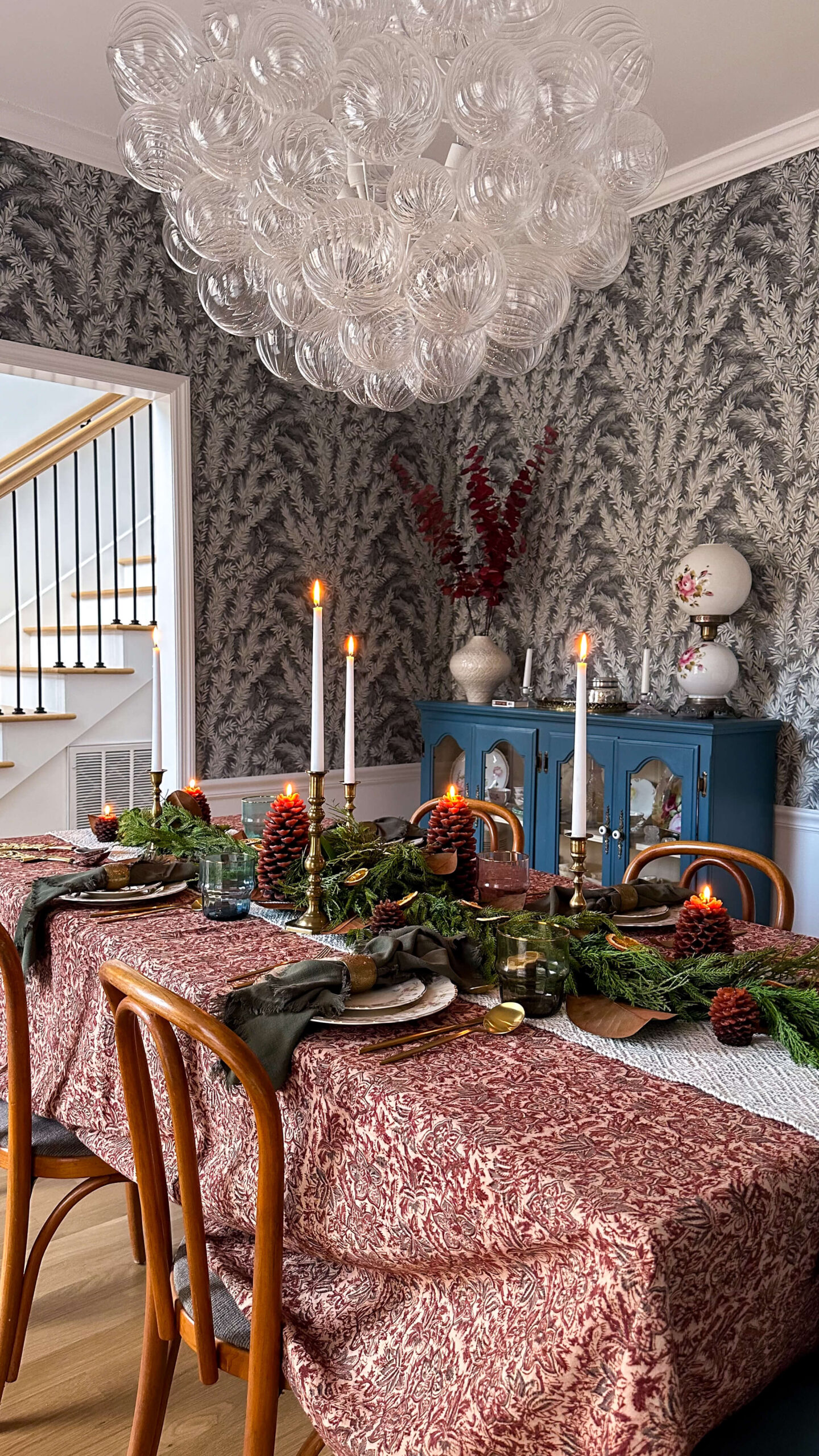
Photo of my traditional dining room set for Thanksgiving
I’ve seen more and more traditional design over the past year and I believe that is here to stay, but with a little twist. Expect to see a reimagination of traditional design this year, and unique spins on what tradition means to each person.
In Conclusion: 2024 Home Decor and Design Trend Predictions
While these are my personal predictions for the year, I truly hope I’m right about all of them! I am ready to see more styling, textures, colors and pattern across interior design, and truly believe a home is collected not decorated. Your home is a representation of you, and I don’t know anyone who is a plain white box.
What do you think about these design predictions? Is there anything you would add? Take away? What are you most excited about?
The Latest on the Blog —
read more
As we inch closer and closer to Christmas Day, I’m soaking up every moment of enjoying the Christmas decorations around my house. The house has seen some big updates this year, most notably the hardwood floors and staircase, so I felt it was only fitting to spring for some new Christmas décor this season. Follow along as I walk you through four of my favorite spaces.

The Staircase
The staircase is the first thing you see upon entering my home and I wanted it to make an impression while being welcoming. I created a sweeping design with Afloral’s Norfolk pine garland and its the perfect whimsical welcome for this space. I topped the design off with some pretty vintage looking burgundy ribbon and tied some brass bells to the newel post for an extra layer of texture.

Shop the Holiday Staircase
Christmas Decor in The Dining Room
The dining room saw plenty of action over Thanksgiving, and I honestly had no plans to decorate it. But then I remembered I had my grandmother’s red table cloth. And then I was gifted a pretty white poinsettia. And then I recalled I had some red taper candles and an extra ceramic Christmas tree. Before you knew it, I was adding another two pieces of Crate & Barrel’s prelit garland above my windows and this space was a festive treat for the eyes.
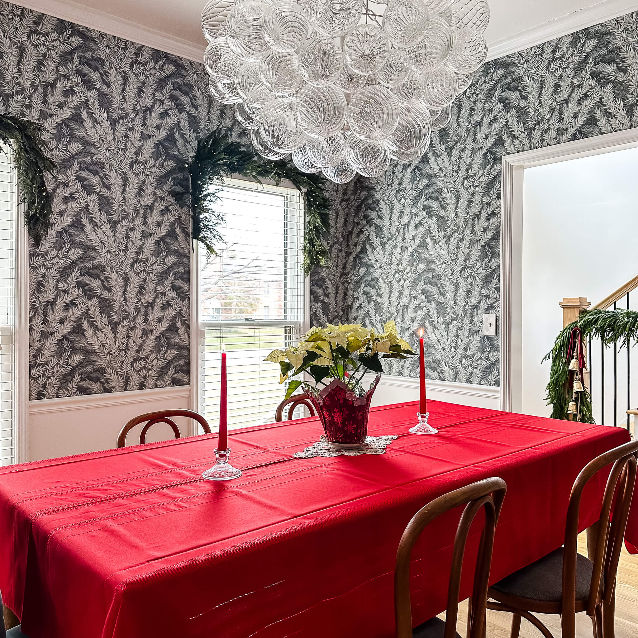
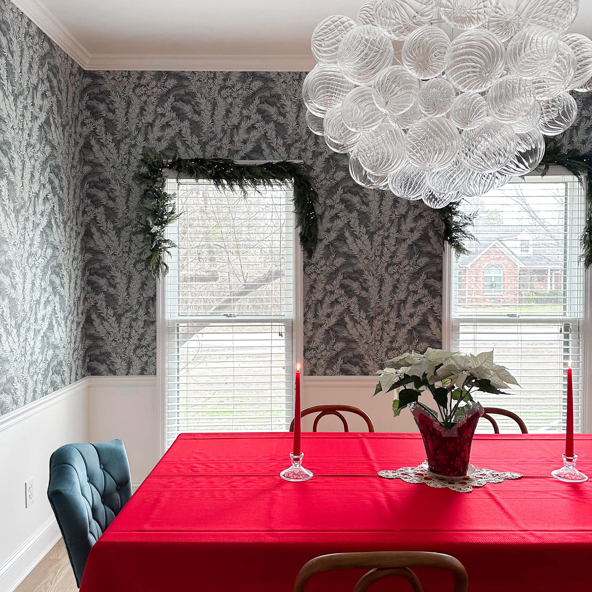
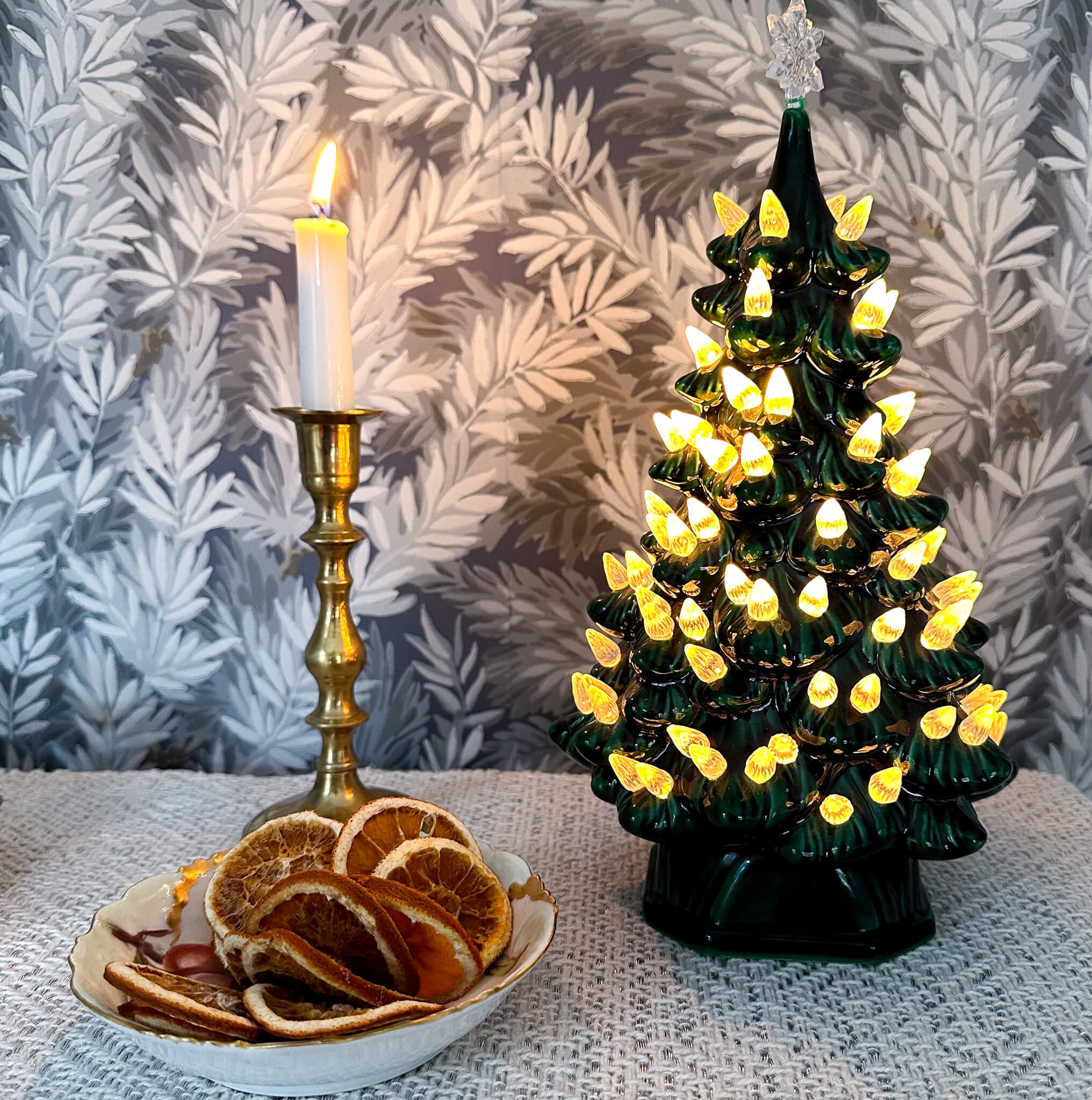
The formal living room
The formal living room is right off the main hallway, and it gets some of the best natural light in the house. I thought it was only fitting to carry the Norfolk pine into this space in a few different spots. The mantel with a sweeping asymmetrical design, matching Norfolk pine wreaths on the windows topped with khaki velvet ribbon, and a pretty but simplistic table arrangement for the coffee table.
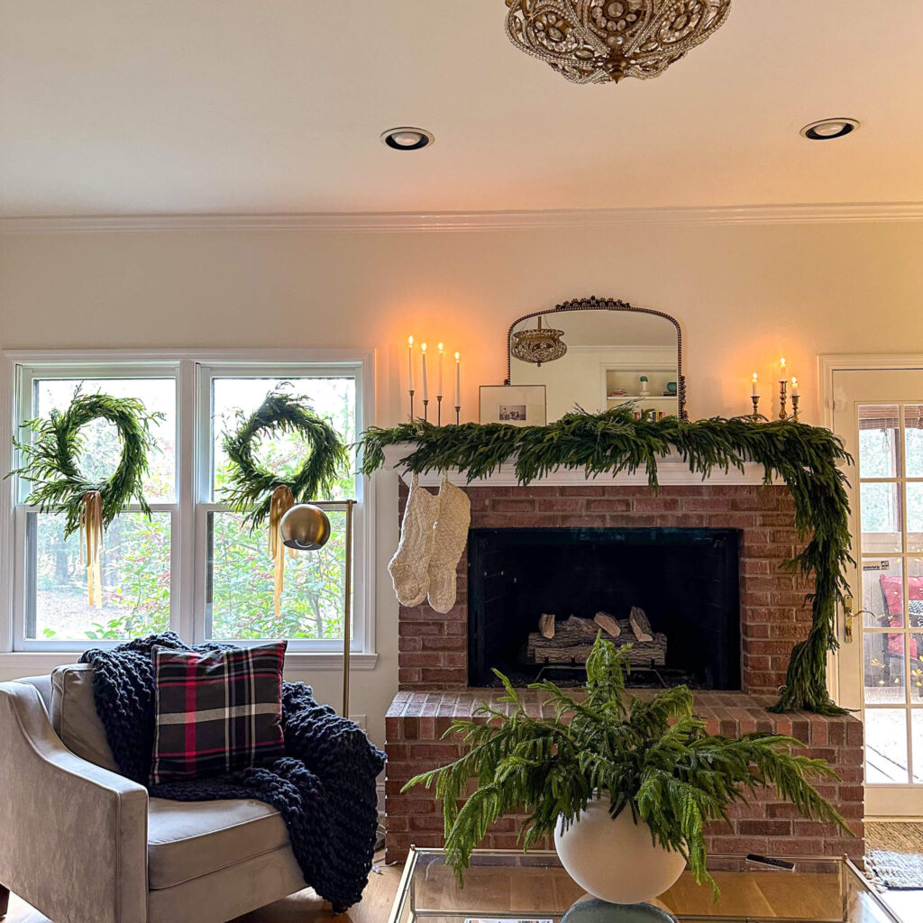


Shop The Holiday Living Room
By keeping the garland simple, my new flocked tree was really able to shine in the space and it is decked to the nines with vintage ornaments, both from my grandparents as well as from local antique stores I’ve been frequenting. I can’t wait to continue to collect more and more vintage glass ornaments over the coming years to build my collection.


The cozy Tv room: ultimate cozy christmas vibes
Last but certainly not least is the cozy tv room. This space got a makeover earlier this year when I decided to color drench the entire room. And while painting this space for the third time was the last thing I wanted to do, I kept telling myself how amazing it was going to look at Christmas. Lets just say it has wildly exceeded my expectations.

After a ton of research on how to pick the perfect Christmas tree, I splurged for a 7.5′ prelit Sanibel Spruce from Balsam Hill, and she is a beauty! I also added more of my favorite pre-lit garland from Crate & Barrel on the mantel and chose to create a beautiful draping design for this space.
Two matching cedar wreaths from Anthropologie adorn each window with leftover burgundy ribbon and I love seeing them pop when I walk into this space throughout the day.
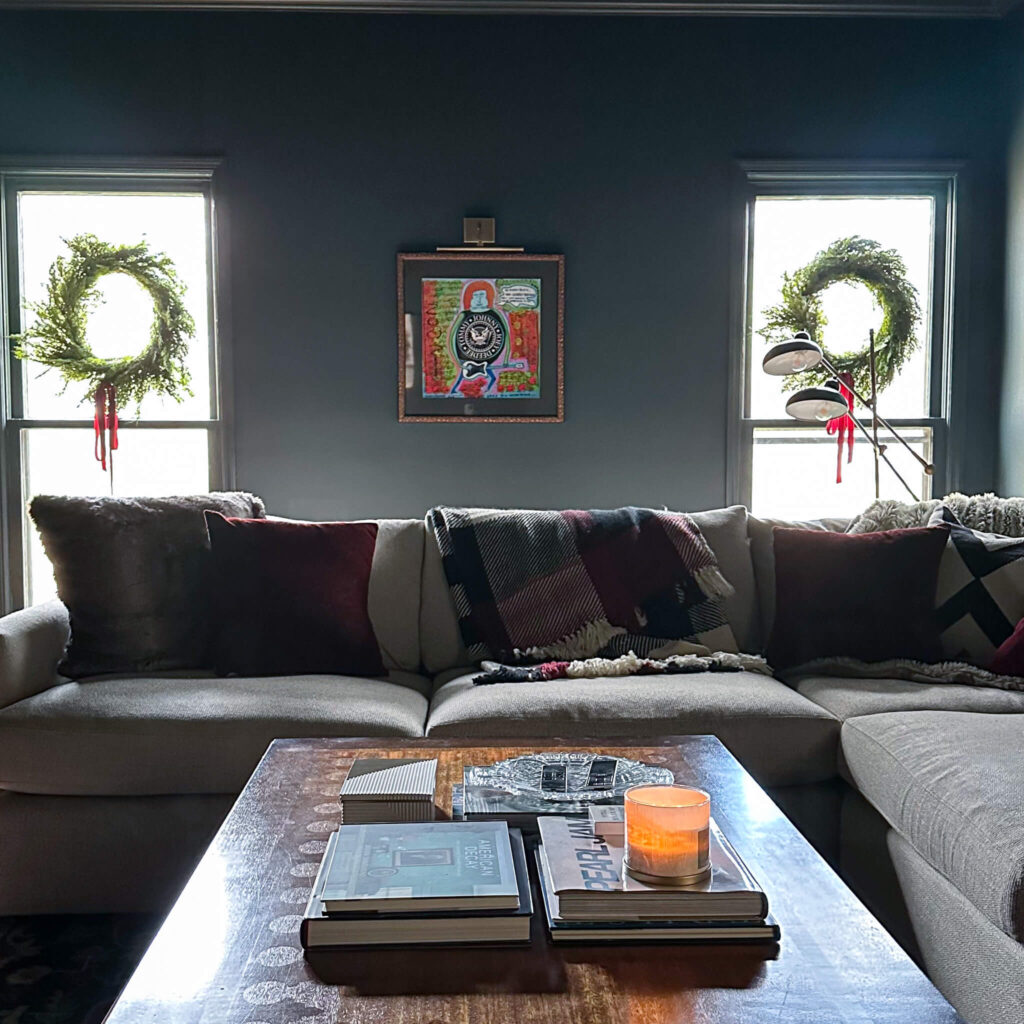

I created a monochromatic village on my bookshelves by flipping the books around and painting the ceramic houses a creamy white. Pine tree candles are sprinkled throughout and my great-grandmother’s reindeer are staged on the center bookshelf. I added remote controlled tea lights in each house and love how easy it is to turn the village on and off every night. Remember plugging everything in and having cords everywhere? These tea lights have made everything so much more seamless and clean!
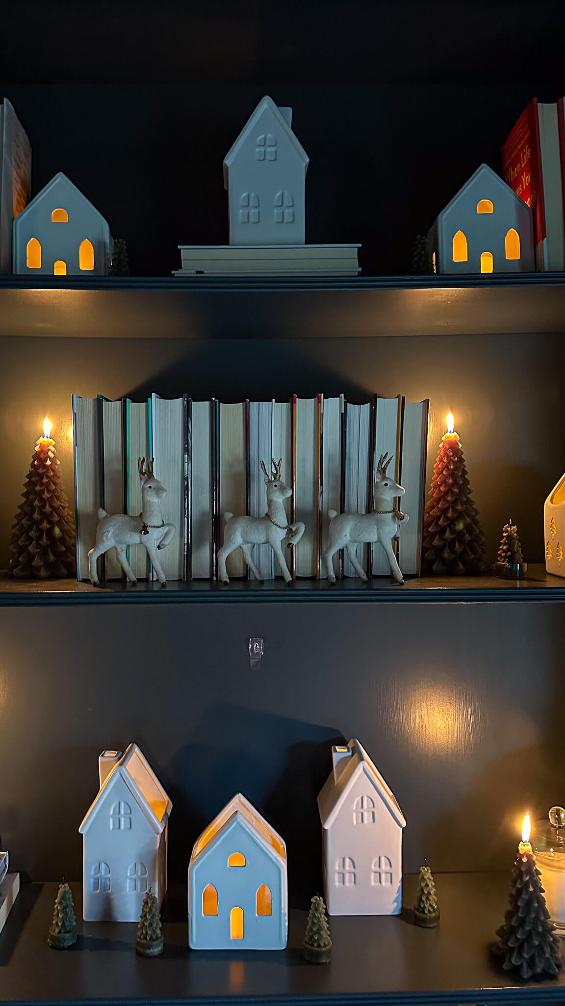

Parting Thoughts on this year’s Christmas decor
I went above and beyond with Christmas décor this year, but I have to say I don’t regret any of it. In fact, I’m already looking forward to sprinkling in holiday cheer into more spaces next season. The primary bedroom, kitchen and main bathroom are all on the list for spaces I hope to spotlight in a bigger way.
Whether you go big for Christmas, or prefer to keep things simple, I hope you’re able to take a quiet moment to yourself over the next few days to enjoy your home for the holidays. There is something so special about the warm glow of a Christmas tree, the scent of the perfect pine candle and the nostalgia of decorations passed down throughout the years.

Merry Christmas and Happy Holidays to you and yours. Thank you once again for being here and I can’t wait to continue this journey with you in 2024!
browse more posts
read more
There are two types of people in this world: those who are excited to buy gifts for others and those who don’t know where to start. I fall into the former category myself, which is why it’s so fun for me to put together holiday gift guides. Whether you need one more item to finish your shopping for the year, or you haven’t even started yet, don’t worry. My 2023 holiday gift guide has you covered!
2023 Holiday Gift Guide
Teenage Girl
The Ultimate Drawing Set: for the budding artist
Stanley Thermos: the “it” mug in the “it” color
LuluLemon Crossbody: so chic
Glam Station: every girl needs one!
Revlon 2-in-1 hairdryer styling brush: she’ll feel like she just left the salon
Teenage Boy

Carbon Fiber Wallet: protect his identity while looking cool
Victrola Record Player: what’s old is new again
Virtual Reality Set: it’s another universe
Star Projector: his room will be the coolest
Electric Scooter: no license, no problem
For Dad

Hyperice Heat massaging Patch: perfect for lower back pain and sore muscles
Personalized leather tote bag: stylish and from a small business
Book of Dad Jokes: buy at your own risk
Smart Phone Magnifier: this is a projector that magnifies his smart phone
Stadium Blueprints: so many stadiums available! Pick his favorite and have it framed for him.
For Mom
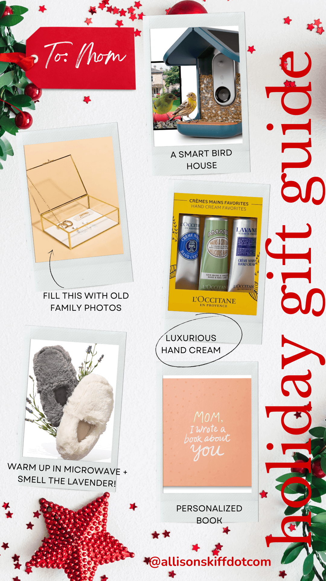
For the Bird Lover: A Smart Bird House with built-in camera
Glass Trinket Box: fill this with family photos
Luxurious Hand Cream: so important during winter
Warmies: slippers you can warm up in the microwave and they smell like lavender
Personalized Book: fill in your memories for her
Significant Other: To Him

3 burner Camping Stove: for the adventure seeker
Cozy UGG Slippers: warm and stylish
A Smart Mug: may his coffee never be cold
Grooming Tools by Manscaped: The Lawn Mower + the Weed Wacker
Theragun Massage Gun: for his sore muscles
Significant Other: To Her

Fuzzy Slippers: memory foam criss cross faux fur slippers. So cute!
A silk pillowcase: her skin will thank you
Ninja Ice cream & gelato maker: a treat for her and for you!
Lounge Set: these are the softest and the prettiest!
Herringbone Italian Throw: pick her favorite color – this one’s a keeper!
Stocking Stuffers

Drum Stick Pens: for your teenager or adult who still acts like a teenager
Apple Air Tags: throw them in your luggage, on your keychain or anything else you’re always losing
The Birdie: a personal alarm that attaches to your keychain. Every teenager needs one!
JBL Portable Mini Speaker: take those tunes anywhere!
Karaoke Bluetooth Mics: one for me and one for you. Watch out Beyonce.
read more
Last week, I shared I upgraded my holiday garland this year and I took you along for the ride on how I styled my staircase with the Norfolk pine real touch garland. We’re going to keep the garland theme and move onto the fireplace mantles. That’s right, fireplace mantles as in more than one! Since I’m lucky enough to have two mantles, I decided it might be fun to try two different techniques for hanging garland on the mantel. Today we’re going to focus on a symmetrical draped look in the cozy tv den.
If you’re new here, you might have missed the massive transformation this room has gone through. We went from a band aide to a full on color drench in a dark blue grey, and this room is just begging for Christmas decorations. Since it’s now such a dark space, we are going to go a little “extra” in here this year, and sprinkle in several different layers of lights.

In the past, I’ve set my garland on top of the mantel, hung stockings on the sides and middle, and called it a day. This year, I felt I could do better. I spent quite a bit of time in November browsing garlands, and I stopped my scroll when I found Crate & Barrel’s faux hemlock pine pre-lit garland. It’s a fuller garland, and drapes beautifully, plus it has battery packs that can operate on a timer. I was able to go into the store to see it in person and it was just as beautiful as it was online.
Anchoring with Cup Hooks
With the size of my specific fireplace and mantel, two of these 74” garlands was just perfect to achieve the look I wanted. Since the garland is extremely heavy, I did not want to rely on command hooks. I also didn’t want to run the risk of the command hooks peeling off the paint on my shelving.
Luckily, since this is a 90’s house, my mantel is made out of wood which means I can easily drill into it. I decided to use 7/8 inch matte brass cup hooks for this and drilled on the inside lip of the mantel, disguising the visibility of the holes. I placed a hook four inches from both ends of the mantel and placed a third in the center.

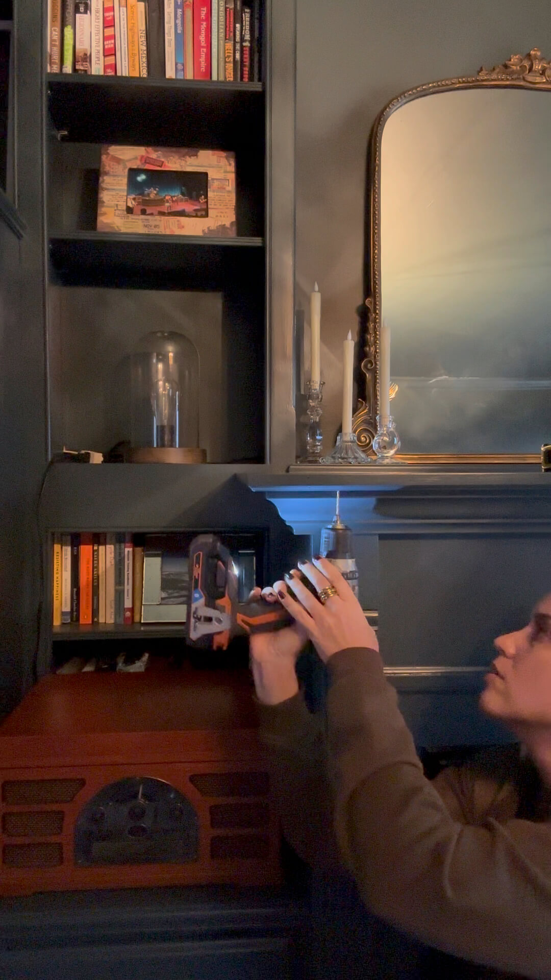
Adjusting with Zip Ties
Placing a zip tie halfway up one piece of garland, I hooked it on one edge of the mantel. From there, I hooked it onto the center hook. I repeated this on the other side, and with some adjusting of the zip ties, I had a romantic look with minimal effort.
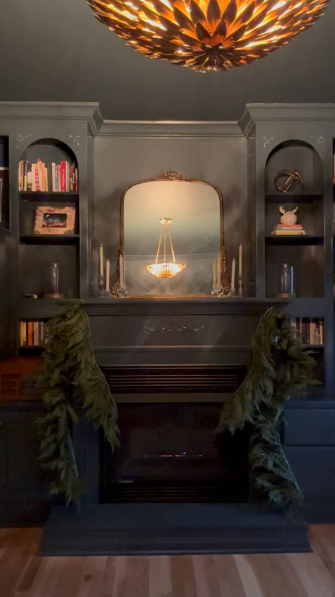
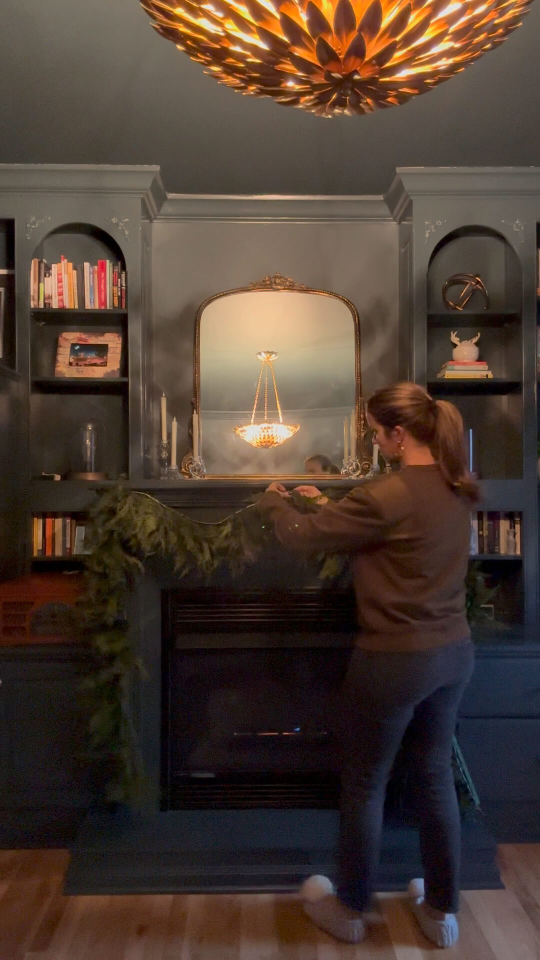
After the holidays wrap, I’ll unscrew the cup hooks and store them for the following year, and no one will know there was ever a hook there in the first place. What do you think about hanging garland on the mantel this way? I love the look of it, and can also rest easy knowing these hooks are tightly secured, and my garland is safe.
Tools for this project:

Faux Hemlock Pine Pre-lit Garland
Sharpie
The Latest on the Blog —
read more
Let’s be honest, choosing the perfect Christmas tree can be overwhelming and sometimes you can be paralyzed by all the decisions that go into it. I should know, I just went through it this year! But I’m here to tell you it doesn’t need to be difficult. Today I’m sharing all of the things I considered before buying my new tree(s). Follow along and no matter your home size or style, I have everything you need to consider for choosing the perfect Christmas tree.
Real vs. Artificial:
The age-old debate. Real trees are undeniably magical: that piney scent, the fresh-cut sap, the Charlie Brown-esque hunt in the lot. But let’s be real, they’re also messy, high-maintenance divas that drop needles like confetti and leave you vacuuming tinsel till February.
Enter the artificial tree – the ever-loyal, low-maintenance old faithful. No shedding, no watering, just effortless Christmas cheer year after year. But can they really capture the magic?
Well, I’m here to tell you they can. This year, I snagged two artificial stunners that are basically the Beyonce and Jay-Z of Christmas trees:
- 7.5′ Flocked Vickerman: Now, this one’s a showstopper. Picture a winter wonderland straight out of Narnia, dusted in the most glorious faux snow. It’s like having a silent disco in your living room – all the sparkle, none of the sticky glitter aftermath.
- My New Sanibel Spruce: This beauty is the epitome of classic Christmas. Lush, full branches, a perfectly symmetrical cone shape, and space in between the branches to go deep with ornaments. It’s like having a perfectly coiffed tree in your living room, minus the demands of keeping it alive.

Green vs. Flocked:
See, this is where things get personal. Are you a minimalist Scandinavian kinda person? Go green – it’s clean, classic, and pairs well with pops of color. But if you’re all about the maximalist Martha Stewart life, flocked is your jam. It’s instant winter wonderland, perfect for piling on ornaments and twinkling lights.
Full vs. Thin:
Full trees are the crown jewel of the bunch: bold, voluminous, and ready to command attention. They’re perfect for grand spaces and statement decor. But if your living room is more of a cozy nook, a thinner tree is your soulmate. It won’t overpower the space and lets your ornaments shine.
Height Matters (But Not Always):
Ceiling height is key: measure, measure, measure! But don’t be afraid to think outside the box. A towering tree in a small space can be dramatic and whimsical. And a mini tree on a pedestal? Instant chic.
The final Verdict on choosing the perfect Christmas Tree
There’s no one-size-fits-all answer. It’s all about your personal aesthetic and lifestyle. Embrace the artificial revolution or stick to your real tree roots. Go full-on Extra with a flocked masterpiece or keep it classic with a timeless green. Just remember, choosing the perfect Christmas tree means picking the one that makes your heart sing when you turn on the lights.


browse more posts
read more
If you’ve been following along, it will come to no surprise to you that I’ve decided to reward myself with some new holiday garland this year. After enduring the messiest renovation with new hardwood floors and a new staircase to boot, I’m ready to show it all off. I decided to splurge on Afloral’s Norfolk Pine real touch garland and it does not disappoint. Follow along as I share my method for how to hang garland on a staircase.
Step 1: Measure
Before you open up your wallet (or browser) you need to decide how much garland you’ll likely need. This will also depend on how you hope to hang it. Do you want long drapey loops or do you plan to wrap it around the banister. What about the newel post, or posts? Are you wrapping those as well? Take time to measure your staircase and add a little extra to be safe.
Personally, I knew I wanted to simple whimsical look, and wanted my garland to be in swoops. With a banister measuring 9 feet, plus an extra 4 feet of railing on the landing above, I opted for two 15 foot pieces off the Norfolk garland. This will allow for draping and a little overage.
Step 2: What type of Garland? Full or Thin?
Right alongside measuring is deciding what kind of fullness you want your garland to have. Do you want a fuller garland or a dramatic one? Keep in mind that many of the pictures you see online or in catalogues are really multiple garlands layered. If you want a fuller look, you may need to double your original calculation. Do you want lit garland or unlit? Is your staircase near an outlet? Run through these questions before you start browsing,

Again, I wanted a whimsical, romantic and dramatic look. For the first year, I’m going to stick with a single layer and see how it goes. As this is an investment for me, I can always build upon it in years to come if I decide I want a fuller look. And unfortunately, my outlets are not in a convenient spot in relation to the staircase, so we’ll be moving forward with an unlit staircase for the time being.
Step 3: Placement
It’s time to place your garland! Start at either the top or the bottom and properly anchor your first piece to the banister. I’m opting to use clear zip ties, but you can also use green pipe-cleaners.
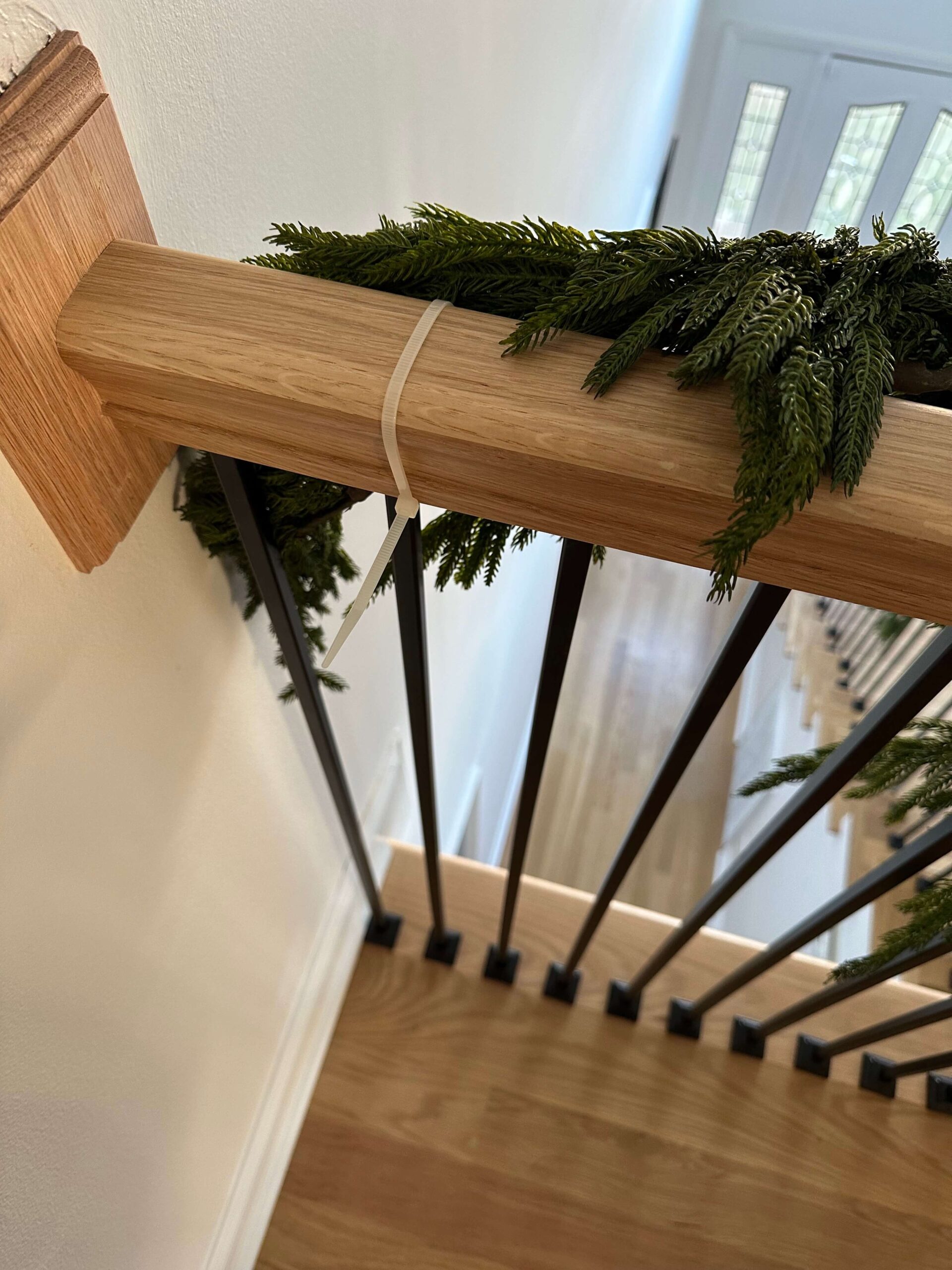
Once you’ve anchored your first piece, its time to decide when to drape or wrap your garland. The way I’ve decided to do it is by counting steps and then dividing. From my 9 foot banister, I have 12 steps from the bottom to the top. Since I want a dramatic look, I’m going to do a long drape. I’ll drape the garland every 4 stairs, which will leave me with 3 big loops.
Step 4: Newel Posts
Generally, you should plan to double up your garland around the newel post. I have an extra 5 foot garland that I’ll be tying onto the base of my last piece, which will help create a fuller look at the bottom.
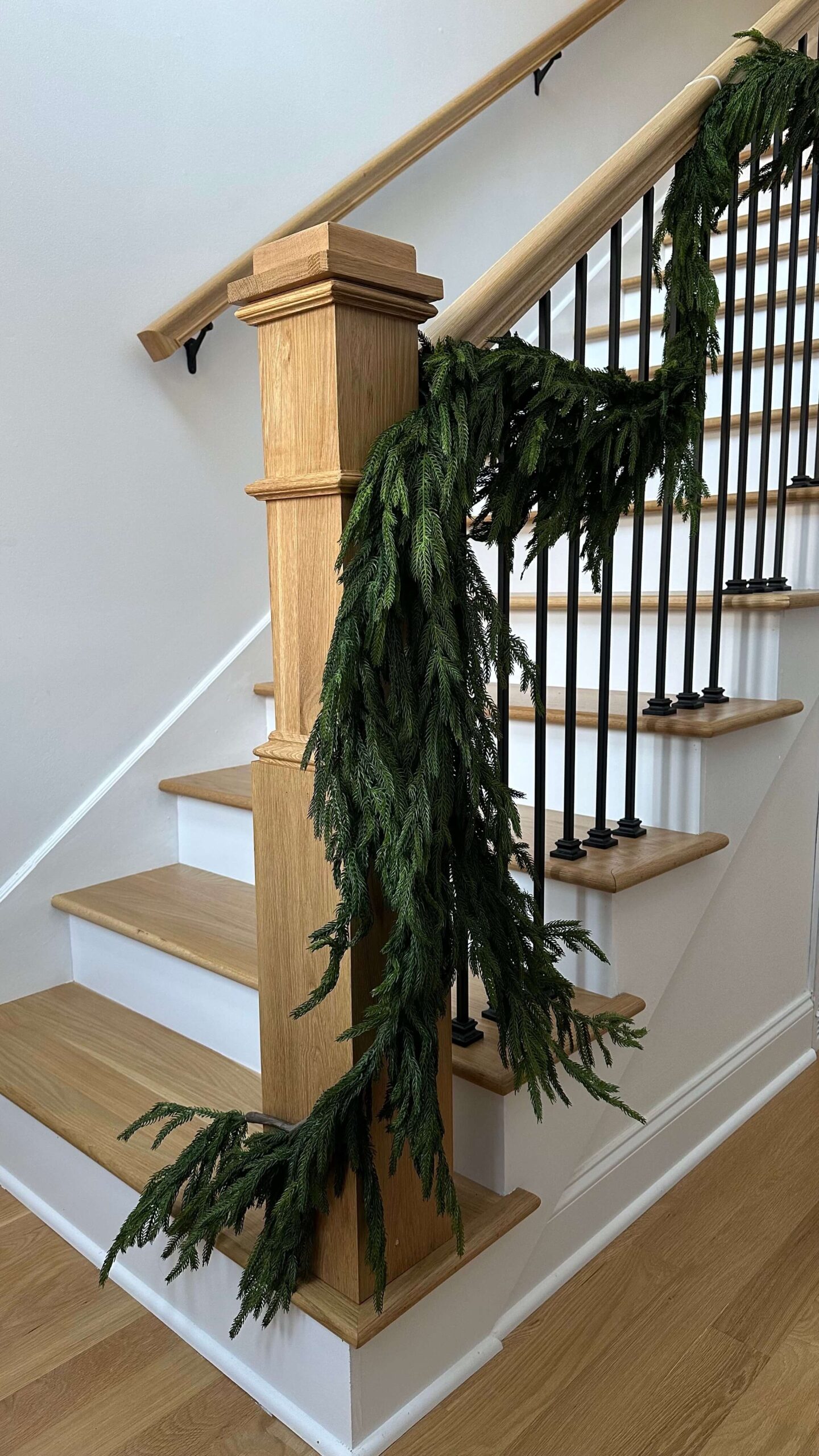
Step 5: Put a bow on it!
Or something else! Deck your garland out with long velvet ribbon, dried oranges, a string of bells or something else of your liking. My mom used to place crystal ornaments throughout hers and when the garland was lit it made such a pretty twinkle.

I ordered some burgundy and khaki velvet ribbon from amazon and created long bows for my garland. I ran a piece of floral wire into the back of the bow and then secured this to my zip ties on the banister. When it’s time to take it all down, I’ll leave the floral wire attached for next year!
Step 6: The bells and whistles
As an extra touch, I’m stringing some pretty bells at the base of the garland, which is at the newel post. They add an extra layer of visual interest and help keep the eye moving. Plus, they have a layer of nostalgia to them!

I’m so happy with my new garland, and while it was an investment, I know I’ll enjoy this timeless look for years to come. I might even continue to build on it! The look is simple and effortless and provides such a warm greeting upon entering the front door. I couldn’t be happier with how it turned out!

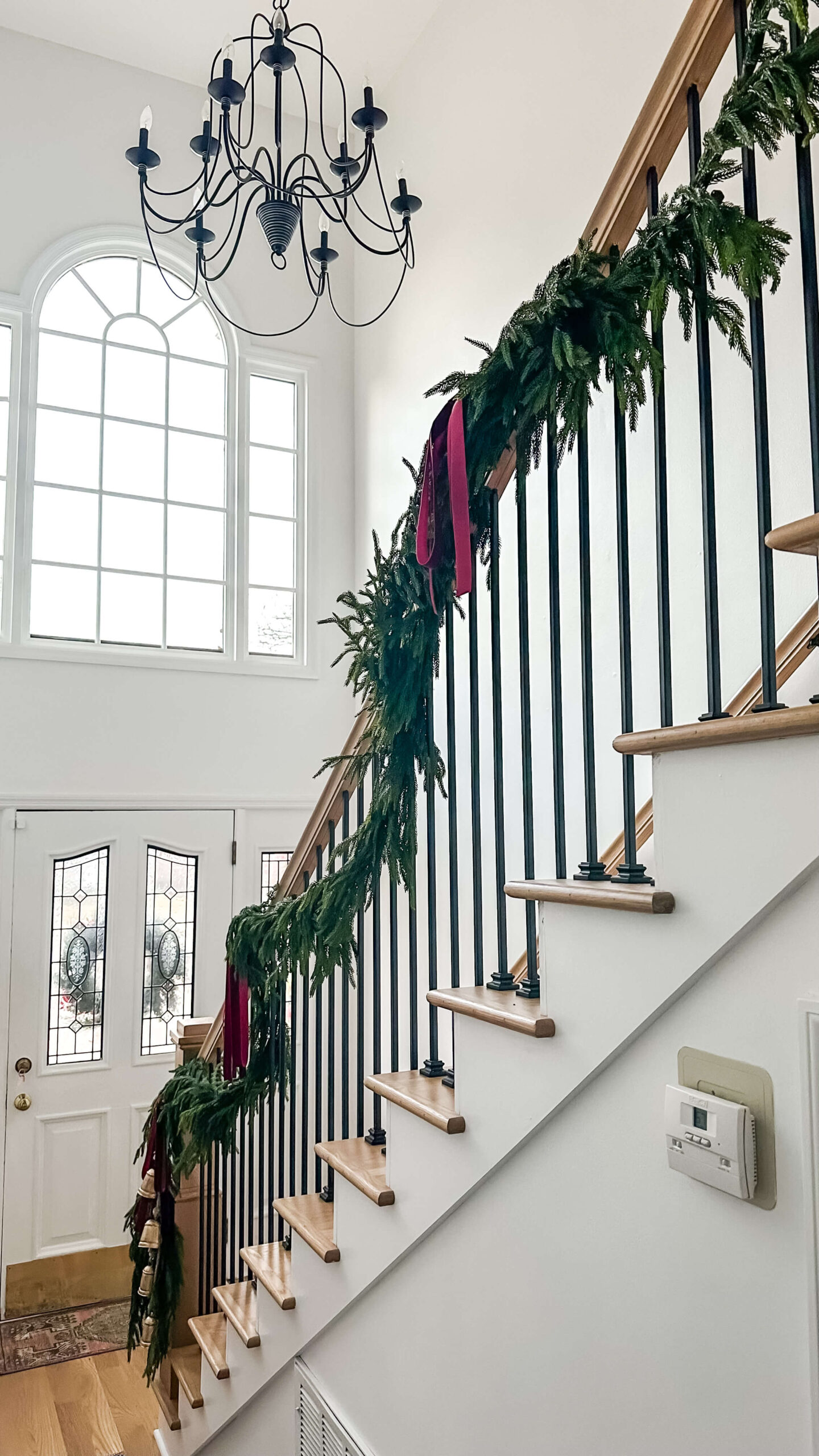
Shop the Look:
Real Touch Norfolk Pine 180″ Garland
read more
Happy Thanksgiving! As I’ve gotten older, Thanksgiving has inched its way to the top of the list as my favorite holiday. I love having the opportunity to spend quality time with my family and being able genuinely enjoy the long weekend. It feels slow, intentional, and warm.
This year has been difficult in many ways. Most notably it’s been filled with quite a bit of loss. As I reflect on this, I can’t help but be reminded by something someone once said to me. At my previous job, my boss at the time unexpectedly lost his mother right before the holiday season. It was awful. When I called him to share my condolences, he said his father once told him: “When you experience loss, you should count all of the things you do have.” It was something so simple yet so profound.
So, I want to take this opportunity to share the things I do have, and be intentional about cherishing them. I challenge you to do the same. Extra points if they’re things money can’t buy!
My Parents
Always at the top of my list, I’m so grateful and thankful for my wonderful parents. Growing up, I thought everyone’s family was just like mine (because most of them in my hometown were!) but as I’ve left the nest and stepped into other people’s lives, I realize how lucky I am to have parents like mine. They are my biggest cheerleaders and are such an inspiration to me. Both as individuals and as a model relationship.
My Family
Up until this year I still had three grandparents, and I realize what a rarity that is this late in life. As life goes, I unfortunately lost both grandmothers this year, leaving me with one remaining grandfather. Even though you know it’s coming, it doesn’t make it any easier. I’m thankful for all the wonderful memories I have with each grandparent. When I see certain things, or smell certain smells, I’ll always be reminded of them. And of course, I’m especially thankful for my remaining grandfather, Poppa Eddie as well as all of my amazing Aunts, Uncles and cousins.
Community
I’ve been blessed to have an incredible community of friends both near and far. It’s so important to know you can always count on someone when you need them. When I think about it, I need more than two hands to count the number of people that I know I can truly count on. How lucky am I?! Having a friend I can just sit still with, or a friend I know I can confide in with absolute trust is one of the most valuable things in life.
This Project!
If you know me personally, you likely know I’ve always loved design. Unfortunately, it’s not what I’m currently doing for a living, but I started this website and this brand as a way of dipping my toe into the design world. The sense of purpose this has given me, and the amazing community of like-minded people I’ve found in such a short time has been overwhelming and unexpected. This has been something I’ve thought about doing for years, and self-doubt has stopped me time and time again. I’m so glad I finally mustered up the courage to just go for it.
YOU
Lastly, if you made it this far, I want to say I’m thankful for YOU! Thank you for taking an interest in this project. Every comment, every like, every share, every follow – they all truly mean the most to me. I hope to continue to give back to you in the coming months and years. Whether it’s through education, inspiration, or just plain entertainment. Thank you for following along and all your support. I couldn’t do this without you!
Just for giggles…
In good fun, I’ll share I’m extra thankful to be done hand scraping 3,000+ square feet of popcorn ceilings. I’m also thankful I’m not living through a hardwood flooring renovation. I’m looking forward to some less dusty renovations for 2024 (more on that soon!).
Happy Thanksgiving
I hope each of you have a wonderful Thanksgiving with friends and family. Remember to take a moment to tell the people in your life how much you love them. And if you get a quiet moment to yourself, I hope you’ll think about all the things you have that money can’t buy.
The Latest on the Blog —
read more
While I’m no stranger to hosting Thanksgiving, this will be my first time hosting both sides of the family which I’m very excited about. I love to cook, and especially love the excuse to make recipes I don’t get to make every day. Plus there’s just something special about those Thanksgiving staples like my mom’s stuffing, or a simple pumpkin pie. On the heels of finishing the dining room, I knew I wanted to make this Thanksgiving a little bit “extra,” and there’s no better place to do so besides setting a festive fall tablescape.
I’ll admit it: after the excitement wore off, the idea became a little overwhelming. Yes I can set a table, but no I have not created a centerpiece from scratch, nor does everything fit a certain color palette. Deep breaths. I set out to my go-to source for inspiration: Pinterest and after plenty of browsing, a few detours, and many pins, my vision started to take shape. As I know firsthand how overwhelming this can be, I wanted to share my top tips for designing your Thanksgiving table.
4 tips for designing a fall tablescape
Don’t overthink the color palette
If you’re like me, when you think about autumn or Thanksgiving, you immediately think of colors like oranges, reds and yellows. While you should certainly plan to incorporate some of these colors into your fall tablescape, there are no hard and fast rules that these should be the only colors on your table. In fact, quite the opposite can be true.

Turning to a color wheel for some show and tell, you can see how certain colors compliment their primary counterparts. Apply this to your fall tablescape and think outside of the box a little.
Florals come in many forms
While adding in some fresh fall flowers is certainly an option for your Thanksgiving table, there are other ways to incorporate botanicals that can really make a statement. This can include a floral tablecloth, or can even come in the form of candles like these pine cone candles. Or look to your dinnerware for inspiration: there are some amazing sets of flower patterned china at deep discounts across facebook marketplace, estate sales or vintage shops.
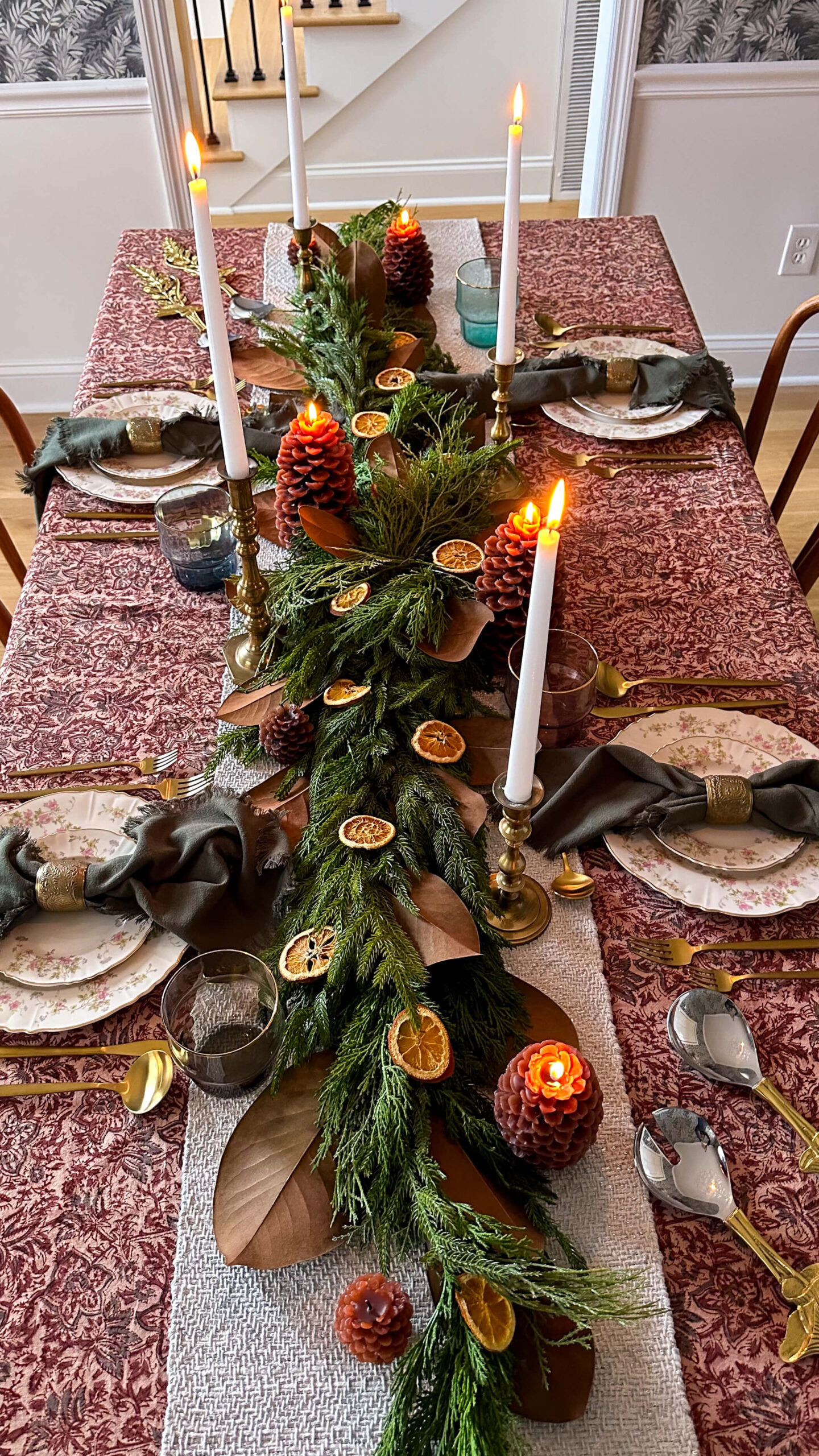
Go for Gold
Gold flatware that is! I wanted to add a layer of warmth to the table, and before I knew any of my other elements, I knew that I wanted gold flatware. I found this amazing 40 piece set on amazon for a steal of a deal.

From there I browsed for some serveware additions that would make a statement and these large gilded spoons from Anthropologie were just the ticket. Don’t overthink getting an entire set that matches. Mine is a combination of pieces I’ve purchased throughout the years and I think it adds a layer of character to the table.
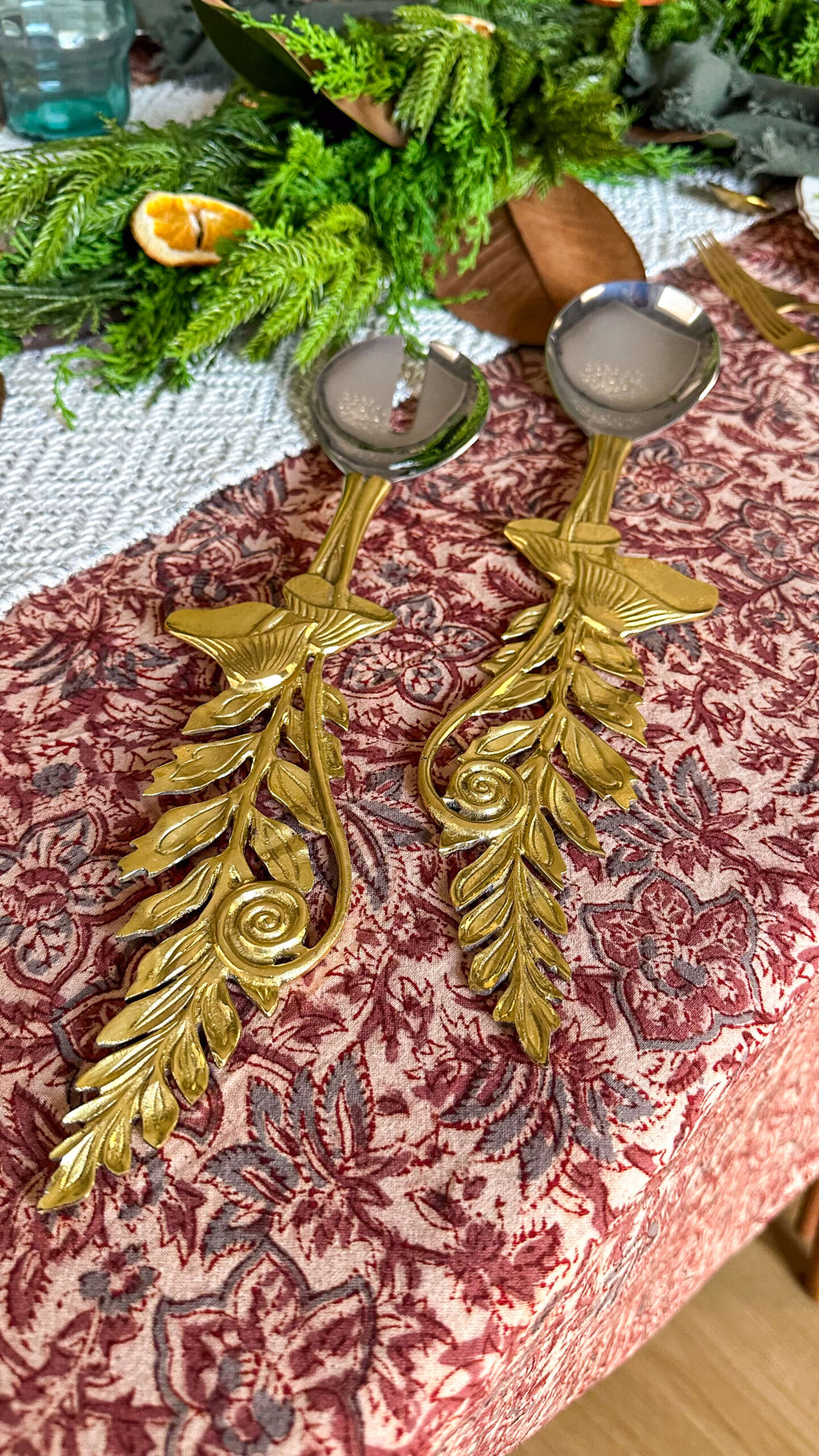
Add in Ambience
Whether it’s through small votive candles or large tapers of varying heights, sprinkle some candles throughout your table when and where you can. They add a layer of sophistication and so much warmth to the space. Turn on some background music (last year SiriusXM had an amazing Thanksgiving playlist) and the mood will be set for your guests to enjoy.

While the idea of designing the perfect Thanksgiving tablescape might seem overwhelming, it’s all about layering in small pieces that capture the spirit of the autumn season. Happy hosting!
Sources
Gold serveware – sold out (see similar)
Napkin rings – vintage. (see similar)
Brass candlesticks – vintage. (see similar)
China – vintage. I’d suggest visiting your local thrift store!
browse more posts
read more
With all the updates to the house this year, especially the floors and staircase, I decided this would be the year I would splurge on some new holiday garland. Ever since last year, I have been eyeing the Norfolk Pine garland and I finally decided to “add to cart” this holiday. I’ll admit, it was a bit pricey. To stretch out the enjoyment from my investment, I decided to repurpose some of the garland and create a DIY autumn centerpiece for my Thanksgiving table.

My goal of this project was to keep it relatively low cost, so many of the items you’ll see in this tutorial have been scavenged one way or another! Ha! With that being said, I think you can easily substitute your own elements into this project to make it suit both your style and your budget.
Here’s everything I used to create my DIY Autumn Centerpiece:
- Long strand of garland. I purchased the Norfolk pine garland and love the realistic look and texture of it. While it’s definitely an investment, I plan on using this for the rest of my life.
- Magnolia leaves. I was able to pluck some from a nearby tree for free!
- 2-3 oranges
- Brass candlestick holders and taper candles. I picked up several vintage brass candlestick holders of varying heights at my local antique store.
- Additional candles. To plus up the autumn theme, I layered in these pine cone candles from Crate & Barrel. There’s also a wonderful battery alternative on Amazon and they look like they have a hint of gold to them!
Again, feel free to mix and match different items that fit your style and scheme. Now that we have our supplies, lets get to work assembling the autumn centerpiece!
Prepare the Dried Oranges
We’re going to make the dried oranges via the oven. It’s a very simple process but you will need to be available to flip the orange slices every 30 minutes for several hours.
- Preheat oven to 200 degrees
- Thinly slice 2-3 oranges. I used 2 oranges for this piece.
- Place oranges on parchment paper on a baking sheet
- Bake for 2-3 hours, turning every 30 minutes. I ended up doing 3 hours, as my oranges were juicer than expected.

Your house will smell amazing! I personally think it smelled like butter!
Place the garland
Add your garland to the center of the table. Mine was a fuller piece, so if you prefer this look, you may want to layer 2-3 pieces of garland to achieve this look. Play around with it and have fun! You can always start over, add or remove as you keep going.
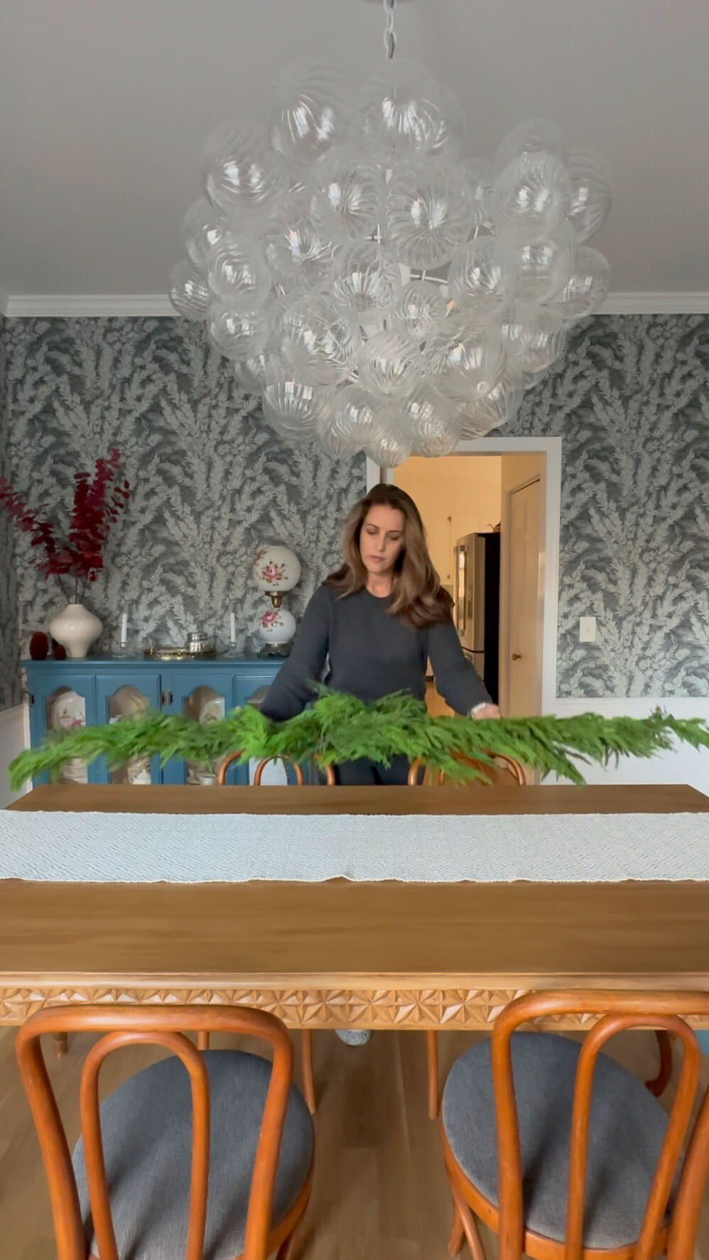
Layer the Magnolia leaves
Once you have your magnolia leaves, wipe them off or wash them to ensure you’re not bringing bugs or dirt into your home (and onto your table!). Weave them into the garland, placing them underneath, in between and on top. Alternate sides of the garland as you work your way from end to end. I chose to place my leaves brown side up, as I really like the contrast and I think it adds a nice autumn color palette to the table.

Bring on the brass!
As I mentioned above, I was able to find quite a haul of brass candlestick holders at my local antique store. This is a more cost effective alternative to buying new, if you don’t already own some. Look for varying heights and shapes, as it will add visual interest to your arrangement. When it came time to add the actual candles, I chose to keep it simple with long white taper candles.
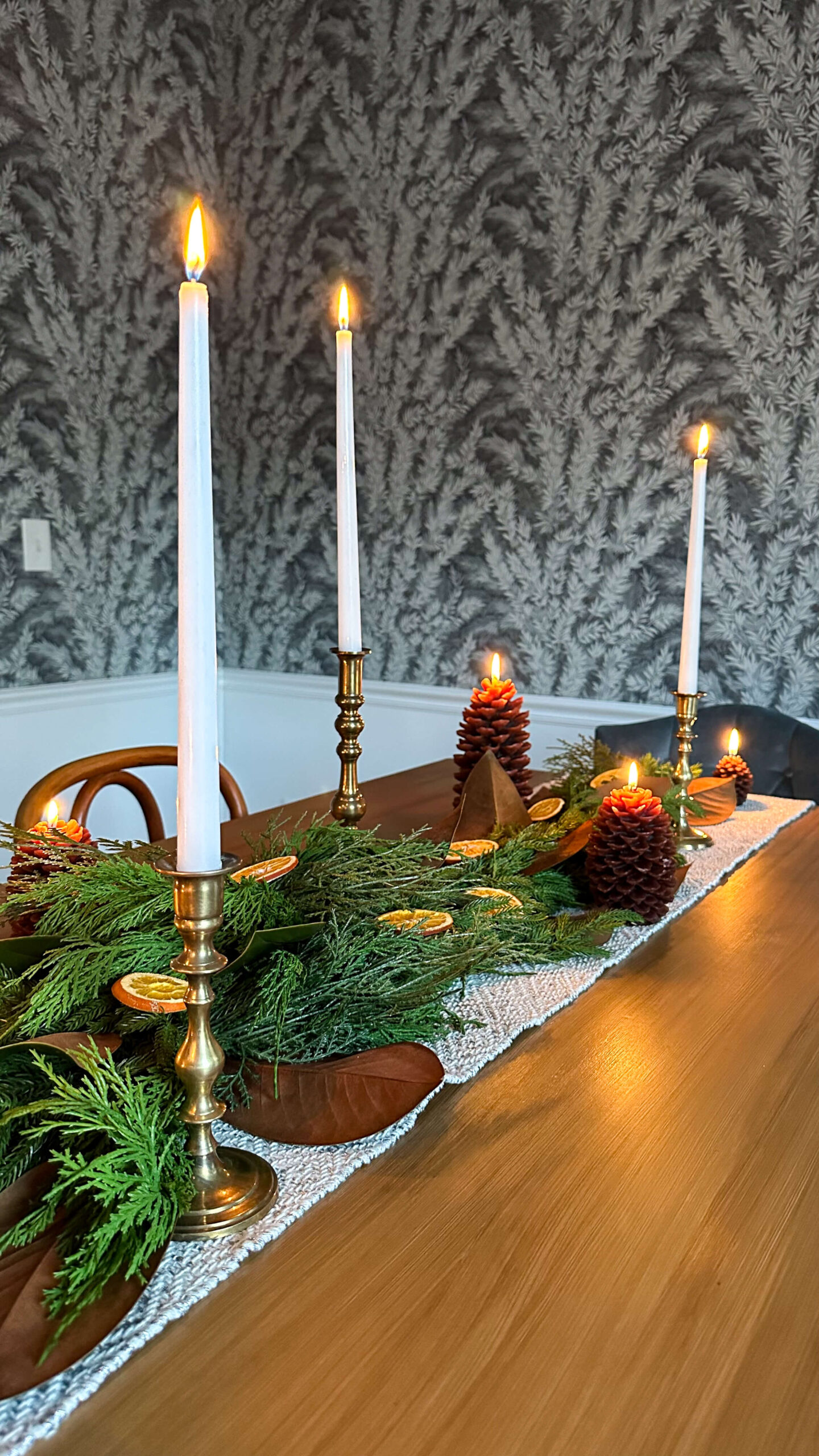
Some brass candle stick ideas if you want to buy new:
Layer in additional candles
To further the autumn theme, I added in these cute pine cone candles throughout the centerpiece. These come in three sizes and are so cute! If you’d like a battery alternative, which will last you a lifetime, these are a great option!

Place your Oranges
Once your orange slices are properly dried out and cooled, layer them throughout the garland. This does not need to be complicated. Simply place them down the table, alternating sides of the garland.

Closing Thoughts
I truly did not know what to expect with this project, but I’m so glad I gave this DIY autumn centerpiece a try! Being able to extend the enjoyment of my new holiday garland, makes me feel better about the investment I made. I love that I was able to transition it into an autumn theme at a relatively low cost, and will be able to enjoy it for years to come!
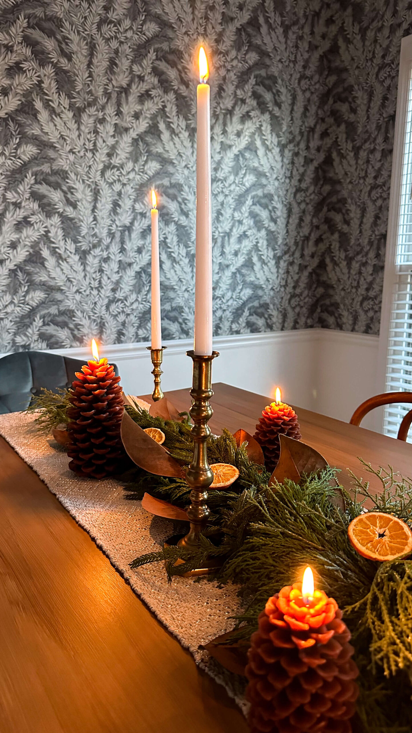
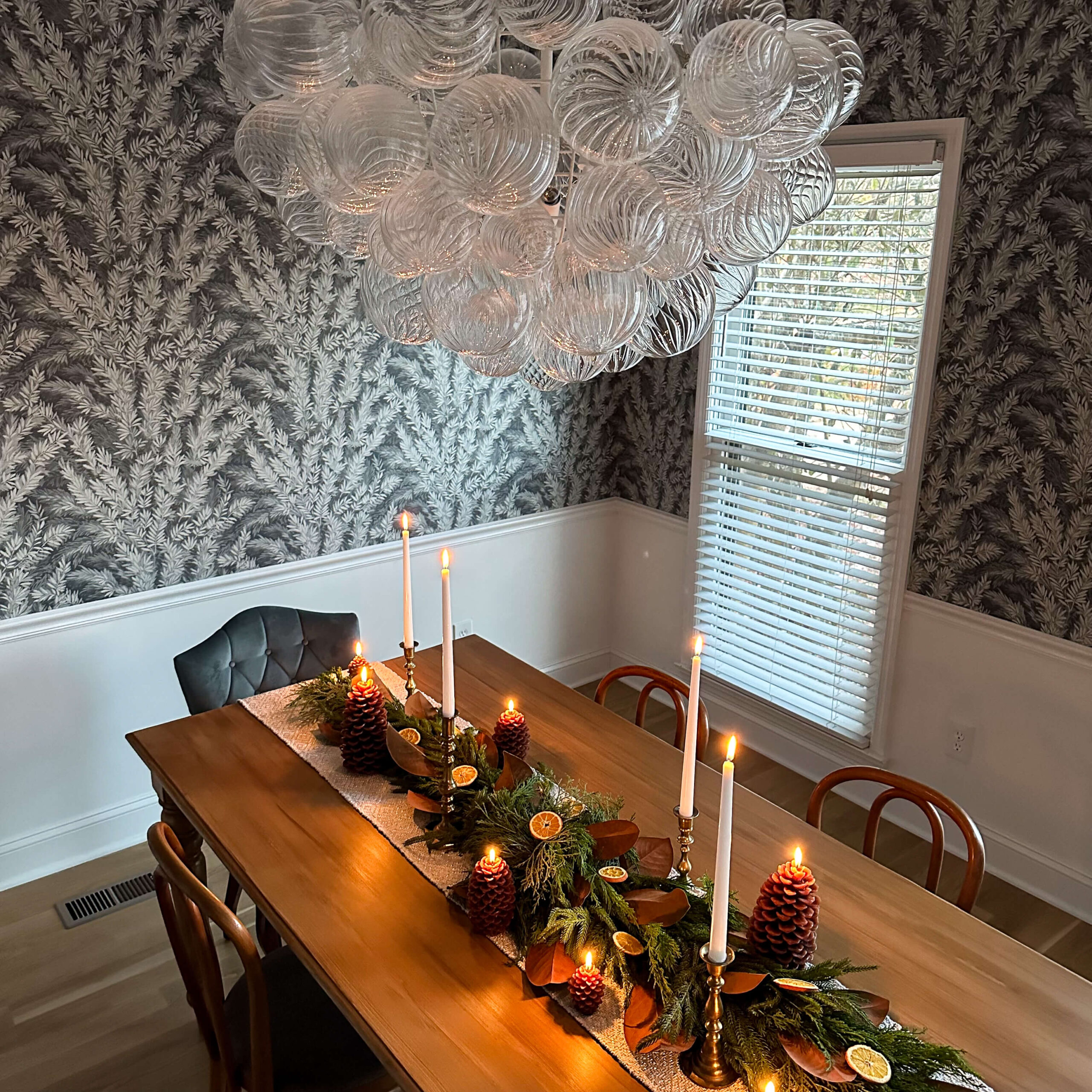
Tell me: what would you put in your DIY autumn centerpiece?
If you enjoyed this, please be sure to sign up for my monthly newsletter. I share personal anecdotes, monthly highlights and favorite things, exclusively from me to you. Thanks for visiting and following along!
read more
Alright, so I’m taking the excitement I had to share the dining room progress report with you and I’m going to multiply that by ten for the dining room reveal!!! Are you ready for it? I am. I was beyond excited about how transformative the Cole & Son’s wallpaper was for this space, and we really kicked things up a notch with the Talia bubble chandelier from Visual Comfort. The room was really turning into the crown jewel of this house.

While all of that was amazing, these big changes really began to amplify that the dining room set needed a change. Or needed to be removed and replaced. You’ll recall during my dining room progress report that I just couldn’t stomach the idea of buying a new table that was going to be incredibly expensive and also very well likely not real wood. So even though this dining room transformation started out in a very non-DIY way, we’re going to roll up our sleeves for the finish line.
Table Transformation
I’ll admit it, I was incredibly nervous to refinish this table. I have limited experience with refinishing anything besides trim work, and I have absolutely no experience with wood stain. And although this dining table weighs a ton, I also wasn’t fully convinced every single piece of it was real wood (here’s looking at you, legs). So I didn’t know what I was getting myself into, but I knew I was biting off a big project with the deadline of Thanksgiving looming.
After some extensive internet sleuthing, I decided to try Retique It in the Pecan finish. Do not ask me how this stuff works, but let me just tell you: it works. With some light sanding, a bit of patience and a lot of trust, I transformed my black dining room table into a beautiful soft wood table. It seriously looks like it was custom built for this space!
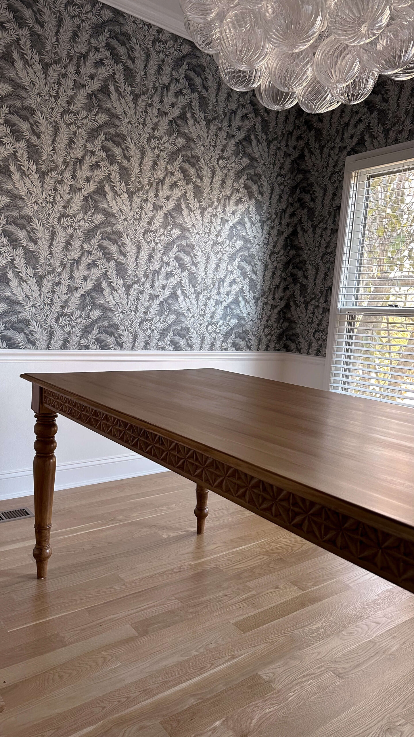
If you’re curious about the process to get here, you can check out my full tutorial and tips here.
Finishing Touches
I rounded out the dining room table with some antique bentwood chairs I found on facebook marketplace (at an amazing price). I love how understated they are, as there is already so much to look at in this space. Can you believe the original blue seat covering matches the wallpaper exactly? What are the odds! I’m still on the hunt for two more chairs to add to each end of the table, but am in no hurry as I have some substitute chairs I can use as needed. If I’ve learned anything over the past several years, it’s that it’s better to wait for the right thing than rush into something that you know doesn’t work.
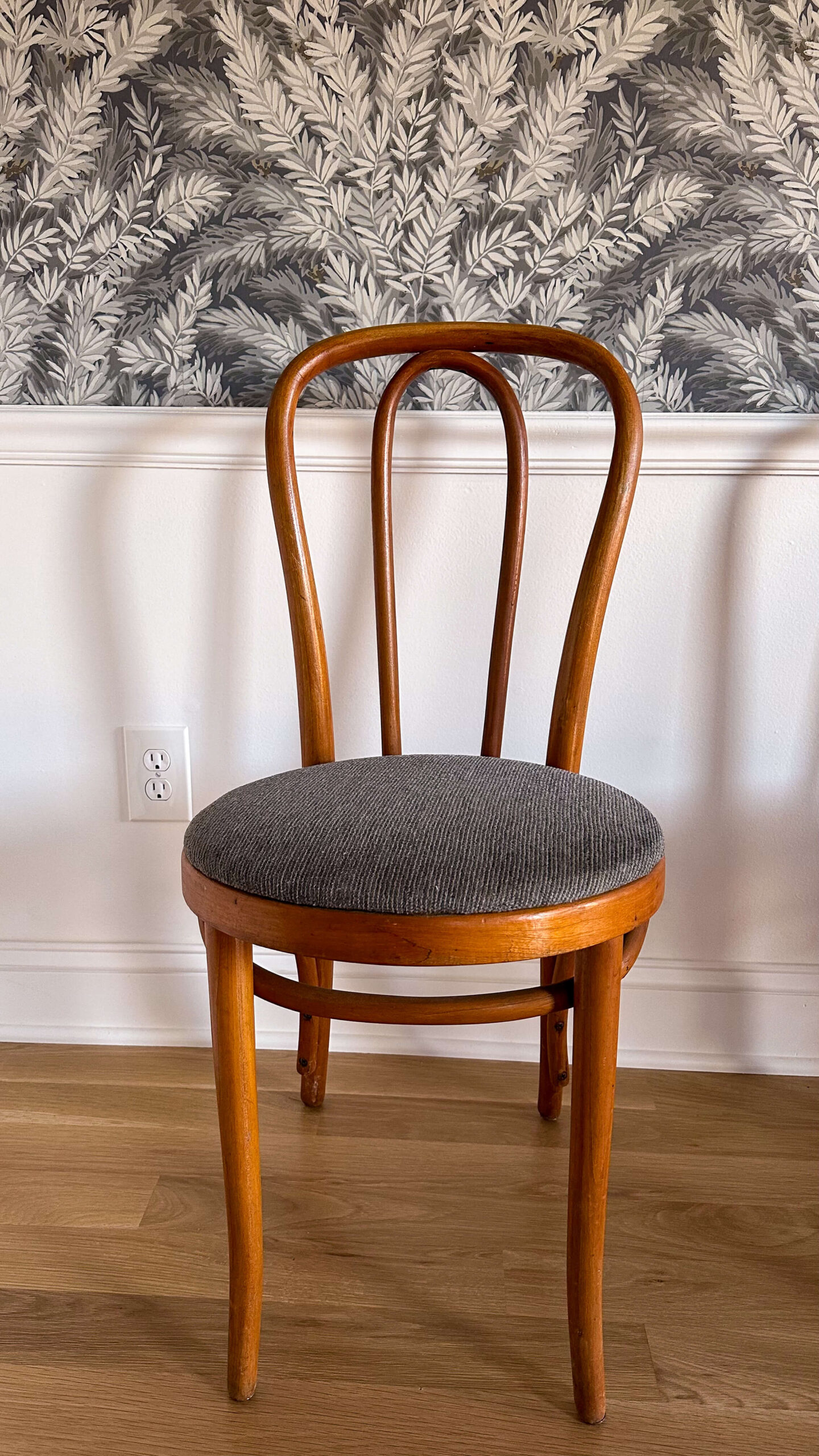
The blue sideboard, which I had previously and is also from facebook marketplace, tucks nicely into the corner. It is the perfect little trophy case for some very special family keepsakes from both grandmothers (and from their grandmothers!). I love being able to look at these pieces and think of them. Eventually I plan to hang a mirror above this but I’m in no rush to put holes in this wallpaper.
Before, Halfway + After

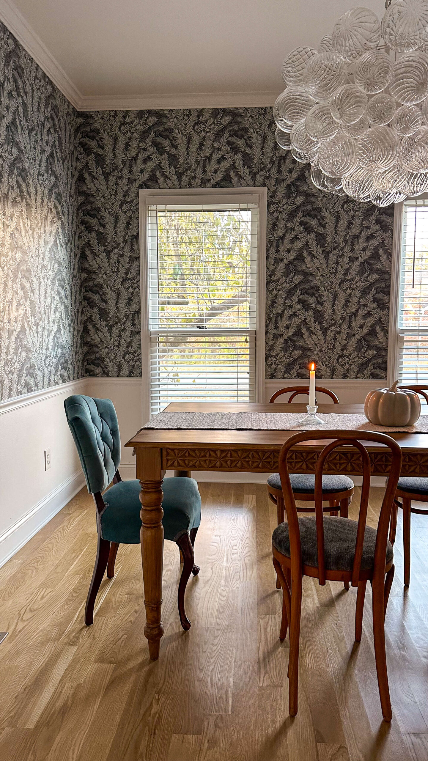
Future plans
After transforming the dining room table to the pecan finish, I do think there’s a bit much of wood on wood on wood, so I’ll be on the hunt for a rug to create some separation. Perhaps something clean with a light line or simple geometric pattern could play nicely with the floral wallpaper.
Nearing the end of the year, I’m beginning to shift focus to 2024, and have started a short list of projects both big and small I hope to complete for the house in general. One of those things is adding some millwork throughout the house and the dining room is one of those spaces. I think adding some custom trim to the lower half of the walls would really make sense for the style of this room. For now, it’s an idea living in my head, but don’t be surprised if you see an update about this next year!
The past few years open concept floors plans have been all the rage, but I’ll always be on Team Dining Room. I love the idea of defined rooms that can have their own personality and special set of memories. For me and this particular space, that includes hosting family and gathering around delicious food. I’m so thankful we have such a special place to make those kinds of memories in.
The Latest on the Blog —
read more
I am beyond excited to share a dining room progress report with you today, as it’s turning out even better than I had ever dreamed! Last week I shared how my initial vision for the dining room did not pan out as I originally planned, but I trusted the process and kept designing until I felt one of my mood boards “stick” so to speak.
While part of this installation happened quite some time ago, I want to go back in time and walk you through the process of some of my decisions along the way. My hope is that by sharing my journey with this space, you’ll be armed with some things to consider for your next room flip.
Wallpaper
Wallpaper can be a tricky thing. All too many times, I’ve fallen in love with a pattern online, only to be disappointed with how it translated in person. What we all hope for, is it will match up fairly well from onscreen to real life. In a rare case, the opposite will happen, and the wallpaper will be even more beautiful in person than on the screen. This was one of those moments.
The minute I pulled the first roll of this Cole & Son wallpaper out of the box, I was mesmerized. The print has texture to it, and almost appears like painting brush strokes, and the quality of the paper is simply beyond. I was already excited about the choice, but seeing and holding it in person just took everything to another level.
While I am a true DIYer at heart, I made the executive decision to hire this job out. I know, I know. While this isn’t the norm for me, I was able to find a wallpaper installer in my area that had amazing reviews and charged an incredibly reasonable rate. Weighing the cost of this particular wallpaper (it was expensive!!!), and the fact I waited a bit longer for it to arrive from London, I decided it was worth the extra expense to ensure it was installed perfectly. Looking back, I’m so happy I did this.
Lighting
After I landed on the wallpaper, the lighting was the next design decision that followed. The wallpaper really feels like I’m bringing the outside in, so I wanted something that complimented that theme. The initial plan was this tiered chandelier by Visual Comfort. I loved the cascading globes, and the fact they were a frosted white would play so nicely with the palette that was currently unfolding with the wallpaper. However, I couldn’t get past the little crystals on the rod. I know it’s a tiny detail, but it’s one I would notice and likely fixate on.
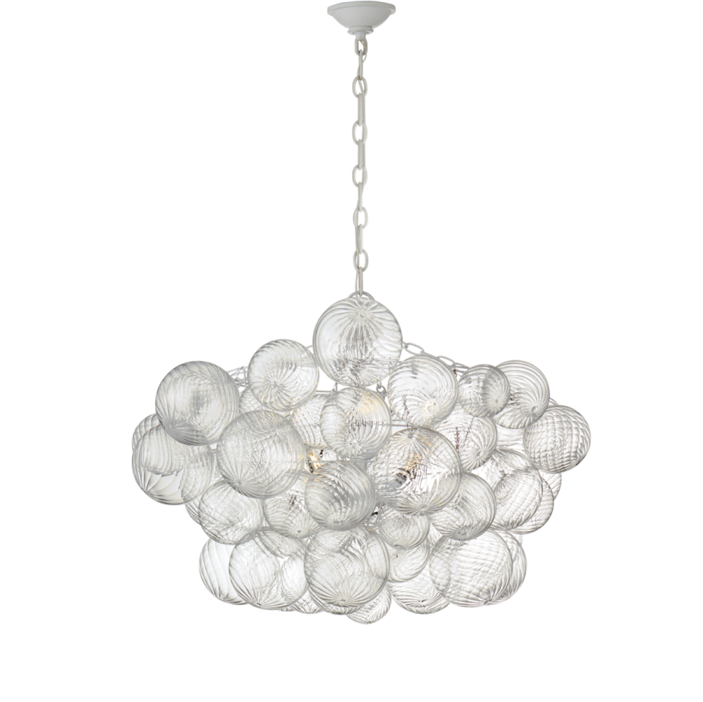
Following the same theme, I continued my hunt until I found what I knew was “the one.” The Bubble Chandelier by Visual Comfort is what dreams are made of. I truly wish I had a picture of the size of the box this was delivered in. It was MASSIVE! The globes were in protective Styrofoam all organized by size, with a chart that showed how to assemble.
Along the same theme as the wallpaper, I opted to hire an electrician to install the cage of the chandelier. While I’ve learned how to rewire lighting on my own, I wanted to be able to stand back and look at the height from the table this would be. Again, super happy I just paid the $100 for the electrician to install the frame of the light. I was in charge of assembling all of the glass globes, which was actually quite fun! I enjoyed seeing it come to life and it really is a piece of artwork.
Dining Set
You’ll remember that during my mood board designs, the furniture was the biggest hang up for me in this space. I spent quite a bit of time browsing through dining set combinations, and at the end of the day, I cannot justify ordering something brand new. Especially when most of the pieces I’ve found definitely are not real wood. On the other hand, a black dining table just isn’t going to work in this space (or any other one in this house).
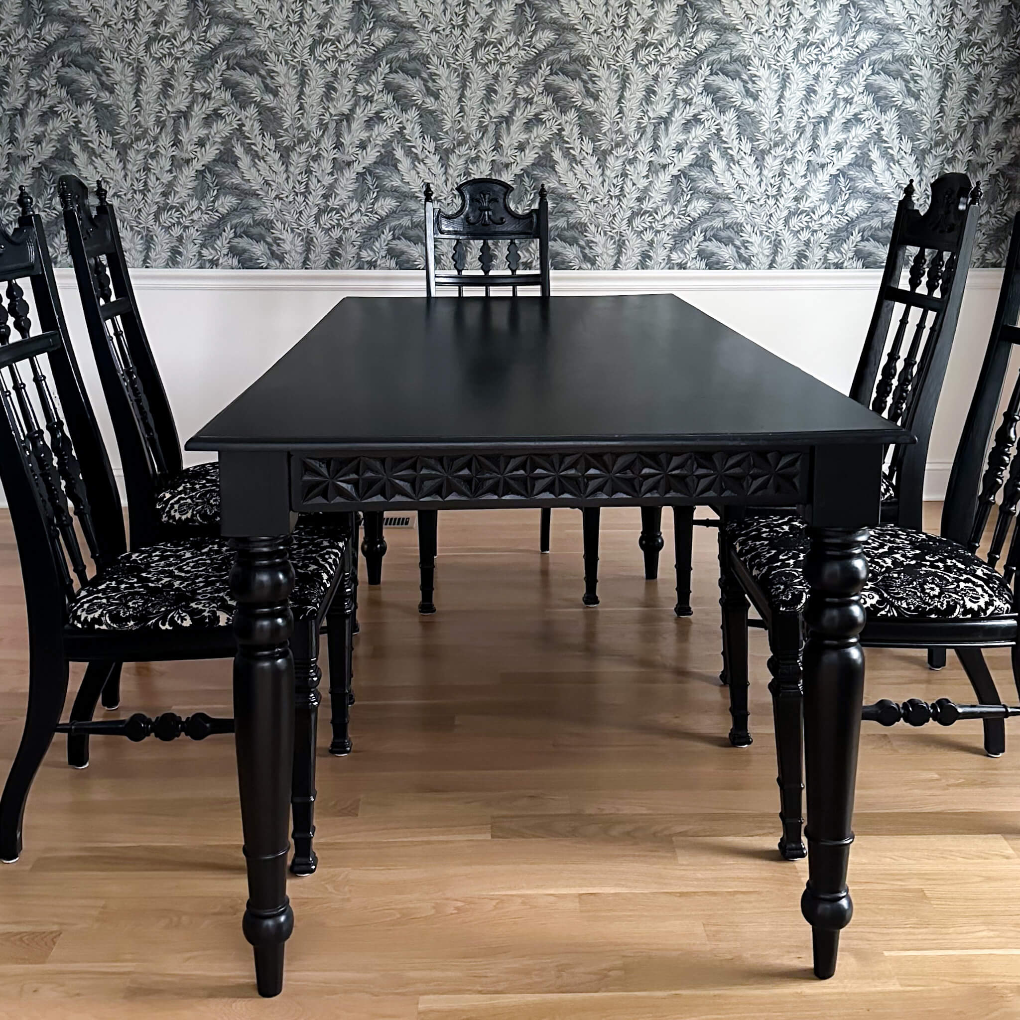
Since I really do love the actual dining table (the criss cross pattern and the shape of the legs are my favorite), I’m going to try my hand at refinishing it using Retique It. This process is currently giving me some stomach flips, as I admittedly do not know what I’m doing, but I’m deep into some YouTube tutorials and am determined to figure it out.
In the meantime, I found some adorable bentwood chairs on facebook marketplace from the 1950’s and immediately scooped them up! The upholstery is a blue that matches the wallpaper exactly! I mean, what are the odds right?! There are only four of these chairs, so I plan to find two additional chairs for each end of the table. I’m taking my time with this, as it’s not incredibly urgent at the moment.
Parting Thoughts
The dining room progress is certainly taking its own shape, and I’m really learning to love the idea of letting the design process unfold the way it should. While we still don’t know what the finished result will actually look like, I feel confident it’s going to be even better than I had originally hoped.
In the coming days, I’ll be sharing the process of flipping my dining room table which will come with the good, the bad and the ugly. But hopefully there’s no ugly to report! All in all, I’ll include an honest review of the process and finished result. Following that, we’ll be primed for a full reveal of the finished dining room, just in time for Thanksgiving!
browse more posts
read more
Today, I’ve got a fantastic project that will instantly elevate the look of your space: painting interior trim. Whether you’re a seasoned DIY pro or just starting your home improvement journey, this step-by-step interior trim painting guide will help you achieve a polished and professional finish. Let’s dive in!
Why Paint Your Interior Trim?
Before we get our hands dirty, let’s talk about why painting interior trim is such a game-changer. Trim, whether it’s baseboards, crown molding, or window casings, is like the icing on the cake in your home’s design. It adds depth, character, and a touch of elegance to any room. When you paint it, you have the power to:
- Refresh and modernize your space: Over time, trim can become scuffed, faded, or discolored. A fresh coat of paint can breathe new life into your home.
- Create visual contrast: Choosing the right trim color can make your walls pop and draw attention to architectural details.
- Highlight your decor: Painted trim can frame your furniture and artwork, making them stand out in style.
Now that we’re on the same page about the magic of painted trim, let’s go over the essential steps to get started:
1. Gather Your Materials
For this project, you’ll need:
- Painter’s tape
- Drop cloths
- Sandpaper (medium and fine grit)
- A putty knife
- Wood filler
- A paintbrush (2-inch angled sash brush is ideal)
- Painter’s cup
- Tack Cloth
- Rags
- Primer
- Paint: choose a high-quality trim paint in the finish of your choice. More about paint finishes here.
2. Prep Your Space
- Clear the room: Remove furniture and cover the floor with drop cloths to protect it from paint splatter.
- Clean the trim: Dust and wipe down the trim to ensure a smooth surface for painting.
- Fill any gaps or imperfections with wood filler. Once it dries, sand the patched areas until they’re smooth.
- Sand down all trim with 220 grit sandpaper. This is an important step that many overlook but is not to be skipped. By doing this, you’re giving the new paint something to grip on to and it will help promote it’s durability.
- If you skip this step, prepare for your new trim to chip easily and even peel off in some instances.
- Wipe up dust with a cloth and vacuum remaining dust on floor area
- Go over all surfaces one last time with a tack cloth
3. Tape and Protect
Carefully apply painter’s tape along the edges of the trim to protect your walls from paint splatter. Make sure it’s securely adhered to avoid any bleed-through. I usually like to run my putty knife over it just to make sure.
4. Prime Time
Apply a coat of primer to the trim. Primer helps the paint adhere better and ensures a smooth, even finish. Let it dry completely before moving on to the next step (usually 2-3 hours is sufficient but always check your paint can label for drying time).
5. Paint Away
Now comes the fun part! Dip your paintbrush into your chosen trim paint and carefully start applying it to the trim. Use smooth, even strokes, and always paint in the direction of the wood grain for the best results. Do not overload your paint brush. A thin coat will promote quick drying time and an even finish. If you try to lay it on too thick, you’ll have paint drips, bubbles and in some cases even tackiness. Less is more here.
6. Sanding + Second Coat
Once your first coat has fully dried (again always check the label for drying time) use a sheet of fine sandpaper and gently run this over the trim. Repeat the same steps as before, wiping with a rag, vacuuming and then going over once more with a tack cloth. Using the same technique as the first coat, apply a second coat to all trim.
7. Remove Tape and Enjoy
As soon as you finish that second coat (if needed) and the paint is still wet, gently remove the painter’s tape at a 45-degree angle for clean, crisp lines. Let the paint dry completely, and then stand back and admire your handiwork!
Pro Tips:
- Invest in quality paint and brushes: The right tools make a huge difference in achieving a professional finish.
- Take your time: Rushing through the job can lead to mistakes. Patient, steady strokes will give you the best results.
- Choose the right finish: Consider your room’s function when selecting a finish. Satin or semi-gloss works well for trim as they are durable and easy to clean.
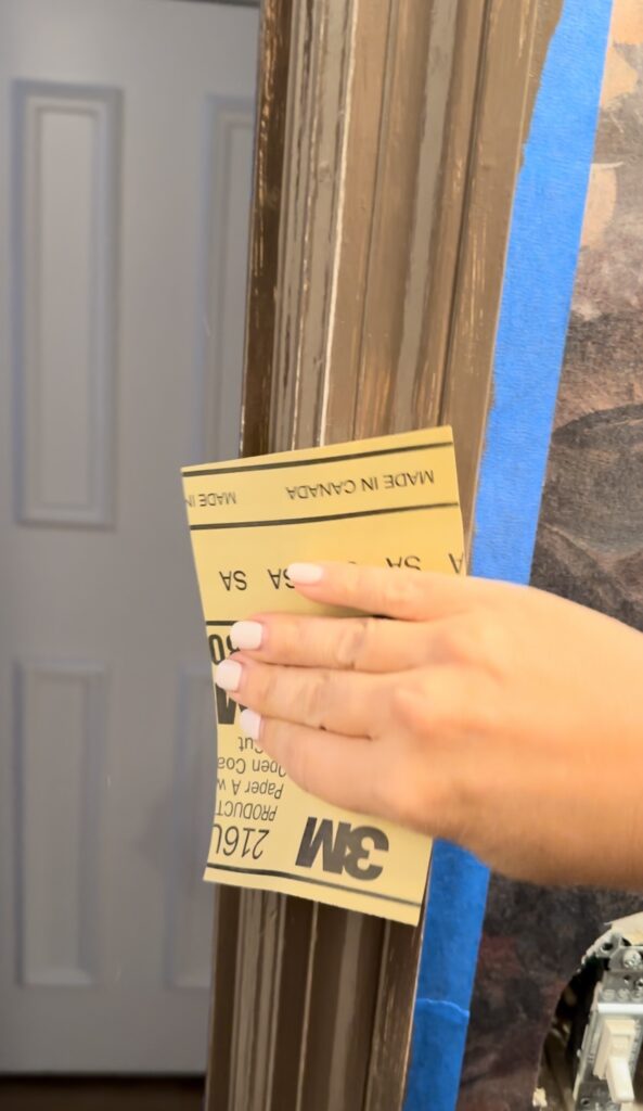
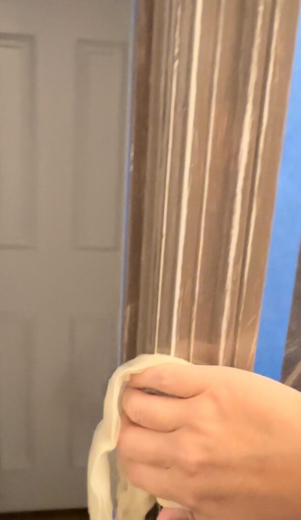
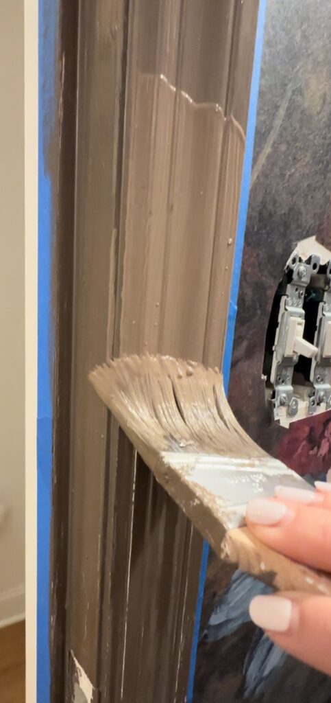
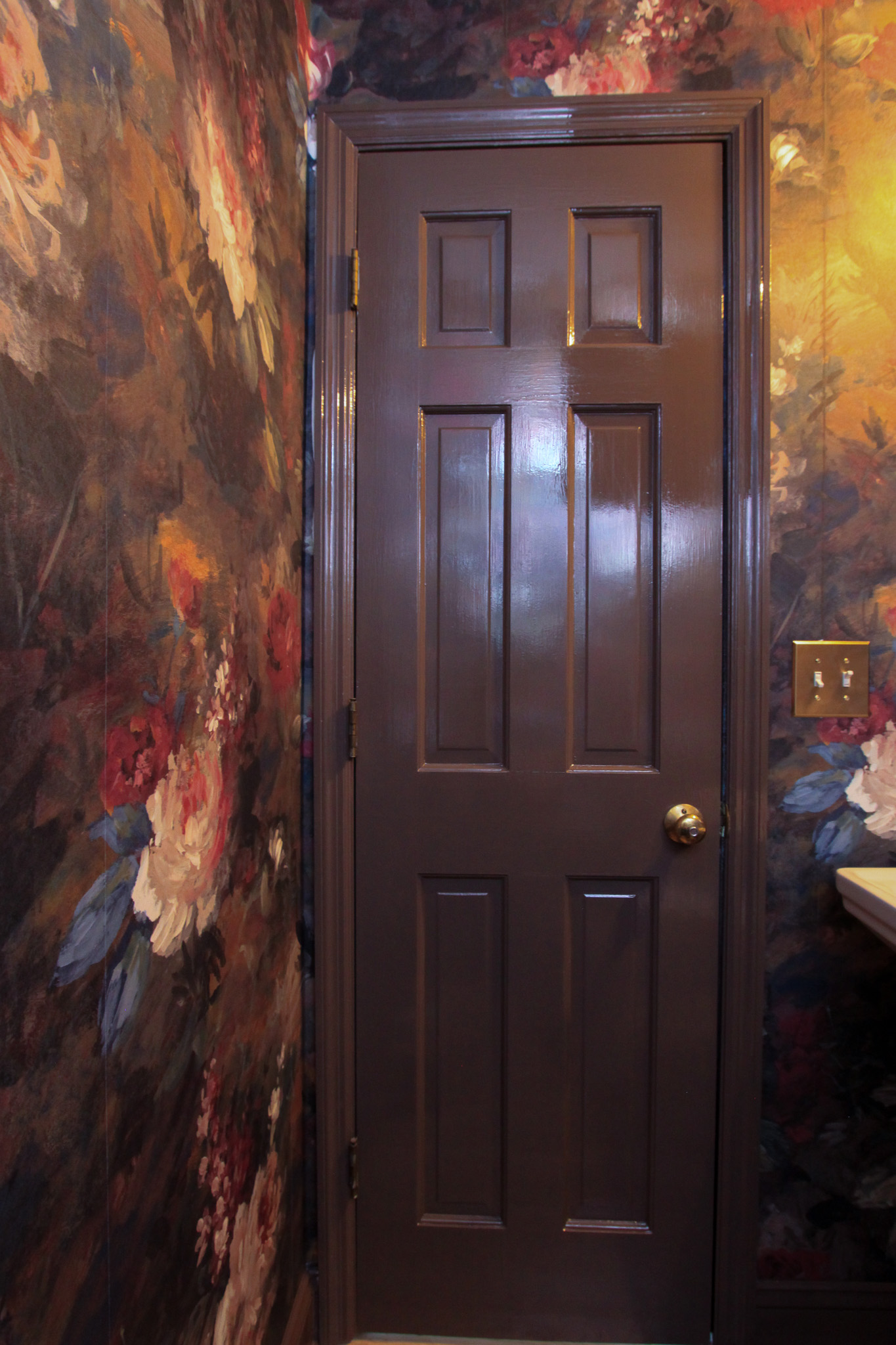
And there you have it! Painting interior trim is a DIY project that can truly transform your space without breaking the bank. It’s a small effort that pays off big in terms of style and value, and can make your entire house feel completely new. So, go ahead and add this project to your weekend to-do list and watch your home come to life with renewed charm.
If you have any questions or want to share your trim painting success stories, drop me a comment below. Happy painting, and stay tuned for more fabulous DIY tips and tricks right here on the blog!
Related:
How to choose the right paint sheen for your project
Using RetiqueIt to transform my dining room table from black to wood grain
read more
When I bought my first house in 2011, I truly wish it would have come with a checklist of things I needed to do each year, and during each season. As with most things, I learned by doing (and failing!). Sometimes this was frustrating, and other times this was expensive. In an effort to help us save our money and our minds, I’ve put together a checklist of essential tasks to ensure your home stays warm, safe, and comfortable throughout the winter months. Winterizing your house is not just about keeping the cold out; it’s also about protecting your home from potential damage. So grab a cup of cocoa and let’s dive into how to winterize your home!
1. Clean Gutters
First on our winterizing checklist is cleaning those gutters. It might not be the most glamorous task, but it’s crucial. Clogged gutters can lead to ice dams, which can cause water to seep into your home and damage your roof. So get up there, remove leaves and debris, and make sure water flows freely.

2. Detach Hoses
Don’t forget to disconnect your garden hoses from outdoor faucets. Leaving them attached can lead to frozen and burst pipes. Drain the hoses and store them inside your garage or basement. As an added layer of caution, remove the nozzle from the hose. If you leave it attached (and leave it outside) you won’t be able to remove it in the future.

3. Move Patio Furniture Inside (or Cover)
Your outdoor furniture deserves some TLC too. Store it inside your garage or shed, or use weather-resistant covers to protect it from the harsh winter elements. This will extend the life of your furniture and save you money in the long run. I bought these duck covers for my chaise lounges and they’ve held up in the elements for several years. Far worth the investment to protect the furniture!
4. Move Plants Inside
Bring your potted plants indoors before the first frost hits. The cold can damage or kill delicate plants, so find a sunny spot for them inside your home to thrive during the winter.
5. Calling All Grillers
If you’re a year-round griller, make sure to disconnect the propane tank and store it in a safe, dry place. Cover your grill to protect it from snow and moisture, which can cause rust and damage.
6. Move Flower Pots Inside
Oops, here’s a lesson I learned the hard way – don’t leave ceramic pots outside during winter! They can crack and break when water freezes inside them. Take them indoors, and your plants will thank you.

7. Service the HVAC
Before the deep freeze sets in, it’s essential to have your heating system checked and serviced. A well-maintained HVAC system will run efficiently and keep your home cozy without skyrocketing energy bills.
8. Close the Pool
For those lucky enough to have a pool, it’s time to close it for the season. Clean and cover it to prevent damage from freezing temperatures. Blow the air out of the pipes, and add the necessary chemicals for your pool type and size to ensure an easy opening come spring time.

9. Deadwood Your Trees
Dead limbs on trees can become brittle in cold weather and pose a risk to your property. Hire a professional arborist to remove deadwood to keep your home safe from falling branches.
10. Inspect the Roof
Give your roof a once-over to check for any loose or damaged shingles. A small repair now can save you from costly leaks later.
11. Close Any Vents
Close any vents or openings around your home’s foundation to keep cold air out. This will also help with energy efficiency.
12. Inspect the Chimney
If you have a fireplace or wood-burning stove, have your chimney inspected and cleaned. A clean chimney is not only safer but also more efficient. To be on the safe side, it’s best to hire this job out to a professional.
13. Seal Any Gaps (Doors, Windows, etc.)
Inspect doors and windows for drafts. Seal any gaps with weatherstripping or caulking to keep warm air in and cold air out. This will save on your heating bills and keep your home more comfortable.
14. Cut Flowers Back
Finally, don’t forget your garden. Cut back dead or frost-damaged flowers and plants to encourage healthy growth in the spring.
By tackling these tasks, you’ll ensure your home is ready to face the challenges of winter head-on. Not only will you enjoy a warm and cozy atmosphere inside, but you’ll also protect your investment by preventing potential damage. So grab your checklist, gather your supplies, and let’s make this winter a breeze!
Stay tuned for more DIY tips and home renovation inspiration. And in the meantime, Stay warm, friends!
The Latest on the Blog —
read more
This one’s for my DIY enthusiasts! Today, we’re diving into a topic that often gets overlooked in the world of home renovation and design: ceiling painting. Sure, we all love a beautifully painted wall, but what about the fifth wall—the ceiling? Trust me, it’s a game-changer when done right. So, grab your paintbrushes and let’s turn that overlooked surface into a canvas of possibilities!
Step 1: Gather Your Supplies
Before we begin, let’s make sure you have all the essentials in your DIY arsenal:
- Paint: Choose a high-quality paint that suits your space and style. Ceiling paint is typically flat or matte, but you can use other finishes for a unique look. Check out my tutorial on paint sheens if you want to explore other options, and the pro’s and con’s of each.
- Paint Roller: Opt for a roller with an extension pole to save your arms from fatigue. A skin with a 3/8” nap should be perfect.
- Drop Cloths: Protect your floors and furniture from paint splatters.
- Painter’s Tape: Use this to mask off edges and create clean lines.
- Ladder or Step Stool: Ensure you have safe access to the ceiling.
- Paint Tray and Liner: Makes dipping your roller easier.
- Paintbrush: For cutting in around the edges. I prefer a 2.5” but no matter what size you choose, make sure your brush is angled for this project.
- Paint Edger: Optional but handy for achieving crisp lines.
Step 2: Prepare the Room
Clear the room of furniture or cover it with drop cloths. Remove light fixtures or ceiling fans if possible, or cover them securely with plastic wrap. Take the time to patch any holes or imperfections in the ceiling, and sand them smooth once the filler is dry. Lastly make sure your ceiling has been wiped down. You can use a Swiffer duster for this.
Step 3: Prime, Prime, Prime!
Never underestimate the power of a good primer. It helps paint adhere better and ensures a consistent finish. Apply a layer of primer to the entire ceiling, and let it dry according to the manufacturer’s instructions. Trust me; this extra step is worth it in the long run.
Step 4: Start Painting
Load up your roller with paint from the tray. Painting a ceiling is much like painting a wall. Begin at one corner of the room and work your way across the ceiling in small sections. Avoid overloading your roller to prevent drips and streaks, and try to paint with a little overlap in each section (this means starting the new rolling an inch into where you just rolled). Do not continuously roll over the same area, as this will creat what’s called “flashing.” Remember, slow and steady wins the race!
Step 5: Cut in the Edges
Use a paintbrush or a paint edger to carefully cut in along the edges of the ceiling, where the roller can’t reach. This step ensures a clean and polished look.
Step 6: Second Coat (If Necessary)
Depending on your chosen color and coverage, you may need a second coat. Allow the first coat to dry completely before applying the second. Drying time will be on your paint can, but if you can wait until the next day I always prefer to do so.
Step 7: Final Touches
Once your ceiling is dry, remove any painter’s tape and look for areas that my need some touch-ups. This is usually along the edge where the ceiling meets the trim/wall, especially if you’re using contrasting colors. Reattach light fixtures or ceiling fans, and move your furniture back in.
Tips for Success
- Work in sections: Don’t rush through it; divide the ceiling into manageable sections for a more even finish.
- Proper lighting: Use adequate lighting to spot any missed spots or imperfections.
- Ventilation: Keep the room well-ventilated to help the paint dry faster and reduce fumes.
Remember, painting your ceiling is a fantastic way to add character and dimension to your space. It’s an often-overlooked element of interior design that can truly transform a room. So, don’t be afraid to get creative and experiment with colors! Happy painting!
As always, stay tuned for more home renovation and design inspiration right here on AllisonSkiff.com Happy DIYing!
browse more posts
read more
Tom Petty once said the waiting is the hardest part. Well Tom, you were right. If you remember, I shared I’d be doing my hardwood flooring installation in phases. Due to the kitchen leak, we knocked out the downstairs first, then scheduled the upstairs second. With how I live in the house, I really use the downstairs floor the most. The primary is downstairs and the only room I use upstairs is my home office. Knowing this, I didn’t think it would be a big deal to space out the installations. Well…turns out I got a taste of something I liked and just couldn’t get it out of my head. I’d be padding across the new white oak hardwoods and then I’d look over and see this dark staircase. The balusters stuck out like sore thumbs and I kept looking back and forth at the contrast. I couldn’t wait.
The Upstairs
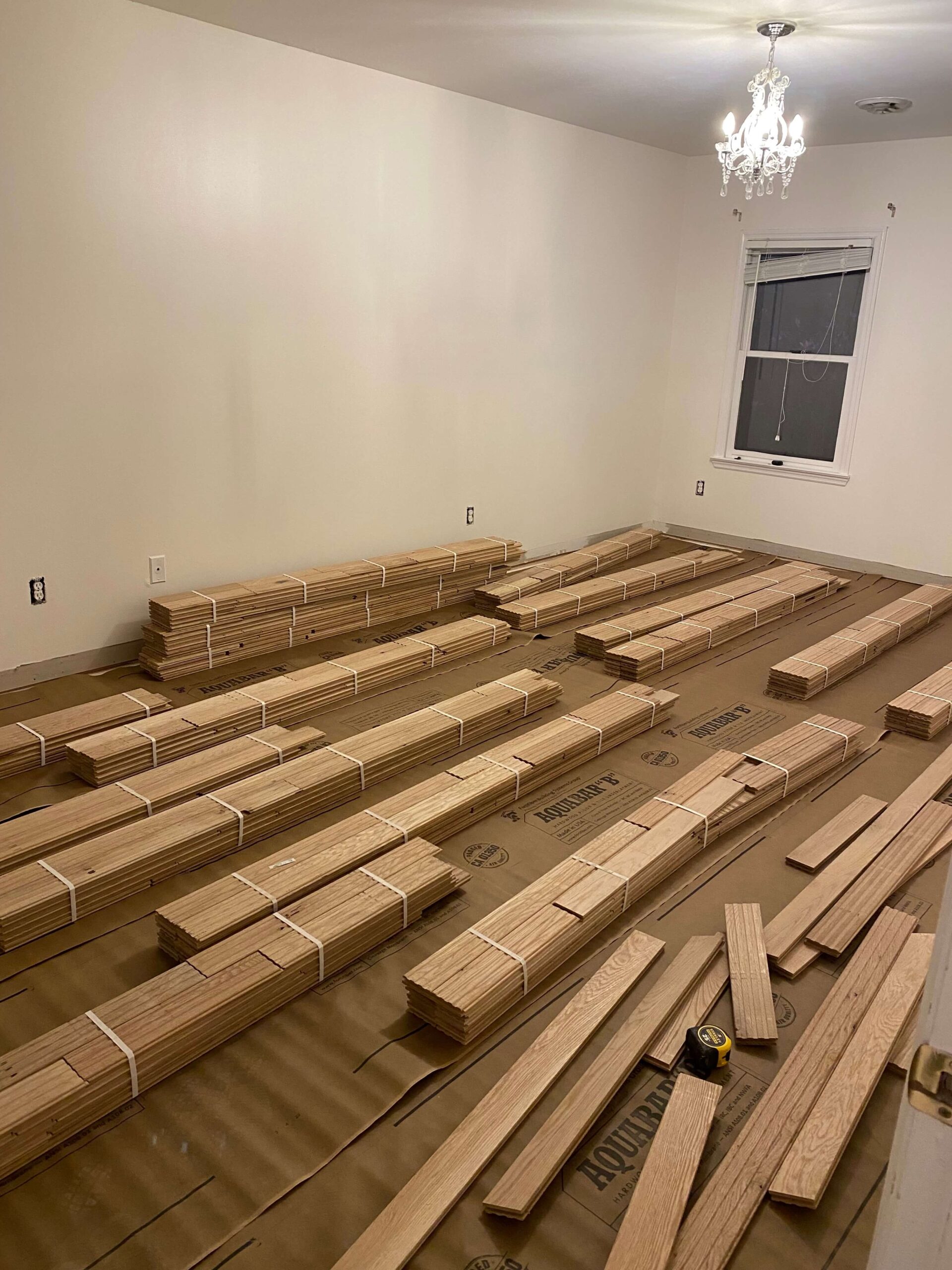
The upstairs flooring took no time at all. There are 3 bedrooms and each room is significantly smaller than the spaces downstairs. The contractor had everything ripped out and bundles of hardwoods placed at the end of day one. Coming home and seeing this I felt like a kid at Christmas! I even dared to think that maybe we’d be ahead of schedule and I could have a full weekend day to put my house back together, and (gasp!) live like a normal person once again.
The Staircase
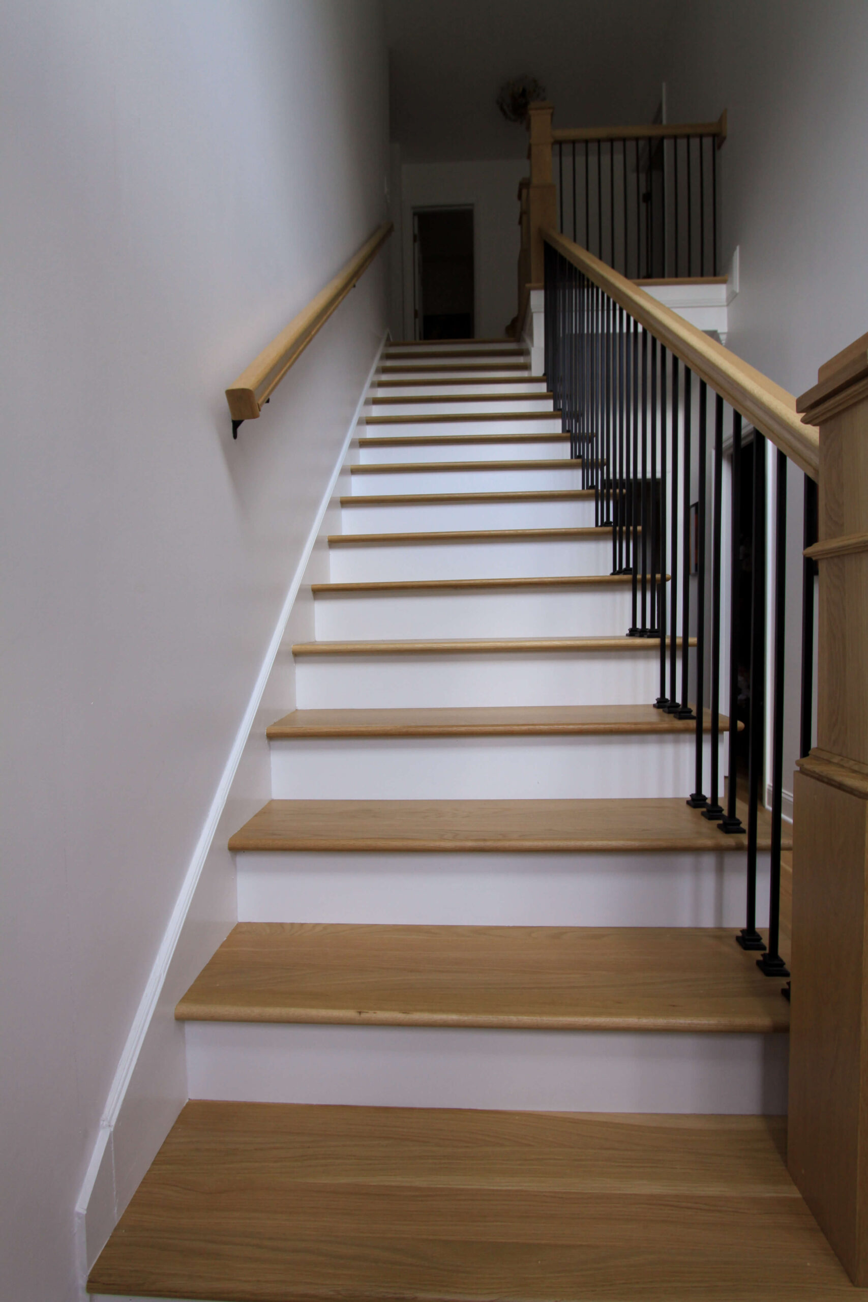
The staircase though, the staircase had other plans. The big issue was adjusting the steps. The very top step was higher than all the other steps, so the entire staircase needed to be adjusted. They needed to raise each tread up to make each stair equidistant. I’m still scratching my head at how the staircase ended up this way in the first place, and I’m happy to know that as of now, it’s been done the right way.
Open Stringer
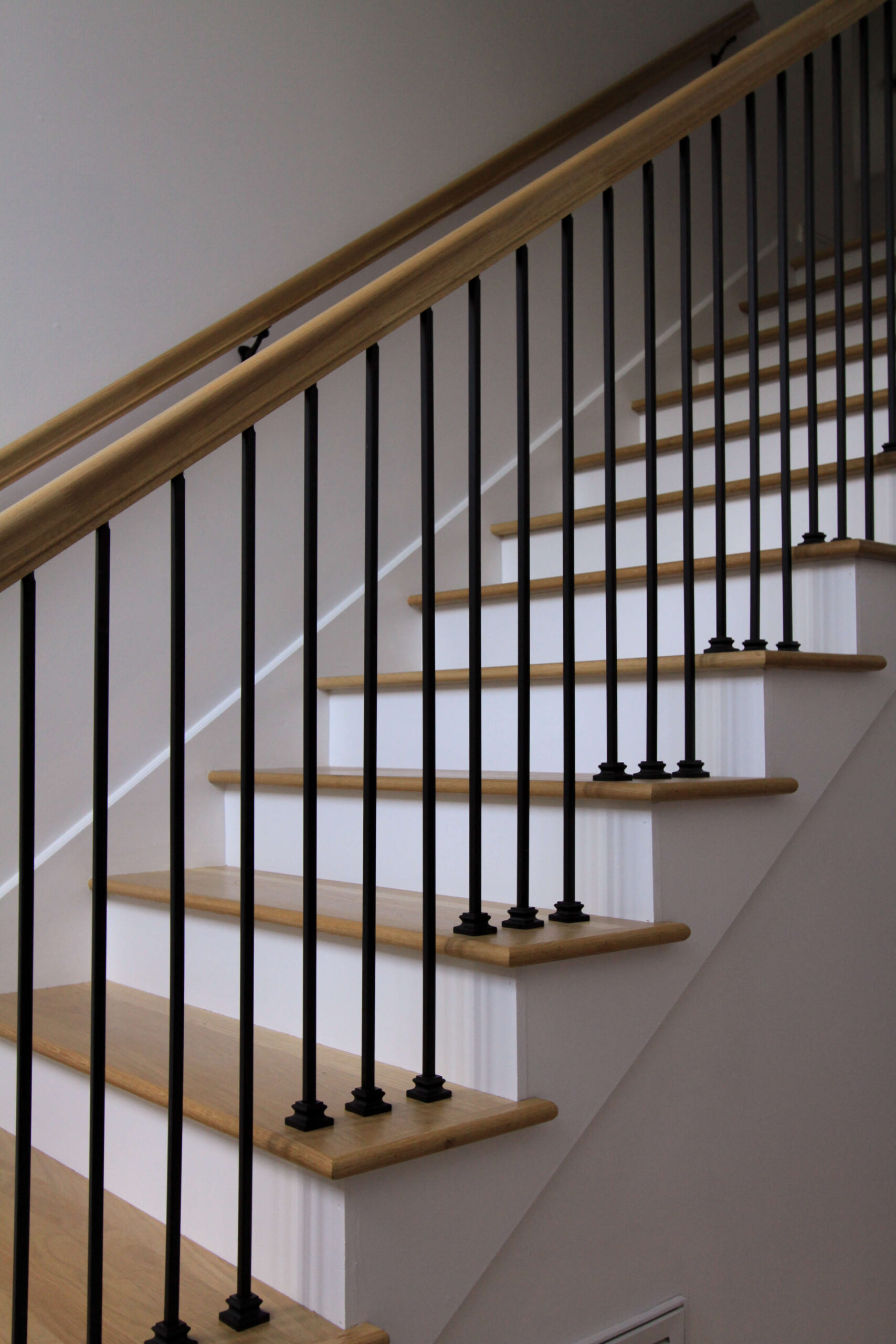
If you recall during the staircase design, I was originally planning to keep the stringer closed (see staircase anatomy and design plans here), but at the last minute decided to open it. During the install week, I would peer around the plastic sheeting each night at the progress and hope I had made the right decision. There was no going back. My fear was the open stringer would feel too modern for the style of the house, and the new number of balusters would feel too busy. Remember, the previous balusters weren’t up to code and were spaced unevenly. So although I opted for a more streamlined baluster, there would be double the amount. The balusters were installed on the second to last day, so it was a long week of waiting for this girl.
Newel Posts
When I saw the newel posts installed for the first time, I knew I had made the right decision. They are chunky and stately and blend perfectly with the traditional style of the house. As soon as I saw them placed I felt like I had at least made one decision right. On the previous staircase, the newel post at the base of the staircase was on the floor, however since these newel posts are so much thicker we had to place this one on the first stair tread in order to allow the front door to clear. It was a design decision that was made for me, but one that I’m happy with and actually prefer to the previous version.
Final Results
The installers worked up until the end of the very last day, but they managed to finish on time and on budget. Similar to seeing the new downstairs flooring for the first time, I am blown away at the transformation this renovation has made to the entire feel of my home. It is lighter, brighter and more open. It’s updated but not in a forced way. It just feels cleaned up.
after / before
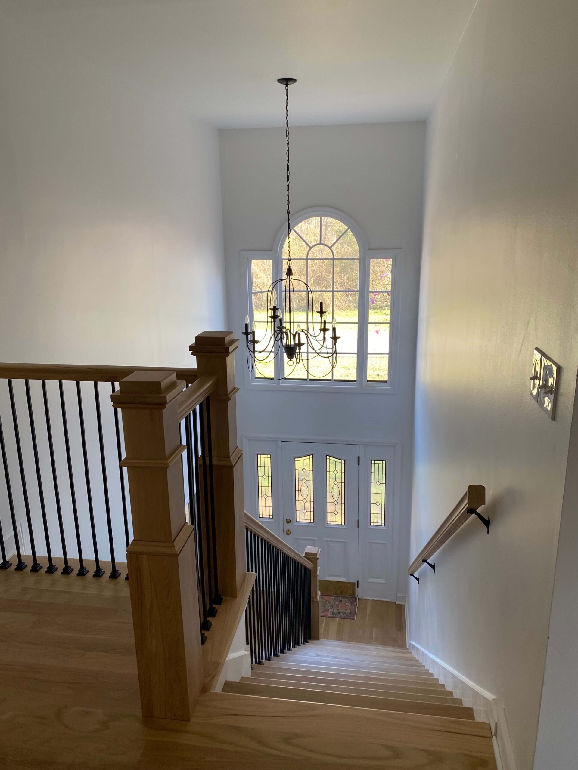
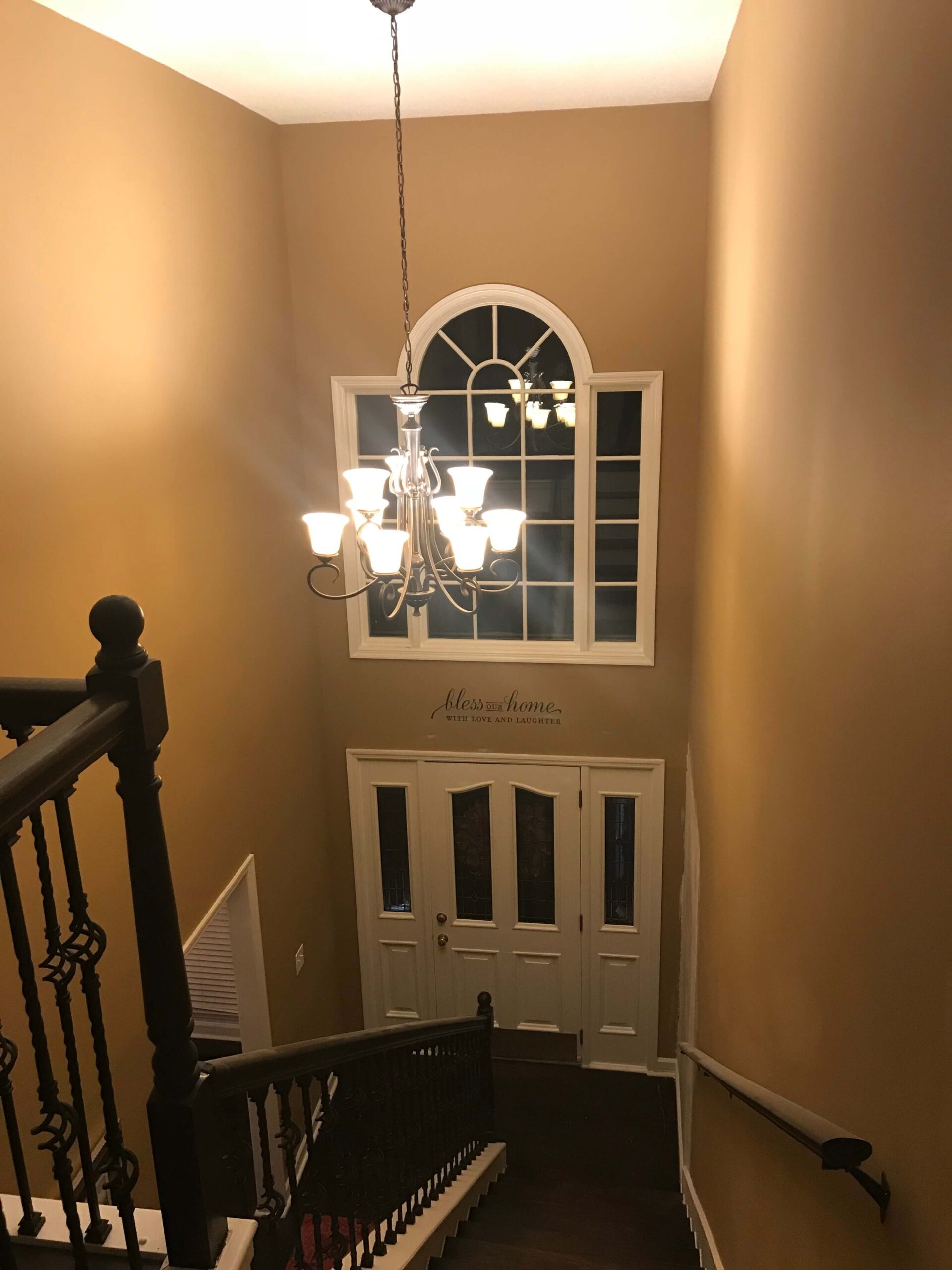
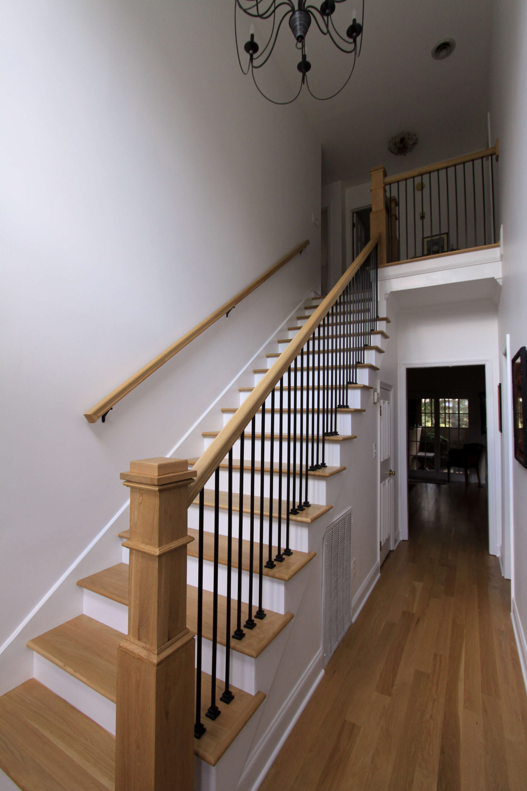
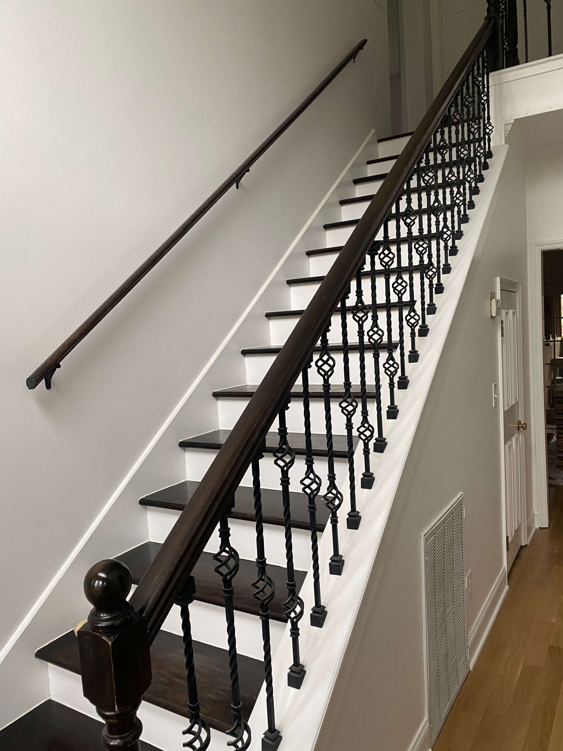
When I walk up and down the stairs now, they no longer creak. The first step from the top doesn’t feel like you’re falling off a cliff. And the railing doesn’t shake when you grab onto it. These are all things I lived with because in the grand scheme of things it wasn’t a big deal – there are bigger problems in the world. But there is something to be said for when a design comes together and you know it’s right. It’s this feeling. It’s a shift from a cringe to a smile.
This is just the beginning for this front entry way. Further on down the road I plan to update the front door to a black one, which I know is going to tie in beautifully with these new black balusters. In the short term, I’m already browsing and pinning new ideas for garland and can’t wait to see what it will look like all decorated for the holidays! I’ll also be hosting Thanksgiving this year, and will be so proud to open the front door and invite family into my home (and not worry about them falling off that top step).
In the coming weeks I’ll share a breakdown of the budget for each phase of this renovation, and will also aggregate all of the design decisions into that post for safe keeping. In the event you find yourself designing a staircase and/or a hardwood flooring renovation, I hope my experience and many learnings will be useful to you!
read more
Are you ready to paint?! Follow along below as I guide you through how to paint a wall like a professional. Speaking of professionals, I’ll share the cost savings you can anticipate by choosing to DIY this project. Get excited – we’re about to transform your space!
Getting Set Up
After you’ve decided on your paint and have properly prepped your space, it’s time to get your painting clothes on and get ready to paint your walls!
First thing’s first: Open your paint can and start stirring. When you think you’ve stirred it enough, keep going. Seriously though, paint (even if it’s white) is mixed of multiple colors that will eventually settle to the bottom of the can. Stir your paint for at least 2 minutes straight, making sure you’re touching the bottom of the can.
Once your paint is mixed, pour paint into both your painting tray and your painter’s cup. Set the painter’s cup and paint brush aside.
Attach your extension pole to your roller (I prefer this but it’s a personal preference) and dip the roller into the paint tray, coating it evenly. Roll off any excess paint on the ridges of the tray.
Rolling Technique
Start painting by rolling the roller onto the wall in a “W” or “N” shape. Apply even pressure and work on one wall at a time.
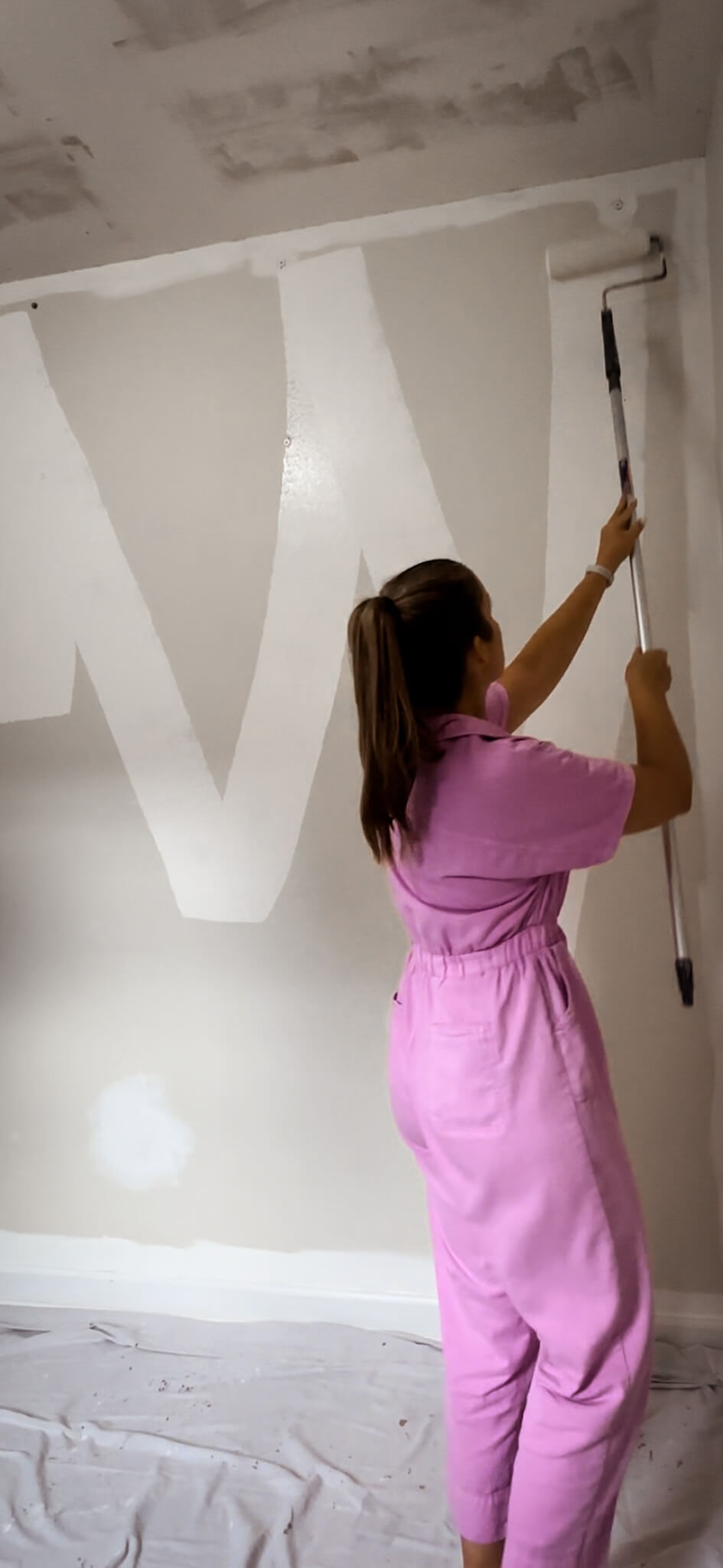
Above: painting a W on the wall. Below: filling the W in with the remaining paint on the roller brush.
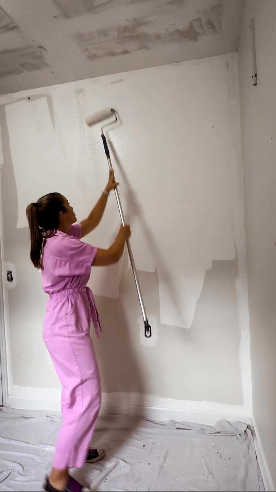
Once you’ve painted your “W” or “N” use the roller without reloading it with paint to smooth out the in between unpainted sections of your letter. This eliminates any visible roller lines and is called “back rolling.” Continue painting the wall, working from top to bottom and from one side to the other. Maintain a wet edge, which means avoiding drying areas and overlapping sections while they are still wet.
Cutting In
Now it’s time to “cut in.” This is the part where you’ll use your angled brush to paint where the roller can’t reach, which will include around doorways and windows, corners, along the baseboards and along the crown molding / ceiling. If you’ve decided to tape the trim, this will be a faster process, as you won’t need to be as careful. I generally like to work from left to right, starting in the corner. I’ll paint up and down the corner first, as far as I can reach on the ladder along the ceiling, and then will move down to the baseboards.
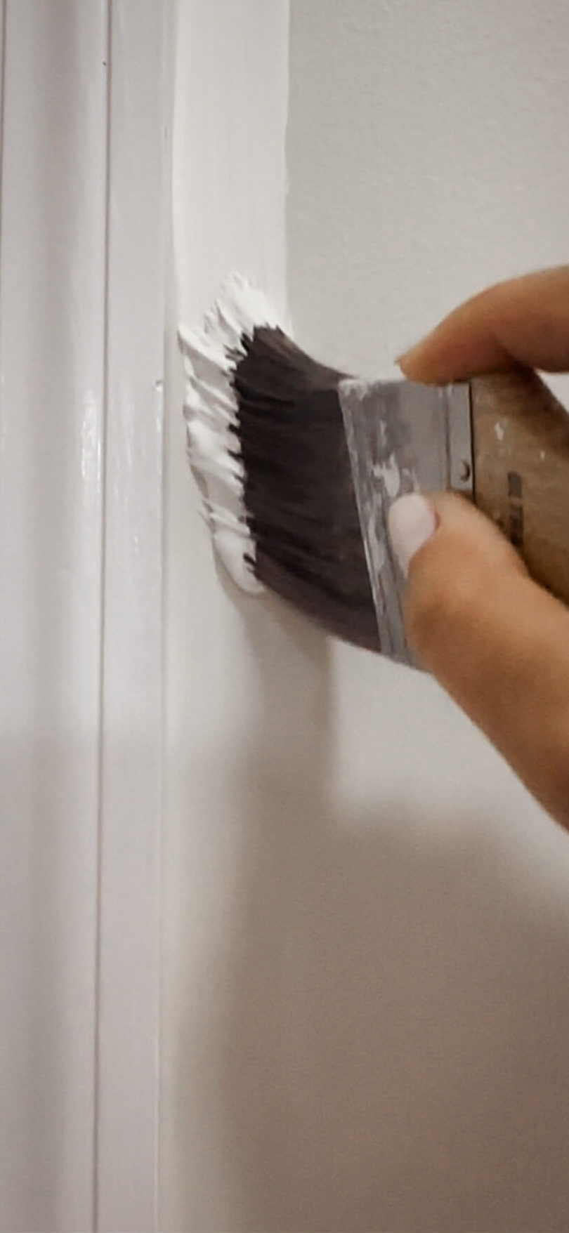
Above: Cutting in against door trim. Below: Cutting in against the ceiling.
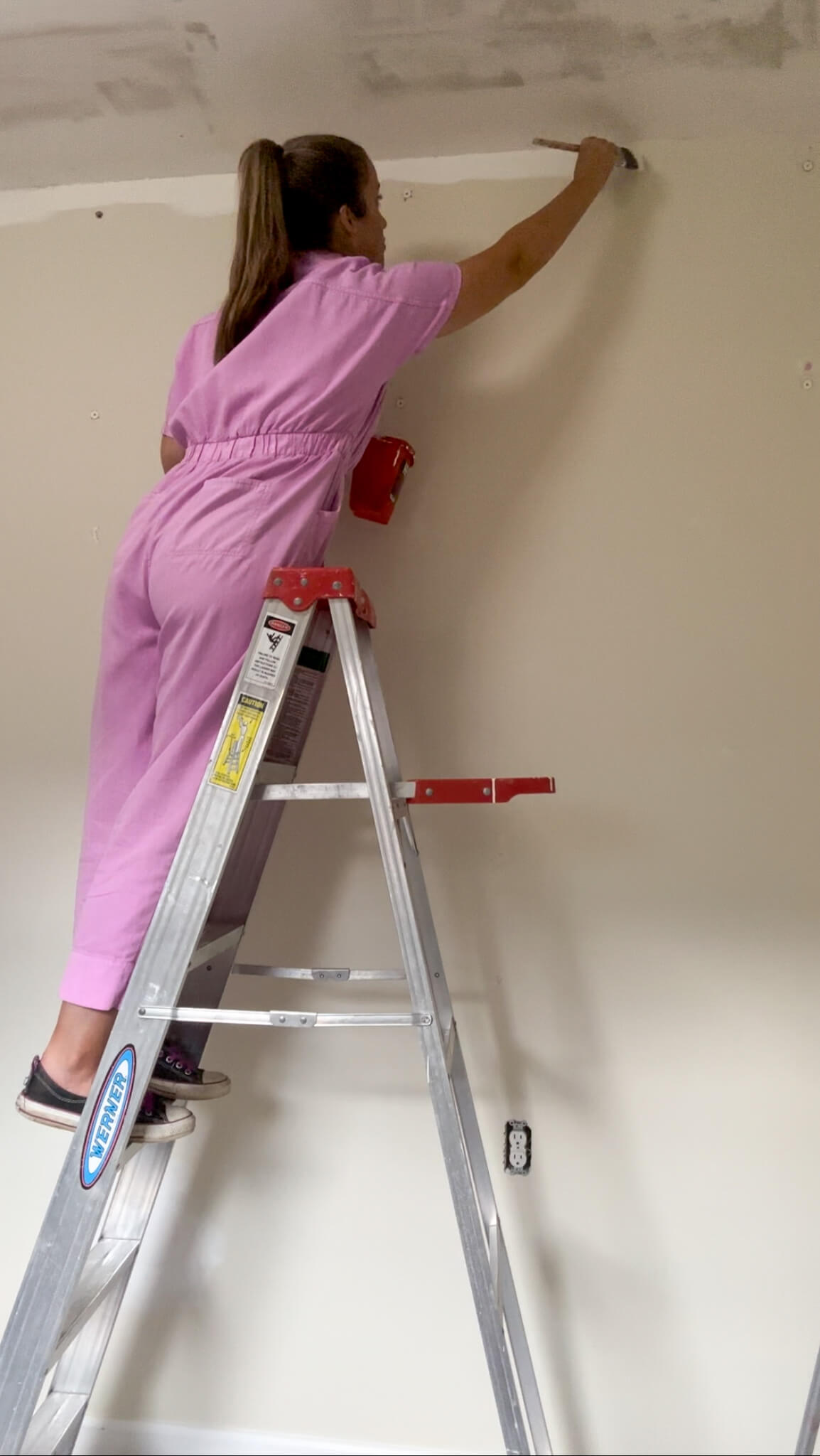
I’ll move the ladder and then repeat until I’m across the whole wall. This helps keep the paint lines wet, and prevents streaking. When using your brush, dip the brush about one-third of the bristle length into the paint and remove excess by tapping it against the side of the painter’s cup.
Drying Time + Second Coat
Continue to the remaining walls and then you’re all done with coat #1. Now I know it’s tempting to want to finish the job and clean up, but it’s important to let the paint dry. Drying time will differ based on the type of paint, and sometimes even the brand. It should be listed on the paint can. Honestly, I would wait a full day for the first coat to dry. Unless you’re painting a super small space and started early in the morning and will go for round two late at night, I generally feel giving the paint a full day to cure is the best approach. If you apply another coat too soon, you run the risk of lifting the paint up with your roller, which will make the paint look like it’s peeling in spots. Yes, I’m guilty of not waiting long enough…so please learn from my mistakes!
Once you’ve applied all coats of paint you should remove the painter’s tape while the paint is still slightly wet to avoid peeling the dried paint with it. Gently peel it off, walking with it as you peel.
It’s suggested to wait a couple days before hanging things like artwork or mirrors, however you can move your furniture back in place the next day.
What Would A Professional Cost?
As with most services, the cost of a professional will depend on where you live and how big your space is. For a frame of reference as it relates to Nashville, I can share for walls alone it’s roughly $2 per square foot. So for example if you have a 2,000 square foot home, it would cost $4,000 plus the cost of paint (around $200 for this space) to have your walls only painted.
All of this to say, painting your walls is a very manageable DIY project and is achievable with a little bit of patience and prep work. Personally, taking the time to hone this skill has saved me thousands of dollars over the course of owning a home. I encourage you to head to your local paint store, pick up some supplies and a gallon of paint and give it a try. You might just surprise yourself!
My Favorite Painting Supplies
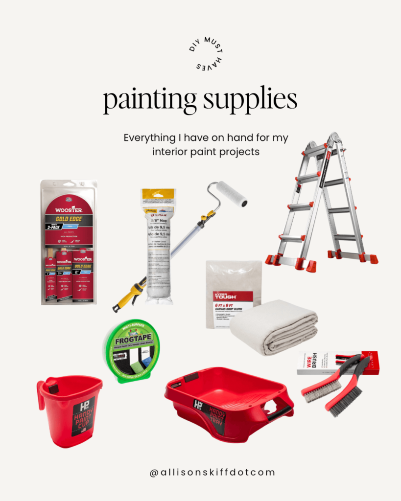
The Latest on the Blog —
read more
Reveal days are my favorite days! I’m so excited about how the powder room redesign turned out and I’m even more excited to share the full room reveal with you today.
How we got here
If you remember, I realized the pedestal sink wasn’t properly secured to the powder room wall, and after calling my plumber, we unfortunately had to remove a patch of drywall, install wood shims and re-plumb the lines. Since the existing wallpaper was out of stock, I was left with no choice but to redesign the entire powder room.
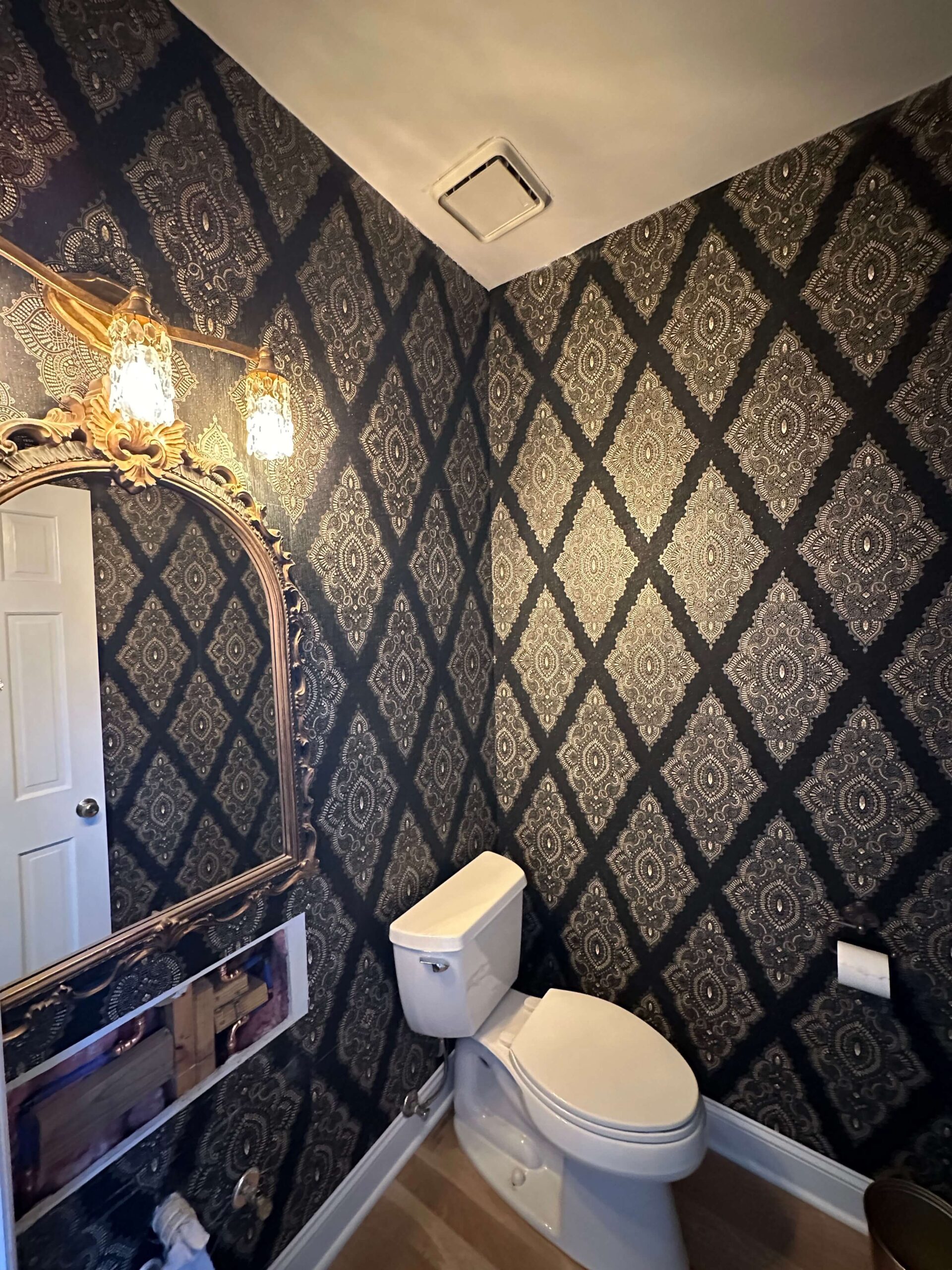
After putting together a handful of moodboards, I ultimately decided on this gorgeous wallpaper by Woodchip & Magnolia. While I loved all three wallpapers, after seeing the samples in real life the decision pretty much made itself. I also feel that based on where the room is located in the house (basically the center of the main floor), this wallpaper will lend itself to easily transition between the surrounding rooms and colorways I have planned for some upcoming renovations. (hello dining room, hello kitchen!)
Trim Decisions: Going Bolder
While the install wasn’t the easiest job, I knew instantly after hanging the first panel that I made the right decision for the powder room redesign. It’s so dreamy and soft, yet still packs a punch for this small space! Another thing that really excited me about this particular wallpaper was the limitless possibilities for the trim, door and ceiling colors. Since painting the trim in the tv room, I’m a bit obsessed with the idea of non-traditional white trim and definitely wanted to try a color out in this space.
Testing 1-2-3
Laying out paint swatches on top of the wallpaper didn’t prove to be as helpful as I had hoped, as I have natural light in every room except the powder room. Because of this, how the paint will look in the actual powder room will be much different than anywhere else in the house I was reviewing swatches. Rather than paint before wallpaper, I opted to install the wallpaper first so I could get a true picture of how the colors would go together. In hindsight, I’m SO glad I did this.

The two colors I narrowed down from paint swatches, were a pretty green (Sage Mountain) and a brown grey (Squirrel Tail). After painting samples on the baseboards and waiting for them to dry, I knew quite quickly that neither color felt like “the one.” I had to sit with this for a while and ask myself why neither of these worked, and after a while, I realized the answer was they both stood out too much. And then the answer hit me: The wallpaper is the leading lady of this room, and I needed a paint color that would play the best supporting actress role.
Pondering what to do, I put on one of my favorite design shows: The Established Home and landed on an episode where Jean paints a butler’s pantry this gorgeous chocolate brown in high gloss. I paused the show, went into the powder room and looked at the wallpaper and knew that was it. After going down a rabbit hole on google, I was able to color match the color to Farrow & Ball’s London Clay. We have one place in Nashville that carries this paint and the next day I was off to the races to buy a high gloss can for the trim and a dead flat for the ceiling. After applying the first coat, I knew: this was the one. It’s just a feeling!
This was my first time using a full gloss paint sheen and I have to say, I’m absolutely hooked! Everything looks like jewelry – it’s so luscious and rich looking. It is such a showstopper, and when I close the bathroom door I love seeing the shiny brown looking back at me.
Supporting Cast: The Light Fixture
Another little speed bump I hit during this design was the light fixture. In the original moodboard I had selected this cute bumble bee sconce, which I thought was a fun play on the floral wallpaper. Unfortunately, when I went to order it I realized this light fixture was out of stock for the next two months. We’ll just say I didn’t love it enough to wait that long for it.
Back to the drawing board
On the hunt again, I was out to find a new sconce and was having a hard time. I decided to try out a large scale sconce from Visual Comfort and was so excited for it to arrive to the house. However upon unboxing it, it was not what I was expecting in the least. I had hoped the “glass” cover was actually glass however it was plastic, which really made everything feel quite dated. We’re trying to get out of the 90’s over here not go back to them! Reluctantly, I returned it and was back on the hunt.

After looking at countless light fixtures, I decided simple would be better for this space and changed up the search to look for something clear. Ultimately I landed on this beautiful double sconce from Rejuvenation and after installing it, I couldn’t be happier. It’s the perfect shade of brass, has two lights (which is sufficient for the small space), and I love how the clear globes allow the wallpaper to shine through.
Final Touches
Moving to the mirror, I was actually able to shop my own house for this! Going back to the moodboard, I wanted a wooden mirror to help break up all the brass. If you don’t order all the fixtures from the same place, it’s usually quite impossible to get an exact match on brass. I had found this cute little mirror at a vintage shop in Nashville a while back and I love how it incorporates both wood and has some gold added in. It’s the perfect size for the space on the wall and I couldn’t be happier with how everything works together.
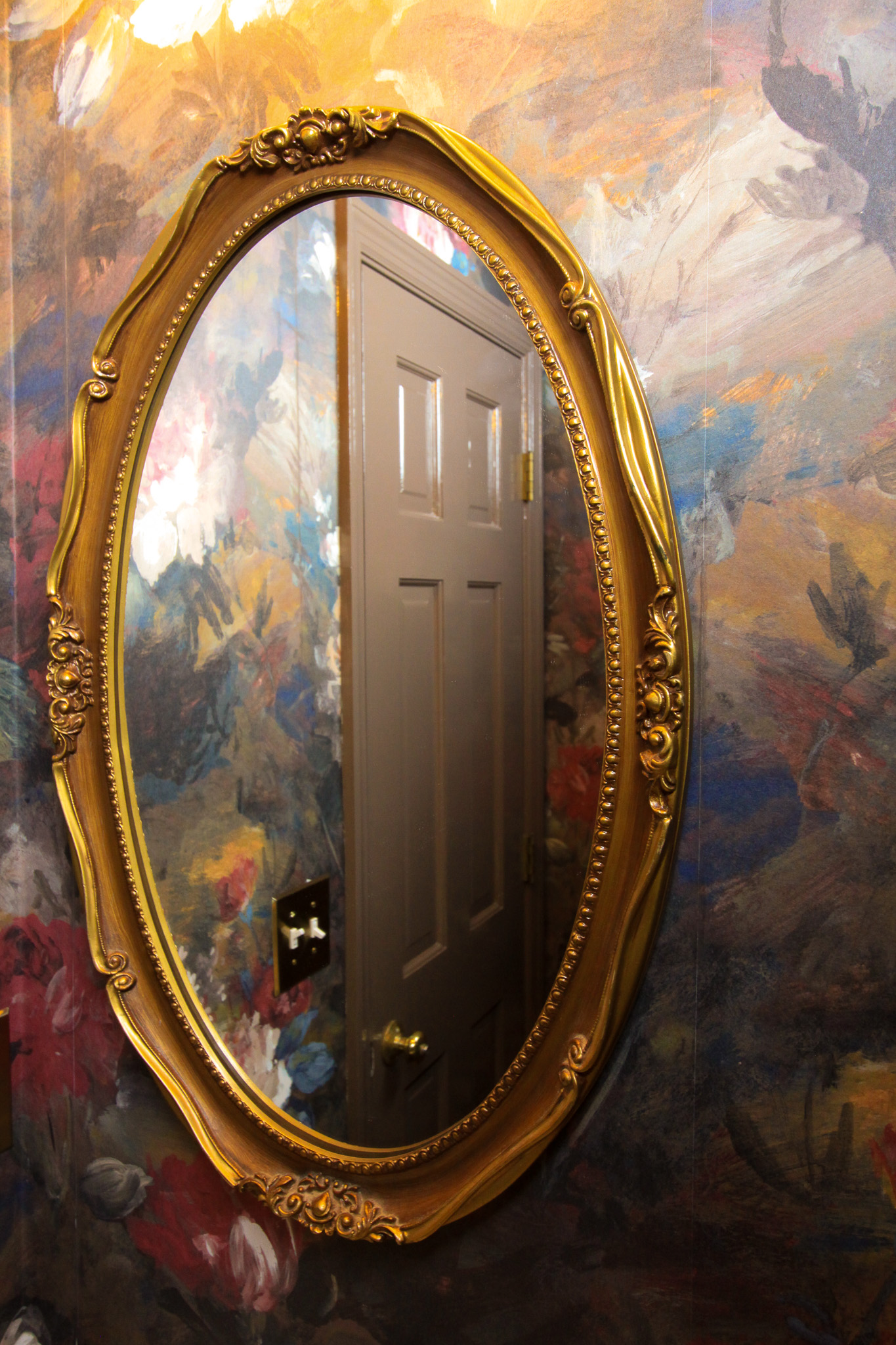
Lastly, I wanted to swap out the old white switch plates for some brass ones. I’m so happy with this brushed brass outlet plate and double switch plate from Amazon. I had browsed so many different options with a wide range of price points and these compete with the best of them. They look high end and were incredibly affordable. Finally, to round it all out, I found a unique toilet paper holder that adds a fun touch to the space!
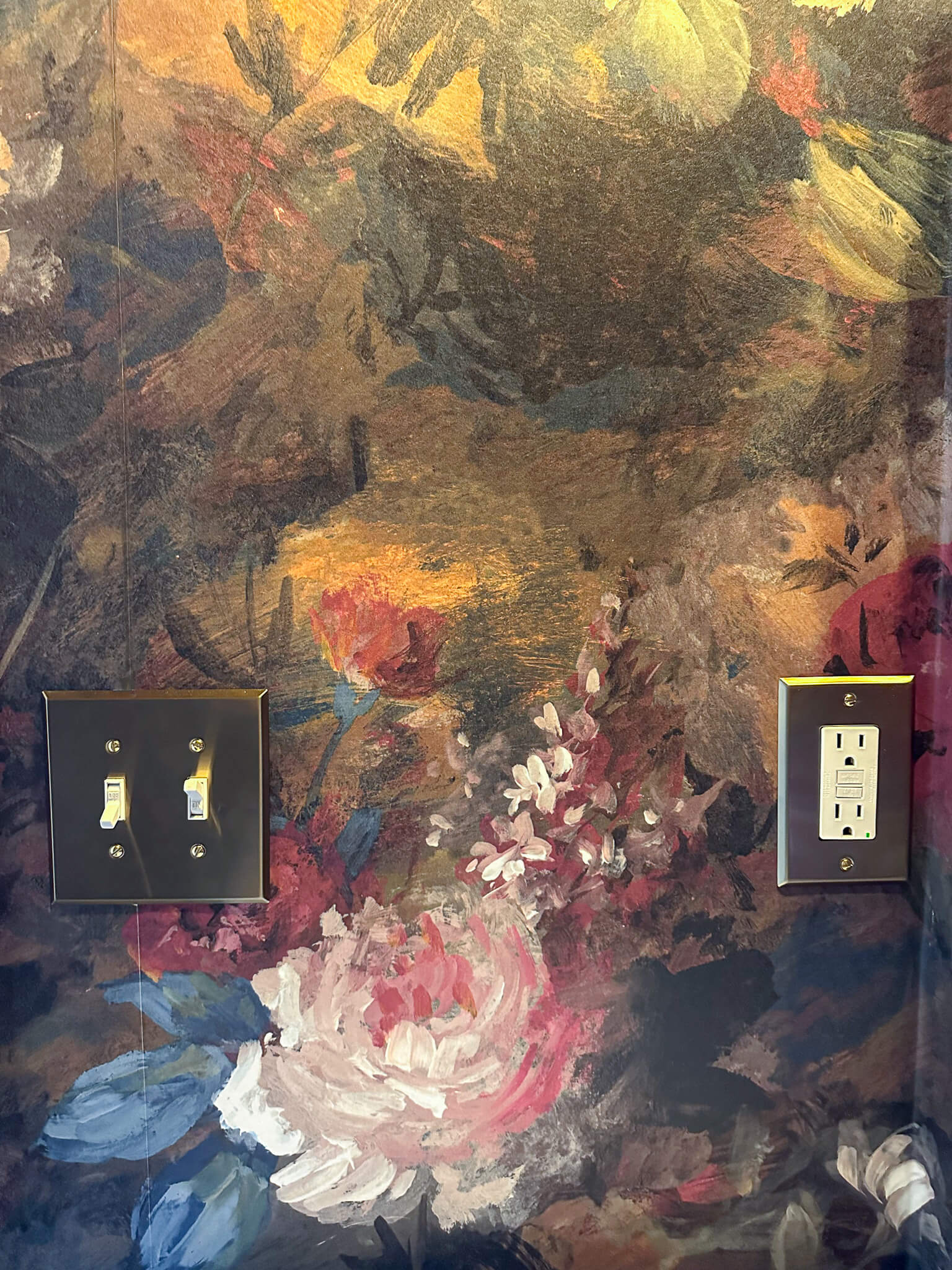
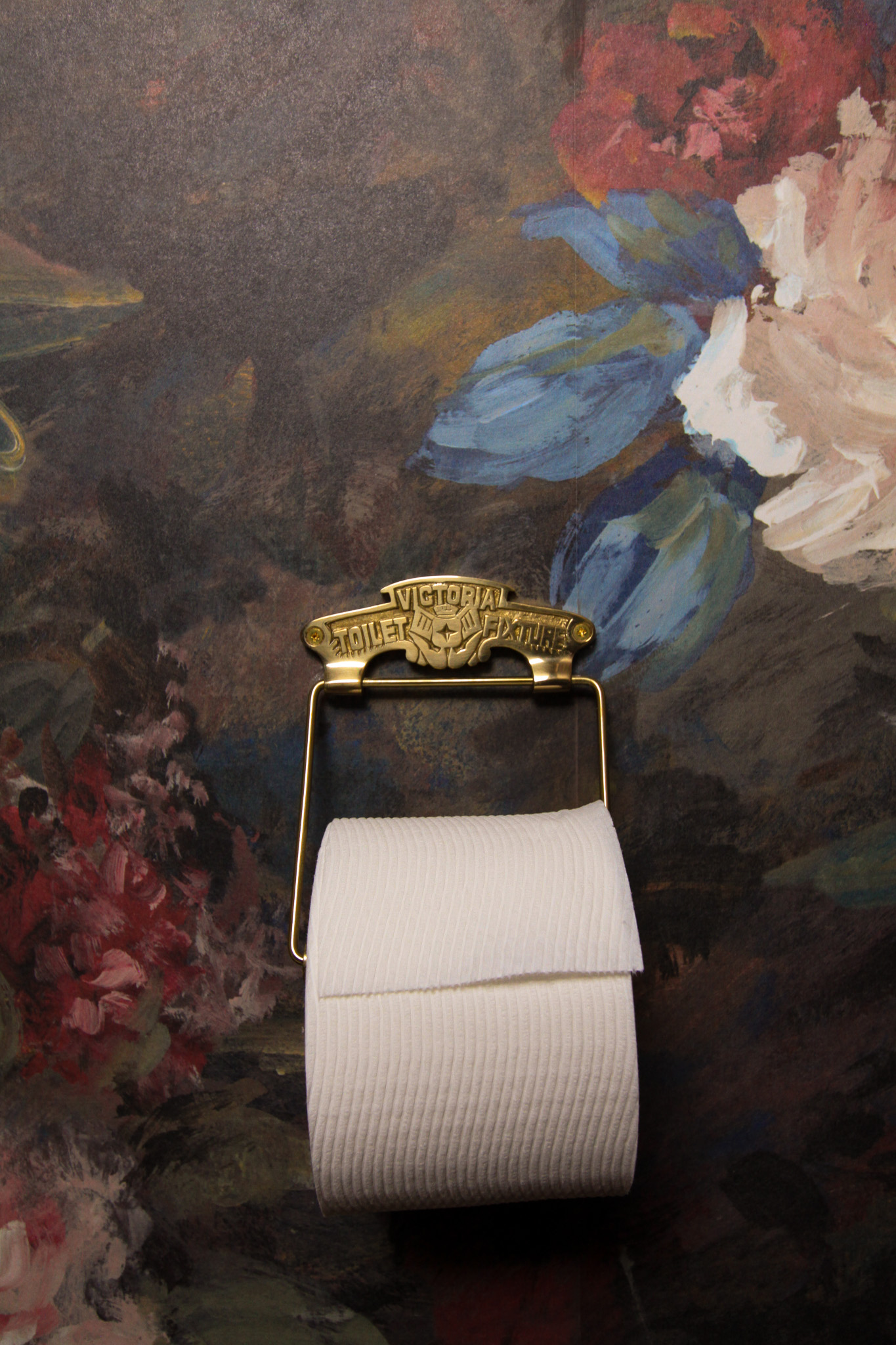
Looking Back To Look Ahead…
Looking back, I remember how irritated I was to spend time and money renovating a room that in my mind was “done.” But upon completing the powder room redesign (for the 2nd time) I have to say my perspective has changed. Even though I loved the previous version of the powder room, and it holds a special place in my heart, I couldn’t be more in love with this updated version. My design style has drastically evolved over the past five years and I feel this space is a better representation of my design aesthetic today. As I pass by this space multiple times daily, I love that it will not only be a beautiful space to glance over at but will also serve as a reminder that change isn’t always a bad thing.
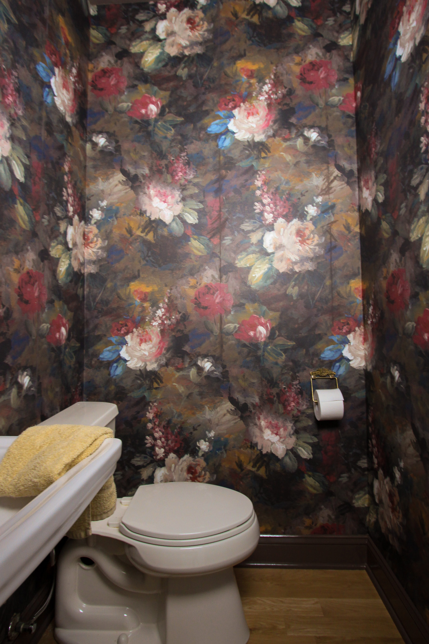
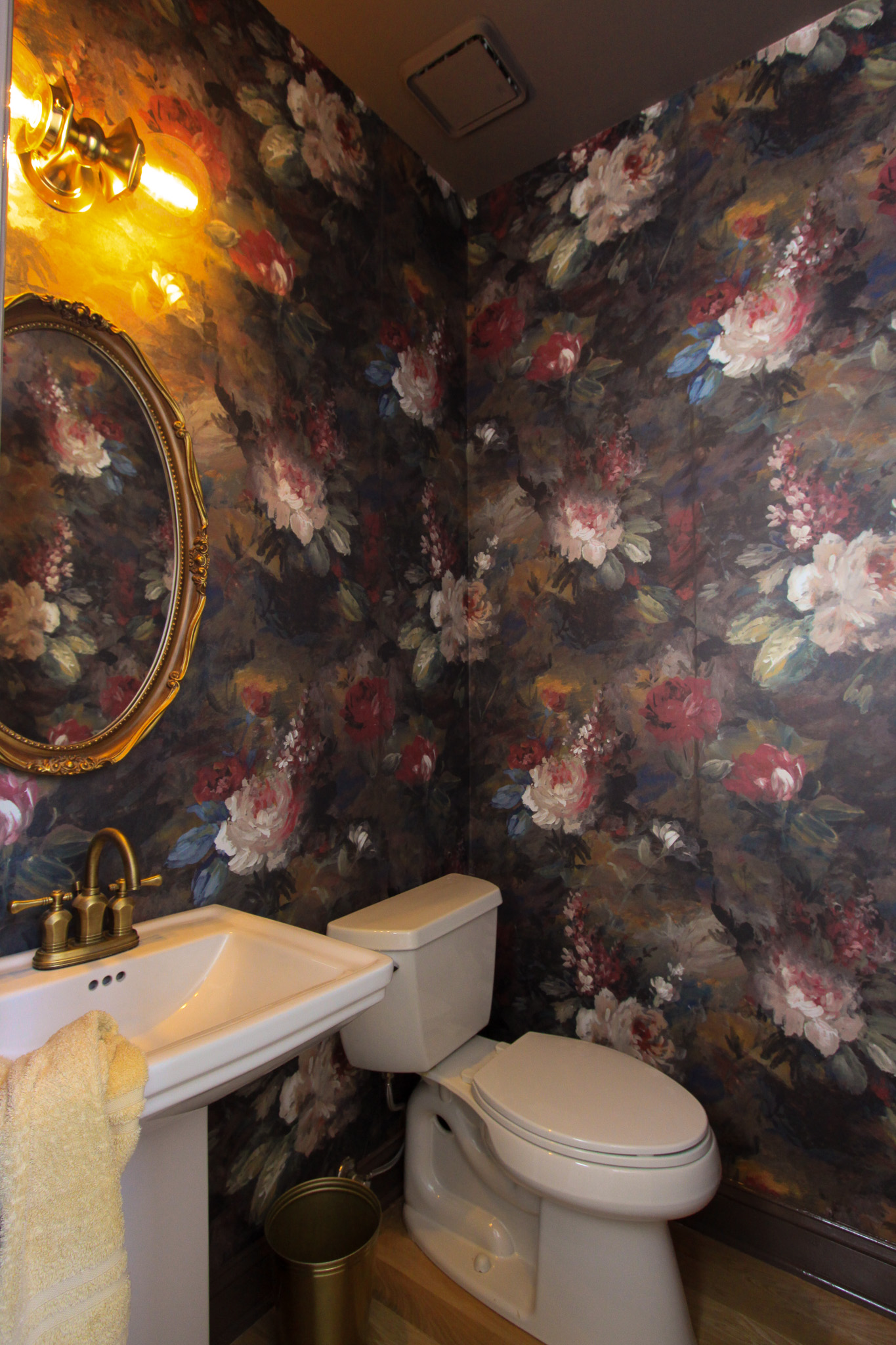
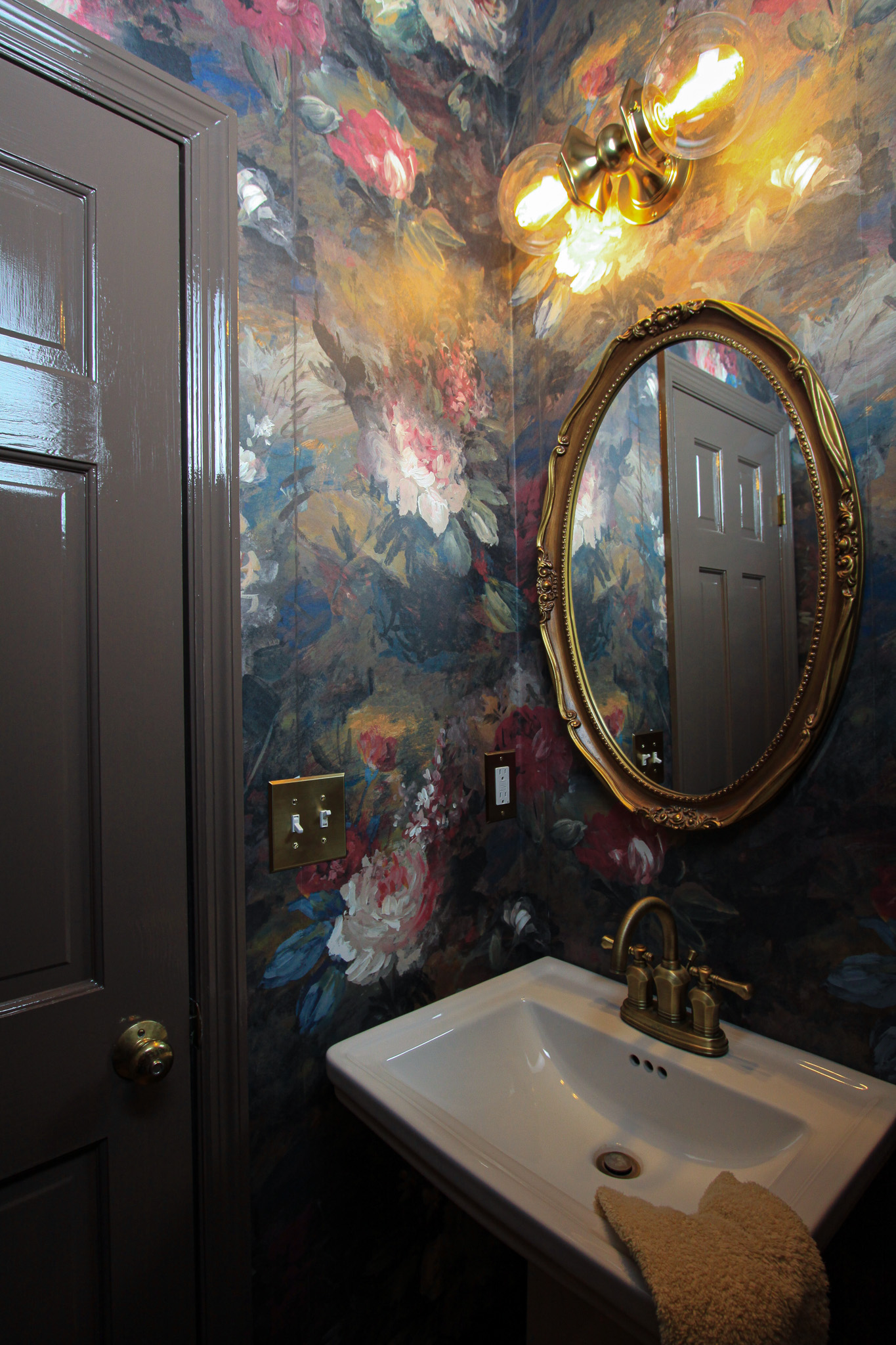
Sources: Wallpaper | Toilet Paper Holder (similar) | Brushed Brass Outlet Plate | Brushed Brass Double Light Switch Plate | Pedestal Sink | Light Fixture | Mirror is Vintage (similar vintage looking option) | Faucet (out of stock – similar)
Related:
browse more posts
read more
If you’ve been following along, you’ll recall that I opted to complete my new hardwood flooring installation in phases. In phase one I knocked out the downstairs flooring first, which is where the water leak happened (it was kinda urgent). Now that we have that out of the way, we can focus on the staircase and upstairs bedrooms. While I’d already made the core decisions when it came to the flooring (wood type, plank width, stain) I still had a lot to nail down when it came to the staircase design. Honestly, it was more than I ever would have expected – I already had a staircase so what was there to decide? Wait for it.
Staircase Terminology 101
Most of the staircase terminology was new to me, so to help you follow along I’m going to break down some key terms along with a diagram.
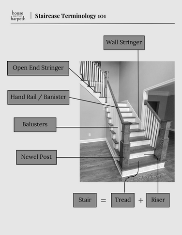
- Riser: this is the back of the stair, and what you might stub your toe on when going up the steps. Technically: the riser is the vertical component of the stair that provides support to the tread.
- Tread: the tread is what we step on (i.e. what we tread on). Technically: the tread is an upper flat surface or a horizontal portion of a step A tread + a riser = a step
- Newel Post: these are the posts at the top and bottom of most staircases. They support and connect the handrail.
- Hand Rail: Sometimes also referred to as a banister, this is what we try to slide down when we’re kids. Technically: the piece of metal or wood that you hold on to when going up and down the stairs, which provides both support and safety.
- Baluster: these are the wood or metal vertical pieces that connect the handrail to the bottom of the staircase (which is called a stringer – see next).
- Stringer: These are angled pieces of wood that support the steps in a staircase. There is always a wall stringer, which is next to the wall and then an open or closed stringer for the other side of the staircase.
Staircase Design Decisions….
The biggest decisions I needed to make for the staircase design came down to a handful of components but ones I didn’t take lightly. They were: newel post design, riser type, baluster type, and open vs closed stringer. Follow along as I break it down from easiest to hardest, along with my design process.
Design Decision #1: Riser type
When it came to the risers, I needed to decide if I wanted to continue the white oak the entire flight of stairs, or if I wanted to break it up with painted white risers. This was a pretty simple decision for me because I felt having continuous white oak would be too much wood, and a white riser would help break things up. Winner: white risers.
Design Decision #2: Newel Post
The house is a traditional style home and I felt bringing in a large newel post would work for both the design style of the house as well as the scale of the entryway which has 20 foot high ceilings. I have a small balcony at the top of the stairs, which would require two additional newel posts. I had the option to vary the sizes of these posts, but I decided to keep all the newel posts large and chunky to allow for design consistency. Winner: chunky newel posts.
Design Decision #3: Balusters
I knew I wanted black balusters. I love the contrast they bring to the table with the white oak floors. The unknown part that I struggled with was what size – there were thick balusters and thin balusters. Due to code, I needed to have three balusters per step (so children can’t put their heads through the balusters). My previous staircase was not done to code, so I had a hard time visualizing if the wider balusters I wanted were going to look too busy due to needing so many per step. The other option was to go with a thinner baluster, however I was worried that would create a modern feel which is what I didn’t want. Winner: thick black metal balusters.
Design Decision #4: Stringer – Open vs Closed
This was the hardest decision for me and I went back and forth multiple times. My previous staircase had a closed stringer. That meant the balusters were drilled into the angled piece of wood that was placed on top of the tread.

I had planned on keeping the stringer closed, however after learning I’d need to keep the existing stringer in order to do so, I opted to open it up. With so many DIY issues from the previous owners, I wanted to ensure I was getting a fresh start all the way around. Winner: Open Stringer
Conclusion
This project gave me a run for my money! The staircase is the first thing you see upon entering the front door and first impressions are everything. While I’m sure it sounds silly to most, I wrestled with the staircase design decisions for weeks, mostly because I wanted to ensure I was staying true to the style of the home. Ultimately I want this first impression to be a memorable one, and a proper introduction of what’s to come upon visiting my home.
read more
A couple weeks ago I shared my vision for the Powder Room Makeover, including three moodboards – all featuring different wallpaper designs. In addition to the moodboards, I ordered samples of each which helped narrow down the decision between Moodboard #2 and Moodboard #3. In the end, I decided to move forward with Woodchip & Magnolia’s Ava Marika Moody wallpaper and I’m so glad I did! It’s even prettier in person and the color pathways are absolutely stunning.
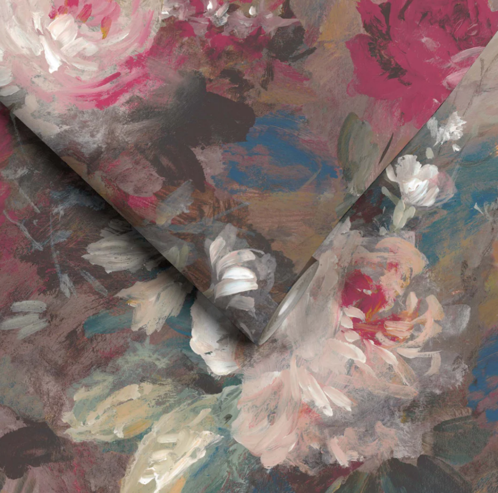
This wallpaper is straight paneled, meaning that each roll contains three panels and they line up precisely. No more measuring for a repeat pattern and collecting large wasting heaps of wallpaper (it’s expensive!). I’m already a huge fan.
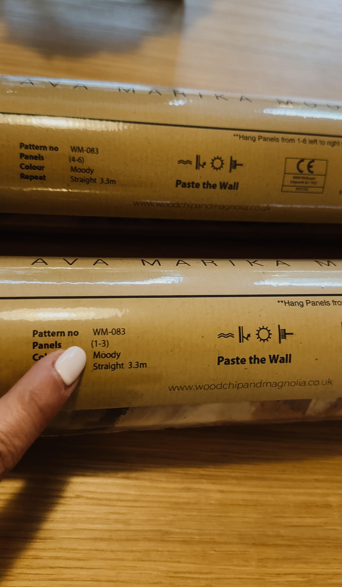
Anytime you’re going to wallpaper it’s important to read the instructions, as some papers are paste the wall and some papers are paste the paper. So far, I’ve installed paste the paper and I’ve also installed a peel and stick vinyl wallpaper, so this is going to be a first. The instructions also suggested to utilize a more heavy duty paste, so even though I had some leftover paste in the garage from a previous job, I invested in a tub of Zinsser Sure Grip Heavy Duty Wallcovering Adhesive.
Installation:
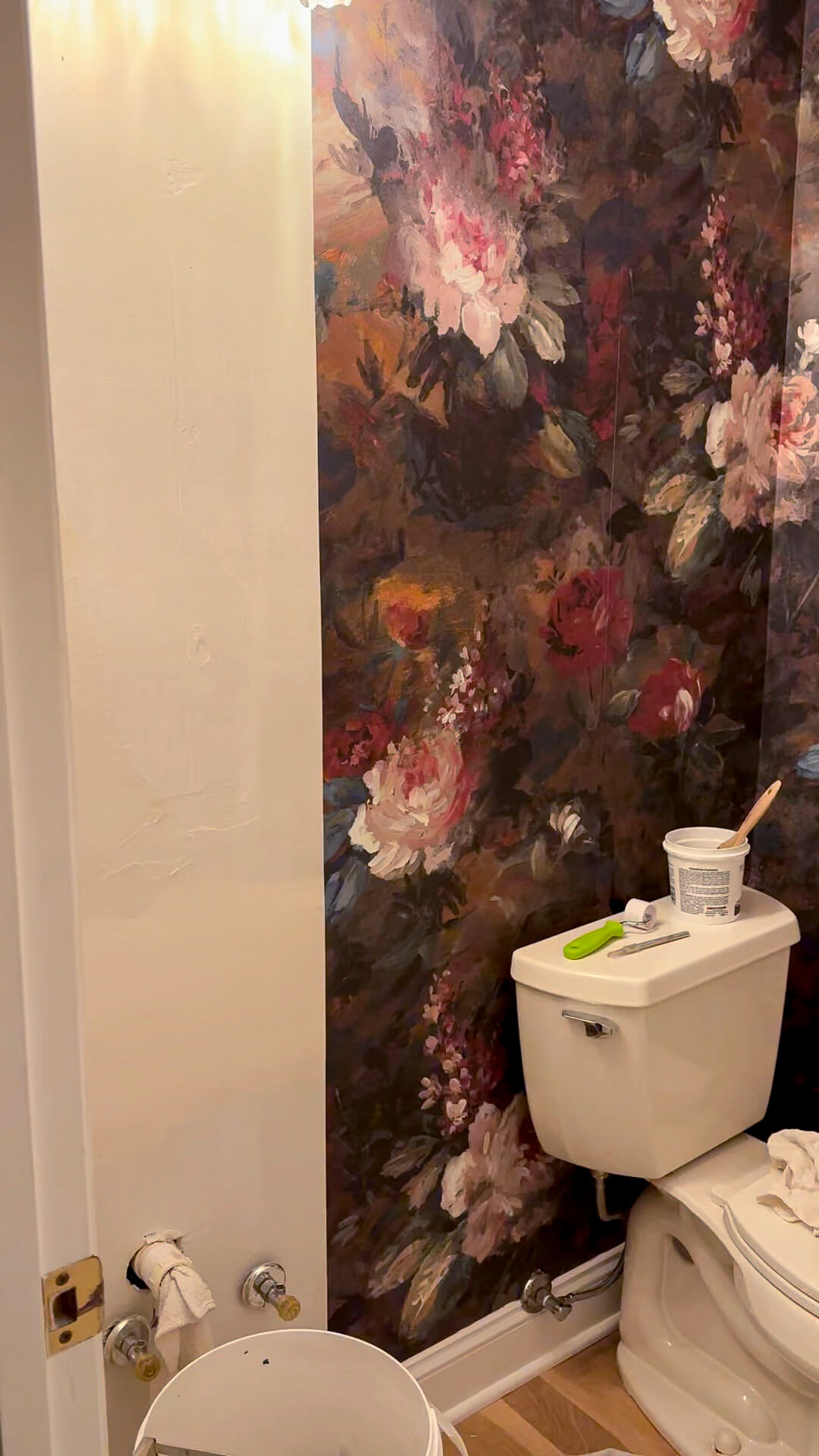
Following this install, I’ll do a separate post about the different types of wallpaper, pro’s vs con’s of each kind + what it costs to hire a professional. To keep it short, this was not the “easy” job I had hoped for, but it was doable by myself. The biggest challenge was the small confines of the room and working around the toilet to get to some of the high corners with my ladder.
Everything I needed for this job: Smoothing Tool | Seam roller | Wallpaper brush | Exacto knife | 24” Ruler | Scissors | Ladder | Paint roller | Paint skin | Wide Bucket | Paint brush | Roller Grid | Wallpaper Paste | Drop Cloths
Choosing A Trim Color
Originally I had hoped to paint the ceiling and the trim prior to installing the wallpaper, as I didn’t want to get paint on it, but after reviewing some paint swatches next to the wallpaper, I decided to wait. The powder room does not have a window, and I also decided to get a new light fixture for the space. These two factors alone can completely transform how the paint looks in this space vs in the dining room which is where I was laying everything out.
Based on where I cut each panel (top & bottom) the color ways were a little bit darker than the middle of the panels which is where I was pulling colors from. I felt my original plan for shiny kettle would be too contrasting against some of the darker colors, especially at the ceiling. Additionally, as much as I wanted it to work, I don’t think it was the right pink to pair with this.
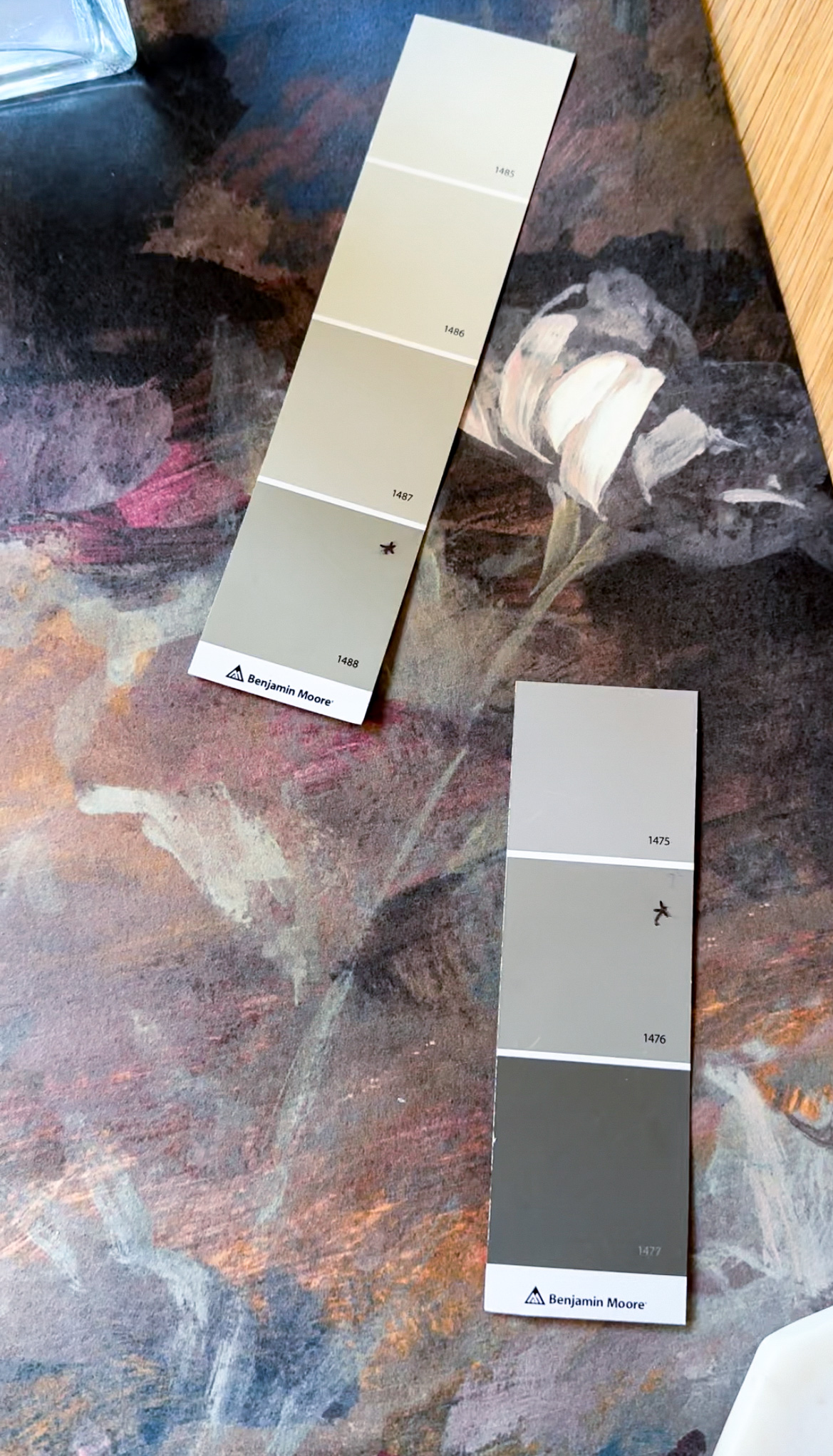
After laying out twenty different swatches I narrowed the decision down to two choices: Benjamin Moore’s Sage Mountain and Benjamin Moore’s Squirrel Tail. Sage Mountain (top left * option) is a muted green with grey undertones and I thought it pulled the green tones out of the wallpaper in a beautiful way, while not stealing the show. Squirrel Tail (bottom right * option) laid really beautifully against the background colors of the wallpaper, and since this color is going to be at the base and the crown, I think a grey with warm undertones would be complimentary to the overall design.
Since picking the trim was such a process, I decided this was not the time to guess and headed to the store to pick up paint samples. For reference, you can get little pots in an eggshell finish for about $7 each. It’s worth the cost of your time, rather than painting your space the wrong color and then having to do it over.
I painted little patches of each color side by side on a strip of baseboard that the sink will eventually go in front of. Both colors looked so similar as I was painting them, however after drying there was a stark difference. And I’m still not sure…
I think the answer is that we still don’t have a winner. I’m going back to the drawing board tonight (aka my paint wheel) and am also going to start scrolling through some photos from my favorite designers for some inspiration. While I’m anxious to finish this space, I want to get it right and fall head over heels in love with it.
Light Fixture Drama
I wanted drama for this room and I’m getting it! The original light fixture I had planned for (this bumblebee sconce) is currently backordered until November and I don’t love it enough to wait that long. So back to the drawing board I went, looking for something new. My parameters were the length (needed to be at least 15″ long but couldn’t exceed 22″), a brass finish, and at least two light bulbs. During my search, I found this extra large dresser sconce from Visual Comfort, and I thought it would add an unexpected twist to the space.
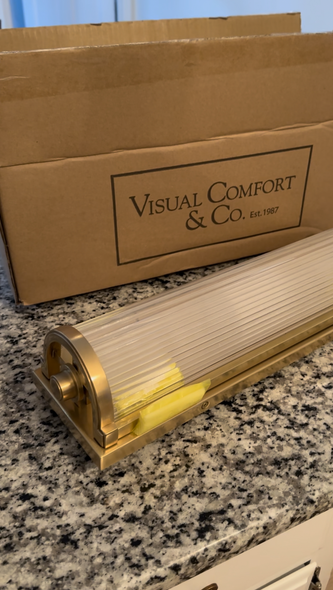
Unfortunately after unboxing it, it did not live up to the expectations in my mind. While the brass was beautiful, and the perfect finish for the space, the clear part of the light was the issue for me. I was expecting it to be glass or crystal, and it was actually plastic! For the price point of this, I was incredibly disappointed. Although, it was only my own fault as I’m sure that was listed in the product description and I missed it. I took the light fixture into the powder room just to be 100% sure, and after that I knew it was getting returned. The plastic really set the room back 20 years, and that’s not the direction I’m trying to go!
As of now, I’m back on the hunt for the right light fixture but am proud of myself for not settling. I’ve learned the same lesson too many times, where I’m eager to get a space done and just settle for something I know isn’t right. Ultimately a few months later I end up replacing whatever that thing is for what I wanted in the first place. So while this is a bit annoying to not be “finished,” I have faith that the final version is going to a showstopper, and I’m going to love every last detail.
Stay tuned for more soon…
The Latest on the Blog —
read more
There’s nothing quite like a gorgeous autumn flower arrangement. The colors are rich but not overpowering, and they blend into the background while still making a statement. If you’re like me, you’ve probably seen a stunning image of one of these autumn arrangements in a catalogue or on social media, and you’ve thought to yourself “that would be perfect for my house.” But then you realize that pretty little arrangement is going to set you back a few hundred bucks after you order the vase and the right number of stems to fill it. Speaking of which, how many stems do I even need?
This fall, I was determined to crack the code on how to style autumn flower arrangements without spending a small fortune, but while still achieving the designer look. After some trial and error, I can confidently say we nailed it. In this tutorial, I’ll walk you through the process of how I styled four different types of autumn flower arrangements. I’ll also go over how I determine the right stems for different types of vases, as well as tips for selecting flowers and vases.
Materials Needed:
Autumn Flowers (e.g., artificial flowers, branches, stems, leaves, or berries)
Vases (various sizes and styles)
Paper (for filling the vase)
Step 1: Your Vase + Selecting the Right Stems

Before you begin, consider the type of vase you’re working with and the overall look you want to achieve. Here are some tips for selecting the right faux fall stems:
- Large Round Vase: Opt for stems with full foliage to create a dramatic and eye-catching centerpiece. Choose stems with long branches or flowers that spill over the sides for a lush and abundant look. You can choose to go monochromatic or incorporate a mix of textures, colors, and heights for added visual interest.
- Tall Vase: Look for long and slender stems that complement the height of the vase.
- Tall branches or grasses work well to fill the vertical space. Consider using a single type of stem for an elegant and streamlined appearance.
- Short Vase: Select shorter stems or cut longer stems to fit the height of the vase. Focus on small to medium-sized blooms or branches to ensure they don’t overwhelm the vase.
- Vase with a Small Opening: Choose stems with narrow profiles, such as thin branches or slender flowers. Trim stems to the appropriate length to fit through the opening without crowding.
Step 2: Determining the Quantity of Stems needed

Here are a few questions and considerations to help you determine how many stems you’ll need for your arrangement.
- Vase & Desired Shape: Which vase you’re using and what shape you’re desiring will help drive how many stems you’ll need. Do you want a full, rounded look or a more sparse and airy appearance?
- Foliage Density: Examine the foliage or blooms on your faux stems. Some stems have more leaves or flowers than others. Keep in mind that if your stems are particularly dense, you may need fewer of them to fill the vase adequately.
- Vase Opening: If your vase has a smaller opening, you’ll likely need fewer stems. On the contrary, if the vase has a larger opening, you’ll need more stems (or stems that are fuller) to properly fill the space.
- The Rule of Thirds: when in doubt, use the rule of thirds for a balanced look. Divide the height of your vase into thirds and aim to have your stems occupy the top third. This allows for a visually pleasing arrangement without overstuffing the vase.
Step 3: Preparing the Vase
Before arranging your faux fall stems, make sure your vase is clean and ready for use. If you have a large vase with a wide opening, you may want to add some packing paper to the bottom to help fill the space and additionally place floral foam on top of the paper in order to secure the stems in place.
Step 4: Assembling
Now, it’s time to arrange your faux fall stems in the vase. Here’s how I styled my four different arrangements.
How I Styled 4 Different Arrangements
a. Large Round Vase – total cost $65

Since this vase is so large, I opted to stuff crumpled packing paper in the bottom to help fill the space. I cut floral foam to fit through the opening, making sure at least two of these pieces were the length of the vase. This arrangement will sit in the center of my kitchen table, so I wanted a full look all the way around.
I chose these large red maple leaf stems which I thought would pair nice with both the vase itself, as well as the setting I was planning on placing it in. Since the foliage is quite full after being properly fluffed, I only needed three stems for this arrangement. I kept one stem more upright and placed it in the center first, then placed the two remaining stems on the sides, bending them a bit to create a fuller and draping effect.
Sources: Crate & Barrel Jimena Round Vase (currently out of stock – similar vase here) | Brown & Burgundy Maple Leafe Bush ( 3 total)
b. Short Vase and Vase with a Small Opening – total cost $40

This arrangement is for my bedroom and I knew would be placed on a light blue dresser. I liked the idea of choosing these stems, as I felt the tones in the orange weren’t too aggressive and would compliment the color of the dresser as well as that of the vase. Additionally, the foliage was not too large for the scale of this vase. I chose two short stems and after properly fluffing them they were more than adequate for the size of this vase. I placed a couple pieces of flower foam in the bottom to help them stay secure. Couldn’t have been simpler!
Sources: Leann Ford Full Moon Clay Vase | Orange & Red Beech Faux Stems (similar) (2 total)
c. Medium Height Vase with Narrow Mouth – total cost $55

I found this vase at Target and felt the colors were so perfect for the fall season. I wanted to create a dramatic effect for this, and I felt this golden berry bundle would be perfect. The stems were easy to bend and really tend to drape in a natural looking fashion. Since this was going to go up against a wall, and not act as a centerpiece, I only used 3 stems as I wanted the backside to be a little closer to the wall. I’d suggest using 4 total if this were going to be in the center of a room.
Sources: Studio McGee Vase | Yellow Berry Bundle Stems (3 total)
d. Tall Vase with Narrow Mouth – total cost $90

The last arrangement was the simplest. I had this tall narrow vase and decided I wanted to go large scale and create something dramatic to be placed in a corner. I chose three of these pretty burgundy eucalyptus stems in the longer length. I bent the bottom of each stem, and then placed one stem in the center of the vase and the other two on each side, making sure to lean them against the lip of the vase. It’s the most simple arrangement but also the most dramatic. A little more expensive, as longer stems tend to be double the price of the short ones.
Sources: Crate & Barrel Geo Vase | Tall Burgundy Eucalyptus Stem (similar) (3 total)
In Conclusion
Styling faux fall stems is a creative, enjoyable and simple way to bring the beauty of autumn into your home. Remember to select stems that match the vase’s size and shape, and don’t be afraid to mix and match different elements to achieve your desired look. For these examples I chose to go monochromatic but it’s also fun to mix and match for scale, color and texture. If you’d like a more visual step by step guide, feel free to check out my YouTube video below. I’ve also included some of the best faux fall stems I’ve found this season below to help get you started. Happy decorating!
browse more posts
read more
I’ve been daydreaming about a moody dramatic tv room, and it’s official – I think this iteration of the TV Room is “the one”! There are still a few tiny details I need to finish such as putting a medallion above the gold leaf chandelier, changing out the electrical sockets to be black and eventually deciding on some window treatments, but for now, I’m checking this room off as complete.

Phase 1
If you’ve been following along, you’ll remember I did a budget friendly refresh shortly after moving into this house. I painted the built-in bookshelves a dark blue-grey (Benjamin Moore’s Lead Grey) in a Satin Enamel finish, swapped out the light fixture and added a sectional to the space. Many of the other pieces of decor came with me from my previous house. It was a fantastic update for the limited budget I was working with and it worked.

When I found out I’d be unexpectedly updating my hardwood floors, I realized now was the time to make a big change to this room and that started with the decision to remove the existing shag carpet. I was incredibly lucky to find beautiful white oak hardwood flooring underneath the carpet and it was in fantastic condition. It just needed sanded down and then stained to match the finish of the new flooring in the rest of the house. I am still counting my blessings about this!
TV Room 2.0
With how much this room had already evolved up until this point, I felt like it was time to take a design risk and try my hand at color drenching. I was a little bit nervous about the new paint (ceiling, trim and walls) matching the existing built-ins, as paint does fade over time, but it turned out seamlessly and I am absolutely in love with the final result!

I had so much fun adding in brass accents to really pop against the dark paint. My Primrose mirror that I had in the dining room for years has found its forever home above the mantel and I love seeing the reflection of the gold leaf chandelier. I swapped out the previous desk lamp for a cute little brass task lamp with a curvy arm and was so excited to add my first art lamp above some of my music memorabilia on the back wall. I tend to move my artwork around a lot, so going with a battery powered option felt like a safe choice and I couldn’t be happier with the decision. I’m already thinking about where I can install more of these – (of course I am).
Same corner. Same room.
Finishing Touches
Adding in a dark area rug helped anchor the room and balance the brightness of the new hardwood floors. I decided to choose a traditional style patterned rug and the colors in this one were perfect as they pulled in the burnt orange pillows, the Lead Grey paint color and the beiges from the coffee table and sectional. I think the floral / botanical pattern helps balance the plaid pillows, as well as the overall masculine tone of the room.
Some finishing touches like restyling the bookshelves and changing things up on the coffee table has made this room feel like a completely new addition to the house, when in reality the true transformation came from taking a design risk with paint. This project has given me the confidence to continue to push my design boundaries and I’m so proud of how it turned out.
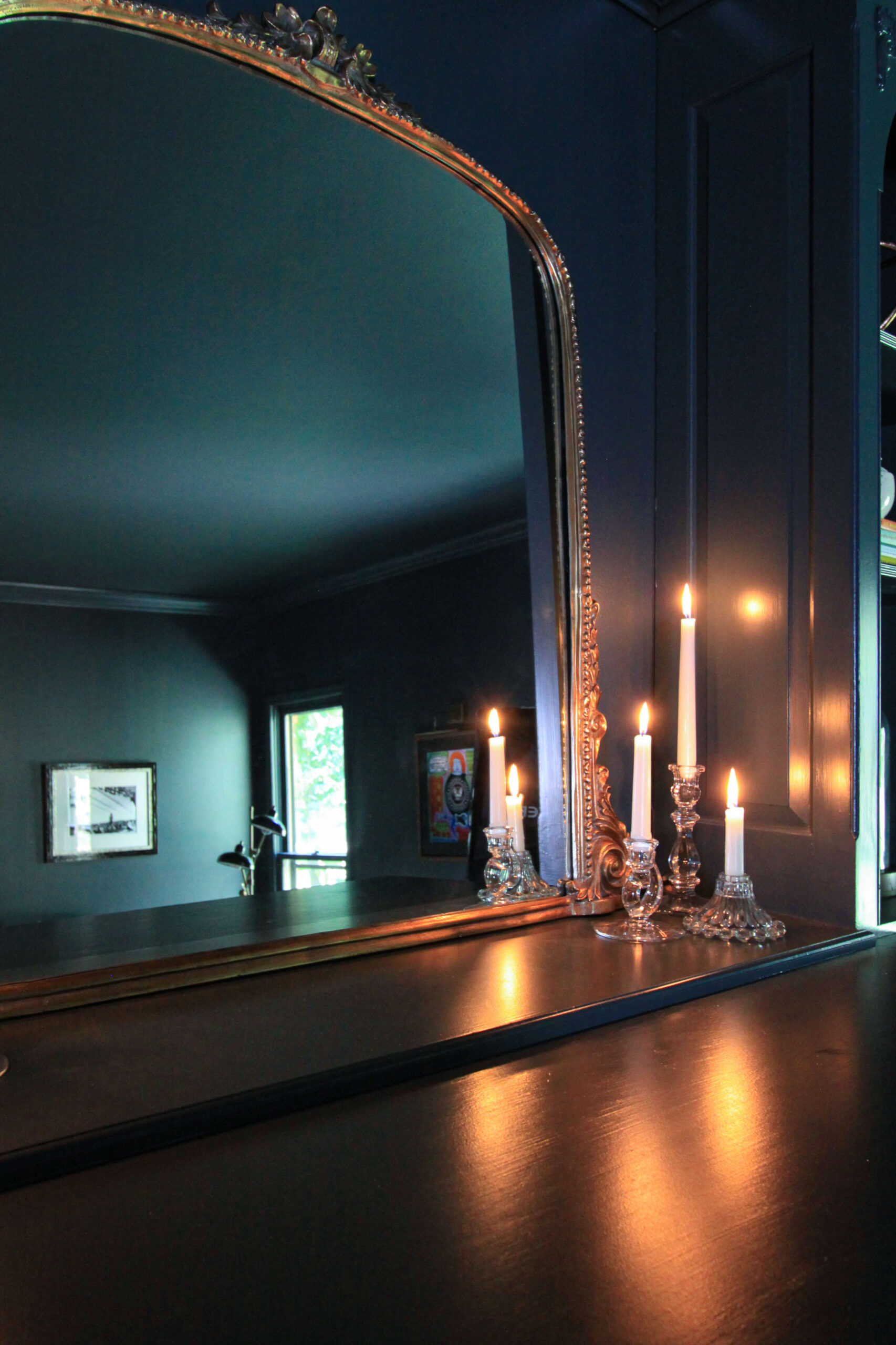
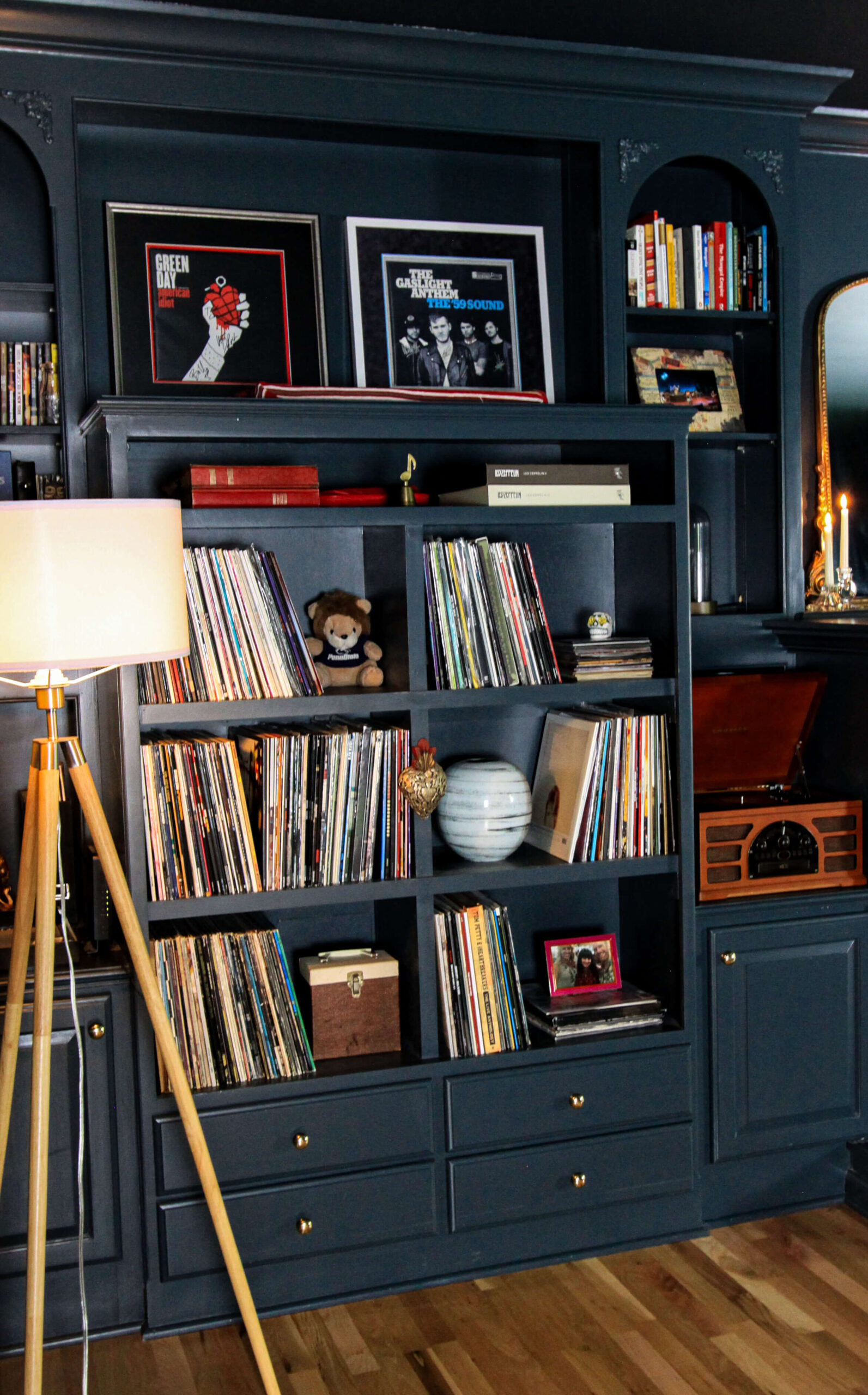
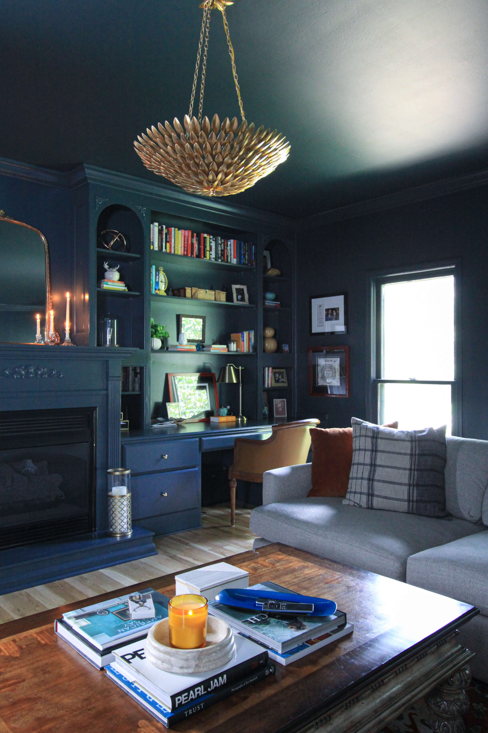
Sources:
Rug (size 10’x13′) | 3 Piece Sectional (in Taft Cement) | Coffee Table (no longer sold) | Desk Chair (antique) | Gold Leaf Chandelier | Tripod Floor Lamp | Double Arm Floor Lamp | Art Lamp | Plaid Pillows (similar) | Record Player | Gleaming Primrose Mirror | Brass Task Lamp | Glass Trinket Boxes | Small White Planter | Paint Color: Lead Grey by Benjamin Moore | Faux Fur Blanket in Silver | CB2 Trinket Box | Candles
read more
Recently, I noticed that the pedestal sink in the powder room was wobbly, and after further investigation I realized it wasn’t connected to the wall! After calling the plumber we came to the unfortunate truth that the sink wasn’t connected to any studs in the wall, but was simply drilled into drywall. The plumber had to cut a hole in the wall, install wooden shims and replumb everything. In order to do so, he had to remove a section of the wallpaper. Since this wallpaper is five years old, it isn’t produced anymore and I don’t have any leftover, so….surprise! It’s time for a powder room makeover.
This is a little bittersweet, simply because this is the first room I flipped after buying this house and my mom and I did it together. Actually it was the day after I signed the house – I just couldn’t wait. I found this gorgeous wallpaper by Graham & Brown that had a little bit of sparkle in it. I love the concept of making a small powder room dark and moody, and this wallpaper was just the ticket!

Above: original powder room | Below: my 1st renovation after closing on this house. I was so proud of it!
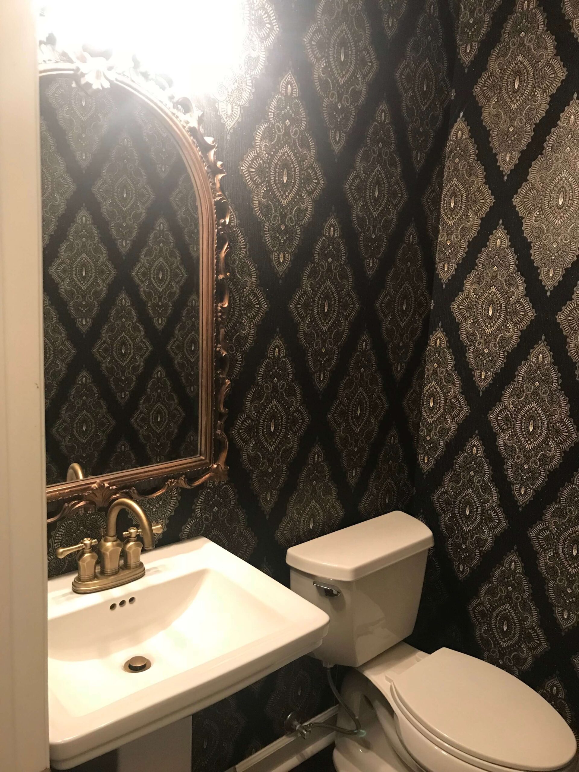
Since the pedestal sink is propped up in a corner of my dining room, and I have a giant hole in the wall, I’m highly motivated to get moving on a new design concept. The plumbers can’t come back until I’ve patched the hole and have uninstalled the old wallpaper and re-installed the new wallpaper, so it’s time to get moving!
Moodboards
I’ve put together a handful of moodboards to start visualizing the next phase of this room, and it’s definitely starting to excite and energize me about the impending change. I’ve had a couple wallpapers bookmarked for a while now, so I’m hoping this might be the right spot for them. I’m a firm believer in ordering wallpaper samples and creating moodboards to get the design out of your head and onto paper. Here are my top 3 contenders.
Moodboard #1:
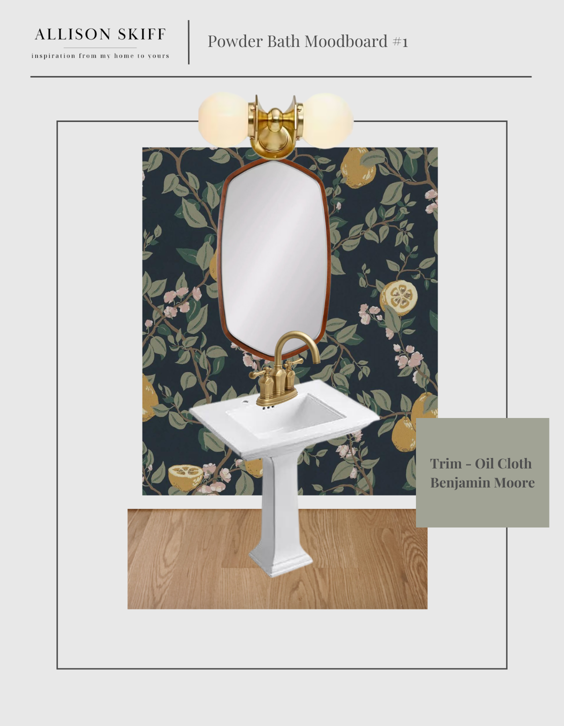
I’ve been eyeing Sandberg’s Kvitten wallpaper in midnight blue for a while now, and have been trying to find the perfect place in my home to integrate it. I love the muted green color in the leaves and think Benjamin Moore’s Oil Cloth would be the perfect accent color for the trim, door and ceiling. I’d add a double light sconce with round milk glass globes to play off the circular shape of the lemons. Adding a wooden framed mirror will help break up the brass between the faucet and light fixture.
Sources: Sandberg Kvitten Wallpaper (Midnight Blue) | Oslo Mirror | Double Milk Glass Sconce | Paint: Oil Cloth by Benjamin Moore
Moodboard #2:
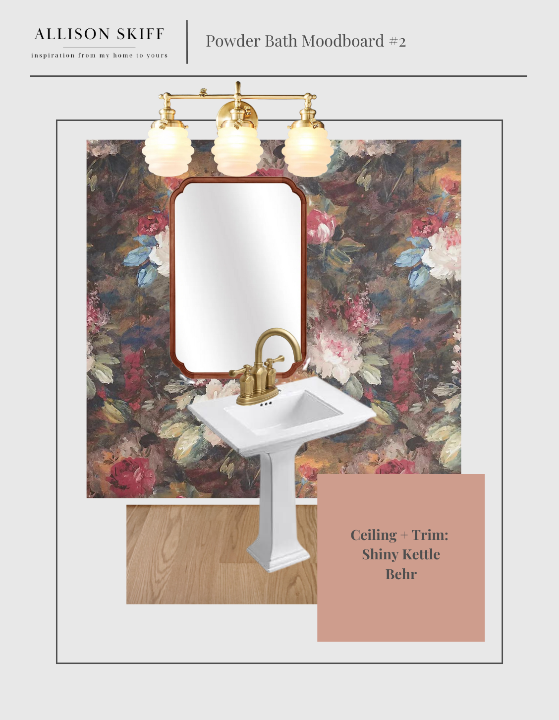
In such a small space I love the idea of a larger print, as it won’t be an overpowering experience when the door is shut. This beautiful wallpaper by Woodchip & Magnolia checks all the boxes and I’m excited about all of the color way options I could pull out for trim. I have a pint of this pretty smoky pink (Shiny Kettle by Behr) that I never used, and I think I can pull out the right tone of pink from this print to match. The bumblebee vanity sconce from Anthropologie would make so much sense given the flowers in the wallpaper and I think it’s such a fun light fixture in general. I’d again break up the brass light fixture and faucet with a walnut mirror in between.
Sources: Ava Marika Wallpaper | Ophelia & Co Mirror | Bumblebee Vanity Sconce | Shiny Kettle by Behr
Moodboard #3:
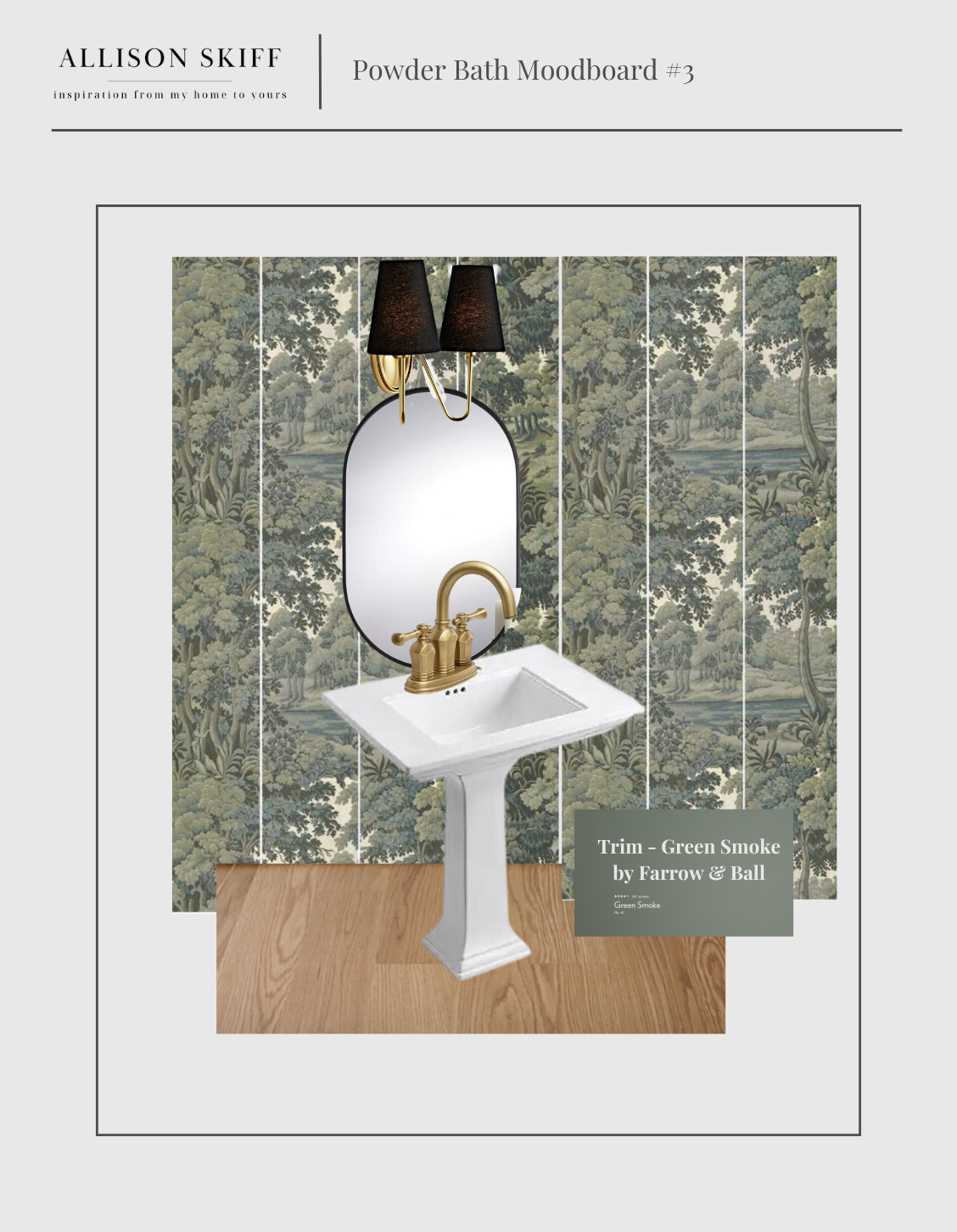
This is such a beautiful pallet of muted greens and I love the concept of a mural in this small space. I’ve been trying to work green into my house and this would be such a wonderful solution. Since I plan to install the wallpaper myself for this project, I love the idea of using panels that already line up, which would avoid measuring for the pattern repeat and eliminate some user error. I would anchor the room by pulling out a darker green from the pattern, and I think Farrow & Ball’s Green Smoke would be the perfect pairing. Adding a double sconce with a black shade will bring some elegance into the space and will allow for a black oval mirror as a neutral element.
Sources: House of Hackney Plantasia Wallpaper in Sage | Berkshire Double Sconce | Rapido Black Matte Wall Mirror |Green Smoke by Farrow & Ball
Out of this group of three, I think I have “the one”…but maybe with a couple tweaks. While I wasn’t initially thrilled about the unexpected renovation, I’ve decided to embrace it and am excited to see the evolution of this tiny space. Drop a comment below and let me know which option is your favorite, and stay tuned for the progress report + full reveal. You can shop all three moodboards here!
The Latest on the Blog —
read more
The initial refresh I did in the TV Room (aka the Cozy Room) was exactly what it needed to make the space feel updated on a limited budget. However the more time I spent in it, the more it didn’t quite feel right. My main sentiment was that it still felt too bright for a movie room, but I was coming up empty on a design solution.
One day I was lying on the couch reading and happened to be facing the built in bookshelves. The angle allowed me to see only the oatmeal colored couch and burnt orange pillows against the all blue grey wall. And well, after that I couldn’t get it out of my head. I knew I had found my answer: this room was destined to be color drenched!
What Is Color Drenching?
Color Drenching is when you paint the entire room – walls, ceiling, trim, windows – all the same color. I bet you’ve seen it and didn’t even realize it. Lately I’ve noticed it popping into several TV series. If you’ve seen Emily In Paris, you’ll notice the French interiors in the show are color drenched in beautiful blues and lavenders. Showtime’s “Your Honor” has scenes from The Baxter Hotel which show a deep blue room that’s completely color drenched. The more I kept seeing it, the more I couldn’t stop thinking about it.

Phase 2
Knowing this room was about to go from day to night, I set out to start building a moodboard with a mix of old and new. The more I started to design, the more excited I became to add in accent pieces that will make the room feel more cohesive, while adding plenty of drama and a touch of masculinity. The centerpiece will be this beautiful gold chandelier, which will really pop against the new dark ceiling. I’ll anchor it by repurposing my Primrose Mirror above the fireplace, and will flank it with candlesticks.
There are obviously (and thankfully) a lot of elements that are staying the same. The sectional couch, the coffee table, the blankets, tripod lamp and the vintage desk chair will all fold into the new design seamlessly.
Lastly, I’ll add a couple more lighting sources to the room that will compliment the ambience I’m trying to create, but will also provide a source of light when needed. I’m currently on the hunt for a brass task lamp to add to the built in desk for a pop of gold, as well as this double arm floor lamp for the back corner. I also have my sights set on adding a brass art lamp on the back wall of the room and am loving this rechargeable one. I’ll be able to avoid needing to hard wire it, and if I change my mind about it’s location (as I tend to do) it won’t matter. I’m also planning to incorporate some plaid into the room and am currently browsing tons of options like these plaid pillows.
I think it’s going to be the perfect style for the space and I can’t wait to see this room really come to life for what I hope will be the final time! And then we can watch movies in it.
browse more posts
read more
If you’ve been following along, you’re up to speed on how a small leak has changed my entire house (seemingly overnight). After I had a minute to process what was happening and just how much damage it caused, I decided to lean into the situation and look at it as a blessing. In truth I’ve been unhappy with the engineered hardwoods in this house but installing new hardwoods throughout the entire house was not currently in my budget and therefore wasn’t a short term possibility. With the insurance supplement I’ll be able to get what I really want, and it will be a design choice that fits with the style of this house.
After working with my flooring contractor for a few weeks, we went over my options for the new hardwood flooring, as well as installation plans. The immediate decisions were flooring width, types of wood and the stain. I’ve been saving a few inspiration photos to help guide the conversation with my contractor and am excited to share the design process with you today!
Design decision #1: Plank Width
My previous house had original maple hardwoods that were around 2 inches wide. Initially I was pretty set on installing a similar sized plank because I loved my former floors so much, however after taking a step back I realized just because something works in one house, doesn’t mean it’s the right choice for another house. My previous house had much smaller rooms, as well as lower ceilings. This house has incredibly large rectangular rooms (a lot of 11’ x 17’ spaces) and also has 9 foot ceilings. Knowing this, I decided to increase the floor board width to 3.25 inches and feel like this is going to fit well with the traditional style of the house.
Design decision #2: Wood Type
When it came to the type of wood to consider for the hardwoods, I ultimately went with White Oak. I don’t love seeing a lot of grain in hardwood floors, and I knew that White Oak tends to have a tight linear grain. On top of this feature, it’s also one of the more water-resistant options, and is more accepting of a variety of stain choices.
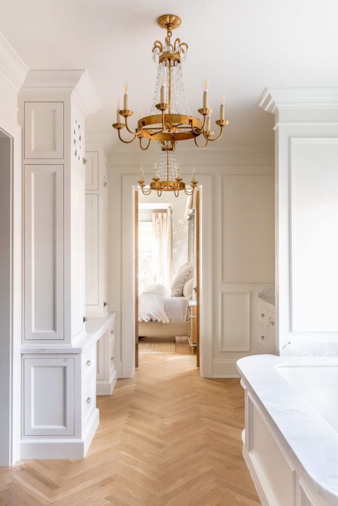
Design decision #3: replacing the existing carpet
The other big decision was going to be the two rooms with carpet. Both the tv room (“Cozy Room”) and the master bedroom have a beige shag carpet that the previous owners installed. From lifting up the air vents on the floor, we were able to tell that there was already hardwood in both rooms. My contractor could tell the hardwood in the tv room was an oak, but we wouldn’t know until we removed the carpet if it was a red oak or a white oak, and we definitely didn’t know what kind of shape it would be in. Unfortunately the bedroom had a bamboo flooring underneath the carpet, so that was going to need removed and replaced, adding to the overall cost. Ultimately, I decided to remove all the carpet in both rooms and roll the dice on what we’d find underneath.
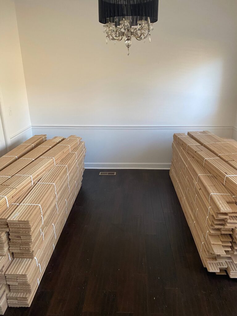
Design Decision #4: Choosing A Stain
The first bundle of white oak arrived and will sit in the dining room for 2 weeks to cure. While initially I wasn’t sure what I was going to do about a stain decision, after seeing the flooring in its raw state I knew right away this was the look I’d like to stick with. It really goes to show that it’s okay to take your time and sit with some decisions until the right one comes to you. Seeing the wood in my house during all different lighting throughout the day helped me feel confident in my decision.
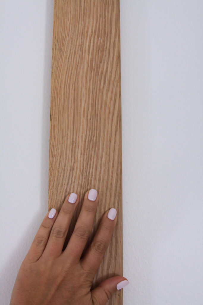
Timeline & Next Steps
Due to the process with the insurance company, I opted to complete the install in phases. We’d do the downstairs first, and then book the upstairs in conjunction with the staircase. I’ve been living on the subfloor in the kitchen for 6 weeks and cannot wait to finally get this over with. I know the situation could be so much worse, and I’m truly thankful it isn’t, but I’m ready to have things where they belong (where is my coffee thermos?!) and not step on nails popping up from the subfloor. I can’t wait to take you along for the ride and share the journey along the way. Stay tuned for more to come!
read more

Yes, I bought a house with popcorn ceilings and yes I scraped every square inch of them off, all by myself. 3,222 square feet to be exact.
When I bought this house, there was no question that these ceilings were going to get fixed, but it was something I planned to hire out for. I was talking to my mom one day, complaining about how ugly the ceilings are and how dirty they looked (and I couldn’t clean them!) and she told me that one of my cousins removed her popcorn ceilings herself. The seed was planted. Why not try? If it was something I couldn’t do myself, then I could hire out as I originally planned.
Ignorance is truly bliss because this was a bear of a project, and I had no idea how hard and dirty this job was going to be. In the end, I’m so glad I did it myself, as it allowed me to save money that I could invest into other areas of the house. If you have popcorn ceilings and are considering removing them yourself, read on for my step-by-step how to guide.
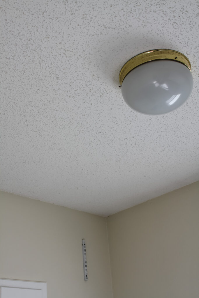
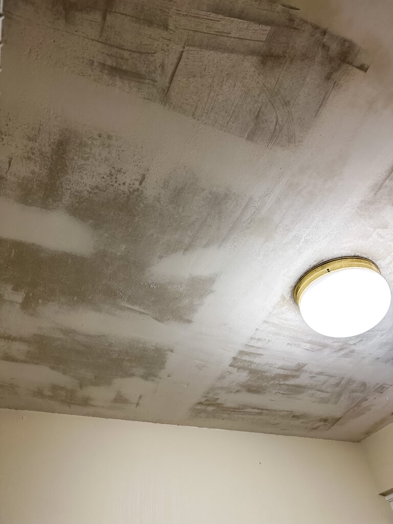
How To Remove Popcorn Ceilings: A Step-by-Step Guide
Removing popcorn ceilings can be a messy and time-consuming task, but it’s possible to do it yourself with the right tools and precautions. Here’s my step-by-step guide as well as key learnings from along the way:
1. Test for asbestos: You can read all about asbestos as much as you want to, but regardless of the year your house was built I’d suggest testing just to be safe. You can buy self test kits that are easy and relatively cheap, or you can call a professional to test. This is the kit I used and I had my (negative!) results inside of a week. If asbestos is present, hire a licensed asbestos abatement contractor for safe removal.
2. Prepare the area: Remove everything possible from the room including light fixtures. Cover the floors with sheets or drop cloths, and then add an extra layer of plastic sheeting on top for easier clean up. You can also try to hang the plastic sheeting on the walls taping them up with frog tape (see supplies list next), however I chose to let them be and then just cleaned the walls at the very end.
3. Supplies: For protective gear make sure you’re wearing a mask, goggles/glasses and gloves at the minimum. Towards the end of this project I chose to invest in a hazmat suit. You’ll need: a ladder, a spray bottle or pump, fabric softener, a wide putty knife, plastic, painters tape, garbage bags, a shop vac, rags, sandpaper and determination.
4. Wet the ceiling: Before scraping, you need to moisten the popcorn texture to make it easier to remove. Fill your spray bottle with warm water and add a tablespoon of fabric softener. Lightly wet the ceiling being careful not to oversaturate it, as it can damage the underlying surface. Wait 10 minutes.
5. Scrape the texture: Once the ceiling is damp, use a wide putty knife to gently scrape away the texture. Hold the scraper at a shallow angle and apply even pressure to avoid damaging the ceiling. If your knife feels like it’s catching, you might be on a seam. Be gentle and go over this area multiple times rather than applying more pressure. If you feel like you need to, you can add a little bit more water to the area, wait and scrape again.
6. Repair any damage: During the scraping process, some areas may require additional attention. Patch any holes or gouges with drywall compound or joint compound. Sand the repaired areas once they are dry to create a smooth surface.
7. Clean up: This job is messy and there’s no way around it. To avoid cleaning multiple times, I like to work from the top down. Make sure you’ve sanded the ceiling where needed and wiped the tops of the walls where the ceiling and walls meet to loosen any popcorn that might have stuck. Wipe any cabinets / walls, then wipe off your ladder, allowing the residue to drop to the plastic. Slowly gather the plastic from the corners of the room, working inwards to keep the popcorn contained. Place in a trash bag. Remove drop cloths, tools, etc. Shop vac remaining debris.
8. Finishing touches: Depending on your desired result, you may need to apply a skim coat of joint compound to create a flat surface. Once the compound dries, sand it to achieve a smooth finish ready for painting.
After you’ve completed all of the above steps you’ll be ready to paint your new smooth ceiling!
Sometimes seeing someone just like you do the job you’re considering doing really goes a long ways. I’ve gone ahead and put together a video recapping the above instructions, which you can find here.
What Would A Professional Cost?
I know you’re probably wondering what the cost to pay for popcorn ceiling removal might be. Just like anything, it depends on where you live and how big your house is. There was one area of the house I couldn’t do myself which was the entry way. The space has 20 foot ceilings and I don’t own scaffolding, so I needed hire out. The cost to have a 100 square foot section removed was $1200 with another $400 on top for paint. That comes out to $16/square foot, which means my whole house would have cost over $51,000 for professional removal and finishing. I’ll leave you with that information, but I’ll also share that if I can do it, you can too.

Lifestyle
Our homes are meant to be lived in. Look here for recipe ideas, tips on shopping vintage + estate sales, gift guides, holidays and everything else!
Learn more

DIY / Projects
You're capable of more than you think. And we all start somewhere. Start here and lets learn together. Painting, basic carpentry, and all things DIY live here.
Learn more

Design
The detail is in the design. Come with me through my design process as I flip my traditional colonial home room by room.
Learn more


There's no gatekeeping. Everything shoppable in my house will be right here. Can't find it? Just ask and I'll do my best to link it for you.
Shop my house


shop my favorite things
Browse By Room
cozy tv room
dining room
powder room
kitchen
primary bedroom
primary closet
primary bathroom
what I'm loving right now

It all started with a glass of Cabernet and an innocent scroll through Zillow. Four months later I was scraping off 3,222 square feet of popcorn ceilings. By.My.Self.
That particular DIY project taught me two important lessons:
1. I’ll never buy a house with popcorn ceilings again.
2. I’m capable of more than I realized.
Follow along as I share detailed DIY projects, design inspiration, large scale renovations and more.
“The details are not the details. They make the design.”
~ charles eames
Join the community! Visit me on social for daily updates, design inspo, shopping recs and more.
