


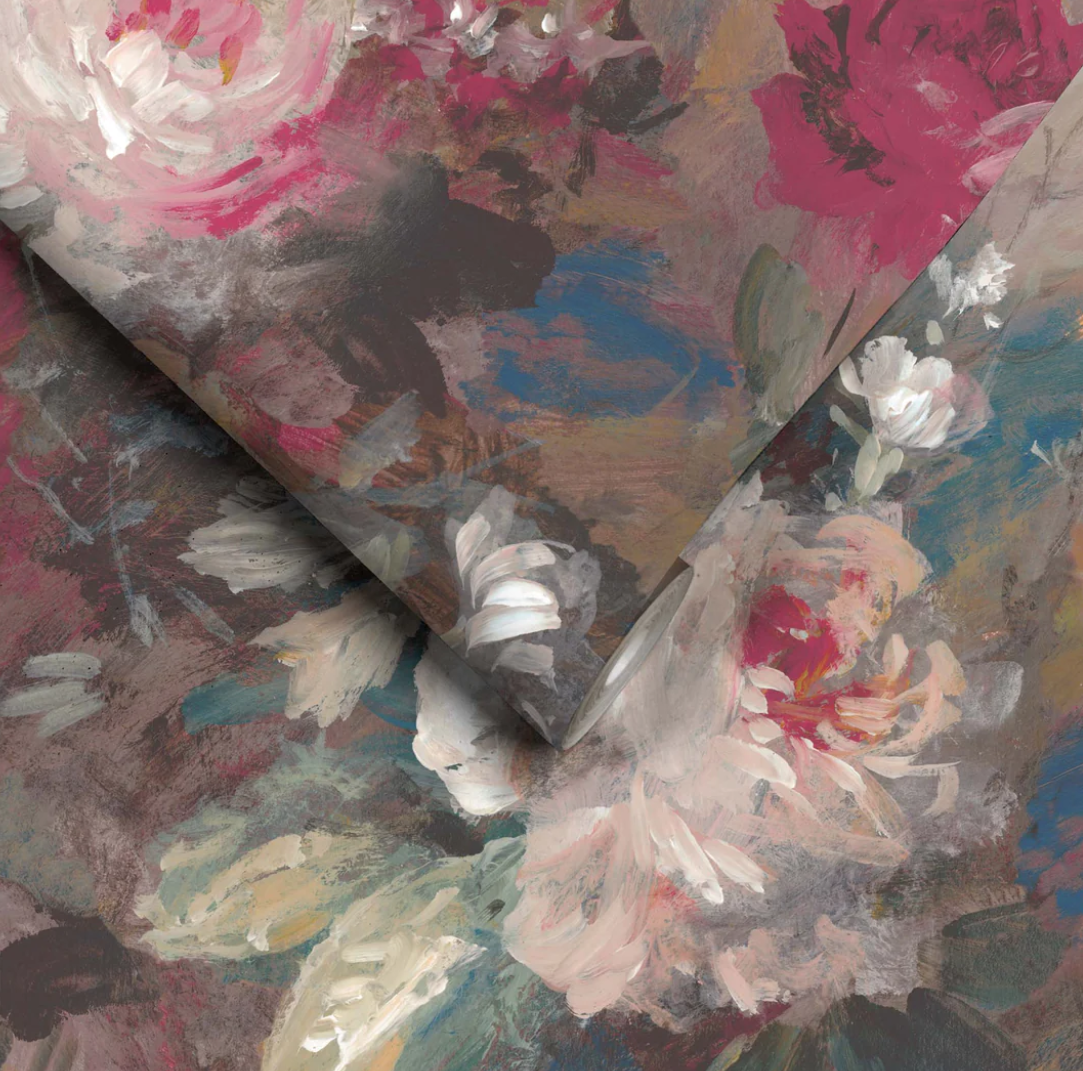


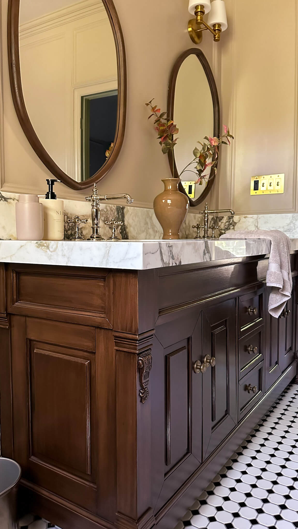
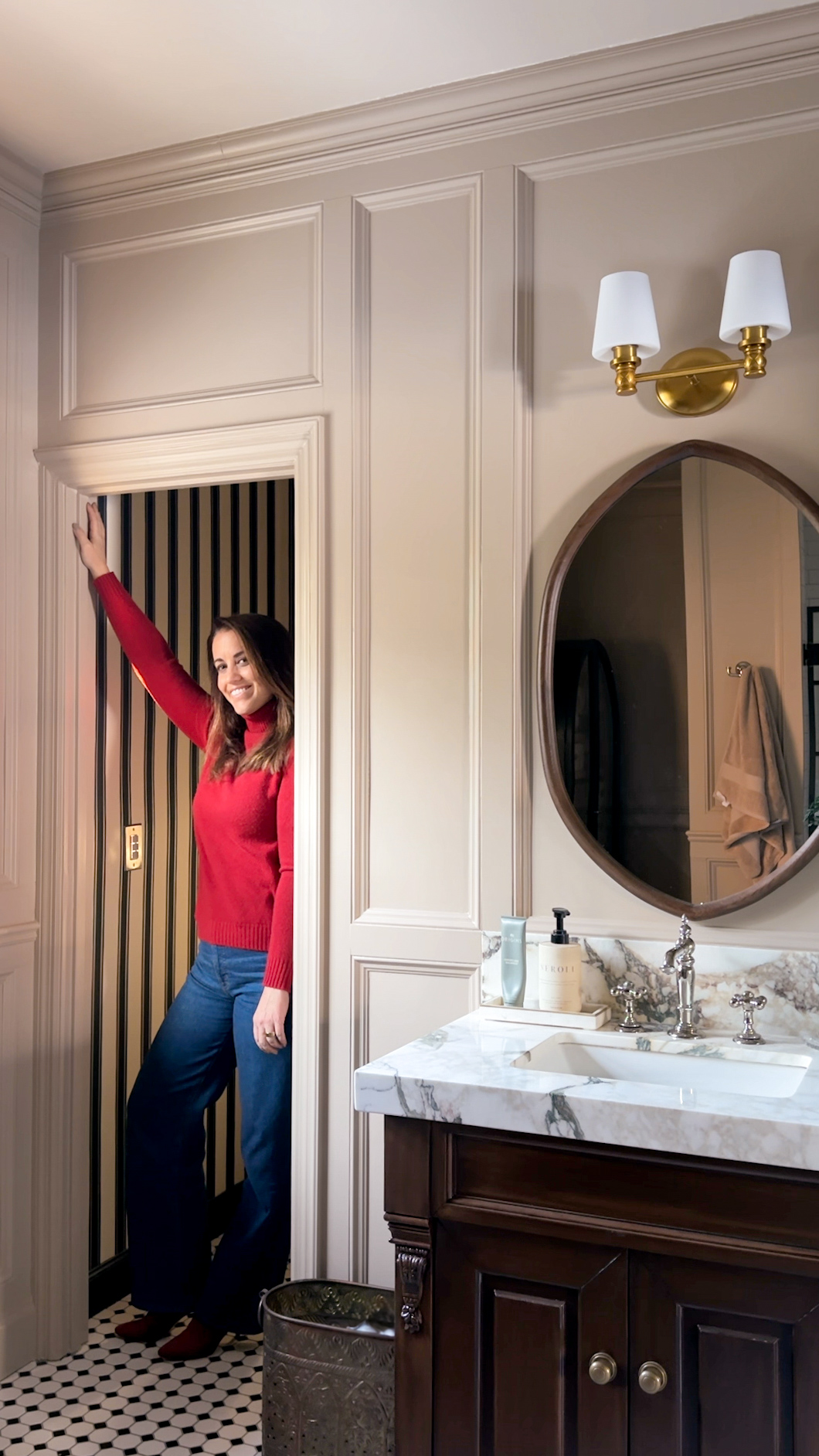
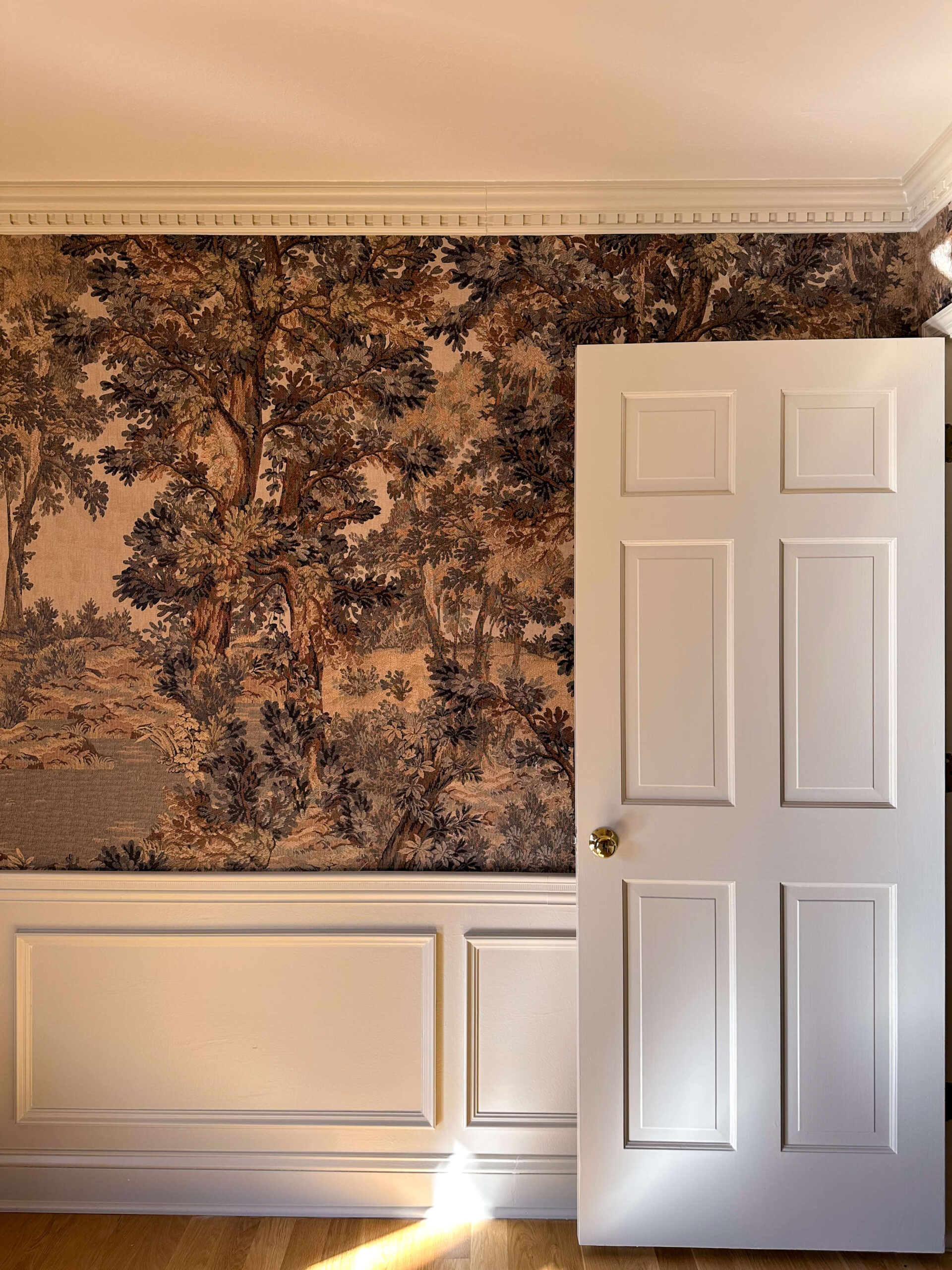
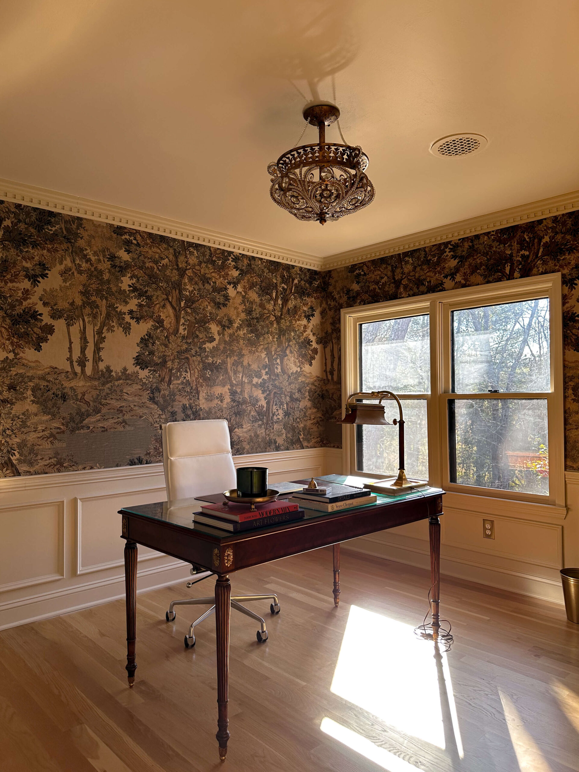
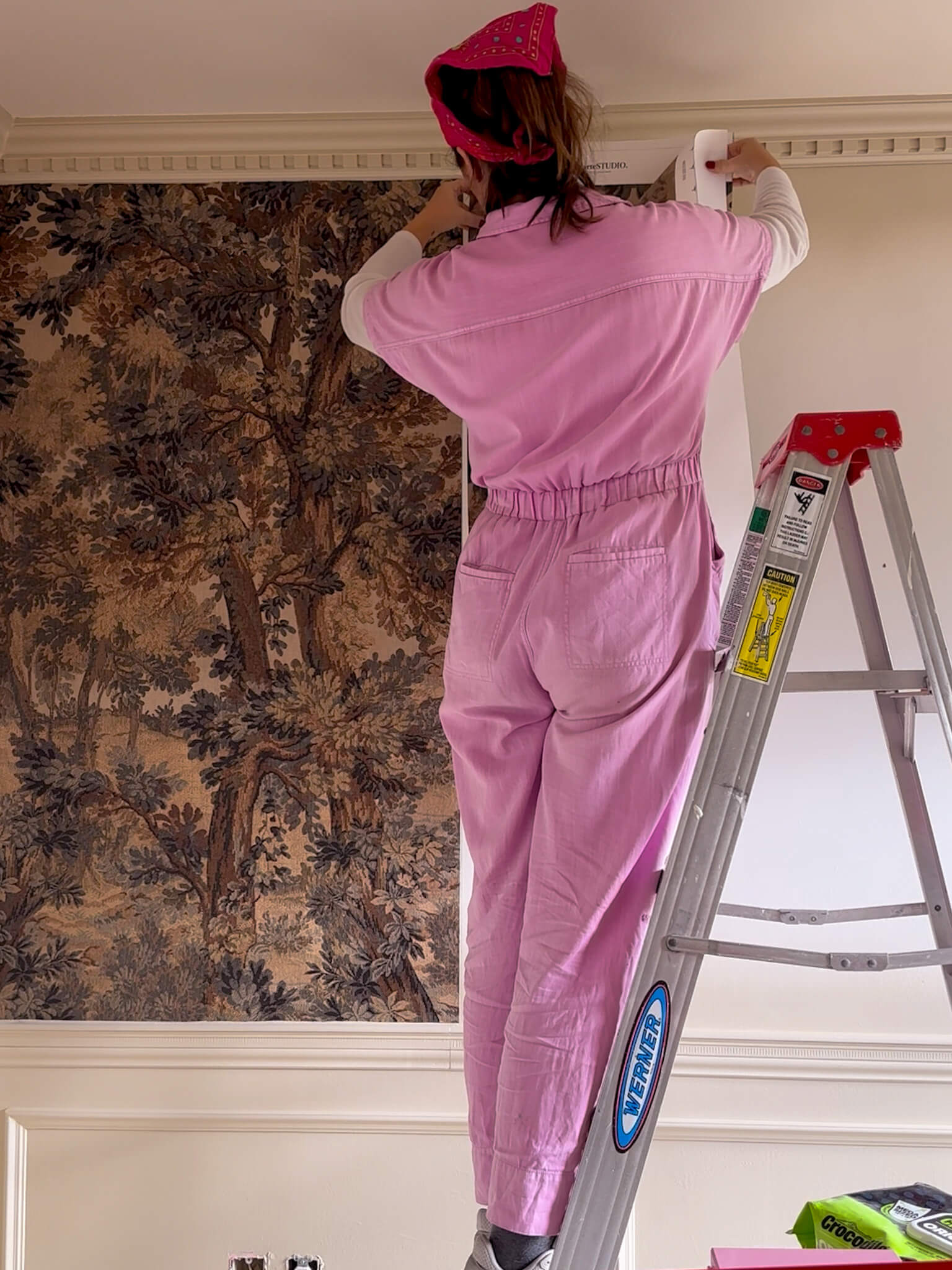
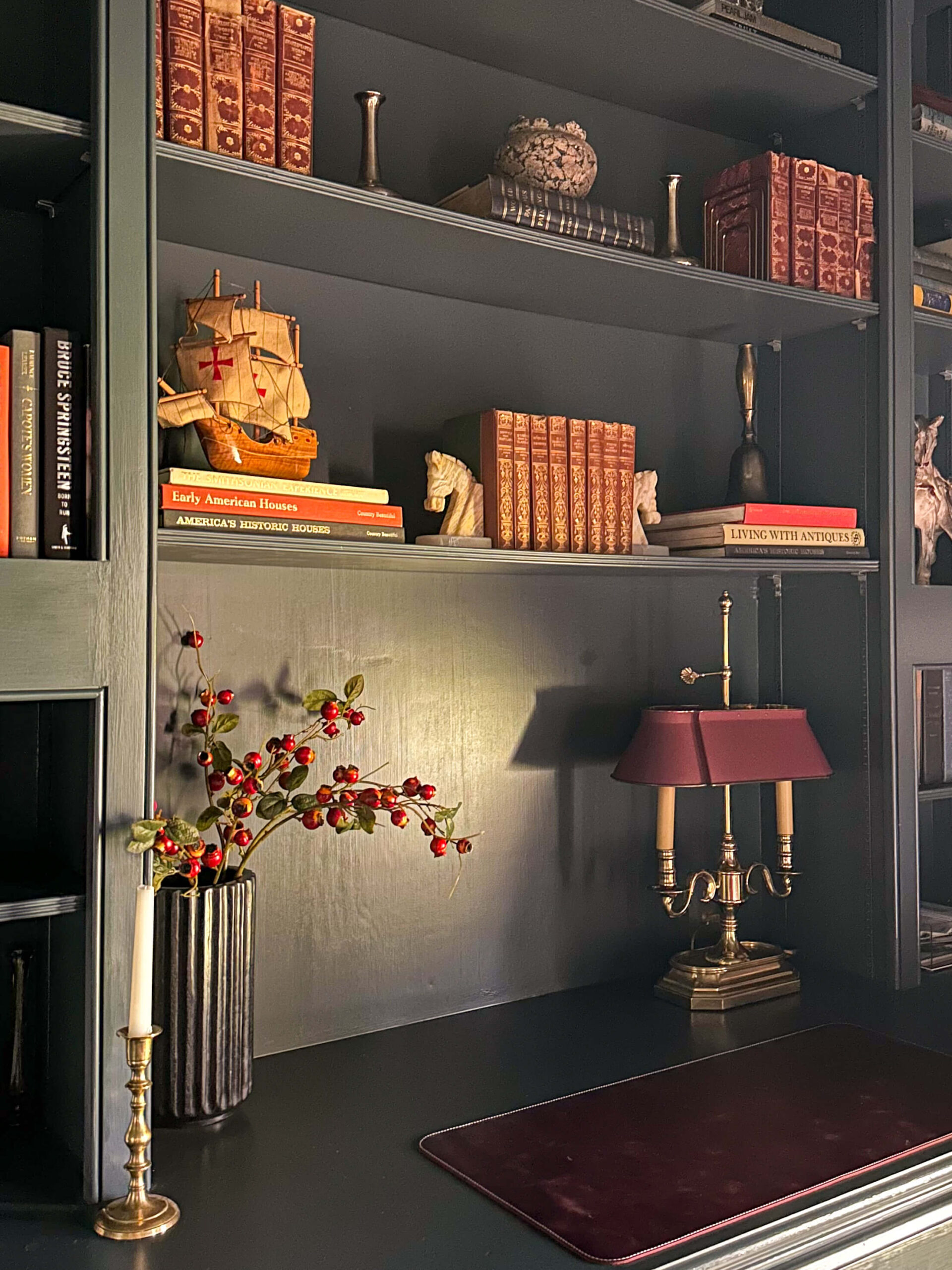
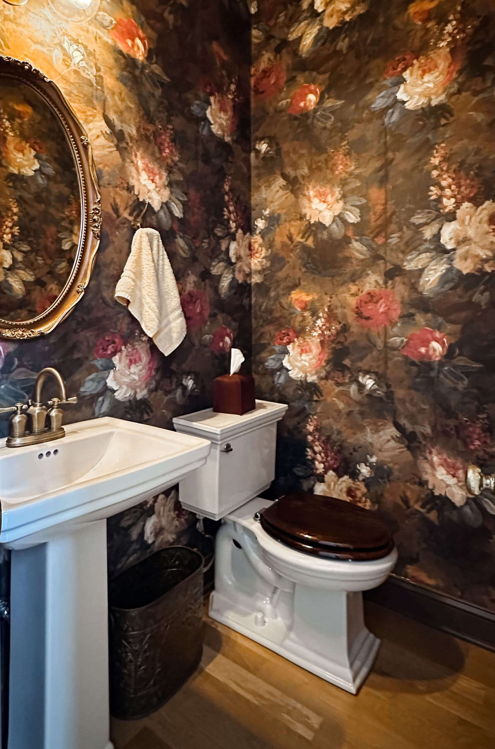
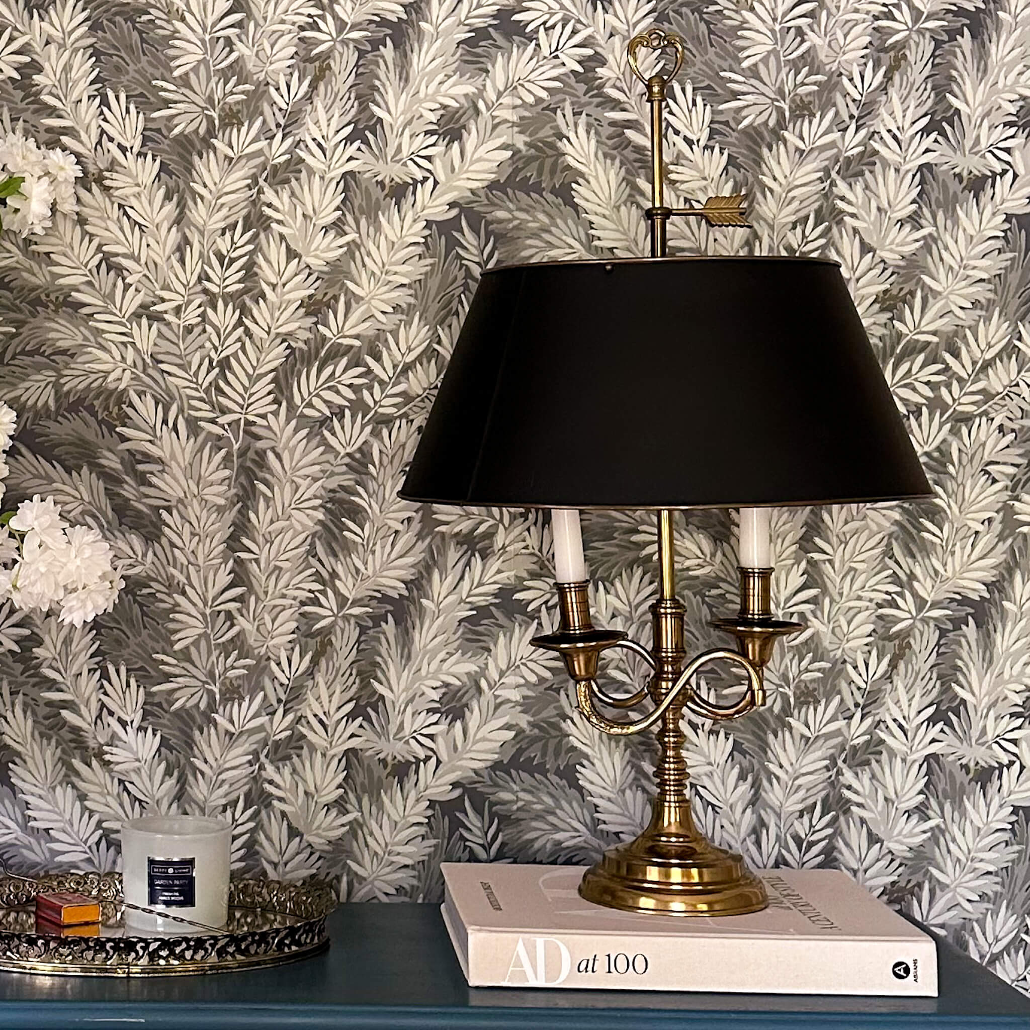
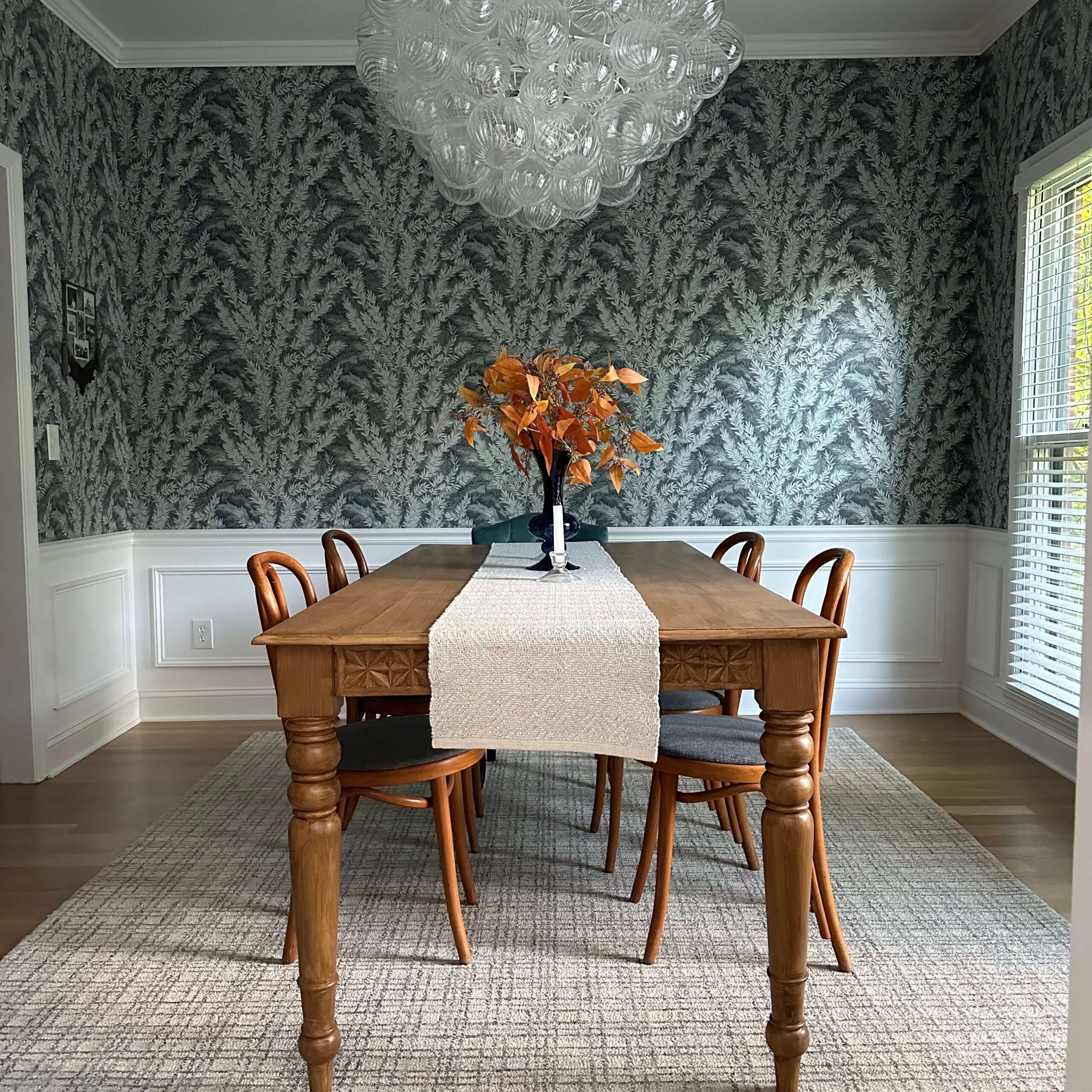
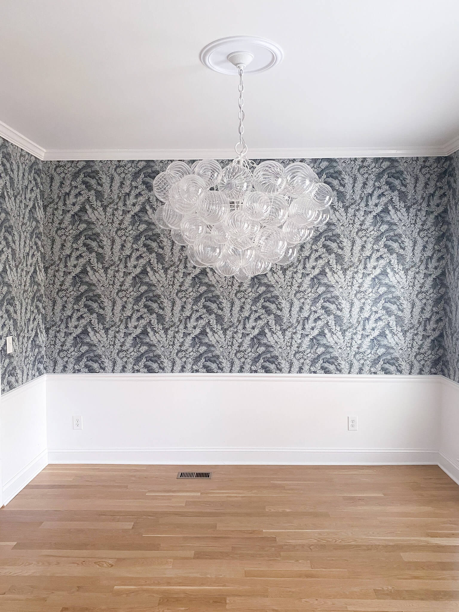
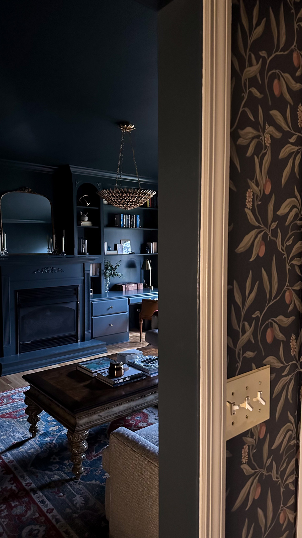
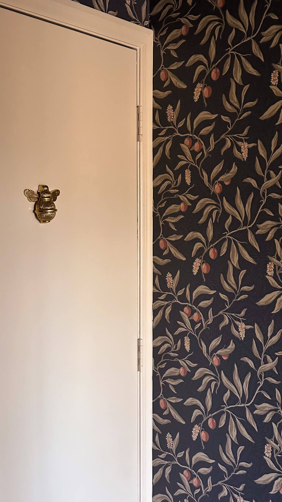
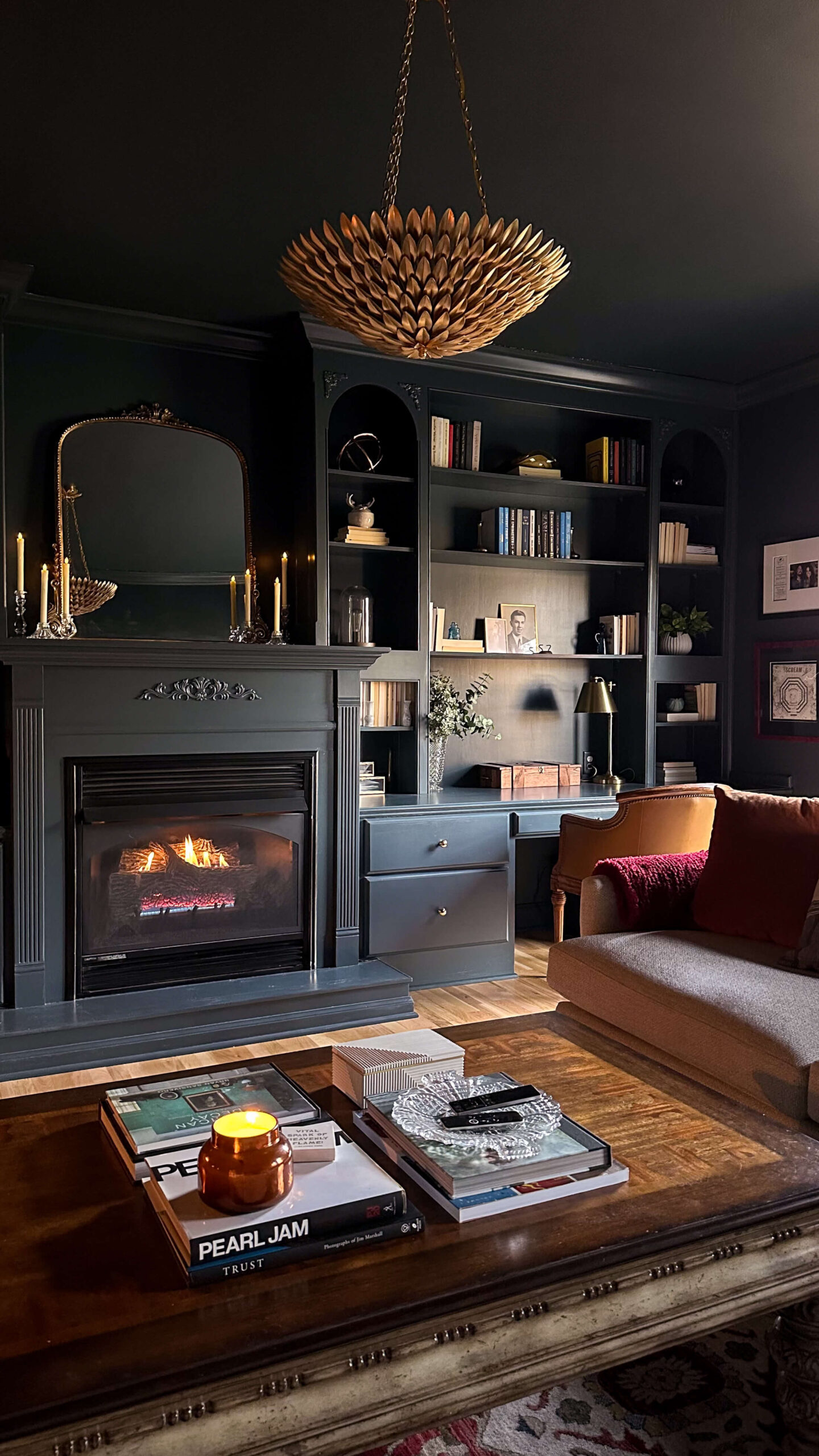
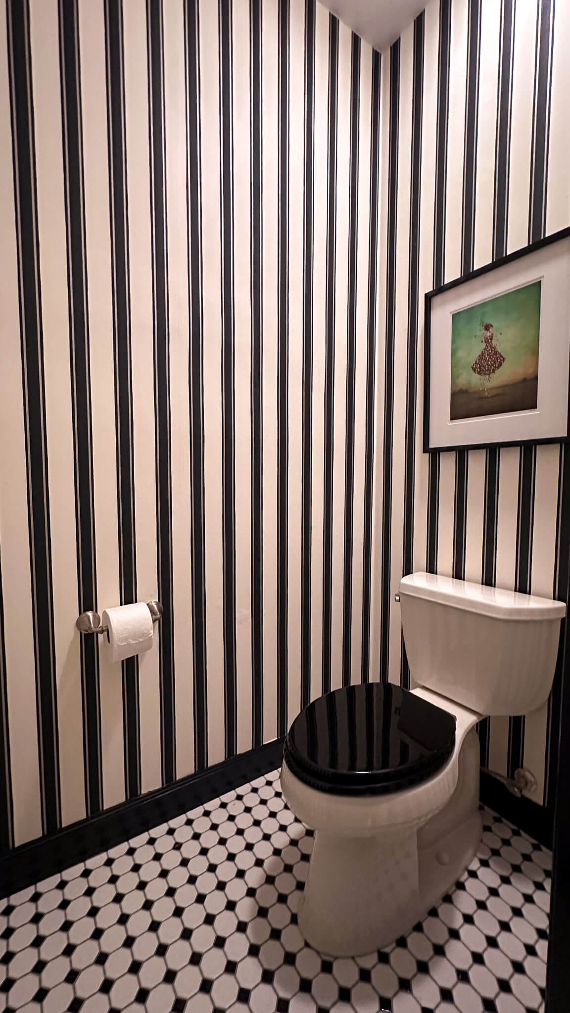
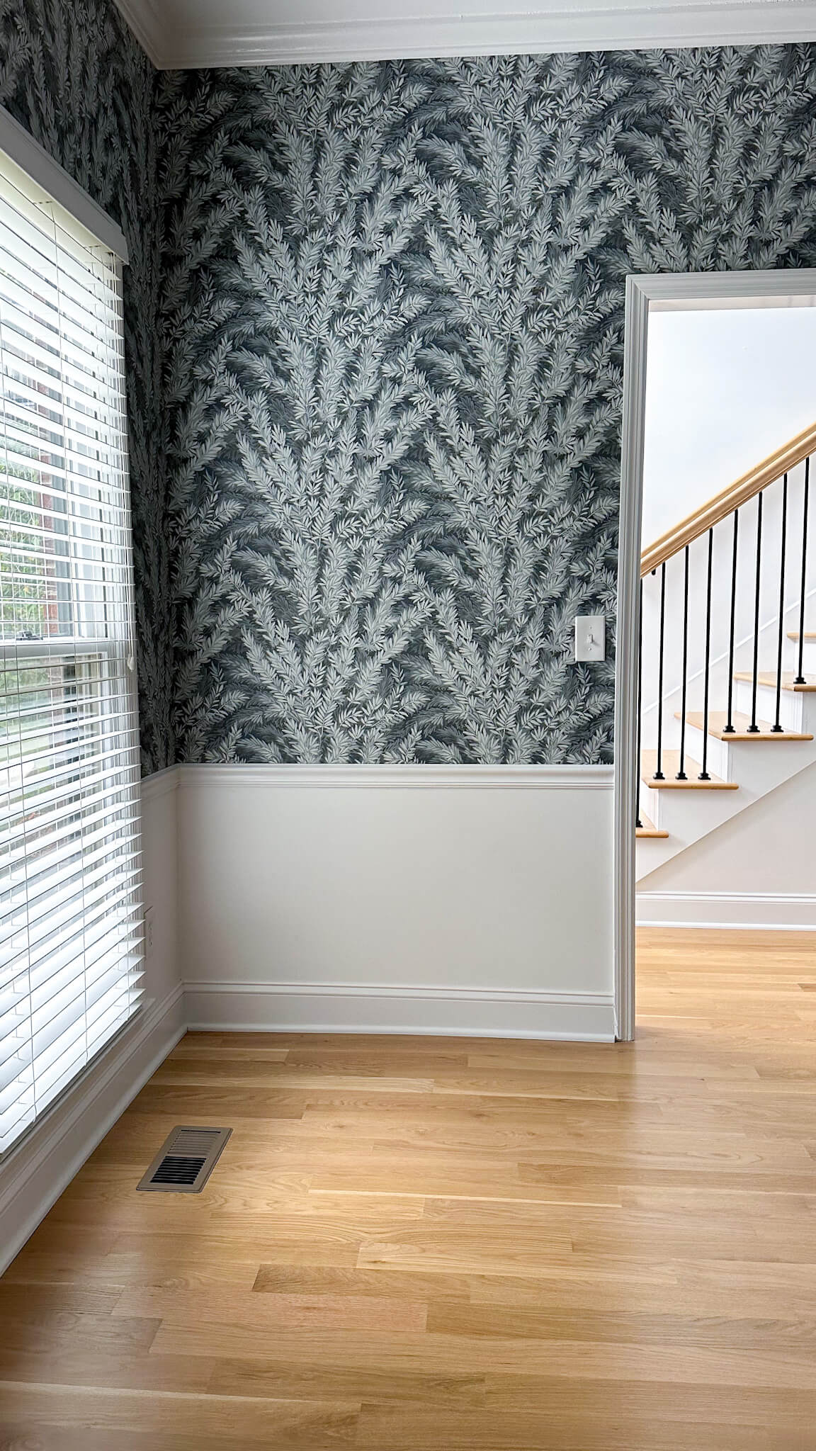
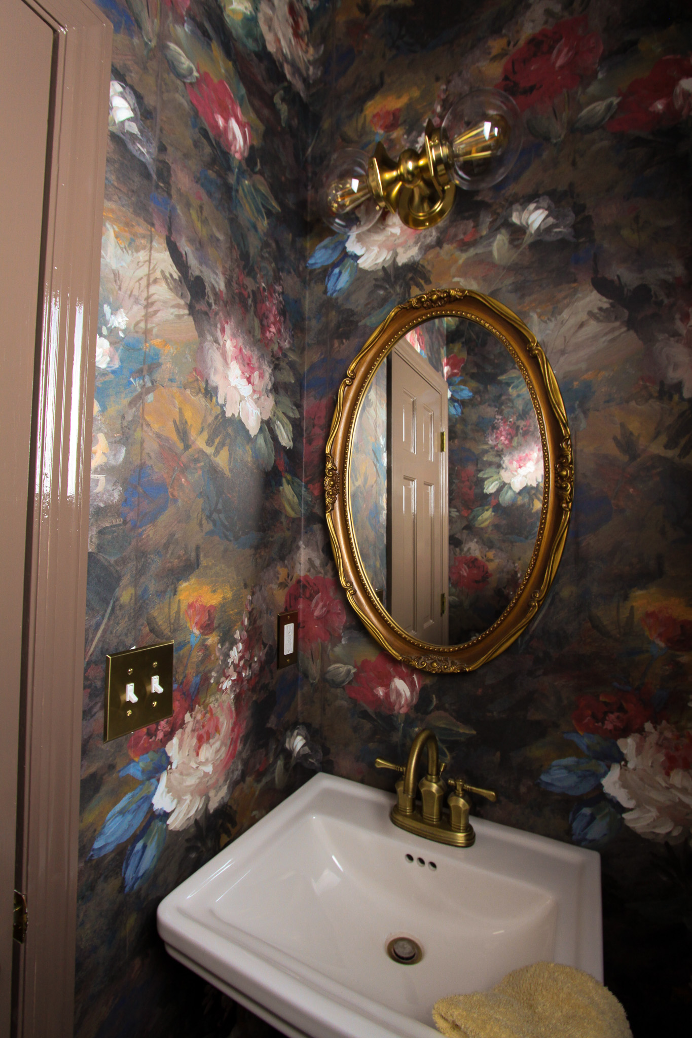
A couple weeks ago I shared my vision for the Powder Room Makeover, including three moodboards – all featuring different wallpaper designs. In addition to the moodboards, I ordered samples of each which helped narrow down the decision between Moodboard #2 and Moodboard #3. In the end, I decided to move forward with Woodchip & Magnolia’s Ava Marika Moody wallpaper and I’m so glad I did! It’s even prettier in person and the color pathways are absolutely stunning.
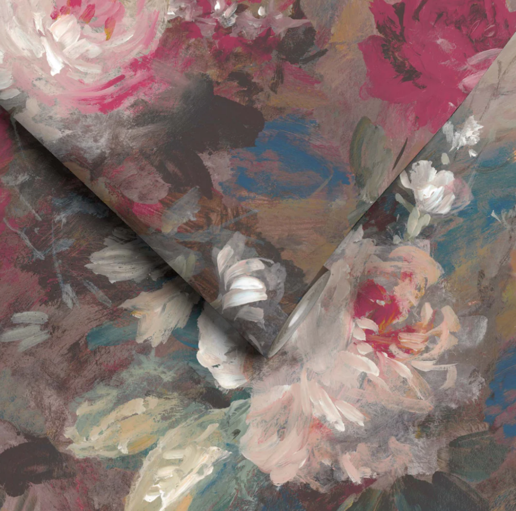
This wallpaper is straight paneled, meaning that each roll contains three panels and they line up precisely. No more measuring for a repeat pattern and collecting large wasting heaps of wallpaper (it’s expensive!). I’m already a huge fan.
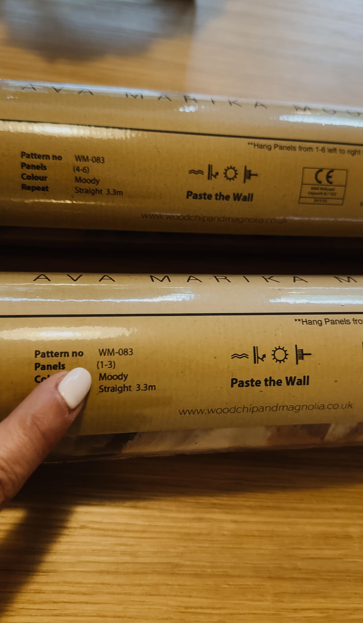
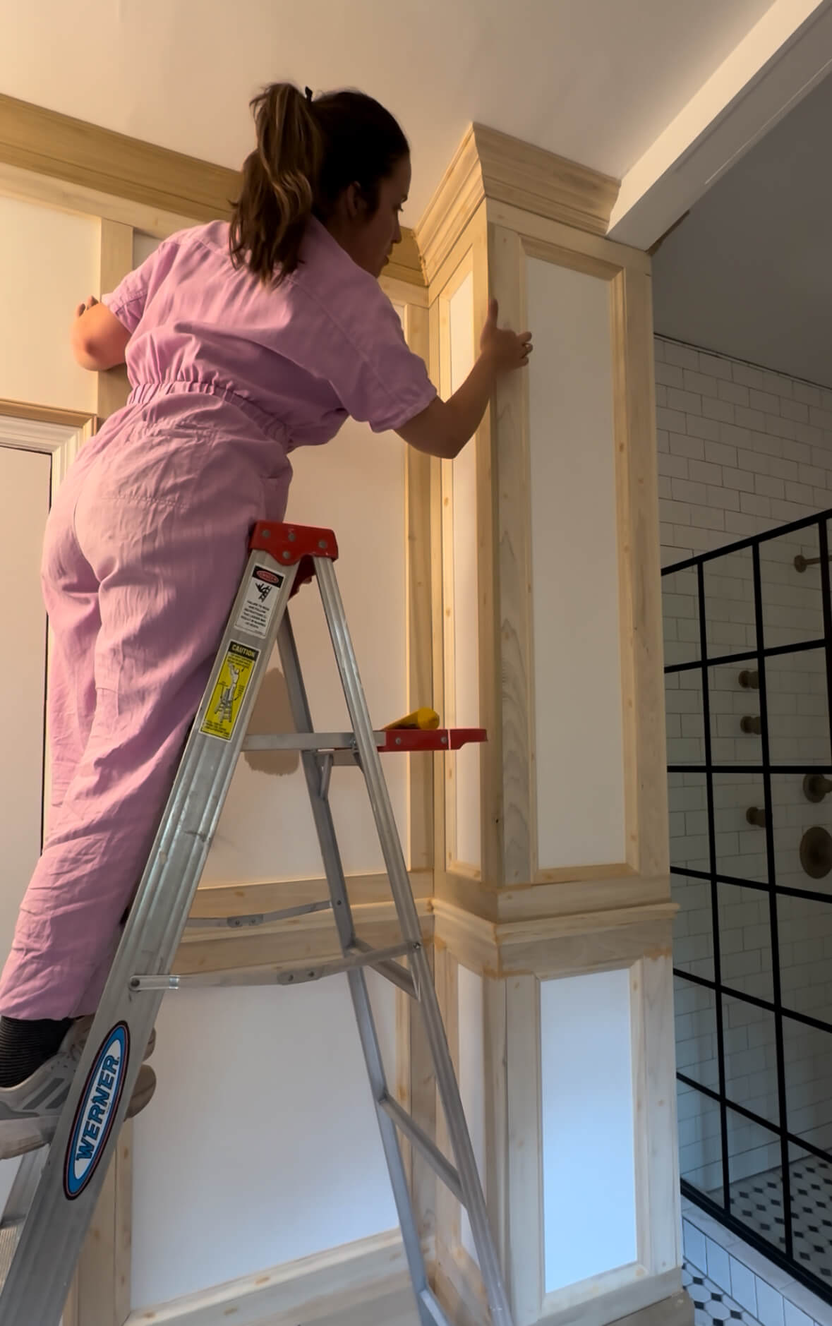
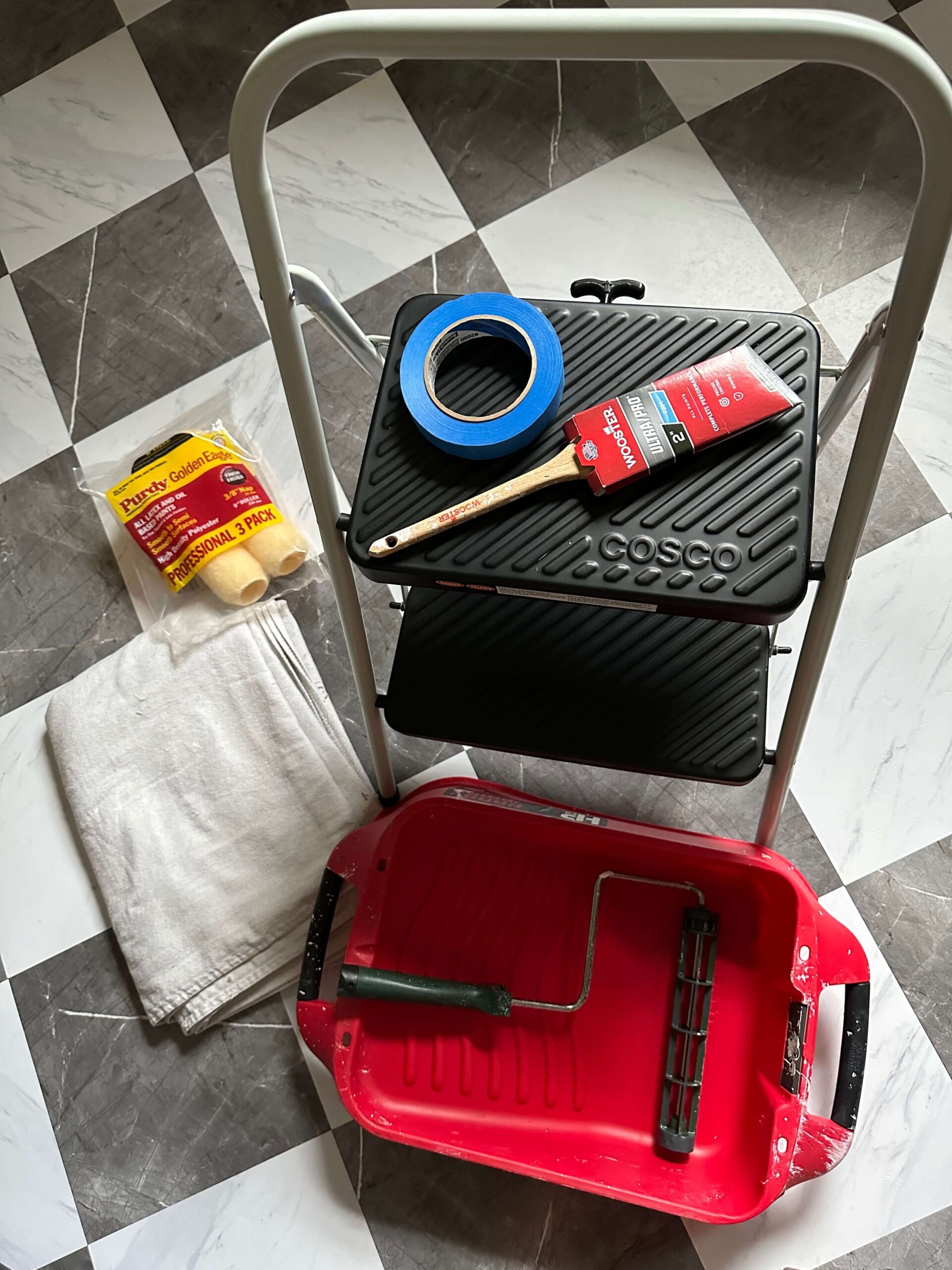
Anytime you’re going to wallpaper it’s important to read the instructions, as some papers are paste the wall and some papers are paste the paper. So far, I’ve installed paste the paper and I’ve also installed a peel and stick vinyl wallpaper, so this is going to be a first. The instructions also suggested to utilize a more heavy duty paste, so even though I had some leftover paste in the garage from a previous job, I invested in a tub of Zinsser Sure Grip Heavy Duty Wallcovering Adhesive.
Installation:
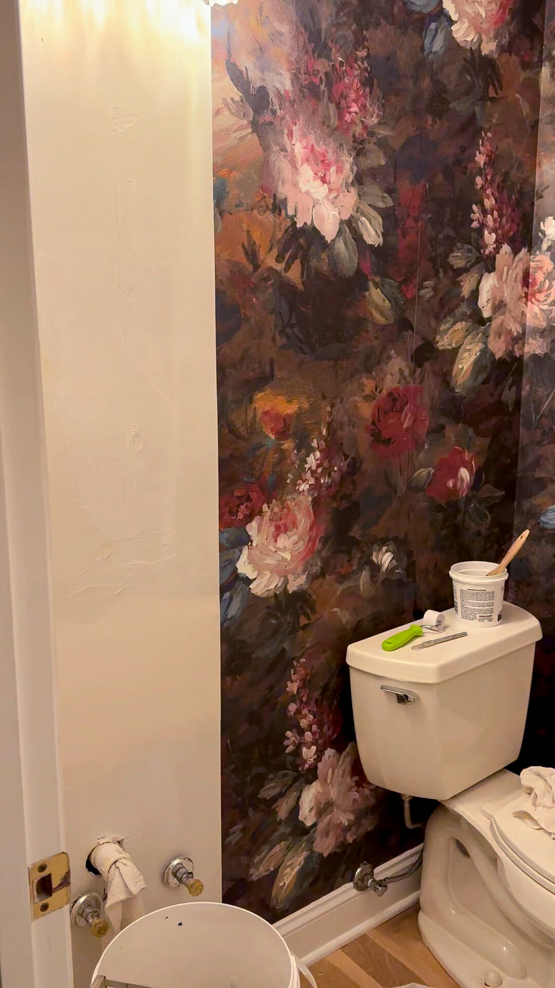
Following this install, I’ll do a separate post about the different types of wallpaper, pro’s vs con’s of each kind + what it costs to hire a professional. To keep it short, this was not the “easy” job I had hoped for, but it was doable by myself. The biggest challenge was the small confines of the room and working around the toilet to get to some of the high corners with my ladder.
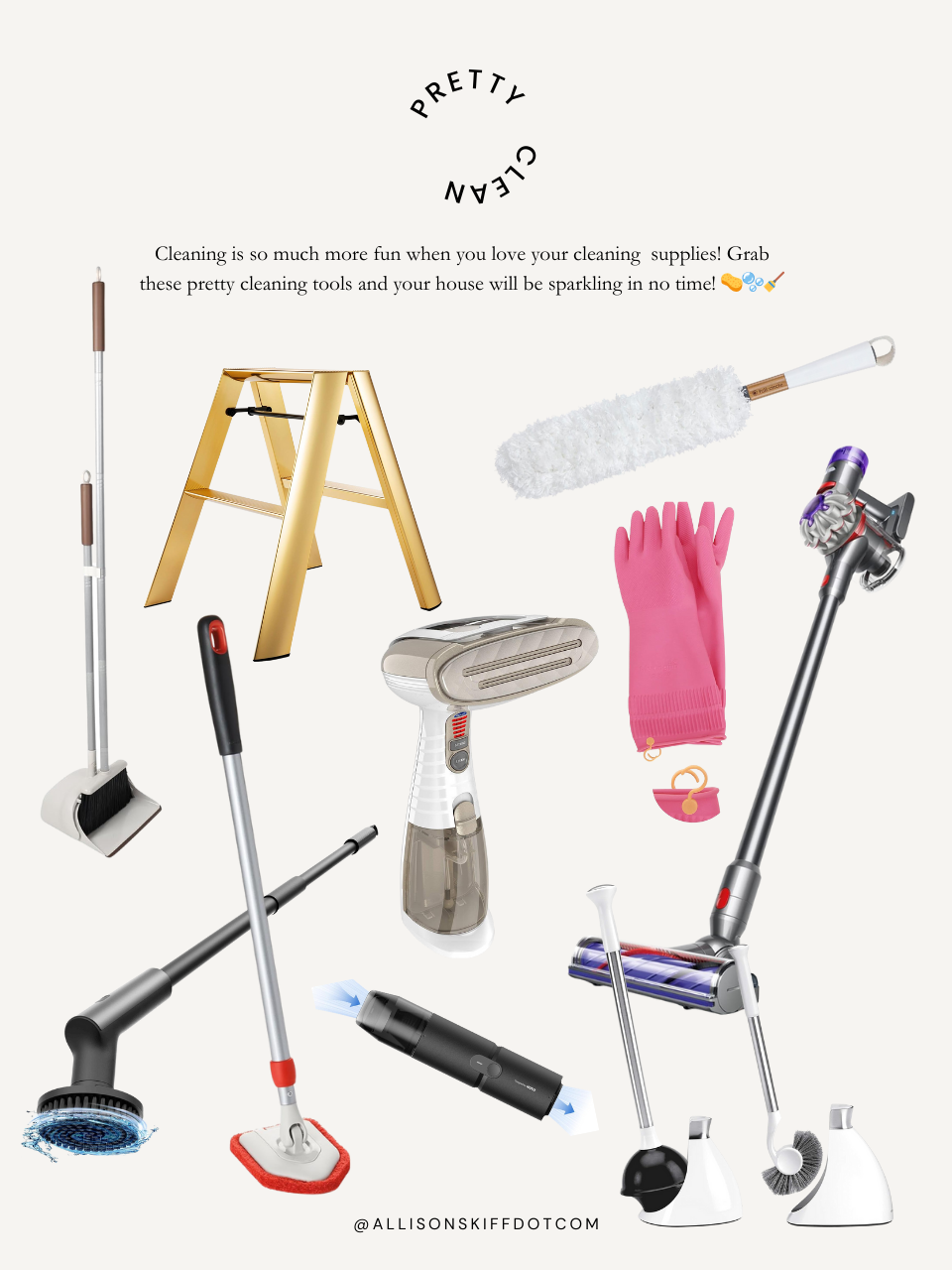
Everything I needed for this job: Smoothing Tool | Seam roller | Wallpaper brush | Exacto knife | 24” Ruler | Scissors | Ladder | Paint roller | Paint skin | Wide Bucket | Paint brush | Roller Grid | Wallpaper Paste | Drop Cloths
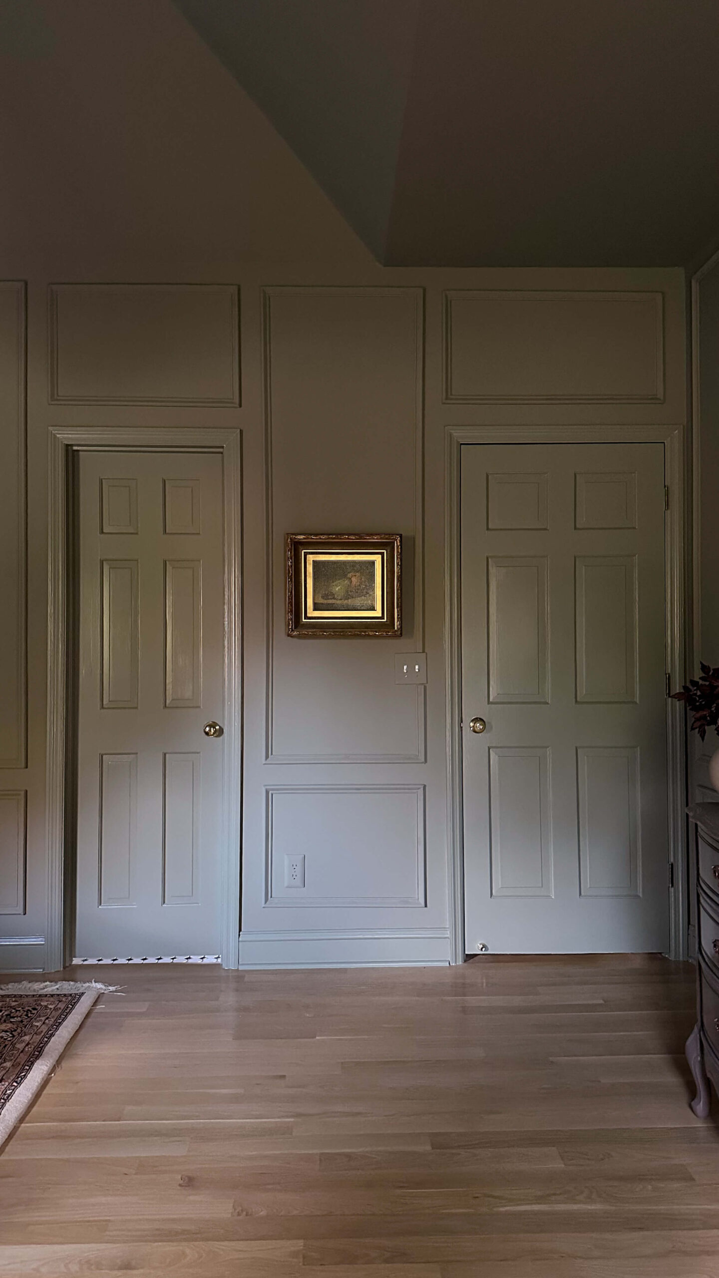
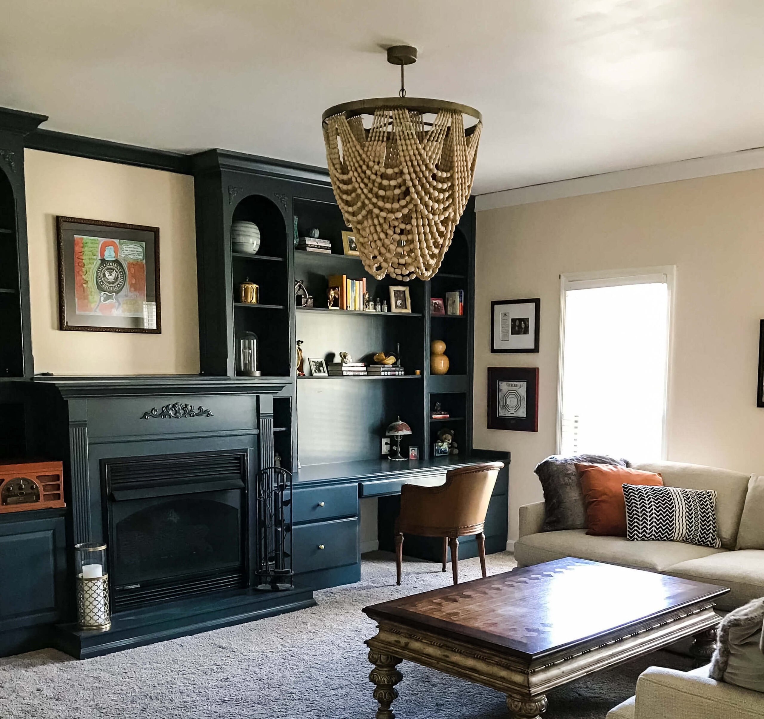
Choosing A Trim Color
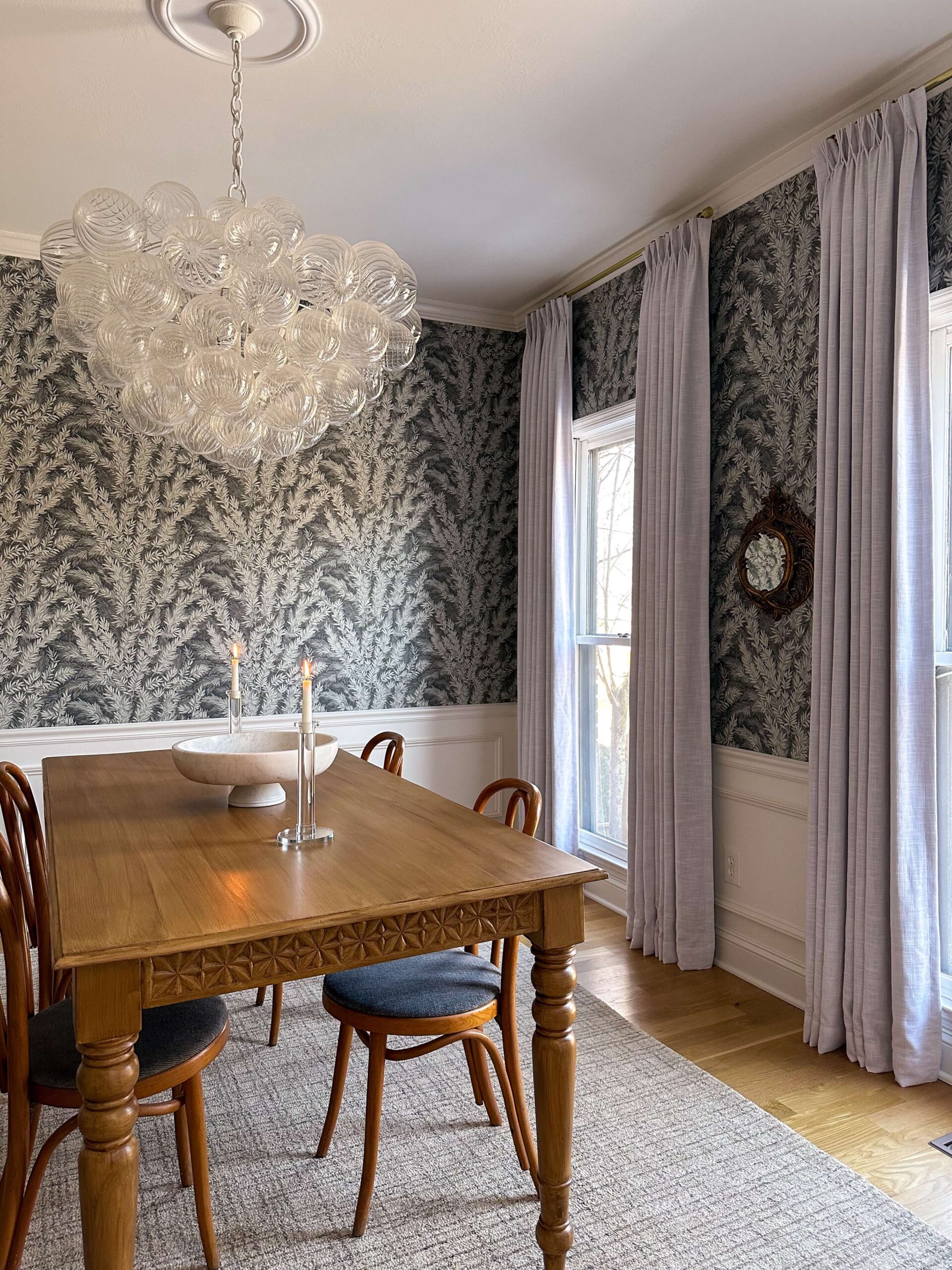
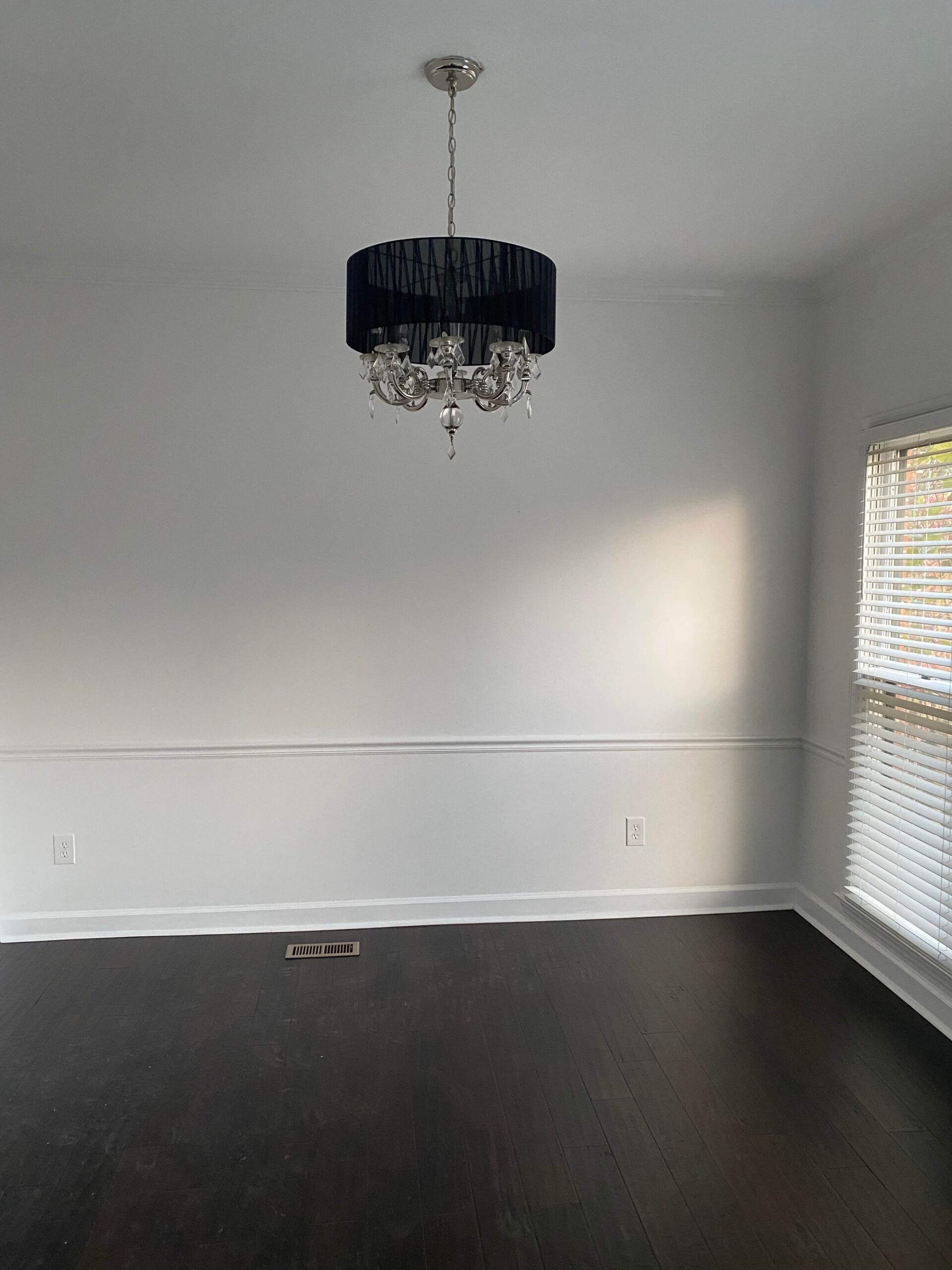
Originally I had hoped to paint the ceiling and the trim prior to installing the wallpaper, as I didn’t want to get paint on it, but after reviewing some paint swatches next to the wallpaper, I decided to wait. The powder room does not have a window, and I also decided to get a new light fixture for the space. These two factors alone can completely transform how the paint looks in this space vs in the dining room which is where I was laying everything out.
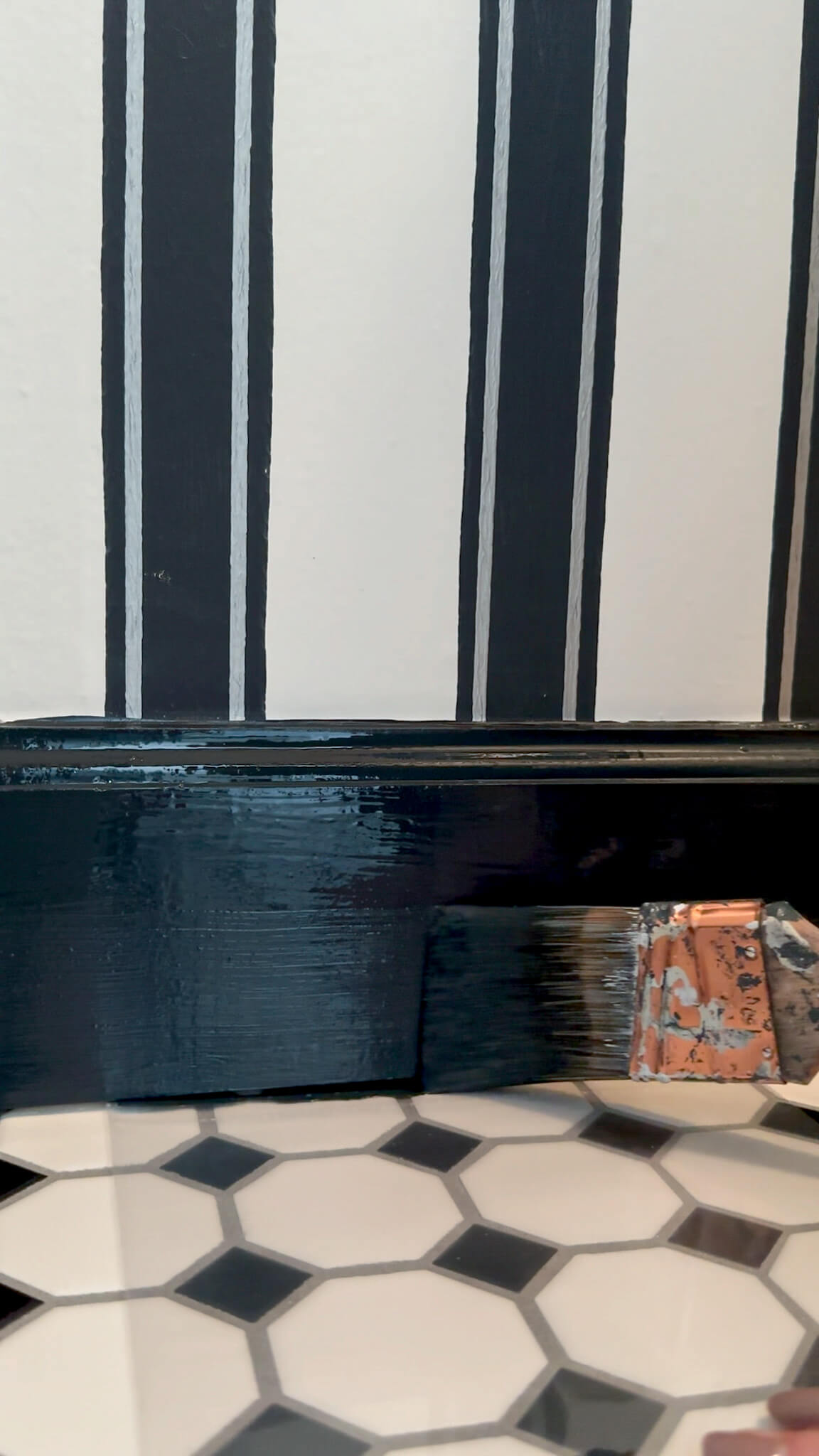
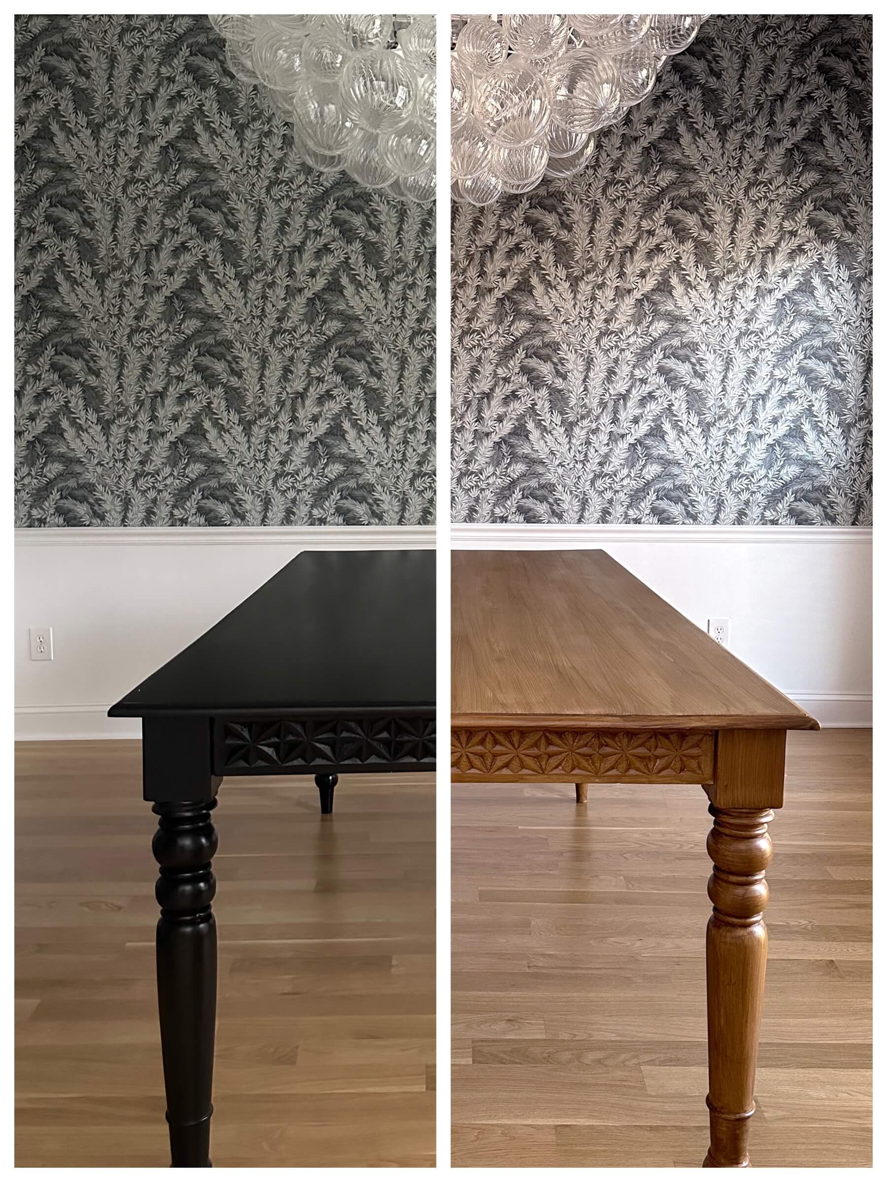
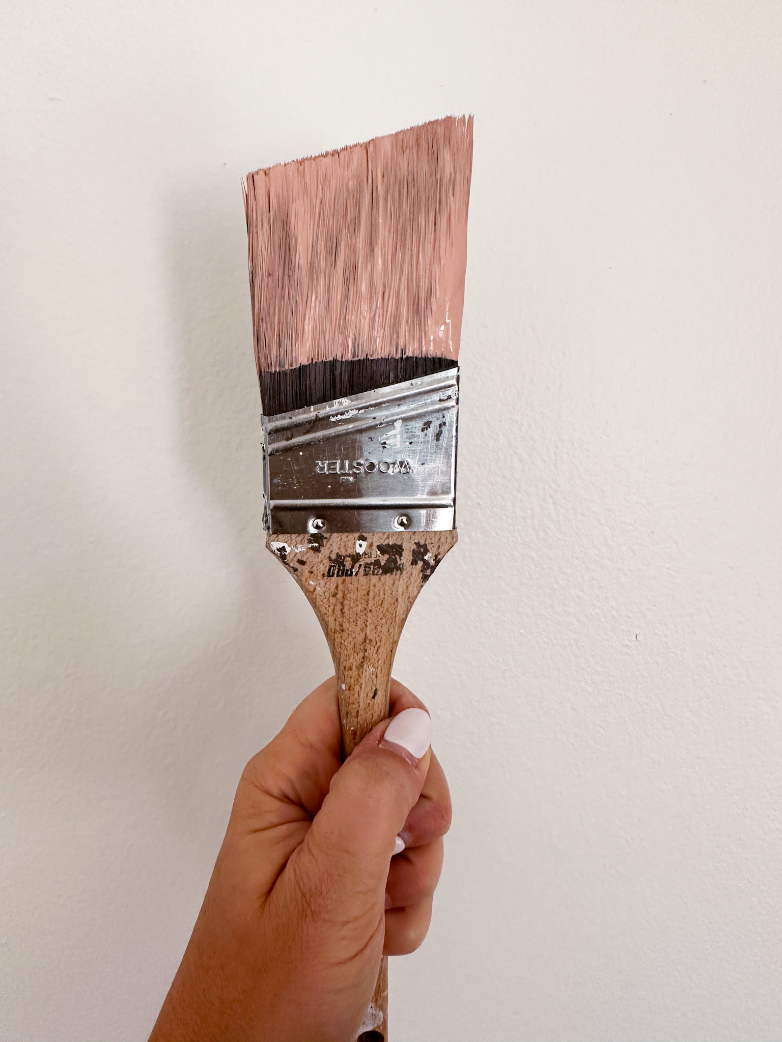
Based on where I cut each panel (top & bottom) the color ways were a little bit darker than the middle of the panels which is where I was pulling colors from. I felt my original plan for shiny kettle would be too contrasting against some of the darker colors, especially at the ceiling. Additionally, as much as I wanted it to work, I don’t think it was the right pink to pair with this.
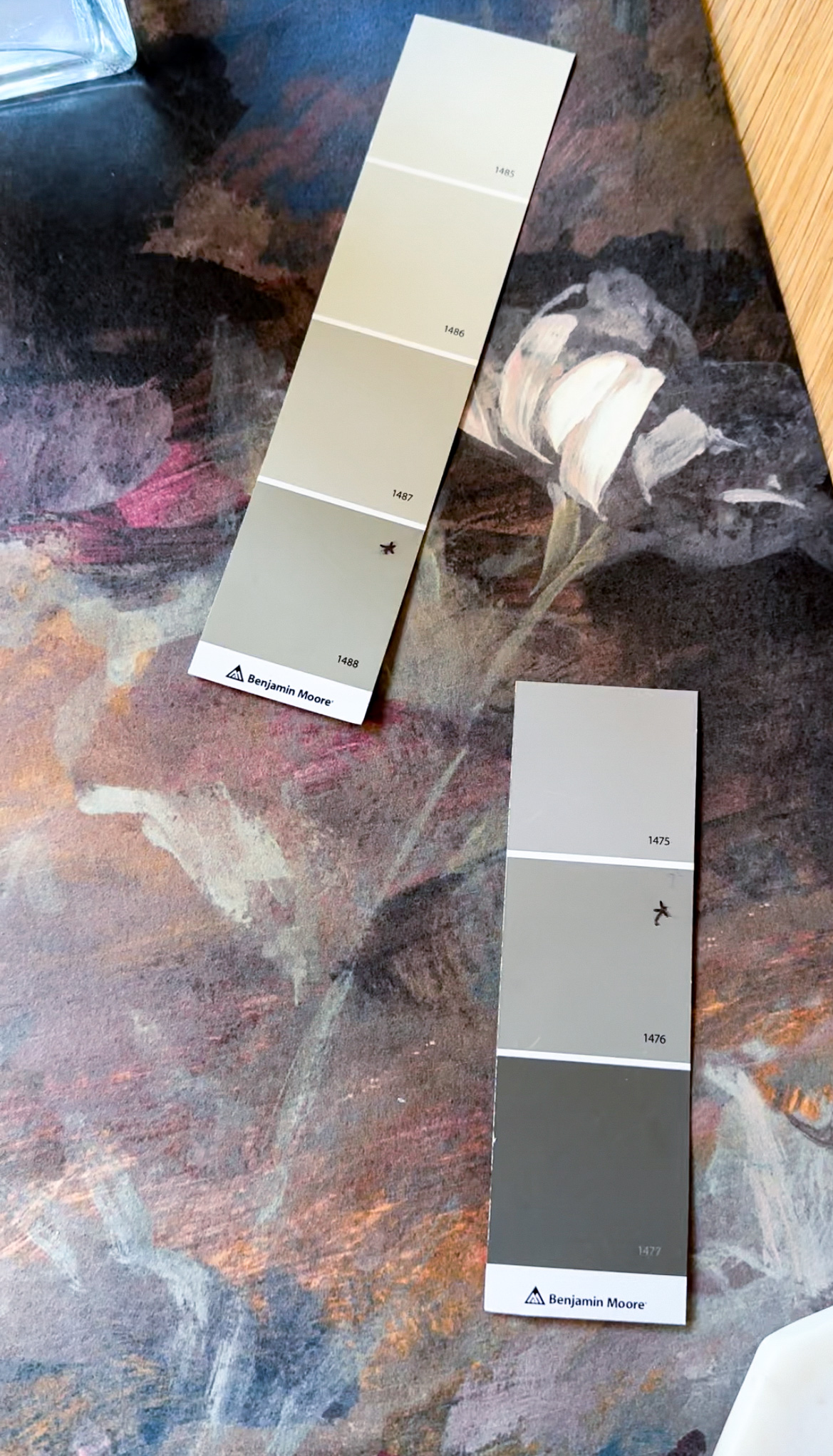
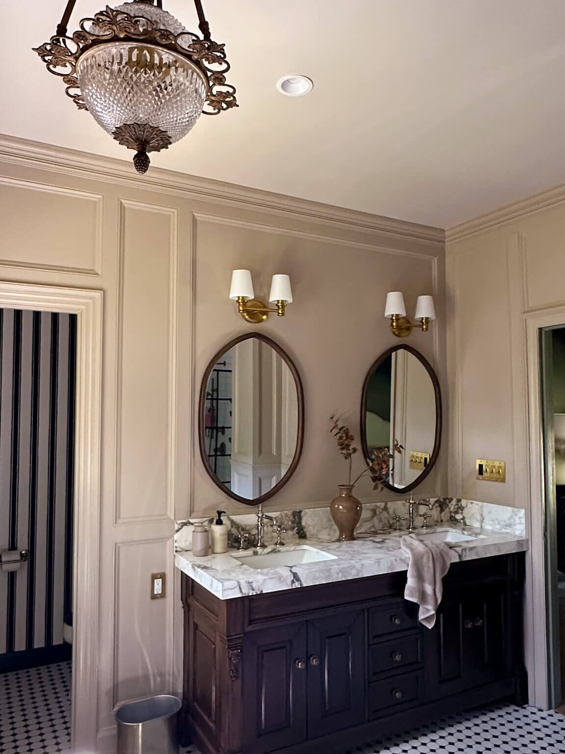
After laying out twenty different swatches I narrowed the decision down to two choices: Benjamin Moore’s Sage Mountain and Benjamin Moore’s Squirrel Tail. Sage Mountain (top left * option) is a muted green with grey undertones and I thought it pulled the green tones out of the wallpaper in a beautiful way, while not stealing the show. Squirrel Tail (bottom right * option) laid really beautifully against the background colors of the wallpaper, and since this color is going to be at the base and the crown, I think a grey with warm undertones would be complimentary to the overall design.
Since picking the trim was such a process, I decided this was not the time to guess and headed to the store to pick up paint samples. For reference, you can get little pots in an eggshell finish for about $7 each. It’s worth the cost of your time, rather than painting your space the wrong color and then having to do it over.
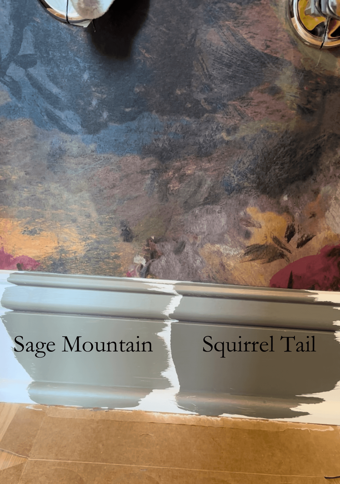
I painted little patches of each color side by side on a strip of baseboard that the sink will eventually go in front of. Both colors looked so similar as I was painting them, however after drying there was a stark difference. And I’m still not sure…
I think the answer is that we still don’t have a winner. I’m going back to the drawing board tonight (aka my paint wheel) and am also going to start scrolling through some photos from my favorite designers for some inspiration. While I’m anxious to finish this space, I want to get it right and fall head over heels in love with it.
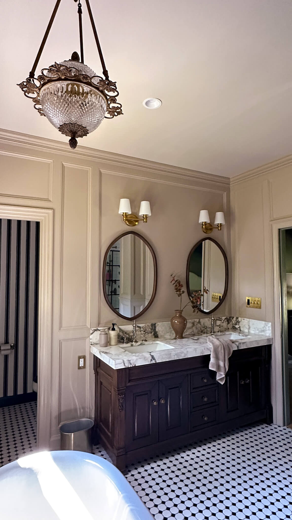
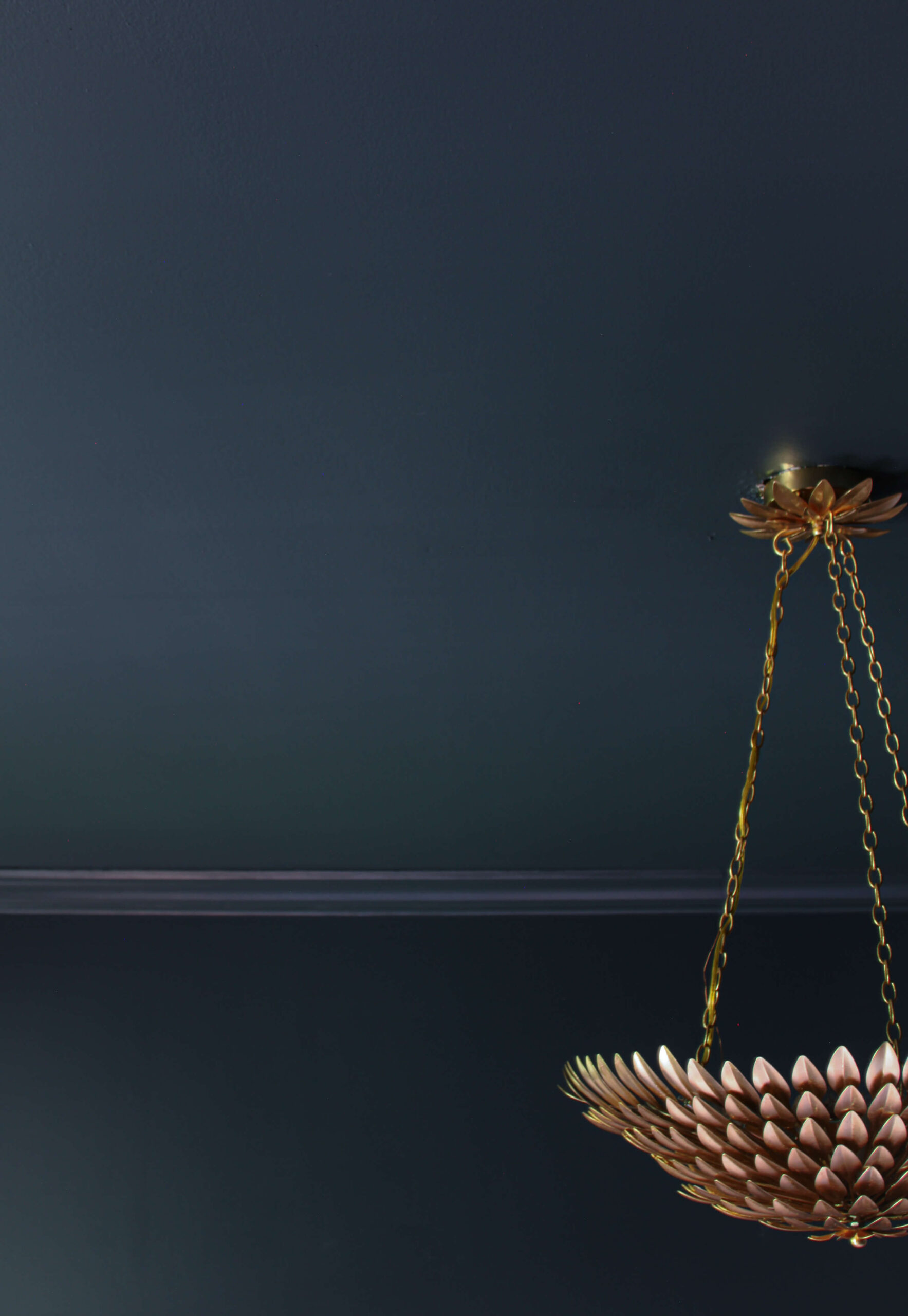
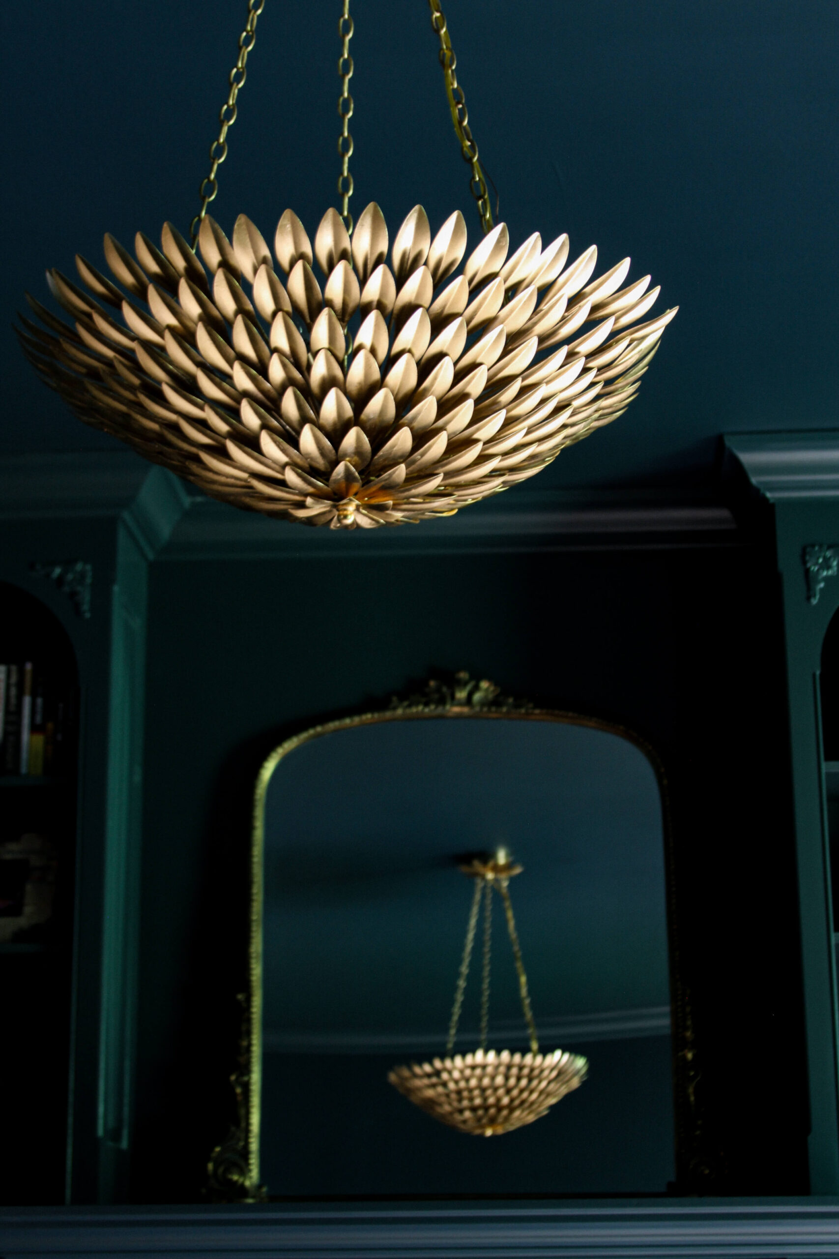
Light Fixture Drama
I wanted drama for this room and I’m getting it! The original light fixture I had planned for (this bumblebee sconce) is currently backordered until November and I don’t love it enough to wait that long. So back to the drawing board I went, looking for something new. My parameters were the length (needed to be at least 15″ long but couldn’t exceed 22″), a brass finish, and at least two light bulbs. During my search, I found this extra large dresser sconce from Visual Comfort, and I thought it would add an unexpected twist to the space.
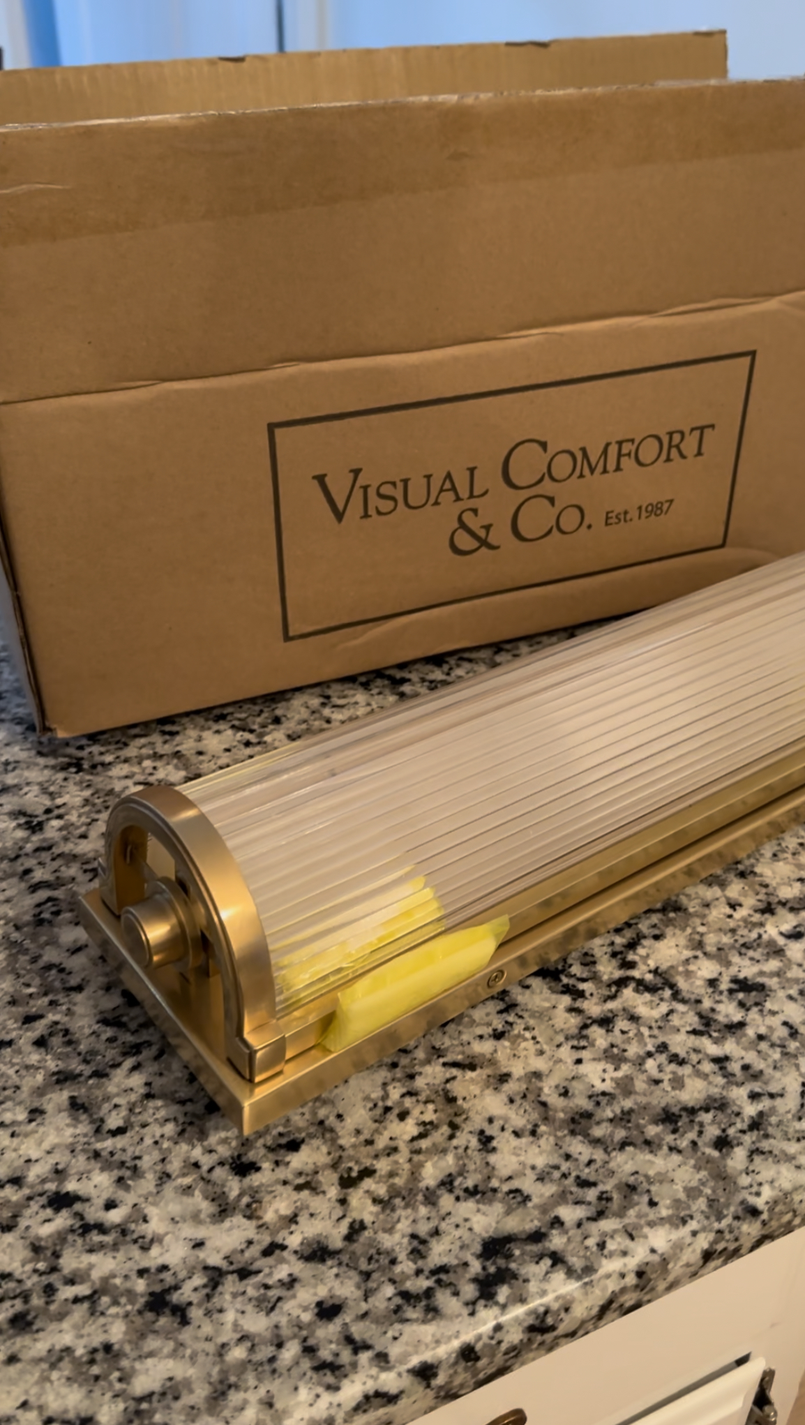
Unfortunately after unboxing it, it did not live up to the expectations in my mind. While the brass was beautiful, and the perfect finish for the space, the clear part of the light was the issue for me. I was expecting it to be glass or crystal, and it was actually plastic! For the price point of this, I was incredibly disappointed. Although, it was only my own fault as I’m sure that was listed in the product description and I missed it. I took the light fixture into the powder room just to be 100% sure, and after that I knew it was getting returned. The plastic really set the room back 20 years, and that’s not the direction I’m trying to go!
As of now, I’m back on the hunt for the right light fixture but am proud of myself for not settling. I’ve learned the same lesson too many times, where I’m eager to get a space done and just settle for something I know isn’t right. Ultimately a few months later I end up replacing whatever that thing is for what I wanted in the first place. So while this is a bit annoying to not be “finished,” I have faith that the final version is going to a showstopper, and I’m going to love every last detail.
Stay tuned for more soon…


Loving the wallpaper! (My choice!!). It is better to wait and find the perfect light fixture. Wondering what paint color you’ve chosen for the trim…….