


If you’ve ever found yourself wondering about the paint colors in my home, you’re not alone. I get these questions constantly in my messages and comments. What is the green paint color in your bedroom? What color are your kitchen cabinets? Is the tv room blue or black? Instead of answering one by one, I’m sharing a complete, search friendly guide to the paint colors in my home so you can find everything in one place.
When I bought this house in 2018, I spent the first year undoing a lot of what the previous owners had done. They loved a farmhouse aesthetic and I very much do not. Rather than trying to design around finishes that didn’t feel like me, I painted almost everything white. I needed a neutral reset so I could see clearly and create a cohesive plan. That fresh start gave me the clarity to thoughtfully choose the paint colors in my home over time.
Since then, the paint colors in my home have evolved room by room. Some choices were bold and dramatic. Others were warm and classic. Each one was selected with lighting, undertones, and flow in mind. Let’s walk through every space.
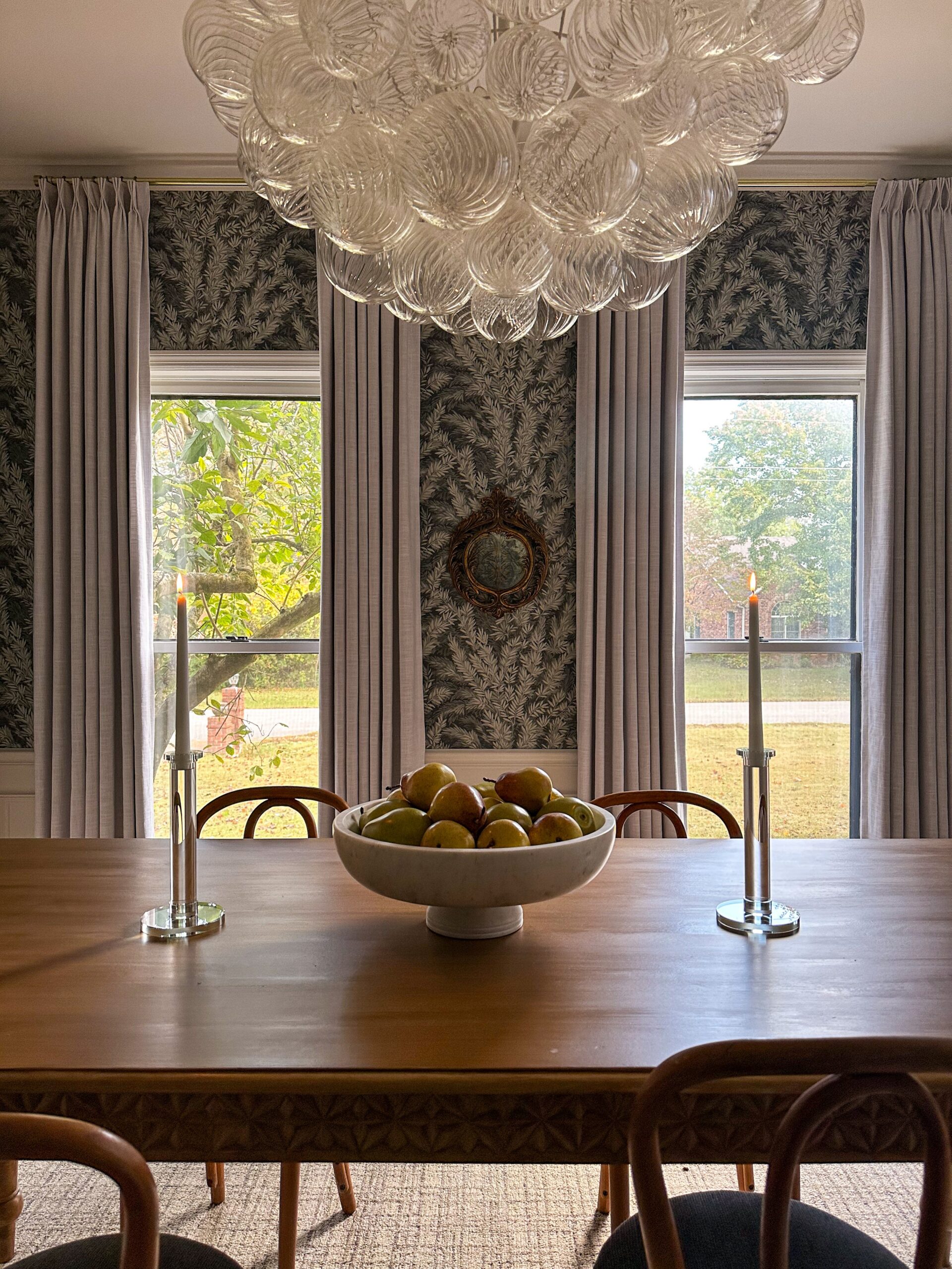
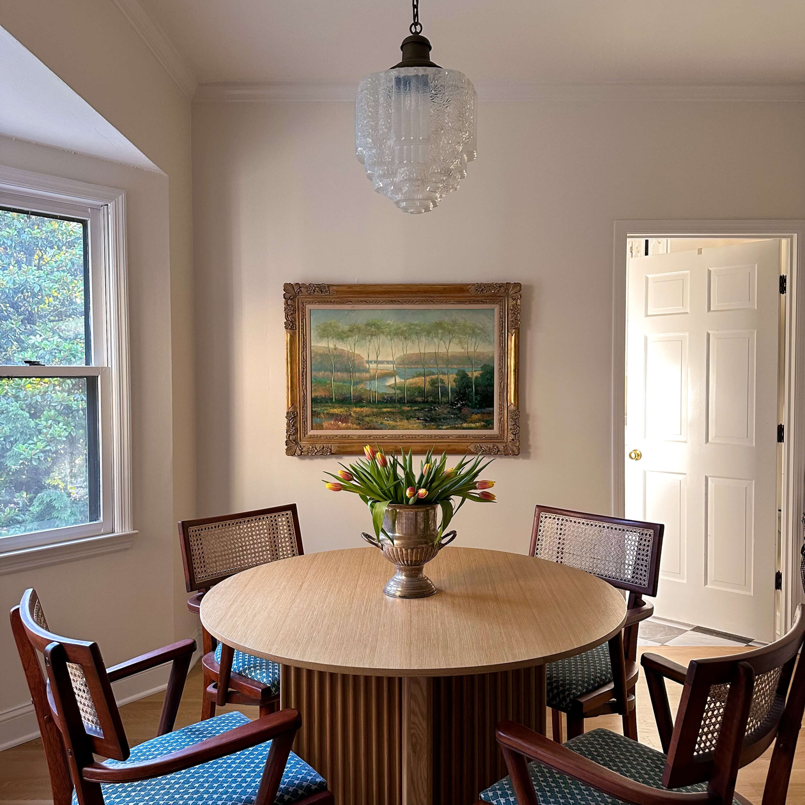
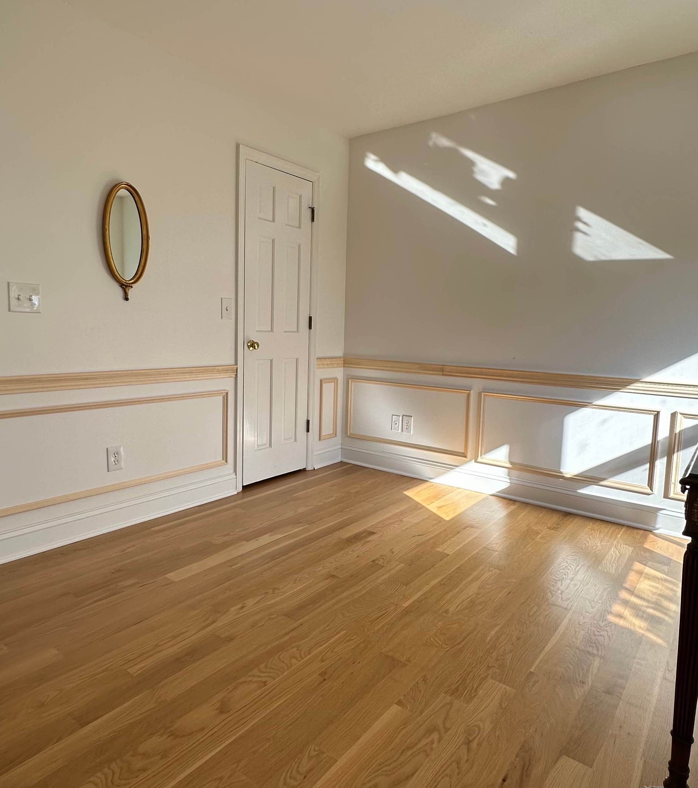
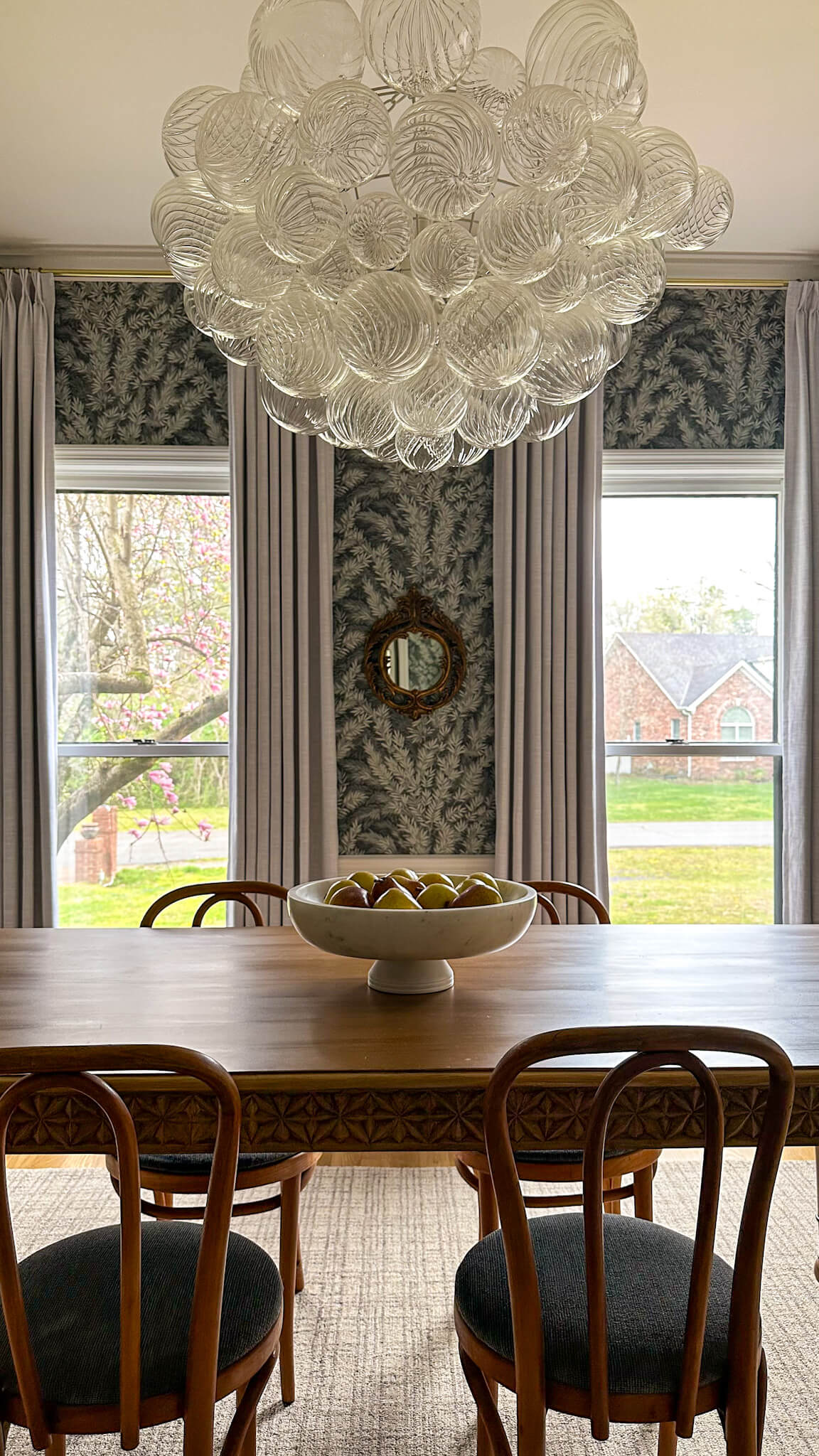
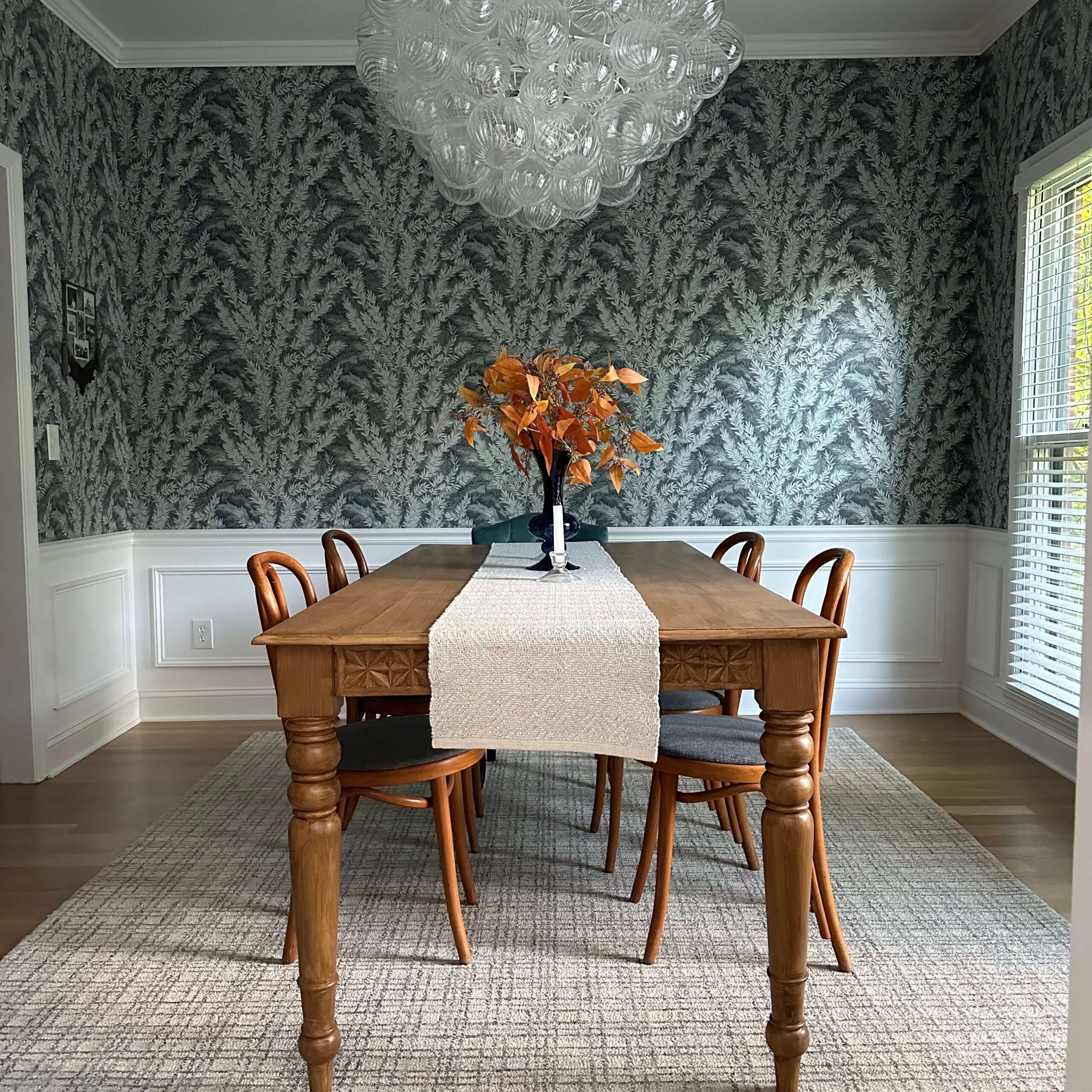
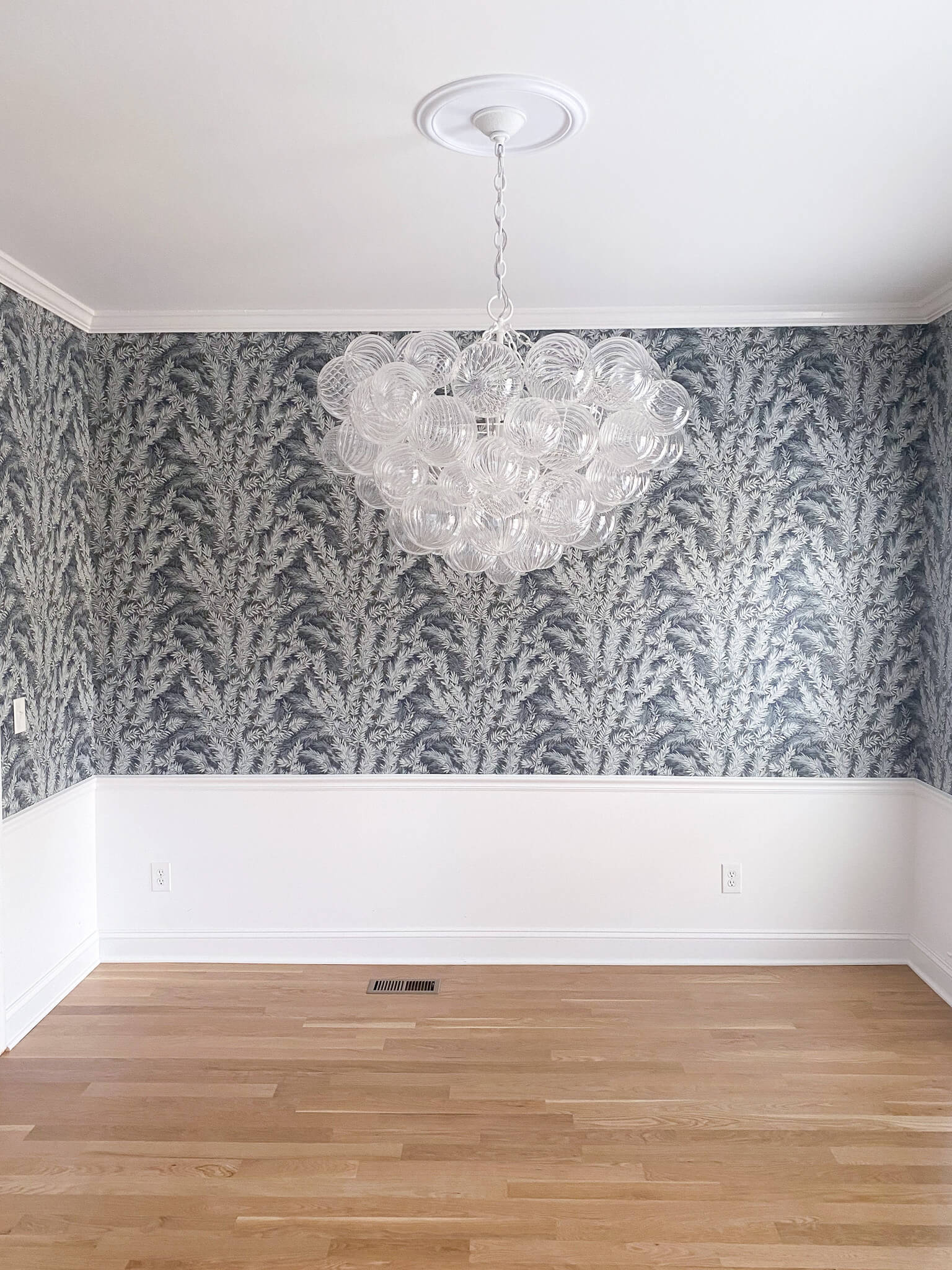
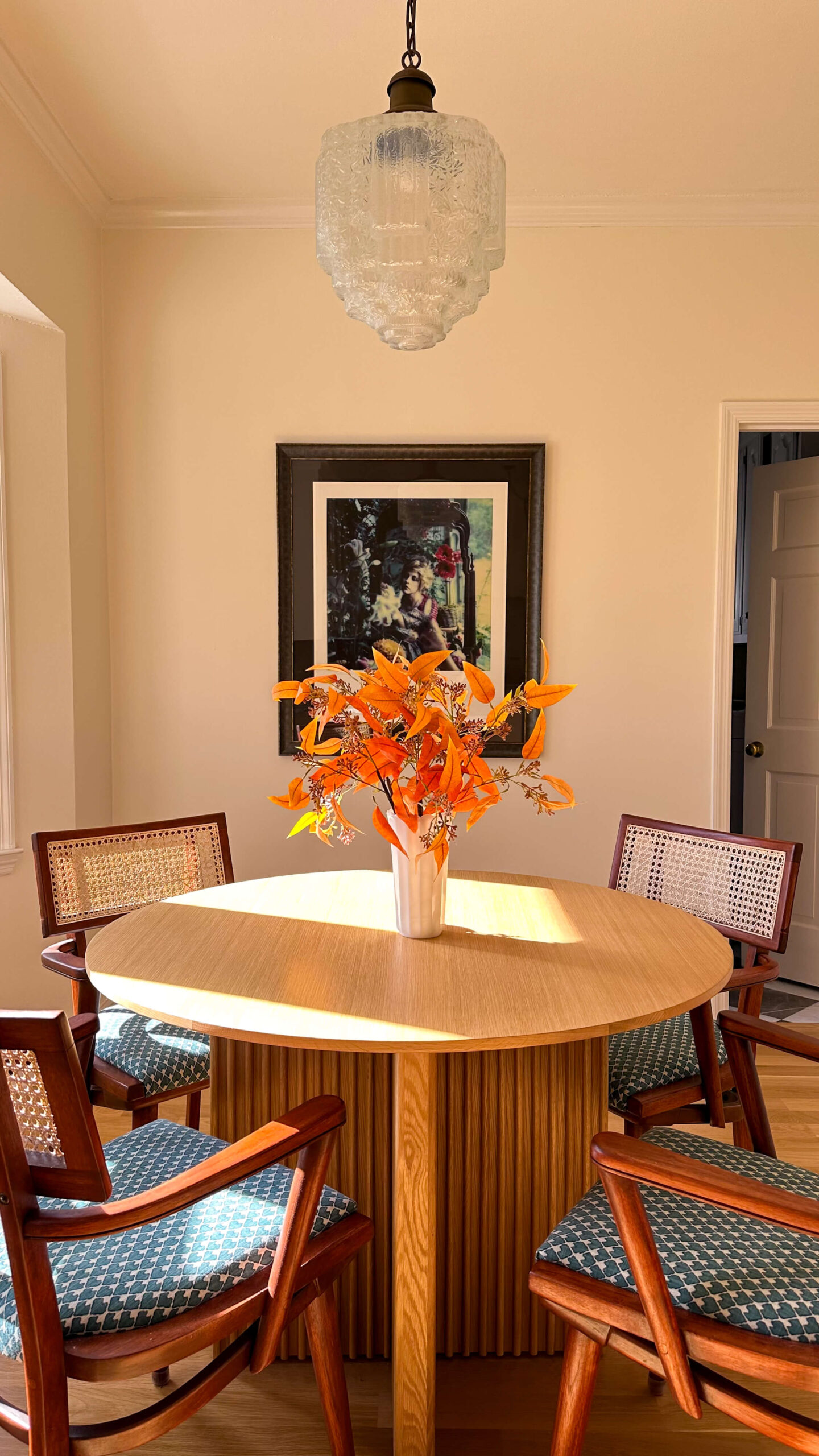
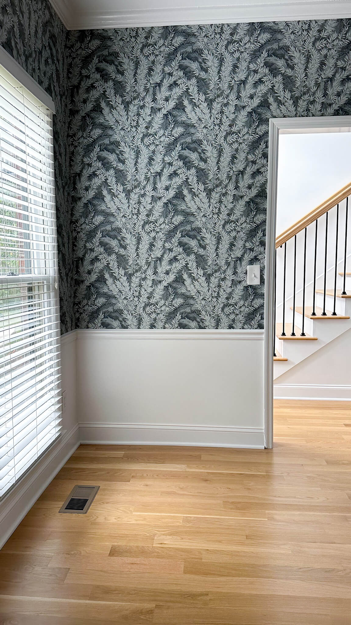
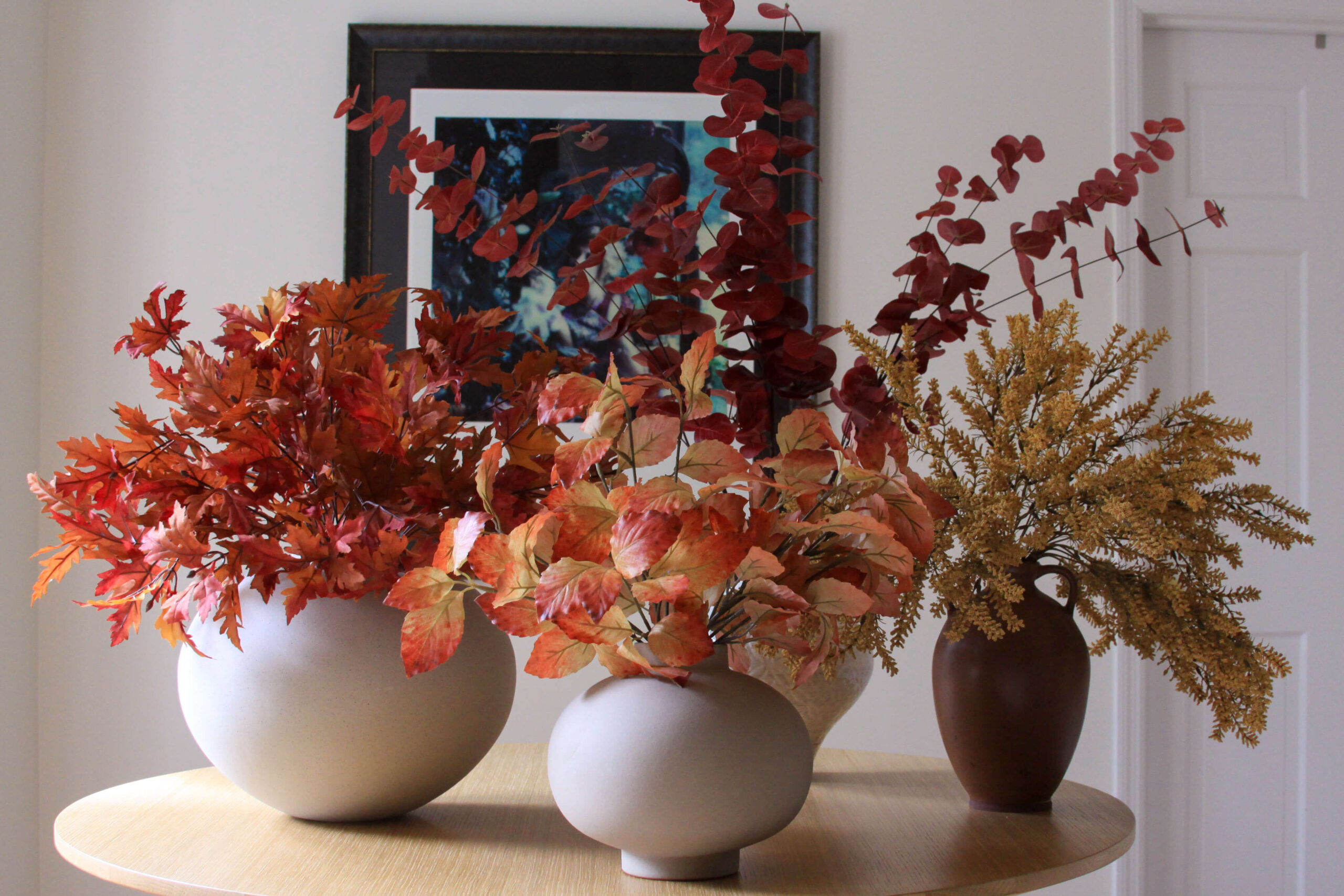
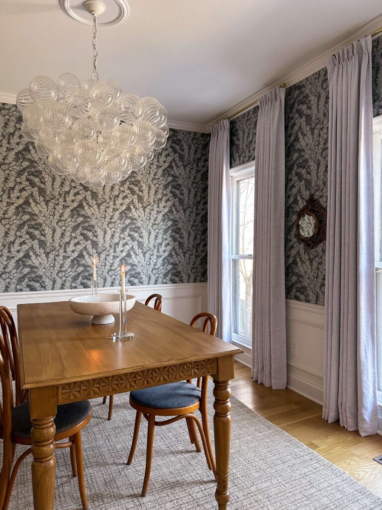
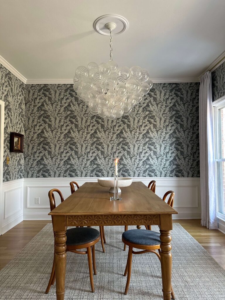
Dining Room: Dujour by Valspar
Shop: Wallpaper | Bubble Chandelier | Rug | Curtains | Paint | Box Trim
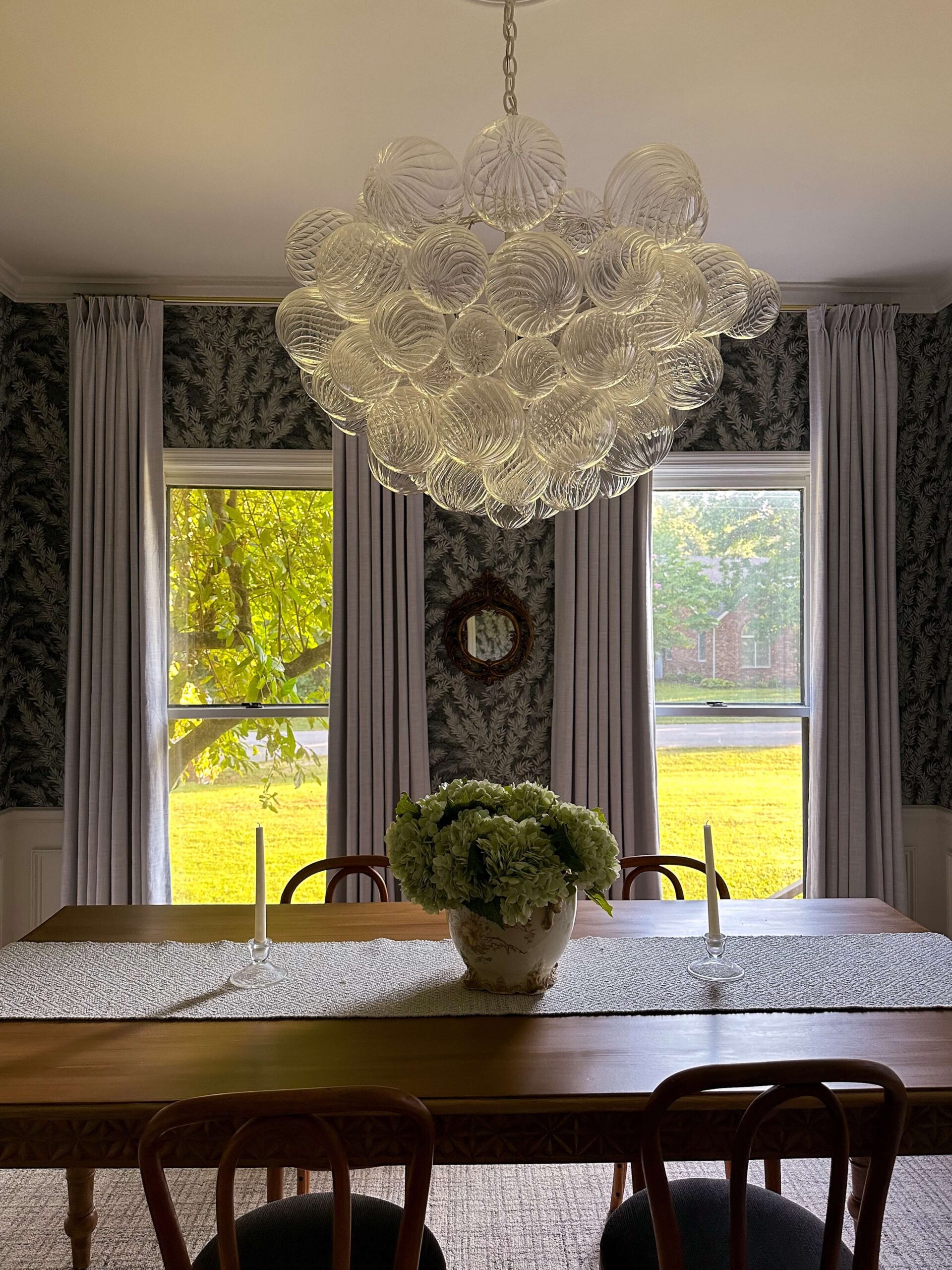
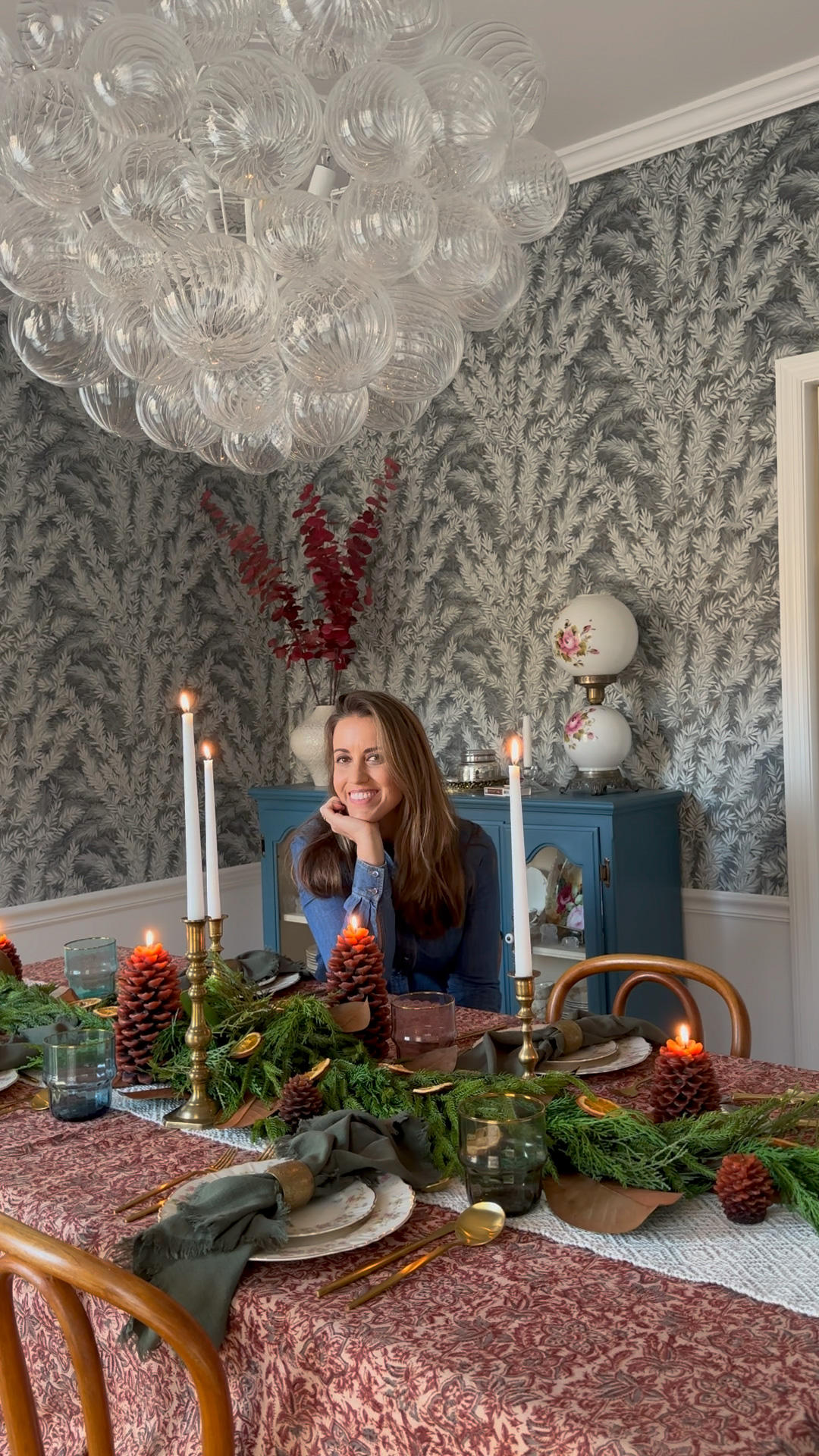
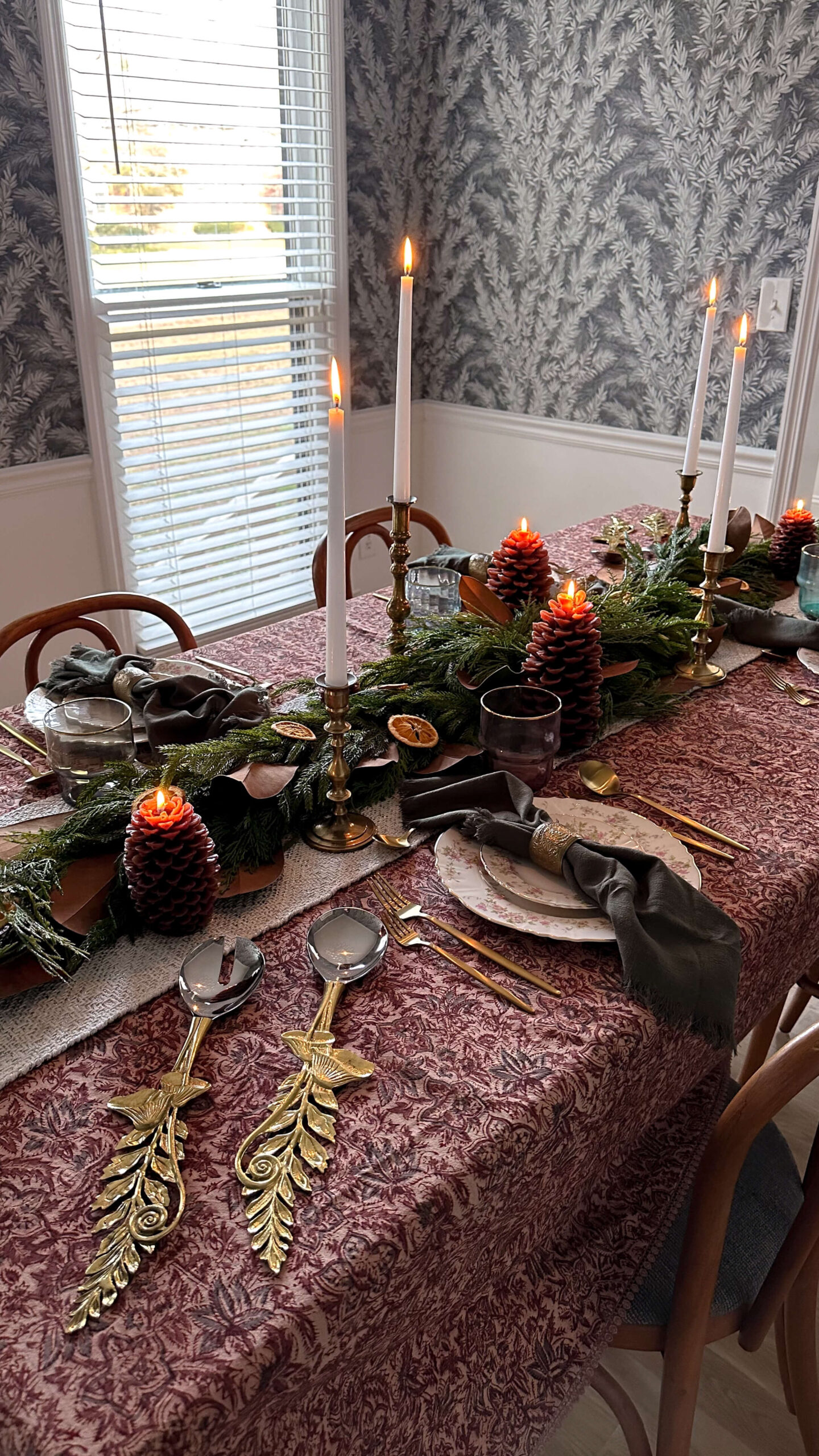
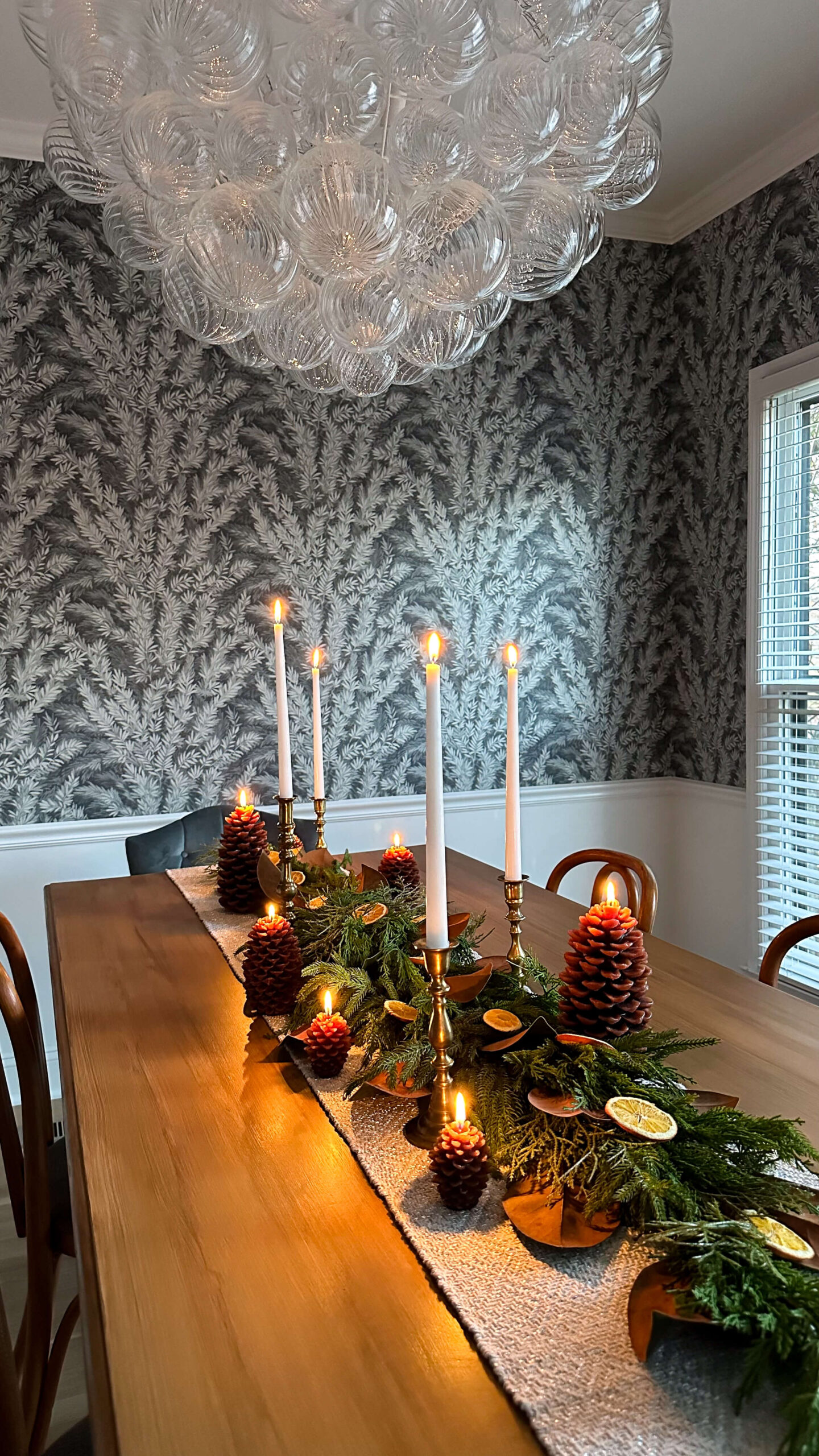
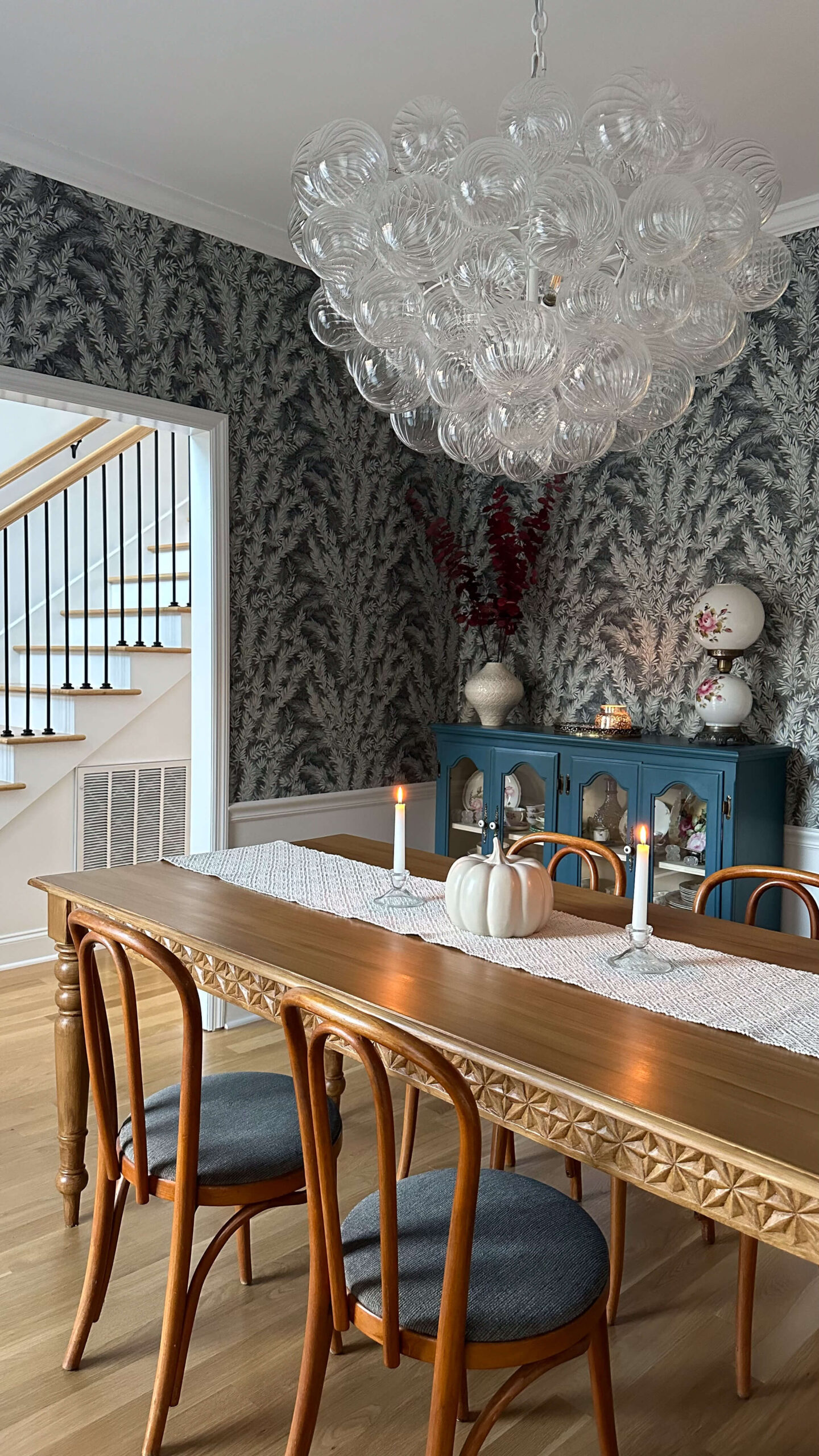
The dining room is painted Dujour by Valspar, a warm neutral white. This room also faces north, so selecting a white with warmth was important. Cooler whites can feel stark in north facing light.
Even after adding a bold botanical wallpaper and picture frame molding, I kept Dujour as the foundation. It compliments the wallpaper beautifully and keeps the room feeling balanced. If you’re searching for a versatile white that works in low light rooms, this is a strong contender.
Shop: Crystal Candlesticks | Marble Display Dish | Brass Toggle Light Switch | Wallpaper | Bubble Chandelier | Rug | Curtains | Paint | Box Trim
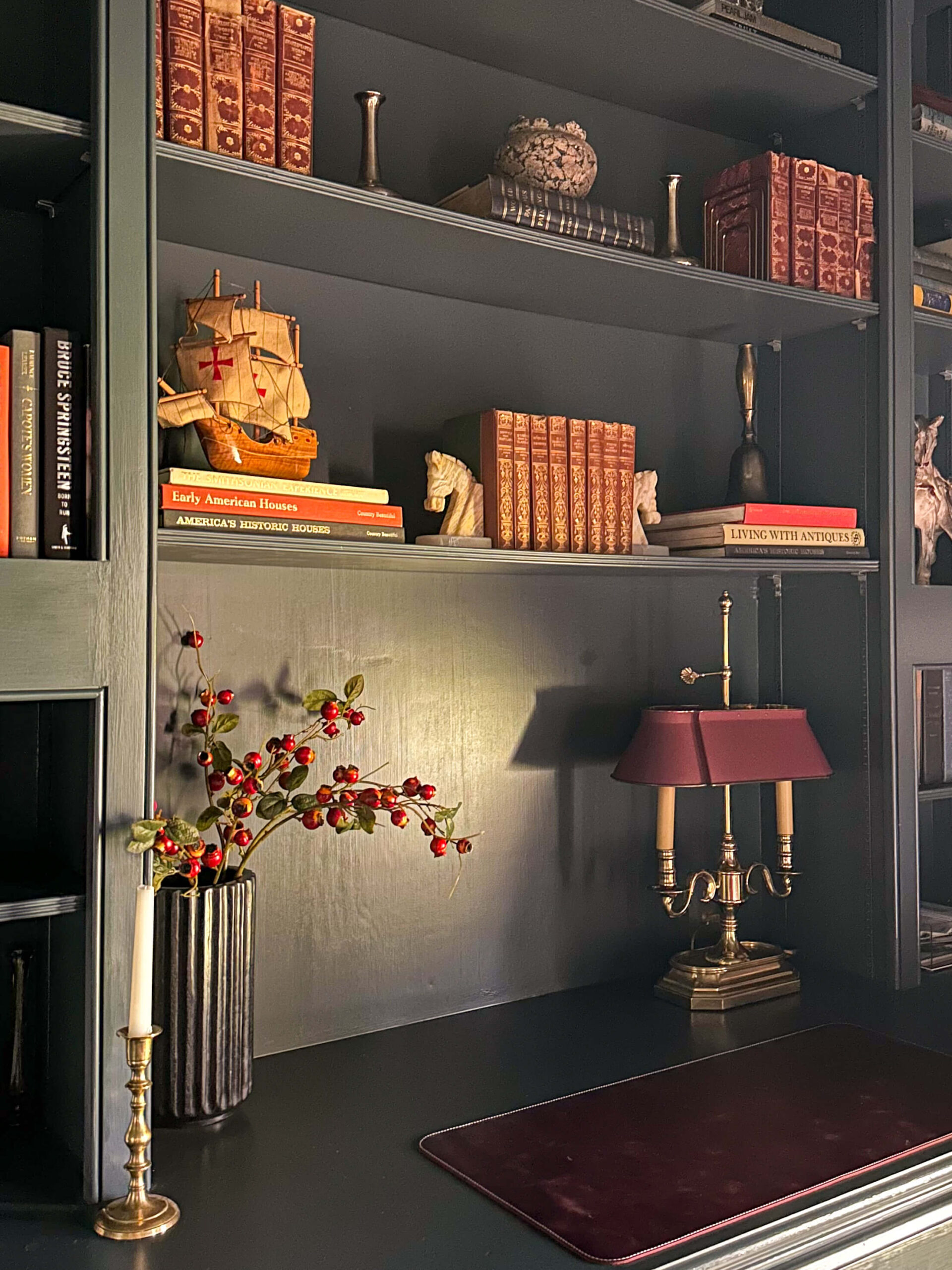
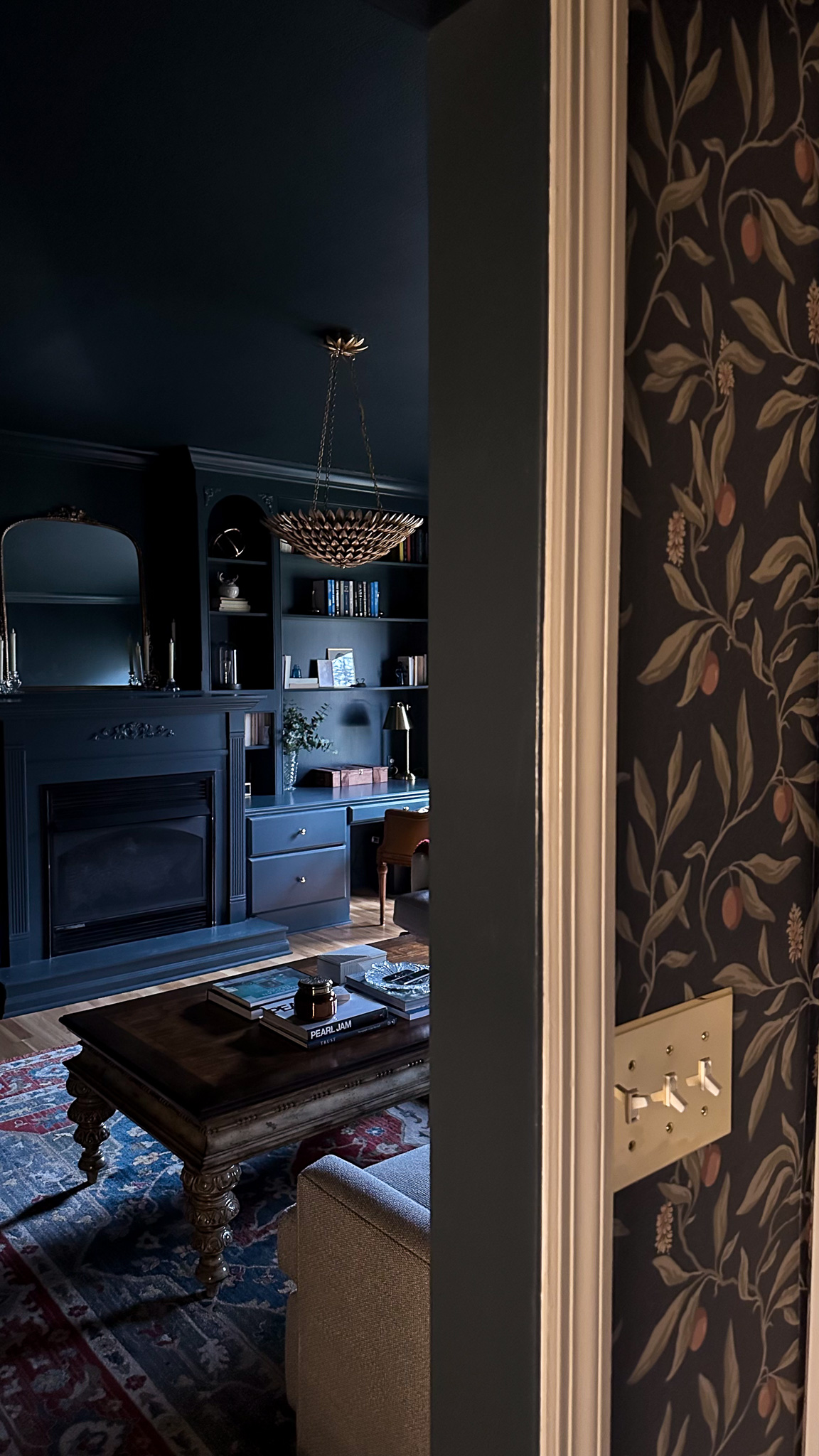
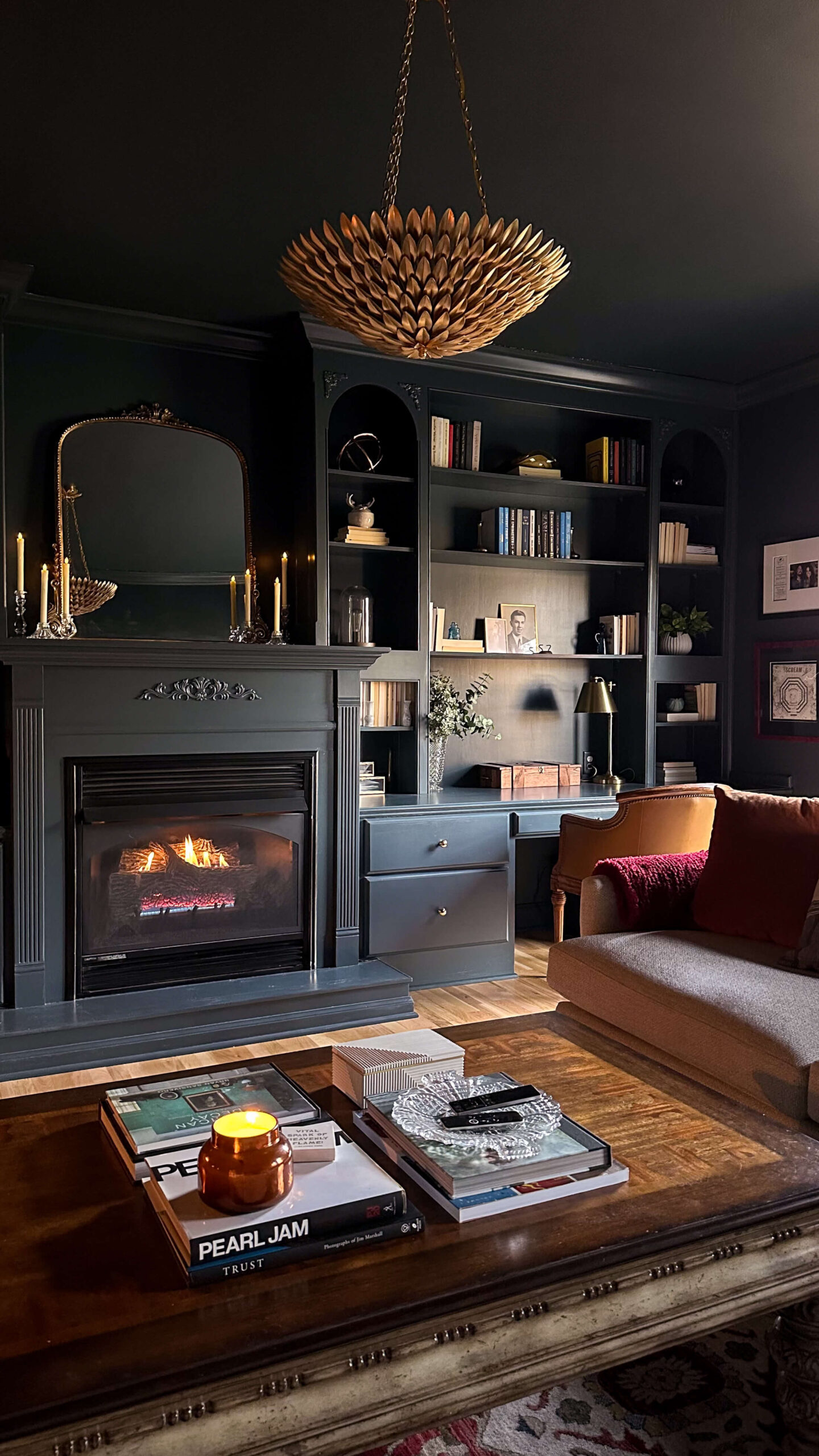
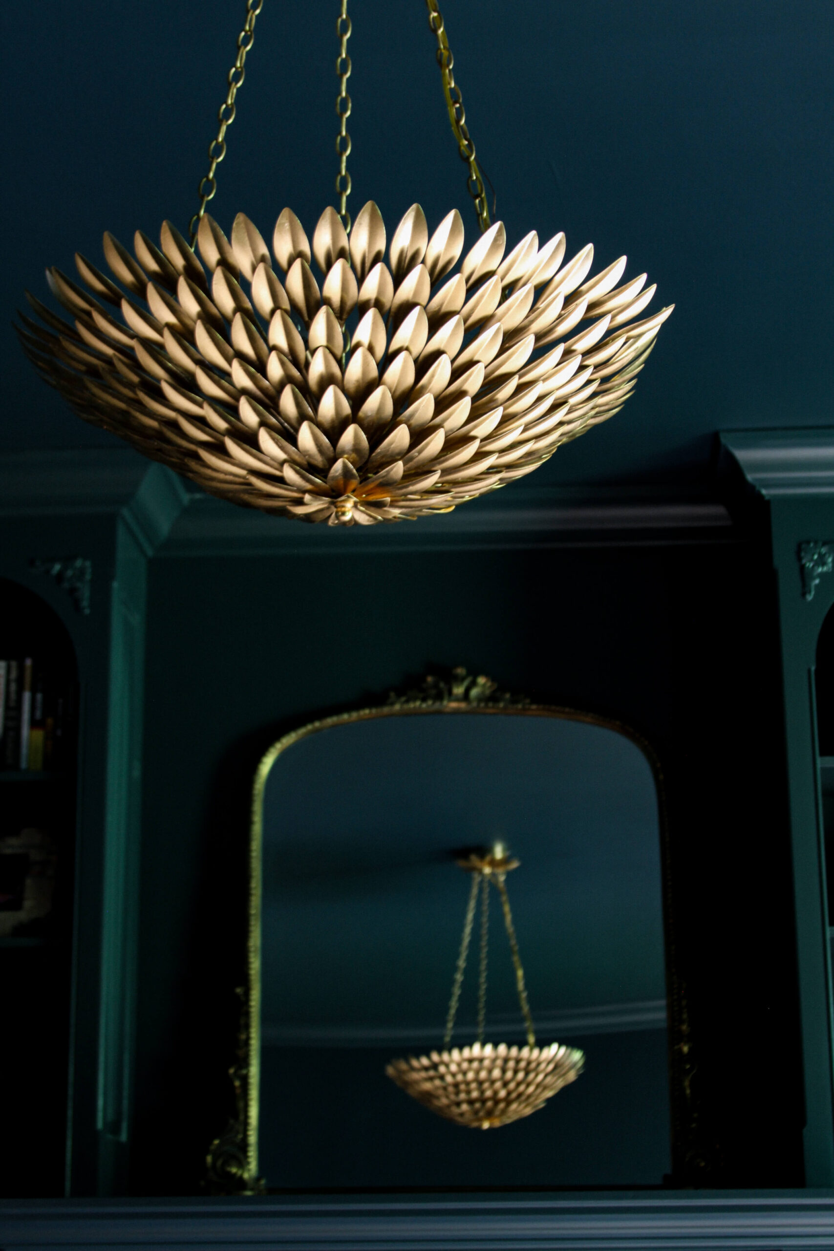
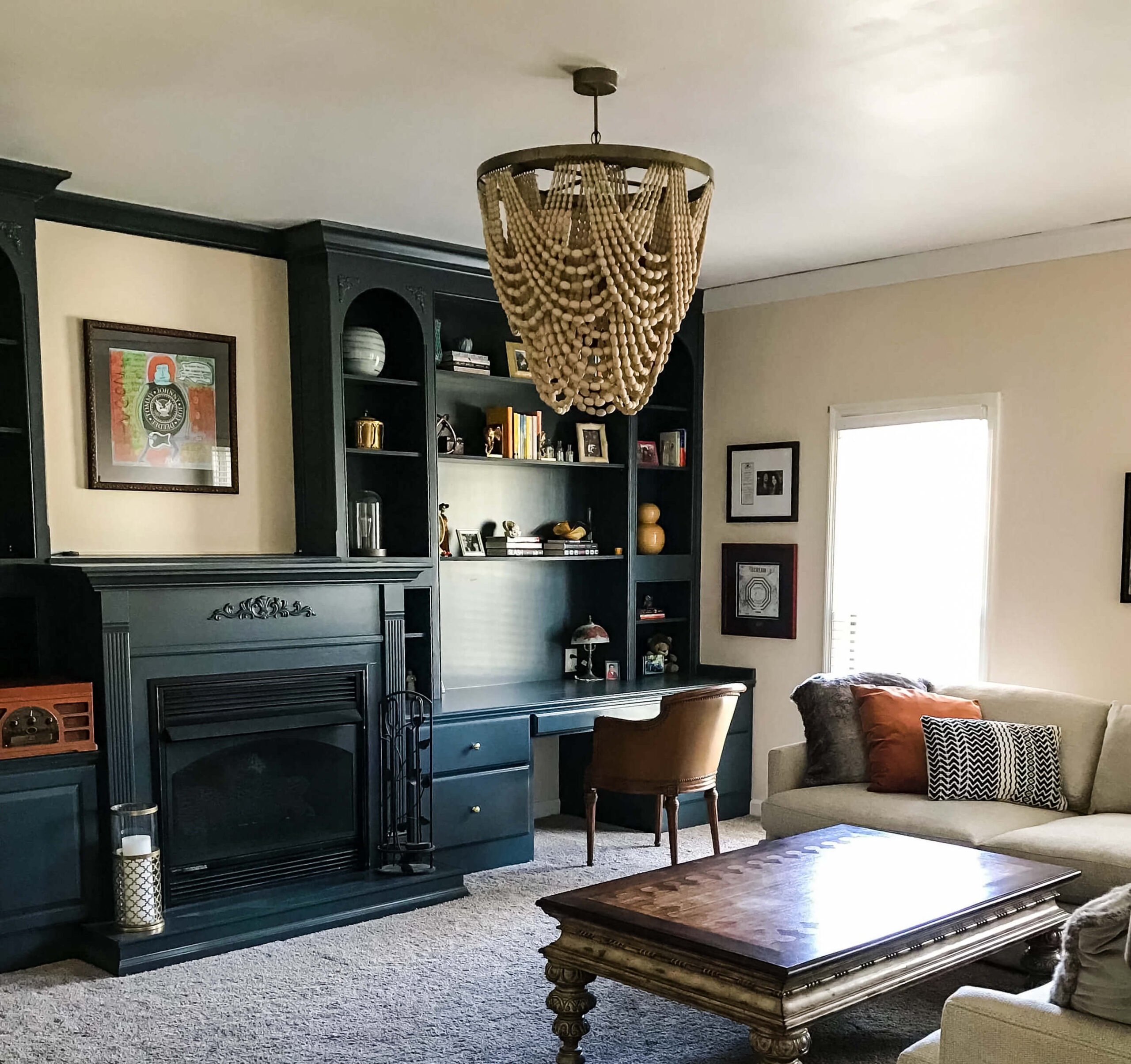
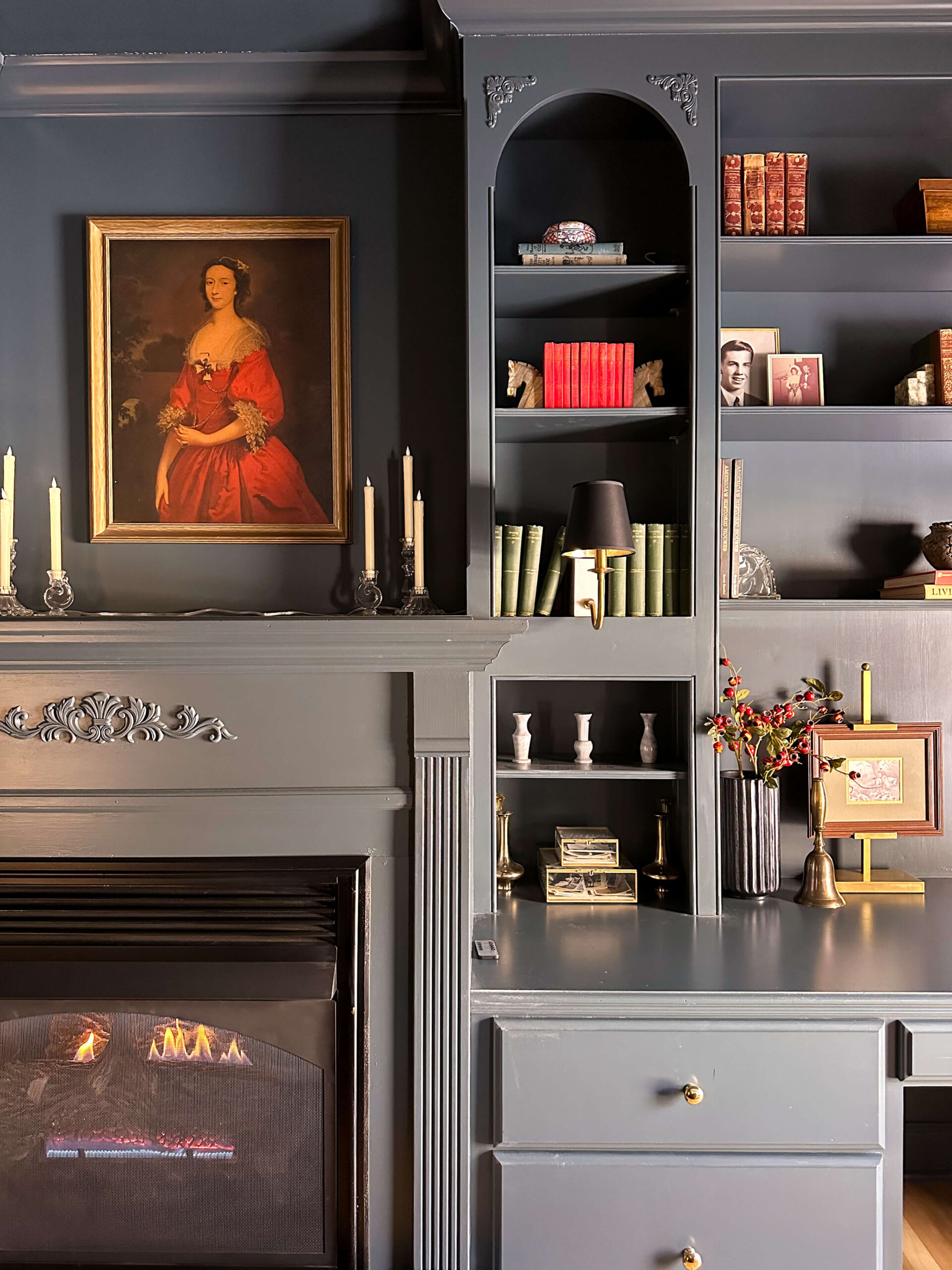
Cozy TV Room: Lead Gray by Benjamin Moore

Shop: Paint Color | Bookshelf Lamps | Black Lampshades | Glass Display Boxes (similar) | Brass Picture Easel | Onyx Horse Bookends | Flameless Candles
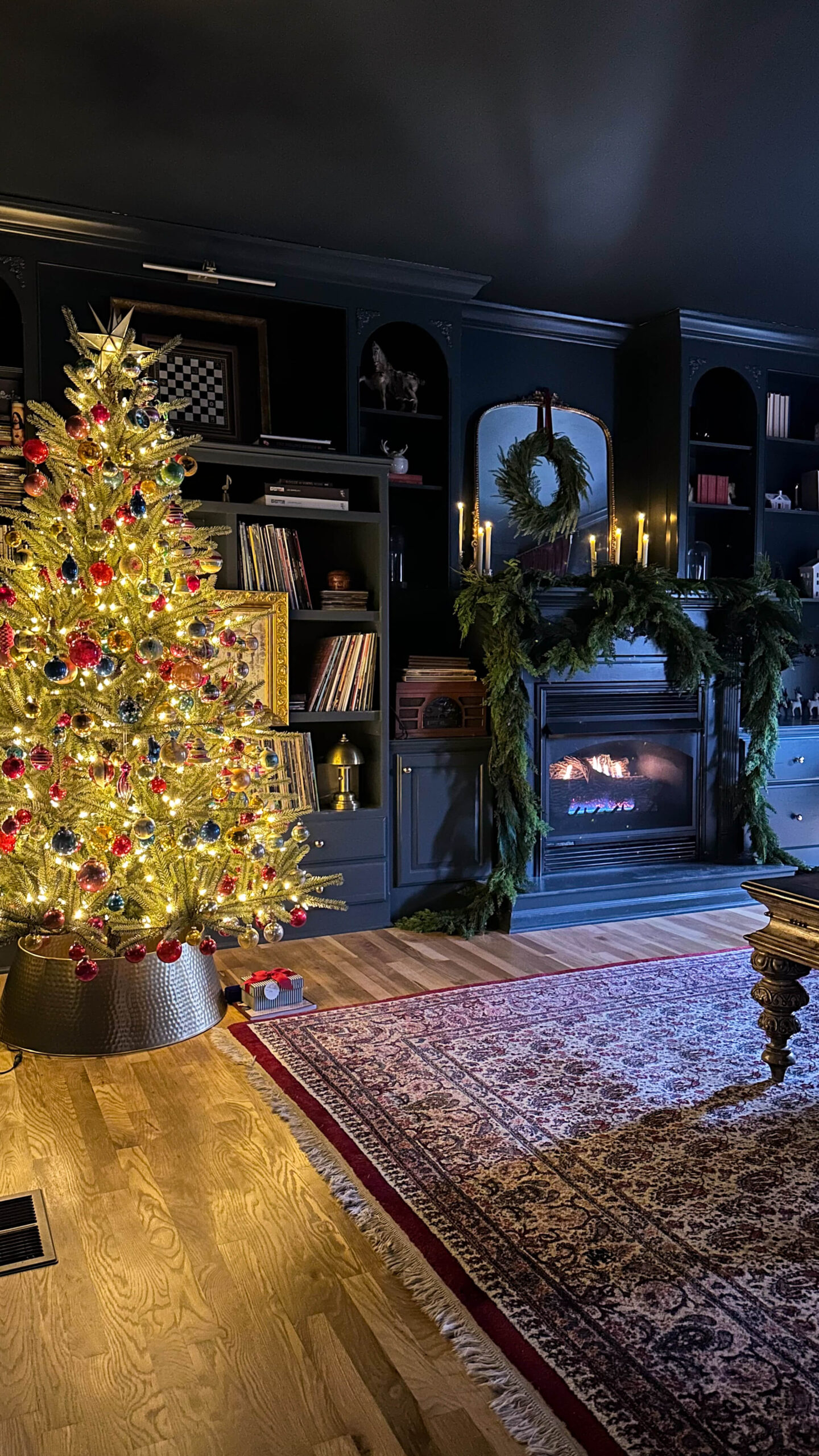
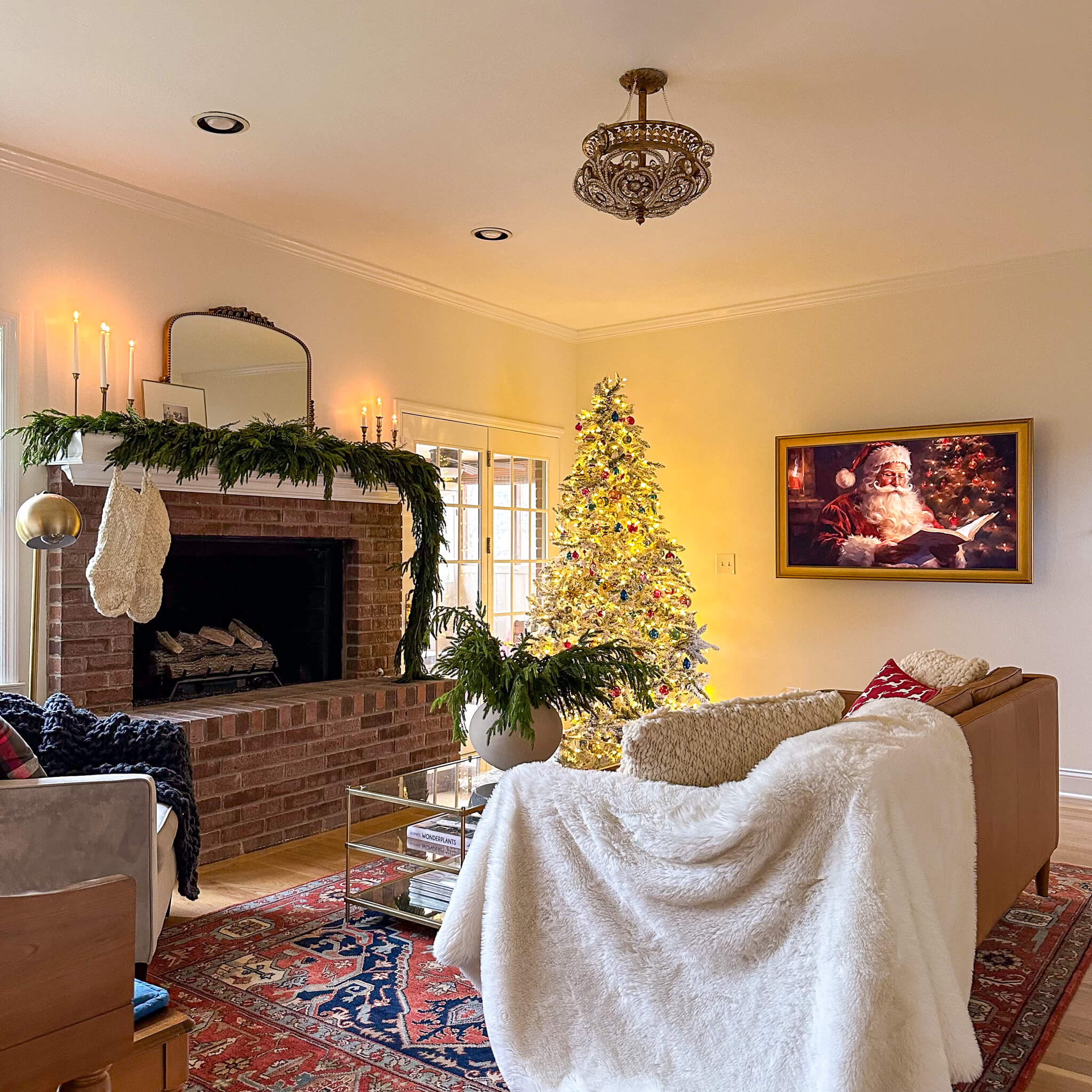
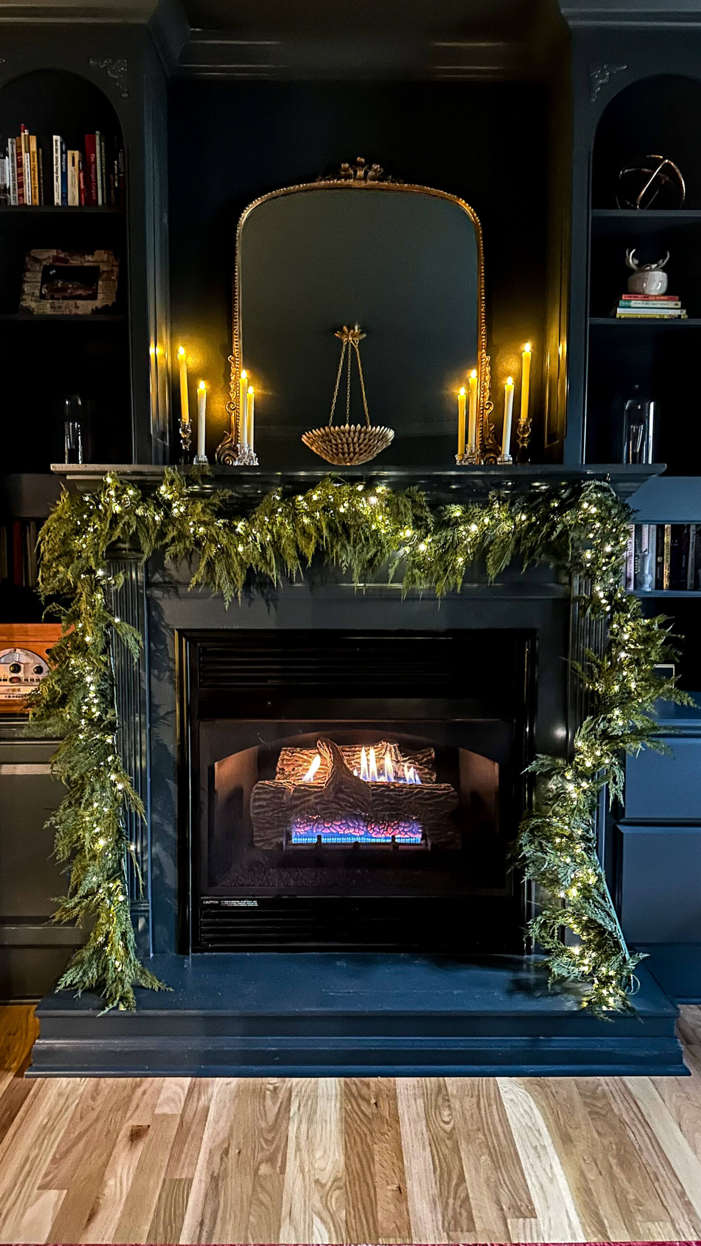
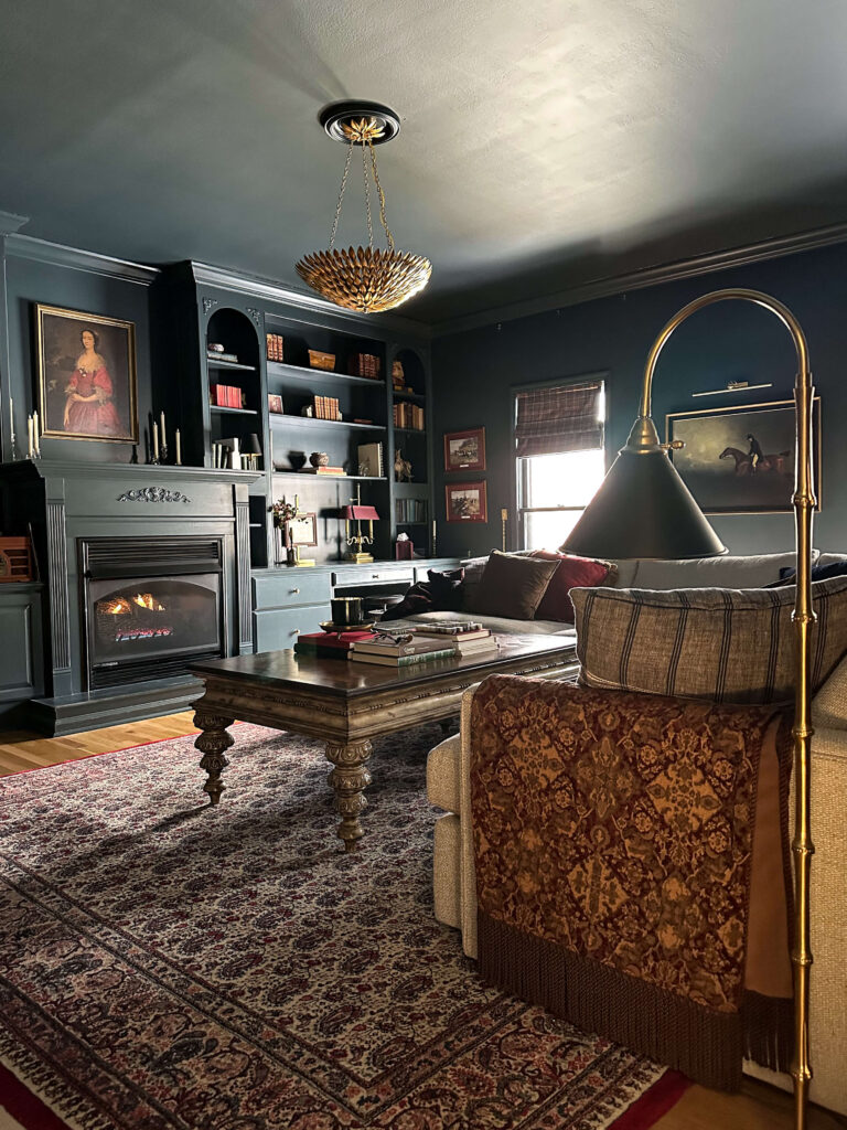
The cozy TV room was the first space where I took a real design risk with the paint colors in my home. I had seen Lead Gray by Benjamin Moore in a catalog and couldn’t stop thinking about it. It’s a true chameleon color that shifts depending on the light.
This room is north facing, which means the light naturally pulls cooler. Even though it’s called gray, Lead Gray has blue undertones and often reads more blue than gray in this space.
Shop: Gold Chandelier | Floor Lamp (similar) | Sectional | Roman Shades | Picture Frame Lamp | Equestrian Painting | Coffee Table Books
I originally painted only the built ins, which were an outdated wood tone and painting felt like the simplest update at the time. After living with it, I realized the room needed more depth. Eventually I worked up the nerve to fully color drench the space, and it completely transformed the room.
It’s now one of my favorite spaces in the house and one of the most asked about paint colors in my home, especially during the holidays when everything stands out against that rich backdrop.
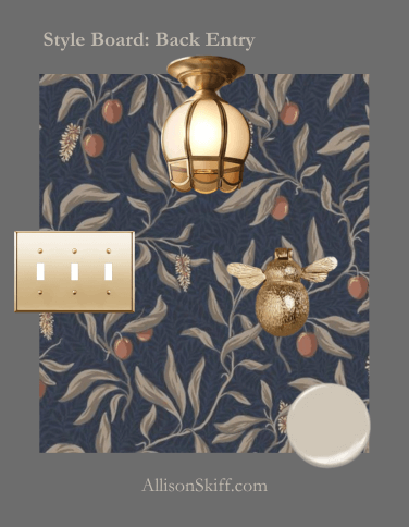
Back Entry: Accessible Beige by Sherwin-Williams
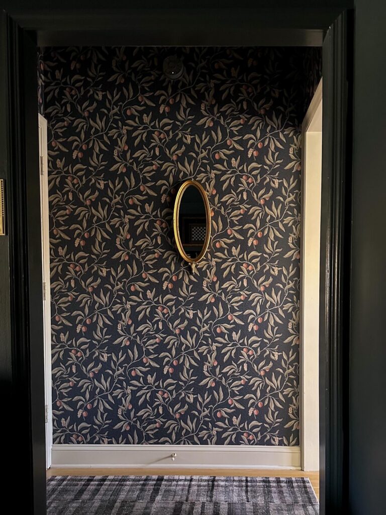
Shop: Wallpaper | Trim Color | Mirror (similar) | Rug
The back entry connects the kitchen and the cozy TV room and is one of the most used areas in the house. When I added wallpaper in this space, I needed a neutral that would tie everything together.
I chose Accessible Beige by Sherwin-Williams, which I had used at my previous home, and in two rooms upstairs. It’s a dependable warm neutral that works well in transitional spaces.
All of the trim, the door, and the ceiling are painted Accessible Beige. Using the same color throughout creates a cohesive and welcoming feel in this smaller area.
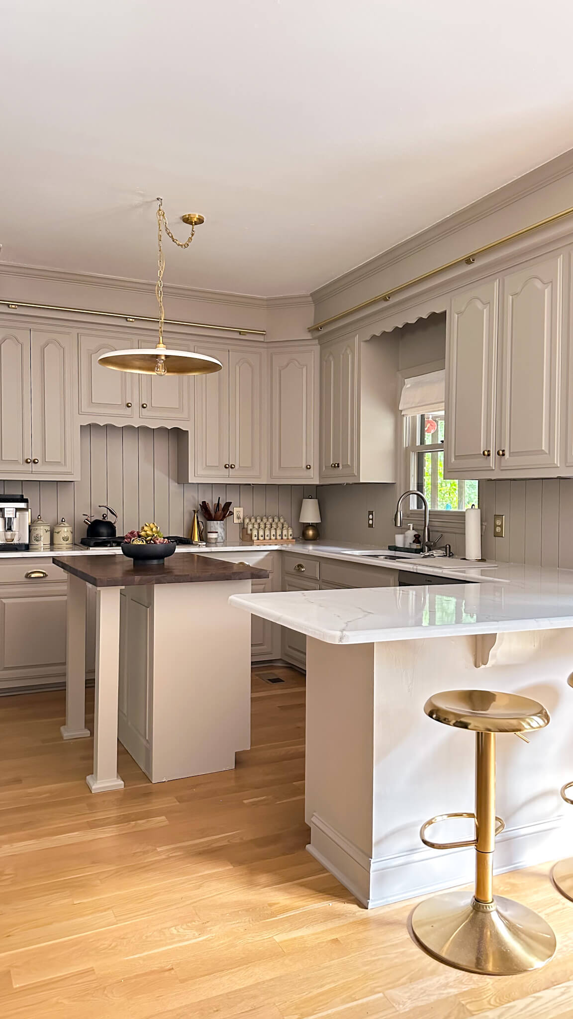
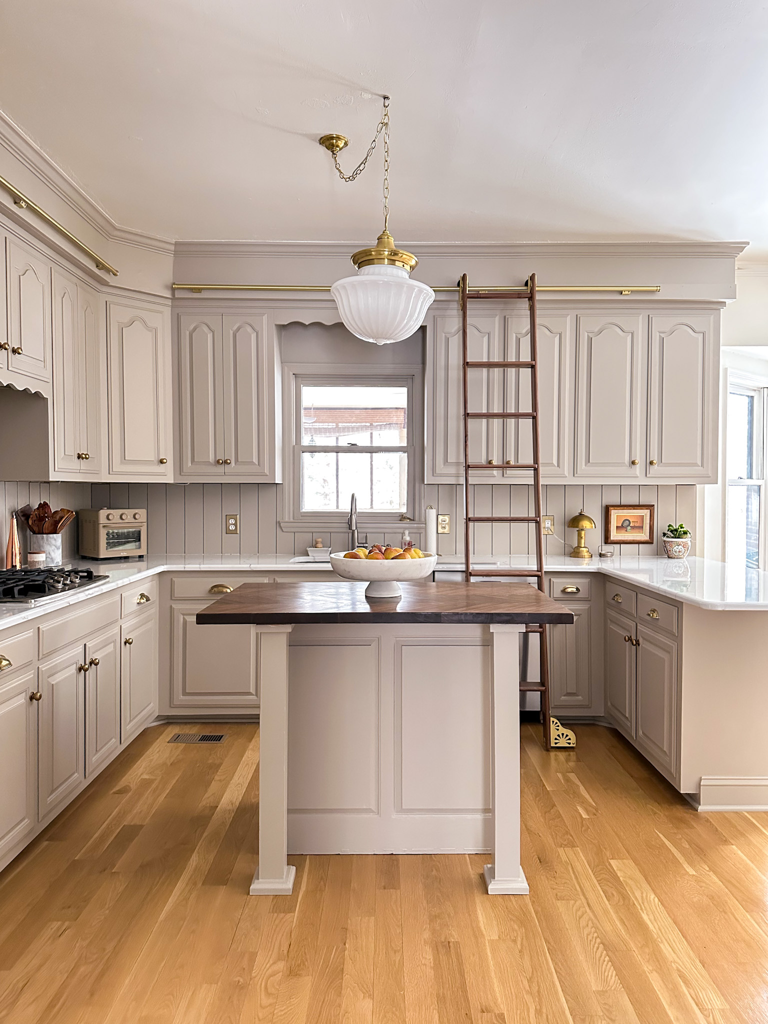
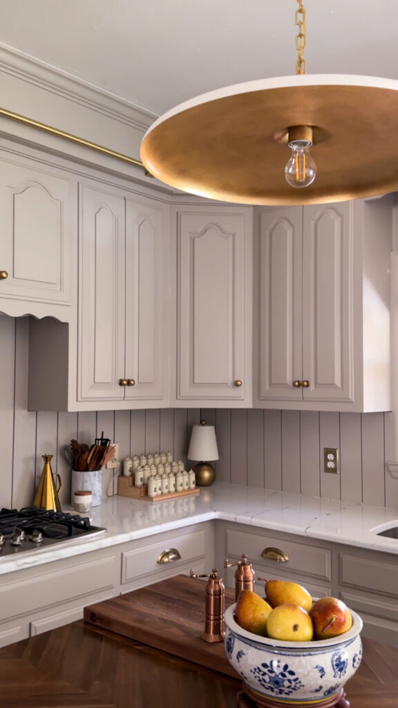
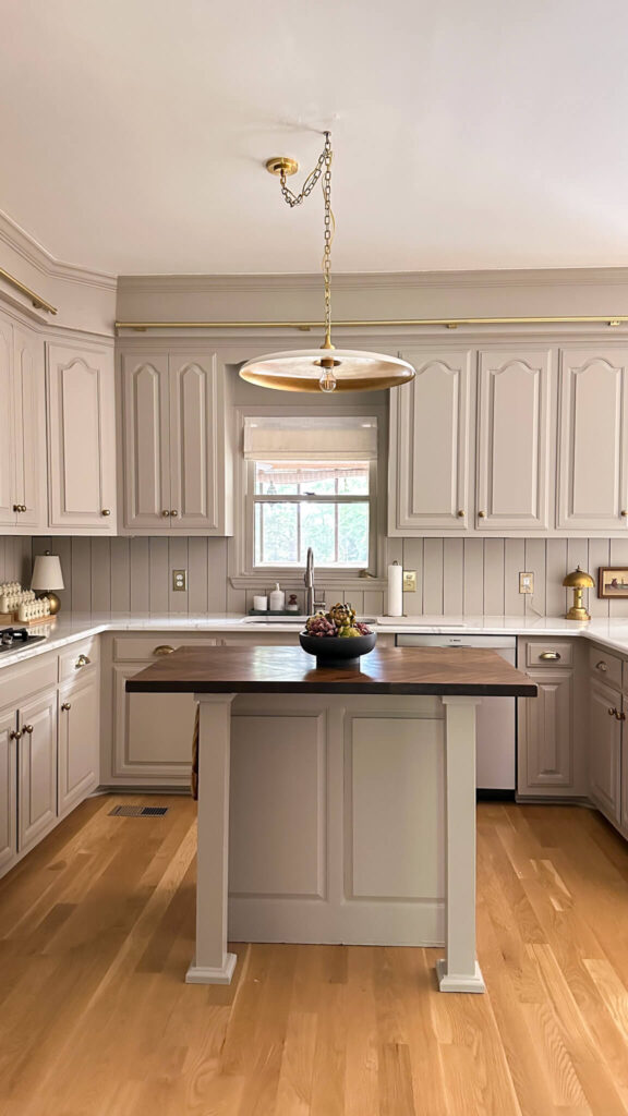
Kitchen Cabinets: Stone Hearth by Benjamin Moore
Shop: Cabinet Color | Piatto Pendant | Brass Lamp | Spice Jar Stadium | Olive Oil Cruet | Marble Spoon Holder | Wooden Spoons | Brass Outlet Cover
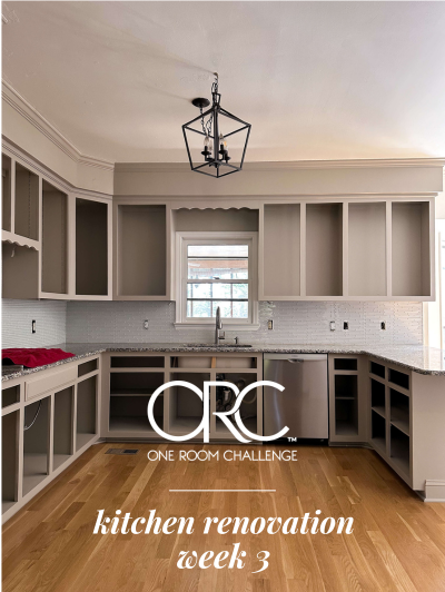
One of the most frequently searched paint colors in my home is my kitchen cabinet color. During my budget friendly kitchen renovation, I decided to refinish the existing cabinets versus gutting them and buying new.
I was looking for the perfect taupe that felt warm and elevated without going too dark, and Stone Hearth by Benjamin Moore was the perfect choice. This side of the kitchen does not receive abundant natural light, so balance was key.
Shop: Cabinet Color | Piatto Pendant | Roman Shades | Brass Outlet Cover | Backsplash Paneling | Artichokes | Brass Totie Task Lamp
Stone Hearth is beautifully saturated without feeling heavy. It adds warmth and depth while still feeling timeless. If you’re searching for a taupe cabinet color that feels classic but not flat, this one is worth sampling.
The kitchen walls are painted Swiss Coffee by Behr, which continues into the living room. It’s a warm neutral that keeps the overall space cohesive and bright.

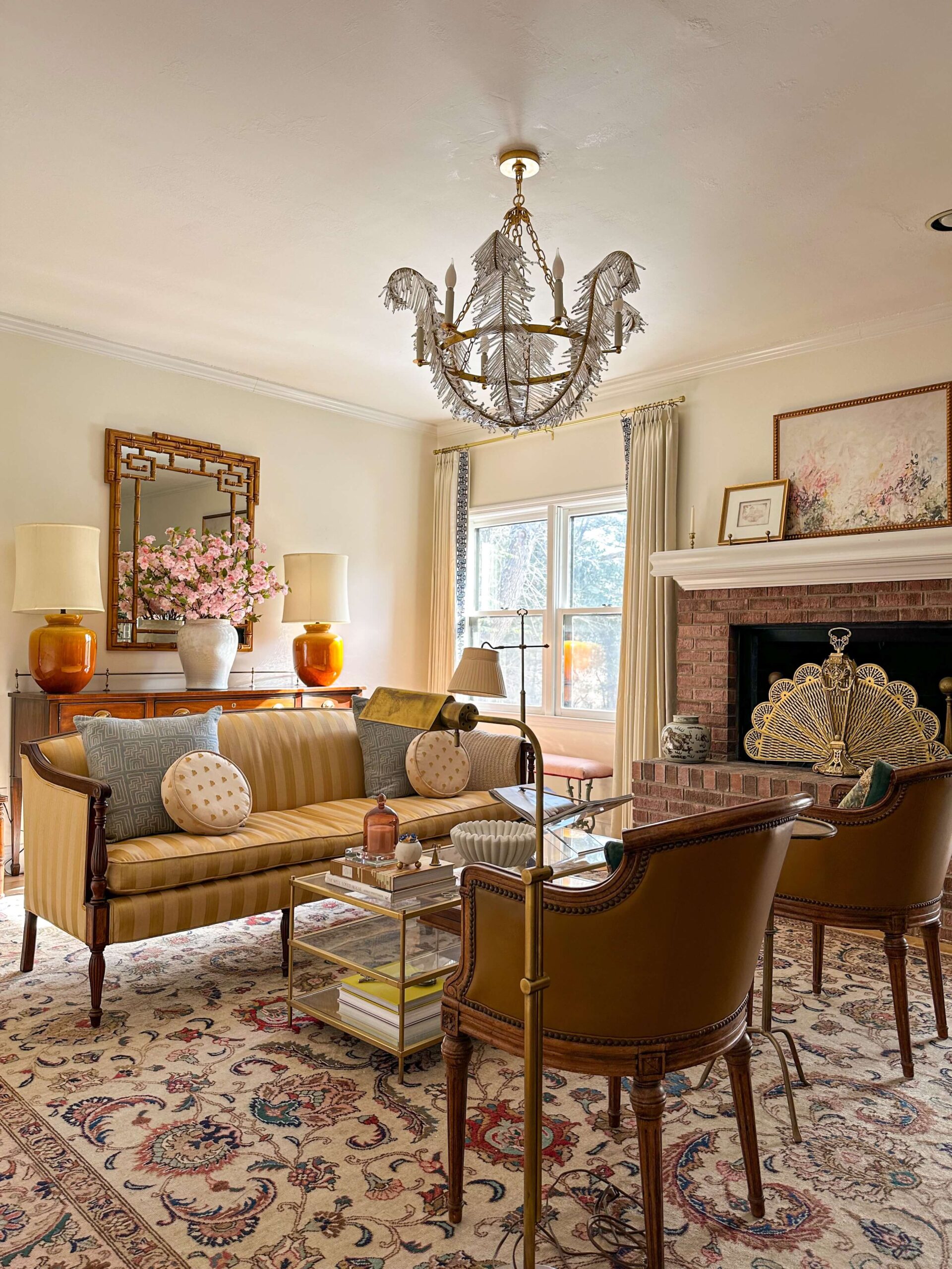
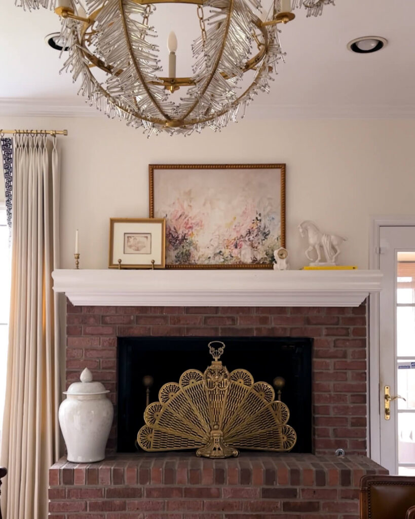
Living Room: Swiss Coffee by Behr

Shop: Chandelier | Draperies | Buffett | Greek Key Mirror | Pink Cherry Blossoms | Opal Shell Jar | Coffee Table (similar) | Marble Ribbon Bowl | Candle Cloche | Coffee Table Books | Peacock Fireplace Fan | Dragon Jar | Mantel Artwork | Brass Pharmacy Lamp
The living room walls are Swiss Coffee by Behr. I originally used a cooler white in this space, but it did not feel right long term.
Shop: Chandelier | Draperies | Opal Shell Jar Peacock Fireplace Fan | Mantel Artwork | Milo Easel | White Trojan Horse
Swiss Coffee has a soft warmth that works beautifully in this south facing room. With abundant natural light, it creates a bright and inviting environment without feeling sterile. While I have big plans for the living room this year, for now this paint color has been perfect.
If you’re searching for warm neutral wall paint colors that work in bright spaces, Swiss Coffee is a dependable option.
Shop: Marble Lamp | Lucite Easel | Brass Frame w/ Matte | Framed Intaglio | Marble Vase | Staffordshire Dogs | Coffee Table Books | Anni Jar | Horse Artwork | Brown Vases | Schumacher grass cloth wallcovering
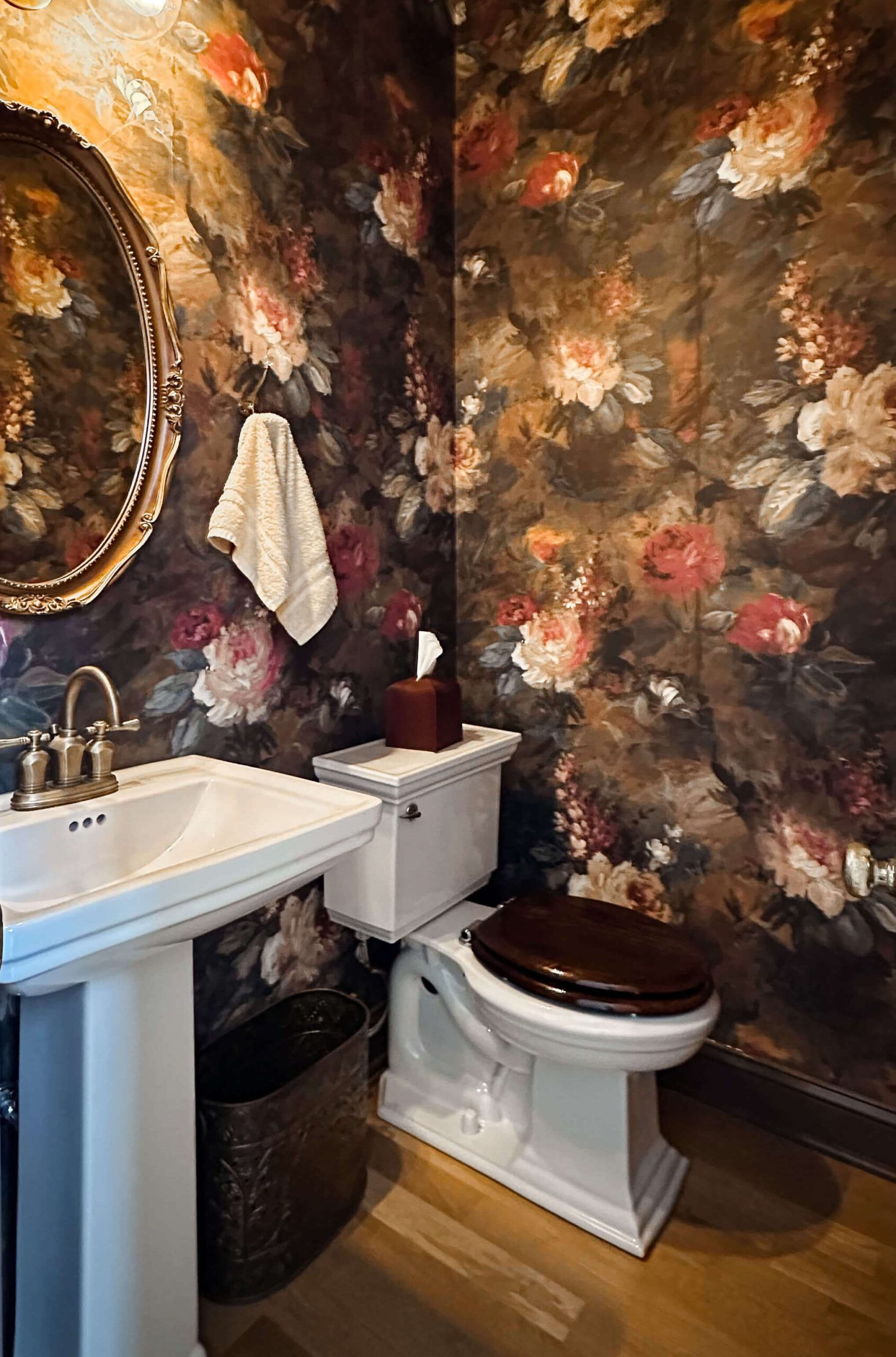
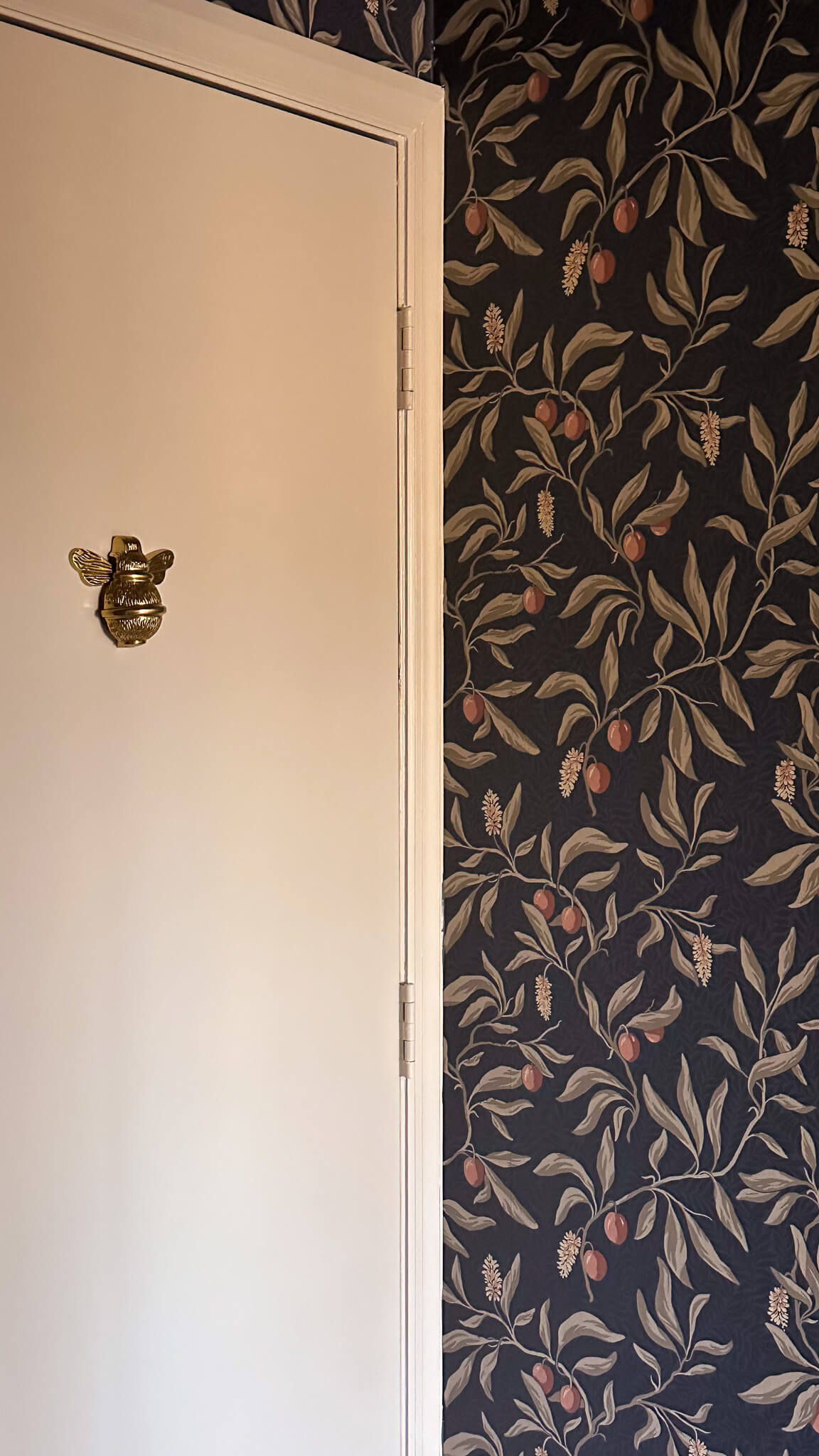
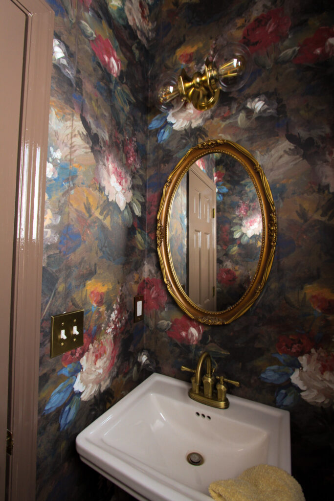
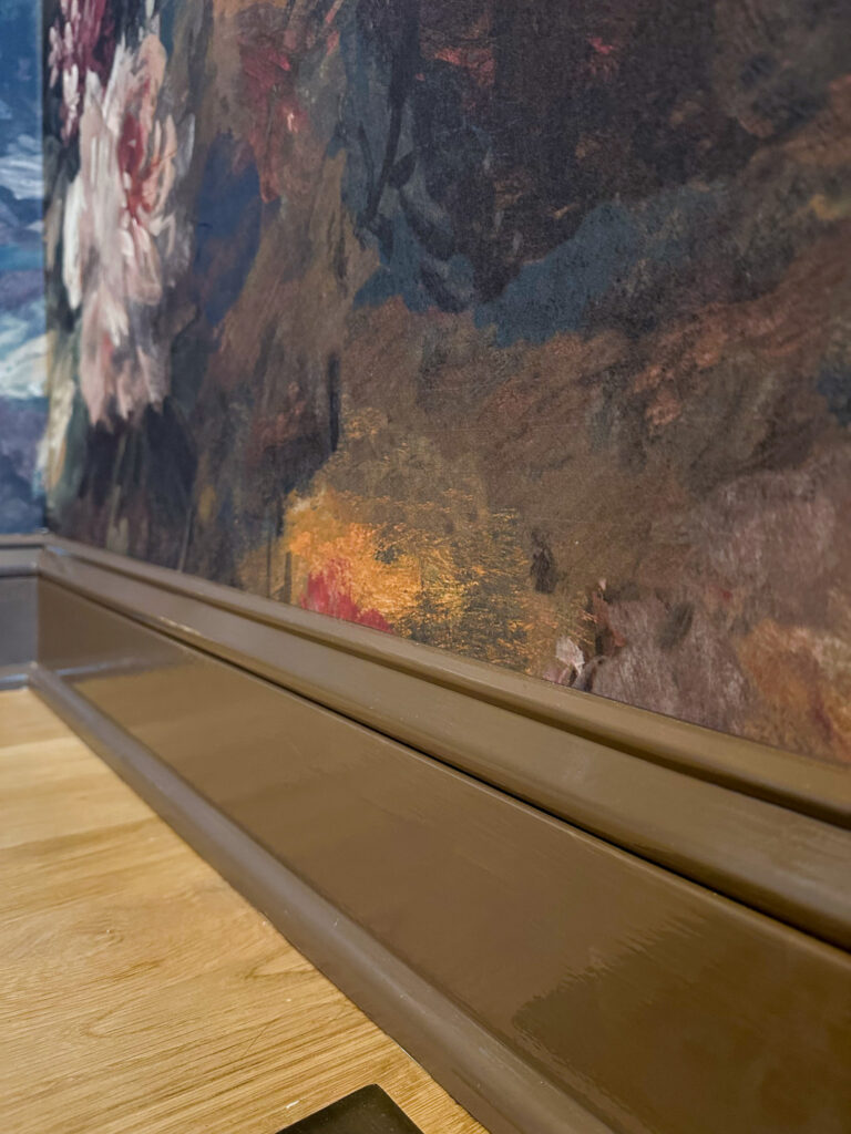
Powder Room: London Clay by Farrow & Ball
Shop: Wallpaper | Paint Color | Light Sconce | Brass Outlet Covers
The powder room is where I embraced bold color again. I paired a floral wallpaper with London Clay by Farrow and Ball.
London Clay is a rich brown with subtle magenta undertones. It brings warmth and depth to the space and pairs beautifully with the patterned wallpaper. Small spaces are a wonderful place to experiment with deeper paint colors in your home.
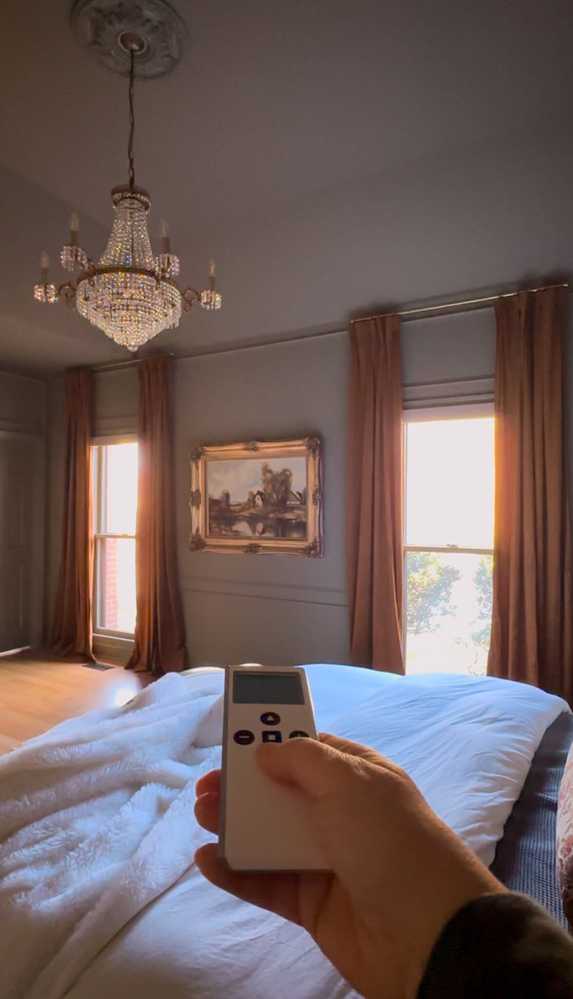
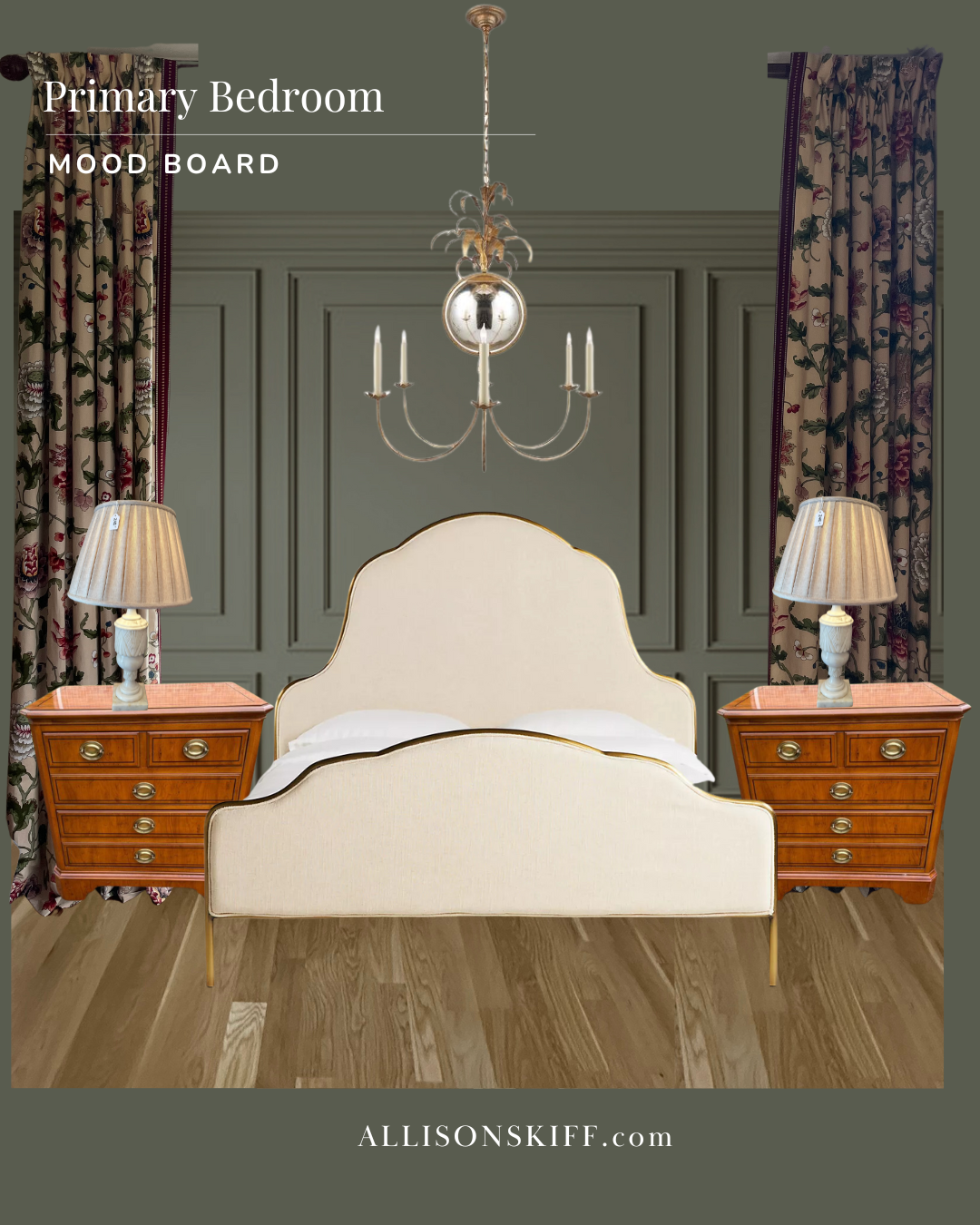
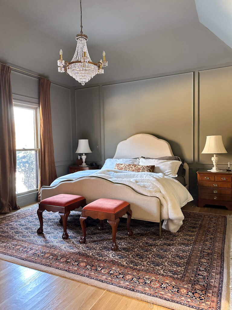
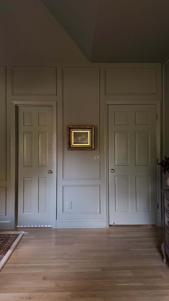
Primary Bedroom: Treron by Farrow & Ball
Shop: Paint | Bed | Chandelier | Draperies | Duvet Set | Sheets | Marble Lamps | Rug (similar)
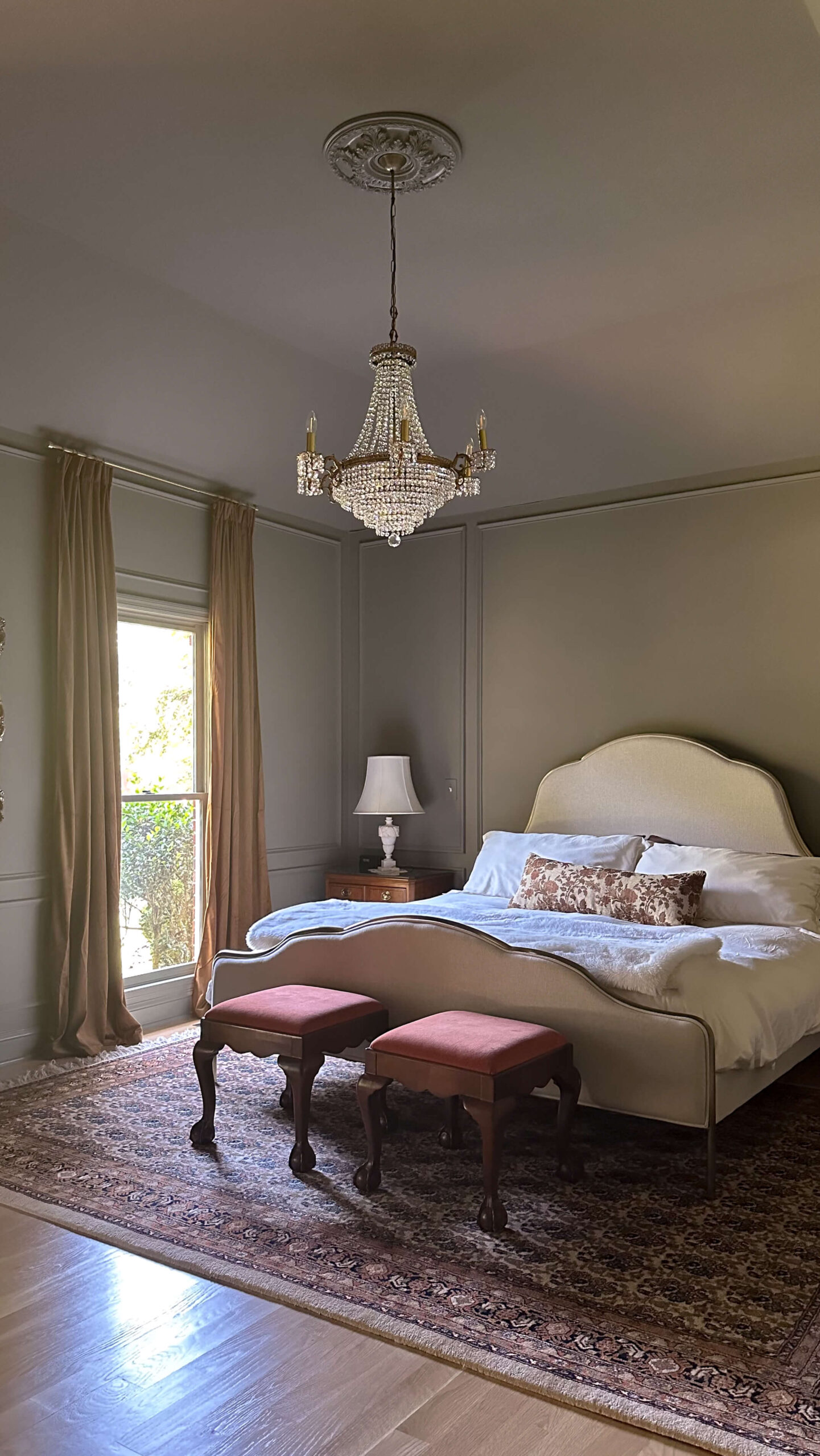
My primary bedroom is color drenched in Treron by Farrow and Ball. This north facing room required a green with warmth to prevent it from reading too blue.
After sampling eleven greens, Treron was the clear winner. Its subtle brown undertones keep it grounded and cozy. It transformed the room into a calm, layered retreat.
If you’re researching green bedroom paint colors for north facing rooms, look for options with warm undertones like this one. Looking for a different green? Check out my other post highlighting 5 green paint color ideas.
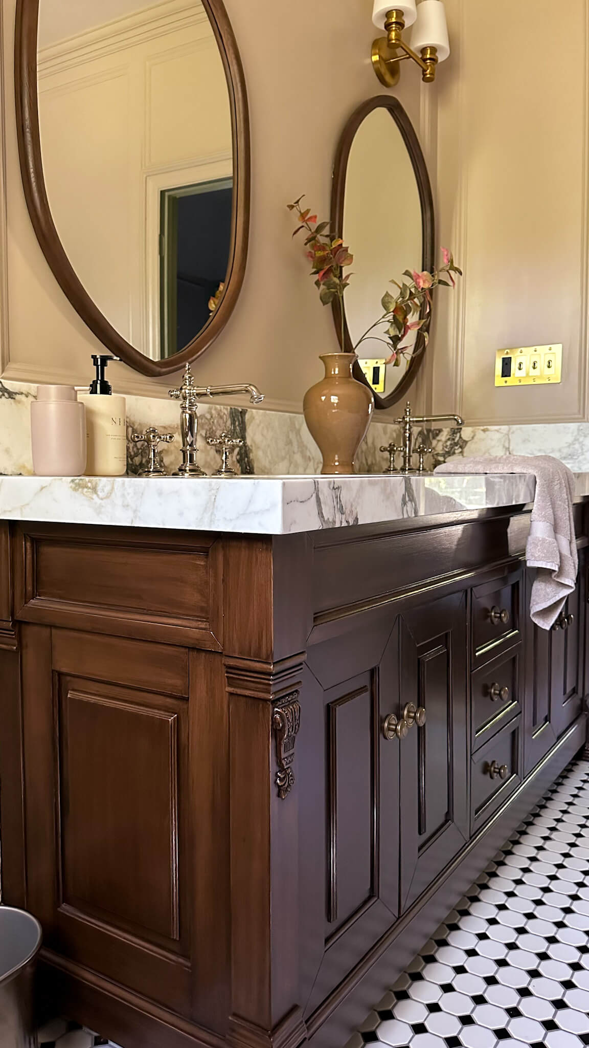
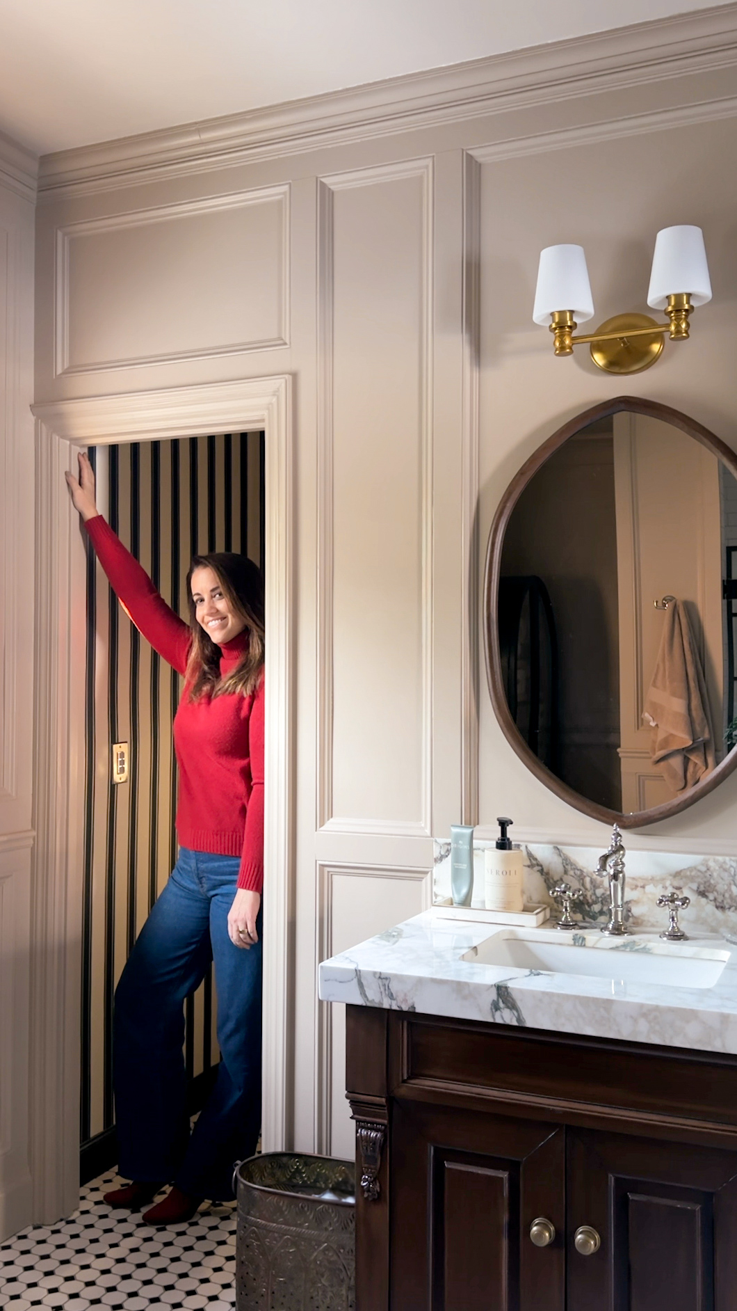
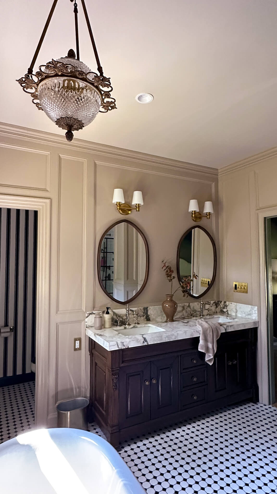
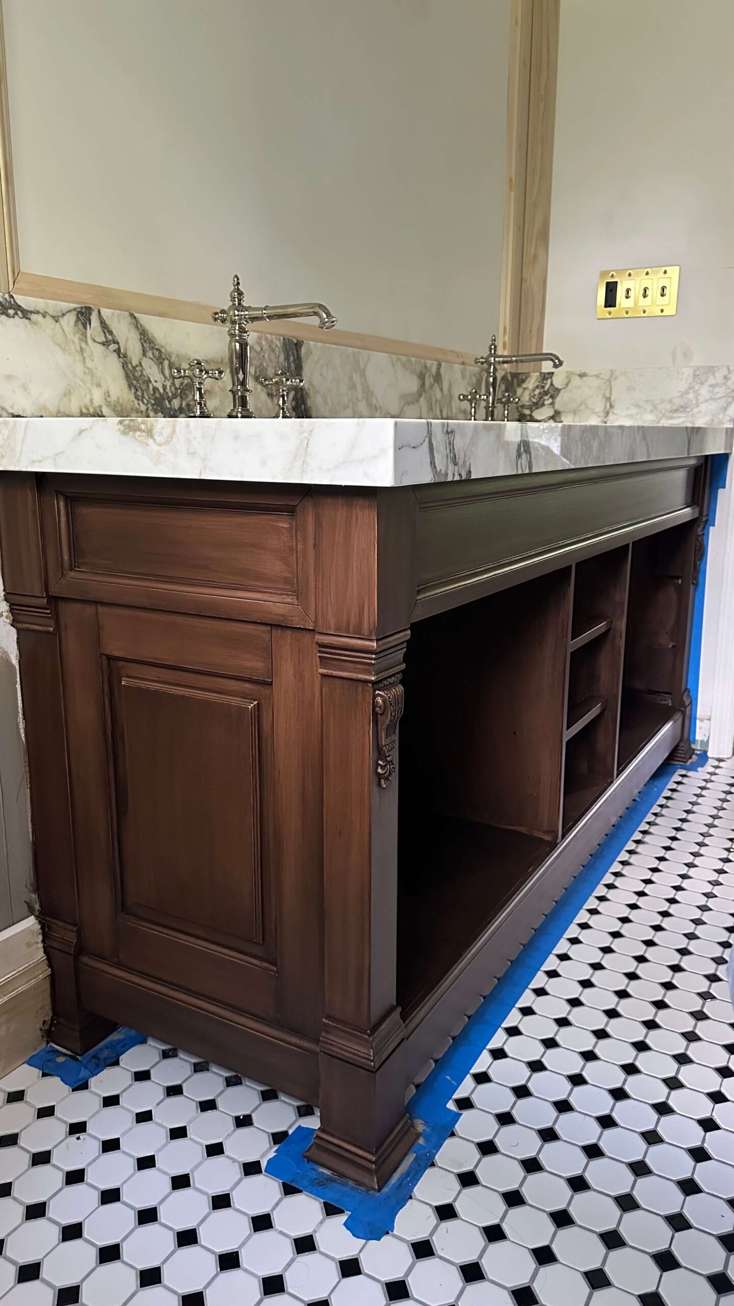
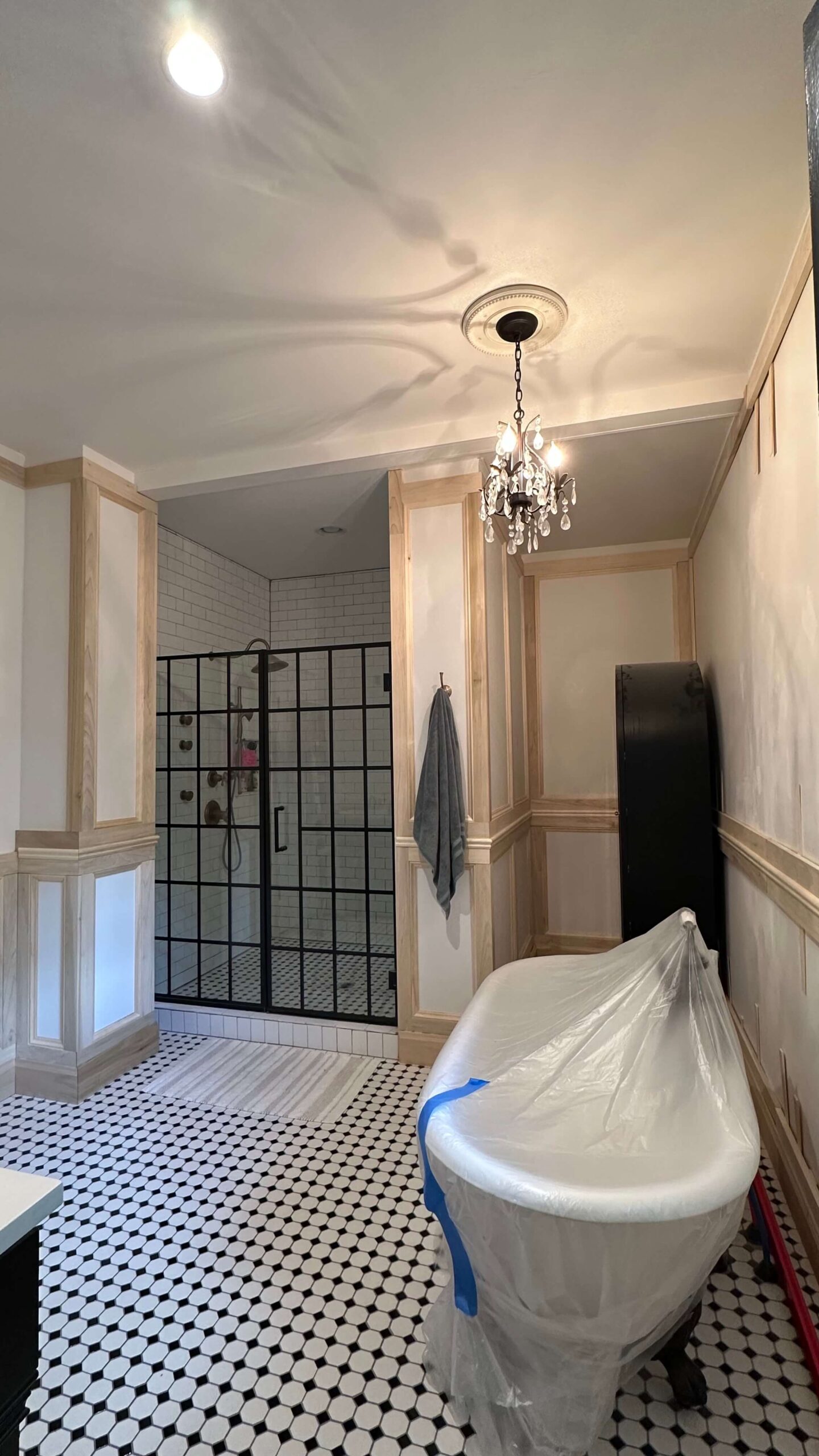
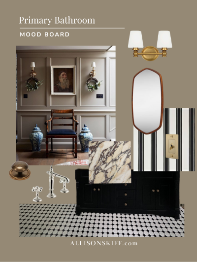
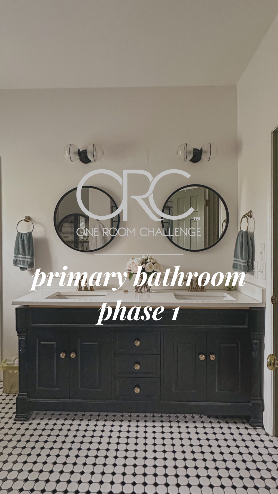
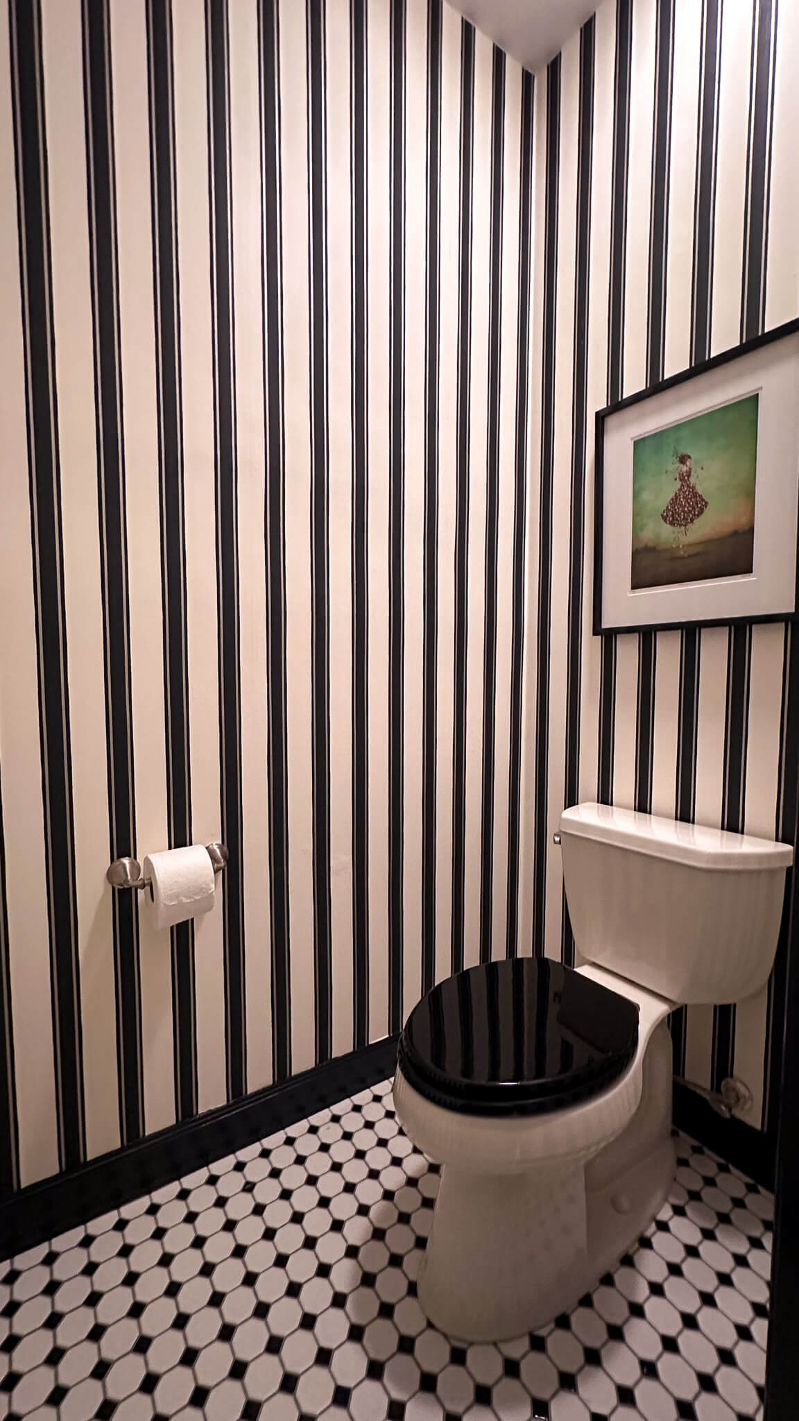
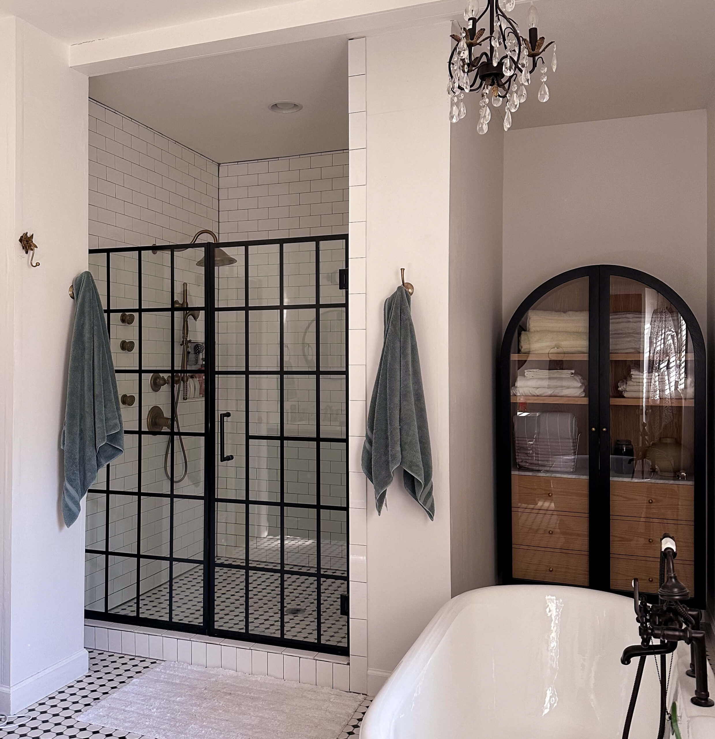
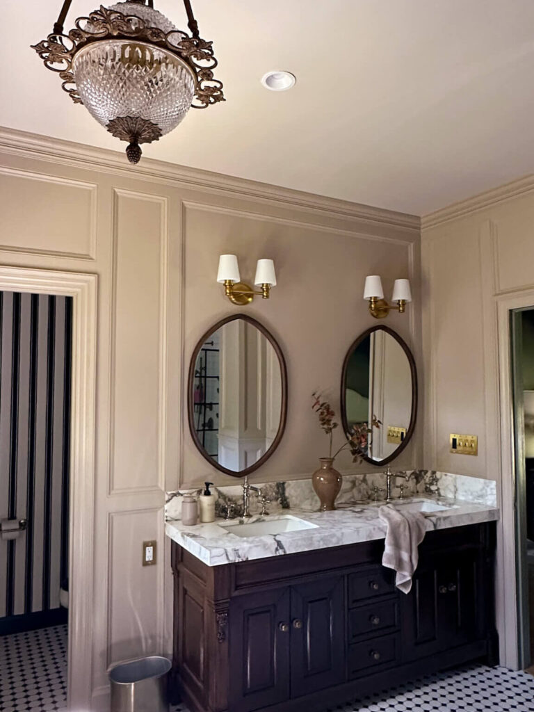
Primary Bathroom: Jitney by Farrow & Ball
Shop: Paint | Chandelier (similar) | Vanity | Faucets | Mirrors | Light Sconces | Toggle Switches | Striped Wallpaper | Checkered Floor Tile
The primary bathroom renovation included a careful paint selection process. I ultimately chose Jitney by Farrow and Ball to complement the adjacent bedroom.
Jitney is a warm neutral with soft pink undertones. It feels inviting and pairs seamlessly with surrounding finishes. The ceiling is painted Stirabout by Farrow & Ball, and creates a subtle contrast while maintaining warmth.
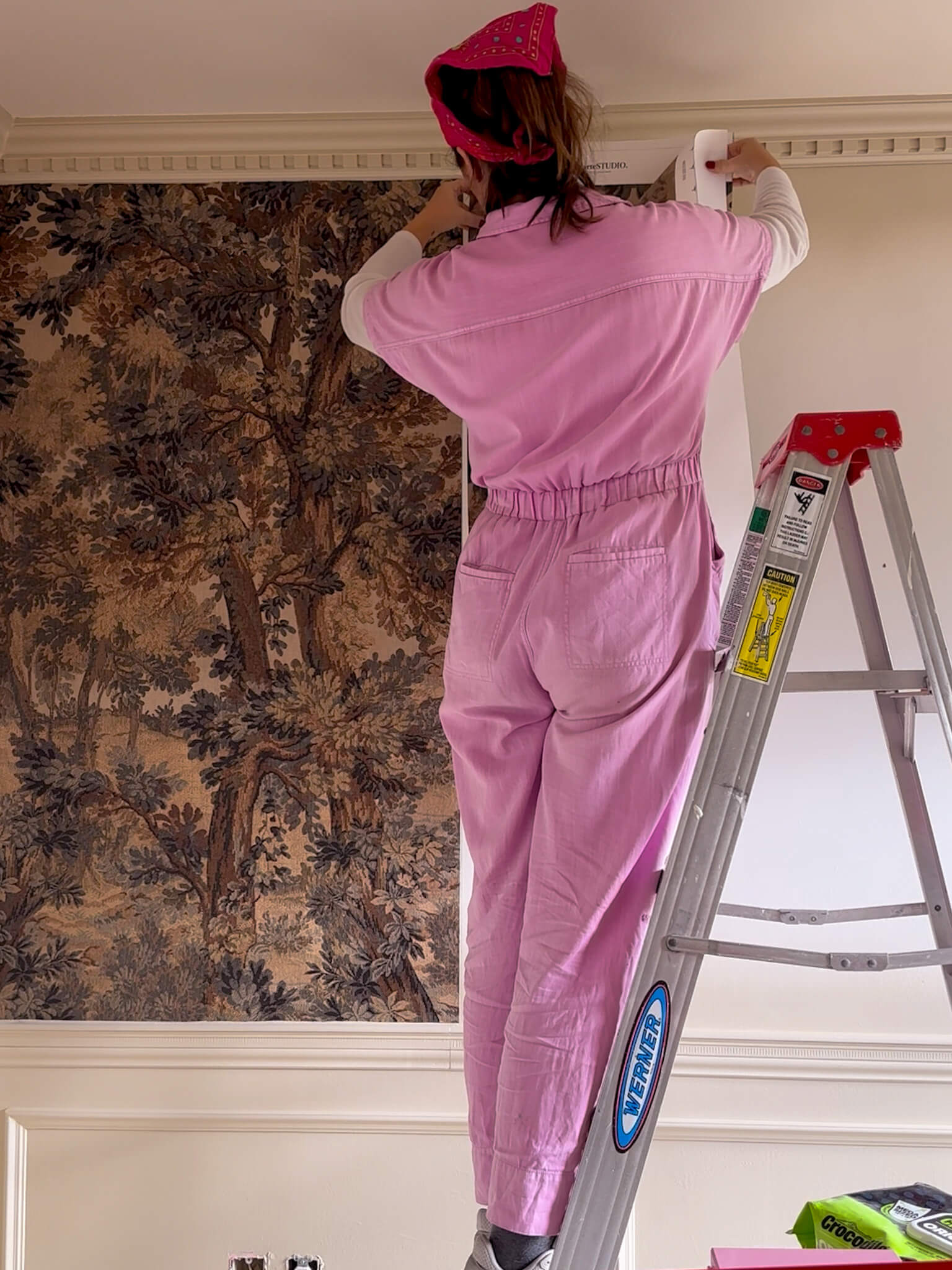
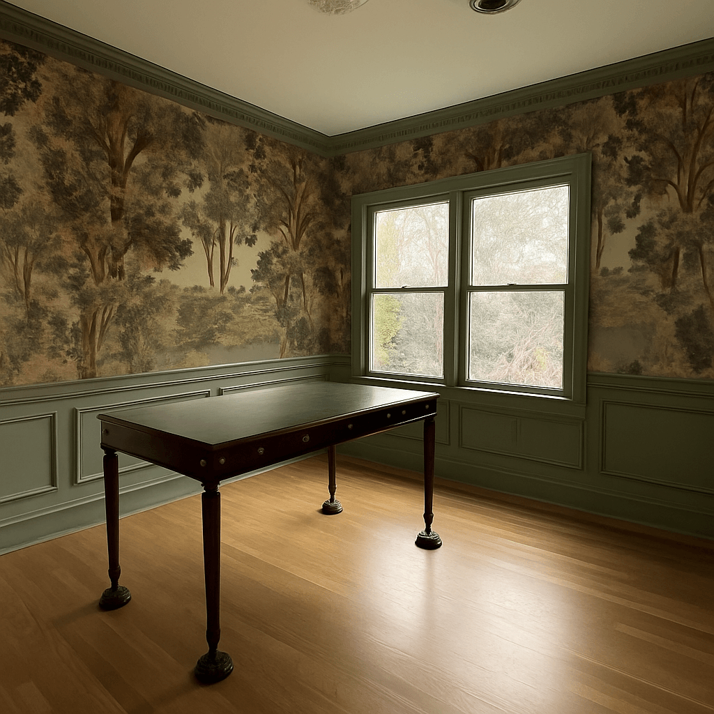
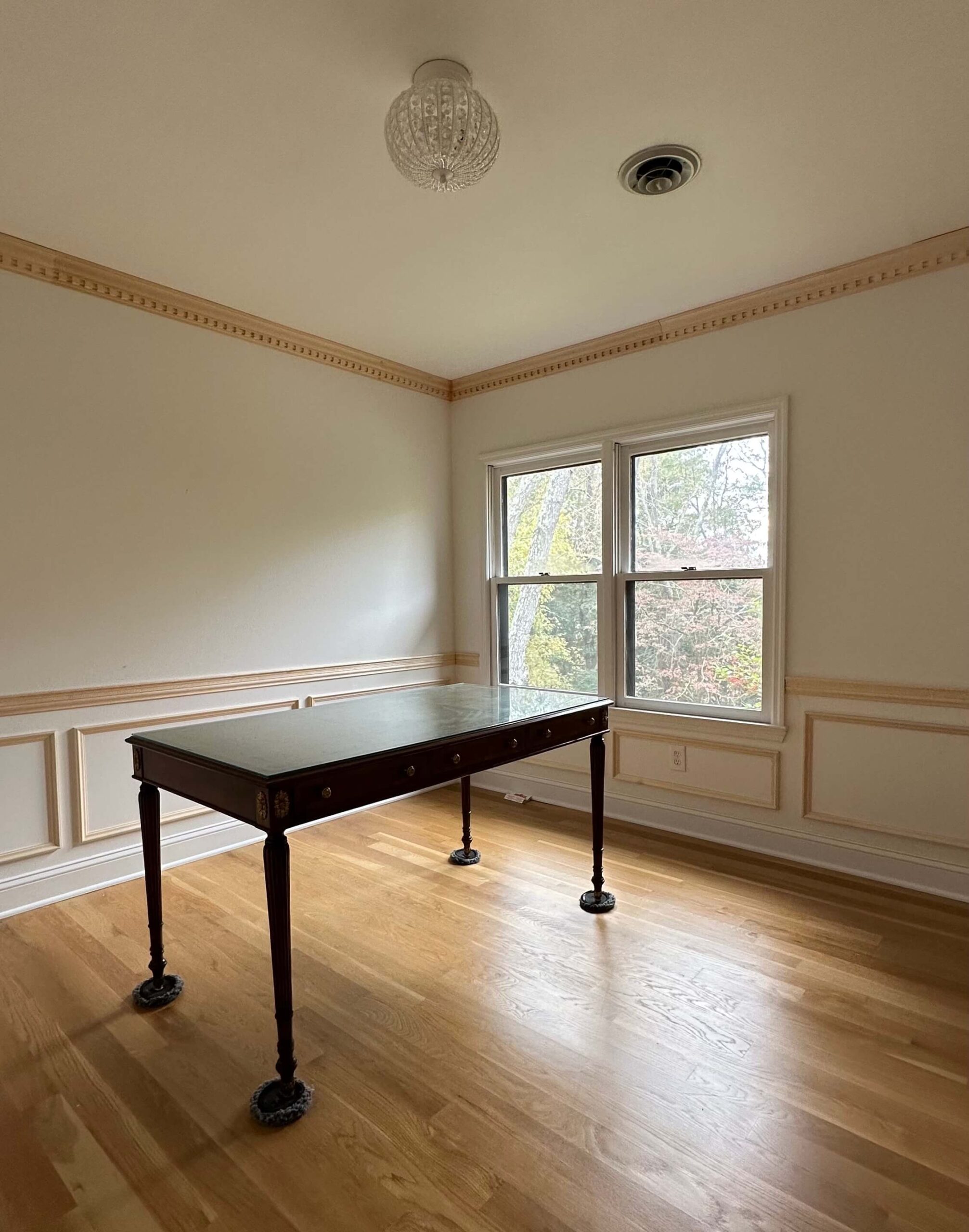
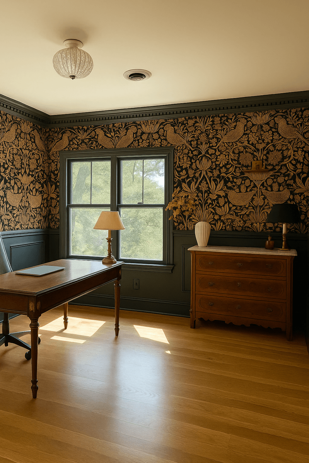
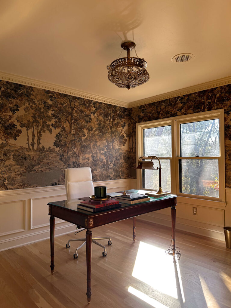
Home Office: Joa’s White by Farrow & Ball
Shop: Paint | Wallpaper | Crown Molding | Desk | Brass Lamp | Brass Candle Tray | Light (similar)
The home office features a landscape mural, so I needed a complementary neutral. I chose Joa’s White by Farrow and Ball, a slightly saturated cream that adds warmth without competing.
This south facing room allows the color to shift throughout the day, which adds dimension. The ceiling is painted Dimity by Farrow & Ball to create gentle contrast and architectural interest.
By the way, if you’re thinking about a landscape wallpaper mural I highly recommend it! I wrote an entire post here featuring a ton of options for every budget.

Shop: Wall Paint | Ceiling Paint | Wallpaper | Crown Molding | Chair Rail | Box Molding
Future Paint Colors in My Home?
Those are the current paint colors in my home, but this is just the beginning! I’m dying to add a deep burgundy somewhere and I think a beautiful French Blue could be so beautiful in the laundry room or even the pantry (both are on my 2026 project list!). This post will continue to evolve as rooms change and new projects unfold. Stay tuned to see what’s next and in the meantime if you’re searching for real life examples of paint colors with honest insight about lighting and undertones, I hope this guide gives you clarity and confidence for your own space.
Related:
Five Green Paint Colors I Considered for My Bedroom
Debunking Common Myths About Color Drenching
Refinishing My Existing Kitchen Cabinets
How to Choose the Right Paint Sheen
How to Get Crisp Paint Lines (when painting two different colors)