Today we’re taking a jaunt down memory lane, as I share the one of the first things I decided to do after buying this house: a primary bathroom renovation. There’s nothing quite like biting off more than you can chew, and I can say I confidently achieved that by renovating the primary bathroom with little to no design experience. What was I thinking, you might ask?
The Before
I wish I had more “before” photos, but I’ll do my best to fill in any gaps from the pictures I do have. The existing primary bathroom was definitely original to the house, and had not been updated (nor cleaned) since 1989. The square purple tiles in the shower and garden jacuzzi had dark grout that was not by design.
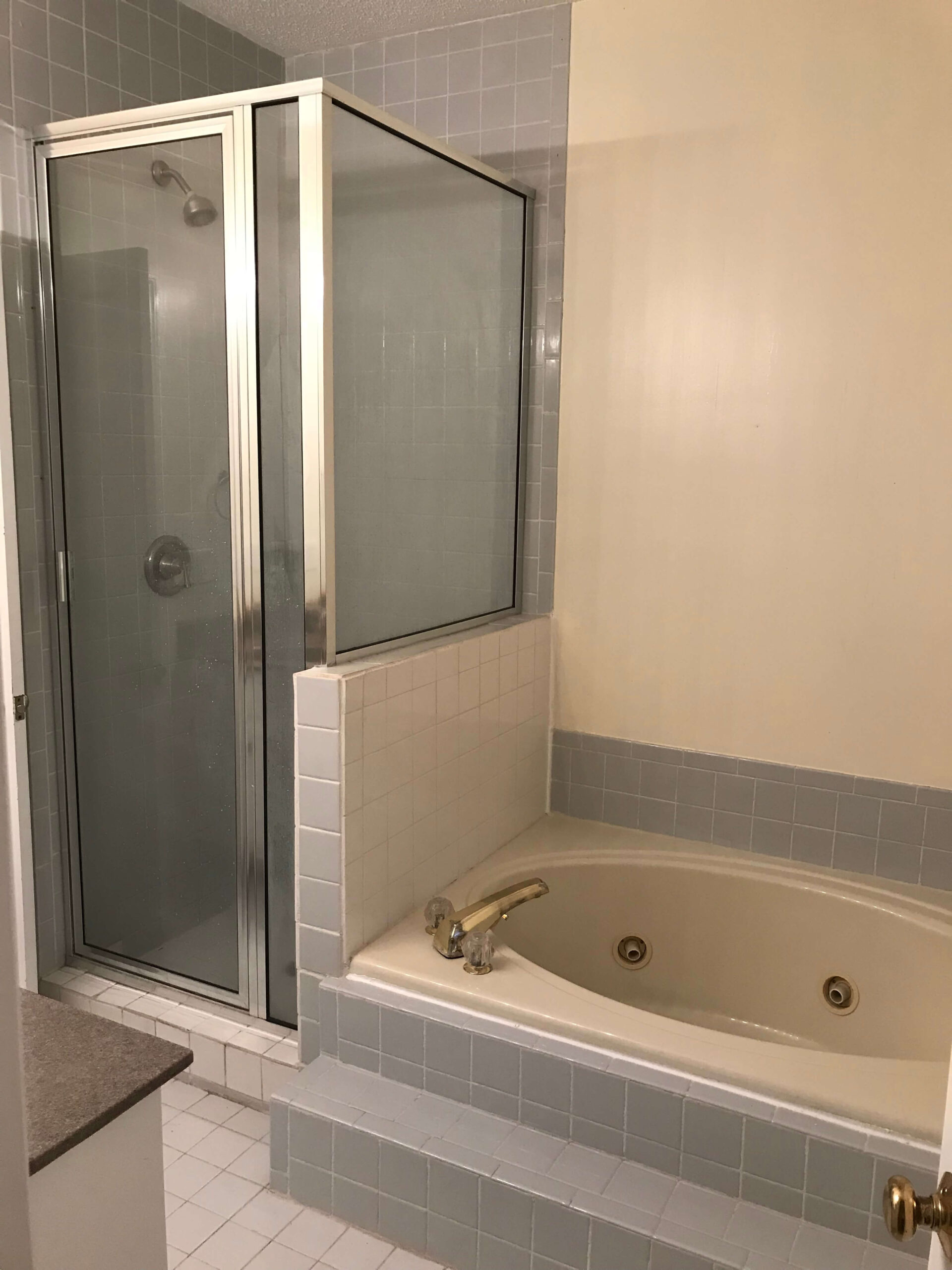
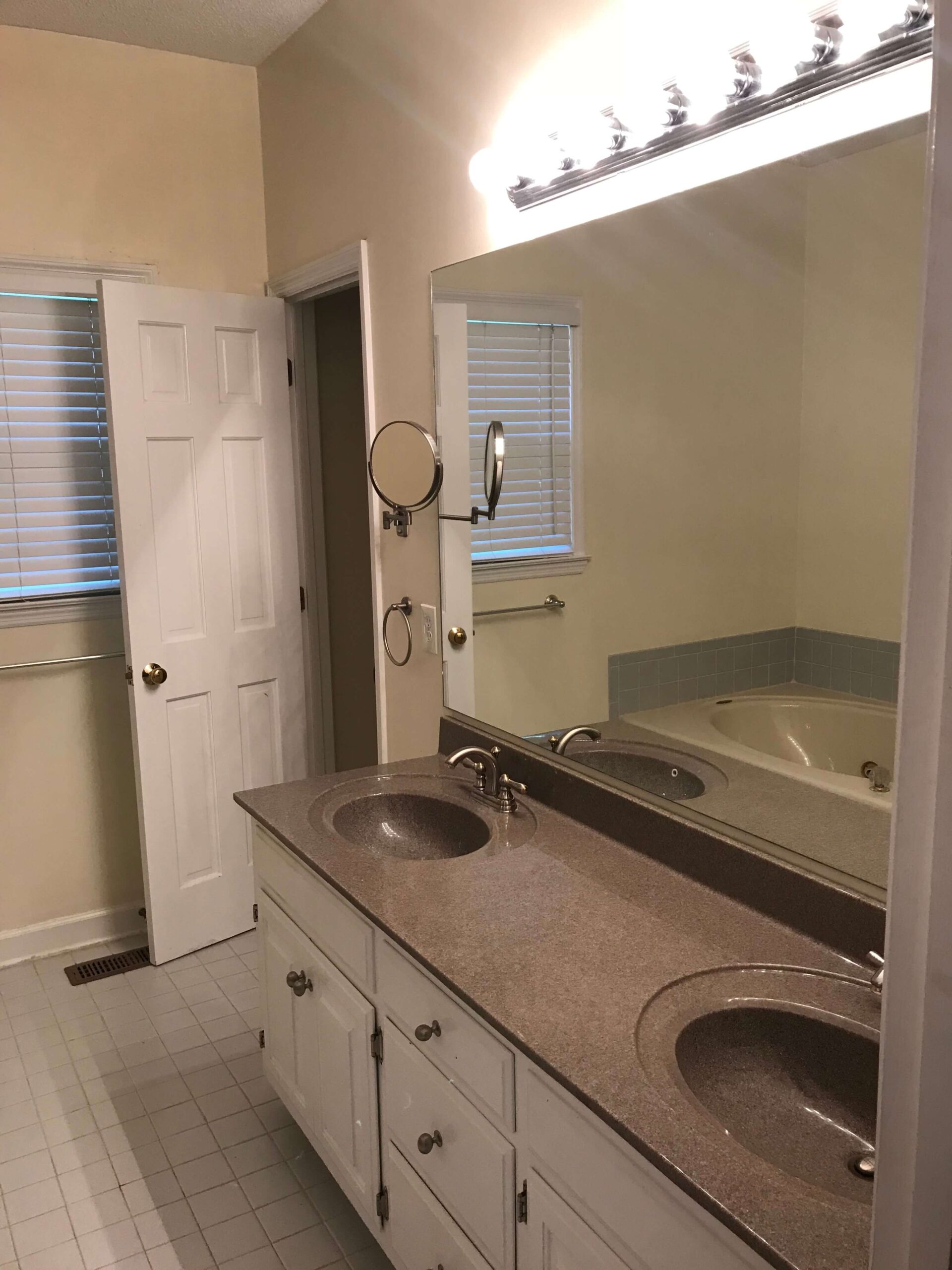
The vanity was so low I was bent over perpendicular to brush my teeth. And the shower was so narrow it was impossible to shave my legs without getting my hair wet. The jacuzzi tub also let out a fun mildew smell when you turned it on (and the water turned to brown).
The design plans
It was not a question. This space needed updated immediately. While I certainly could have made do with redesigning the space as is, I decided to take this renovation a step further by really blowing it out (literally).
The original bathroom dimensions measured 10 feet wide by 9.5 ft deep. However, as luck would have it, the primary bedroom had a long narrow closet which backed up directly to the existing bathroom. It also had a spare room on the other side of it.
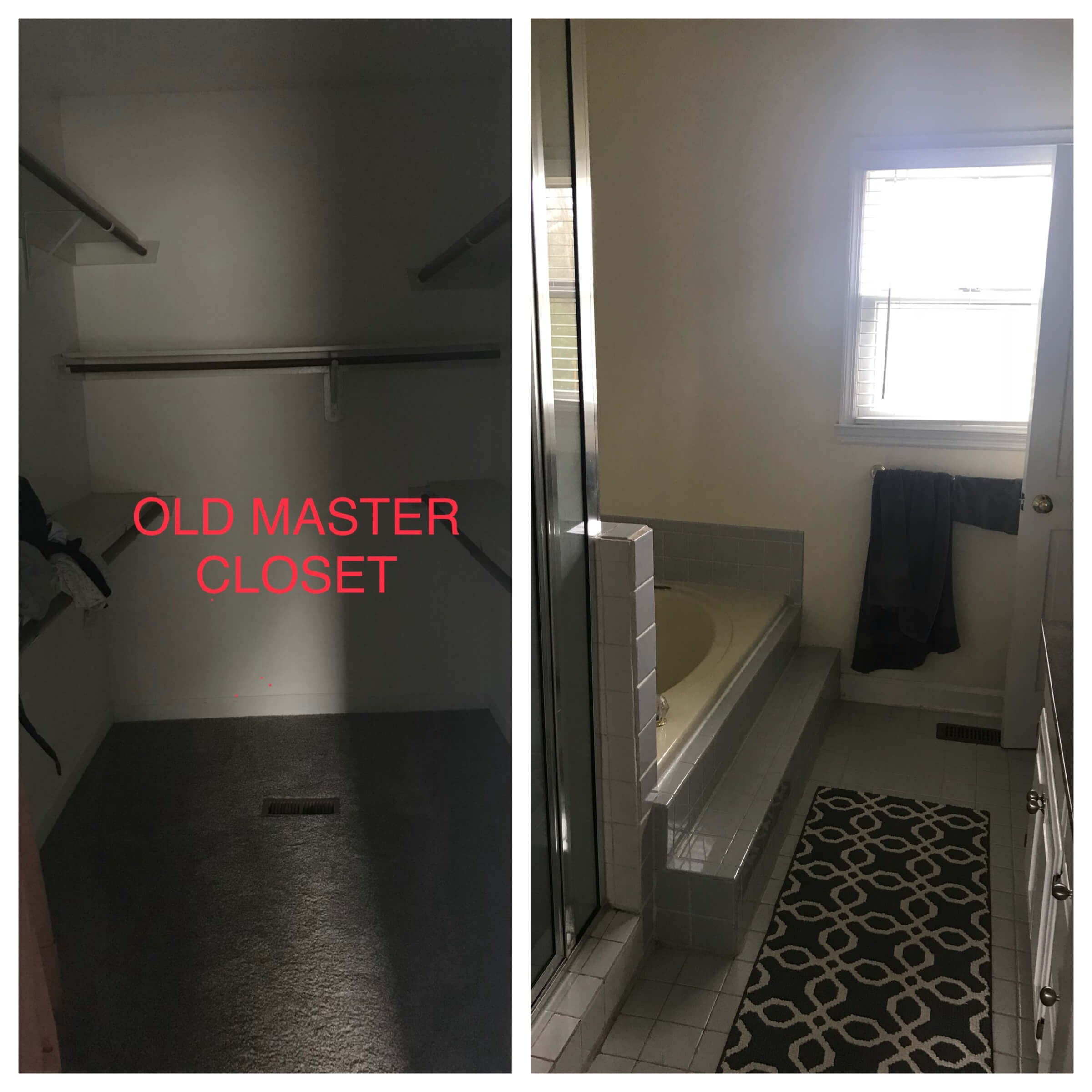
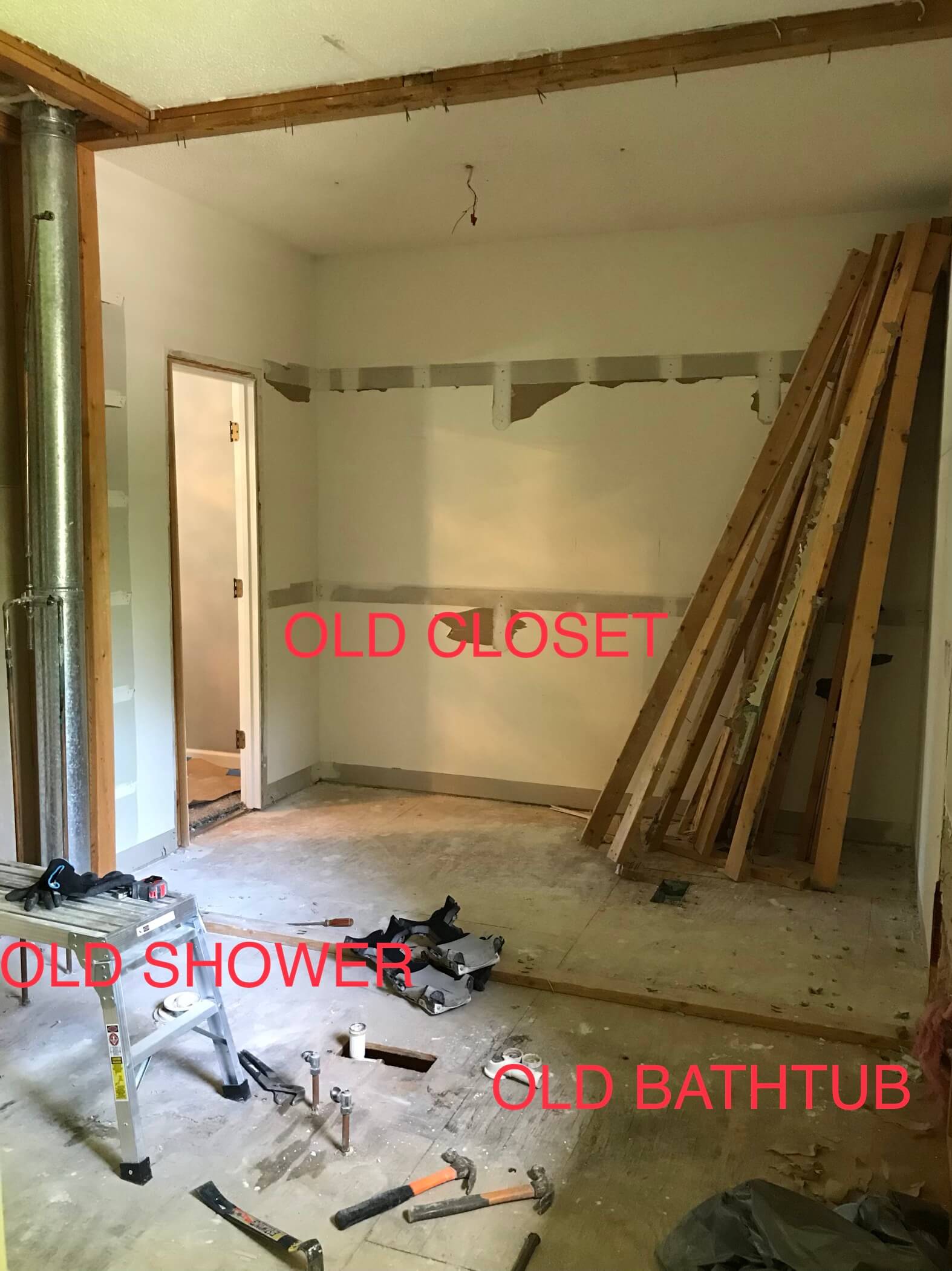
Knowing this, I decided to knock down the wall in between the bathroom and original closet and create one large space for the bathroom. This would allow me to get more creative with the overall design and not be restricted on space. By knocking down the closet wall, the primary bathroom would now be 10 ft wide by 14.5 feet deep.
The color palette
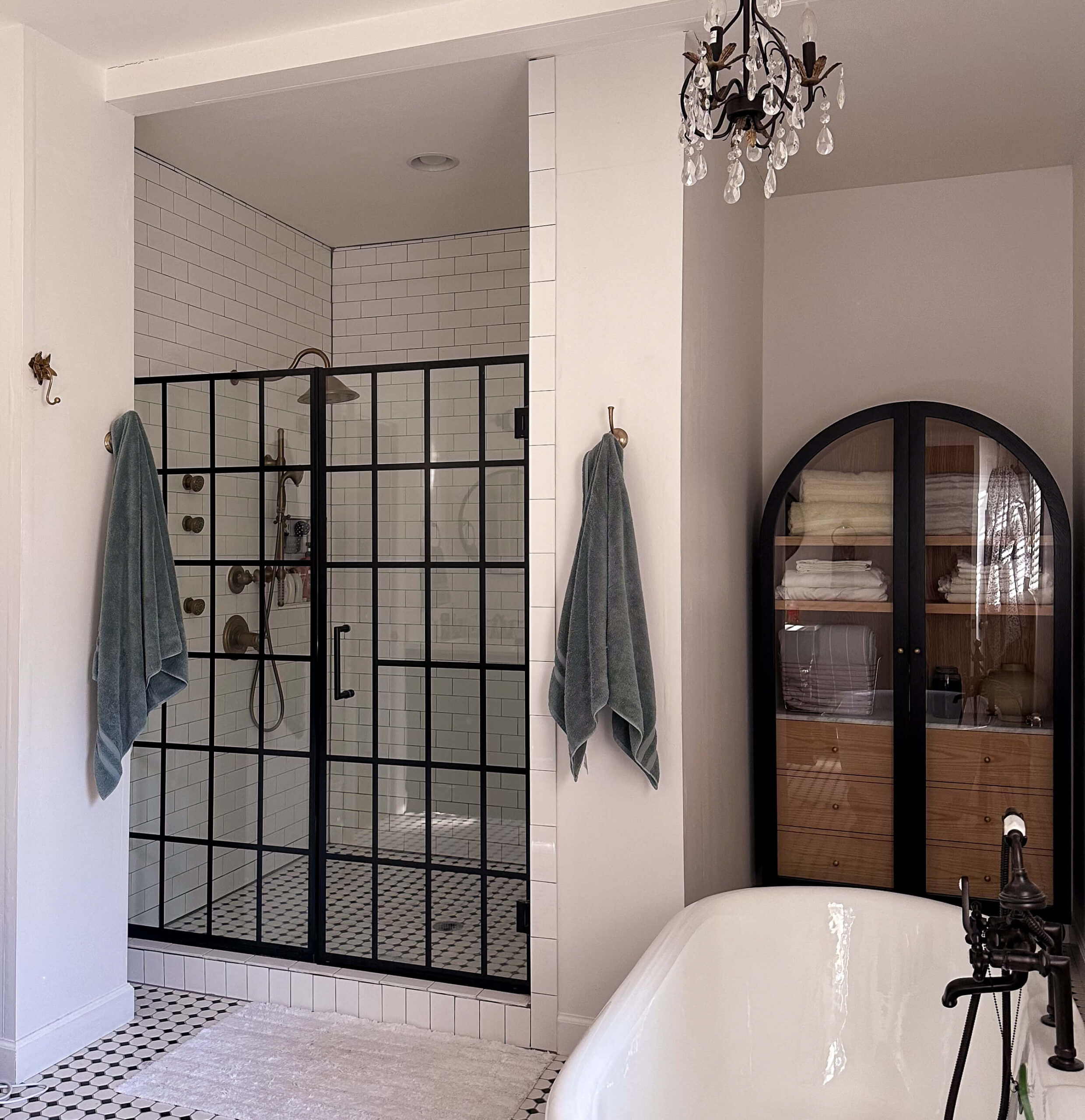
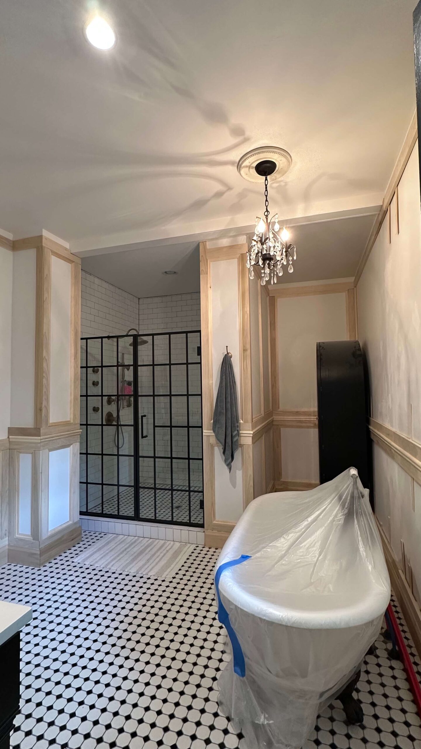
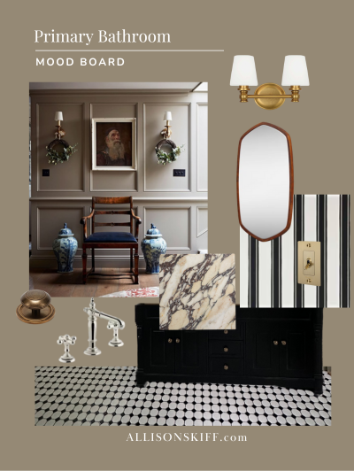
One thing I’m so thankful for, is my decision to stick to a classic bathroom color palette. I went with a traditional black and white bathroom schematic, choosing a simple black and white checkered tile with dark grout. A classic white subway tile would line the shower, and brass fixtures would add in pops of color throughout the space.
The shower
The biggest pain point in the original bathroom was how narrow the shower was. With my new added space, I designed a large walk in shower that is 6 ft wide by 5 ft deep. You can quite literally have a dance party in it, and then take a rest on the built in bench afterwards.
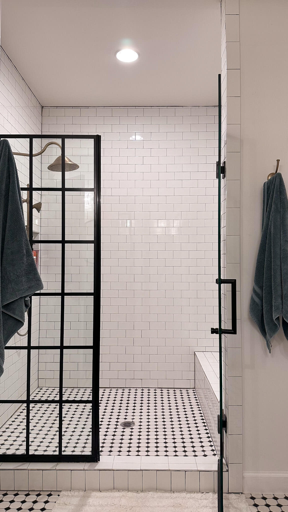
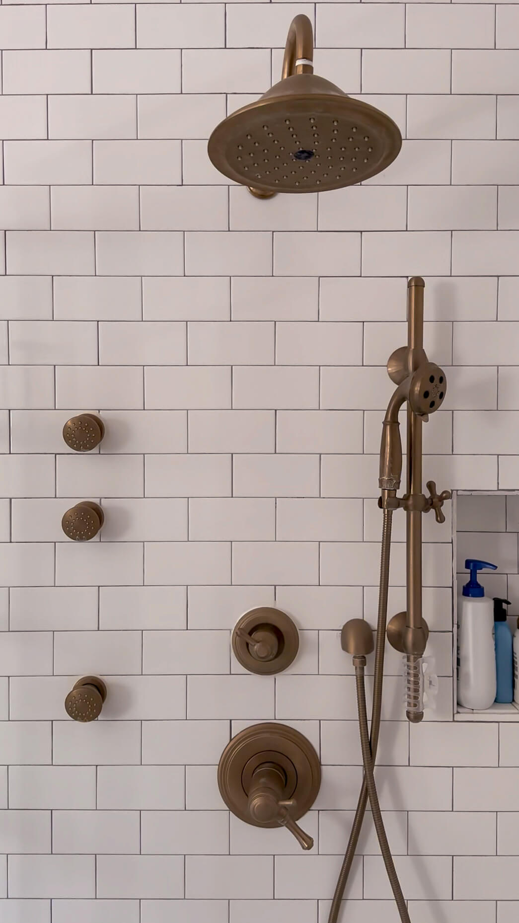
A beautiful glass door with a black grid adds a pop of interest to the shower space and I splurged on a complete shower system by Delta with an adjustable wand and three jets. It’s in a beautiful brushed brass finish and I do not regret the splurge one bit.
The vanity
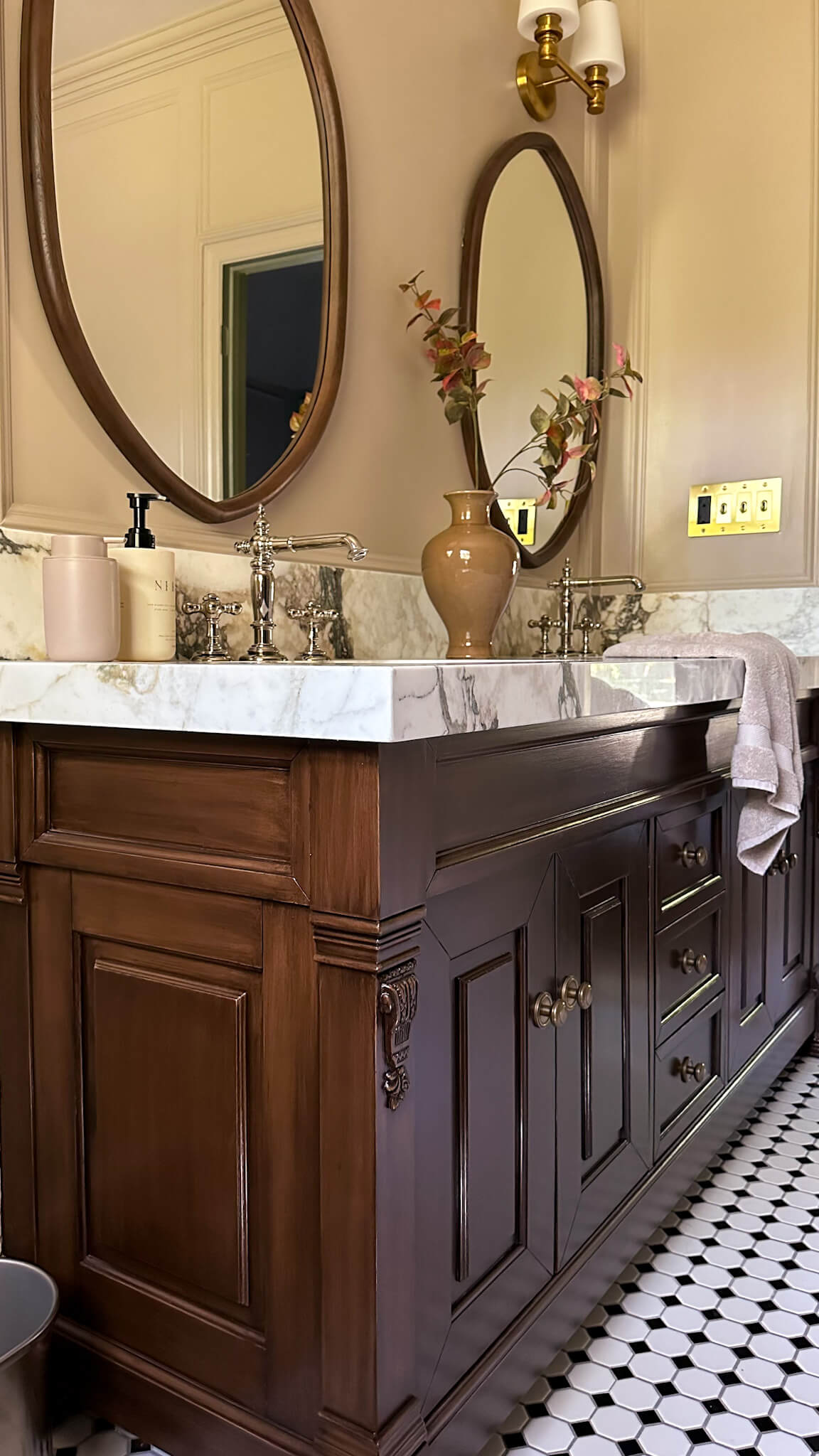
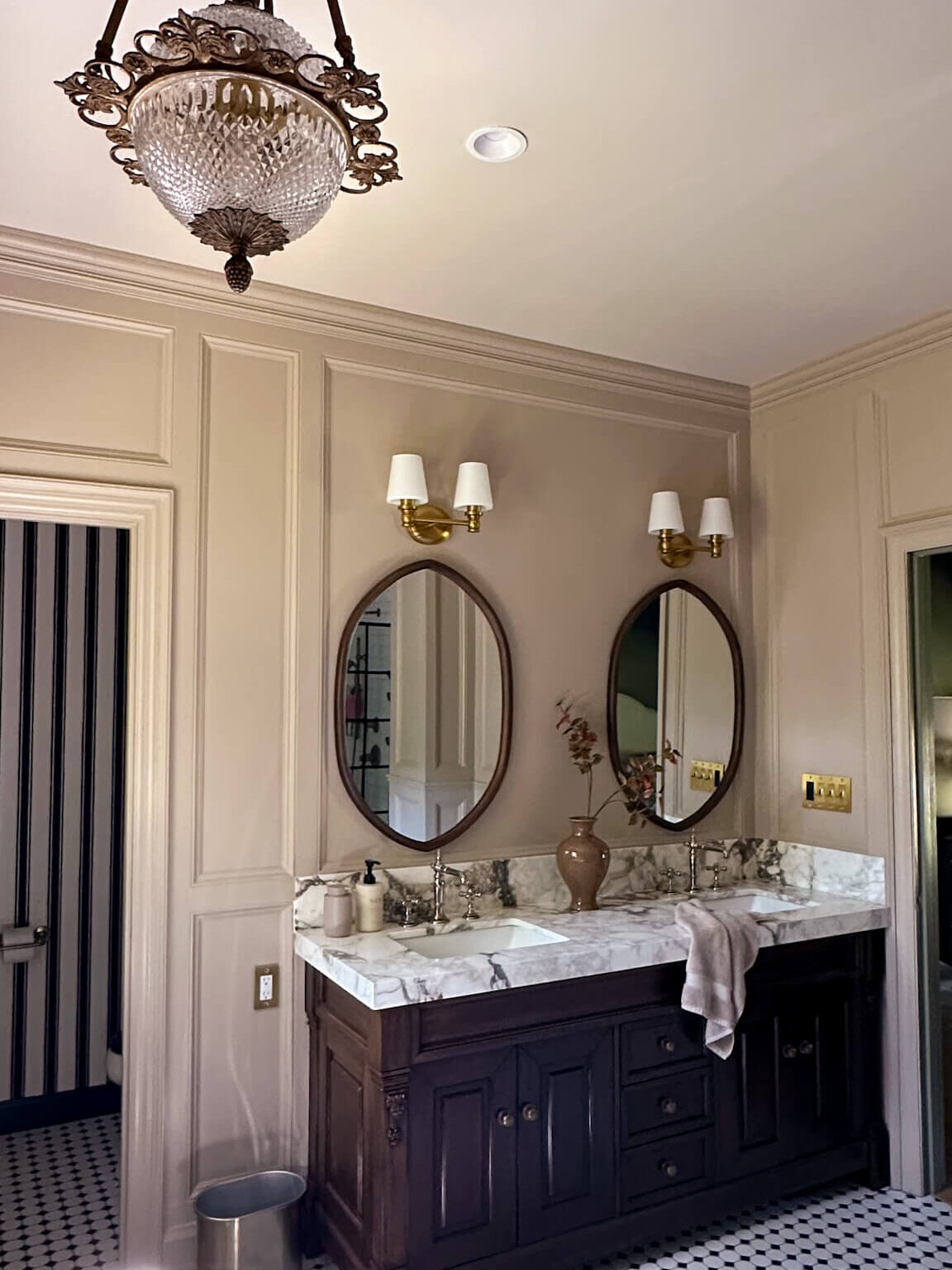
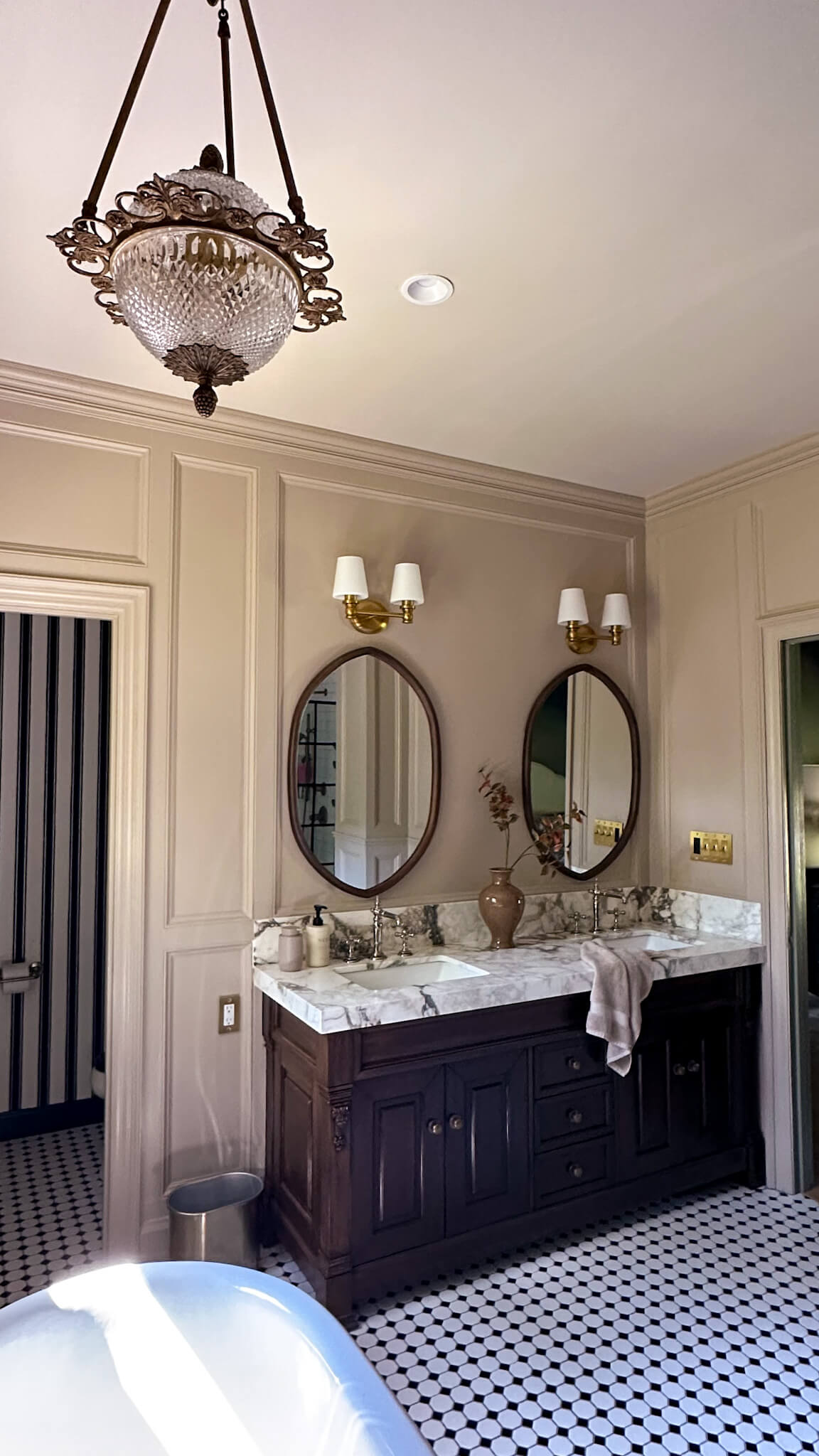
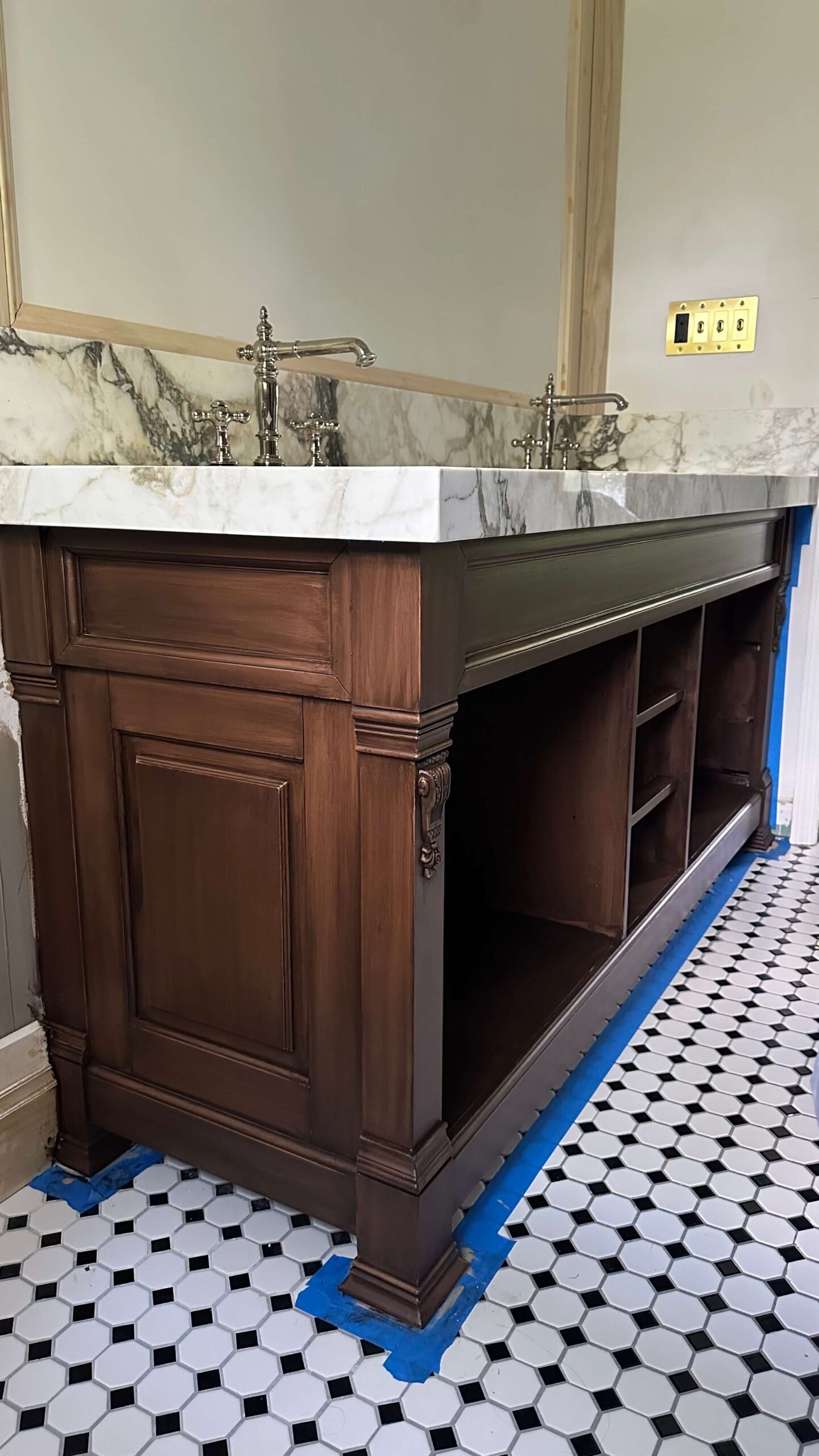
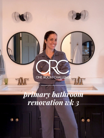
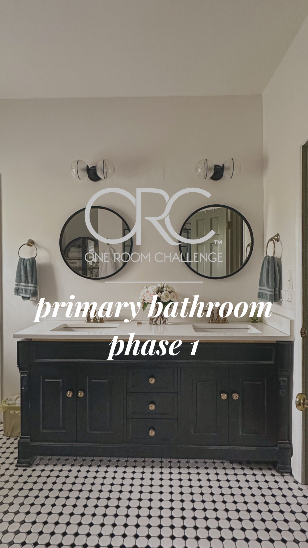
The master bathroom already had a double vanity in place and since I liked this feature, I didn’t feel the need to rearrange the room. I kept the vanity where it was originally located but swapped out the original for a new 72″ black vanity (that’s the proper height) and updated the hardware. A quartz countertop was the perfect stone choice for a high traffic area like a bathroom vanity and matching brass fixtures from Delta complimented the shower system directly behind the vanity.
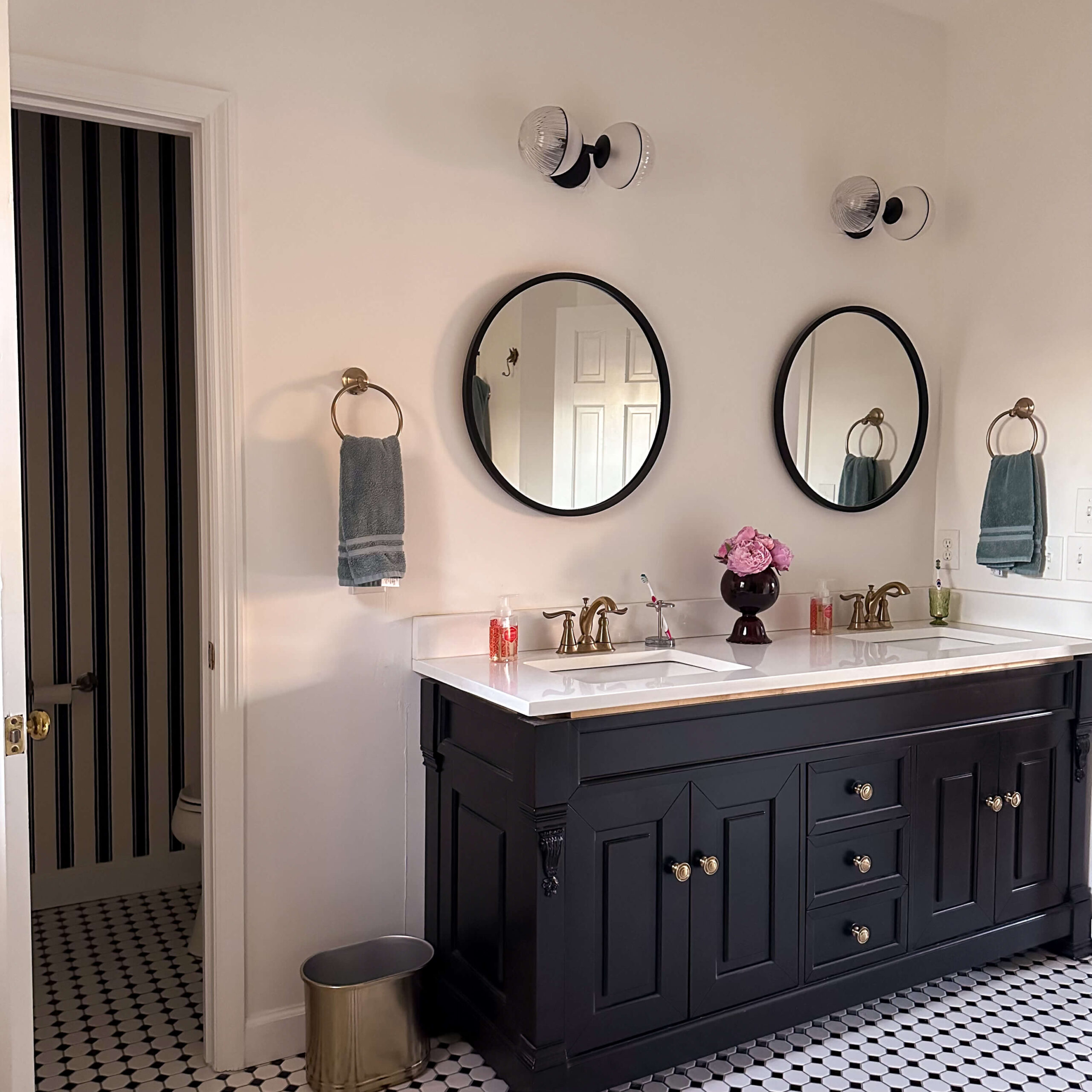
Sources: Vanity | Mirrors | Faucets | Towel Rings | Brass Trash Basket (similar) | Floor Tile
To break up the design, I found these beautiful sconces at Anthropologie which I felt complimented the classic style of the room and I added black round mirrors above each sink. Having lived with these for several years, I’m ready to swap these out for a more rectangular mirror that works better for the space. I was on a tight budget when I did renovated this bathroom and these mirrors have worked hard for the dollars!
The tub
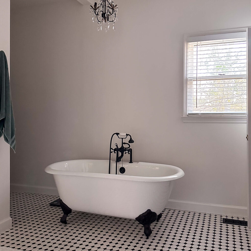
I’ve always wanted a clawfoot tub! This was a big part of the design and I think it fits so beautifully into the classic style of the space. I do have a handful of regrets in hindsight…
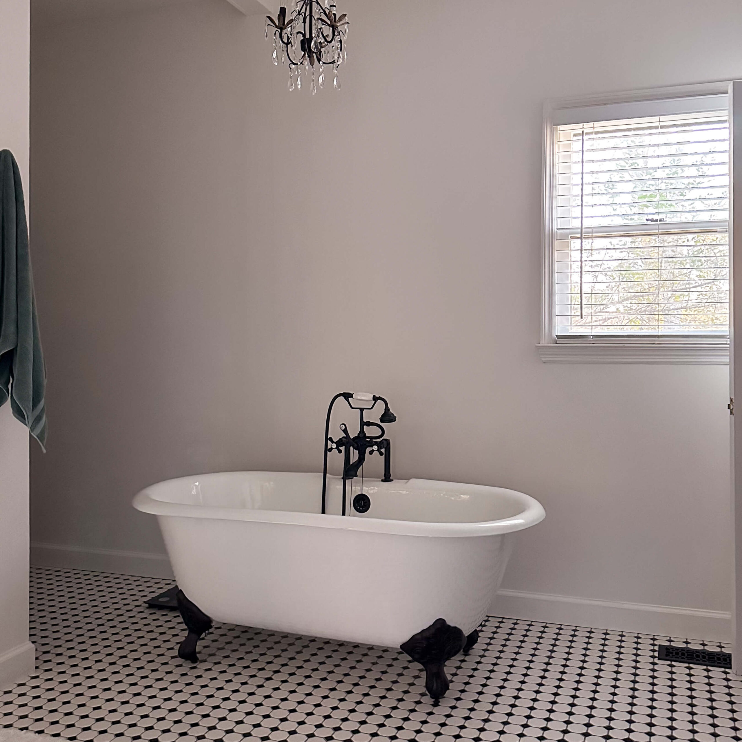
I wish I would have chosen a tub that had white feet vs the oil rubbed bronze. While these almost look black, they are not black. So as part of a mini-refresh on this space I’ll be exploring ways I could potentially paint these a lacquered white, or even a brass.
Additionally, I wish I would’ve dared to mix metals in this space and the clawfoot tub would have been the perfect opportunity. While it’s not something I currently have planned to swap out, it’s something I’m going to learn from for the future.
Storage
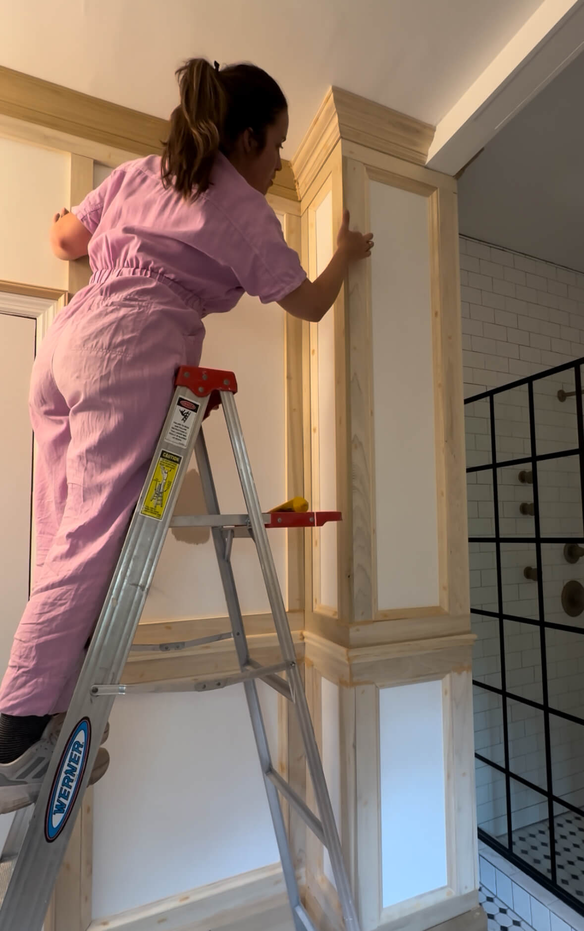
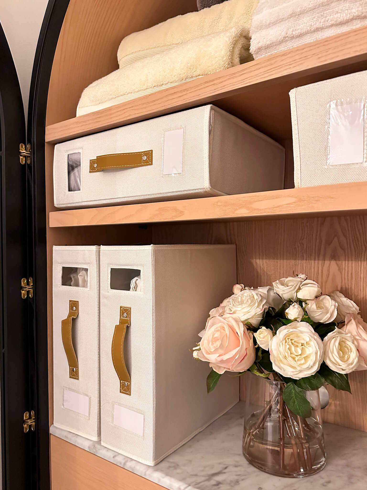
The original master bathroom had the tiniest linen closet behind the entry door, so when I knocked down the original shower, I gave up that space. With the extra space adjacent to the shower, I was able to perfectly fit a gorgeous armoire from Anthropologie into this nook. This built in houses bed linens, towels, toilet paper and fun things like bath bubbles and salts.

Sources: Floor Tile | Towel Hooks | Glass Shower Door | Subway Tile | Storage Cabinet
Toilet Room
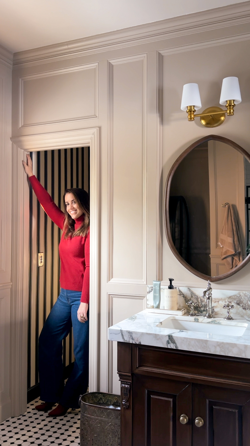
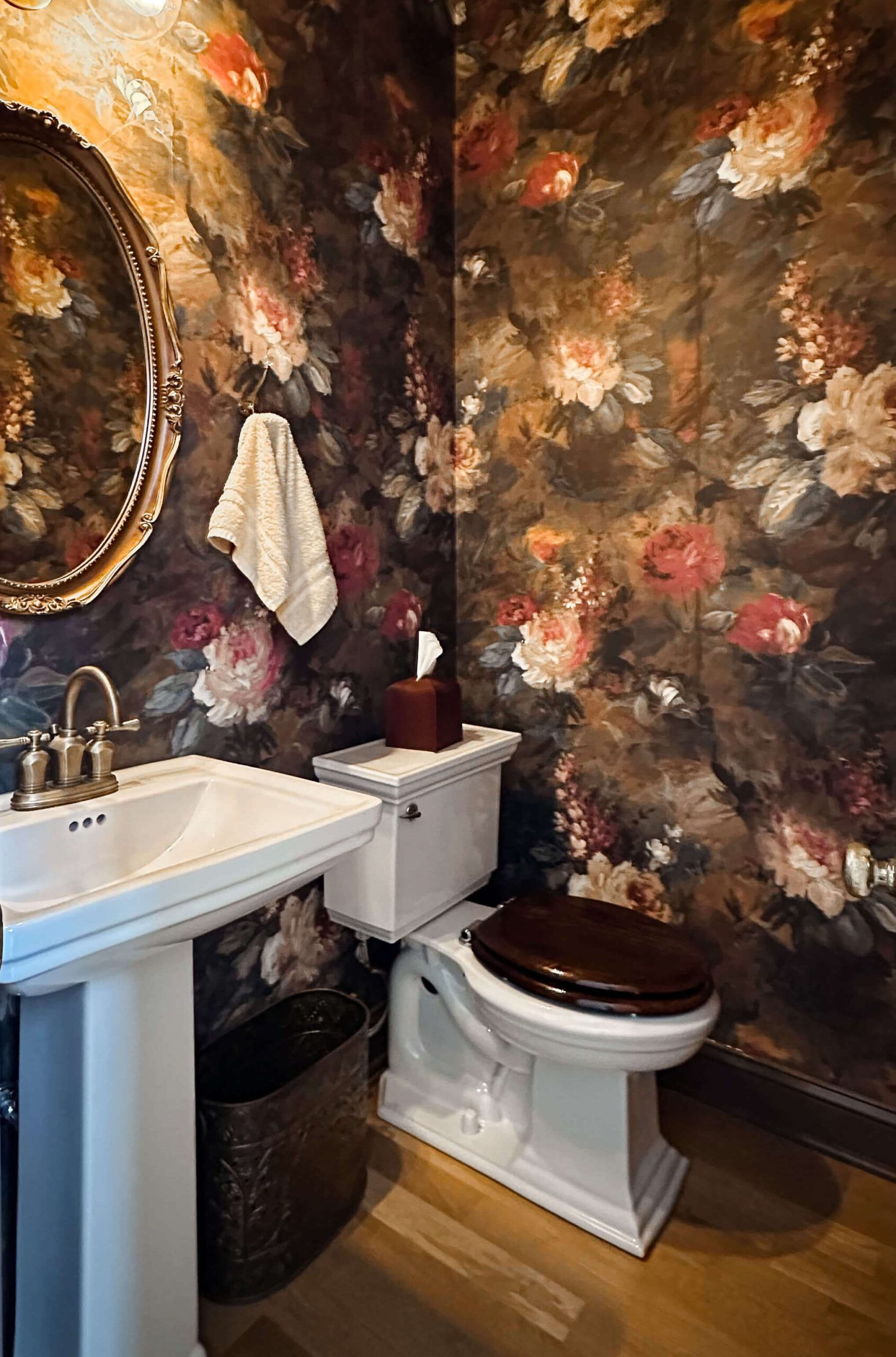
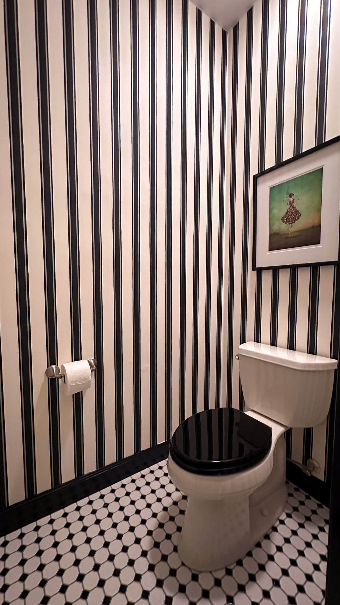
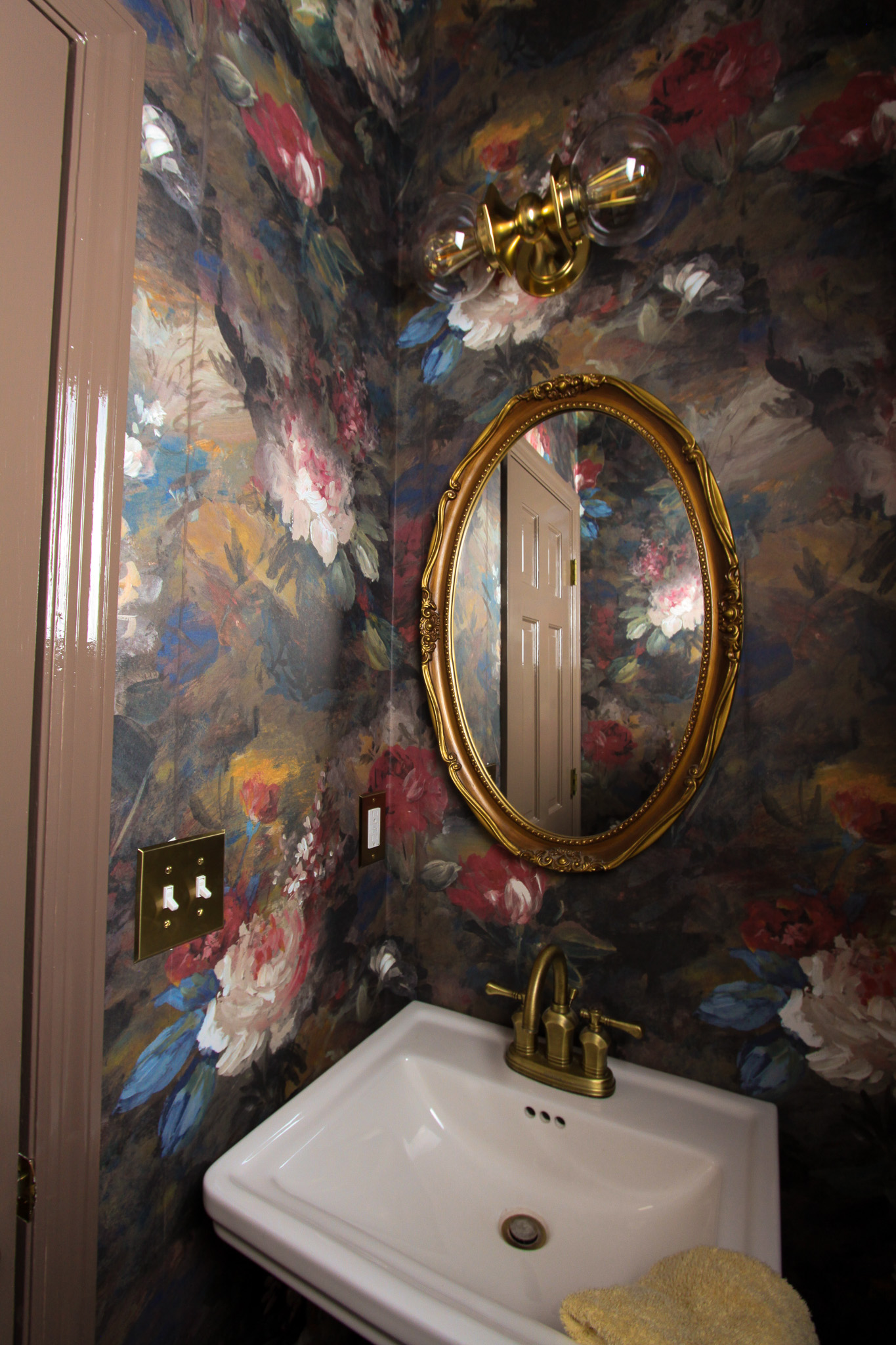
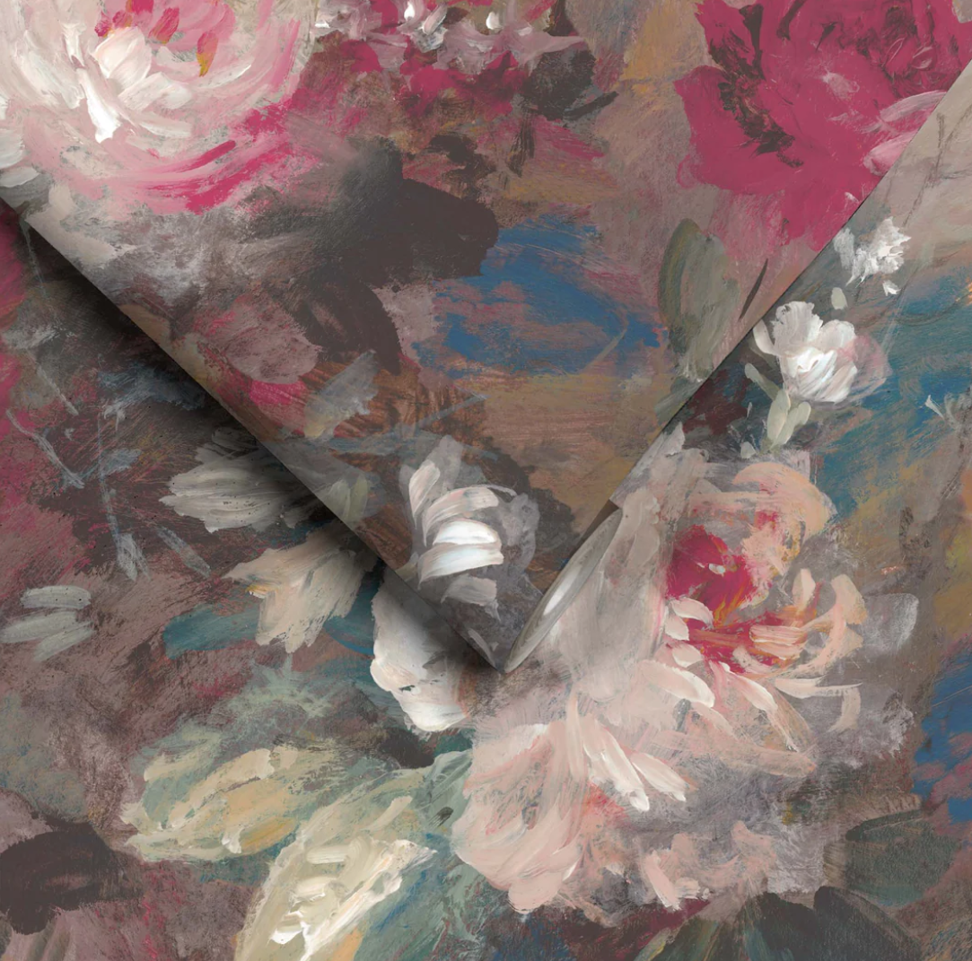
Where’s the toilet? One of the blessings of this space was having an existing toilet room! I think this is such a wonderful feature for any bathroom and am so thankful this space already had this baked in. Since the initial renovation I’ve tried to add a little more personality into the space and wallpapering the toilet room has been one of the best updates thus far.
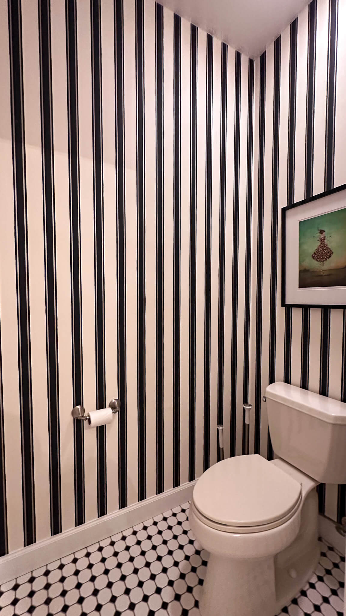
Sources: Floor Tile | Wallpaper | Toilet Paper Holder
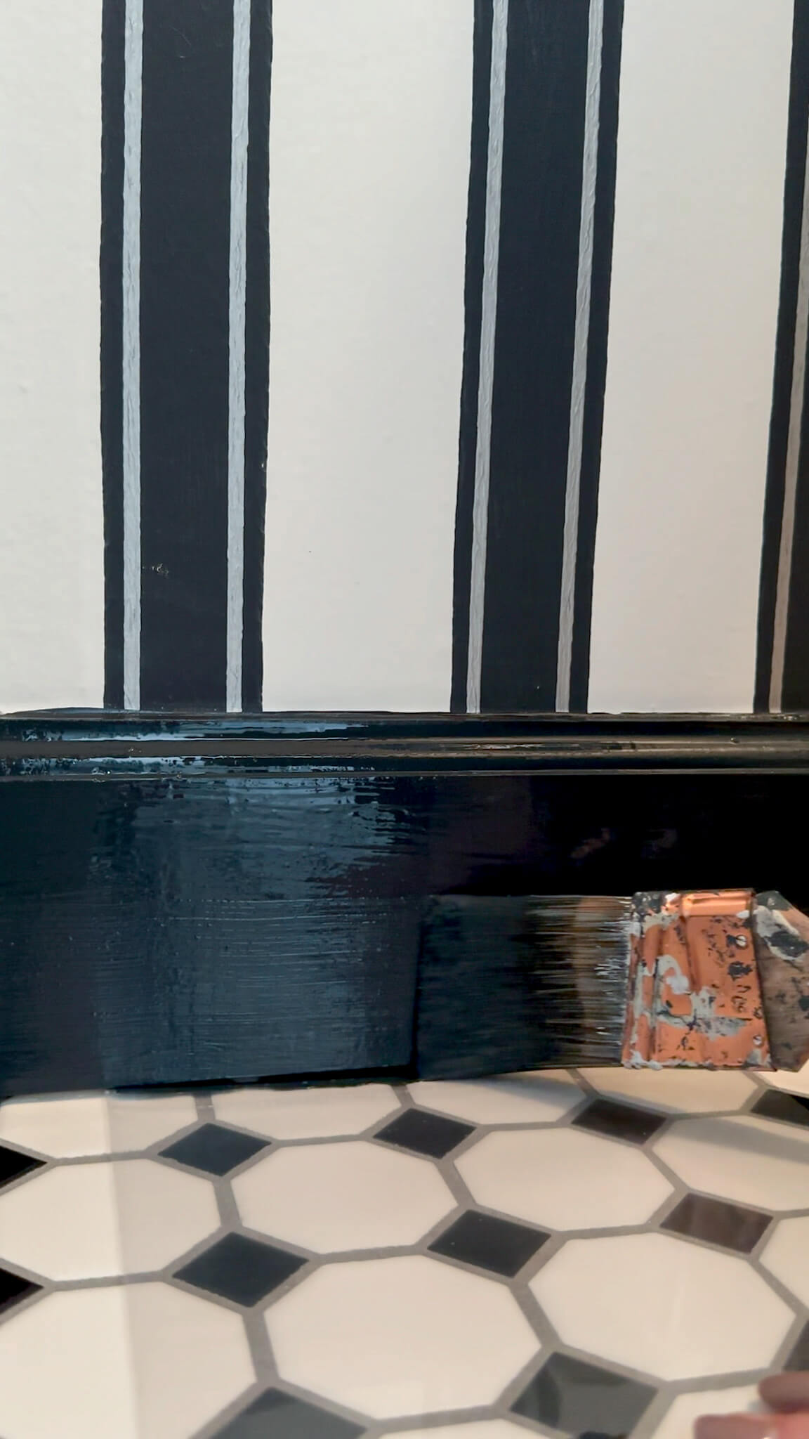
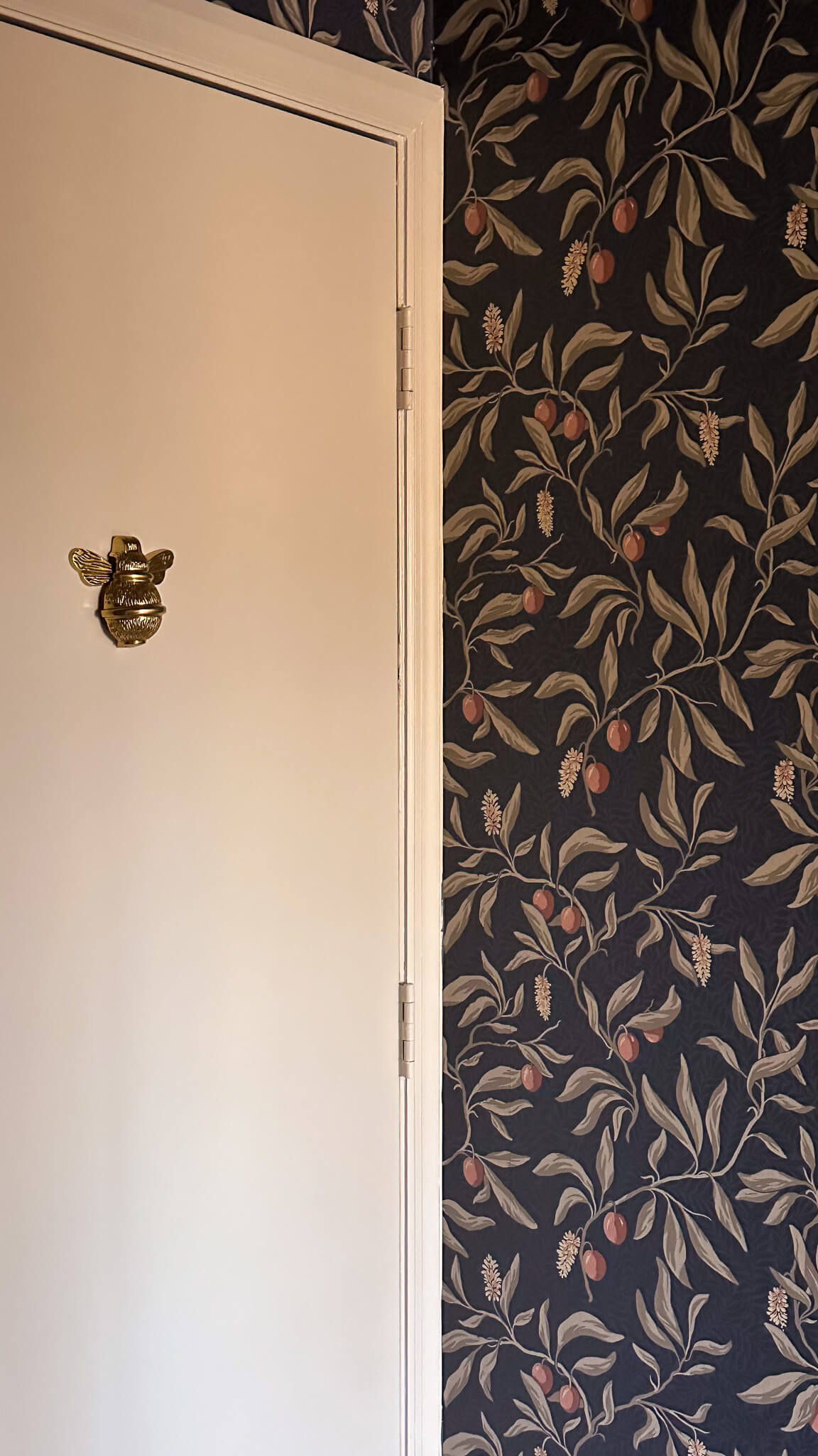
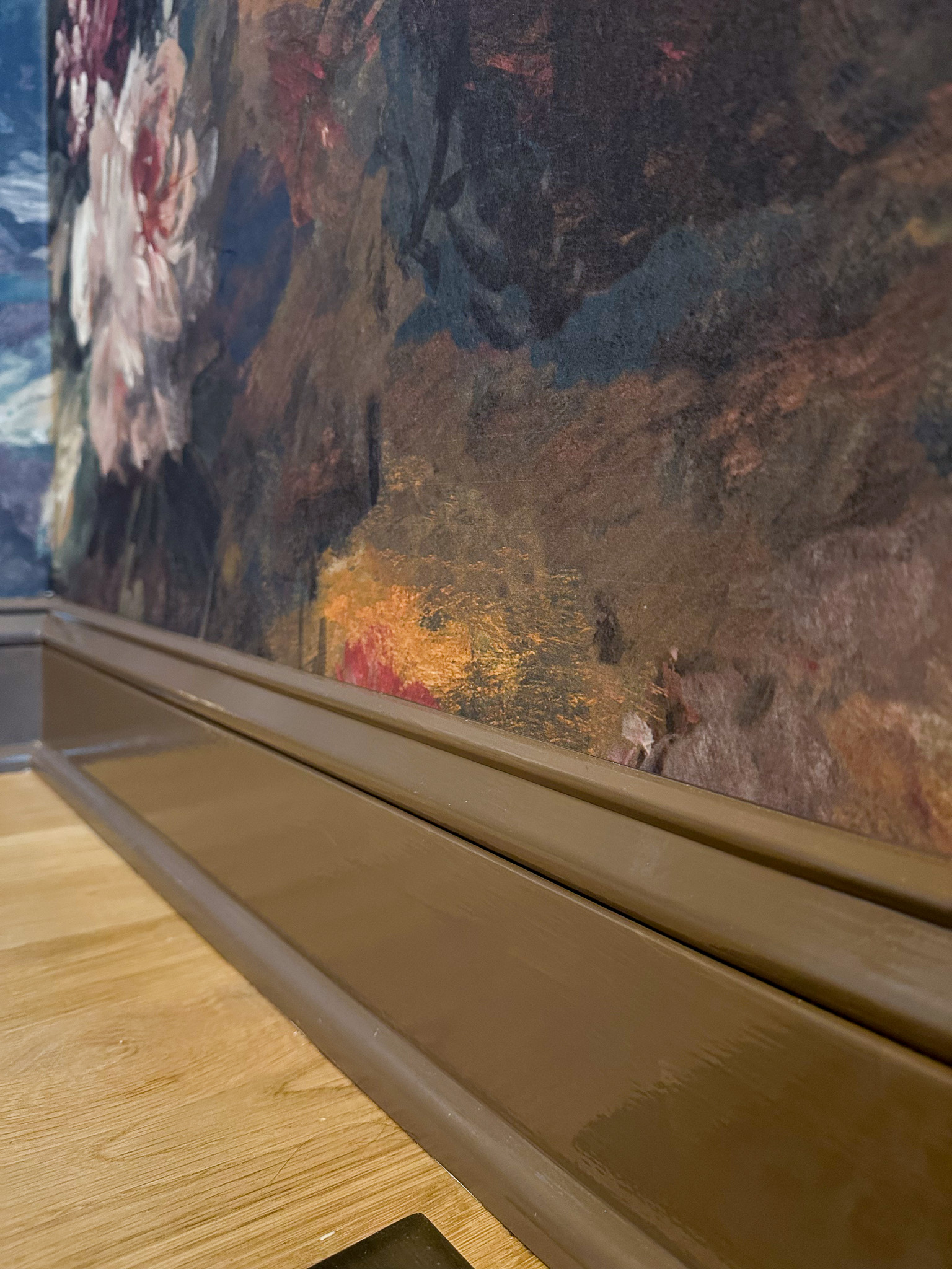
I’m going to take it one step further in the coming weeks and paint the trim, ceiling and door of the toilet room a pretty black color matched to the wallpaper. I think it will really pop and tie the wallpaper and tile floor together in a beautiful way. After painting the trim in the powder room and cozy room last year, I can’t stop thinking about more places to incorporate non-white trim and am so excited to try my hand with black.
Full Circle
Are there things I would do differently if I had the chance to design this space all over again? Absolutely. But am I incredibly proud of what I designed in my head and brought to life? 100%.
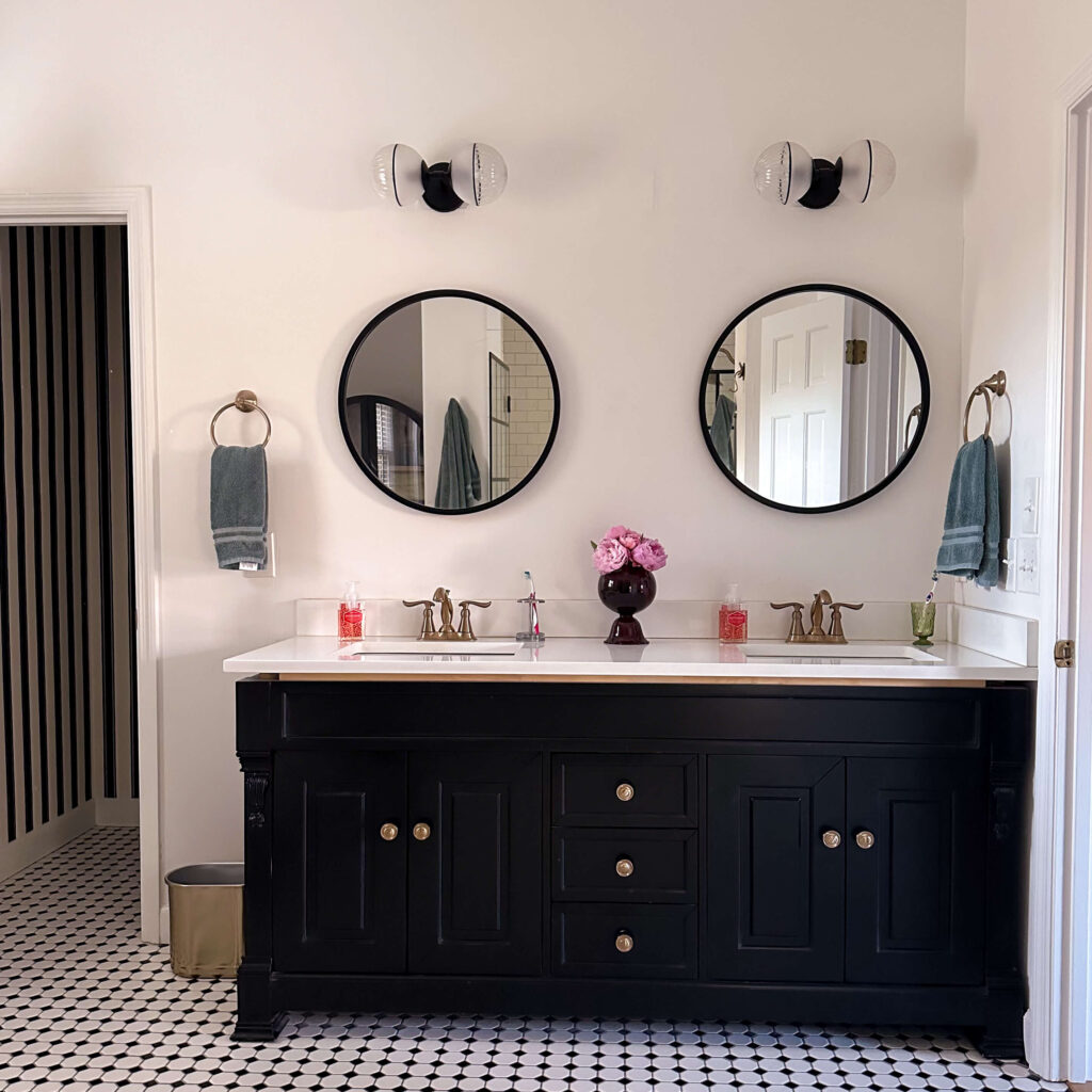
Shop the Primary Bathroom
Stay tuned for some little updates to this space throughout the year, as well as some follow-up thoughts on what I’d do differently the second time around.
Sources
Light Sconces (sold out)
Round 24″ Black Vanity Mirrors
Anthropologie Black Storage Cabinet
